Digital Ain’t Film: Modern Photo Editing
[Note: To view the illustrations in this article properly, your screen ought to be calibrated. Calibrating a screen takes only a minute or two and enables pictures to be displayed as they are supposed to be. To calibrate the screen in any version of Mac OS X, go to System Preferences > Display, click the Color tab, click Calibrate to launch the Display Calibrator Assistant, select Expert Mode, and follow the directions. When you come to a choice for gamma, choose 2.2. That has long been the formal standard but before Mac OS X 10.6 Snow Leopard, Apple set 1.8 as the default.]
When architects began to build with iron, they did not understand its capabilities, so they cast and painted it into pillars that looked like stone. Most photographers are doing the equivalent now with digital photography. We buy digital cameras made to work like film cameras, and we use software that imitates the filters, darkroom manipulations, and retouching brushes that were commonplace when the world used film.
To take full advantage of a digital camera requires an altogether different approach from conventional photography, and sufficient tools to implement it are now available. In this article I am going to describe an intrinsically digital approach to photography. This approach does not employ a virtual equivalent of any conventional photographic gadget or process, nor does it involve pixel-by-pixel changes made by wielding a virtual brush.
Verisimilitude, Not Special Effects — In my photographs I rarely try to create special effects, I usually want verisimilitude. I want my pictures to present the illusion of reality. I say “illusion” because nothing in a photograph is an accurate representation of what the brain sees when we look at a scene. The appearance of reality is a perceptual illusion, an illusion created by contrasts among adjacent patches of light entering the eye, contrasts in intensity and wavelength. When we look at something – at any scene or any image of a scene – our eyes sample local contrasts and the brain infers from those samples the lines and colours and objects that we see. In the literal as well as the figurative sense,
optical reality is out of the picture. (For a discussion of reality in digital photography see “Reality and Digital Pictures,” 12 December 2005.)
For this reason, when I take or adjust a photograph, I do not think in terms of good skin tones or accurate colours, I think in terms of contrast. If every tone contrasts appropriately with every tone adjacent to it, then every tone in the photograph will look natural, regardless of what the actual tones or colours are. That is why, in the picture on the left, square A looks darker than square B. As you can see on the right, they are actually the same.
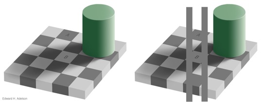
Image-wide Adjustments — Controlling the contrast of film requires filters on the camera – I used to carry nearly a hundred of them – plus careful control of the chemical processing and, for a sophisticated few, creating contrast masks. Photoshop offers analogues to all of these but an application designed specifically for digital photography could be more sophisticated. It could go over the image as our eyes might, and adjust every contrast that it “sees.” To make everything maximally distinct, the application could clarify all of the contrasts within a small area, then move to another small area overlapping the first and clarify all of its contrasts, and so on across the image.
Of course, we would rarely want every tone to be maximally distinct from every other, because that would likely distort their natural relations. We would want to be able to temper the adjustments. We could have the application do this by having it “look” at larger areas and/or by having it apply only a partial correction. Also, where the contrasting tones are tiny, we interpret them not as tones but as lines and detail, so we would want to be able to adjust tiny contrasts separately.
This, in essence, describes a Photoshop plug-in by Topaz called Adjust, which has one panel for adjusting the contrast of broad areas and another for adjusting the contrast of fine detail. Both panels are filled with sliders, and you can see changes instantly in a reasonably large, scalable image. Adjust’s adjustments are too unusual to feel intuitive immediately, but after reading the instructions and adjusting 20 or 30 photos I found myself saving a stunning amount of time. For image-wide adjustments of lightness and darkness, those two panels provide all of the controls of tonality that I need, and do so in an interface that is simple enough for me to cope with when I am in photo-editing
mode rather than computer-geek mode. Instead of fussing with Photoshop’s controls for exposure, levels, curves, shadows and highlights, and contrast masking, and often trying HDRsoft’s Tone Mapping plug-in (reviewed in “Photomatix: A Virtual Magic Wand,” 16 October 2006), I can just fiddle with a few sliders, usually only four.
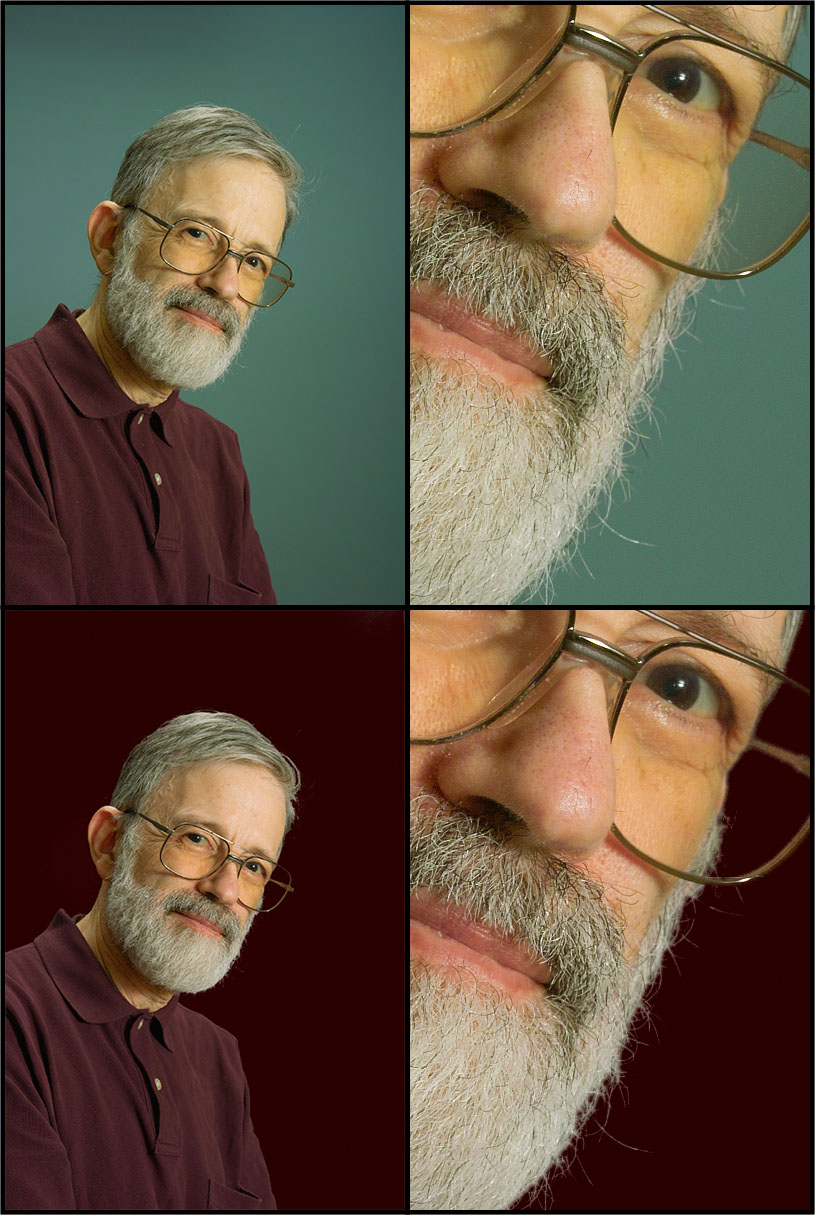
To see what Adjust can do, take a look at this photo. The version on the left shows what the sensor recorded. It is a raw file converted to an image with no adjustment of any kind. It’s a pleasant snapshot with a full range of tones from black to white across the frame, but the crown of the man’s hat is the brightest tone, so it draws the eye away from the man’s face. Everything above the hat also distracts from the face, and the shirt stands out as more blue than anything else in the picture, so it distracts as well. Moreover, the picture provides no sense of how hot and bright the day was – we were sweating up a storm – nor does the picture bring out the interesting lines and textures of the man’s skin.
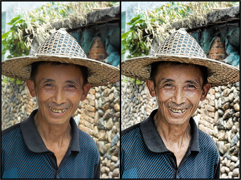
The version on the right shows the result of adjusting tones with Adjust. Now we have a full range of tones not just within the image but within each important part of the image: a full range across the man’s face and a full range across each of the three areas of wall behind him. His face is now as prominent as his hat and his skin shows heat and brightness, lines and wrinkles. To effect the improvements in tonality, I just moved two sliders in Adjust’s Exposure tab. To bring out the lines and texture of his face I moved two more sliders in the plug-in’s Details tab. The bricks above the hat still strike me as distracting, and so does the tint of the shirt, but we shall deal with these shortly.
Note that the files I work on are raw images converted to TIFF files with minimal adjustment or manipulation. Like most DSLRs, my cameras produce raw files with 12 bits of information from each cell of the image sensor. These bits of information need to be transformed into colours: that is the job of a raw converter. Raw converters usually convert the 12-bit information from the camera into a visible image of 8 or 16 bits per colour. Squeezing 12 bits into 8 or expanding 12 bits into 16 requires adjusting the brightness and/or contrast. I want to control this process using the products I am describing here, so I set my raw converter to convert the 12-bit information from the sensor into 12 bits of a 16-bit image. This imbues the TIFF
with exactly the information contained in the raw file.
Topaz Adjust can enhance detail usefully, but the same company also makes a more sophisticated plug-in specifically for details, a plug-in straightforwardly called Detail. Detail lets you adjust the contrast of details in three different ranges of size, and does so using more sophisticated mathematics that modify the image more naturally. Adjust would be sufficient for most people and purposes, but for large prints, Detail is a valuable complement.
Unfortunately, Adjust presents the user with a needlessly confusing interface, because it contains many superfluous features. Besides the tabs dealing with overall contrast and details, a third tab adjusts saturation over small areas in the same way that Adjust adjusts contrast, and a fourth tab cleans up noise. The adjustments to saturation strike me as all but useless, and the noise reduction does not seem special. Topaz’s approach seems to be, “If we can throw in a feature easily, let’s do it, so that the product will seem more valuable.” Thus, Adjust’s Details tab is complicated by two sliders to add unsharp masking, yet Photoshop itself does unsharp masking and this is most sensibly done after a picture is nearly finished, as the
last step before printing, because the appropriate amount varies with size of the print. Moreover, one pane of Adjust’s window fills a lot of screen space, and throws a lot of noise at the eye, to display perfectly silly presets – 35 of them. The visual effect of any slider depends upon the photograph being adjusted, so these presets are intrinsically meaningless, and I think a user would be foolish to use Adjust by clicking on them to find the one he likes best, for then he would not learn how to control the adjustments systematically and thus use the product efficiently and to best effect. It is possible to hide this pane but no setting will let it stay hidden by default. The Detail plug-in’s interface is similarly complicated.
Picking Out the Pieces — Adjust adjusts the contrasts within the image as a whole, but often contrast needs to be adjusted differently in different parts of the picture. A good example is the bricks above the hat in the previous image. They do not blend in with the other bricks because they are too dark, too saturated, and a redder tint. Photoshop has a host of tools to deal with portions of an image but most of them involve fancy brushwork of one kind or another. Essentially, they involve painting the image. More efficient is to lasso part of the picture and tell the computer something like, “Select every tone in this region that I dislike and change it in proportion to the amount that I dislike it.”
A patented approach permitting this has been implemented in a family of plug-ins by Asiva. Each of them lets you select parts of the picture the same way. The plug-in provides a curve showing all hues of the spectrum, a curve showing the range of brightness from white to black, and a curve showing the range of saturation from brightly coloured to monochrome. By adjusting those curves you can select any tone or set of tones, then do something to them. Asiva’s Selection plug-in just selects the tones for Photoshop to work on; the Correct Color and Correct+Apply Color plug-ins let you change the tones interactively. These latter plug-ins obviate every control over colour that Photoshop provides, and will do many difficult things with ease, like change the colour of a woman’s dress, or replace a background, even a complicated background like a sky poking through leaves or a blue matte behind hair.
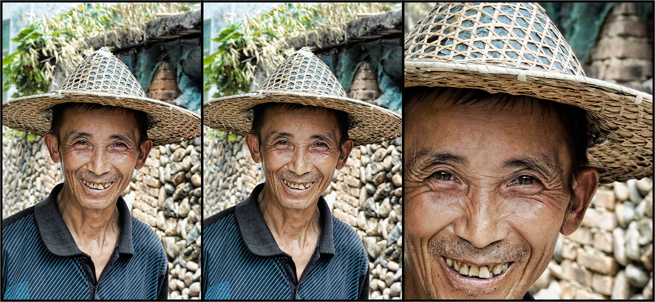
In this picture I used Correct Color to lighten, desaturate, and re-tint the bricks above the man’s hat. I could have spent a lot of time sponging and dodging and tinting those bricks with Photoshop, but instead I lassoed that corner of the photo and fixed the bricks in one pass with Correct Color. Here is the result in the middle, with the original and a larger detail for comparison.
This screenshot of Correct Color shows how easy it was do do this. The left side shows part of the photo that I was seeing at full size. The yellow identifies what Correct Color selected. I had Correct Color select that area by dragging the pointer across the bricks. This selected a range of hues, a range of saturation, and a range of brightness. Correct Color showed those ranges in the graphs on the right. The graph of hues on top shows the range of hues that I actually selected, but I could have grabbed the curves and moved them to select a different range. The graphs of saturation and brightness no longer show what I selected with the pointer: I wanted to select a greater range of saturation and brightness, so I clicked their Reset
buttons to move them to their more inclusive defaults. The Operation controls in the centre of the window show what I did to this selection: I nudged the hue to make it more yellow, decreased the saturation, and increased the brightness. To make the changes appear natural, I did not want to brighten every colour, I wanted to leave dark and saturated tones as a visual base and increase the lighter tones around them. To effect this I implemented the changes progressively by choosing Gain in the topmost pop-up menu. I could instead have chosen Shift, which would have shifted every selected tone a constant amount.

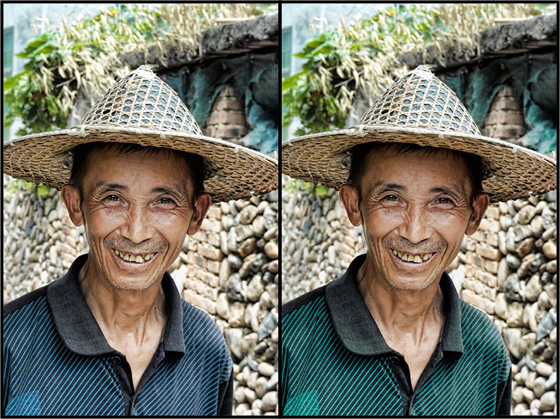
Just as I altered the bricks, so I altered the shirt to complement the other colours better, making it more cyan:
I also fix colour fringing in much the same fashion. I lasso areas that show fringing, select the fringes’ colours, and reduce their saturation. If that affects other parts of the picture as well, then I select the Edges Only checkbox instead of From Curves. Fixing fringes usually takes a few passes, especially if I work only on edges, but Correct Color will clean up quite a mess.
Aside from colour fringing, the most common kind of noise is grainy speckling from the sensor. This is most visible in flat tones with little detail, most commonly the sky, and if you use Topaz Adjust to bring out fine detail, it can become pronounced. To remove ordinary granular noise from the image I run the sophisticated plug-in NoiseNinja, but I often want more noise removed from skies than elsewhere and occasionally Adjust makes skies so noisy that they need the coarser treatment of Photoshop’s tools, treatment that would destroy detail in the rest of the picture. In these cases I use Asiva Selection to select the sky and apply my noise reduction only to the sky. Selection looks like
Correct Color but lacks Correct Color’s Operation controls. Some of Photoshop’s noise-reducing controls will blur the edges of the sky with whatever is adjacent to them. When this happens I work on a layer that contains only the sky. To make that I create a duplicate layer, select the sky, then use Photoshop’s Inverse command to select and delete everything except the sky.
Asiva’s Correct+Apply Color plug-in works similarly but has a different set of sliders that change colours wholesale. This makes it practical to change a distracting colour on a shirt, or to change the colour of a background. Stray hairs normally make these changes difficult because the colour of the shirt or background tends to spread over individual hairs and tint them, and because the colour of the background affects what tint of the foreground looks right. Warmer backgrounds imply warmer light, so we expect to see a warmer foreground. I have tried a number of masking plug-ins to do this but Asiva’s plug-ins are the only products I have the patience to use. In this photo, Correct+Apply Color changed the background from blue to red
and Correct Color adjusted the face afterwards. The cropped sections are full size.
The developer of the Asiva plug-ins, Kevin Gordon, maintains and markets them in his spare time. Unfortunately, he does not have much spare time, so it has taken him a long time to get them working properly on Intel-based Macs. Until recently their basic functions have worked well enough on Intel-based Macs, but trying to use their preset selectors would cause a crash. However, this seems to be fixed now, and Kevin has even made a couple of improvements to the user interface.
Bypassing Optics — Digital photography has not changed the laws of optics, but it sidesteps most of them. With film, the optics of the lens and camera determine the quality and geometry of an image, but these can be altered digitally. Photoshop’s distortion controls will remove barrel distortion, pincushion distortion, and vignetting; Asiva Correct Color will remove colour fringing; and Photoshop’s Smart Sharpen will sharpen an image optically. These corrections are not perfect but neither is any lens, and using them I get sharper pictures from inexpensive zoom lenses on my Foveon-based digital cameras than I used to get with expensive prime (non-zoom) lenses on film cameras.
On top of that, Topaz Adjust and Asiva Correct Color permit finer and more complete control of tonality than all of the photographic filters in the world, and Photoshop’s perspective controls will let you transform the geometry of a picture to provide the equivalent of three movements of a view camera: rising front, shifting front, and rotating back. At this writing, the only optical flaw that is difficult to correct is flare, but with CS5, even this problem seems about to fall.
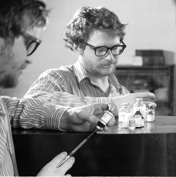
Only one optical control on some film cameras lacks an exact replacement, but digital photography offers other solutions for the problems that it solves. This control is tilting and/or swivelling the lens of a view camera to change the plane that is in sharp focus. In this picture, I tilted the lens so that the plane of sharp focus tilts diagonally from the doctor’s hands in front of the mirror back to his face beyond, then I used a relatively wide lens opening to make everything else blurry.
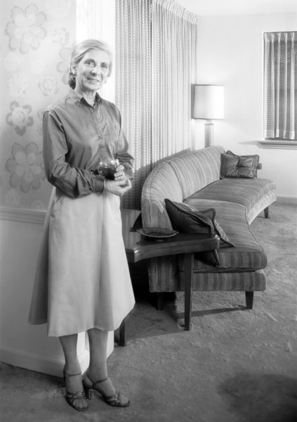
This technique is also used to keep everything sharp. For this picture, I swivelled the lens so that the plane of sharp focus swings from the housewife to the lamp. If I had left the lens in its normal position, parallel to the film, then the sofa would have gone out of focus.
With film, selective focusing is the only optical tool available for directing attention, but digital photography is not so limited. The tools I described above for enhancing contrast can also be used to reduce the contrast of a background. If you want to soften some elements more than others you can do this with greater subtlety and control than selective focusing permits by selecting an area using Asiva Selection and/or Photoshop’s selection tools, and then softening the selection with Photoshop’s blurring tools, or you can combine those operations with another Asiva plug-in called Sharpen or Blur.
As for getting everything in the picture sharp – well, large-format cameras usually need a moveable lens to do this, but digital cameras usually do not. At f/4, the four-thirds sensor used in many small SLRs shows as much depth of field as 4-inch by 5-inch film at f/32. (Four-thirds sensors also have a two-stops’ advantage over 35mm-sized “full-frame” sensors.)
I find myself using Topaz’s plug-ins with just about every photo that I take, unless I am in control of the lighting. Asiva’s plug-ins I also use with almost every photo, including shots that I light with studio strobes, because fine adjustments of tonality are easier to make with a computer than with reflectors, grids, diffusers, snoots, barn doors, and gels. I may use Photoshop’s tools to make a spot disappear or to effect some simple lightening or darkening, but I do not care much for Photoshop itself and use it mostly because these plug-ins require it.
Enlarging — Once I have finished a picture, I want to print it out. This usually requires enlarging it. Most enlarging programs are also pillars cast from iron, but some of them are not, most notably PhotoZoom Pro.
A photographic printer needs to lay down at least 300 dots of ink per inch. This means that a print on letter-sized paper contains at least 7 million to 8 million dots, a print on 11″ x 17″ or A3 paper (my snapshot size) contains at least 15 million dots, and a 24″ x 36″ (600cm x 900cm) print contains over 60 million dots. The Foveon sensor in my camera generates an image with 4.7 million pixels, so I need to generate more dots in an image than I have pixels, especially when I crop the picture. This means interpolating a lot of dots. Your camera probably has a Bayer sensor that generates images with more pixels, so you may not need to interpolate dots for a letter-sized print, but you will still need to do so if you crop the image much
or if you enlarge it to hang on a wall.
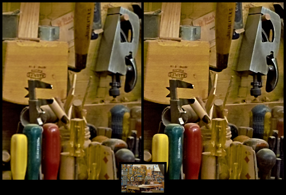
Most digital enlargers work like the enlarger in a darkroom. They magnify every spot in the image and blur every spot into the spots surrounding it. The enlarger in a darkroom does this a little with a lens, and a digital enlarger does it rather more with mathematics, but the results look the same when examined closely: every sharp contrast between black and white goes through a blur of grey. Photoshop does this, your printer driver does this, and your operating system does this, but PhotoZoom Pro does not.
PhotoZoom Pro enlarges tones but it does not blur boundaries between tones, so it retains edges and fine details. You can see the difference in the comparison shot below. The pictures are sections of enlargements that would be around 4 feet by 6 feet (1.2m by 1.8m) at the resolution of most LCD displays. The left one is a conventional, bicubic interpolation, the right one is PhotoZoom Pro’s recommended setting for detailed photographs. onOne Software’s GenuineFractals also enlarges well, and the current version of GenuineFractals worked better than the last version of PhotoZoom Pro, but the current version of PhotoZoom Pro seems to have surpassed GenuineFractals again,
and PhotoZoom Pro has always been more flexible and convenient to use.
Good enlarging software is especially important for images from Foveon sensors. Foveon images start out sharper than Bayer sensors, so the blurring of conventional algorithms does more harm. (For a discussion of image sensors see “Sense & Sensors in Digital Photography,” 18 October 2004, and the article’s errata.)
Last and Least — All the software I described in this article I use with nearly every picture that I take, but I also use some specialized products for special purposes. These products also have no equivalent in film. Occasionally I want to show detail in blacks and whites that are too far apart for the image sensor to capture in one exposure. Photoshop can combine different exposures to do this but Photomatix can combine them in more sophisticated ways. Whitening teeth and reducing excessive shine on skin can be a nuisance, but two plug-ins from Image Trends make this easy: Pearly Whites and Shine-Off. Finally, Fisheye Hemi is a trio of plug-ins from Image Trends that modify the perspective of a fish-eye lens in various ways, so that it may look more natural. I usually use a fish-eye lens when I want its special perspective, but occasionally one of these plug-ins comes in handy. These specialized plug-ins and all of the other products I have mentioned here run under Windows as well as on Macs.
This toolkit of software lets me do almost everything to a photo that I normally want save one thing: it will not reduce the distortion of ordinary wide-angle lenses. No product made for film will do this either, but a Photoshop plug-in called Squeeze used to. Unfortunately, its developers, The Imaging Factory, shut up shop without compiling it for Intel-based Macs. I am hoping that somebody will produce something like it anew.
The farther away from the centre of a lens an object is, the more it is magnified: that is why a wide-angle lens makes objects look larger toward the edge of the frame. The magnification is a simple trigonometric function of the angular distance from the centre of the field. Most of the distortion is in the longer dimension, so shrinking the longer dimension to compensate makes a wide-angle picture look more natural. I am going to close this article with a plea for somebody to develop a small application or plug-in that will do this. At its simplest it could be a stand-alone product with no user interface save one field for entering the angle covered by your lens. If anybody does this and needs a beta tester, please let me know!
[If you found the information in this article valuable, Charles asks that you pay a little for it by making a donation to the aid organization Doctors Without Borders.]