iBooks 1.5 Refines the Reading Experience
With the release of version 1.5 of the iOS reading app iBooks, Apple has made a few welcome changes aimed at enhancing your reading experience. None are earthshaking (unless you need the white-text-on-black, as people with certain vision problems do), but if you are an iBooks user, the release is a good excuse to take a moment to learn more about iBooks. Let’s look at what’s new in iBooks 1.5, and make sure you know the nuances and special tricks.
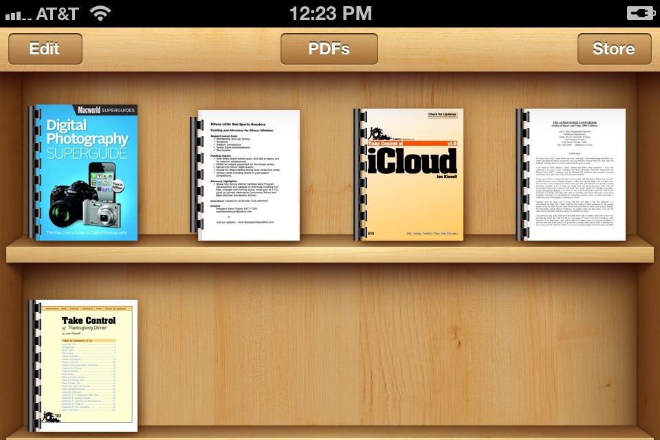
Previously, you could tweak iBooks for reading in different lighting situations by changing the overall screen brightness or (for EPUBs only) by switching the background page color to sepia. In a PDF, the Brightness button is near the upper right, while in an EPUB, the Brightness setting was previously tucked away in the Table of Contents view. (To switch between PDFs and EPUBs, on the iPad, tap the Collections button. On the iPhone or iPod touch, tap the Books — or whatever the label may be — button at the top of the main view. In the iPhone screenshot below, I’m in the PDFs view, so I need to tap the PDFs button to switch to a different collection.)
In iBooks 1.5, Apple has enhanced the display options for EPUB viewing and grouped them in the Fonts menu, so the Brightness control has moved there. The Sepia switch used to be immediately available on the Fonts menu, but now it’s a button nested under a new Themes button, along with the new Night option. The Night option shows the ebook with white text on a black background — a setting that will work better for some people’s eyes and which will cause your iPad to emit less light, something that anyone trying
to sleep nearby will appreciate.
On the iPad only, there’s also a new Full Screen toggle switch nested under Theme; turn it on to make your EPUB look less like a book in favor of showing a bit more text at once — EPUB expert Liz Castro calculates the increase in text shown at about 15 percent. For example, with Full Screen on while in the landscape orientation with two “pages” showing side-by-side, the image that looks like the inside of a book spine
disappears, making the two “pages” look like two columns on a single page.
Apple has also revamped the lineup of fonts that readers can choose from. In the serif camp, Baskerville and Cochin have been replaced with three new fonts: Athelas, Charter, and Iowan. On the sans-serif side, Verdana is out, but Seravek is in. Georgia, Palatino, and Times New Roman remain as before. Apple gives no reason for the switch to these little-known fonts, but our own Glenn Fleishman suggests, at BoingBoing, that the new fonts are simply better for on-screen reading. As always, it’s worthwhile trying a few different fonts and sizes to see what you like in the context of a particular publication.
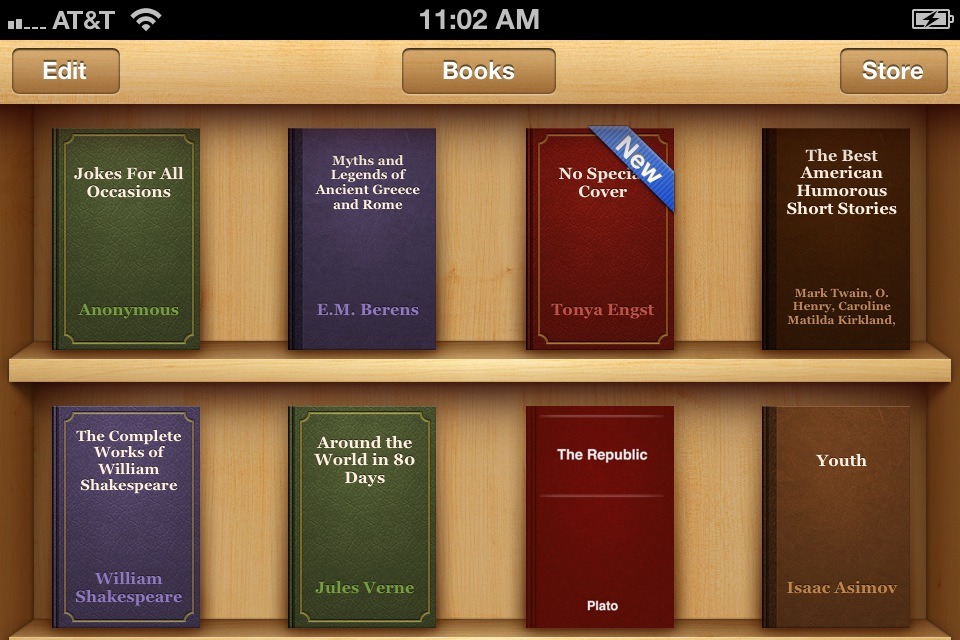
One small touch added in version 1.5 is that the generic covers of ebooks that lack designed covers, such as many public domain texts, now have a leather-bound look. In the screenshot below, the “New” ebook called “No Special Cover” is one that I created myself to test whether an ebook had to be some sort of anointed classic to get the fancy cover or just be one that didn’t get a cover specified for it by the publisher. So any EPUBs you create yourself using Pages (or even Automator!) will get these new covers if you don’t specify your own. iBooks seems to assign the color and style of the covers randomly, which makes for nice variety.
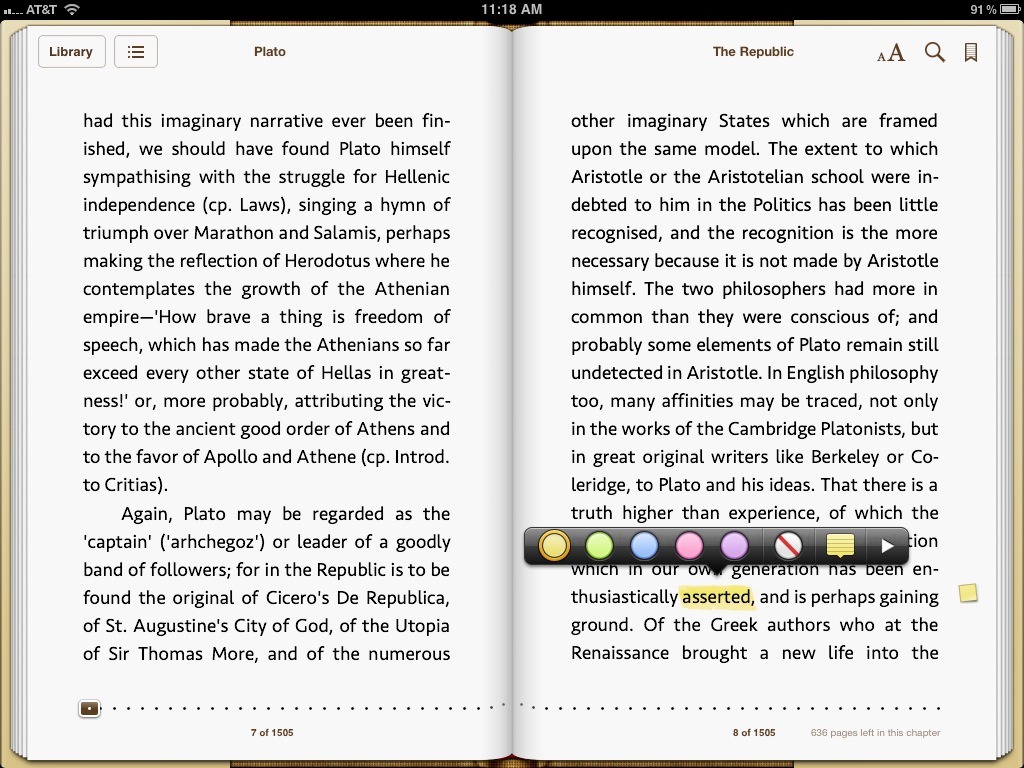
Much like jotting your thoughts in the margin of a print book, you can attach notes within the text of EPUBs in iBooks, and the basic procedure has not changed in iBooks 1.5: double-tap a word, drag the blue selection dots if desired to expand the selection, and then tap Note. As you type, the note has a popover-style triangle pointing to the selection (previously, the note looked like a sticky note). Tap the Hide Keyboard button to complete and save your note. To change the color associated with a note or to
delete a note, after you’ve created it, tap its associated text and then tap either the color of your choice or the red-slashed delete button.
In the previous version of iBooks, the completed note displayed a small icon in the margin that you could tap to view the note in context, and that icon had the note’s date on it. In iBooks 1.5, you get a smaller and more refined icon, but no date. You can view all your notes at once in the Table of Contents view; previously, notes and bookmarks were combined under the Bookmarks button, but now they appear when you tap a separate Notes button. A note’s date appears in the list, so it’s not a big deal that the margin icons no
longer include it.
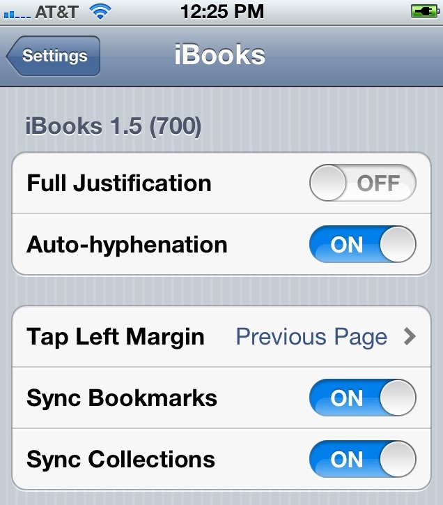
A helpful iBooks feature that remains unchanged in iBooks 1.5 is that if you own more than one iOS device, your notes (and highlights and bookmarks) can appear in copies of the same ebook on all your devices, so long as you are logged in to the iBookstore with the same Apple ID (in Settings > Store). To turn this option on, tap Settings > iBooks and then turn on the Sync Bookmarks switch. Be sure to turn it on for all devices that you want linked!
That’s the end of today’s iBooks lesson. I hope you’ve found a few useful tips, and feel free to share more iBooks tips in the comments below.
I may have not uses iBooks on the iPhone enough but I can't see how it can beat Stanza for flexibility and ease of use.
There are a lot of great ebook readers for iOS. For people who want a straight Apple consumer experience, iBooks makes buying and reading an ebook an easy tap-tap-tap situation (if the ebook you want is in the iBookstore). For people who are more comfortable and confident with iOS and/or who want to download third-party apps and experiment, there's a wide world of options, for sure. I thought about expanding this article with a look at other recently updated iOS ebook-reading apps (GoodReader was also recently updated, just for instance), but I realized that it would be a much longer article at that point, and that I wouldn't have been able to finish by my deadline.
It has a bug where it renames PDF files after viewing them.
Hi Michael, Can you give an example of this? How can you tell that the PDF is renamed?
See this Apple Discussion. After viewing a PDF it changes the file name in the Libary list (probably to the metadata title). This is very unhelpful
https://discussions.apple.com/message/16980857#16980857
A PDF can have a title in its metadata in addition to whatever file name it has on a computer or server. I believe that if a PDF has a title, iBooks displays it instead of the file name it had on its originating system.
I was elated to discover that my 13" Macbook Air is an excellent eBook reader. I am disappointed that iBooks is restricted to iOS devices. That's the *real* change I'm waiting to see in iBooks. Yes, I left feedback for Apple.
Jeffrey, all I can say is, "Watch this space!" :-)
iTunes 11? NDA?
I assume it has something to do with the just-announced media event in NYC...
http://techcrunch.com/2012/01/02/this-months-apple-event-to-focus-on-publishing-and-ibooks/
Thanks for this, I'd downloaded the ibooks 1.5 applications and simply had not looked for any improvements or changes. I love the new night theme (one of my only issue with ibooks has been the lack of white on black) and the full screen mode.
The white text on black seems to be pretty battery friendly.
Finally some action in the iBooks realm.
Thank you for the update. Can you (or any TidBits contributor) explain why apostrophes and quotation marks are rendered as primes in so many eTexts? My first e-reader was Eucalyptus, which did (and does) a credible job of presenting Gutenberg titles as typeset books. Given Steve Jobs' famed love of typography, it's surprising that iBooks still shows apostrophes and quotes as primes. For that matter, so do the Kindle and Nook. If Eucalyptus got it right three years ago, why can't iBooks do the same now? What needs to be implemented? Any insight into why "prime-time" persists would be appreciated.
This is a tricky issue, because getting it "right" is impossible to do algorithmically without making some mistakes. Common areas that break down are 'iPhoto '11' and "He ordered the 27" iMac." What direction does the curly quote in front of 11 point? And how do you know that the hash marks indicating 27 inches should be straight and not curly.
I have some macros in BBEdit that fix this in TidBITS articles now, but even my macros fail every so often. And don't get me started about "code text" that becomes incorrect if the straight quotes curl. :-)
Tweaks. Ok. But when I read I want not only annotations but the ability to 'copy' a few lines to lead off my own comments/analysis. E-books drive me crazy on that count; totally locked down for the most part.
And/or...how do I get an e-book downloaded into ibooks to somewhere that I can now import it to GoodReader, for example?
I agree, the DRM policies of many publishers have crept into the code of many ebook readers, preventing things that are perfectly legal and legitimate.
Any book that you can load into iBooks from your Mac (ie, not one purchased from the iBookstore, which is likely DRM-shackled) can also be loaded into GoodReader (there are lots of ways, with GoodReader, but going from iBooks is not one of them, since iBooks isn't interested in playing with others).
What you might try is signing up for Dropbox, then putting all your ebooks in Dropbox. Then, in the Dropbox app, you can send books to whatever ebook app you want on the iOS device.
For the visually impaired (me), PDF support is pathetic. Stretch the page to enlarge the print and it doesn't paginate so you are limited in size. Then when you go to the next page, it's back to small print and you need to stretch the page again. No support for different fonts or font sizes. This lack of support for PDF books is really pathetic for a company like Apple. Where is their commitment to support for the visually handicapped?
One thing about iBooks I don't understand. Perhaps someone with more of a technical background can help?
ePubs that are created using apps that use fixed size fonts (Book Creator for example) cannot take advantage of highlights nor can they annotate pages using the note feature?
Since I'm very intersted in using student created ePubs in a classroom environment (and are created on the iPad' rather than Pages or Automator), this seems like an arbitrary decision since features like search still work.
Could anyone enlighten me?
Thanks
Alan
Honestly, I don't know enough about the EPUB format internally to hazard a guess, but the person who would likely know is Liz Castro. She's written a lot about EPUB.
Google Books lets you read in any web browser, Kindle has an app as well as a Cloud Reader browser extension for Chrome.
iBooks was announced by Apple in January 2010. Can anyone explain Apple's thinking behind its refusal thus far to allow one to read its ebooks on one's own computers?
I imagine that Apple must lose some sales to those who want to read on a large screen but don't have iPads.
How do you get those colorful new generic cover pages for PDF files as with the generic "free" books?
I think it just happens automatically - I didn't do anything to get them other than upgrade to the latest version of iBooks.
I'm starting to enjoy reading epub books on the iPad more and more - I just wish there was a way to export my annotations. I use iAnnotate for my pdfs and it is able to email me a summary of everything I annotated while reading the document.
Also - Re the night reading mode - you have always been able to triple click the home button to reverse colours in iOS, and for some reason I still seem to prefer this (reversed on sepia) to the standard night mode in iBooks - plus it works for other app like Safari and pdf readers.