Four Smartwatches Reviewed: Cookoo, Martian, MetaWatch, i’m Watch
A little over a year ago, I mused in TidBITS about what was coming with wearable computing in “Pondering the Social Future of Wearable Computing” (29 May 2013) and predicted that smartwatches would be adopted more rapidly than heads-up systems like Google Glass. Today, with market penetrations of both approaching mere microscopic fractions of a percent, the jury is obviously still out — but I can award myself a prognosticator’s medal for predicting which market would be busier. It’s time to do an overview of what’s actually available as shipping technology. Steve McCabe covered the Pebble (see “Pebble Smartwatch Puts Notifications on
Your Wrist,” 29 Jun 2014), probably the most well-known of the shipping smartwatches; this article takes a look at four more entrants.
I attended the International CES earlier this year with a vague plan to cover “wearable technology” for TidBITS (see “CES 2014: CES Unveiled and the Startup Debut,” 6 January 2014). This rapidly became scaled back to “smartwatches,” because a team of fifty would have had trouble taking in the hundreds of exhibitors who claimed to have wearable breakthroughs. Many of whom, unfortunately, were referring to something utterly unrelated, like an iPhone case — marketing always trumps information in the CES catalog — but even so, the dozens of exhibitors who were genuinely unveiling fitness wearables were impossible to cover. (And also not in my journalistic wheelhouse, as my
fitness routine is neatly encompassed by a decent pedometer app.)
Even now, restricting this review to smartwatches and with enough models to cover my arm from wrist to elbow, the savvy reader will notice omissions. This review includes some well-known models and some unknown brands, but not others — a decision process that can largely be chalked up to which companies provided review models. If you’re looking for additional coverage, I recommend The Verge’s excellent 2013 roundup of smartwatches and wearables.
At press time, WWDC has come and gone without an Apple iWatch, but some are predicting it’ll be announced sometime before October. Personally, having heard dozens of rumors to this effect, I’ll believe it when I see it… but I’ll have some thoughts later on what it should look like.
What, Exactly, Is a Smartwatch? — This is the question that’s bedeviling the smartwatch market as the various watches compete to be the first computer you wear. But certain features jump out as being the obvious things you want a smartwatch to be.
A smartwatch shows you useful information. MetaWatch uses “the art of the glance” as their marketing tagline, and I think they’ve summed it up perfectly. A watch is an always-on tiny display that’s available in a second or less; flick your wrist to get your shirt cuff out of the way, and any watch will tell you the date and time, while also acting as a signaling mechanism to those around you about your fashion style.
Every smartwatch aims to provide you with more than just the date and time, but the crucial question is how each decides what information to show you. The smartest models use the iOS or Android notification system to pick what data is relevant, by replacing a standard watch face with a notification display that varies based on the type of notification coming in. Others require you to tap, swipe, or push buttons to get from one display to the next — which works fine in a situation where you’re able to fiddle with your toys, but not so much when you just want to know why your wrist is buzzing.
Unfortunately, one area where all smartwatches fall short is in their target markets. Smartwatches are large and clunky compared to the overall watch market, which means that, as Andy Ihnatko pointed out during a Q&A podcast, there simply isn’t a model that’s suitable for women to wear. Or at least, considering that all of the models under review feel a bit big by my (male, average-wrist-sized) standards, a woman would have to be even less fashion-conscious than I am in order to wear one of these. Until someone comes up with a smartwatch sized for women — and I’ll suggest how that might be possible later — keep in mind that I’m using guy-type parameters when I say that a smartwatch
feels normal or big and clunky.
A smartwatch provides a control surface. This is where smartwatches struggle most — that is, among those watches that attempt it at all. Nearly all smartwatches use low-power Bluetooth LE to communicate with your iPhone or Android phone, and let you communicate and control your phone with some combination of button-pushing, tapping, and swiping.
All of this happens on a screen that is, on a generously sized smartwatch, 50 millimeters (2 inches) or less across. You know that feeling of claustrophobia you can get when switching from an iPad to an iPhone? That happens in spades when using a smartwatch, where a huge screen is 240 pixels square. Putting that in iPhone terms, that’s 1/13th the real estate on your iPhone 5. The Pebble’s 144-by-168 pixel screen is black-and-white and has a display area of 24,192 pixels, which is about 1/8th the resolution of the 128K Mac from 1984 (512 by 342, or 175,104 pixels).
In other words, forget about using a tappable touchscreen as a smartwatch control interface; the ones that do are virtually unusable by any sentient race whose fingers don’t taper to a fine point. Which means the current generation of smartwatches are defined by how well their software is designed to use buttons and maybe swipes (rather than taps) to navigate their features. This is hard enough for the mere function of deciding which information to display — it’s even more fiddly and difficult when it comes to iPhone control.
A smartwatch is a watch. Not to discourage the manufacturers of smartwatches out there, but speaking as an early adopter who has eagerly taken possession of several smartwatches with the feeling of a kid at Christmas: I bought my first cell phone in the mid-1990s, and haven’t worn a regular watch since. My computers and gadgets sync with cellular networks and atomic clocks to tell me the exact time — why would I want to have one more device that simply duplicates that function?
A smartwatch has to be useful enough to get me back in the habit of wearing any watch. (And useful enough to overcome its price, which ranges from “probably not an impulse buy” to “you gotta be kidding me.”) And while I’ve already mentioned that my own fashion standards are a low bar to hurdle — does it go well with a T-shirt and jeans? — other potential purchasers are not so forgiving of what they’ll put on their wrists.
On to the reviews, where I’ve roughly ordered the contenders in least-to-most “smart,” which is absolutely not to say least-to-most “good.” Nearly every smartwatch in this review suffers from being too clever by half for at least some of its features, and would have been improved by having fewer features and more focus.
The Cookoo — Made by ConnecteDevice, The Cookoo is an analog watch with a grouping of fixed LCD indicators underneath the watch face. “Fixed” means that there’s no display, per se; instead, there are a half-dozen icons that turn on to tell you that there is a notification on your iPhone. You then have to use your phone to actually see what it is. Thanks to the lack of a display, the Cookoo has one clear design win — it runs entirely off two built-in watch batteries, and has no need to recharge. The Cookoo lists for $129 in the company’s online store, with the exception of the “limited edition” $249 watch that differs
only by being green.
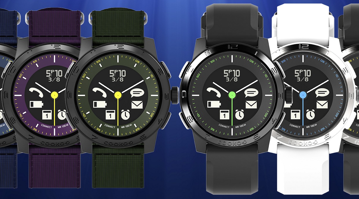
The Cookoo specifications say that the watch diameter is 44 millimeters (1.73 inches), which feels about right, and 16 millimeters thick (0.63 inches), which feels too thick. Perhaps it’s due to the limited functionality of the watch face, but a thinner case would be apropos here.
The watch connects via Bluetooth to a Cookoo app on the iPhone, where you can set preferences for which notifications appear on the watch, and theoretically update the watch’s firmware. (“Theoretically” because this function failed when I paired the watch, and I can’t figure out how to try it again.) The pairing operation is driven by the app and is even attractive, allowing initial setup without mucking about in Bluetooth settings.
That said, I have difficulty understanding who would be interested in Cookoo-style notifications. The amount of information that appears on the watch is not much greater than what the phone itself provides when it vibrates in your pocket; yes, you can tell the difference between a text message and a Facebook notification, but not the difference between an important email and any other that’s come in over the transom. The out-of-range alert goes off whenever you deliberately turn off Bluetooth or leave your phone behind. So when I first tried out the Cookoo with an earlier version of the connection software, I was distracted by near-constant buzzing on my wrist; now it’s possible to turn off the buzzing, but only by turning off
entire categories, such as email alerts. There’s a missing killer feature here — the capability to pass along notifications only from VIP lists rather than just anyone, which would make the Cookoo’s indicator icons substantially more useful.
Likewise, the Cookoo falls short in what it can tell the iPhone to do. A command button can be configured in the app, according to the documentation, to find a misplaced iPhone or check in to Facebook — but perhaps due to my upgrade woes, I couldn’t use this feature. I was able to take a picture remotely from my watch, but as that requires setting up the Cookoo app in advance and positioning the iPhone’s camera, it seems better done with a dedicated photo app.
So I’m confused whom the Cookoo is supposed to be for. It’s not smart or customizable enough for the technophile, who will receive far too many notifications to make the Cookoo’s display useful. It might be useful for the kind of person who has few notifications and frequently doesn’t carry his phone — provided he stays within Bluetooth range of it. Perhaps that’s why the Cookoo video of the kindly but forgetful grandpa is the strongest association I have with this watch, because it seems most useful for people who receive almost no notifications. And then why have a smartwatch at all?
Martian Watches — Martian’s line of Voice Command watches includes three models ranging from $249 to $299, all of which combine analog watch face, an LED notification window, and a two-way wrist radio — or at least, that Dick Tracy description is the first thing that comes to mind when using the built-in microphone and speaker. I reviewed the $299 Passport, the dressiest of the three watches; also available is the $299 Victory, which replaces the Passport’s square face with a round one, and the $249 G2G, which retains the square face but comes in a range of bubblegum colors.
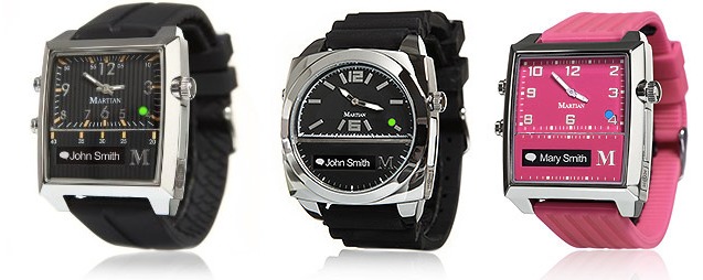
The Martian uses a built-in watch battery to power the analog watch, but needs to be recharged over micro USB to keep the smart notifier and Voice Command features working. The micro USB slot has a cover that feels a bit flimsy but has survived testing without breaking off. Compared to the “smarter” watches, it’s nice that the core watch functions continue to work (with the correct time displayed) even when you forget a recharge.
The Martian is paired to the iPhone under Settings > Bluetooth, and then configured with the Martian app. The app allows choosing which notifications are sent to the watch, but from a limited list: Facebook, Twitter, Calendar, Reminders, and one email account. I use Google Voice instead of Messages, so I couldn’t test whether iMessages are included in the always-on SMS notification, and likewise I can’t receive unsupported Google Voice SMS notifications. These limitations might be circumvented with some clever IFTTT automation actions (see “IFTTT Automates the Internet Now, but What Comes Next?,” 20 December 2013), but as with the Cookoo, the lack of more notification control is
jarring.
The bottom-left button brings up an in-watch display showing current settings, a world clock (or local date, omitted from the analog watch), and the current temperature. A double-press displays a menu for changing some of the watch’s settings, or using the watch as a remote camera shutter button. (Which presents an iPhone request for permission every time, so it’s not exactly hands-free.)
The top-left button invokes the Voice Command feature: press it, and the watch’s microphone connects you directly to Siri. In quiet environments, this works about as well as Siri usually does, but without the usual visual feedback. The button can also be used to pick up a call through the watch, like any Bluetooth headset. This has been more problematic, as more than once I’ve had an incoming call transferred to the watch when I’m trying to use the handset.
The Voice Command feature is clever, but I find it a bit too clever; how often are you in a quiet environment where you’d prefer to use the watch’s speaker and mic, rather than the excellent ones built into an iPhone? Martian suggests this is useful for “quick phone calls while jogging,” (now there’s a mental image!) but for people who feel like I do, the company has come out with a range of $129 Notifier watches that omit voice control entirely. I prefer the looks of the Passport over the Notifier, but all in all, I think dropping the voice feature will make for a better smartwatch.

MetaWatch — The MetaWatch is the smartwatch that’s currently the also-ran in the race against the Pebble; it’s also the only smartwatch aside from the Pebble that I’ve ever seen worn out in the wild. It includes a display that’s — brace for it — 96 by 96 pixels, which would need a magnifying glass to be seen on a Retina screen, but which doesn’t look too clunky thanks to good use of fonts and screen positioning.
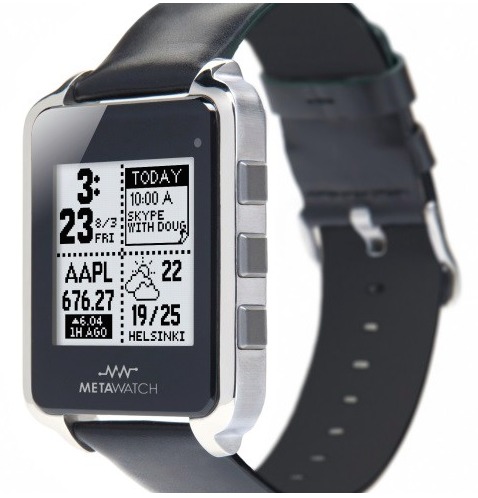
The MetaWatch syncs via Bluetooth to an app on the iPhone, which is a quick proposition — and that’s a good thing, since I had to resync to the iPhone every time the battery ran out or the MetaWatch came off a recharge. Recharging needs to happen only every two or three days, but it requires a dongle that connects to micro USB and then literally clamps onto the front and back of the watch. It works, but it’s one more dongle I fear losing.
The good news about MetaWatch is its clever design for selecting and displaying apps. It has four virtual screens divided into a 2×2 grid, which you set up on your iPhone. Apps for the watch, called widgets, are 1×1, 1×2, 2×1, or 2×2, so you can mix and match them so long as they’ll fit into the 2×2 square. I have my MetaWatch set up with a full-screen watch on the first screen; time-weather-iPhone battery on the second; full-screen calendar on the third; and full-screen weather on the fourth.
When notifications come in, they take over the screen briefly and display relevant parts of the message in a font ranging from small to tiny; despite the inherent limitations of the display, the screens are readable with either ambient light or the built-in LED. One oddity, though, is that black pixels pressed against the glass can cause a mirror effect, which gives the MetaWatch a unique look when glanced at from angle. A welcome controller in the MetaWatch app controls which apps can send notifications to the watch, so you have fine control over what appears on your wrist.
The other good news is that the MetaWatch ships with a lengthy list of widgets, which includes sports and stocks alongside the ones I mentioned earlier. The bad news is that there’s no app store and limited availability of new widgets; for example, MetaWatch pushed a widget with NBA scores during the playoffs, but nothing for World Cup results. You also can’t choose from a wide variety of watch faces as you can on the Pebble.
That said, the MetaWatch includes enough functionality to be useful, and I’m hard-pressed to think of what other widgets I’d add if I had them — which is why I’d like to see an app store of widgets to give me better ideas.
The MetaWatch is currently available from Best Buy or the MetaWatch online store. Prices range from $179 to $299, although Best Buy has them advertised from $79 to $99. The online store has switched from being out of stock to linking directly to Best Buy, which might presage the release of the forthcoming MetaWatch 2 with a higher quality screen, which was demoed at CES in January 2014.
i’m Watch — The i’m Watch from Italian company i’m S.p.A. made a major splash at the 2013 International CES; this splash may or may not have been coincidental with the fact that they gave away a pile of $389 watches to anyone who attended the press briefing. A year later, the price of an i’m Watch is now $349 (or $1,199 if you want the titanium-band version), but they’re not generating much press. This may because other reviewers discovered the same thing I did — it was impossible, in the 2013 version, to make it useful.
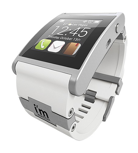
At first glance, the watch is gorgeous. It’s machined as well as an Apple device, and the silicone strap is perfectly functional and attractive. It’s almost comically big at 52.9 mm by 40.6 mm (2.08 by 1.6 inches), hosting a 240-by-240-pixel Android screen at 220 ppi. A USB recharging cable ingeniously charges the watch through its audio jack. A bunch of apps are included on the watch, and more are available through an online market. If you have four minutes to kill, watch this marketing
video to get an idea of why this product seemed, at first, like smartwatch manna from heaven.
The first time you start to realize there might be a problem is when you try to use an i’m Watch’s “watch” feature, because it requires a two-handed gesture to turn on the screen. It’ll be turned off most of the time to conserve battery. Once you can see it, the default display shows the time and temperature, and three default buttons that cannot be changed provide access to phone, email, and contacts. Scroll left for four more pre-selected apps, or right for the complete list. However, none of these apps can be set up within the watch; instead, you log into the i’m Cloud Web site to create your settings. The i’m Watch can fetch your contacts from your iPhone, but that’s where the integration stops. If you want to see
your email or calendar, you have to sync it with one, and only one, Gmail account.
It doesn’t pair with an iPhone, but rather uses Internet tethering over Bluetooth for its functionality. This drains the iPhone battery faster than Bluetooth pairing, but as the i’m Watch itself needs to be recharged twice a day with moderate use, you’ll have plenty of time to recharge your iPhone at the same time.
The i’m Watch has Facebook and Twitter integration, but I turned these services off quickly because while I’m happy to see a dozen notifications on my iPhone, they’re less useful two at a time on the i’m Watch. Then there’s the problem that you can’t reply or do anything with them. Likewise with i’m Mail, although there you can read (short, text-only) email messages in a much more reasonable small font. But you can’t read much in the News app, which displays only headlines. The Weather app can display temperatures for only three cities, and only the first city appears on the home screen; there’s no “current location” option, and if you want to change the home screen city, you have to manually delete it in
another setting or it’ll show up twice.
In the i’m Watch’s favor, I did make this note: “In a few years with improved software, this could be a really excellent gizmo.” Unfortunately, I don’t see anything in their newer video tutorial to indicate that they’ve improved anything. Most importantly, watch this video closely to see how difficult it is to set up and use an Android device on a tiny screen. The i’m Watch is an impressive feat of engineering, but unfortunately it resulted in a substandard product that even early adopters will find frustrating and limited.
The Winners — As I said earlier, men have several winning options right now, but women have to be more circumspect. The Pebble and the MetaWatch are neck-and-neck at press time by being what most people expect a smartwatch to be, and with divergent approaches to design that give them distinct strengths and weaknesses. I expect the MetaWatch to move forward shortly on some fronts with the forthcoming release of their newer, higher-resolution models, but Pebble to stay ahead with the diversity of its app selection. In a head-to-head competition, either could be chosen as a matter of personal preference.
The dark horse contender winning its own race is the Martian, which is the only model I’ve seen, let alone reviewed, that contends as a “dress smartwatch.” When not providing a notification, its LED screen mostly disappears into the bezel, and even in “smart” mode it’s quick and unobtrusive. A Pebble or MetaWatch is still a computer on your wrist, however fancy its housing. A Martian is a nice watch. Points can be given to the Withings Activité for also looking nice, but it contains only biometric sensors and doesn’t actually have any smartwatch functionality.
The Ideal Smartwatch — Since everyone else, including The Verge, seems to be doing it, I’m going to go out on a limb and suggest what I think the ideal smartwatch would be. And yes, I’m going to try to think in terms of what Apple would do, if the company decides to get into this crazy business. But I’ll be happy to see any smartwatch manufacturer get there.
First, the Ideal Smartwatch would have a high-resolution color screen. This is rather ironic considering that the only watches that do this now are Android, and based on the ones I have plus the reviews I’ve seen of the ones I haven’t covered, all of them stink. That’s because every Android smartwatch fails to reconfigure for sane inputs, no matter how nice their displays are. I expect this to improve when the first generation of Android Wear smartwatches hits the market — but while their demos are pretty, the rubber won’t hit the road until they’re in general use. Initial reviews of the bleeding-edge releases — the LG G and the Samsung Gear Live — put them in the same category as the i’m Watch for bulky hardware and short battery life. Wrist-top Google Now, however, is a potential breakout feature for upcoming hardware.
A back-of-the-napkin calculation of “Retina-ish” displays says that you could get a 1024-by-768 display on a men’s watch without making it the size of brick, and might even be able to get away with a 640-by-480 women’s watch.
This already pushes the ideal watch past the 2014 time horizon, presuming that you don’t want to spend $300 or more for one. Reasonably priced smartwatches today have black-and-white screens for good reason. Maybe Apple has a supplier chain that would allow them to get tiny color displays cheaper than anyone else; even if that’s so, since when has Apple competed on price?
Second, we need a revolutionary input mechanism. The Verge’s mockup uses the bezel dial as a scroller, which just strikes me as being a different kind of fiddly from “which button do I press to do what?” The Garmin Forerunner 410 GPS watch used a touch bezel that was generally disliked; the company dropped it in the next generation, relying instead on screen taps and physical buttons.
What’s the easiest thing to do on a watch? Tap its face. (Which is in part what Garmin did with the current Garmin Forerunner 620, in fact.) Give me a smartwatch where a single tap brings up a user-selected favorite app. If you want to get fancy, divide the face into halves, thirds, or quadrants — but no more — to bring up a range of apps, which you might indicate on the screen with favicon-sized reminder icons. A double-tap switches to a voice interface — built into the watch, not using a patch to the phone — that understands maybe 50 words, all of which launch individual functions.
I don’t care how many buttons or dials you have on your watch, nothing is as simple as “[tap] [tap] tomorrow” for a calendar, or “[tap] [tap] weather.” If an app needs Siri to work, such as “[tap] [tap] phone,” it can be activated and Bluetooth-connected after the built-in voice recognition does its job. (This, incidentally, is where Android Wear may have gone one better, as saying “OK Google” to a watch is even easier than tapping. But I think I prefer my tactile method until I’m convinced I won’t have to repeat it four times to get it to listen.)
Third, we need the price point. The R&D and manufacture of what I’ve just listed could easily result in a $500 watch, which might sail off into oblivion due to the tiny market of early adopters willing to buy one. But it might not.
Whoever pulls off the first Ideal Smartwatch needs to adopt Apple’s pricing strategy. The first iPhone cost $700; now you can get one (albeit, not the best one) free with a two-year contract. I think $500 for a first-generation Ideal Smartwatch is sane in a way that $1,500 for the first-generation Google Glass was not; let it be an early adopter, premium gadget that only a few people purchase, so long as the same model is cheaper a year or two later.
Meanwhile, I’ll be happy to see Pebble, MetaWatch, and Martian scrap it out in the $100 to $400 range with their different designs and solutions. I hope that by the time the Ideal Smartwatch manufacturer is competing with them on price, these three have improved their designs to be feature-competitive — or at least refined their designs to be exactly what your smartwatch should be.
I have been proudly wearing my Apple iPod watch, purchased refurb a year ago for less than $70, including a soft plastic band. Watch (19 face versions), iTunes, FM Radio, Podcasts, iTunes U, & Photos. As a photographer, I keep several dozen of my favorites to show friends and folks at the dog parks I frequent, as well as a bunch of dog pics that may contain the dog the person I'm talking to belongs to.
I laid down $17 for a black leather band and cage. The red cage the iPod came with was too "flashy"for my style.
Not a smartwatch, but a tap and swipe screen that even my 72 year old eyes can read (with glasses). With a good pair of earbuds the sound is very nice, deep bass and highs that don't get hissy.
Can't ask for more, for me.
And the Pebble is now cheaper.
http://techcrunch.com/2014/09/30/pebble-price-cut-background-activity-sleep/