TidBITS News 1.5: A Revolution in a Nutshell
The freeware TidBITS News app, which lets you read and listen to the most recent TidBITS articles, is a tiny microcosm of almost the entire history of iOS. And it’s been one heck of a history. If dog years are 7 years, then developer years, trying to keep up with a rapidly changing target like iOS, feel more like 20 years. This app has been public for just over 3 solar years, but it seems I’ve already spent a lifetime trying to keep it running and up-to-date.
A Brief History of the World — Perhaps I should stretch my metaphor even further, and say that developer years are more like 200 million years. Then I could compare the six released versions of TidBITS News to geologic strata, tracing a history of cataclysmic changes. Here’s some of what we’ve lived through (and somehow survived) with TidBITS News:
- When TidBITS News version 1.0 was released, in December 2009, the latest devices were the iPhone 3GS and the third-generation iPod touch. I had acquired one of the latter a couple of months before, sporting Apple’s shiny new iOS 3.1, and I was intrigued by its capability to make do with little in the way of speed, memory, and screen real estate. I wrote TidBITS News in part to teach myself how to program in this strange new world of tiny single windows with touchable interfaces.
Architecturally, TidBITS News was a simple pair of Master-Detail screens: in the Master view, you see a list of TidBITS stories with their titles and summaries; if you tap one, you see the Detail view, containing the entire story. Still, behind the scenes, it was doing some pretty slick networking: the stories were downloaded from an RSS feed and parsed using an open source library, and the Detail view let you listen to the online podcast of that story if it existed. The Master view contained one highly innovative feature: the titles and summaries, and the table rows containing them, could vary their heights from row to row. I knew of no other app at the time that did that, and I was
proud of having worked out how to do something so tricky. Since then, I’ve published instructions, and it’s become a fairly widespread form of interface. - In April 2010, Apple released the iPad. Fortunately, iPhone-sized apps continued to run on the iPad, in a kind of emulation mode, displayed at the iPhone screen’s size (or at a rather ugly double size). So the TidBITS News app didn’t need a separate iPad version, I felt, and I hoped to get by with doing nothing. Unfortunately, the emulation wasn’t exact. The iPad ran iOS 3.2, while the iPhone remained at iOS 3.1, a cross-device discrepancy that took Apple an unconscionably long time to resolve. There were differences in how the two systems implemented identical features, and in how they responded to identical code. (Most egregiously, if you drew a shadow in iOS 3.1, the same code caused the shadow to come out backward in iOS
3.2. Oh, Apple.)This difference in system behavior had consequences for TidBITS News: iOS 3.2 broke my prized methodology for dynamically sizing the titles, summaries, and table rows in the Master view. I had to scramble to fix the problem. I still remember solving it, sitting at my parents’ kitchen table in Princeton, New Jersey, banging away with a virtual hammer, and eventually somehow coming up with code that worked on both systems and both kinds of device. Version 1.1 of TidBITS News, incorporating the fix, was posted in June 2010.
-
By that time, Apple was ready with another revolution: the iPhone 4. This brought two huge changes. First, it had a double-resolution screen; this made the text in TidBITS News look fabulous, but unfortunately it made the graphics look lousy. Second, and more far-reaching, it introduced iOS 4 and multitasking. This, as I explained at the time (“What is Fast App Switching?,” 23 June 2010), meant that an app was suspended rather than terminated when the user switched to the Home screen or to another app, but the suspended app might be terminated without notice thereafter. In August 2010, we released version 1.2 of TidBITS News, incorporating multitasking and with
double-resolution graphics (along with some nasty kerfuffle involving the App Store; see “Explaining the TidBITS News App Version Confusion,” 21 August 2010). -
iOS 4.0 ran on the new iPhone 4, as well as on some older iPhone and iPod touch models, but not on the iPad, which was still back at iOS 3.2 and therefore didn’t have multitasking or any other iOS 4 innovations. TidBITS News, which was designed to run on either the iPhone or the iPad even though the App Store refused to let us distribute it that way, contained a lot of extremely messy code, jumping through various hoops to detect and respond to what system it was running on. I found this situation disgusting (there is no nicer way of putting it), and was resolved, as long as Apple persisted in giving its developers the virtual finger, to give Apple the same virtual finger right back again. Like Achilles in his tent, I would refuse
to come out and fight until my conditions were met: Apple must first unify the system across devices. Finally, in November 2010, after a dramatic false start, Apple released iOS 4.2.1, which ran on the iPad as well as all devices that previously ran iOS 4.0, and now Achilles had to come out and fight. I proceeded to turn TidBITS into a “universal” app, meaning that it had two interfaces, one which loaded on an iPhone-sized screen and another which loaded on the iPad.Version 1.3 of TidBITS News was released in December 2010; it still had quite a bit of hoop-jumping code, but this was different hoop-jumping code: instead of behaving differently for different systems, it behaved differently for different devices, and not because the systems had different capabilities, but because the interface architectures were different. On the iPhone, the Master view was the first view of a navigation interface, and the Detail view was the second view of the navigation interface, replacing it; on the iPad, they were both visible simultaneously, as the left and right views of a split view (in landscape orientation; in portrait orientation, the Master view was an annoying “popover,” because
that’s how iOS 4 implemented split views). The iPad, being taller, could accommodate taller table rows, and screen real estate wasn’t tight, so a story could be displayed with bigger images and wider margins. -
Shortly after the release of version 1.3, a rare memory bug arose. After some experimentation, I decided that it wasn’t ultimately my bug — it had something to do with that extremely annoying popover — and that I’d done all I could to ward it off. Also, acting on a suggestion from a reader, I incorporated a new audio management policy: if the user was playing background music at the time TidBITS News came to the front, we’d permit the user to continue enjoying that music while reading, but if the user then asked to listen to one of our podcasts, we’d pause the background music. Version 1.4 of TidBITS News was released in February 2011 (“TidBITS News App 1.4 Allows Background
Audio,” 18 February 2011).
And there things remained for nearly two years, as far as TidBITS News was concerned. Things in the Apple world, however, continued to move at their usual pace. iOS 5 (October 2011), and especially iOS 5.1 (March 2012), brought innovations that I wanted to incorporate into TidBITS News (see “How iOS 5 Will Affect Developers — and You,” 17 October 2011), but they didn’t actually break anything, so I had no real excuse to write a new version. The third-generation iPad (March 2012), with its Retina display, made our text look even better; we already had double-resolution graphics (except for the app’s icon itself), so there was no need to panic. Then, iOS 6 (September 2012) brought
still further inviting innovations (see “How iOS 6 Will Affect Developers — and You,” 25 September 2012), plus it gave me the excuse I’d been waiting for: it broke, ever so slightly, the technique I’d been using to draw the text in those variable-height table rows — and, of course, the app was letterboxed on the taller screen of the new iPhone 5. I was darned if I was ever going to jump through those runs-on-two-systems hoops ever again, so I resolved to rewrite TidBITS News completely from scratch as a pure iOS 6 app. After providing due warning in “Get the TidBITS News App for iOS 4.2 and iOS 5 Now” (10 December 2012), we
released TidBITS News 1.5 in January 2013.
What You See — What’s new in TidBITS News 1.5, then, is a highly representative cross-section of what’s new in iOS 5, iOS 5.1, and iOS 6. Some of it appears quite obviously on the surface. Compare side by side, for example, the Master view (the list of story titles and summaries) as it appears in TidBITS News 1.4, on my iPod touch running iOS 5.1 (left), with the same interface as it appears in TidBITS News 1.5, on my iPhone running iOS 6 (right).
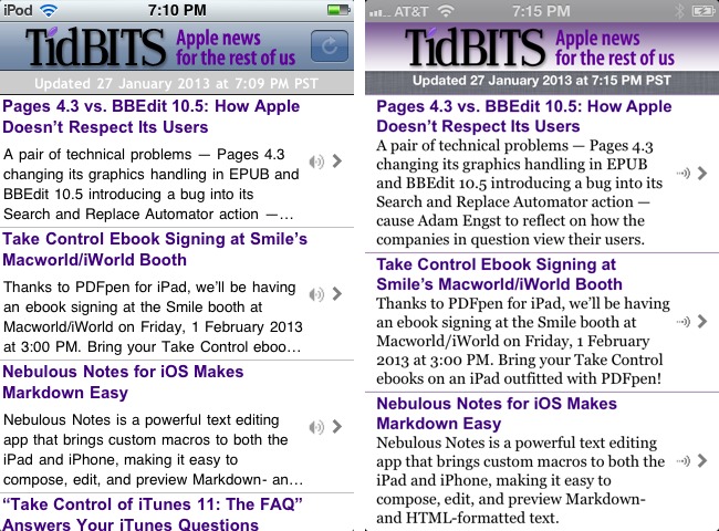
Start by looking at the very top of the screen, above the TidBITS logo, where it reports things like the current time and the state of the battery. That’s not really my app; it’s the system status bar. But there’s a change here nevertheless. iOS 6, on the iPhone (but not on the iPad), insists on tinting the status bar in a mysterious, automatic way. Developers don’t like this, because the tinting algorithm is undocumented (though of course we’ve figured out what it is, and how to fool the status bar into tinting itself some other
color) and you can’t turn it off — unless you want the status bar to be black. What you absolutely can’t have, alas, is the good old gray gradient status bar from iOS 5 and before. It’s just a nostalgic memory.
Cast your eye a little lower, now, to the TidBITS logo. What’s changed here isn’t the logo, but what’s behind it. Back in iOS 4, when TidBITS 1.4 was written, standard interface elements like this one — it’s a navigation bar — were pretty much the same in every app. It was like the status bar: you could have a gray gradient or a black gradient. Starting in iOS 5, Apple began providing official ways to customize many interface elements, and they went even further in iOS 6. So this navigation bar now has a background image that was previously impossible; the artwork for that gradient comes from the TidBITS home page. Oh, and just below the navigation bar — just below it, and barely visible against the “linen”
background in the second screenshot — is another new iOS 6 feature: a navigation bar now optionally casts a tiny shadow against whatever’s below it.
At the right of the navigation bar, version 1.4 has a Refresh button; version 1.5 doesn’t. That’s because iOS 6 provides a new built-in Refresh control for tables. The idea, which originated with the Twitter app, is that you pull to refresh: you scroll the table down until the Refresh symbol appears, and keep holding it down until the Refresh symbol starts animating. By taking advantage of this, I use a bit of interface that’s become common coin in standard apps like the iOS 6 version of Apple’s Mail app, and I keep the Refresh button from cluttering up the visible interface.
The iOS 6 Refresh control has both an activity indicator and a label where I can display some text. I’ve taken advantage of this to change the way I display the date and time when we last updated our data from the feed. In TidBITS News 1.4, that information is displayed in a label that’s always present, distracting the eye and occupying screen real estate. In version 1.5, it’s part of the Refresh control and is usually hidden up under the logo at the top of the table; you can see it in the screenshot only because I expose it just after the feed data is refreshed. Thus the 1.5 interface is much cleaner: no refresh button, no Updated label, just the TidBITS logo on a nice background and the list of stories.
The list of stories itself is obviously formatted slightly differently in version 1.5 — I’ve chosen a different font for the summary, and I’m allowing slightly taller cell rows, so there’s a better chance of displaying the entire summary (and on the iPad I always display the entire summary) — but the really significant change is behind the scenes. In version 1.4 and before, the title and summary are two separate labels, each in a single font and style; as I mentioned earlier, a great deal of ingenuity then goes into juggling their heights and positioning them dynamically. But iOS 6 changes all that, introducing genuine styled text as a first-class citizen. So the headline and summary together are a single
two-paragraph formatted string, drawn directly and laid out far more easily and accurately.
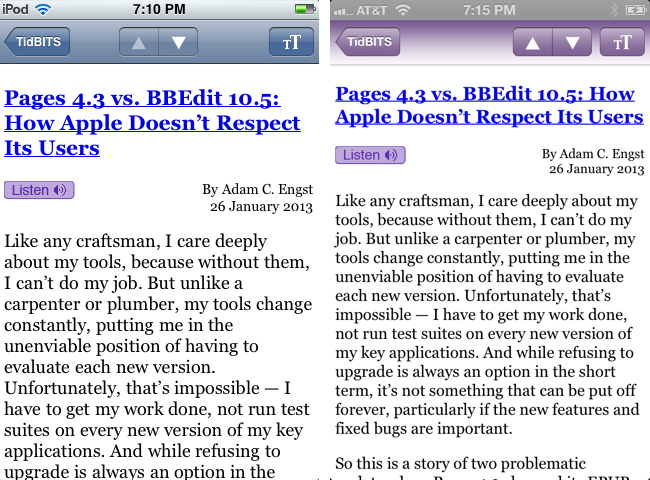
The Detail view (an individual story) isn’t so dramatically interesting in a side-by-side comparison. Once again, TidBITS News 1.5 benefits from a capability to customize standard interface elements that wasn’t available before; here, the buttons in the navigation bar get a nice tinting to complement the new background gradient. (The shadow cast by the navigation bar is also more obvious in this screenshot.)
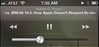
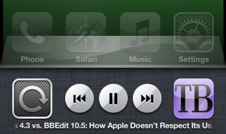
Next, let’s consider how the user listens to a podcast. The side-by-side comparison shows that the view here has completely changed in version 1.5. This is not, however, because of some iOS 6 innovation; it’s because I completely recast the interface. The view on the left, in version 1.4 and before, is a single built-in view that plays an Internet resource (a movie or a sound); I used this originally, in version 1.0, because I was relieved to discover, when I was first writing TidBITS News, that I could play an online podcast and display an
interface with just a couple of lines of code. Later, though, when I was writing version 1.3 and 1.4, I discovered that some secondary aspects of this interface were limiting what I could do with the sound. So, in version 1.5, I changed the interface. This change lets me display the title of the currently playing podcast, but that’s not the real reason for the change. The real reason has to do with what happens when the user switches away from the app while a podcast is playing.

Formerly, I was able to keep the sound playing in the background only if the user stayed in TidBITS News but locked the screen. Now, thanks to this change in interface, I have much more control over the app’s sound policy, so I can keep the sound playing even if the user quits TidBITS News altogether. What’s more, the user can pause and resume playback from within the lock screen itself, or from the app switcher interface (where you swipe rightwards to see the sound controls). The user can also see, in those two places, the title of the
currently playing podcast, thanks to a feature introduced in iOS 5.
The other obvious surface change in TidBITS News 1.5 is how the list of stories is displayed on the iPad. Formerly, as I mentioned before, the list had to be summoned in a popover when the device was held in portrait orientation. But in iOS 5.0, Apple introduced a new interface, evident particularly
in the Mail app, where the message list would slide in from the left. I immediately spent three days reverse-engineering that interface, and even published an explanation of how to achieve it, but I needn’t have bothered: in iOS 5.1, Apple made that same interface directly available to developers, with no code required; basically, the old popover-based interface just magically turns into the new sliding interface. TidBITS News 1.5, being compiled against a system version later than iOS 5.1, automatically acquires that interface.
Under the Hood — Two more significant changes in TidBITS News 1.5 are buried under the hood. They have no manifestation in the interface; rather, they have to do with changes in the building blocks that Apple provides to its developers. One of them, though, does change the app’s behavior slightly, as I’ll explain.
TidBITS News now uses storyboards, introduced in iOS 5. A storyboard is a single file containing drawings of most or all of an app’s interface. Formerly, an app with many “screens” had either to construct each screen’s interface in code or else load the interface from a “nib” file; a typical app could have many, many nib files. A storyboard is effectively a way of combining all those nib files into a single file. I found the iOS 5 implementation of storyboards rather crude, but iOS 6 added some improvements that made storyboards truly useful, and I adopted them for TidBITS News 1.5.
TidBITS News contains two storyboards, each representing the entire interface for one device version — iPhone or iPod touch on the one hand, or iPad on the other. The correct storyboard for the current device loads automatically as the app launches. Moreover, the storyboard itself implements standard transitions between screens, such as navigating from the Master view to the Detail view on the iPhone, or summoning and dismissing the podcast player view. The result is that I was able to remove huge amounts of code. I no longer have to draw my interface in code; more important, I no longer have to fill the app with ugly conditional code that does one thing if we’re running on iPhone and another thing if we’re running on
iPad. There is still some conditional code, having to do mostly with tiny differences in configuration of interfaces that both devices share; for example, as I mentioned before, there’s a height limit on a Master table row on the iPhone, but none on the iPad (we now display the entire article summary, no matter how long it may be). But the code is now far neater, simpler, and easier to understand and maintain.
The other major under-the-hood change has to do with how state is maintained between launches. This has been a vexing problem ever since multitasking came roaring onto the scene in iOS 4, and many apps (including Apple’s own iBooks) still haven’t solved it. The issue stems from the fact that an app can come to life in two very different ways. If the app was suspended (the user switched to the home screen or to another app), then it is instantly freeze-dried in its current state; when the user returns to the app, the app is thawed out, and there it is, doing exactly what it was doing previously. But if the app was terminated while it was suspended (the device needed to free up some resources), then the app launches from
scratch. This difference is annoying and mystifying for the user, especially since, from the user’s point of view, there’s no distinction between the two situations; you never explicitly quit an app, and you’ve no simple way of knowing what’s running and what’s not — even the app switcher interface doesn’t distinguish between running and terminated apps.
To solve this problem is not at all easy for developers. TidBITS News, even before the days of multitasking, had made some effort to grapple with the question of what should happen on a cold start: if you (the user) were reading an individual story, TidBITS News remembered that fact, and navigated to that story when you relaunched it. Multitasking actually made the problem harder, because now there were two ways in which the app could come to the front, and we had to distinguish between them: if the app is merely coming back from suspension, do nothing, but if the app is launching from scratch, try to navigate to the story that was being viewed previously if there was one. I found this extraordinarily difficult to implement in a
sensible, maintainable way — even though we’re talking about an app with just two main views!
In iOS 6, Apple introduced a new, built-in mechanism for state saving and restoration, and I eagerly adopted it when I was rewriting TidBITS News 1.5 from scratch. The result is that you should barely be able to tell the difference between resuming TidBITS News when it has been suspended and launching TidBITS News when it has been terminated in the background! Either way, there it is where you left off, displaying the Master list of stories scrolled to the same position as before, with the same selection, or the Detail view of an individual story, likewise scrolled to the same position as before.
Unfortunately, it turns out that there’s a huge bug in Apple’s built-in state saving and restoration mechanism, a bug so huge that you could drive a luxury Winnebago straight through it with your eyes closed at 70 miles an hour and never harm a hair on the head of any of the top Apple executives drinking martinis inside. The saved state doesn’t survive a restart of the device.
The discovery of this bug put me in a serious quandary. Here I’d rewritten TidBITS News to use this supposedly wonderful new feature, and now it was behaving less well than formerly! TidBITS News 1.4 and before performed a clunky, simple-minded form of state restoration; if the user was reading a story when we are suspended, we save that fact, along with the story identifier and the scroll position, and try to restore it if we are subsequently launched from scratch. Clunky and simple-minded, yes; but it always worked. Now, I found I had hitched my wagon to the wrong star; the new built-in state saving and restoration only worked sometimes. What was I to do?
My decision was influenced by the evident awareness of folks at Apple that this bug existed, and my consequent expectation that it would eventually be fixed. Consider my options:
- I could back out the entire use of the built-in save-and-restore mechanism, and return completely to the clunky methodology I was using before. I really didn’t want to do that, as my code was ugly and nearly incomprehensible.
-
I could implement a two-pronged approach: I could use the built-in save-and-restore mechanism if it was working, but if the app launched from scratch and it was clear that the save-and-restore mechanism was not operating, I could then fall back on my original clunky approach. But there were two problems with that. First, it meant that my ugly old code was going to live on, which I didn’t want. Even more important, what if Apple suddenly fixed the bug? I could imagine a situation where the built-in save-and-restore mechanism started working properly even after a device restart, and my ugly old code might somehow conflict with it.
-
I could use only the built-in save-and-restore mechanism, and hope that some day Apple fixes the bug.
I chose the third option. And, of course — of course! — Apple still hasn’t fixed the bug in iOS 6.1.
So right now, if you restart the device (or if you are so foolish as to kill TidBITS News manually in some other nonstandard way, such as using “jiggly mode” in the app switcher interface), all state is lost. The app launches from scratch, as if it had never launched before. Thus there is no saved feed, and if you don’t have an Internet connection at that moment, you’ll get a blank interface and an error alert. Of course, if you do have an Internet connection, which I assume most people will most of the time, then there’s no serious problem: TidBITS News will download a new copy of the feed, just as if you had asked it to refresh the list of stories.
The result is imperfect, but the circumstances involved are sufficiently rare that most people shouldn’t be adversely affected. I don’t think users restart their devices all that often, and if they do, they are not surprised to find that all bets are off and that apps that they launch are starting from scratch; that, indeed, would be one of the purposes of restarting the device. Similarly, people don’t generally manually kill an app in the app switcher, and if you do, you’ve only yourself to blame for the consequences; you can hardly complain if the app launches from scratch next time (though, to be honest, I’ve already received email from one reader who thinks he can complain). And remember, the consequences are not
dire, provided you’ve got an Internet connection when you relaunch.
If, on the other hand, the system itself kills the app while it is suspended, then the save-and-restore mechanism works brilliantly. When you relaunch TidBITS News, you should be virtually unable to tell whether it was killed in the background or merely suspended: the saved feed and the interface as you were viewing it will be preserved.
Matt, this was a fascinating journey. Thanks!
Great article, as always, Matt!
> people don’t generally manually kill an app in the app switcher
Are there any other ways to manually kill (or, preferably, safely quit) an app? As an old-timer, app minimization runs in my blood. ;-)
iOS doesn't want you to know, or even think about, the difference between suspending and terminating an app. Only the iOS system itself can terminate a suspended app in good order; if you do it directly, this is regarded as some kind of emergency kill and (as the article explains) destroys state. The bug is that shutting down the device is not regarded by the state restoration mechanism as termination in good order.
This is similar to stories of ancient Japanese samurai warriors... so deeply and honorably committed to their craft that they neglected to notice that the need for their craft had passed them by. I am touched by your commitment.
This is how it is for any fast-changing science or technology. You spend years learning to do something, only to have it become outmoded. My Greek vocabulary application has been migrated from HyperCard to Mac OS X Cocoa to iOS. My database applications have gone from HyperCard to FileMaker to Panorama. What about the year I spent painstakingly disassembling and reverse-engineering the ROM on my LASER (Apple IIc clone)? I've written books in Gutenberg (an amazing Apple II layout application, similar to TeX) and FrameMaker; now I can't even run those programs. I've forgotten more programming languages and techniques than most people will ever learn. My father used to program in ones and zeros on a piece of massive graph paper representing the computer's spinning drum; it mattered *where* you put each line physically, because by the time the computer had read and executed a line, the drum had spun some distance, and you wanted the next line to be right there waiting to be read.