Unveiling the New Take Control Web Site
The yellow-bellied Take Control Web site is extinct! After three years of effort, we have replaced it with a complete redesign. Speaking as the person who designed and coded the bulk of the previous site, when Take Control was something we were going to throw against the wall to see if it would stick, I had become thoroughly sick of those colors.
In 2003, when we started Take Control, the site was just a bunch of static HTML pages. By 2008, we knew we needed a database-driven back end and settled on ExpressionEngine, from Ellis Labs. Developer Adam Khan of Engaging.net worked with us on it for the next few years, first turning it into a database-driven site, and then, in 2010, collaborating with Glenn Fleishman on an account management system that serves both Take Control and TidBITS (see “Reading Take Control Ebooks on an iPad (or iPhone or iPod touch),” 7 April 2010). But this was all back-end work, and at the end of 2010, we started working with designer Terry Evans to update the look and feel of the catalog and library pages first, with the rest of the site to follow. Unfortunately, after those first major pages, Terry got busy with other projects, and it took us until early 2012 to find Sam Schick and Eli Van Zoeren of Neversink.
So why did it all take more than three years? At first, there was just a lot to do, in terms of going back and forth with Sam on the site and associated book cover design, working through a logo redesign with Geoff Allen of FUN is OK, and answering questions from Eli about the complex business logic embedded in the bones of the site. But it took longer than we’d anticipated, and our window of free time closed. From then on, it seemed that whenever we had time to look at something, Sam and Eli wouldn’t be ready, or a major bug would prevent further work. And when they had addressed that problem, we’d have our heads down in another book release or three (blame Apple!). Feedback cycles
took months, not days. So it goes, to quote Kurt Vonnegut, and so it went until earlier this year when Eli and I finally synced up well and were able to make solid progress.
Key to that progress was a Trello board, where we moved bug report cards between Open, Testing, and Done lists, carrying on conversations within the cards and attaching screenshots as necessary (“Trello Offers Compelling Collaboration Tool,” 9 July 2012). Other lists on the board helped us track issues that required further discussion, things we’d need training on, and ideas we put on hold. In the last few months, Lauri Reinhardt, who helps us with customer support, dove into Trello and employed her past experience with eSellerate to make our cart match the site’s new look and identify subtle cart behavior bugs.
Some of the delay was our extreme trepidation to pull the switch, since the new site came part and parcel with an upgrade to ExpressionEngine 2, which in turn required non-trivial changes to the underlying MySQL database tables. Making it all the scarier, various aspects of the TidBITS site rely on the same tables, particularly for account information. It was a one-way trip, not something that could be done piecemeal, and something that had to work immediately with live data, since every Take Control order through our cart writes to those database tables.
We were ready to go in early July, so Eli spent July 2nd bringing new versions of the database tables over to our staging site, and on July 3rd, Tonya, Lauri, and I spent 12 hours straight catching transition bugs for Eli to stamp out. By 8 PM on the 3rd, we were ready to make the jump, and after an hour-long panic caused by Apache refusing to launch after we pointed it at the new site (caused by some long-missing closing quotes in our Apache configuration files), it came online. I felt like Dr. Frankenstein: “It lives! It lives!”
The Fourth of July weekend is always slow, which is why we’d chosen July 3rd for the transition, and while most things worked, we all kept finding bugs. Permissions in the new site’s file hierarchy were different, I hadn’t known certain file locations would change, and most surprisingly, the encryption used for account passwords had changed, requiring us to loop in Glenn for significant changes to the TidBITS account code. This turned out to be quite interesting. ExpressionEngine 2 has a neat feature designed to increase the security of its account passwords. On a user’s first login after the upgrade, it changes the hash used for the password from SHA-1 to SHA-2 (specifically
SHA-512), and it adds “salt” (extra random data that makes attacks harder) to each. That’s great, but because the TidBITS account code didn’t know about the salt or SHA512, merely logging in to the Take Control site rendered that user’s login on the TidBITS site inoperable. Oops. The two are once again in sync, so for every person who logs in to either site and has their account updated behind the scenes, the stored passwords become all the more resistant to attack, reducing the impact of a data breach. Speaking of security, the entire site is now served with HTTPS, so logins are always encrypted.
At this point, we’ve dealt with all the user-facing bugs we know about, but if something doesn’t work for you, let me know.
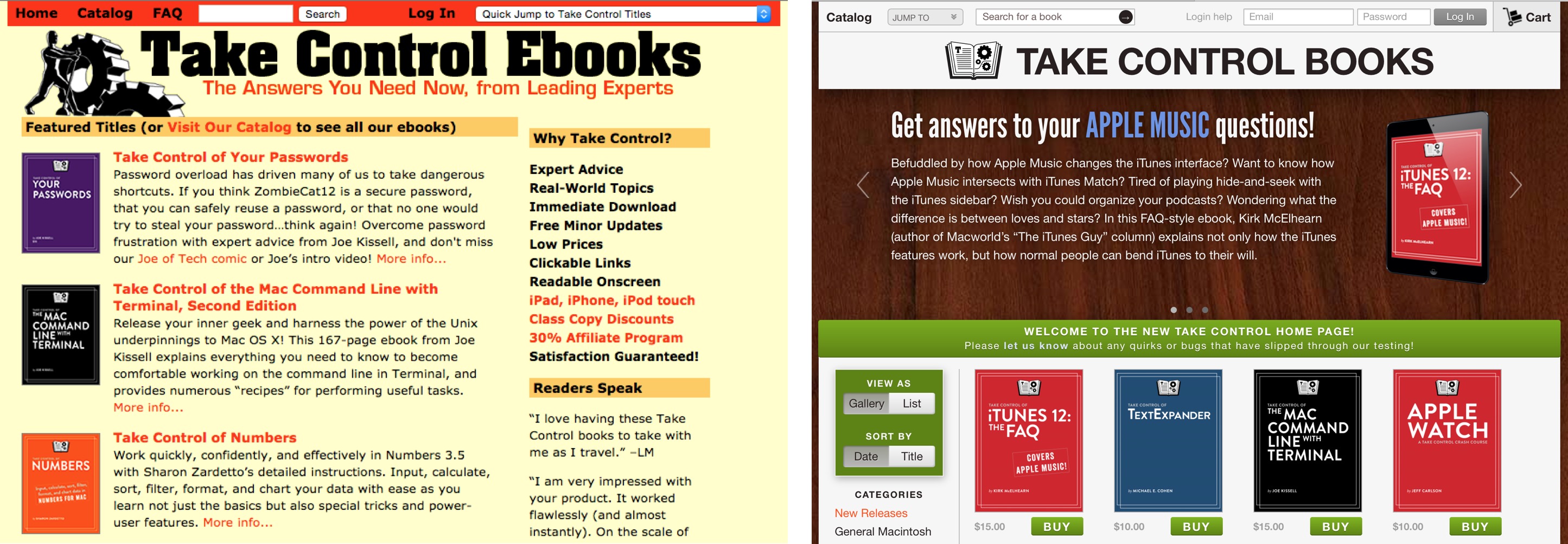
So, the redesign. The structure and functionality of the site are quite similar to what we had before — there’s a catalog page that shows recent releases and allows filtering by category. The home page is now a variant of the catalog page, also calling out a few featured books in slides at the top. And all the books you own are still collected on a library page from which you can download the various formats or click over to the full Ebook Extra page for a title.

Each book has its own detail page, of course, and each book’s Ebook Extras page (with goodies for book owners) now looks more like a book detail page, for a more consistent user experience.

The most significant change is a full-fledged shopping cart. Previously, clicking the Buy button on a book page or after selecting books in the catalog sent the order to eSellerate for processing; it was so difficult to return to our site to keep shopping that a frequent user question was, “Where’s your cart button?” That simple question required a complex solution, but the site now provides an on-site shopping cart that lets you find and add multiple books before you wrap up with a Check Out button that sends the
order to eSellerate (coupons are calculated on the eSellerate site once you click Check Out on our site). On both the home page and the catalog page, clicking Buy buttons adds the books to the cart and turns the buttons into Cart buttons; click any Cart button or the Cart icon in the upper-right corner to display the cart and check out.
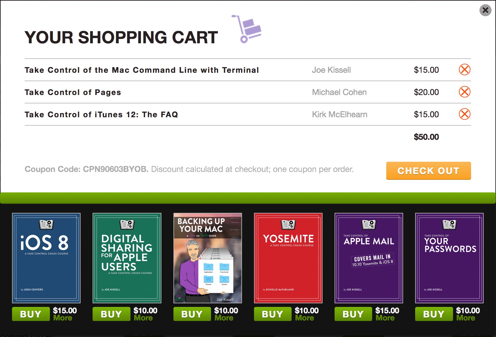
Also, every book page and the cart itself display related titles — one of our biggest challenges is helping people realize the breadth of books we publish. The cart even notices automatically if you add three or more books and gives you 30 percent off (unless another coupon is already loaded).
Perhaps the hardest thing to code and test was how the site changes dynamically when you log in, based on which books you own. For example, when you’re logged in, it gives you easy access to the Ebook Extras pages for your books from the home page and catalog. If you see unexpected results here, it’s possible that there’s a bug, or you might have purchased books using different email addresses and thus ended up with multiple accounts. Unlike Apple IDs, our accounts can be merged; log in to your main account, click your name at the top of the site, and then on the Profile page you can add another email address. The system will do the rest (after email verification, of course).
The look of the site is utterly different and was designed to showcase the cover design Sam Schick created for us, with lovely graphics that look great on a Retina screen. It’s meant to be a lot less text-heavy — since Tonya and I are writers, we addressed every user experience problem on the old site with text explanations. For instance, on the new book pages, rather than have the free sample link be normal text, it’s styled like a little sticky note on the book image (which includes an iPad frame, a convention used to reinforce the point that we sell ebooks, not print books).
Finally, since I know the designistas will be all over this, a few words about the wood background. We started the design process before iOS 7 and Apple’s war on skeuomorphism, so iBooks still had wood paneling in the background. Referencing wooden bookshelves seemed entirely appropriate; we love natural wood, and all the renovations to our house have been done by a woodworker friend with locally harvested lumber. But iBooks appeared to be using cheap pine, and we wanted to do better, so we looked at hundreds of stock photos of wood grain before settling on the one you see in the background. Could we have swapped it out for a flat background after Apple switched iBooks to a dull gray? Sure, but we like wood, and we like the rich
color, even if it’s not entirely Apple-trendy.
Of course, we’re not really done. We’re already adding cards to our wish list in Trello for features we’d like to add and changes we’d like to make, but now that we’ve made the big jump, we can bite off smaller chunks and turn some attention to the TidBITS site, which also needs some design attention.
Definitely keep the wood background. The Jony Ive redesign in iOS 7 (and 8) is the stupidest thing Apple has done with iOS. The current UI is butt-ugly. Apple needs to restrict Ive to hardware design only.
I totally disagree. The new design is much better! Thanks. I was getting tired of the yellow too.
I'm running Safari 5.0.5 (because any newer version would not be compatible with some other piece of software I need badly) and I cannot use your interface; clicking on anything — including the faq#contact link — will only display a blank wood background, and nothing else in the foreground…
Sorry to hear it! I'd recommend you get a recent version of Chrome or Firefox for accessing our site, then (and a lot of the rest of the Web too, I suspect).
I can't test with Safari 5 any more since Apple replaced it with v6 in Mountain Lion in 2012. It must just be too far behind the curve in Web technologies. It is surprising to me that there would be something else that would require such an old version of Safari.
I'll ask our developer about this, but with Safari 5 accounting for only 1.47% of our Web traffic in the last month (and likely even less of our sales), it would have to be a pretty easy fix to be worthwhile. :-(
thank you, Adam; your developer has heard you: now it works smoothly with Safari!
Excellent! Our developer said:
"Apparently this is some weird and mysterious bug in Safari. Through trial and error, I discovered that adding -webkit-backface-visibility: hidden to any element on the page fixes it. Computers are the worst."
What?! A dumb option like this can fix that sort of bug? Well, I'm flabbergasted to say the least... Kudos to the developer!
Web development!
Hi Adam.
Congratulations on the new site! I really like it.
I especially like the list view and gallery view options.
Love Take Control Books and Tidbits.
You guys rock!
Good job Adam and TidBITS team! It looks & feels very nice.
The link in the 'Please let us know about any quirks...' text takes me straight to MESSAGE RECEIVED without giving me a chance to type anything. :)
Well, that's really odd - I can't reproduce that. Did you send a message via that form before clicking that link for a second one? The link just goes to:
https://www.takecontrolbooks.com/faq#contact
So it should just load the Contact form. If you're getting the Message Received state, all I can think is that it was somehow confused about your session state.
Beautiful and practical. Congratulations.
I like the new look of the Take Control Web site. It's frightening, though, to learn how much work it took to do the redesign.
I like the wood look too. I agree that Apple's design meme these days is butt ugly. What's worse, to my mind – and to my less than optimum eyes – is how usability has been degraded, both in OS X, in their apps (like iTunes) and on the Apple Web site. I suppose gray type on a white background is aesthetically pleasing in some circles, but it kicks accessibility into the ash can.
One caveat, however. Nowhere on any TidBITS page I've visited is there a link to the Take Control Web site. This seems like a glaring oversight to me and I can't think of any credible reason for it. Please add a card to Trello to fix this. Likewise, the Take Control site is not noted in the eBooks themselves, at least not in the one I just bought about iTunes 12 – which, by the way, does not have a solution for the problem I have with the iTunes 12 layout, which displays playlists with album art badges with no apparent option to restore the old, text only, list view with selected columns. That, sadly, adds insult to injury. Fifteen dollars down the drain. I e-mailed Kirk McElhearn about it but have little expectation of an answer. Knowing how stiff-necked Apple has become about the virtues of their own design choices, it's more than likely there is no solution. Ugh! And before you mention it, the keyboard shortcut Kirk mentions to display a view options fly-out menu (Command-J) doesn't work.
Back to the main point, though, I think your new site design is a success, all the more so because you haven't followed Apple's ill conceived "trendy" style. Although the flat design of most of the eBook covers looks a lot like Windows OS tiles when spread out on a page. On the other hand, the largely uniform cover designs make it easy to browse a list of titles. Given that, the Windows look of the thing can be forgiven. ;-)
Glad you like the redesign! The fact that you don't see the Take Control links on the TidBITS site is perhaps indication of some of the challenges designers are up against. There's a Take Control link in yellow text at the top right of every TidBITS page, and any article that covers a topic related to a Take Control title links to that title at the bottom of the article.
As far as the Take Control site not being mentioned in the books, it is, though subtly. First, every book has an Ebook Extras button on the cover of the PDF, and a corresponding link in the About This Book section (for EPUB and Mobi in particular, since their covers aren't clickable). Plus, nearly every Take Control book references other books, and links to them within the text. Other standard links appear in the Read Me First section and the Copyright and Fine Print section.
Any resemblance to Windows tiles is coincidental, I assure you, since none of us have ever used it. Besides, I think it's much more like an arranged icon view from the Finder, anyway. :-)
Finally, though this isn't the place to discuss it (post in the iTunes article if you want to go back and forth), I think, but can't check at the moment, that there's a popover menu on the right side of the iTunes window that, when set to Songs, will give you the spreadsheet-like column view. It's entirely possible iTunes changed the keyboard shortcut for that and we missed that in the update - Kirk's slightly out of commission right now, since he threw his back out and is on major painkillers.
I bet that Kirk will email you back (though he hurt his back last weekend, so he may be a little slow on email right now).
As for iTunes and the iTunes 12 FAQ ebook (which I edited), if I'm understanding you correctly, what you want is the look shown in Figure 43 (page 113 of the PDF): on the navigation bar, click the Music icon (left), My Music (center), and then from the little "View Options" menu/popover at right, choose Songs and de-select the Show Artwork checkbox.
If you aren't seeing the right columns, Control-click the header bar (the one containing the column names) and choose the ones you want from the contextual menu -- or use the Show Columns menu in the View Options popover.
If that's not what you want, view-wise, take a look in the View chapter and see if you can work from there, or describe what you want from there to me. You can use the comments link at the start of the "About This Book" chapter (page 245) to get in touch directly -- mention that this is a question for me (Tonya) so that Lauri routes to me instead of trying to answer it herself.
As to the book covers looking Windows-ish, it's safe to say that Adam and I don't pay enough attention to Windows that this was something we noticed. We were thinking much more about how the icons might look on our site or in a collection of books shown on O'Reilly, Amazon, Barnes & Noble, iBooks Store, etc. ;-)
One more thing -- the Command-J keyboard shortcut is working on both my Macs -- one running Mavericks and one running Yosemite. We also had two people besides me "test" the View chapter. So, it seems weird that your Mac isn't honoring it.