TidBITS#1214/17-Mar-2014
Josh Centers has been busy this week, first keeping up with the snoops, in a piece that features UFOs, the NSA’s advice columnist, and a potentially significant fight between the CIA and the Senate. When not following the latest NSA shenanigans, Josh has been in the kitchen, testing the Paprika recipe management app for iPhone, iPad, and Mac in his latest FunBITS column. You’ll also hear from Julio Ojeda-Zapata, who returns with a look at the Microsoft Surface for those wondering about Microsoft’s entry into the tablet market, and Adam Engst, who reviews the Recur iPhone app for tracking repetitive tasks and shares where TidBITS staffers will be at the upcoming Macworld/iWorld conference. Notable software releases this week include Alfred 2.2, Default Folder X 4.6.4, and 1Password 4.2.1.
Keeping Up with the Snoops 4: When the Going Gets Weird…
Things are getting weird in Spyville as we once again keep up with the snoops. How weird? In a word: UFOs. No, I’m not kidding.
As reported by The Intercept, the new media partnership between reporter Glenn Greenwald and billionaire eBay founder Pierre Omidyar, the GCHQ (the British counterpart to the NSA) has been actively falsifying information to discredit targets who haven’t even been charged with a crime. The techniques, called Online Covert Action (OCA), involve writing fake blog posts claiming to be victims of the target, emailing and texting those close to the target, changing the target’s photos on social media sites, and ruining business relationships. OCA is based around the four D’s: Deny, Disrupt, Degrade, Deceive. While it’s not known if the NSA engages in these
tactics, these GCHQ slides were presented to the NSA.
The presentation, called “The Art of Deception,” features something even stranger: several pictures of UFOs, with no explanatory text. Nigel Watson, author of the Haynes UFO Investigations Manual, told Yahoo News that the images are likely not proof of alien visitations, but rather evidence that spy agencies use fear of UFOs to scare the public. (Of course, it’s more likely these slides were just illustrating something the speaker was saying, perhaps about how people grasp for meaning when faced with inexplicable facts. After all, another slide is a photo of a Whole Foods sale poster; no one is
suggesting that Whole Foods is a GHCQ front.)
But things get even stranger. Did you know that the NSA has its own advice columnist? The column, called “Ask Zelda!” has been distributed on the agency’s intranet since 2010. In a twist of bizarre irony, one of the letters to Zelda is from an NSA employee concerned about his boss spying on him and his coworkers. Zelda advises “Silenced in SID” that such snooping is inappropriate, and that he should confront his boss about it.
Those in charge of U.S. intelligence agencies apparently don’t read Zelda’s column, as the Associated Press reports that they are planning a system to implement continuous monitoring of employees with security clearances. The computerized system would scan “private credit agencies, law enforcement databases and threat lists, military and other government records, licenses, data services, and public record repositories” for “unusual behavior patterns.”
On the legal front, the New York Times explains how the secret rulings of the FISA court paved the way for mass surveillance. The key is the so-called “Raw Take” order from 2002, which loosened restrictions on sharing “unfiltered personal information” with interior agencies and foreign governments.
Meanwhile, The Intercept broke another major story about how the NSA is planning to infect millions of computers with malware, codenamed TURBINE, to enable “industrial-scale exploitation.” Apart from the obvious concerns here (Industrial-scale malware? Really? Like that could never get out of control.), Mikko Hypponen of Finnish security firm F-Secure warns that TURBINE could inadvertently undermine the security of the Internet by potentially creating new vulnerabilities on affected systems, thus making them more susceptible to attack by third parties.
But of all the intelligence-related developments, the brewing battle between the Senate Intelligence Committee and the Central Intelligence Agency might be both the strangest and the most consequential.
The tussle revolves around the 6,300-page, $40-million report by the Senate Intelligence Committee on the CIA’s use of torture during the Bush administration. The CIA classified the document, which reportedly lambastes the CIA’s use of torture for being ineffective, barring it from public release. Part of the reason the report cost so much was that Senate investigators had to travel to a special CIA facility to view the relevant documents on CIA-approved computers.
At some point, Senate investigators obtained a copy of the CIA’s internal review on the use of torture, which the CIA claims it did not intend for the Intelligence Committee’s eyes. In return, the CIA searched the computers provided to the Senate, along with a separate network drive containing Senate staffers’ work and internal messages. As a result, the Senate Intelligence Committee and the CIA have accused each other of wrongdoing; both cases now have been referred to the Justice Department.
Senator Dianne Feinstein, who has in the past been a staunch defender of the intelligence community, is hopping mad about the CIA’s actions. On 11 March 2014, Feinstein delivered a long, scathing speech, accusing the CIA of tampering with the Senate’s work.
The key question in the dispute revolves around who owns the computers. The CIA says it owns the computers. However, Feinstein claims that the computers are the property of the Senate, and Senator Ron Wyden has backed up her claim, even stating that the CIA has admitted as such in a recent (unspecified) court filing. The Guardian reports that a 2009 agreement between the Senate Intelligence Committee and the CIA stated that the committee staffers’ records and the provided computers would remain their own.
The broader question is why there were documents related to torture that the Senate panel wasn’t supposed to see in the first place. But more troubling is the even broader implication for U.S. government in general.
“This is kind of death of the Republic kind of stuff,” said MSNBC’s Rachel Maddow, who has often served as a cheerleader of the Obama administration. And that’s not just the media talking. “I have grave concerns that the CIA search may well have violated the separation of powers principle in the U.S. Constitution,” Senator Feinstein said in her speech.
Even more chilling is that intelligence leaders are pushing for legislation that could criminally punish journalists for publishing government leaks. “I am an optimist. I think if we make the right steps on the media leaks legislation, then cyber legislation will be a lot easier,” said outgoing NSA chief General Keith Alexander. President Obama has nominated Vice Admiral Michael Rogers to replace Alexander, but Rogers has his work cut out for him.
On the other side of the fence, Edward Snowden submitted 12 pages of testimony to the European Parliament’s Civil Liberties, Justice and Home Affairs committee. There isn’t much new there, but it’s a fascinating read, and Snowden counters critics by stating that he attempted to address issues about mass surveillance to “more than ten distinct officials,” but his superiors ignored him. Both Snowden and Julian Assange of WikiLeaks held remote panels
at this year’s SXSW Interactive conference. Again, nothing new, but they make for interesting viewing.
Speaking of conference panels, yours truly has been invited to moderate one at this year’s Macworld/iWorld, titled “The NSA and You.” We have a fantastic guest lineup: Parker Higgins of the Electronic Frontier Foundation, our own Joe Kissell (author of “Take Control of Your Online Privacy”) and Rich Mogull (whose day job is as a security consultant for Securosis), Kim Zetter of Wired, and Quinn Norton — who has in the past been embedded with Occupy Wall Street and Anonymous, and who was recently invited to speak with the Office of the Director of National Intelligence. It’s sure to be a lively discussion, so swing by if you’ll be in town. And if you have questions for the panel, send them my way! In the meantime, you can watch my MacVoices interview with Chuck Joiner about the panel.
TidBITS Events at Macworld/iWorld 2014
The annual Macworld/iWorld exhibition and conference has moved from January to late March this year, running from Thursday, 27 March 2014 through Saturday, 29 March 2014. The conference is once again at Moscone Center in San Francisco, though the nearly 200 exhibitors will be housed in Moscone North rather than the Moscone West location of recent years. Hours are 11 AM to 6 PM Thursday and Friday, and 10 AM to 6 PM on Saturday.
As always, a number of us will be in attendance, including me and Tonya, Josh Centers, Michael Cohen, Joe Kissell, Jeff Carlson, and Rich Mogull. I encourage you to flag us down on the floor to introduce yourself and tell us what of our work you’re finding the most useful these days.
Also, a number of TidBITS staffers will be making public presentations. I’ll list them briefly below, but remember, this is one of the major reasons we created the public TidBITS Events calendar (see “Subscribe to the TidBITS Events Calendar,” 15 October 2012), so if you’re going to Macworld/iWorld, be sure to subscribe to it to learn about late-breaking additions. If you want to add alarms to the events, copy them to a local calendar first. (I’m a bit worried that Apple changed the calendar’s public address,
so if you subscribed to it previously and aren’t seeing this year’s events, try resubscribing.)
Otherwise, here’s the list of where we’ll be. Note that talks on the main stage are open to everyone; the Tech Talks require a Conference Pass, and an All Access Pass provides access to both Tech Talks and the MacIT presentations.
- Thursday, March 27th at 1 PM: On the main stage, Jeff Carlson is moderating the panel “Create Photo and Video Workflows from Mobile to Desktop,” which will be talking about the latest mobile apps for shooting photos and how the results can be moved to and polished on the desktop.
- Thursday, March 27 at 2 PM: With the briefest of breaks, Jeff will be hotfooting it to his tech talk, “Take Control of Your Digital Photos” in Room 132. Based on his popular title “Take Control of Your Digital Photos on a Mac,” the presentation will explain how to develop a workflow for managing your photos.
-
Thursday, March 27 at 3 PM: Joe Kissell will be giving the first of many talks (in Room 123), titled “Using iCloud Keychain,” and drawing on details in his “Take Control of iCloud, Second Edition” and “Take Control of Your Passwords” books.
-
Friday, March 28th at 9 AM: For those attending the MacIT Conference that’s going on simultaneously with Macworld/iWorld, Security Editor Rich Mogull will be giving a general session called “What You Need to Know about Apple Security.”
-
Friday, March 28th at 11 AM: Jeff Carlson returns to the main stage to participate in a panel called “The Working Macs: Creative Workflows from Professional Creatives.”
-
Friday, March 28th at 11 AM: Simultaneously, Joe Kissell will be at the AgileBits booth in the Appalooza area to talk about “Take Control of 1Password.”
-
Friday, March 28th at 1 PM: Our new managing editor, Josh Centers, will be making his Macworld debut by moderating a panel called “The NSA and You,” in Room 125. Joining him on the panel will be Rich Mogull and Joe Kissell (based on his experience writing “Take Control of Your Online Privacy”) along with Kim Zetter of Wired, writer Quinn Norton, and activist Parker Higgins of the Electronic Frontier Foundation.
-
Friday, March 28th at 3 PM: Continuing to mine his books, Joe Kissell’s next talk is “Apple Mail for Power Users,” in Room 125, with information drawn in part from his recent “Take Control of Apple Mail.”
-
Saturday, March 29th at 10 AM: Jeff Carlson’s final talk is “The iPad for Photographers” in Room 131 — if you’re interesting managing photos with your iPad, don’t miss it.
-
Saturday, March 29th at 11 AM: Closing out our appearances, Joe Kissell has what I’m certain will be a fun presentation on “Becoming a Creative Complainer,” in Room 131, aimed at explaining how to become more effective at getting help. (We recommend reading his “Take Control of Troubleshooting Your Mac, Second Edition” first, but it can’t cover everything!)
Of course, Tonya and I, along with Michael Cohen, Jeff, Joe, and Josh will be on the show floor all three days, so if you see us, come and say hello!
Recur iPhone App Helps You Manage Repetitive Tasks
Most to-do apps suffer from the same problem, which is that there are far more things you could — and would like to — do than there are hours in a day. For me, that means that the vast majority of items on my to-do list merely slouch around at the bottom, mocking me forever with their un-doneness. But juggling my task list in my head doesn’t mean I’m ineffective — TidBITS comes out each week, Take Control books get published, the business keeps running — and while I’m not always as timely as I’d like, I don’t believe I’m disappointing people through utter inaction.
That said, I’ve run across a particular iPhone to-do app — the $1.99 Recur from Grailr — that turns the concept of a to-do list on its head in surprising and compelling way, so much so that Recur has earned one of the coveted spots on the home screen of my iPhone. (Although Recur works on the iPad, it’s truly an iPhone app, and merely scales itself up for the iPad screen. Before you ask, no, there’s no syncing of data between copies of the app.)
Standard to-do lists are aspirational — they hold things you must do, should do, or would like to do, along with those jobs you don’t want to do at all, but feel you shouldn’t forget. Grailr ignored such fanciful flights of future possibility, and instead designed Recur to support those repetitive tasks and activities that underpin our lives. (To be fair, the company has another app, the $1.99 CARROT To-Do, that’s more of a traditional to-do app, albeit one with a sadistic personality that rewards you for completing tasks and gets upset with you for slacking off.)
More specifically, Recur helps you focus on those things that you may not think to do on your own or that aren’t better handled by a calendar app. You probably don’t need to be reminded to make dinner or brush your teeth, since hunger pangs make it hard to forget eating, and something like brushing your teeth is easy to turn into a nightly habit. And while date-related tasks like taking out the recycling every other Wednesday night need tracking, they’re what apps like Calendar and BusyCal are designed to handle.
But what about watering houseplants, which should be done every week, doing some physical therapy for an injury every day or two, or just working out a few times per week? All of these need to happen regularly, so putting them on a traditional to-do list would likely involve a lot of interaction and clutter, and since they don’t need to be completed on a highly specific schedule, a calendar program would just be annoying. And yet, you want to know which of these activities you should do at any given point, it’s useful to have a small amount of nagging, and it’s nice to get a sense of completion in the short term and accomplishment in the long term.
Here’s my situation. I’ve been recovering from a bad case of plantar fasciitis since October 2012. I’ve finally hit the point where I can run several days per week again, but for the last 8 months, I’ve been working daily on strength and flexibility, both to aid recovery and to reduce the likelihood of injury once I’m running seriously again. I’ve built up a variety of routines, none of which needs to be done every day, but which I should rotate through. Look at the screenshots below, and I’ll explain what’s so cool about Recur.
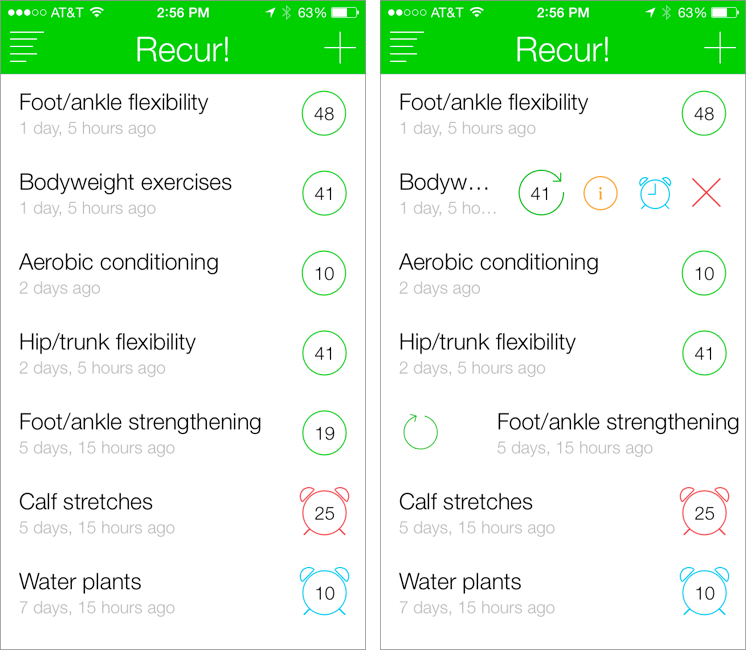
Recur has one main screen, which shows your tasks. You add a new one by tapping the + button or pulling the list down; a new task needs only a name. Once an item is created, you mark it as done by swiping to the right on its name; in the right-hand screenshot, I’m noting that I did my foot/ankle strengthening exercises. That increments the number inside the green circle so you can see how many times you’ve accomplished the task, updates the last-done date, and moves the item to the top of the list.
Tapping an item’s name reveals four buttons, as you can see in the Bodyweight Exercises line above. Here’s what they do:
- The green refresh button works like swiping to the right, except you can choose the date on which the action happened, which is handy when you forget to record something on the spot.
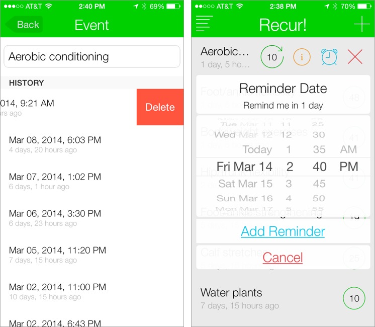
- The orange information button shows the task’s history, which is useful for seeing how regular you’ve been. You can also swipe to the left on any history item to delete it, if you added it accidentally. You cannot edit the dates and times of history entries, which would be nice; the workaround is to remove and recreate them manually.
-
The blue alarm clock button lets you set a reminder, which can either occur once or repeat daily, weekly, monthly, or yearly. (Other options, such as every other day, would be welcome but would increase the app’s complexity.) When an item has a reminder, the blue alarm clock icon replaces the green circle around the number of times you’ve accomplished the task. The alarm clock turns red after you’ve dismissed the notification and stays that way until you mark the task as done — clearly I need to do my calf stretches, and I should water the plants this weekend.
-
The red X button does double duty, letting you either delete a task entirely, or decrement its number by one, deleting the most recent history entry and returning the task to its previous position in the list. It’s easy to swipe the wrong task accidentally, so I use the decrement feature fairly often.
What I appreciate about Recur is that I can glance at the app in the morning and see which of my exercises are settling toward the bottom of the list and should thus receive some attention. And if I talk to a coach or therapist about what I’ve been doing, I don’t have to guess at how often I’ve done the exercises I was assigned.
I’ve tried a variety of ways of logging such information, ranging from paper to a Google Docs spreadsheet, and no system has ever stuck, thanks to being too much work, too messy, or just plain unsatisfying. I won’t pretend that using Recur is a major reward, but I do get a tiny thrill of accomplishment when recording a task as done and seeing it leap to the top of the list. And when it comes to those chores you know you should do but have trouble mustering the enthusiasm for, any little boost helps.
Microsoft Surface: A Tale of Two Computers
In the first two parts of this informal series looking at unexpected hardware options for Apple users, I pegged the iPad Air as the ideal machine for the mobile writer (see “iPad Versus MacBook for the Mobile Writer,” 17 February 2014) and suggested that a Chromebook (“Google’s Chromebook Makes for a Fine Auxiliary Laptop,” 24 February 2014) would be great for a student and surprisingly good as a mobile adjunct for the Mac user. But even more surprising, I’ve found another worthy option in mobile computing: the Microsoft Surface.
I didn’t expect that. Like many Apple stalwarts, I have long regarded the Windows world as a foreign land — an intriguing, exotic destination suitable for a bit of sightseeing, but the sort of place that suffers from too many problems for me to want to live there.
Surface, Microsoft’s line of hybrid computers that are part tablet and part Windows PC, has me rethinking this position. I had tried these portable machines off and on in my role as a technology journalist, but they never clicked for me. But in the interests of keeping an open mind, I decided to have another go at using Surface devices almost exclusively to see if my lukewarm opinions about them would change.
As I write this, I’m going on a month of near-continual Surface use that has had its moments of frustration. I have at times wanted to smash it into the wall so that it shatters into glassy shards. But, for the most part, it has been a positive experience.
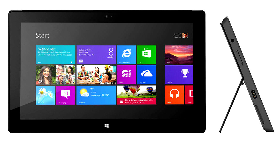
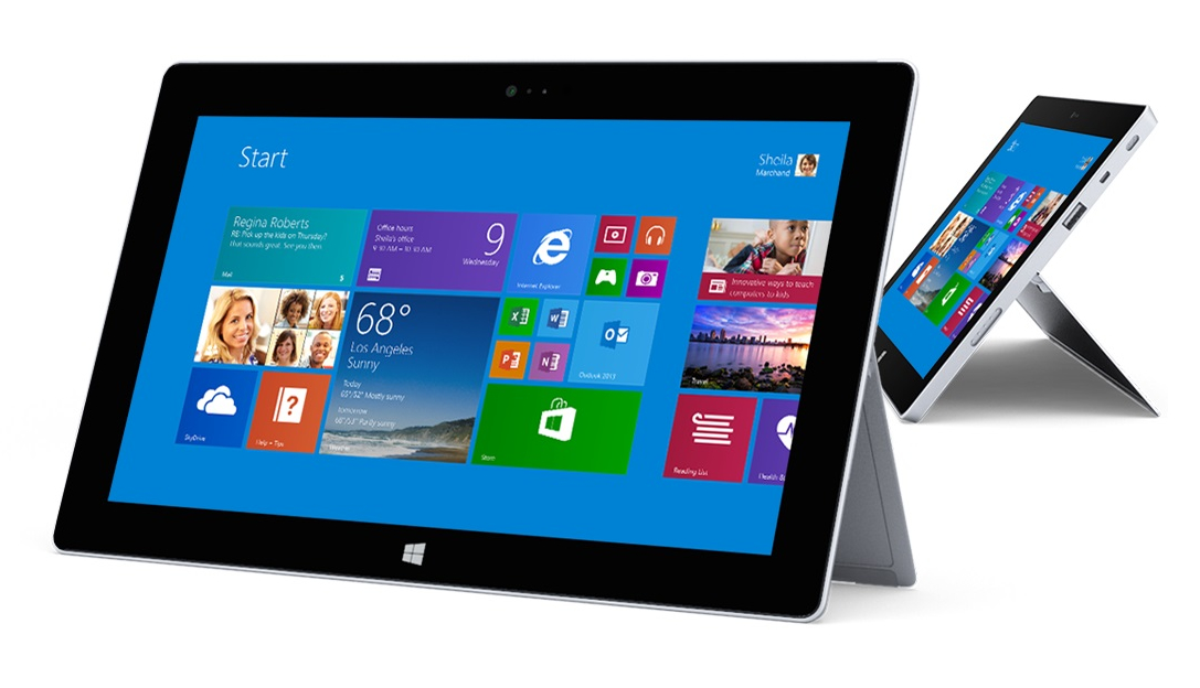
Surface PCs are notable for incorporating elements of tablets, notebook computers, and desktop computers into mobile machines that you can use much like an iPad, yet they also behave much like a full Windows PC.

Surface’s biggest plus – and the primary reason I have warmed to it – is its versatility. You can interact with a Surface PC solely via touchscreen interaction à la iPad, as a quasi-notebook when you clip on a super-thin Microsoft keyboard and flip out the integrated kickstand, and as a desktop PC when it’s hooked up to an external monitor.
Such flexibility has been Microsoft’s longtime Surface pitch, and although weak Surface sales to date would indicate that it’s falling on many deaf ears, I’m mostly sold on it, despite some huge flaws beneath the surface.
Three Computing Visions — A bit of background is in order. The newest Windows, with its emphasis on touch interaction, represents an approach to mobile computing that is quite different from that of Apple with its iPad line, and from that of Google with its Chromebooks.
Consider Apple. Although Mac OS X and iOS share some low-level foundations, Apple has otherwise completely separated the two. iOS bears little resemblance to Mac OS X — iOS relies on a touch interface in favor of a mouse and keyboard, and while developers go out of their way to make Mac and iOS apps work well together, most apps look and act quite differently across the two platforms. At the same time, Apple has kept its hardware lineup to a minimum, ensuring that there are never so many choices that they paralyze potential buyers.
Google, meanwhile, has taken a Web approach with its Chrome OS mobile operating system, derived from the Chrome Web browser. Though Chrome OS has been enhanced to take on the look and feel of a classic operating system, it’s fundamentally a Web-centric environment. When you open the lid of a Chromebook and get to work, you are using Web apps as you would within Chrome on Windows or Mac OS. Although the Chromebook hardware ecosystem is broader than Apple’s, it’s still fairly constrained — there’s only so much you can do with a laptop instantiation of a Web browser.
Not surprisingly, Microsoft has taken a completely different tack with Windows, preserving the essence of Windows while adding mobile interface elements to make it a viable alternative to iOS (and the rival, Google-owned Android). A new, touch-friendly interface made up of big, colorful, tappable tiles has been added for those times when a finger is preferable to a classic input device. This “Start Screen” environment has its own breed of full-screen, touch-friendly apps, available via a Windows Store that’s similar to Apple’s App Store. But in classic Microsoft preserve-the-past fashion, the traditional Windows desktop — controlled by a mouse and keyboard — hasn’t gone away. That’s entirely sensible, given how Microsoft
has invested decades of development in a desktop operating system with native software that customers insist on running for the foreseeable future.
Accompanying Window 8 is a dizzying variety of mobile computers, ranging from iPad-style tablets and traditional notebooks that happen to have touch screens to hybrids consisting of tablets that fit into keyboard docks to become laptops. It all feels a bit random, as if PC hardware vendors are just throwing technology against the wall to see what sticks, but it does result in a wide variety of options, particularly when compared to the more limited iPad and Chromebook ecosystems.
Scratching the Surface — Microsoft’s Surface line is the company’s first try at manufacturing Windows hardware of its own instead of relying entirely on third parties like Acer, Dell, HP, and Lenovo.
But what is a Surface, exactly? Let’s define our terms. “Surface” doesn’t refer to a single kind of PC, but several. Here’s where things get complicated and confusing, which is again classic Microsoft.
One Surface category, the “Surface Pro,” consists of computers that are full-featured Windows PCs in every sense of the word. The full Windows 8 is installed on them. Computers in this category include the first-generation Surface Pro, released in February 2012, and its recently released Surface Pro 2 successor (starting at $899 for 64 GB of storage). Only the newer model is still on the market, at least according to Microsoft, with stock of the older model at third-party retailers dwindling as I write this.
Surface Pro devices can run standard Windows desktop applications — just like any other PC — along with new, touch-centric apps intended for use in tablet mode.
This tablet mode relies almost entirely on the aforementioned Start Screen interface (shown below) with tiled apps, which has led tech writer David Pogue to christen it “TileWorld.” This interface initially struck me as jarring and alien, but has grown on me over time. It is a bold user-interface approach, and one that has come under criticism, but I love it now.

The other Surface category, consisting of computers without the “Pro” moniker, offers the classic Windows environment only in a limited sense. The familiar desktop is present, and Microsoft has installed Office, but users cannot install any other traditional desktop applications. That is because these non-Pro Surface devices have ARM processors instead of Intel processors, and use the Windows RT variant of Windows that is incompatible with traditional Windows software. Microsoft intends them to be used almost exclusively via the Start Screen,
with those tiled apps, and to compete with the iPad more directly than Surface Pro devices.
Computers in this category include the early 2012 Surface RT (ranging from $299 for 32 GB without a Touch Cover to $349 for 64 GB with a Touch Cover) and a recently released successor dubbed the Surface 2 ($449 for 32 GB, $549 for 64 GB). Both are officially on the market as of this writing, with the Surface RT dropping the RT suffix to become merely Surface.
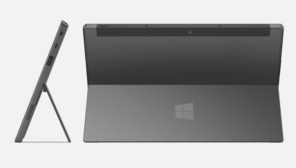
Pro and non-Pro Surface PCs have a similar appearance, but the latter are less bulky. The first shot below shows a thicker Surface Pro, and the second shows the thinner Surface 2.
I prefer the Surface Pro machines, despite their additional weight and bulk, because of their greater power and versatility. Non-Pro devices running Windows RT instead of Windows 8 are all but useless to me because they are Windows-based computers that cannot run Windows software. This makes no sense. Microsoft appears to agree, since it recently hinted
that Windows RT-based PCs are not long for this world.
Surface Pros are not cheap, with prices ranging from $899 for 64 GB up to $1,799 for 512 GB, but the first-gen Surface Pro model has been aggressively discounted, as low as $500, which is a steal. That’s what you’d pay for the entry-level iPad Air; the entry-level MacBook Air costs twice as much.
Microsoft deserves credit for conjuring up a computer category that is chockablock with good ideas — though some of them have been executed abysmally. Let’s look at these ideas, broken down by category.
A Smooth and Shiny Surface — Pick up any Surface device, Pro or non-Pro, and you’ll know you aren’t in Cupertino anymore, Toto.
The computers are aggressively rectangular with a 16-by-9 aspect ratio, unlike square-ish iPads that have a 4-by-3 aspect ratio. Surfaces are made out of a special magnesium alloy, VaporMg, that Microsoft claims is a third the weight of aluminum and, depending on the Surface model, is either light or darkish gray. They look fantastic, but I dislike their sharp edges, which make them less comfortable to grip than an iPad.
Whatever the model, Surfaces have a pair of iconic features that rank among the reasons I have fallen for the devices.
First, the rear of the devices incorporate a sturdy flip-out stand. This is killer. For many people, the iPad needs to be placed in a stand or sheathed in a stand-equipped case, giving the Surface gizmos an edge up in usability out of the box. Stands on first-generation Surfaces have one position while the second-generation stands have dual positions that offer different viewing angles for greater comfort. The stands on my various loaner Surface devices have held up nicely through months of use.
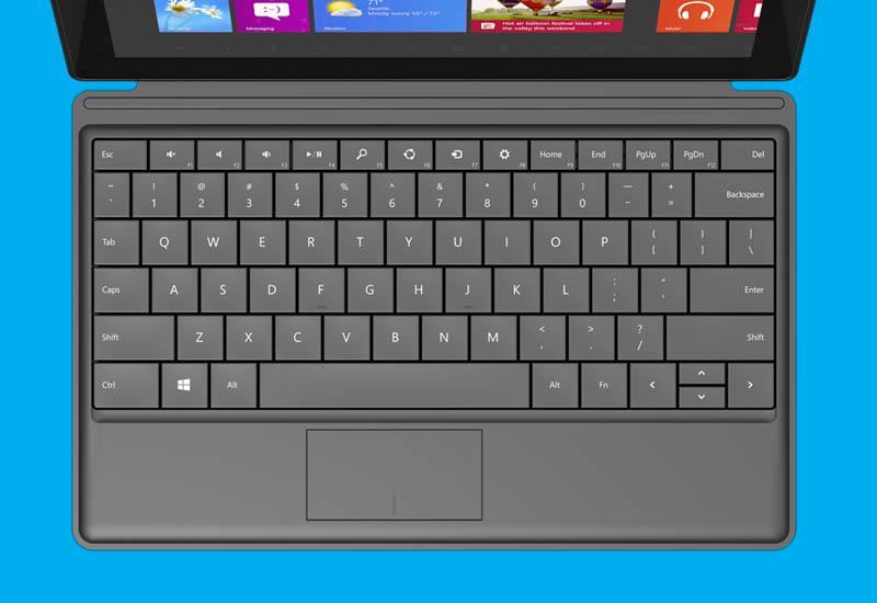
Second, Surface tablets can be paired up, at an additional cost, with covers that flip down onto work surfaces to reveal built-in keyboards.

There are two such ultra-thin covers, one dubbed the Touch Cover with touch-sensitive buttons that detect finger taps via pressure-sensitive sensors, and another called the Type Cover with mechanical keys. You can see both below, with the Touch Cover on the left and the Type Cover on the right.
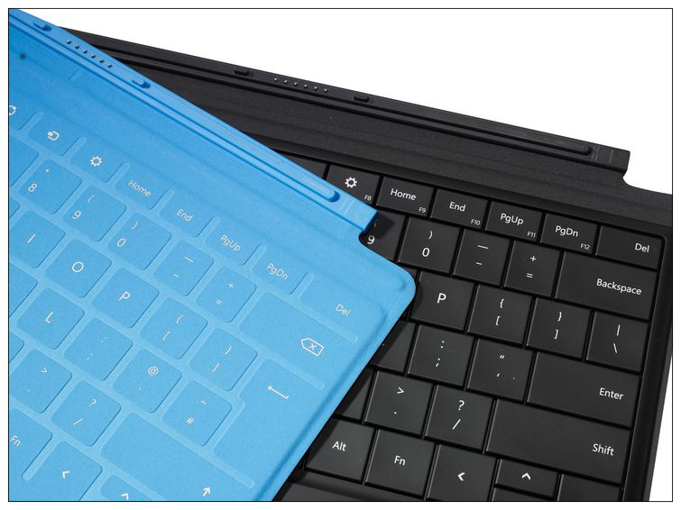
The Type Cover is the best option by far. It is, in fact, the best mobile keyboard I’ve ever used. Though very thin, it has a terrific feel with square-shaped buttons of a generous size (unlike the often-teensy keys on iPad keyboard covers and cases), and just the right amount of movement or “throw.” The keyboard’s built-in trackpad isn’t all that great, but it’s assumed you’ll use the Surface’s touch screen most of the time. You can also use a Bluetooth or USB mouse.
A Surface with its keyboard is reasonably “lappable,” as well — though not as comfortable in the lap as a conventional clamshell notebook.
Microsoft, sensing that it has a hit accessory on its hands, has turned its Surface covers into a mini-ecosystem. Models with backlighting are now available. A Bluetooth attachment lets you use a Surface keyboard separate from the computer, instead of magnetically attached to the bottom edge of the device. A cover with a built-in battery extends the amount of time a Surface can function without an AC adapter. Color choices have been expanded, but the black backlit Type Cover appears to be the most popular since it’s perennially out of stock in Microsoft stores.
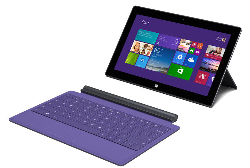
Together, the stand and keyboard covers turn the Surface into a computer ideal for productivity.
The iPad, with a vast array of third-party add-on covers and cases that build in keyboards, has been positioned similarly. I’m fond of using an iPad Air with Logitech’s fine FabricSkin Keyboard Folio in this way. But the Surface offers a superior experience because it’s wider than the iPad, which allows for a more expansive and therefore far more effective keyboard.
Microsoft’s Surface line includes one other notable piece of hardware: a desktop dock. This is a handsome, minimalist accessory that clamps onto either side of a Surface Pro, plugging into a USB port on the left and a Mini DisplayPort on the right. The Surface-dock combo then links to an external display while adding four USB 2.0 ports along with power, audio, and Ethernet ports. It seamlessly transforms a Surface Pro from a mobile computer to a desktop PC. As with other computer-monitor pairings, the two screens can be mirrored or extended (I tend to do the latter so I can have a larger workspace).
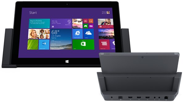
Apple hasn’t offered a dock for one of its mobile computers since the dearly departed Duo Dock. Third-party hardware makers have come up with iPad docks and, to a lesser extent, Mac docks, but the Surface dock is the best such accessory I’ve come across in recent years.
The dock is what put the Surface Pro over the top for me. It meant I could use a Surface Pro as a full Windows desktop PC as well as a tablet and a notebook computer. When I got to my desk at work, I placed the Surface into the dock, snapped its left and right sides into the tablet to engage the power, USB, and DisplayPort connectors, and got to work on my big display.
When I took a lunch break, I pulled the Surface from the dock and placed it upright on my desk to flip through Flipboard while I munched on my sandwich. When I had a meeting at a coffee shop, I clipped on the Type Cover to use the Surface in notebook mode. Later, in bed, I put the Surface on my lap to watch “House of Cards” as I would with the iPad. If an email came in that needed an immediate reply, I clipped the keyboard back on to type before getting back to the show.
See what I mean? Versatility.
Battery life is reasonably good, too. The original Surface Pro lagged in this area, but the Surface Pro 2 is a huge improvement courtesy of its updated Intel processor. I easily managed between six and eight hours or more, depending on my circumstances (whether I was watching video or just word processing, how bright I had the screen, etc.). RT-based Surface models have excellent battery life, too.
Below the Surface of Windows — Using a Surface Pro and, to a lesser extent, a non-Pro Surface is a disjointed experience because of its two, radically different interfaces: the classic Windows interface and the new Start Screen or “TileWorld” interface.
Microsoft has signaled that the Start Screen is the future of Windows computing, but the ever-conservative company has been loathe to abandon the traditional Windows environment — even on the simpler, non-Pro Surface computers, where it would make the most sense given their inability to accommodate traditional PC software. The company has been criticized for such vacillation.
Yet, transporting a Surface Pro 2 everywhere in recent weeks, I’ve come to appreciate both interfaces for what they are, and what they can give me.
When I’m toting the Surface Pro 2 around by itself, the Start Screen and its candy-colored tiles are fast, fluid, and effective for touch interaction. Although you can attach a mouse or use the Type Cover’s trackpad, you’d do so only when you have a desk-like environment. On the other hand, the classic Windows interface becomes indispensable when coupled with a mouse and an external display, directly or via the Surface Dock. In other words, when it becomes a desktop PC.
But the converse is true too. The Start Screen interface feels a little silly on a big display, and the classic Windows interface can’t be used comfortably on the Surface Pro’s smallish display — the click targets are just too small to hit with a finger. It’s easy to mock the round peg trying to fit into the square hole, but in my usage, I just used each interface for what it was good for, and didn’t fight it.
Neither the Mac nor the iPad can offer such dual-interface versatility. Apple has kept Mac OS X and iOS separate. That’s fine. It’s a good approach, one that has served the Cupertino giant well, and I wouldn’t dream of dissing it here. And while Google makes both Chrome OS and the Android smartphone and tablet operating system, the two are entirely different at the moment.
This doesn’t make Microsoft’s approach a bad one — and it’s one I’ve come to like. It’s appealing partly because it lets users carry an everything computer. It’s a tablet. It’s a laptop. It’s a desktop PC. It does it all.
This does make it a bit of a Frankencomputer. A Surface is too small to be a perfect laptop, yet a bit too bulky and heavy to be an ideal tablet (this is especially true of Surface Pro models). Microsoft’s claim that a Surface is a “no-compromise” computer is a stretch, but compromising isn’t necessarily a bad thing when it means you can have a single device that serves multiple needs well. In that sense, Surface delivers.
Sliding Microsoft’s Apps around the Surface — TileWorld can be an acquired taste, but it’s a daring, innovative approach from a company not known for its originality. Apps in this environment are located and installed via the Windows Store, and are added to an app library. You then have the option to make them tiles on your Start Screen in sizes of your choosing — from a small or medium-size square to a rectangle or a giant square. Everyone uses some apps more than others; being able to size and arrange them to your liking is a welcome improvement over screens of similar-looking icons.
Tap a tile and you launch a full-screen app — essentially the equivalent of an iPad app — with the key difference that you can manipulate Surface apps with a mouse or a fingertip. Microsoft, for instance, has concocted a touch-centric version of OneNote, its popular information-organizing app, with features similar to those of the desktop variation, but with Start Screen flavoring. It is terrific. So are the Mail and Maps apps bundled with Surface computers.
Some tiles are even interactive, constantly changing in useful ways. Microsoft’s own News tile displays a series of headlines and pictures. Its Weather tile shows up-to-the minute conditions and forecasts. Its Travel, Food, Health, and Finance apps are all diminutive Live Tile information consoles with clever customization options to control what information you can see. I love them.

So far, so good. But Microsoft failed to take the single most important step for TileWorld to achieve its full potential: It did not release full-screen, Start Screen versions of its Office productivity apps. Seems like a no-brainer, right? When Apple unveiled the first iPad, it also released iWork apps to get users busy right away, and as proof-of-concept software to spur developers. When the first Mac arrived 30 years ago, it came loaded with MacWrite and MacPaint so Mac users could get to work from the get-go. Heck, Microsoft could have even
built in Live Tile functionality with, perhaps, visual cues on the Word tile when others collaborating on a Word document had made edits.
The fact that Microsoft didn’t offer a touch-friendly version of Microsoft Office concurrently with the first generation of Surface devices is baffling. It’s said to be on the way at last, but I can only wonder how much more successful the Surfaces might have been with such a Microsoft Office touch suite available on day one.
Microsoft did preload the classic version of Office on its non-Pro Surface tablets, for use on those gizmos’ otherwise-pointless Windows desktop, but it hasn’t proven to be much of a selling point. I can see why; I’m not crazy about using the classic version of Microsoft Word on a Surface Pro when I’m in mobile touch mode.
Going Beyond the Surface with Third-Party Apps — One of Microsoft’s epic Surface failings has been its scant success in luring top third-party developers to the Windows 8 touchscreen platform. This has crippled the Surface devices, because a tablet purchase is, to a big extent, made on the basis of app availability. That is largely why the iPad has been a hit while Surface has bombed.
The original Surface RT, in particular, has been a flop of epic proportions for Microsoft. Last summer, the company slashed the product’s price by 30 percent after the computer piled up in stores, all while writing off about $900 million to account for those price reductions and its unsold inventory. The Surface Pro wasn’t a sales monster in 2013, either. Microsoft has not released Surface sales numbers, but is believed to have shipped to retailers only about 2.1 million Surface tablets of any kind between October 2012,
when the RT version was released, through the first half of 2013. Apple shipped 57 million iPads during that period.
No wonder third-party app developers have been skittish about committing themselves to the Surface platform.
Facebook, Twitter, Flipboard, Evernote, Netflix, 500px, and Hulu have touch-friendly Start Screen versions of their apps, but there’s no Instagram, no Feedly, no Pocket, no Amazon Instant Video, no Rdio or Spotify, no Xfinity TV Remote and TV Go, and no Google apps other than a search app with links to the software giant’s Web apps. Unofficial alternatives to many of the apps are available – Nextgen Reader is a dandy Feedly-friendly newsreader, for instance, and third-party Instagram and YouTube apps are legion – but official versions of top apps give computing platforms credibility.
As a writer, I find the paltry selection of writing-related apps particularly painful. I’ve found a handful of basic Markdown editors in Microsoft’s Windows Store, and some other mediocre apps for writers. I have yet to find anything stellar in this category. I wouldn’t care as much if a Start Screen flavor of Office were available, but its absence makes the paucity of third-party alternatives problematic for those who live and die by the written word.
The iOS ecosystem presents an interesting contrast. Microsoft hasn’t released a full version of Office for the iPad either, but who cares? Writers have a vast, rich selection of apps to suit nearly any need, starting with Apple’s Pages and including oodles of independent alternatives.
The Live Tile environment is low on choices, too. When I tried to create an ever-updating news wall made up of news-type Live Tiles, I had a hard time finding enough. USA Today, the Wall Street Journal, New York Times, Associated Press, and CNET are among the minority of prominent news organizations providing top-flight Live Tiles.
I have found Start Screen apps to be catastrophically buggy in certain cases, as well. I stopped using Evernote Touch on a Surface 2 because it did not synchronize information to the cloud reliably and caused me to lose a day’s worth of data due to app crashes.
All of this is a shame because Live Tiles are big fun. I have spent hours organizing my Start Screen, with themed tile clusters that are equivalents of iOS folders, but are vastly more useful in the visual sense since I can glean bits of precious information at a glance.
The Web browser has been my Surface salvation, to a large extent. Google Chrome works well on a Surface Pro but can’t be installed on a Surface. That’s fine because a Start Screen version of Microsoft’s Internet Explorer works acceptably. I can get to my Gmail and Google Calendar on it. I can also get back to the Google world in the Google search app that, as I noted earlier, provides access to Google’s Web apps.
Judging Surface — When Microsoft Windows dominated personal computing, the spunky Mac was the alternative for those who prioritized productivity and flexibility over following the crowd. Back in the day, no one ever got fired for buying Microsoft, and Apple was lucky to carve out a single-digit market share.
Today, these roles have largely flipped. When you add iPhone and iPad sales to Mac sales, Apple is selling more devices than all Windows-based PCs combined (this is obviously an apples-to-oranges comparison, but still telling of how far Apple has come). Apple is now seen as the personal computing gold standard, and those who compete with the Cupertino behemoth have worked overtime to dream up alternative technologies.
We are all the better for this. We live in a golden age of personal computing. Gloriously, we have the Mac, the iPhone, and the iPad, but the Surface alternatives also have enormous appeal for those who are looking for something other than what Apple provides.
Google has spawned not one but two computing ecosystems — Chrome OS for a fresh breed of low-cost Web-centric computers, and Android for tablets and smartphones — that have rough edges, but also momentum and potential.
Microsoft, more embattled now than at any time in its nearly 40-year history, has scrambled to rethink its desktop operating system and mobile Windows Phone operating system, and while neither has set the world on fire, both are entirely usable.
With Surface, Microsoft has created a kind of computer that is new, innovative, and exciting, while simultaneously not leaving the past behind. Apple burns its bridges with regularity; Microsoft continually pulls the stragglers along. Neither approach is right or wrong. Apple serves those who always want the fresh and new, whereas Microsoft is experimenting with new ideas while trying keep the “if it ain’t broke” crowd happy.
Microsoft has fumbled fundamental aspects of this computing ecosystem, but is attempting to rectify its missteps while, rumor has it, readying more Surface devices. The third time may be the charm — Microsoft has a history of patience and getting products right only on the third try.
Even after coming to like it more than I ever thought possible, the Surface Pro 2 wouldn’t be my first choice. I’m still an Apple guy. With $500 to spend, I’d buy an iPad Air. With $1,000 or more, I’d get a MacBook Air. And if I was limited to less than $500, I’d be looking at Chromebooks. I’m not Microsoft’s target audience.
But, by forcing myself to revisit the Surface, I have come to admire that which I once dismissed, and to realize how alternatives to the Apple ecosystems can help move consumer computing forward in ways I had scarcely imagined.
FunBITS: Paprika Recipe Manager for iPhone, iPad, and Mac
My wife and I love cooking, but we stink at kitchen management. Recipe management, grocery shopping, and meal planning aren’t our forte. As such, we would often reach dinner time realizing that we had no idea what to cook and didn’t have much in the pantry, so we’d end up going out for dinner. Again.
Enter Paprika, available as separate purchases for iPhone ($4.99), iPad ($4.99), and Mac ($19.99). It deftly stores recipes, maintains a shopping list, and can help you plan meals. While it doesn’t actually make us dinner, Paprika has become an essential member of our household.
The first thing you’ll notice about Paprika is how well it’s designed. It’s iOS 7 style at its best: great typography surrounded by lots of white space, making for an interface that’s clean and easy to read. A sidebar features buttons that display four sections: Recipes, Browser for finding recipes online, Groceries for building grocery lists, and Meals for planning menus.

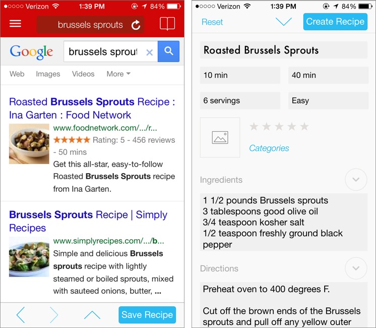
If you cook mostly from online recipes, adding them to Paprika is fast and fun. Tap the Web browser and enter your terms into the search bar. Hindsight Labs, Paprika’s developer, designed it to work with a number of cooking sites, including About.com, AllRecipes, Bon Appétit, Cook’s Illustrated, and Food Network. To find
recipes, Paprika performs a custom Google search that’s restricted to the sites it supports. Tap a recipe to view it, and then tap Save Recipe to add it to your saved recipes. Paprika does the work of arranging recipe ingredients, directions, and metadata in the right places, but also gives you a chance to edit the details. Once it looks right, tap Create Recipe.
If you’re browsing in one of Paprika’s supported recipe sites and come across a recipe you’d like to add, you can do so by copying its URL and switching over to Paprika, which detects the URL and asks if you want to add it to your saved recipes.
But what if your recipes aren’t on a compatible Web site, or they’re not online at all? What if, like TidBITS publisher Adam Engst, you have years of paper recipes haphazardly written down or printed out and stored in binders? Or if, like many people, you have dozens of paper cookbooks, from which you cook on a regular basis?
In this case, you have two basic options. If you have the iPhone or iPad version and a Bluetooth keyboard, you can type recipes in manually. This is easier in the Mac version, if you anticipate a lot of data entry. How long it takes to enter a recipe depends on how much detail you need and how fast you type. Entering a handful of recipes takes only a few minutes, but if you have dozens you want to enter, you could instead try BigOven’s RecipeScan transcription service. It offers 3 transcriptions for free, and if you’re happy with the results, you can get 25 more with an annual BigOven Pro subscription for $19.99; additional transcriptions cost $0.99 each, or as little as $0.59 if you
buy in bulk.
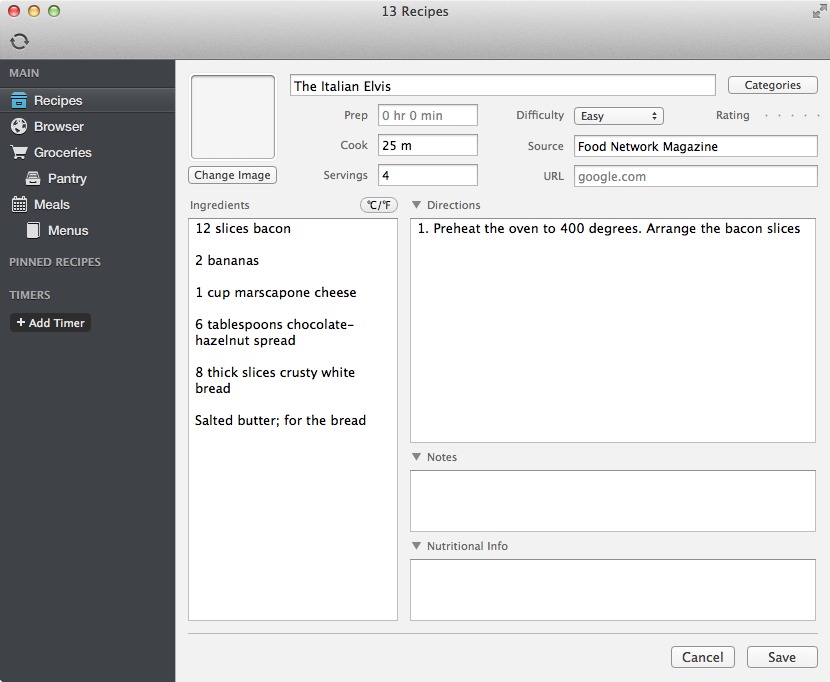
To work with your saved recipes, tap Recipes in the sidebar. Here you can view and sort your saved recipes. Tap one to view its ingredients and directions. Helpfully, Paprika keeps the screen from going to sleep while you’re viewing a recipe, so you don’t have to keep waking your device up while cooking. Paprika also features handy tools to aid in preparation, such as multiple timers and scaling options, and you can pin multiple recipes to switch between them quickly.
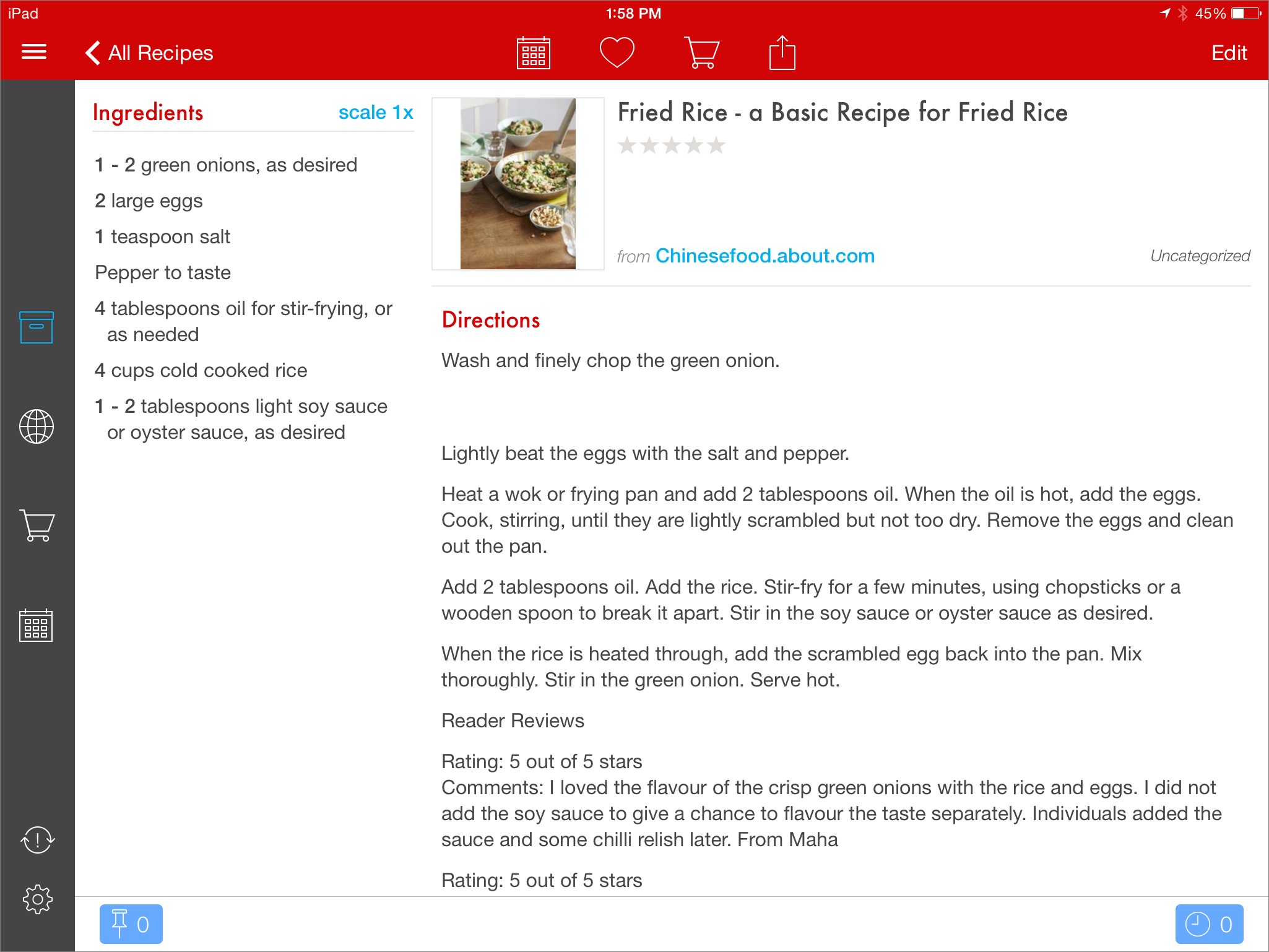
If I’m preparing a recipe for the first time, I like to study it on the iPad’s larger screen before I start. Then, once I’m working, I refer back to Paprika on the iPhone to remind myself of what’s next. An iPhone in my pocket is safer from damage than an iPad sitting on a counter, but when I do need the iPad, we have a separate prep table in the middle of our kitchen that I rest it on. If you’d rather work from an iPad, many stores have inexpensive tablet stands that will fit the bill and protect your
delicate devices from spills and splashes. Or just use a plexiglass cookbook holder.
Storing your recipes in Paprika doesn’t just make cooking easier; it also helps with shopping. Whenever you have a recipe open, tap the shopping cart icon, and add the ingredients to your grocery list, deselecting ingredients you already have.
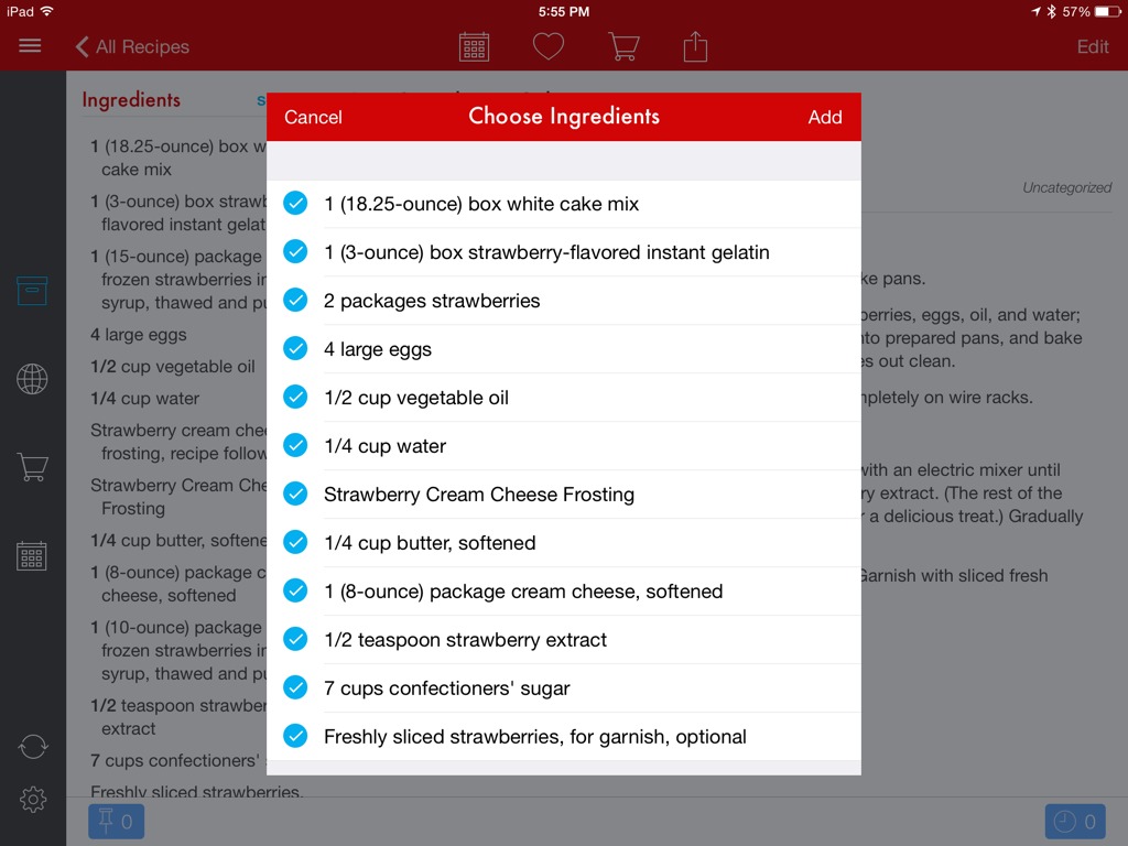
For us, the grocery list feature alone is worth the price of admission, since we both shop at different times, and are constantly failing to get items that the other person needs for a recipe. To address that problem, Paprika includes its own syncing service, so you can share an account with other members of your family, or with housemates. Add items to the grocery list and they’ll appear instantly on everyone else’s devices, making it even easier to add something while your partner is at the store.
You can also print a list from any of the apps if you don’t want to juggle your iPad or iPhone in the grocery store, but you’ll then have to check items off manually in Paprika later.
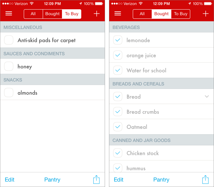
Paprika’s grocery list is one of the best of its kind I’ve seen in iOS. It’s built on a database of items, so you can enter just a few characters and select what you want, and Paprika intelligently sorts groceries by aisle. You can’t edit the aisles, and they may not match what’s in your store, but I still find the grouping helpful. If you don’t, you can turn off aisle grouping in settings.
The grocery list interface is split into three sections: All, Bought, and To Buy. At first, I found this annoying, because why would I want to see items I’ve already bought? The reason is that you can see your past shopping list items and uncheck them, to move them back to the To Buy list. Most of us buy many of the same items each week, and with this approach, there’s no need to type “milk” every week. Just go back through your past items and uncheck what you need.
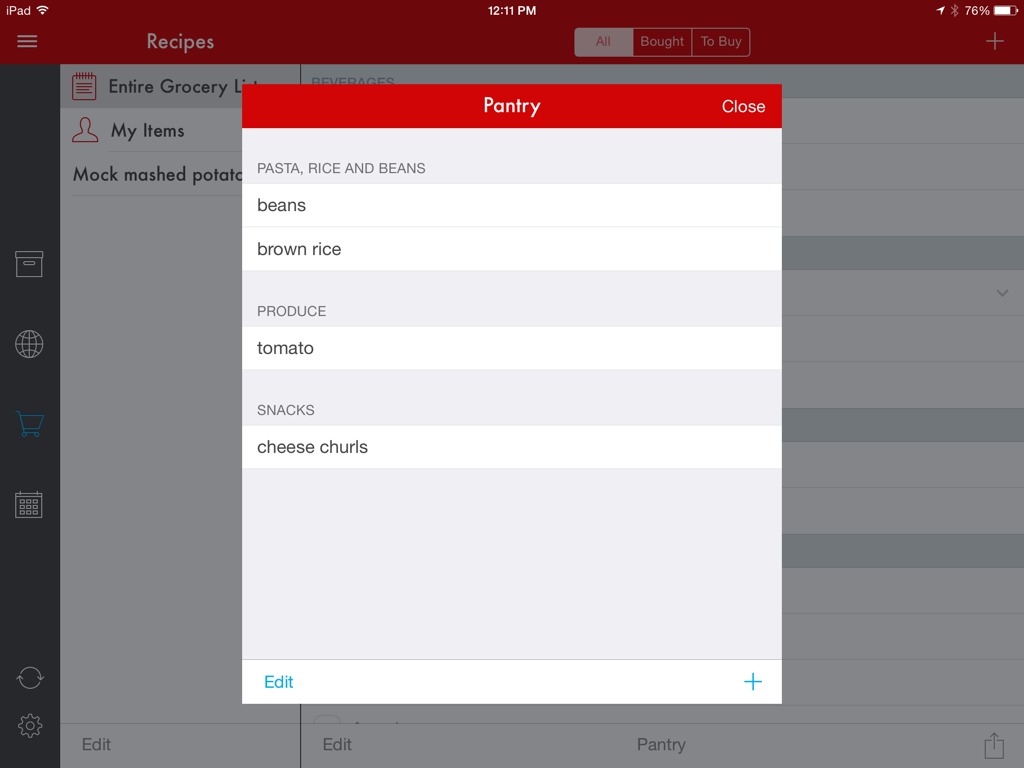
For staples, Paprika maintains a list of items in your pantry. Tap Pantry at the bottom of the grocery list, and you can add items to your pantry. The downside is that you can track only items predefined by the developers, it doesn’t keep track of quantities, and you have to manage the whole thing manually — it’s perhaps the weakest part of Paprika. However, the upside of entering your pantry items is that when you add a recipe or menu to your grocery list, Paprika automatically checks off those items so you don’t buy them
unnecessarily.
While being able to build a grocery list is great, Paprika has additional features for those who plan even further ahead. Tap Meals in the sidebar to bring up a calendar, which you can view either by week or month. Tap the plus button, and you can add a recipe, note, or menu for a certain date, for breakfast, lunch, dinner, or snacks.
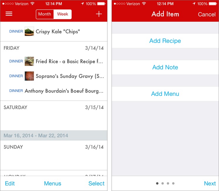
What’s a menu? It’s a grouping of recipes for a particular meal, just like in the real world. While in the Meals view, tap Menus at the bottom. Name your menu, then select stored recipes to add to it. So, for example, if you want to serve eggplant parmesan (with its associated spaghetti sauce recipe) and roasted fennel for a big Sunday dinner, you can combine them into a menu. Another tap adds the entire meal to your planner for Sunday.

Once you’ve built a meal plan or a menu, you can add it to your grocery list. That enables you to plan an entire week (or month) of meals in advance and have your grocery list created automatically. Imagine how helpful that would be for maintaining a diet! You can also print out a monthly calendar of meal plans to post on your fridge. The Mac version also allows you to print just a weekly meal plan.
Paprika is by far the best kitchen app I’ve ever used, and I recommend it highly. But with separate iPhone, iPad, and Mac versions, there’s a question as to which version or versions should you get. If I could have only one, I’d get the iPhone version, since my iPhone is always in my pocket, and the shared grocery list feature is brilliant. But the iPad version is easier to read, and if you plan to use Paprika in the kitchen while cooking, it offers a hands-free reference. An iPad mini might be the best compromise. The Mac version is the odd man out, since it’s both the most expensive and the least likely to be useful while shopping or in the kitchen; the main reason to get it is if you need to enter a lot of recipes from
notecards or cookbooks.
TidBITS Watchlist: Notable Software Updates for 17 March 2014
Alfred 2.2 — Running with Crayons has released Alfred 2.2 with several new features, including debugging options for workflows, additional organization options and filtering for workflows, the capability to copy objects from one workflow to another, and an option to use metadata for contacts search instead of the Address Book API (for improved word-based and diacritic matching). The keyboard-driven launcher also now prevents smart quotes in the AppleScript workflow action editor, improves reindexing, and allows multiple selections for categorizing and deleting workflows. For those who purchase the feature-enhanced Powerpack, Alfred also adds support for creating email messages with attachments in the Airmail email client, improves Alfred’s knowledge sorting for fixed and unique filter results, clarifies advanced preferences for 1Password 3 and 1Password 4, and removes the capability to add new syncs to the Dropbox Apps folder (which was causing problems for a small number of users). (Free, £15 for Powerpack, 3.0 MB, release notes)
Read/post comments about Alfred 2.2.
Default Folder X 4.6.4 — St. Clair Software has released Default Folder X 4.6.4, which improves how the initial folder is set in a file dialog in a wide range of popular applications, including Apple’s Mail and Pages, Microsoft Word and Excel, and Adobe InDesign and Photoshop. The update fixes an issue in Carbon applications that could result in file dialogs switching away from a folder after Default Folder X initially switched to it, addresses a bug with the rebound feature that caused nothing to be selected, and corrects a conflict with OmniOutliner 4 that caused its Export dialog to hang. It also fixes a bug
that could cause the Save button to stop working in Save As dialogs, and resolves a conflict related to apps and macro utilities that type text into the filename field of Save dialogs (such as Typinator, Keyboard Maestro, and TypeIt4Me). ($34.95 new, $10 off for TidBITS members, free update, 11.1 MB, release notes)
Read/post comments about Default Folder X 4.6.4.
1Password 4.2.1 — AgileBits has released 1Password 4.2 with improvements to 1Password mini, AutoSave, and item editing. The updated 1Password mini now enables you to edit items (including generated passwords) directly within the companion menu bar app, displays secure notes, supports fuzzy search (enabling you to type “zon” and get “Amazon”), improves support for multiple Chrome profiles, and greatly improves URL matching when attempting to fill in a password for a Web site’s subdomain (which can be configured in Preferences > Browser).
The AutoSave window now prompts to save new logins in your primary vault by default, and it also searches all vaults before asking to save/update new logins. Additionally, you can specify a vault to use when saving a new login. The update also adds support for Undo/Redo when editing an item, enables you to resume editing if 1Password locks or quits in the middle of a change, and lets you rename tags directly within the sidebar. Other changes include the addition of a Find Backup button to aid in restoring external backup files, the capability to restore from a backup when launching 1Password for the first time, improved CSV import, and the addition of Catalan and Danish localizations.
Shortly after releasing version 4.2, AgileBits issued 1Password 4.2.1 with a fix for a crash when setting up syncing on OS X 10.8.5 Mountain Lion, plus improved notifications that avoid message truncation and remind you that 1Password needs to be unlocked to change sync preferences. As of this writing, the Mac App Store edition of 1Password remained stuck at version 4.1.2; the latest update should appear soon after Apple approves it. ($49.99 new with a 25 percent discount for TidBITS members when purchased from AgileBits, free update, 38.6 MB, release notes)
Read/post comments about 1Password 4.2.1.
ExtraBITS for 17 March 2014
In this week’s ExtraBITS, we take a look at the startup that’s purportedly challenging Google’s search hegemony, speculate on why Apple keeps turning on Bluetooth in iOS updates, and find out why the creator of Flappy Bird pulled the plug.
The Upstart that Dares to Challenge Google — John Paul Titlow, writing for Fast Company, takes a look inside DuckDuckGo, the fledgling search engine with a focus on privacy. New users are flocking to the site after the intelligence leaks that began last year. However, even with its fast growth, it receives only about 4 million searches per day, three orders of magnitude less than Google’s 5.9 billion.
Why Apple Keeps Turning on Your Bluetooth — It seems that every recent iOS update turns Bluetooth back on if you had previously disabled it. Why would Apple do this? Kashmir Hill of Forbes proposes that the answer has something to do with iBeacons.
The Rise and Fall of Flappy Bird — The iOS game Flappy Bird rose from App Store obscurity to become an overnight sensation. Then creator Dong Nguyen just as quickly decided to remove it from the App Store. Rolling Stone’s David Kushner traveled to Hanoi, Vietnam to track down Nguyen and ask him why.