TidBITS#1234/04-Aug-2014
Apple has updated the MacBook Pro lineup, but don’t get too excited, since the update brings only small performance increases, along with a couple of $100 price cuts. More compelling is Microsoft’s Office for iPad update, which addresses many user complaints, adding support for third party fonts, PDF export, Excel pivot tables, and more. In Take Control news, the indefatigable Joe Kissell has designed his most recent book — “Take Control of FileVault” — to dispel misconceptions and encourage readers to enable FileVault in order to protect their data in the event of theft. Plus, for TidBITS members, the latest chapter of Charles Edge’s “Take Control of OS X Server” covers mobile device management, a hot topic for anyone tasked with managing a collection of iPads. If you’ve been wondering what’s available in the smartwatch world to compete with the Pebble, Jeff Porten took a look at four available smartwatches, with an eye toward what an Apple smartwatch could look like. Finally, in FunBITS, Josh Centers evaluates Amazon’s new Kindle Unlimited service to see if it’s worth the monthly price. Notable software releases this week include Paprika 2.0.4, ChronoSync 4.5.2, Mellel 3.3.6, and OmniFocus 2.0.2.
Apple Upgrades 2014 MacBook Pro CPUs and RAM, Lowers Prices
Apple has updated its MacBook Pro with Retina display lineup with more RAM and slightly faster processors, as well as a few price drops. While these updates are overall about as humdrum as recent updates to the MacBook Air (see “2014 MacBook Air Offers Better Performance for $100 Less,” 29 April 2014), the interesting bit is that 8 GB of RAM is now the base level.
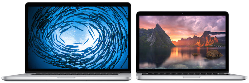
The $1,299 13-inch MacBook Pro with Retina display is practically identical to last year’s model, except it now comes equipped with a slightly faster 2.6 GHz dual-core Intel i5 processor (up from 2.4 GHz) and double the amount of RAM — 8 GB as opposed to 4 GB. It still features 128 GB of flash storage, and stepping up to the $1,499 model continues to double that to 256 GB. The high-end 13-inch model has been bumped to a 2.8 GHz dual-core Intel i5 processor (up from 2.6 GHz) and still features 512 GB of flash storage, as well as 8
GB of RAM.
Build-to-order options for the 13-inch MacBook Pro with Retina display include a $300 upgrade to a 3.0 GHz dual-core Intel i7 processor, 16 GB of RAM for $200, and for the high-end model, 1 TB of flash storage for $500.
Finally for the 13-inch line, the non-Retina model from 2012 continues to hang on by its virtual fingernails, and receives a $100 price cut, bringing it to $1,099. It features a 2.5 GHz Intel Core i5, 4 GB of RAM, and a 500 GB hard drive.
The 15-inch MacBook Pro with Retina display still starts at $1,999, but the high-end model has dropped in price from $2,599 to $2,499. The base 15-inch model has been bumped to a 2.2 GHz quad-core Intel i7 (up from 2.0 GHz) and 16 GB of RAM (up from 8 GB), and still features 256 GB of flash storage. The high-end model receives a similar processor bump to a 2.5 GHz quad-core Intel i7 (up from 2.3 GHz).
Options for the low-end 15-inch model include 2.5 GHz (add $100) and 2.8 GHz (add $300) quad-core Intel i7 processors, and either 512 GB (add $300) or 1 TB (add $800) of flash storage. For the high-end model, the 2.8 GHz processor costs $200 and the 1 TB flash storage is $500.
Particularly given that Intel’s next-generation Broadwell chipset has been delayed (see “Intel’s New Mac Processors Delayed Until 2015,” 9 July 2014), it’s not surprising to see Apple sticking to its standard approach of small performance and RAM upgrades and associated price drops. Besides, Apple has no need to rethink the MacBook Pro line every year, given that Mac sales are up a staggering 18 percent over a year ago, in a time when PC sales continue to sag (see “Apple Q3 2014 Results Show Highest EPS in Seven Quarters,” 22 July 2014).
“Take Control of FileVault” Dispels FileVault Misconceptions
Confession time here. I formed my opinion of Apple’s FileVault encryption feature a long time ago in a galaxy far, far away, and if you think back to those days (Mac OS X 10.3 Panther!), you’ll remember that it was terrible, causing performance problems, data reliability issues, and backup frustrations. All that went away in 10.7 Lion, when Apple introduced the completely rewritten FileVault 2. About the only things in common that FileVault 2 and what’s now called Legacy FileVault have are the name, the interface in System Preferences, and the fact that encryption is involved. FileVault 2 is fast, transparent, and far safer than Legacy FileVault. But you know what? I never got
around to trying FileVault 2, even though I’ve heard no reports of trouble with it, in part because I never saw any discussion of FileVault that was sufficiently in depth and from a source I trusted.
So when the idea of Joe Kissell writing “Take Control of FileVault” came up, I was ecstatic, since I’ve long had a nagging feeling that I should be using full-disk encryption on my Macs to protect data in case of theft. That hasn’t happened, thankfully, but now that I’ve read “Take Control of FileVault,” I’m far more comfortable with turning on FileVault, integrating it with my backups (which should also be encrypted now!), and figuring out how I’d work with Find My Mac in the event of theft. If you too have been hesitant to entrust your data to FileVault before understanding how it works, Joe’s 92-page “Take
Control of FileVault” will dispel any misconceptions, answer your questions, and get you running FileVault with confidence. It’s available now for $10.
Here then is the question. If your Mac were stolen, would you worry about the thief — or whoever your Mac was fenced to — seeing your email, photos, financial data, and other sensitive information? Or do you have a Mac that contains business data, such as customer names and addresses, credit card numbers, or the like? In either situation, you should enable FileVault, especially if you’re using a MacBook that you carry around with you. Too many laptops are nicked from coffee shops or left in cabs to risk leaving the drive unencrypted.
In “Take Control of FileVault,” Joe begins by demystifying FileVault in a quick FAQ that explains, among other things, how it is that you can work with your startup drive normally even though all the data on it is encrypted. The FAQ also answers questions about whether FileVault will impact your Mac’s performance (no), what restrictions FileVault imposes (no more automatic login, for one), and exactly when your data is protected (at rest, and what “at rest” means). After the FAQ, Joe provides detailed steps for activating and using FileVault on both your startup volume and external drives. He also explains how FileVault interacts with your backups and how to use Find My Mac
to lock or wipe a stolen Mac’s drive once you’ve turned on FileVault.
Additional topics in “Take Control of FileVault” include making and using encrypted disk images, third-party software that can encrypt just a single file or folder, and accessing special FileVault features from the command line.
Chapter 9 of “Take Control of OS X Server” Now Available
I’ve been editing along in Charles Edge’s “Take Control of OS X Server” so far with a certain amount of knowledge, since I’ve used OS X Server in the distant past and have run Internet servers for decades. But this week’s installment, Chapter 9, “Mobile Device Management,” was an eye-opener for me. The Profile Manager service in OS X Server is one of the more complex — and more useful! — features of OS X Server, since it enables system administrators to configure multiple iOS devices or Macs with consistent settings and policies, something I’ve never had a chance to play with before.
The list of settings that can be pushed wirelessly to a fleet of iPads, for instance, is huge, and it’s something that any organization with a collection of devices should be using. Among much else, you can use it to push apps and Web clips to devices, set and enforce passcode policies, configure email settings, set device restrictions, and even remotely unlock, lock, or wipe devices.
Charles starts out by walking readers through enabling Profile Manager, which is a bit more involved than many other services in OS X Server. The next step is to enroll devices in Profile Manager, and once that’s done, Charles explains how to manage those devices, which takes place in a Web-based portal, rather than in the Server app. It’s not hard, but you’ll spend some time wrapping your head around all the options and determining what settings and policies you wish to distribute.
We encourage everyone to read the first two chapters of “Take Control of OS X Server” to see where the book is going — all subsequent chapters are available only to TidBITS members for now. If you have already joined the TidBITS membership program, log in to the TidBITS site using the email address from which you joined. The full ebook of “Take Control of OS X Server” will be available for purchase by everyone in PDF, EPUB, and Mobipocket (Kindle) formats once it’s complete. Published chapters include:
- Chapter 1: “Introducing OS X Server”
- Chapter 2: “Choosing Server Hardware”
- Chapter 3: “Preparation and Installation”
- Chapter 4: “Directory Services”
- Chapter 5: “DNS Service”
- Chapter 6: “File Sharing”
- Chapter 7: “Collaboration Services”
- Chapter 8: “Mail Services”
Publishing this book in its entirety for TidBITS members as it’s being written is just one of the ways we thank TidBITS members for their support. We hope it encourages those of you who have been reading TidBITS for free for years to help us continue to bring you more of the professionally written and edited articles you’ve become accustomed to each week. For more details on what the membership program means to us, see “Support TidBITS in 2014 via the TidBITS Membership Program” (9 December 2013).
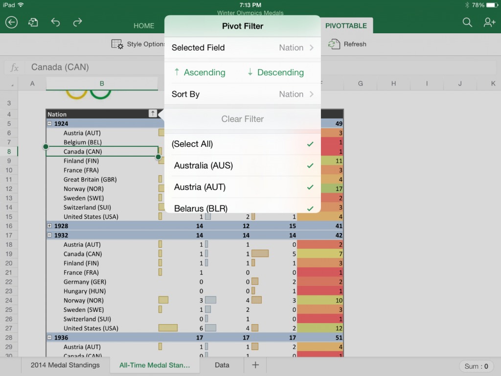
Microsoft Addresses Notable Complaints with Office for iPad Update
Microsoft Office for the iPad, released four months ago to generally positive reviews (including mine, see “Office for iPad: A Deep Look,” 3 April 2014), but lacking obvious and important features, has received a solid round of upgrades.
New features in all three of the suite’s apps – Word, Excel, and PowerPoint – include export to PDF, support for third-party fonts, and an image-cropping tool with a reset control. PDF exporting is available even to those without an Office 365 subscription, which is required for most Office for iPad functions.

The other updates focus on Excel and PowerPoint. Excel for iPad gains pivot tables, a flicking gesture for selecting data across a row or column, support for external keyboards, and augmented printing options.
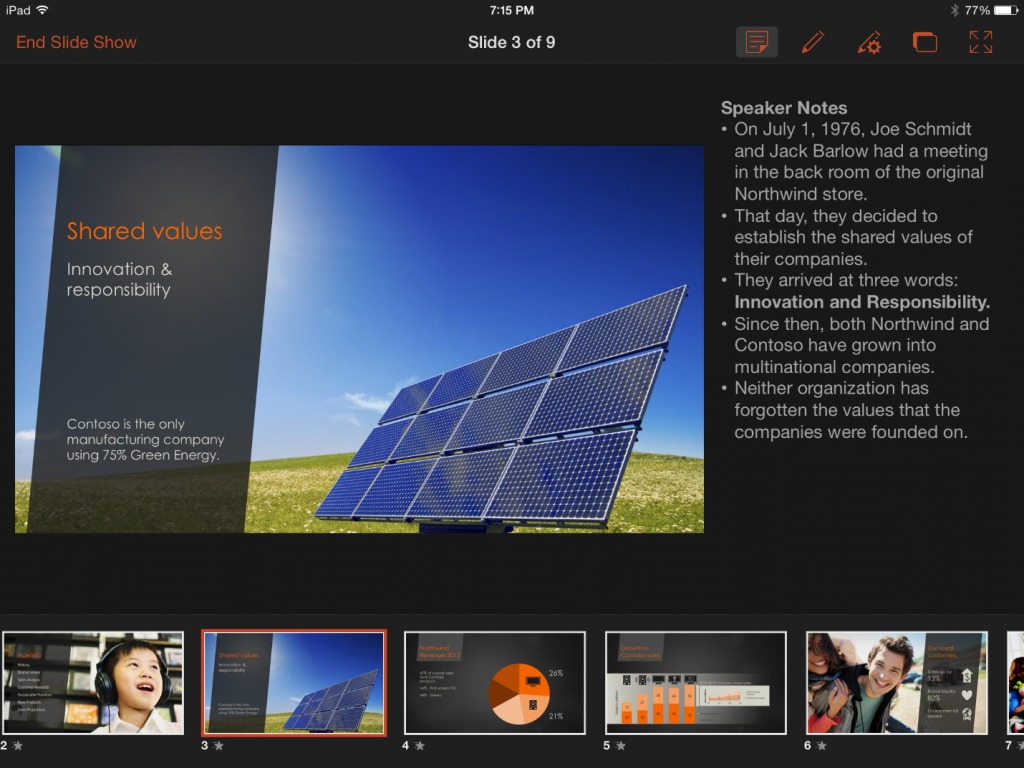
PowerPoint for iPad has added a Presenter View for seeing and editing notes, previewing the next slide, and jumping to other slides, all while running the presentation. The app also lets you play video or audio during a presentation, insert videos from the Camera Roll, add and edit hyperlinks, and use new pen and eraser settings for making and removing annotations during a presentation.
Microsoft earlier addressed one other major shortcoming, by adding printing support, so with this update the company has filled in the biggest holes in the Office apps.
I previously noted other, less-critical shortcomings in Office for iPad, and these remain, for the most part. They include the lack of access to the camera from within any of the apps, no Open In feature for handing content off to non-Microsoft apps; and document sharing that’s limited to email (as a link or attachment).
I don’t expect Microsoft to offer any Web-based file sharing and backup options other than its own OneDrive (previously known as SkyDrive). Apple and Google favor their own such services over independent services like Dropbox as well, so this is hardly a shocker.
Microsoft has also released updates to iOS and OS X versions of OneNote, the free note-organizing app that is offered separately but has an identical look and feel to its Office cousins and is, for all intents and purposes, an Office app.
The OneNote updates include access to OneDrive for Business and Office 365 notebooks; unlocking of password-protected content created in OneNote for Windows; inserting of attachments, including PDFs; improved note organizing, including rearranging; and copy-and-paste improvements. OneNote for Mac also makes it possible to send notes in the bodies of email messages, rather than just as PDF attachments.
But OneNote still has a long way to go before it will tempt me into defecting from my note-keeping standby, Evernote, as I concluded in “Microsoft’s OneNote takes on Evernote” (6 May 2014).
Four Smartwatches Reviewed: Cookoo, Martian, MetaWatch, i’m Watch
A little over a year ago, I mused in TidBITS about what was coming with wearable computing in “Pondering the Social Future of Wearable Computing” (29 May 2013) and predicted that smartwatches would be adopted more rapidly than heads-up systems like Google Glass. Today, with market penetrations of both approaching mere microscopic fractions of a percent, the jury is obviously still out — but I can award myself a prognosticator’s medal for predicting which market would be busier. It’s time to do an overview of what’s actually available as shipping technology. Steve McCabe covered the Pebble (see “Pebble Smartwatch Puts Notifications on
Your Wrist,” 29 Jun 2014), probably the most well-known of the shipping smartwatches; this article takes a look at four more entrants.
I attended the International CES earlier this year with a vague plan to cover “wearable technology” for TidBITS (see “CES 2014: CES Unveiled and the Startup Debut,” 6 January 2014). This rapidly became scaled back to “smartwatches,” because a team of fifty would have had trouble taking in the hundreds of exhibitors who claimed to have wearable breakthroughs. Many of whom, unfortunately, were referring to something utterly unrelated, like an iPhone case — marketing always trumps information in the CES catalog — but even so, the dozens of exhibitors who were genuinely unveiling fitness wearables were impossible to cover. (And also not in my journalistic wheelhouse, as my
fitness routine is neatly encompassed by a decent pedometer app.)
Even now, restricting this review to smartwatches and with enough models to cover my arm from wrist to elbow, the savvy reader will notice omissions. This review includes some well-known models and some unknown brands, but not others — a decision process that can largely be chalked up to which companies provided review models. If you’re looking for additional coverage, I recommend The Verge’s excellent 2013 roundup of smartwatches and wearables.
At press time, WWDC has come and gone without an Apple iWatch, but some are predicting it’ll be announced sometime before October. Personally, having heard dozens of rumors to this effect, I’ll believe it when I see it… but I’ll have some thoughts later on what it should look like.
What, Exactly, Is a Smartwatch? — This is the question that’s bedeviling the smartwatch market as the various watches compete to be the first computer you wear. But certain features jump out as being the obvious things you want a smartwatch to be.
A smartwatch shows you useful information. MetaWatch uses “the art of the glance” as their marketing tagline, and I think they’ve summed it up perfectly. A watch is an always-on tiny display that’s available in a second or less; flick your wrist to get your shirt cuff out of the way, and any watch will tell you the date and time, while also acting as a signaling mechanism to those around you about your fashion style.
Every smartwatch aims to provide you with more than just the date and time, but the crucial question is how each decides what information to show you. The smartest models use the iOS or Android notification system to pick what data is relevant, by replacing a standard watch face with a notification display that varies based on the type of notification coming in. Others require you to tap, swipe, or push buttons to get from one display to the next — which works fine in a situation where you’re able to fiddle with your toys, but not so much when you just want to know why your wrist is buzzing.
Unfortunately, one area where all smartwatches fall short is in their target markets. Smartwatches are large and clunky compared to the overall watch market, which means that, as Andy Ihnatko pointed out during a Q&A podcast, there simply isn’t a model that’s suitable for women to wear. Or at least, considering that all of the models under review feel a bit big by my (male, average-wrist-sized) standards, a woman would have to be even less fashion-conscious than I am in order to wear one of these. Until someone comes up with a smartwatch sized for women — and I’ll suggest how that might be possible later — keep in mind that I’m using guy-type parameters when I say that a smartwatch
feels normal or big and clunky.
A smartwatch provides a control surface. This is where smartwatches struggle most — that is, among those watches that attempt it at all. Nearly all smartwatches use low-power Bluetooth LE to communicate with your iPhone or Android phone, and let you communicate and control your phone with some combination of button-pushing, tapping, and swiping.
All of this happens on a screen that is, on a generously sized smartwatch, 50 millimeters (2 inches) or less across. You know that feeling of claustrophobia you can get when switching from an iPad to an iPhone? That happens in spades when using a smartwatch, where a huge screen is 240 pixels square. Putting that in iPhone terms, that’s 1/13th the real estate on your iPhone 5. The Pebble’s 144-by-168 pixel screen is black-and-white and has a display area of 24,192 pixels, which is about 1/8th the resolution of the 128K Mac from 1984 (512 by 342, or 175,104 pixels).
In other words, forget about using a tappable touchscreen as a smartwatch control interface; the ones that do are virtually unusable by any sentient race whose fingers don’t taper to a fine point. Which means the current generation of smartwatches are defined by how well their software is designed to use buttons and maybe swipes (rather than taps) to navigate their features. This is hard enough for the mere function of deciding which information to display — it’s even more fiddly and difficult when it comes to iPhone control.
A smartwatch is a watch. Not to discourage the manufacturers of smartwatches out there, but speaking as an early adopter who has eagerly taken possession of several smartwatches with the feeling of a kid at Christmas: I bought my first cell phone in the mid-1990s, and haven’t worn a regular watch since. My computers and gadgets sync with cellular networks and atomic clocks to tell me the exact time — why would I want to have one more device that simply duplicates that function?
A smartwatch has to be useful enough to get me back in the habit of wearing any watch. (And useful enough to overcome its price, which ranges from “probably not an impulse buy” to “you gotta be kidding me.”) And while I’ve already mentioned that my own fashion standards are a low bar to hurdle — does it go well with a T-shirt and jeans? — other potential purchasers are not so forgiving of what they’ll put on their wrists.
On to the reviews, where I’ve roughly ordered the contenders in least-to-most “smart,” which is absolutely not to say least-to-most “good.” Nearly every smartwatch in this review suffers from being too clever by half for at least some of its features, and would have been improved by having fewer features and more focus.
The Cookoo — Made by ConnecteDevice, The Cookoo is an analog watch with a grouping of fixed LCD indicators underneath the watch face. “Fixed” means that there’s no display, per se; instead, there are a half-dozen icons that turn on to tell you that there is a notification on your iPhone. You then have to use your phone to actually see what it is. Thanks to the lack of a display, the Cookoo has one clear design win — it runs entirely off two built-in watch batteries, and has no need to recharge. The Cookoo lists for $129 in the company’s online store, with the exception of the “limited edition” $249 watch that differs
only by being green.
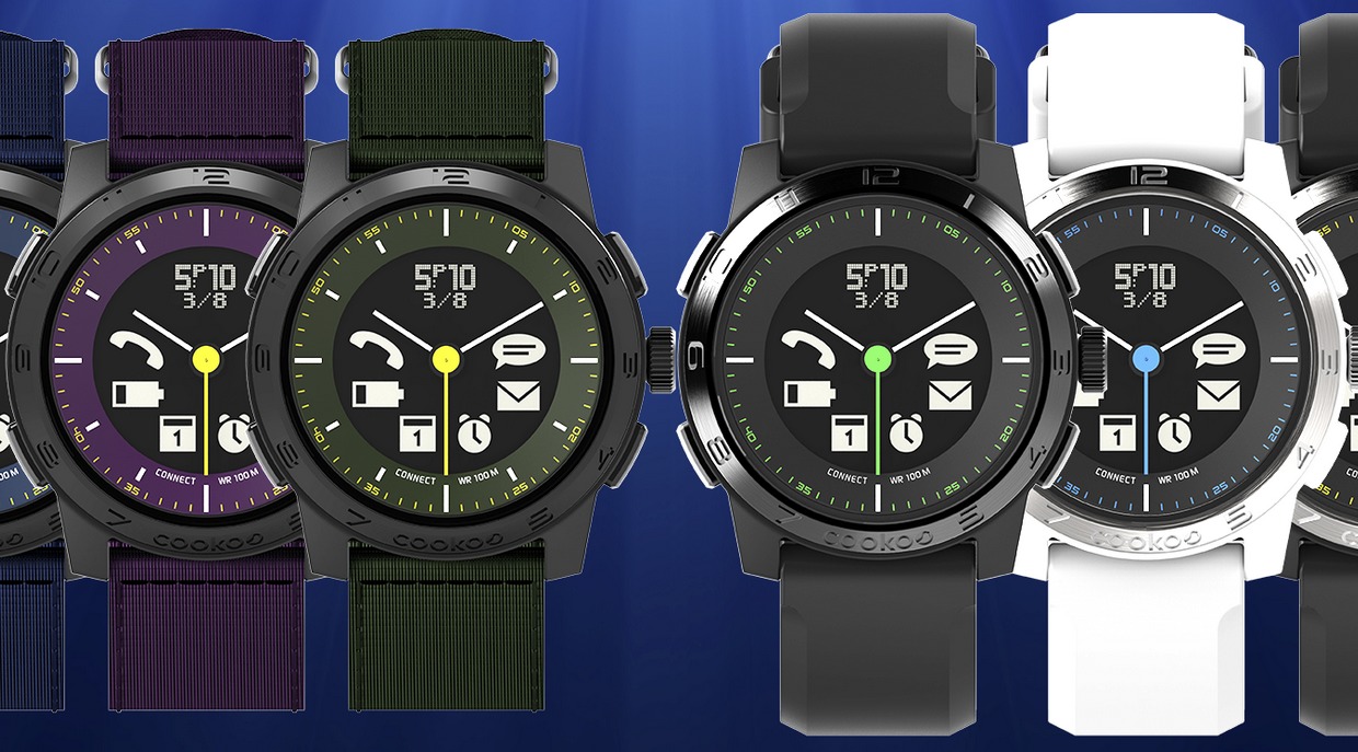
The Cookoo specifications say that the watch diameter is 44 millimeters (1.73 inches), which feels about right, and 16 millimeters thick (0.63 inches), which feels too thick. Perhaps it’s due to the limited functionality of the watch face, but a thinner case would be apropos here.
The watch connects via Bluetooth to a Cookoo app on the iPhone, where you can set preferences for which notifications appear on the watch, and theoretically update the watch’s firmware. (“Theoretically” because this function failed when I paired the watch, and I can’t figure out how to try it again.) The pairing operation is driven by the app and is even attractive, allowing initial setup without mucking about in Bluetooth settings.
That said, I have difficulty understanding who would be interested in Cookoo-style notifications. The amount of information that appears on the watch is not much greater than what the phone itself provides when it vibrates in your pocket; yes, you can tell the difference between a text message and a Facebook notification, but not the difference between an important email and any other that’s come in over the transom. The out-of-range alert goes off whenever you deliberately turn off Bluetooth or leave your phone behind. So when I first tried out the Cookoo with an earlier version of the connection software, I was distracted by near-constant buzzing on my wrist; now it’s possible to turn off the buzzing, but only by turning off
entire categories, such as email alerts. There’s a missing killer feature here — the capability to pass along notifications only from VIP lists rather than just anyone, which would make the Cookoo’s indicator icons substantially more useful.
Likewise, the Cookoo falls short in what it can tell the iPhone to do. A command button can be configured in the app, according to the documentation, to find a misplaced iPhone or check in to Facebook — but perhaps due to my upgrade woes, I couldn’t use this feature. I was able to take a picture remotely from my watch, but as that requires setting up the Cookoo app in advance and positioning the iPhone’s camera, it seems better done with a dedicated photo app.
So I’m confused whom the Cookoo is supposed to be for. It’s not smart or customizable enough for the technophile, who will receive far too many notifications to make the Cookoo’s display useful. It might be useful for the kind of person who has few notifications and frequently doesn’t carry his phone — provided he stays within Bluetooth range of it. Perhaps that’s why the Cookoo video of the kindly but forgetful grandpa is the strongest association I have with this watch, because it seems most useful for people who receive almost no notifications. And then why have a smartwatch at all?
Martian Watches — Martian’s line of Voice Command watches includes three models ranging from $249 to $299, all of which combine analog watch face, an LED notification window, and a two-way wrist radio — or at least, that Dick Tracy description is the first thing that comes to mind when using the built-in microphone and speaker. I reviewed the $299 Passport, the dressiest of the three watches; also available is the $299 Victory, which replaces the Passport’s square face with a round one, and the $249 G2G, which retains the square face but comes in a range of bubblegum colors.
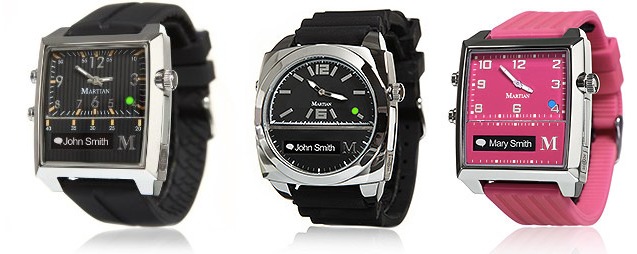
The Martian uses a built-in watch battery to power the analog watch, but needs to be recharged over micro USB to keep the smart notifier and Voice Command features working. The micro USB slot has a cover that feels a bit flimsy but has survived testing without breaking off. Compared to the “smarter” watches, it’s nice that the core watch functions continue to work (with the correct time displayed) even when you forget a recharge.
The Martian is paired to the iPhone under Settings > Bluetooth, and then configured with the Martian app. The app allows choosing which notifications are sent to the watch, but from a limited list: Facebook, Twitter, Calendar, Reminders, and one email account. I use Google Voice instead of Messages, so I couldn’t test whether iMessages are included in the always-on SMS notification, and likewise I can’t receive unsupported Google Voice SMS notifications. These limitations might be circumvented with some clever IFTTT automation actions (see “IFTTT Automates the Internet Now, but What Comes Next?,” 20 December 2013), but as with the Cookoo, the lack of more notification control is
jarring.
The bottom-left button brings up an in-watch display showing current settings, a world clock (or local date, omitted from the analog watch), and the current temperature. A double-press displays a menu for changing some of the watch’s settings, or using the watch as a remote camera shutter button. (Which presents an iPhone request for permission every time, so it’s not exactly hands-free.)
The top-left button invokes the Voice Command feature: press it, and the watch’s microphone connects you directly to Siri. In quiet environments, this works about as well as Siri usually does, but without the usual visual feedback. The button can also be used to pick up a call through the watch, like any Bluetooth headset. This has been more problematic, as more than once I’ve had an incoming call transferred to the watch when I’m trying to use the handset.
The Voice Command feature is clever, but I find it a bit too clever; how often are you in a quiet environment where you’d prefer to use the watch’s speaker and mic, rather than the excellent ones built into an iPhone? Martian suggests this is useful for “quick phone calls while jogging,” (now there’s a mental image!) but for people who feel like I do, the company has come out with a range of $129 Notifier watches that omit voice control entirely. I prefer the looks of the Passport over the Notifier, but all in all, I think dropping the voice feature will make for a better smartwatch.

MetaWatch — The MetaWatch is the smartwatch that’s currently the also-ran in the race against the Pebble; it’s also the only smartwatch aside from the Pebble that I’ve ever seen worn out in the wild. It includes a display that’s — brace for it — 96 by 96 pixels, which would need a magnifying glass to be seen on a Retina screen, but which doesn’t look too clunky thanks to good use of fonts and screen positioning.
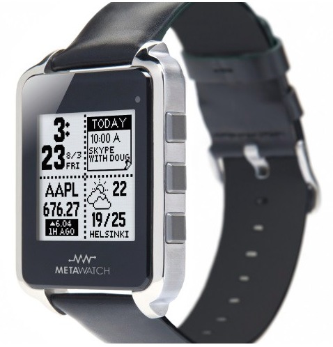
The MetaWatch syncs via Bluetooth to an app on the iPhone, which is a quick proposition — and that’s a good thing, since I had to resync to the iPhone every time the battery ran out or the MetaWatch came off a recharge. Recharging needs to happen only every two or three days, but it requires a dongle that connects to micro USB and then literally clamps onto the front and back of the watch. It works, but it’s one more dongle I fear losing.
The good news about MetaWatch is its clever design for selecting and displaying apps. It has four virtual screens divided into a 2×2 grid, which you set up on your iPhone. Apps for the watch, called widgets, are 1×1, 1×2, 2×1, or 2×2, so you can mix and match them so long as they’ll fit into the 2×2 square. I have my MetaWatch set up with a full-screen watch on the first screen; time-weather-iPhone battery on the second; full-screen calendar on the third; and full-screen weather on the fourth.
When notifications come in, they take over the screen briefly and display relevant parts of the message in a font ranging from small to tiny; despite the inherent limitations of the display, the screens are readable with either ambient light or the built-in LED. One oddity, though, is that black pixels pressed against the glass can cause a mirror effect, which gives the MetaWatch a unique look when glanced at from angle. A welcome controller in the MetaWatch app controls which apps can send notifications to the watch, so you have fine control over what appears on your wrist.
The other good news is that the MetaWatch ships with a lengthy list of widgets, which includes sports and stocks alongside the ones I mentioned earlier. The bad news is that there’s no app store and limited availability of new widgets; for example, MetaWatch pushed a widget with NBA scores during the playoffs, but nothing for World Cup results. You also can’t choose from a wide variety of watch faces as you can on the Pebble.
That said, the MetaWatch includes enough functionality to be useful, and I’m hard-pressed to think of what other widgets I’d add if I had them — which is why I’d like to see an app store of widgets to give me better ideas.
The MetaWatch is currently available from Best Buy or the MetaWatch online store. Prices range from $179 to $299, although Best Buy has them advertised from $79 to $99. The online store has switched from being out of stock to linking directly to Best Buy, which might presage the release of the forthcoming MetaWatch 2 with a higher quality screen, which was demoed at CES in January 2014.
i’m Watch — The i’m Watch from Italian company i’m S.p.A. made a major splash at the 2013 International CES; this splash may or may not have been coincidental with the fact that they gave away a pile of $389 watches to anyone who attended the press briefing. A year later, the price of an i’m Watch is now $349 (or $1,199 if you want the titanium-band version), but they’re not generating much press. This may because other reviewers discovered the same thing I did — it was impossible, in the 2013 version, to make it useful.
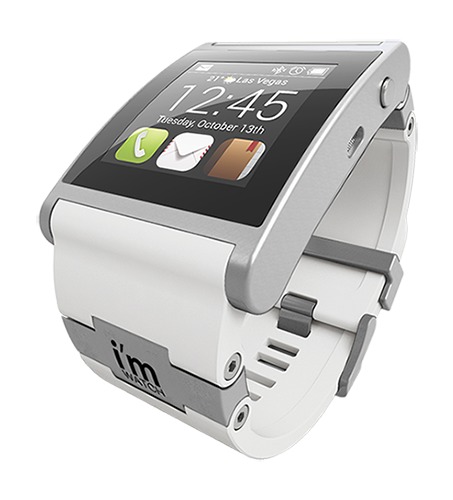
At first glance, the watch is gorgeous. It’s machined as well as an Apple device, and the silicone strap is perfectly functional and attractive. It’s almost comically big at 52.9 mm by 40.6 mm (2.08 by 1.6 inches), hosting a 240-by-240-pixel Android screen at 220 ppi. A USB recharging cable ingeniously charges the watch through its audio jack. A bunch of apps are included on the watch, and more are available through an online market. If you have four minutes to kill, watch this marketing
video to get an idea of why this product seemed, at first, like smartwatch manna from heaven.
The first time you start to realize there might be a problem is when you try to use an i’m Watch’s “watch” feature, because it requires a two-handed gesture to turn on the screen. It’ll be turned off most of the time to conserve battery. Once you can see it, the default display shows the time and temperature, and three default buttons that cannot be changed provide access to phone, email, and contacts. Scroll left for four more pre-selected apps, or right for the complete list. However, none of these apps can be set up within the watch; instead, you log into the i’m Cloud Web site to create your settings. The i’m Watch can fetch your contacts from your iPhone, but that’s where the integration stops. If you want to see
your email or calendar, you have to sync it with one, and only one, Gmail account.
It doesn’t pair with an iPhone, but rather uses Internet tethering over Bluetooth for its functionality. This drains the iPhone battery faster than Bluetooth pairing, but as the i’m Watch itself needs to be recharged twice a day with moderate use, you’ll have plenty of time to recharge your iPhone at the same time.
The i’m Watch has Facebook and Twitter integration, but I turned these services off quickly because while I’m happy to see a dozen notifications on my iPhone, they’re less useful two at a time on the i’m Watch. Then there’s the problem that you can’t reply or do anything with them. Likewise with i’m Mail, although there you can read (short, text-only) email messages in a much more reasonable small font. But you can’t read much in the News app, which displays only headlines. The Weather app can display temperatures for only three cities, and only the first city appears on the home screen; there’s no “current location” option, and if you want to change the home screen city, you have to manually delete it in
another setting or it’ll show up twice.
In the i’m Watch’s favor, I did make this note: “In a few years with improved software, this could be a really excellent gizmo.” Unfortunately, I don’t see anything in their newer video tutorial to indicate that they’ve improved anything. Most importantly, watch this video closely to see how difficult it is to set up and use an Android device on a tiny screen. The i’m Watch is an impressive feat of engineering, but unfortunately it resulted in a substandard product that even early adopters will find frustrating and limited.
The Winners — As I said earlier, men have several winning options right now, but women have to be more circumspect. The Pebble and the MetaWatch are neck-and-neck at press time by being what most people expect a smartwatch to be, and with divergent approaches to design that give them distinct strengths and weaknesses. I expect the MetaWatch to move forward shortly on some fronts with the forthcoming release of their newer, higher-resolution models, but Pebble to stay ahead with the diversity of its app selection. In a head-to-head competition, either could be chosen as a matter of personal preference.
The dark horse contender winning its own race is the Martian, which is the only model I’ve seen, let alone reviewed, that contends as a “dress smartwatch.” When not providing a notification, its LED screen mostly disappears into the bezel, and even in “smart” mode it’s quick and unobtrusive. A Pebble or MetaWatch is still a computer on your wrist, however fancy its housing. A Martian is a nice watch. Points can be given to the Withings Activité for also looking nice, but it contains only biometric sensors and doesn’t actually have any smartwatch functionality.
The Ideal Smartwatch — Since everyone else, including The Verge, seems to be doing it, I’m going to go out on a limb and suggest what I think the ideal smartwatch would be. And yes, I’m going to try to think in terms of what Apple would do, if the company decides to get into this crazy business. But I’ll be happy to see any smartwatch manufacturer get there.
First, the Ideal Smartwatch would have a high-resolution color screen. This is rather ironic considering that the only watches that do this now are Android, and based on the ones I have plus the reviews I’ve seen of the ones I haven’t covered, all of them stink. That’s because every Android smartwatch fails to reconfigure for sane inputs, no matter how nice their displays are. I expect this to improve when the first generation of Android Wear smartwatches hits the market — but while their demos are pretty, the rubber won’t hit the road until they’re in general use. Initial reviews of the bleeding-edge releases — the LG G and the Samsung Gear Live — put them in the same category as the i’m Watch for bulky hardware and short battery life. Wrist-top Google Now, however, is a potential breakout feature for upcoming hardware.
A back-of-the-napkin calculation of “Retina-ish” displays says that you could get a 1024-by-768 display on a men’s watch without making it the size of brick, and might even be able to get away with a 640-by-480 women’s watch.
This already pushes the ideal watch past the 2014 time horizon, presuming that you don’t want to spend $300 or more for one. Reasonably priced smartwatches today have black-and-white screens for good reason. Maybe Apple has a supplier chain that would allow them to get tiny color displays cheaper than anyone else; even if that’s so, since when has Apple competed on price?
Second, we need a revolutionary input mechanism. The Verge’s mockup uses the bezel dial as a scroller, which just strikes me as being a different kind of fiddly from “which button do I press to do what?” The Garmin Forerunner 410 GPS watch used a touch bezel that was generally disliked; the company dropped it in the next generation, relying instead on screen taps and physical buttons.
What’s the easiest thing to do on a watch? Tap its face. (Which is in part what Garmin did with the current Garmin Forerunner 620, in fact.) Give me a smartwatch where a single tap brings up a user-selected favorite app. If you want to get fancy, divide the face into halves, thirds, or quadrants — but no more — to bring up a range of apps, which you might indicate on the screen with favicon-sized reminder icons. A double-tap switches to a voice interface — built into the watch, not using a patch to the phone — that understands maybe 50 words, all of which launch individual functions.
I don’t care how many buttons or dials you have on your watch, nothing is as simple as “[tap] [tap] tomorrow” for a calendar, or “[tap] [tap] weather.” If an app needs Siri to work, such as “[tap] [tap] phone,” it can be activated and Bluetooth-connected after the built-in voice recognition does its job. (This, incidentally, is where Android Wear may have gone one better, as saying “OK Google” to a watch is even easier than tapping. But I think I prefer my tactile method until I’m convinced I won’t have to repeat it four times to get it to listen.)
Third, we need the price point. The R&D and manufacture of what I’ve just listed could easily result in a $500 watch, which might sail off into oblivion due to the tiny market of early adopters willing to buy one. But it might not.
Whoever pulls off the first Ideal Smartwatch needs to adopt Apple’s pricing strategy. The first iPhone cost $700; now you can get one (albeit, not the best one) free with a two-year contract. I think $500 for a first-generation Ideal Smartwatch is sane in a way that $1,500 for the first-generation Google Glass was not; let it be an early adopter, premium gadget that only a few people purchase, so long as the same model is cheaper a year or two later.
Meanwhile, I’ll be happy to see Pebble, MetaWatch, and Martian scrap it out in the $100 to $400 range with their different designs and solutions. I hope that by the time the Ideal Smartwatch manufacturer is competing with them on price, these three have improved their designs to be feature-competitive — or at least refined their designs to be exactly what your smartwatch should be.
FunBITS: Kindle Unlimited Is Pretty Limited
I was on vacation last week, which was a great opportunity to catch up on my reading. It was an ideal time to test the beach capabilities of my newish Kindle Paperwhite (for my initial impressions, see “Amazon Announces New Kindle Paperwhite,” 3 September 2013), which Amazon has long bragged about, as well as the recently launched Kindle Unlimited service.
Kindle Unlimited is Amazon’s answer to subscription book services like Oyster and Scribd. (For Michael Cohen’s take on Oyster and Scribd, see “FunBITS: Scribd and Oyster Aim to Be Netflix for Books,” 25 October 2013). For $9.99 per month, Kindle Unlimited promises open access to over 600,000 Kindle books, plus a generous helping of Audible audiobooks.
If you’re a voracious reader, that may sound tempting, but there’s a catch: none of the five major publishers are on board. That doesn’t mean that there aren’t some gems in Kindle Unlimited, which boasts the Lord of the Rings trilogy, the Hunger Games trilogy, and the entirety of the Harry Potter series.
The one thing that differentiates Kindle Unlimited from its competitors is that it’s natively compatible with Amazon’s Kindle ebook readers. Once you’ve subscribed, if you see titles in the Kindle Store that are labeled “kindleunlimited,” you can download and read them for free.
I’ve been critical of some of Amazon’s business decisions (like the removal of in-app purchases from ComiXology; see “Explaining the ComiXology In-app Purchase Debacle,” 3 May 2014), but I love the Kindle Paperwhite, which is the best ebook reader on the market. It’s small enough to fit into a large pocket but large enough to be readable; it has a clear, bright screen that’s easy on the eyes without being glaring; it has more storage than I’ll ever use; it suffers from few distractions; and it’s relatively cheap. I’m generally unenthused by Amazon’s other hardware devices, but in my book, the Kindle Paperwhite is a home run. It’s a simple device that has one function
and does it well.
That, as a whole, is the advantage that Amazon has in the subscription ebook space: the might of its thoroughly competent Kindle readers and the retail ubiquity of Amazon.com. Once you’ve subscribed to Kindle Unlimited, obtaining books is as simple as clicking or tapping Read for Free on an eligible title. The book will be sent to the device you specify.
Unlike Kindle Owners’ Lending Library (a side benefit of being an Amazon Prime subscriber), Kindle Unlimited works on any device with a Kindle app, like an iPad; the Kindle Owners’ Lending Library requires that you read on an actual Kindle device. If a book you download from Kindle Unlimited is listed as “with narration,” the corresponding audiobook will also be added to your linked Audible account, if you have one: just open the Audible app on your iPhone or iPad and you’ll see the book listed in your library automatically. Thanks to the magic of Whispersync for Voice, the ebook and audiobook will sync locations, a feature I would have killed for
when I was a commuter.
Amazon isn’t the first to offer a veritable smorgasbord of reading — besides Scribd and Oyster, as many snarky online commenters have noted, public libraries have been around for hundreds of years, and many have long offered ebook lending.
It’s a good point. Many public libraries have systems powered by Overdrive, where you can enter your library card number and send books to your Kindle for free. But while the Overdrive-based selection at my local public library was better than I expected, it suffered from artificial scarcity. I was able to check out Reza Aslan’s “Zealot” with no problem, which was great, but I came up short with just about every other title I tried. How about “The Hunger Games”? Available, but on hold. “Harry Potter and the Sorcerer’s Stone”? Available, but on hold. What about Neil Gaiman’s “American Gods”? You guessed it. I even tried what I thought was a somewhat obscure title on the
periphery of my to-read list — Pope Benedict XVI’s “Jesus of Nazareth.” Nope, on hold.
So yes, your local public library has a number of ebooks on offer, but you might have to wait before you can read them. This is purely due to artificial limitations on libraries imposed by publishers — some publishers even require libraries to pay for a new ebook license after a specific number of check-outs, in an attempt to simulate wear-and-tear on paper books in the virtual world.
The question is: is Kindle Unlimited worth the money? To find out, the TidBITS staff compiled an eclectic list of 30 books, of varying ages and subjects, all of which are available in the Kindle Store and which would currently cost you $232.12 if you bought them individually (prices, of course, are subject to change). I wanted to see how many of these books were available for subscribers of Kindle Unlimited, Oyster, and Scribd, and in Overdrive at my public library.

Of our 30 books, only 6 (20 percent) were available via Kindle Unlimited, 7 (23 percent) were available through Oyster, 8 (27 percent) through Scribd, and 13 (43 percent) were available through my library. However, of those 13, 10 were on hold. Financially, a Kindle Unlimited subscription would have accounted for $51.48 of our list, Oyster $40.54, Scribd $56.53, and if you didn’t mind waiting a short while, the library would save you $92.42 (plus the money you saved on subscription fees to a commercial
service). Dedicated library users often rely on “the shotgun method,” where you put several books you’re interested in on hold and receive them randomly as they become available, but that doesn’t help much if you need reading material right away.
We can take away a few lessons here. First, it’s worth your time to get a library card and see what’s available on your public library’s digital shelves. You’re likely already paying for your local library with your tax dollars, so you may as well use it. Second, there’s only a slim chance that these subscription books services, as they currently exist, will save you much money.
That’s not to say that Kindle Unlimited is a complete waste. Sure, it’s filled with virtual piles of self-published junk, but there are a host of gems to be found: the aforementioned The Hunger Games trilogy, Harry Potter, and Tolkien’s Lord of the Rings books; most of Philip K. Dick’s works; Ian Fleming’s James Bond novels; Anthony Bourdain’s “Kitchen Confidential”; and Thomas Piketty’s just-released “Capital in the Twenty-First Century.”
If you can identify a number of titles that you can read quickly, subscribing to Kindle Unlimited for a month or two might save you a pretty penny. Of course, you won’t actually own those books, but when you buy books encumbered by digital rights management, you never truly own them anyway.
That is, unless you strip Amazon’s DRM off the downloaded file, the method of which I leave as an exercise to the reader. But that leads to an excellent question posed by our own Michael Cohen: what’s to stop people from signing up for a free trial of Kindle Unlimited, downloading dozens of books, and then stripping away the DRM? Well, nothing, apart from general honesty.
There has been much talk about the effect of Kindle Unlimited on authors, but as a published author myself, I’m not terribly worried. First of all, ebook piracy is nothing new, and it’s usually the best-selling titles that are the most pirated (giving less popular books away might even boost sales). Second, it’s up to the publishers to decide if they will participate in Kindle Unlimited (Take Control books aren’t included). If Amazon isn’t offering enough money to the publisher, and thus the authors, those titles won’t be available on Kindle Unlimited. Sure, publishers don’t necessarily have authors’ best interests at heart, but they do have an
industry that they’re invested in maintaining — an industry that needs authors. Finally, Amazon is paying independent authors directly — if they sell exclusively through the Kindle Direct Publishing Select program and if a reader reads 10 percent or more of the book. Independent authors can choose whether or not they want to be included in Kindle Unlimited. Of course, this is an oversimplification of a complex situation that can affect each author differently.
In general, as a reader and writer, I’m in favor of anything that gets people reading more — including cheaper ebooks — even if I deplore Amazon’s strong-arm tactics with authors and publishers.
Another way to look at this: did Netflix kill the movie and TV industry? No, of course not — if anything, Netflix has been an overall boon to the movie and TV industry. (And yes, I realize there are significant differences between video and books.) As a recent example, AMC’s “Breaking Bad” was obscure until Netflix viewers started marathoning the villainous drug drama. In the recording industry, “Weird Al” Yankovic scored his first number one Billboard 200 album with the recent “Mandatory Fun,” likely thanks to posting eight free music videos and the entire
album on streaming audio services. In short, there’s no reason to assume that subscription services can’t enhance existing content markets.
With that said, what about readers? I can’t see Kindle Unlimited garnering that many subscribers as things stand now, with such a thin selection. $9.99 per month isn’t unreasonable, but only if you would get your money’s worth of books you want to read. By comparison, Marvel Unlimited, which focuses on comic books, charges the same $9.99, but has a vastly greater selection and most of the titles Marvel fans want to read.
Kindle Unlimited is a service that can please almost no one. It angers publishers, who see it as devaluing their products — a sentiment many authors share. Voracious readers will be frustrated, as they’ve probably read most of the good stuff on offer. And more leisurely readers will likely better off buying books individually. It’s not like Kindle books are all that expensive — relatively few exceed $10, thanks to Amazon’s insistence on cheap ebooks (backed up by court rulings against the attempts by Apple and publishers to raise prices, see “Apple Receives Final Judgment in Ebook Price-Fixing Case,” 9 September 2013). The only people likely to benefit from Kindle Unlimited
are self-published authors in the Kindle Direct Publishing Select program, for whom any increased exposure is a win.
Ultimately, what makes the existence of Kindle Unlimited rather pointless is the fact that for a $99-per-year Amazon Prime subscription and a Kindle (starting at $69), you get access to much of the same stockpile of ebooks (minus audiobooks), thanks to the Kindle Owners’ Lending Library. With Amazon Prime’s added benefits of free two-day shipping, streaming video, and streaming music, it’s hard not to see it as a better deal than Kindle Unlimited.
TidBITS Watchlist: Notable Software Updates for 4 August 2014
Paprika 2.0.4 — Hindsight Labs has released Paprika 2.0.4 with a number of handy additions and fixes for the popular recipe manager (for our review, see “FunBITS: Paprika Recipe Manager for iPhone, iPad, and Mac,” 14 March 2014). The update adds support for scaling recipes by arbitrary percentages, options for printing a larger photo and a two-column layout, support for duplicating recipes, the capability to export a single recipe directly, and support for users with multiple keychains when storing Paprika Cloud Sync credentials. When copying images from the browser, Paprika will also
copy them to the clipboard for pasting into an existing recipe. The app also squashes a bug related to re-saving recipe photos unnecessarily, fixes a bug that prevented the contextual menu from appearing after Control-clicking, and fixes a problem related sorting of recipes when in the detailed list mode. ($19.99 new from the Mac App Store, free update, 3.5 MB, 10.8+)
Read/post comments about Paprika 2.0.4.
ChronoSync 4.5.2 — Econ Technologies has released ChronoSync 4.5.2 with a large assortment of fixes for the automated synchronization and backup app. The update now produces more meaningful error messages if Rename, Delete, or Duplicate tasks fail, squashes several bugs associated with displaying the Document Organizer (introduced in version 4.5; see “ChronoSync 4.5,” 11 June 2014), fixes a problem with the Last Synchronized column in the Analyze and Archive panels that resulted in erroneous values, eliminates some inefficiencies in the copy
engine, improves collection of file metadata, and fixes several cosmetic glitches. ($40 new with a 25 percent discount for TidBITS members, free update, 41.6 MB, release notes, 10.6+)
Read/post comments about ChronoSync 4.5.2.
Mellel 3.3.6 — RedleX has released Mellel 3.3.6, a small maintenance update for the word processing app. The release puts a halt to the appearance of the “mysterious” systemParStyle paragraph style that appeared in the paragraph style list after setting the style to a paragraph containing a citation or hyperlink. It also adds support for Traditional Chinese DOS encoding (fixing a problem that garbled styled Chinese text when pasting from Scrivener), and fixes a couple of bugs that caused crashes: one when editing and saving documents that contained empty citations and hyperlinks, and another when editing around inlines that
contained tracked changes. ($39 new from RedleX and the Mac App Store, free update, 101 MB, release notes, 10.6+)
Read/post comments about Mellel 3.3.6.
OmniFocus 2.0.2 — The Omni Group has released OmniFocus 2.0.2 with several fixes and a change to the initial setup of the Getting Things Done-inspired task management utility (see “OmniFocus 2 for Mac Brings a Fresh Look to GTD,” 22 May 2014). The update fixes a bug that caused the clipping service to fail silently if invoked when OmniFocus wasn’t running, fixes an issue that prevented stale clients from being pruned (and thus preventing database compaction), and fixes a hang that occurred during low system memory conditions. When setting up OmniFocus for the
first time, the app now offers to import an existing OmniFocus 1 database or create a new empty database if you choose a cloud location that doesn’t already contain an OmniFocus database. ($39.99 new for Standard edition and $79.99 for Pro edition from The Omni Group Web site, $39.99 for Standard edition from Mac App Store (with in-app purchase option to upgrade to Pro), free update for version 2.0 licenses, 44.2 MB, release notes, 10.9.2+)
Read/post comments about OmniFocus 2.0.2.
ExtraBITS for 4 August 2014
Apple has launched its content delivery network with the participation of leading ISPs, which should lead to faster streaming and downloads for users. Also, Apple’s “Stickers” ad has lead to a surprising boon for makers of MacBook stickers and decals.
Apple’s “Stickers” Ad a Boon for Decal Makers — Apple’s “Stickers” ad was surprising because it actually encouraged owners to customize the sleek aluminum MacBook Air. According to a piece in MacStories, the ad also led to a happy, if unintended side effect: sales of MacBook stickers and decals are soaring. Benjamin Clark of The Decal Guru said they saw a quadrupling of orders after the ad, and Etsy sellers also reported similar gains.
Apple’s CDN Is Live — Apple has completed the CDN, or content delivery network, it began building last year. A CDN distributes content among multiple servers and data centers in order to spread out the load and better serve demand. Dan Rayburn of StreamingMediaBlog.com has spoken to ISPs and discovered that Apple’s CDN is capable of handling ten times the capacity the company currently uses, which will come in handy for the releases of iOS 8 and OS X 10.10 Yosemite, plus upcoming features like iCloud Drive, iCloud Photo Library, and any possible expansions to its streaming media services.
To ensure smooth traffic flow, Apple has secured interconnect deals with ISPs like Comcast — which may explain in part why Apple has been so quiet regarding net neutrality.