TidBITS#1236/18-Aug-2014
Whether you’re a current student or a lifetime learner, you can save 50 percent on all Take Control ebooks this week in our Back to School sale! For TidBITS members following along with Charles Edge’s in-progress “Take Control of OS X Server,” we also have a chapter explaining how to run wikis and blogs in OS X Server, something that nearly any organization can use. You may not associate Android with productivity, but Julio Ojeda-Zapata has discovered that Samsung’s larger tablets are surprisingly capable. Sadly, comedian and actor Robin Williams died last week, and we say goodbye to a fellow Apple fan with a few Macworld pictures and Jeff Carlson’s story about his brush with fame. Photographer Charles Maurer returns to TidBITS to review the Fujifilm XQ1 point-and-shoot camera, which is capable of producing professional quality photos when paired with the Photo Ninja app. FunBITS continues the focus on photography, with Michael Cohen returning from vacation to review PhotoCard, a modern take on the postcard from Apple legend Bill Atkinson. Notable software releases this week include Fission 2.2.2, Alfred 2.4, Delicious Library 3.2.2, CloudPull 2.5.4, Corel Painter 2015, and Safari 7.0.6 and 6.1.6.
Save 50% in Take Control’s 2014 Back to School Sale
Whether August means heading back to school for you personally, or you consider learning to be a lifetime endeavor, we’d like to make it easier for you to pick up new skills. Through 25 August 2014, you can add any number of our ebooks to your Take Control library for 50 percent off the cover price. All our books are DRM-free and available in PDF, EPUB, and Mobipocket (Kindle) formats, so you can read wherever, whenever, and on whatever device you like. (Though we certainly hope everything works properly, if our site is overloaded by sale traffic, try again later in the day when things have settled down.)
We don’t expect you to read every one of our books cover to cover, much as our authors would be tickled if you did. Instead, each book has a Quick Start section that gives you a look into the book beyond the Table of Contents so you can jump instantly to the sections that will teach you what you want to know.
Whether it’s dealing with passwords, upgrading your wireless network gear, getting a handle on Apple’s Pages word processor, automating repetitive tasks on your Mac, or finally writing your own book in Scrivener or iBooks Author, we have a title to help. We also have ebooks about iCloud, Mail, FileVault, iBooks, CrashPlan, PDFpen, TextExpander, setting up a paperless office, and more.
What can you learn from our expert authors? Tons. Here are some highlights:
- Passwords: Develop a secure password strategy that won’t slow down everyday activities, thanks to Joe Kissell’s best-selling “Take Control of Your Passwords.” Also don’t miss Joe’s “Take Control of 1Password,” about the popular 1Password 4 password manager.
- Wireless networking: Upgrade your wireless network with Glenn Fleishman’s “Take Control of Your Apple Wi-Fi Network.” The book will help you extend the range with multiple AirPort base stations, add USB drives and shared printers, enable security options, and more.
-
Pages: Find in-depth guidance for using Apple’s Pages for all manner of word processing tasks and to create visually attractive, media-rich layouts. In Michael E. Cohen’s “Take Control of Pages” pre-book, you’ll find 200+ pages documenting Apple’s rewritten Pages 5 for Mac, iOS, and even iCloud. Since “Take Control of Pages” is in progress (Apple keeps making changes!), it’s available only via Leanpub, but you can still save 50 percent with this link.
-
Apple TV: Apple’s diminutive streaming media box is much more than a conduit to the iTunes Store. Find out how to play a wide variety of media and have more fun with “Take Control of Apple TV,” by Josh Centers.
-
Podcasting: Start podcasting or improve your podcast with the recently updated third edition of Andy Affleck’s “Take Control of Podcasting on the Mac.”
-
Dropbox: Enjoy a thorough look at how to use Dropbox — particularly the non-obvious bits — for file transfer and collaboration with Joe’s “Take Control of Dropbox.” (But don’t be deceived; as useful as Dropbox is, it does not a backup strategy make. The definitive word on backups remains Joe’s “Take Control of Backing Up Your Mac.”)
-
iTunes: Manage your music collection and find your way around iTunes more effectively with Kirk McElhearn’s tips in “Take Control of iTunes 11: The FAQ,” where he answers oodles of questions about playing, ripping, buying, tagging, viewing, organizing, searching, syncing, sharing, and burning your music.
-
Automation: Make working on your Mac less tedious, more accurate, and more easily repeated with “Take Control of Automating Your Mac,” also by Joe. (For even more Mac mojo, don’t miss his “Take Control of the Mac Command Line with Terminal.”)
So stock your Take Control library today with the titles that you’ve been wanting to read or that you think might become useful in the future — remember that we give readers minor updates for free, so your library can stay up to date throughout the year!
Thanks for your continued support, and the many useful questions and kind comments you’ve sent over the years. And please, if you would do us a quick favor, spread the word about this sale to friends and colleagues!
RIP: Robin Williams, One of Us
On 11 August 2014, Oscar-winning actor and comedian Robin Williams died, of an apparent suicide. Apple CEO Tim Cook posted a rare tweet with his condolences, and Apple made the unusual decision to honor him on its Web site. But maybe that shouldn’t come as a surprise, since Williams’s voiceover from the 1989 “Dead Poets Society” kicked off Apple’s Your Verse ad campaign.
But we also know that Williams was something of an Apple fan, attending Macworld Expo in 2005 and again in 2007. In fact, our own Jeff Carlson nearly bumped into him — literally — at the 2005 show.

(Photo courtesy Graham Keith Rogers.)
Back when Macworld Expo was a much bigger event (when that was the way Apple revealed all of its important new products), you’d occasionally see celebrities who were just as geeky as us. One year as I was walking the crowded aisles, I nearly collided with a man in a hurry. In a split second I recognized Robin Williams, loaded with tchotchkes and smiling his wide grin. I could tell this was the speed he needed to use to see the show floor without becoming trapped by dozens of fans. As he rushed by, a woman behind me yelled, “We love you Robin!” He smiled even more broadly, but kept on moving.
Robin Williams was one of the funniest comedians and best actors of our time, and it makes this sad news all the more poignant to know that in some ways, he was just like the rest of us.
(Of course, the Mac world has another Robin Williams, the woman best known for penning “The Little Mac Book,” “The Mac is Not a Typewriter,” and numerous other books about the Mac, desktop publishing, Web design, and Shakespeare. Last we heard from her, she’s alive and well.)
Chapter 11 of “Take Control of OS X Server” Now Available
Last week in the streamed “Take Control of OS X Server,” we looked at what was necessary to run a general-purpose Web site. But if your goal is instead to host a wiki or a blog, you don’t have to mess with the Web service at all. Instead, in Chapter 11, “Wiki Services,” Charles Edge explains how to enable OS X Server’s Wiki service, and how to create your own wikis.
The massively popular Wikipedia is the best known example of a wiki, but with OS X Server, anyone can set up and run a wiki, whether it’s for a family, a class, a volunteer organization, or a business. Wikis are tremendously useful, because they allow anyone (to whom you’ve given permission) to create and edit pages, spreading the load and enabling those who have information to share it without going through a webmaster or other gatekeeper.
You can use a wiki for household documentation, employee manuals, process lists, collaborative class projects, and nearly anything else that can be created with text, graphics, and links. Plus, with a click of a single checkbox, a wiki can also host a blog, with chronologically arranged posts that are nothing more than special wiki pages.
There’s almost nothing to do in the Server app when it comes to enabling the Wiki service; the main work comes in setting up your wikis. It’s not hard, but it’s worth putting some thought into setting permissions, choosing the theme, and creating a skeleton for the site. Users aren’t likely to build the site you envision on their own, but if you give them a framework in which to work and encourage them, they’ll be more likely to add the necessary content. Frankly, I could easily see small organizations running OS X Server just for the Wiki service; it’s that useful.
We encourage everyone to read the first two chapters of “Take Control of OS X Server” to see where the book is going — all subsequent chapters are available only to TidBITS members for now. If you have already joined the TidBITS membership program, log in to the TidBITS site using the email address from which you joined. The full ebook of “Take Control of OS X Server” will be available for purchase by everyone in PDF, EPUB, and Mobipocket (Kindle) formats once it’s complete. Published chapters include:
- Chapter 1: “Introducing OS X Server”
- Chapter 2: “Choosing Server Hardware”
- Chapter 3: “Preparation and Installation”
- Chapter 4: “Directory Services”
- Chapter 5: “DNS Service”
- Chapter 6: “File Sharing”
- Chapter 7: “Collaboration Services”
- Chapter 8: “Mail Services”
- Chapter 9: “Mobile Device Management”
- Chapter 10: “Web Services”
Publishing this book in its entirety for TidBITS members as it’s being written is just one of the ways we thank TidBITS members for their support. We hope it encourages those of you who have been reading TidBITS for free for years to help us continue to bring you more of the professionally written and edited articles you’ve become accustomed to each week. For more details on what the membership program means to us, see “Support TidBITS in 2014 via the TidBITS Membership Program” (9 December 2013).
12.2-Inch Samsung Galaxy Tablets Bring Productivity to Android
In the initial installment of this informal series about potentially unexpected hardware choices for Apple users, I wrote about the iPad Air as an alternative to the MacBook Air (“iPad Versus MacBook for the Mobile Writer,” 17 February 2014), focusing on writing. That made sense, thanks to the addition of one of the many third-party keyboard covers and cases that turn the iPad into a quasi-laptop.
I did note one big problem with such an arrangement: These keyboards are cramped by necessity to fit the iPad Air’s compact dimensions. Even though the keyboards built into such peripherals are tailored to the iPad’s lengthier landscape orientation, typing on them is not as comfortable as using a roomier desktop keyboard.
Comfort plays a significant role in two other mobile-productivity setups in this series, Google Chromebook notebooks (see “Google Chromebook Makes for a Fine Auxiliary Laptop,” 24 February 2014) and Microsoft Surface tablets (see “Microsoft Surface: A Tale of Two Computers,” 11 March 2014). The physical keyboards used in both scenarios are roomier, and therefore more appropriate, for extensive typing.
This leads me to a fourth kind of mobile-productivity setup, consisting of tablets that run Google’s Android operating system, along with their associated keyboard accessories.
Android tablets are direct competitors to Apple’s iPads, unlike Chromebooks, which compete more with inexpensive Windows laptops. Android tablets are available in a wider range of sizes, and from a variety of makers, including Acer, Asus, Amazon, Lenovo, Motorola, Samsung, Sony, Toshiba, ViewSonic, and others. Google even sells its own Nexus-branded tablets in partnership with hardware makers like Asus and Samsung.
Android tablets tend to be more affordable than their iPad equivalents, too. For instance, my favorite Android tablet, Google’s 7-inch Nexus 7, starts at $229. The cheapest comparable Apple tablet, a 7.9-inch iPad mini without a Retina display, starts at $299. Acer’s 10.1-inch Iconia A3 is $250, while the cheapest Apple equivalent, a 9.7-inch iPad with Retina display, is a relatively whopping $399.
Despite this cornucopia of choices, I have long been skeptical of the Android world in a mobile-productivity context for a couple of reasons.
First, app choices on Android are not as good as they are on Apple’s iOS platform for those wanting to accomplish real work. As I noted in my iPad Air article, iOS users have a stunning assortment of apps just for writing. The choices on Android are not as ample or appealing, though there are good some options.
Second, there are fewer keyboard covers and cases for Android tablets, though some that are available are nice. Belkin, Logitech, and ZAGG are among the hardware makers catering to Android users with high-quality typing add-ons. Regardless, these accessories suffer from the same cramped-typing conundrum that iPad users confront. For keyboards to match Android tablet dimensions, the keys must by necessity be scrunched.
My advice for those seeking a tablet expressly for productivity has rarely wavered: Get an iPad if at all possible. You will probably be happier.
Recent developments on the Android hardware and software fronts (including one from Microsoft) have caused me to shift my thinking on this a bit, at least for those who are otherwise invested in the Android ecosystem.
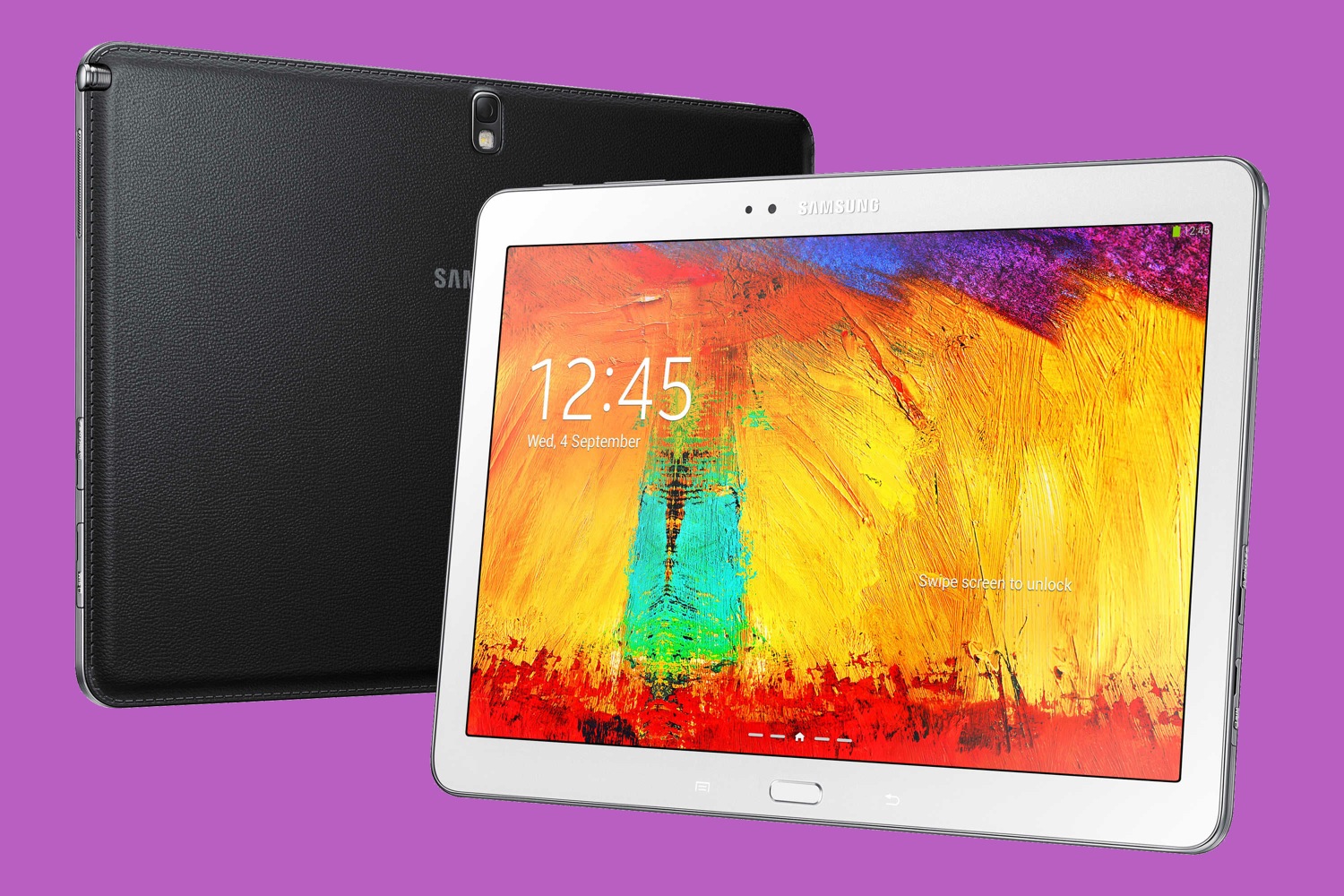
Most notably, Samsung released additions to its Galaxy Note and Galaxy Tab tablet lines with one big new feature: they are extra large at 12.2 inches. This is unusual in the Android ecosystem, where hardware tends to tops out at 10 inches or so. Apple’s iPads are no larger than 9.7 inches, too.
Here’s the Note Pro, followed by the Tab Pro:
Such gigantic Samsung tablets would not mean much to me in a productivity context without decent keyboard options to go with them, but several companies have delivered. Logitech has released a Logitech Pro keyboard case for each of these jumbo tablets.

ZAGG offers a Cover-Fit keyboard case for each of the tablets, too.

I recently tested a 12.2-inch Galaxy Note Pro with the corresponding Logitech and ZAGG keyboards, and I’ve been pleasantly surprised overall.
The Hardware — The new tablets are surprisingly portable for their size at only 0.31 inches (7.9 mm) thick (only 0.2 inches or 0.4 mm thicker than an iPad Air) and weighing a not-bad 1.6 pounds or 726 grams. The iPad Air is much lighter at 1 pound or 469 grams, while the original cellular iPad weighed 1.6 pounds. These aren’t gadgets you can hold in one hand while reading an ebook in bed — at least not for long — but they don’t come off as beasts on the couch.
Their 2,560-by-1,600-pixel screens are stunners, too, and fantastic for Hulu and Netflix. That’s almost a million more pixels than the iPad Air’s 2,048-by-1,536-pixel resolution.
With the addition of a keyboard, I could see real potential on the productivity front.
The Logitech keyboard case is my favorite. Its sturdy, folio-style exterior keeps the tablet nicely protected when it is not in use. When it’s time to work, the top cover with attached tablet flips upward, and the Galaxy Note fits firmly into a slot just beyond the keyboard in a landscape orientation.
The tablet also can be removed from the case and placed into the slot in portrait mode, but that’s a bit of a stretch given the tablet’s roughly 16-by-9 screen ratio, which makes it comically tall in a portrait orientation.
The Logitech keyboard is what won me over. It is wider than any iPad keyboard case I’ve seen, and wide enough that I never felt cramped. Chiclet keys — little squares with rounded corners — are subtly scooped for a superb tactile feel.
(I immediately thought of Logitech’s Ultrathin Keyboard Folio for iPad Air, whose keys bulge upward, not downward, for a far-less-pleasing typing experience. Why Logitech went one way with its Android keyboard, and another with its otherwise superb iPad accessory, is beyond me.)
The Galaxy Note Pro with the Logitech Pro case amounts to a top-notch mobile workstation, albeit one that is a bit bulkier than a MacBook Air or Windows Ultrabook. This was not a major drawback for me as I used the hardware combo at home, work, and a parent committee meeting at my son’s high school. I entered the latter with the gear tucked under an arm, flipped it open in a heartbeat at the meeting table, and began taking notes.
So why not just get a laptop, such as my beloved MacBook Air? (See “How Does the MacBook Air Compare to the Latest Ultrabooks, Surface?,” 3 July 2014.)
That’s a valid question, and one to consider carefully, but I like that this Android arrangement allows for the tablet’s removal to be used in touch-only mode on a whim. That’s a nice bonus.
Another great feature, Verizon cellular data access, made me all the more productive on the Note Pro at that parent meeting. At one point, when purchase of a domain name was called for, I was able to complete the transaction right on the spot, despite not having Wi-Fi access. My fellow parents were impressed.
I’m not as taken with the ZAGG keyboard case, which is the kind of device that clamps over a tablet’s screen for protection when the hardware is not in use. That’s fine, and ZAGG has made fine keyboard cases for iPads, but its Galaxy Note Pro model strikes me as a bit chintzy. The keyboard is roomy, but its flat keys don’t feel as good as the scooped Logitech ones. Getting the case on and off the tablet is a chore, too, and I don’t like that the tablet’s back is left unprotected.
On the plus side, the ZAGG keyboard case and the Note Pro make for a far less bulky package. The back of the case has a pleasing texture, though with the same ugly faux stitching that Samsung favors.
One of these jumbo Samsung tablets with a companion keyboard case and, optionally, cellular-data service will come at a steep cost. Verizon, for instance, charges $749.99 for the Galaxy Note Pro with a two-year wireless commitment, which is $42.49 a month. You can also buy the tablet without the cellular service for $849.99, and activate that later.
You can buy either tablet without wireless capability at a lower cost, but I found such prices to be highly variable. On Amazon.com, for instance, I found the Tab Pro model with 32 GB of storage listed for $543.99 and the 32 GB Note Pro for $647.99. This is cheaper than a MacBook Air, but you have to also factor in the cost of the keyboard case at $99 for the Logitech model or $78.45 for the ZAGG variant.
One final hardware-related note: at one point my Galaxy Note Pro went berserk, throwing up error messages by the dozens on launch and relaunch, creating a horrid kind of paralysis I could resolve only by doing a hard reset to restore it to factory defaults. I never figured out what the issue was, and it happened only once, but I feel duty-bound to report it. To be fair, I have occasionally experienced such extreme malfunctions on the iPad as well.
The Software — Productivity software for Android is a mixed bag, as I’ve mentioned. Those who need to write, for instance, do not have as many options as their iOS counterparts, and few such apps display the spectacular styling and attention to detail that is routine in the iPad world. As a writer, going from iOS to Android isn’t like going from heaven to hell — but I’d definitely describe Android as purgatory.
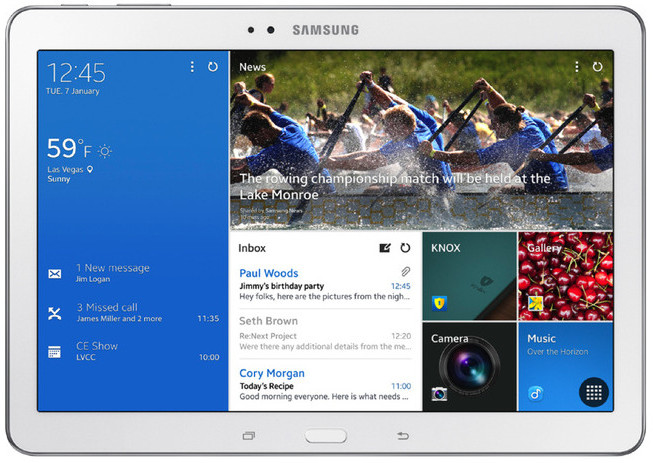
Samsung positions its jumbo tablets more for business than for pleasure, but its software offerings did not impress me as much as Apple’s iWork iOS apps have.
There is something called Hancom Office on the Galaxy Note, but I couldn’t figure out how to switch it from file-viewing to file-editing status, and I therefore don’t have much to say about it. This is not an anomaly. Samsung insists on offering its own download mechanisms for certain apps, and while it does not block the Google and Amazon app stores, its in-house app infrastructure is a glitchy, opaque nightmare.
Samsung tries to capitalize on the Galaxy Note’s large screen size with supposedly productivity-enhancing features that come off as gimmicky. There’s a desktop-style option for having multiple floating app windows arranged on the screen at the same time, but this proved to be a hassle and I quickly reverted to the classic one-app-at-a-time format that Apple continues to emphasize. Besides, only a subset of the apps on my tablet were compatible with this “Multi Window” mode, which defeated the purpose.
My Note Pro loaner included a stylus, as all Galaxy Note models do to set them apart from their Tab cousins. The Note Pro is loaded with stylus-friendly apps, including sketchbook, note, and memo apps. I am not a stylus guy, so they don’t do much for me, but I can see how they might appeal to others.
I used the Note Pro the same way I have used all other Android tablets — with a combination of app icons and interactive widgets (for Gmail, Google Now, Flipboard, the New York Times, and others) on a handful of screens. The difference was that everything looked big and beautiful due to the Galaxy Note Pro’s extra-large display dimensions.
For productivity (which primarily means writing for me), I turned to all the usual app suspects, most of which have never thrilled me. These include Google Docs, which I use heavily in Web-based form on PCs and Macs and in app form on iOS devices, and Microsoft Office-like apps such as Docs To Go, Polaris Office, Kingsoft Office, OfficeSuite Pro, and others.
Google Docs, my default on all mobile devices, works on Android pretty much as it does on iOS (as in, just fine, thanks). (For my take on the latest Google Docs apps for iOS, see “New Google Docs, Sheets Apps Aid Mobile Collaboration,” 3 June 2014.)
Among the others, I like OfficeSuite Pro the best. Still I feel like that kid on a tricycle in “The Incredibles.” When Mr. Incredible barks at him, “What are you waiting for?” the tyke responds, “I don’t know. Something amazing, I guess.” Office-style apps for Android are reasonably functional, but they never amaze.
That is where the aforementioned Microsoft comes in. The software giant recently released a version of its Office suite for the iPad to nearly universal acclaim and solid sales (see “Office for iPad: A Deep Look,” 3 April 2014).
The company said at that time that it has been working on touch-friendly versions of Office for Windows-based tablets and for Android devices.
Microsoft Office is the last piece of the puzzle, the remaining element to make Android (and notably these 12.2-inch Samsung tablets) serious productivity rigs. The only problem is that Microsoft gave no clue when the Android version of Office might be released — it could be months (but hopefully not years) away.
Still, I am excited to finally add Android to my list of mobile-productivity platforms. It has been a long time coming. The combination of the 12.2-inch Samsung tablets and the currently available Android productivity apps won’t excite iOS users or cause significant numbers to defect, but it is sure to delight Android stalwarts who have until now lacked anything that could compete with the iPad in any significant way. Sometimes bigger really is better, at least when it comes to tablet productivity.
Fujifilm XQ1: A Professional Point-and-Shoot?
Imagine celebrating your spouse’s birthday on a sunny afternoon. You are dining in one of the fine restaurants of France. Your table is on a shaded terrace alongside a medieval canal. Half-timbered houses line the canal and flowers hang everywhere. This is JY’s in Colmar, and here is how I saw it.

Now imagine you want to capture the scene in a snapshot. You are carrying a simple point-and-shoot in your shirt pocket, so you whip it out. Voila! The blue sky you see turns white and the green foliage goes black in the shade.

This second picture is typical of pocket-sized cameras, and it shows their primary limitation. To take a picture is to spray photons of light at an image sensor. Where only a few land, the sensor records mostly its own electronic noise. More photons mean brighter tones, but pocket-sized cameras have image sensors that are too small to handle many photons without being overloaded. This greatly constrains the dynamic range — the range of brightness between pure black and pure white — that a little camera can capture. I never
would have expected that any little camera could produce the photo with the blue sky above.
But a little camera did, a $400 Fujifilm XQ1 that I pulled out of my shirt pocket during lunch.
A Porsche Under the Hood — The XQ1 is a point-and-shoot camera that looks like any other and can be used as simply as any other, but it has a high performance engine under the hood: a small version of Fuji’s X-Trans sensor. (For a description of the X-Trans sensor, see “The Lazy Man’s New Camera: the Fujifilm X-E2,” 19 March 2014.) Unlike most point-and-shoots, the XQ1 can save raw files for later processing as well as produce JPEGs. On top of that it offers the controls of a professional camera and — quite a feat of design — manages to make them accessible and reasonably convenient to use.
The XQ1 seemed interesting enough that while I was packing for a month of backpacking through Europe, I decided to take one with me instead of a heavier “real” camera. I found it surprisingly capable. Even at ISO 800 the camera has some spare dynamic range. For example, here on the left is the camera’s normal JPEG; on the right is its raw image with detail pulled out of the blacks. This looks sharp and clean as an 11-by- 14-inch print (28cm by 36cm).

(This model is older than she looks. She is a 500-year-old terracotta in Amsterdam’s Rijksmuseum — Mary lamenting the death of Jesus — by a schoolmate of Michelangelo’s named Pietro Torrigiani. If you don’t mind a short digression, you might want to compare that photo to the one below. Although these look like different women, they are the same. The picture below is the museum’s reference photo. This is a striking demonstration of how perspective forms a face and
lighting limns it.)

To my astonishment, I even found ISO 3200 to be a useful film speed on the XQ1, although at this sensitivity its sensor is so noisy that the raw image has no dynamic range to spare. I printed this droll picture of Rembrandt’s “Night Watch” trimmed as you see here on 11-by-17-inch paper (~A3). The result is not the cleanest enlargement I have ever made, but it meets the standards of professional photojournalism.
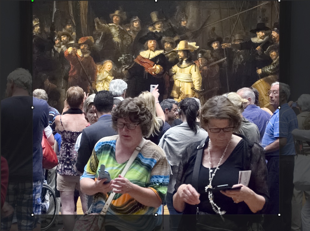
In the image below, you can compare a detail from my photo to a reference photo supplied by the Rijksmuseum, a small part of a carefully controlled image containing 163 megapixels. The Rijksmuseum’s photo is of course sharper and can be enlarged many times larger without breaking up, while mine is close to its maximum enlargement. Even at ISO 3200, the dynamic range of the XQ1 is serviceable for most purposes.

Sharpness and Detail — Most people assume that a professional camera must record exceptionally fine detail, but this is not true. An image spread across two pages of a glossy magazine can contain at most 4 megapixels of information. Professional photographs do not require super-fine detail, they require clarity. They require lines and middling details to be sharp and contrasty.
To my eye, 11-by-17-inch prints from the XQ1 at lower ISO speeds compare to optical enlargements of a similar size made from 35mm film. In addition, the XQ1 can take good pictures at high ISO speeds that are beyond the capability of film.
But of course, 35mm film has never defined the quality of photographic prints, and when examined closely, the XQ1’s images cannot compare to those taken with a professional digicam. In the images below, the details on the left come from the XQ1 and, on the right, from Fuji’s 55–200mm lens on an X-E2. The top comes from the centre of each frame, the bottom from the edge. Both lenses are stopped down to the sharpest aperture. The image is a lossless PNG at 100 percent magnification.
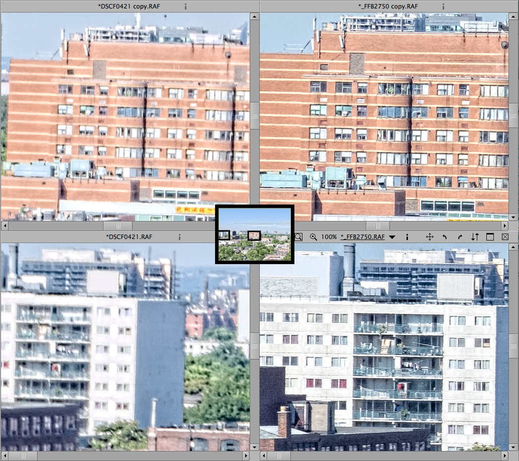
This is not what you might expect from Fuji’s marketing materials, but as skillful as they may be, Fuji’s copywriters cannot rewrite the laws of optics. An ideal lens casts an image of a point of light that looks like a point, but every real-world lens casts an image of a point that looks like a blurry disc. This blurry disc is large enough to spread beyond one cell on the image sensor to the surrounding cells. To minimize this blur with smaller cameras and lenses requires tighter tolerances in manufacturing, and one source of blur
(diffraction) increases exponentially as the size of the lens is reduced. Software can compensate for some blur, but the XQ1 is very small and it costs only $400. You cannot expect miracles from it.
Using the XQ1 — I have tried other point-and-shoot cameras that offered manual control, but none has been sufficiently straightforward to use. The XQ1 is an exception. I find it a little awkward to adjust, but not so awkward as to be a problem. Moreover, although it lacks a viewfinder, the screen on the back is visible under all lighting conditions. The screen dims automatically in low light, and pressing a button jacks up its brightness enough to be comfortable in direct sun.
The primary difficulties I have using the XQ1 lie in framing the image. The lens’s zooming is motorized and impossible to control precisely, so I cannot crop as well in the camera as I like, and I end up trimming pictures more than my norm. Also, while looking at an LCD display on the back of the camera I find it difficult to keep vertical and horizontal lines perfectly straight, so I need to correct them more often than usual in the computer.
Although using the XQ1 is nothing like using a professional camera, I did find myself using it to perform professional tricks, like showing motion. This I found possible using three of the four basic techniques. The “Night Watch” above uses stop-action. Below on the left, the street scene in Amsterdam shows a blurred subject, and the motorcycle shot on the right shows panning the camera to blur the background. You can see the full frames here as well as my crops.

This right-hand picture looks good, but it is most peculiar. If you look closely, you can see that the people and objects in the background show a sweep of motion and then end up sharp. It looks as though the anti-shake kicked in toward the end of the 1/30 second exposure. The camera’s anti-shake correction is remarkable under normal conditions — I can usually shoot down to a shutter speed of 1/8 second — but there is no way to switch it off. For this reason I have not tried using the XQ1 to show motion by blurring
everything, as I did with a different camera for this Balinese monkey dance.

JPEG vs. Raw — Like all digital cameras, the XQ1 will produce JPEG images automatically. To the extent that automatic JPEGs can be good, the XQ1’s JPEGs are good, but to my mind a good automatic JPEG is an oxymoron. An automatic JPEG is a one-size-fits-all shoe.
Although they differ at the margins, all cameras compress the brightness of images in similar ways, based on curves worked out in the first half of the 20th century largely by Kodak. Kodak’s goal was to minimize complaints after people came back from the drugstore with a dozen postcard-sized prints that had cost them half a day’s wages. But minimizing complaints does not create excellence. Photographic excellence requires matching a scene’s dynamic range to the compression curve of the imaging process.
Professionals can control the compression of black-and-white films to a modest extent, and Kodak eventually came to offer a small choice of colour films with different compression curves, but perfectly matching a scene’s lighting to film usually requires lighting the scene artificially, even when taking pictures out-of-doors. For example, I had to create this sunrise.

Control of tonality is easier with digital cameras like the XQ1 that can capture a decent dynamic range and save raw files. Now, instead of travelling with flash units and reflectors, I use whatever lighting I find and adjust the picture to suit later.
For example, here is a stunning stone sculpture by Frédéric Bartholdi, the Frenchman responsible for the Statue of Liberty that graces New York’s harbour. The XQ1’s JPEG on the left is too flat to show the strength of the carving and the chiselling of the stone. The directionality of the lighting is good — in the studio I might have used a similar setup — but its range of tones does not complement the camera’s compression algorithm well enough to result in a full range of tones from black to white. My version does.

The automatic JPEG above — indeed, all of the automatic JPEGs in this article — is based on the XQ1’s default settings. Like all other digital cameras, the XQ1 includes controls that will override its defaults so that you can tailor the automatic processing for a particular subject, but I find these to be totally impractical. I cannot know how I want to process a picture until I see it, and I need to be able to redo the processing when I get the settings wrong. It’s easier and more certain to save raw images in the
camera and then process them on the computer.
Photo Ninja — To process the XQ1’s raw images, I do not use the version of Silkypix that comes with the camera, because I find it awkward and incomprehensible. Instead, I use the $129 Photo Ninja from PictureCode. As you can see in the samples below, Photo Ninja brings out more sharpness than Adobe’s Camera Raw (a free Photoshop plug-in that also processes raw files) and a broader dynamic range. Note that both crops show the extreme left-hand edge of the image. For some reason Camera Raw is trimming the picture.
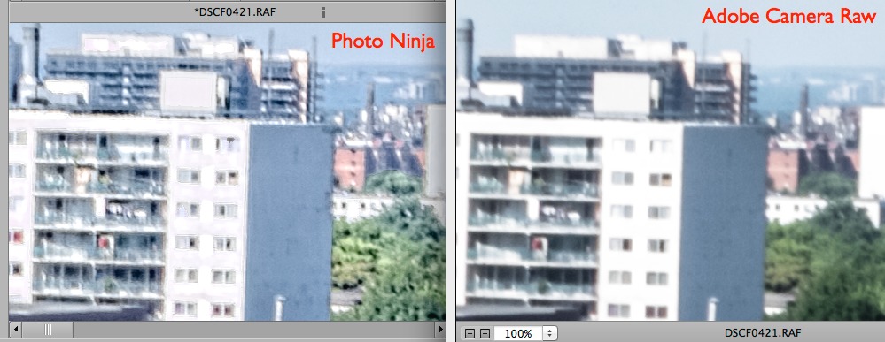
Photo Ninja is a vector-based editor that modifies the entire image rather than individual bits. Thus, Photo Ninja can bring out the blue of a sky and the contrast of a scene but cannot remove a spot of dust or a stick sprouting from a woman’s head. Photo Ninja is also more limited in its vector transformations than Photoshop and some of Photoshop’s plug-ins. For this reason, pictures from my larger cameras I start in Photo Ninja but finish in Photoshop.
However, my larger cameras have interchangeable lenses, which allow dust to fall on the sensor, and they have a greater dynamic range, which can support more extreme transformations. The XQ1 is dustless (at least so far) and has a more limited dynamic range. For it Photo Ninja is sufficient and is almost ideal.
My only complaints about Photo Ninja lie with the user interface and a bug. Photo Ninja has a straightforward interface that is not difficult to learn, but since it’s a cross-platform application, some elements of the user interface do not look or function quite as a Mac user expects.
The bug lies with an automatic feature. Photo Ninja’s presets provide good starting points, and if you calibrate presets to different cameras and lenses, then Photo Ninja chooses the appropriate preset automatically based on the EXIF information in the file. However, if a zoom lens is built into the camera — if it is not an interchangeable lens — then Photo Ninja won’t save a calibration for more than one focal length. The developer knows about this problem and expects to fix it in the next release, but in the meantime I need to straighten the XQ1’s barrel distortion for each picture individually.
To see how Photo Ninja works, I suggest looking through its tutorials.
Viewing Mode — Like all digital cameras, the XQ1 has two basic modes: shooting and viewing. The controls for shooting pictures are well thought out, but the viewing mode offers one “feature” that is peculiarly annoying.
This feature is direct access from a button to a Wi-Fi function. When I push the button, the XQ1 sets up an ad hoc Wi-Fi network. I am then supposed to be able to reset my smartphone or tablet to use that network instead of my normal network, and to be permitted the use of a special Fuji app. This app is intended to display Fuji JPEGs on a tablet or smartphone — only Fuji JPEGs. No other JPEGs, no raw files, no desktop Mac, no normal network. This wouldn’t be convenient or useful even if it worked but, as it is, I cannot make it function on either of my iOS devices.
Not only is this feature useless, it gets in the way. In shooting mode, the Wi-Fi button does double duty as the function button. Since I use the function button frequently, I often find myself pushing it by accident to access a shooting function while I am still in viewing mode. Once I do this, the camera sets up its Wi-Fi network and stops dead while waiting for a connection. To start shooting again I need to realize what I did, then press the back button or the shutter and wait four or five seconds.
I also found an annoying bug, which I shall describe here in the blithe hope that somebody from Fuji will read this and see it fixed. I normally display data and the histogram along with a small version of the picture, but in this display mode I cannot enlarge the picture so that it fills the display completely and no more. The lever controlling the magnification goes directly from the thumbnail version to a cropped version, without stopping at a full-frame size.
In Conclusion — The XQ1 is not so easy to use manually as a professional camera, but its manual controls are practicable, its LCD display is visible even in bright sun, and its automatic controls and effective anti-shake make it suitable for rank novices. Moreover, it can produce professional-quality images under many circumstances. Teamed up with Photo Ninja it bears a similar relationship to larger digicams as 35mm cameras bear to medium format and 4-by-5-inch film.
The main functional limitation of the XQ1 is its lens, which is a zoom lens that’s equivalent to 25mm to 100mm with a 35mm system. The shorter end of this range covers a goodly wide angle but the longer end is too short for sports or wildlife, or to produce gee-whiz effects like a close-up of someone amidst a crowd or a distant landscape compressed in depth.
On the other hand, the XQ1 is not a camera intended to do everything, it’s a camera intended for beginners or for a serious photographer who wants a pistol in his pocket when he leaves his big gun at home.
That is how I use the XQ1, and I am pleased to have it. I never expected to see a camera so small that can take pictures so well.
[If you found the information in this article valuable, Charles asks that you pay a little for it by making a donation to the aid organization Doctors Without Borders.]
FunBITS: PhotoCard Is a Modern Postcard for iPad and iPhone
It used to be a standard part of my vacation to send postcards to friends and family so I could let them know I was having a better time than they were. These days, however, between the ever-rising cost of postage stamps, the gradual disappearance of corner mailboxes, and the increasing ubiquity of both smartphone cameras and Wi-Fi, my postcard-picking vacation ritual has fallen into desuetude. However, not all of my friends and family are as tech savvy as I, nor are emailed vacation snapshots quite as suitable as the venerable postcard for sticking on the refrigerator, pinning to the cubicle wall, or sharing with friends at the weekly coffee and bagel meet-up.
So for my vacation this year I thought I would check the App Store to see if there was a reasonably priced, reasonably capable postcard app among the 75 gajillion digital widgets available, an app that would let me create a digital card with my own photos, compose a short message, and then either send it via email (for my friends who were comfortable citizens of the 21st century) or print and send it via standard postal mail (for those in my cohort who pine for phones with dials and typewriters with ribbons). Not surprisingly, I found several apps that offered these capabilities, but the one that caught my eye and won my heart was an app by some guy named Bill Atkinson: PhotoCard.
You may remember that name. Atkinson was the Apple employee who was the guiding light behind such things as QuickDraw (the graphical software underpinning the original Mac), MacPaint, and HyperCard. What you may not know is that, aside from his software-crafting brilliance, he is also a highly respected nature photographer. He brought his love for fine photography together with his outstanding abilities as a software artisan to create PhotoCard, an app that is finely tuned to do one thing well: produce attractive digital postcards with a minimum of fuss and fiddling. PhotoCard is free; it requires iOS 7.
PhotoCard is not new; it first appeared for the iPhone back in 2010 (TidBITS readers may remember Adam Engst’s close encounter with Bill Atkinson at Macworld in 2010, during which Atkinson waxed passionately about the app, among much else; see “Macworld Expo 2010 Reboots,” 15 February 2010). PhotoCard has evolved since then, becoming more streamlined and capable with each iteration; the current version is 9.0.
The app, which is native for both the iPhone and iPad, presents a simple interface controlled by a small strip running along the bottom of the screen on the iPad; on the iPhone, the app uses landscape orientation and the strip is split in two, presented along the sides of the screen. The commands available on the strip are easy to figure out, but on the off-chance you find them obscure, the Guide (also available from a single tap on the strip) can clarify things.

To create a new card you tap (what else?) New. This provides you with the opportunity to take a new photo with your device’s camera, choose a photo from your Photos collections, use a photo from a card you sent previously (PhotoCard retains a history of all the cards you make and send), or use one of Atkinson’s own nature photos. The app comes with hundreds of such photos that you can use on your postcards for free; if storage space on your device is an issue, you can, instead, download the “lite” version of the app, which
includes only a few dozen photos.
Although I appreciate the capability to take a picture within the app and immediately make a card from it, I found that I never actually used that feature. Instead, I would usually compose and take pictures using my Camera app and later pick a shot from my Photos collection when it came to postcard-writing time.
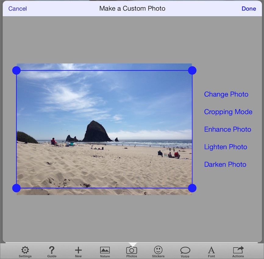
Once you have a picture selected, you can crop and adjust it in various ways. The controls are simple and not too ambitious: you can enhance the photo (which automatically tweaks the brightness, saturation, and contrast, usually to good effect), lighten it, darken it, and switch between landscape and portrait orientation. However, because you can use any photo in your Photos collection, and because there are many apps that provide more complex and detailed image editing capabilities, PhotoCard’s minimalist editing controls are not much of a drawback.
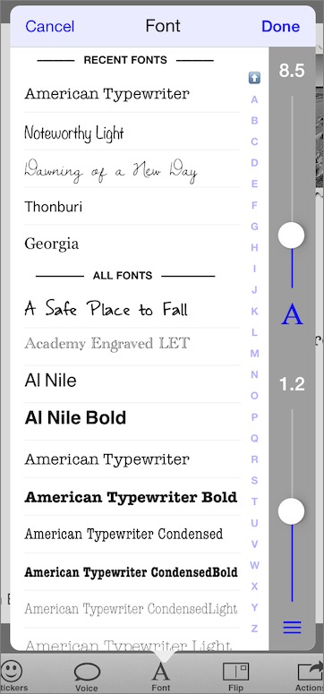
With a photo picked and tweaked, it’s time to compose the message to put on the card. Once again, the function is simple: just tap in the content area of the card and start typing. If you don’t like the typeface, type size, or line spacing, a quick tap on the Font button provides a menu of fonts from which you can choose, along with two simple sliders to adjust size and spacing. Aside from the built-in iOS fonts, the app comes with a bunch of additional licensed typefaces. My only complaint about the text
editing interface is that it does not support styled text, like italic or boldface. I can live with that.
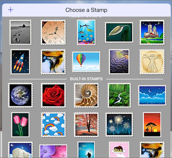
Next, you can pick a stamp to put on the card. Again, PhotoCard comes with a huge selection of stamp designs from which you can choose. However, if none of these appeals to you, you can, for a small fee, create a stamp from one of your own images, which you are then free to use on any cards you subsequently make (more about the fee below). For email cards, the stamps are of course merely decorative items; for cards to be sent via postal mail, the stamps serve as postage, and they display the appropriate postal bar
codes required by the U.S. Postal Service (the care with which Atkinson designed the stamp layout to work within the USPS’s requirements is typical of the app).
If you like, you can also decorate your cards with stickers; these are graphics that also come with the app and that range in style from whimsical…

…to photo-realistic.
You can resize and rotate the stickers and drag them to where you want them to appear. Don’t worry, PhotoCard won’t let you place a sticker that obstructs the address or the stamp. To remove a sticker, just drag it off the card. As with stamps, you can create your own stickers for a small fee and reuse them as often as you like.
You can also tap Voice to add short voice notes to any emailed card (about a minute’s worth of audio). A voice note is indicated by a speech balloon graphic that, like a sticker, you can position wherever you want on the card. The actual voice note, though, comes through as a separate sound file attached to the email; your recipient can click the attachment to play it in most email programs.
Finally, you can tap Actions to address the card, either manually or by choosing the addressee from your iOS Contacts list. PhotoCard also keeps track of previous addresses you have used so you can send additional cards to the same recipients with minimal fuss. The app knows whether you have chosen an email address or a postal address, and adjusts the card’s stamp appropriately.
With the card suitably addressed, you tap Actions again and then tap Send Postcard. For printed and mailed cards, the fee is deducted from your PhotoCards account, and the card is printed, trimmed, laminated, and mailed within about two business days. It costs nothing to send a card via email.

And how do the cards look? The email cards are beautiful; Take Control editor in chief Tonya Engst, who received one of my emailed vacation cards last week, said, “It’s nice enough that I could print it out and stick it on my fridge to enjoy for a while (were my fridge not already encrusted with stuff).” (She sent me a snapshot of her refrigerator to support her case.)
As for the print cards, they are 5.5 by 8.25 inches (14 by 21 cm) in size, and are stunning: the colors are bright, the details are sharp, the print quality is excellent, and the laminated paper stock on which they are printed is sturdy enough to survive all but the most negligent handling by postal employees. For best results when printing, Atkinson recommends that you crop your own images to exactly 1920 by 1280 pixels and save them as 8-bit sRGB JPEGs; the image I used for my sample card I simply grabbed as-is from my Photo Stream, and the printed version came out looking just fine.
Now, about the “account” that I previously mentioned. Rather than your buying stamps, stickers, and printing/mailing charges as in-app purchases, you create an account with PhotoCard when you first use the app. You can then purchase “credits” for your account via PayPal or credit card. Credits cost about $2 each; I say “about” because the more you buy at a time, the less they cost. For example, on my recent vacation I paid $25 for 30 PhotoCard credits. The fee for creating a custom stamp or sticker, or for having a card printed and mailed, is two credits.
The account is useful beyond just providing a way to buy and spend credits. It also keeps a history of all your cards and card recipients and syncs them among all the iOS devices on which you have PhotoCard installed. This means you can send a card from your iPhone, and later pick up your iPad and reuse the previously sent card to send to someone else.
I don’t have much else to add other than that I love, love, love this app. On my most recent vacation I found myself looking for opportunities to take pictures and send them off to friends and family. PhotoCard is simple, slick, and attractive, and I never once found myself frustrated or confused by it. Bill Atkinson has said, “This is my best work, much better than QuickDraw, MacPaint, and HyperCard all rolled together.” Although that may seem a rather hyperbolic statement, given how big a dent in the universe each of those creations made, when it comes to sheer craft, beauty, and elegance, Atkinson may not be wrong.
TidBITS Watchlist: Notable Software Updates for 18 August 2014
Fission 2.2.2 — Rogue Amoeba has released Fission 2.2.2, a small maintenance release for the audio editor that fixes a rare crash (caused by closing a window) and a regression of Apple Lossless transcoding. The update also adds a hidden preference to disable the limit on Smart Splits, improves logging in the Saving pipeline (with more detailed optional error reporting available), and is more forgiving when importing slightly malformed FLAC files. Additionally, the Mac App Store version addresses several changes that Apple made to its
Gatekeeper system. ($32 new from Rogue Amoeba with a 20 percent discount for TidBITS members, free update, 14.5 MB, release notes, 10.7+)
Read/post comments about Fission 2.2.2.
Alfred 2.4 — Running with Crayons has released Alfred 2.4, adding support for OS X Yosemite, with new Yosemite Light and Dark built-in themes and the addition of Helvetica Neue and Helvetica Neue Light fonts to the theme editor. The keyboard-driven launcher no longer syncs window position (due to different Macs having different location requirements), but adds a new option for displaying fuzzy match file system navigation results. For those who purchase the feature-enhanced Powerpack, Alfred provides more robust nil checking when searching for snippets when doing placeholder
replacements, improves the performance of activating and watching clipboard history, and fixes a failure to move or copy a file when the filename contains a grave accent. (Free, £15 for Powerpack, 3.1 MB, release notes, 10.6+)
Read/post comments about Alfred 2.4.
Delicious Library 3.2.2 — Delicious Monster has released Delicious Library 3.2.2, which lets you add your own custom fields. Autocomplete values can be accessed, and custom fields support Delicious Library’s Export, Search, and Saved Sorts. The media cataloging app also now improves importing of Delicious Library 2 collections, fixes a bug that prevented items from resizing if they didn’t have a cover image, improves editing and sorting for the Purchase Date field, and fixes occasional crashes caused by deleting shelves. ($25 new from Delicious Monster and the Mac App Store, free update, 77.5 MB, 10.8.3+)
Read/post comments about Delicious Library 3.2.2.
CloudPull 2.5.4 — Golden Hill Software has released CloudPull 2.5.4 with a handful of improvements to the Google data backup application (see “Back Up Your Google Data with CloudPull,” 6 March 2012). The update responds to changes to the Google Calendar API to restore the capability of backing up calendars, adds the capability to control the HTTP timeout length and the number of simultaneous downloads per account when backing up Google Drive files, fixes a crash that occurred when retrieving an updated list of mail messages from Gmail, and fixes a bug that caused a crash
during the first backup cycle. ($24.99 new with a 20 percent discount for TidBITS members, free update, 9.7 MB, release notes, 10.7.5+)
Read/post comments about CloudPull 2.5.4.
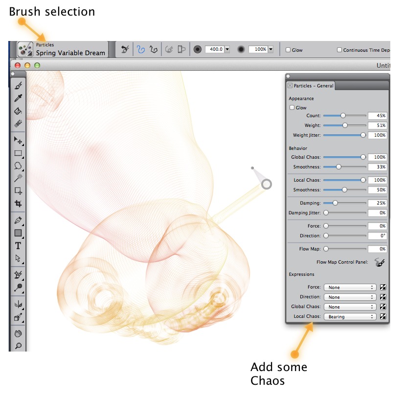
Corel Painter 2015 — Corel has released Painter 2015, the newest version of the venerable graphics application that switches up the app’s numbering convention again. (Painter had been using the standard numeric release convention up to version 12 before changing to the Painter X3 moniker in 2013; Corel says that the new numbering system reflects its plan for a yearly update cycle.) Painter 2015 introduces “physics-inspired” Particle Brushes, which provide a quick way to create unique effects. Strokes from the three types of Particle Brushes (Gravity, Flow, and Spring) emit particles from a central
point that then create patterns and lines as you move across your canvas. Particle Brushes can be controlled by a variety of input options such as pressure, bearing, tilt, or velocity, and you can randomize the effect by selecting a Local Chaos setting.
Now a native 64-bit application, Painter 2015 promises speedier performance while consuming only half the power of previous versions to help you conserve battery life on your laptop. Other changes include the new Jitter Smoothing feature that gives brushstrokes a more organic look, enhanced real-time preview of effects, and new smart photo-painting tools. A free 30-day trial version is available. ($429 new, $229 upgrade from version 7 or later, 194 MB, 10.7+)
Read/post comments about Corel Painter 2015.
Safari 7.0.6 and 6.1.6 — Apple has released Safari 7.0.6 for users of OS X 10.9 Mavericks and Safari 6.1.6 for users of 10.8 Mountain Lion and 10.7 Lion. Both updates improve memory handling to fix multiple WebKit memory corruption issues that could lead to unexpected application termination or arbitrary code execution if visiting a maliciously crafted Web site. (Seven Common Vulnerabilities and Exposures IDs, or CVE-IDs, are listed in the security note.) The two releases are available only through Software Update. (Free, 10.9+/10.7–10.8)
Read/post comments about Safari 7.0.6 and 6.1.6.
ExtraBITS for 18 August 2014
This week in ExtraBITS, Apple has banned two potent toxins from iPhone assembly plants, we delve into the origins of clicking “x” to close a window, Apple releases a not-so-diverse diversity report, and the New York Times gets an inside peek at Apple University.
Apple Bans Two Toxins from iPhone Assembly Plants — Apple has banned the use of two chemicals that endangered the health of Chinese iPhone assemblers: n-hexane, which is used to clean screens and could cause nerve damage and paralysis; and benzene, a known carcinogen that’s used to coat electronic components. However, these chemicals are still in use further up in the supply chain, and Apple is being pressured to eliminate them from the entire chain.
The Origin of “x” to Close — On Medium, Lauren Archer has tracked the evolution of the use of “x” as a symbol to denote closing a window. While it’s now ubiquitous on both Mac and Windows, it wasn’t a common convention until Windows 95, which in turn picked it up from NeXT, but Archer traces the symbol’s origins even earlier, to Atari’s TOS 1.0 from 1985.
Apple Releases Diversity Report — Following in the footsteps of other tech companies, Apple has revealed statistics about the diversity of Apple employees. Unsurprisingly, Apple is mostly composed of white males, of which CEO Tim Cook said, “As CEO, I’m not satisfied with the numbers on this page. They’re not new to us, and we’ve been working hard for quite some time to improve them.” However, Cook did not offer specifics on how he plans to achieve that, but he did mention three women who have recently been hired into executive roles at Apple: Angela Ahrendts, Lisa Jackson, and Denise Young-Smith.
An Inside Look at Apple University, Where Picasso Rules — Brian X. Chen of the New York Times was granted a rare, if limited, peek into Apple University, the company’s internal training program. The program offers courses on Apple business decisions, design choices, and what makes Apple tick. One of the more interesting tidbits is that Apple uses lithographs of Picasso’s “The Bull” as an example of how to narrow a concept to its essential elements.