Examining iTunes 12’s New Interface
In the almost two years since iTunes 11 debuted, Jony Ive and his team have been slowly painting over gradients, sanding down rounded buttons, eliminating shadows, and stripping out any user interface element deemed extraneous to arrive at a brave, new iTunes. Flat is the word for iTunes 12 (officially version 12.0.1 at launch), which is in some ways a radical reinterpretation of Apple’s digital bouillabaisse of media player/organizer, online store, and device synchronization hub. While there aren’t any groundbreaking new features, Apple has shifted around (or pared down) many interface elements. In the end, the essence of what remains retains familiarity with previous versions of iTunes, and there are some welcome tweaks that
actually help to streamline the app.
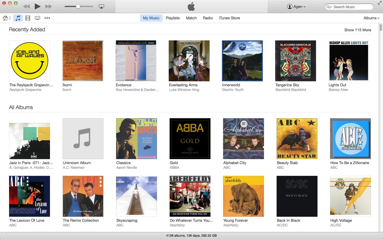
Fewer Shades of Gray — Two years ago, I described iTunes 11 as having a spare look (see “Redesigned iTunes 11 Brings iCloud Streaming and New MiniPlayer,” 30 November 2012), but that version looks decidedly bloated in comparison to iTunes 12’s frugal design elements, which are right out of Scandinavian Design 101. When you first open iTunes 12 (with its new red icon) and find yourself in the new My Music view, you notice that the functional interface elements no longer dominate as they did previously. The top gray control area has shrunk, enabling more of a focus on the music titles in your collection displayed against
a white background (with just a few shades of gray replacing all the drop shadows of iTunes 11).
For comparison, here’s the Albums view from iTunes 11.4:

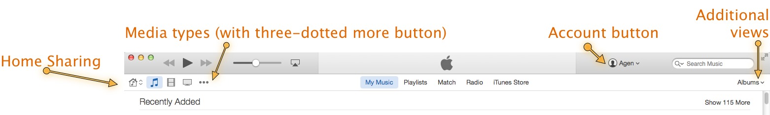
The thinner gray control area retains the previous version’s playback, volume, and AirPlay controls; search field; and Up Next button (the three-lined “hamburger” icon in the Now Playing area); but it adds a new button that opens an Account pop-over with options for accessing your Wish List and Purchased items, redeeming gift cards, and opening your Account Info. Replacing the media type pop-up menu of iTunes 11 is a lineup of icons at the left that display your Music, Movies, and TV
Shows, and you can choose to view other media by clicking the three-dot More icon (which includes an Edit feature so you can permanently add the icons of your favorite media types to this lineup).
You can also quickly switch to other media types using keyboard shortcuts (such as Command-1 for Music and Command-7 for Apps). These were available back in iTunes 11, but they’re now explicitly listed under the View menu. Clicking the Home Sharing icon to the left of the media type icons gives you quick access to other iTunes libraries stored on other networked computers. At the far right of each media type view, you’ll find a popover that provides additional sub-views for that media type, different ways to sort, and control over how far the Recently Added section looks back (six months by default).
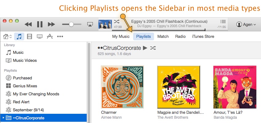
Bringing Back the Sidebar — Sidebar purists (such as myself) might be a little cheesed off by the starkness of the My Music view, but you can easily return to the sidebar by clicking the Playlists text button placed in the top middle of each media type view. This selection is sticky, so if you choose to view Playlists in Music, and then head over to view the Movies media type, you’ll return to Playlists once you select Music again. However, the iTunes Store view (available in all the media types, save for Tones and Internet Radio) trumps this stickiness. If you select iTunes Store while in Movies and then choose the Music media type, you’ll find yourself still in the
iTunes Store — only switched to the Music section.
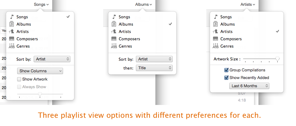
You have more control over the views within individual playlists in iTunes 12. Select a playlist, and then click the sub-views button at the far right to select different ways of viewing that playlist’s media. The Songs, Albums, and Artists views replace the List, Grid, and Artist List views from iTunes 11, and iTunes 12 adds Composers and Genres views to the mix. Each view also has its own additional options. For example, Songs enables you to choose sort order as well as what columns to display and whether to
show album art, while Albums provides two-step sorting (such as first by Artist and then by Title, Rating, or Genre).
Shifting the Info — The Get Info dialog (select a file, and then choose File > Get Info or press Command-I) also gets an overhaul with a much cleaner look and shifting around of panes (the former Summary pane with file info such as bit rate and modification date is now the File pane at the far right). I got excited when I saw the Add Field button on the Details pane, thinking that it was a gateway to creating custom fields; unfortunately, it only provides access to fields that are currently unused and thus hidden from view. It might look like the fields in Get Info are static, but you can click the visible text to make the field editable.

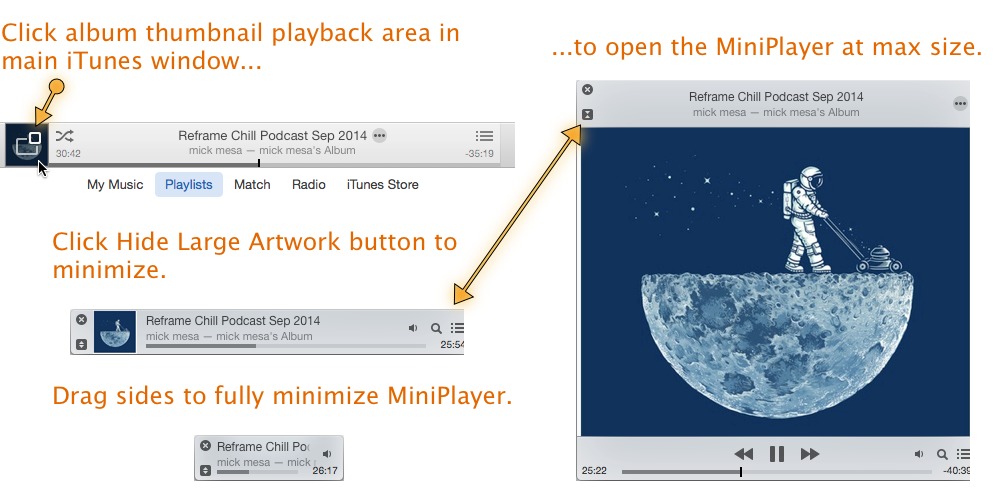
Activating the MiniPlayer — The MiniPlayer button found in the top right corner of iTunes 11 has disappeared in iTunes 12, but the MiniPlayer itself remains. You must now click the cover art thumbnail in the playback control area at the top of iTunes 12 to switch to the MiniPlayer (or press Command-Shift-M; pressing Command-Option-M displays the MiniPlayer next to the full iTunes window). To switch to the most minimal MiniPlayer size, click the Hide Large Artwork button in the top left corner (under the Close Window button), and then drag either side inward to eliminate the album artwork thumbnail on the MiniPlayer.
Connecting Devices — When you connect an iOS device to your Mac, a new Device view icon appears to the right of the three-dot More icon. (If you’ve set a device to sync with iTunes over Wi-Fi, the Device icon appears automatically with that iPhone, iPad, or iPod touch selected.) Clicking a device’s name opens the standard Summary view as well as the sidebar with views of options for syncing different media types and what’s currently residing on your device. If you have multiple devices connected to your Mac, their names appear just below the playback control area; click a name to switch to that device.
![]()
If you have the Playlists view open to any of the media types, you’ll also see any connected devices in the sidebar; click the expansion triangle to see what media is stored on the device. Drag files from the iTunes media view (such as Music) to the device to move it there without having to go through a full sync operation.
Wrapping It Up — While there’s not much functionally new in iTunes 12, the cleaned-up interface can be a bit of a mystery for some who are looking for their favorite features (such as the sidebar or MiniPlayer). But once you’ve discovered those, I think iTunes 12’s new interface should actually make it easier to move around within the app.
As usual, iTunes 12 is a free download from the Apple Web site or via Software Update. Version 12.0.1 requires OS X 10.7.5 Lion or later.
Have used apple products since the 1970s
Apple Shareholder
Apple User Group Founder
It hurts to type this
iTunes 12 Hugh steaming pile of dog crap
Amen, brother!
Mac user since 1985.
Worst Apple software ever. Hate it.
I've already complained to Applecare about the missing sidebar. I couldn't find a way to go between apps and devices anywhere near as easily as the sidebar. Are there any 3 party apps that will do that? Somehow I thing not.
Yeah. I saw the Playlists as the View into the Data (database terminology), so I put everything into the Playlists and played from them, not from the Music, etc. So now I don't always see all the Playlists. Therefore, my scheme is wrecked and I have no easy way to see all my data.
Bug initially in version 11 mini player has returned in version 12 mini player! When viewing the current up next list from the mini player, it fails to return mini player to original screen coordinates. Ugh!
I'm surprised that the author states "iTunes 12's new interface should actually make it easier to move around within the app." I find the reverse to be true. I didn't love iTunes 11, but I hate iTunes 12's interface, and several things that I use it for are much more cumbersome. In previous versions, I could switch from viewing my songs to viewing my podcasts with a single click in the sidebar. Now I have to click a dropdown menu, drag down to Podcasts, and release. I've found no way to put Podcasts back in the sidebar, even though Books is there, whether I want it or not.
Everyone has their own preferences, but Apple iTunes 12 Preferences have removed most of our individual choices and customization options.
I think you missed that the author explained how to add a Podcasts icon to the lineup of icons (the media types at the left of the toolbar — use the Edit item in the dropdown menu). Now you’re back to one click to move between Music and Podcasts!
Perhaps you read the article too quickly. As I read I took the time to try out the features the author described. As a result, I learned that you can add items like Podcasts permanently to the menubar by clicking the "more" three dot item and selecting Edit at the bottom of the pop-down list. You can then check the items you want to see and uncheck those you do not. Once you've added Podcasts to the menubar it's as easy to select there as it ever was in the sidebar. As for the sidebar itself, it can be revealed by clicking the Playlist button near the middle of the menubar. The author doesn't call this a menubar - in fact he fails to name it at all, though he references items in it frequently.
Anyway, I was prepared to dislike the new iTunes. The pale as death interface is less then attractive, but that's how things are in Yosemite. However, after experimenting with things as I read the article I'm less displeased than I was at first. I find the sorting easier than in either iTunes 11 or 10 before that. For example, where before if you chose genre you would get an additional panel at the top with items organized hierarchically; now you get a column to the right of the sidebar with small album images next to the genre titles. And when you select a genre you get an appealing colored header with information about the contents of the category, including the date range of the items included. After using iTunes 12 for a couple of hours, it seems to me actually to be better and more logically organized than ever before. Clearly it has been evolving with the Apple engineers experimenting with ways to organize the wide range of media iTunes is called on to manage. Each new design requires users to learn the app all over again, which can be a nuisance.
I think the negative first reactions are due at least in part to the fact that iTunes is once again different. Obviously it will take some getting used to. And some figuring out. From the remarks here is seems some people are making snap judgements without taking the time to do the figuring. OK, so you don't like change. Lots a' luck with that. Clearly Apple subscribes to the business philosophy that if you're not moving you're dying. Whether they're actually moving forward, backwards of sideways may be a matter of opinion. But Apple is clearly not dying.
One of the things I regret about iTunes 12 is the almost complete loss of color in the UI. Again this was done to harmonize the app with the operating system, which has been drab gray since OS X 10.7 Lion. There is a viable hack to restore color and custom icons to the Finder window sidebar, the ColorfulSidebar SIMBL plug-in, which still works in OS X 10.10 Yosemite. It remains to be seen if an enterprising developer will come up with a way to restore color to the iTunes sidebar. Since the list of categories in the sidebar has been largely moved to the menubar, this may be a vain hope.
The problem is NOT change as such, it's changing the things that finally work properly. For example, Playlists. It took them a full version to recover from 10.0, so now we've got to cope with a less capable 12.0. Upgrades are supposed to improve functionality.
Thank you B., I'm absolutely with you in all points!
As someone who uses iTunes largely to move subsets of movies and TV shows on and off my iPhone and iPad, the fact that I can no longer access Album or Grouping fields for movies and TV shows is a major pain, as is the lack of immediate access and visibility for iOS devices in the sidebar. The popup menu requires me to click to see what's currently connected and selecting devices is much less convenient.
Initially I was totally stumped by the new interface and lack of sidebar ( which is there under certain conditions) I will give it some time but my biggest gripe is the inability to connect wirelessly with iTunes. I had no problem up until about a month ago. I figured an upgrade to OS X 10.10 would fix the problem but, alas, no... I have unchecked and re-checked the appropriate box and no way will iTunes recognize my iPhone or iPad until I plug it in.
I had the problem of no Wi-Fi connection after & installed iOS8 on my iThings. Quit & restart iTunes sometimes helped, as did doing a re-boot of the iThing. I have had no problem since shutting down my Wi-Fi & waiting a minute before restarting. (This also fixes the frequently lost connection between my HP printer & iMac.)
Apple seems determined to ruin iTunes as each iteration since version 9 has sucked worse than the previous version. I blame Jony Ive for a lot of this; he should stick to hardware design and let more competent software designers do their thing. EVERY piece of software he touches ends up looking like crap.
I hate this new iTunes this is a MAJOR step backwards in function and design apple has really dropped the ball the past few years.
I want the sidebar back, I wish I hadn't downloaded this version!
Likewise, what could possibly have made them think this was a good idea?
I agree. This sh*t pisses me off big time! Worst iTunes release ever. Put the sidebar back on the music tab, so I can have my top view list/grid on the same screen as the sidebar for easy access
I've gone back to 11.4 on Windows 7. I just couldn't cope with 12. Multi-line comments are now, apparently, hidden away by an option click, who knew?! I use them as I have a lot of the recordings of my Dad's band in iTunes, and I keep session notes in there. It seems more and more of iTunes is designed with an emphasis on iTunes eStore bought media. iTunes 12 seems to take the interface design guide that Apple have evolved over the last 20 years and tear it up completely. Same as Yosemite. Looks dreadful, works badly as a UI, alienates old users, non-intuitive interface.
The header bar of a podcast now takes its colour from the predominant colour of the podcast icon -- if that's black then it makes it difficult to see the controls. Checking 'use custom colours' in the preferences softens the blow in podcasts but leaves ugly views when viewing an album. Also, why hide podcasts under three dots? I can't find anything in 12 which I see as an improvement over 11.
I've found a bug already which is that when movies (and presumably other media types although I did not test it), are sorted by year the view doesn't update when you change the year of an item. Worse, it shows the movie in the same spot on the screen, but when clicked on the info you see is for an adjacent movie. So the user could very easily end up editing the information for the wrong title. It appears that nothing will make the view update save switching to another media type and then back again. Quite the glaring and easily discovered error on Apple's part. Updating the view should have been the first thing they tested for.
Each new design mistake from Apple, reviewers try to make it sound good that we can't do X, or that Y being more difficult is good. Streamlined! Cleaner! Really? How can you write "functional interface elements no longer dominate as they did previously" with a straight face?
Removing & hiding features, making tasks more difficult, & cluttering up the title & toolbar to get back a few pixels when most have huge screens...that's not streamlined or clean, it's just ugly & less functional. The point of iTunes shouldn't be to look pretty; it should be to be useful, i.e., FUNCTIONAL. That's why the miniplayer is so popular, Apple had to restore it after trying to remove it. To do many things we need the big window of "functional interface elements"! When we want pretty or (more likely) want iTunes out of the way...miniplayer (also useful, in other ways)!
Please, stop pretending that hiding functionality makes it more useful. Pretty much by definition, it does the reverse.
Hear, hear! I agree completely. I think the removal of multiple windows for playlist editing is a great example. Moving tracks between playlists is a real PITA now. Why remove existing functionality when you can easily keep it as options for those that want it?
Wholeheartedly agree! "It's free" is not an excuse, as your customers pay a huge premium to buy your media devices which rely on iTunes. IF IT AIN'T BROKE, FELLA, DON'T TRY TO FIX IT!
Hello. I am a relatively new Mac user, and found a link to this article on http://www.applevis.com . I am a VoiceOver user, and the new iTunes interface appears to be a bit more user-friendly too. I'm planning to devote more time to it though later. I've only downloaded some podcast episodes though, so I suppose in the grand scheme of things that's not saying much.
No problem with the new user interface at all. In fact I use and like it a lot. But hey, I’m 47 years young ;-)
So please hold down the alt-key and press the spacebar until iTunes 12 fights your temporary depression ;-)
I like iTunes 12. I like it's simplistic, uncluttered look. I use to think iTunes was too cluttered. Sidebar? Never liked it in iTunes 11. I liked it for playlists only. In iTunes 12 I like that when I click on playlists I automatically get the sidebar and when I go to albums or whatever other part of iTunes, the sidebar goes away. I like in the Get Info section I get what fields are pertinent to movies in the movie section and if I go to TV Shows, I get what's pertinant to TV shows. iTunes 11 have you all fields for every section. I don't need that. All in all I like the redesign of iTunes.
Alice, you're in a class by yourself... literally.
Still can't sort by Artist and then by year. I don't understand why they DO NOT want their users to have this ability. Why would the Apple geniuses think that listening to all the Pink Floyd albums in alphabetical order is better than in chronological order...
I agree. However I've found that if you go into "album info", then "sort artist" then change that field to a number, you can re-arrange your albums in chronological order.
As soon as I heard a new version was coming out I flew to the Apple website and made sure I had the latest 32 and 64 bit versions of iTunes 11.4 cos I knew I'd need them.
Yep, 12.0.1 simply sux. No thought for what your CUSTOMERS want Apple. 12.0.1 Lasted 2 days and I have NUKED it and gone back to v11.4.
More over, when my plan for my iphone is up in 3 months I will be switching to Samsung.
Jony Ive, eat this:
┌∩┐(◣_◢)┌∩┐
IF I were to switch to an Android phone, it wouldn't be Samsung. Samsung has too much provider crape are on it. I like the Moto X because from what I found its the purest Android OS that I've found.
I'm still on iTunes 11 and Mavericks.
Is it possible to update to Yosemite and NOT update iTunes? I'd hate to see iTunes 12 forced upon me when updating to Yosemite.
the previously simple task of adding the same album artwork to newly added song to an album already loaded, has disappeared.
Maybe I don't understand how you add your cover art but dragging coverart into the artwork tab still works. Highlighting all the songs in the album, then clicking Get Info then dragging the coverart into the artwork area still works too.
Unfortunately, I did not really look to see what the software update was going to do and I got iTunes 12. This looks like a case of changing things just to be able to say "I changed a lot of stuff, wow." iTunes is now a bit less user friendly, more awkward to use... And why is a "clickable" item not shown as such any more? You are left to wonder why so many things are not accessible when in fact they are if you only knew that a word on the screen is actually an item you can click on and do something with. Flattened is not progress or improvement; it is just change so you can point to your changes.
I found iTunes 12 to be the most user unfriendly yet. Believe it or not, I don't store music on my iPhone and iPad. I use iTunes to manage apps. The missing sidebar is a nuisance and not having fix/change details displayed when selecting an app to update is a poor user interface design/decision. As a QA/QC Manager, I find iTunes 12's GUI woefully inadequate, which I could almost say for each version since 7. I'm wondering if this is the same QA Manager/director who oversaw the iOS 7's Apple Maps and iOS 8 release debacles. Time to let him go Apple, he doesn't understand what quality for the user is!
is there any way to add iTunes store to my sidebar menu??
i can not change art work for Movies since updating or is just me Music is ok
I am annoyed as hell by the loss of my playlists in My Music. What could possibly make them think this was a good idea? I create them by dragging from My Music (the only view I *ever* use) and they have just made it harder.
Can we please not prejudge iTunes 12 until you try some of the things mentioned in the article. It seems toe people take one look at iTunes, any version with quite a few changes, and say they dont like it. Sure, I fumbled around iTunes 12 at first but now I like it. for some, it's hard getting use to new things. Those are the most vocal people. How about some who like iTunes 12 saying why they like it.
Why can't I add lyrics to MP4 tracks?
I can put them in 'Description' but why can't they have a 'Lyrics' slot as for mp3 files.
Furthermore, why can I only add artwork and not delete it.
How do I get back to 11?!!!
PS I lost all the lyrics from my MP4 tracks when I downloaded 12 but they where OK in the MP3 tracks.
I agree. The Artwork is very buggy -- you can select an individual track to delete artwork, but you can't edit Artwork if you select the album or multiple tracks. Hopefully, this is something that Apple can fix with the inevitable update.
I retained all my MP4 lyrics. Try holding down shift key + Get Info menu (right-click on selected item(s)) to show the old style info panel, they're probably in there. I hate the new style, too restrictive...let me decide which fields I want to see!
I have found iTunes a frustration over the last several versions but this one takes the cake. It used to be I could just plug my iPhone in and manually transfer added songs or movies. No longer. It wants to control the whole thing - all or nothing. If it weren't for my huge music file (many imported from sources other than iTunes - all legally though) I would drop it completely. They have turned into MicroSoft - you have us, now we own you - and you WILL do it our way!! Bah! I've been a Apple guy since the early 80's, too.
Interesting reorganisation: with Apple removing the main sidebar and splitting the iTunes store, this moves Music/iTunes U/Podcasts/etc. to the highest level — moving iTunes closer to a combination of the Music/iTunes U/Podcasts apps from iOS.
Holding down the shift key while selecting the Get Info menu item (right mouse click) will bring back the old style info panel for those who prefer that (like me). I haven't found a pure keyboard shortcut for this yet, however.
Thank you for this tip! It works great. Now, do you have a tip for how to undo the remainder of the v12 changes, so I can go back to using iTunes effectively? ;-)
I miss the _really_ large artwork option that used to be available in iTunes 11 when you CTRL-clicked on artwork: it was resizable to any size you wanted. It got broken in one of the 11.x updates and is apparently gone for good.
Is there a way to have the sidebar and the lists/grid (at the top) open on the same screen?? That is how I like my iTunes laid out and they appear to have done away with that on this new irritating version. Please tell me there's an answer to this issue...
Ha ha, nevermind. I figured out how to get it set up the way I like it :)
iTunes 12 interface is a complete failure from a usability perspective. Pay as many bloggers to tout its new "spare" interface, as though scrambling / hiding features is a good idea, but it's just less desirable now - period. Design team arrogance will prevail at Apple, I don't doubt, and so we will be stuck with this mess until a product developer takes the role of iTunes product developer...
Does iTunes 11.4 work with Yosemite? I want to go back.
My iTunes 12 has a SOLID black background/interface. Cannot locate any pref settings there, or in SYS Pref (or anywhere) to change it. As a result, absolutely ZERO words can be made out, even faintly (not a very hard to believe circumstance, given that black font on black background has historically been cryptic.... Or "Scandanavian". I have quit & re-launched multiple times to no avail, tried to navigate to different views ("Show View Options, represented as HKey Cmd + J" in "View" menu also brings up no menu or has any affect whatsoever... Am I going crazy? (I can view all the store content, as well as all of my acct content w/ ease as it is still displayed on greyscale...)
Even the 3-Pane Get Info menus are the same. I spent 10 min trying to "select" the only text that was visible (3 of the default sort fields category names, NOT the text that should have followed them unique to the selected item) Anyone else having this problem? About to try STANDING on laptop as a last resort...
Where do I find the Update Apps button?
On my iPhone the App Store ikon shows I have to update 10 Apps. I Sync my iPhone and still have the same ikon (10 Apps to update). Where oh where is the Update Apps button in iTunes 12.
In iTunes, click the Apps button (the stylized A) in the upper left to view your apps, then click the Updates button (middle top), and only then will the Update All Apps button appear at the lower right.
Thanks.
Right-click the three spots (iTunes, upper left), click 'App' in the drop-down box, click Update in the Headers, click the Update All Apps button that appears in the lower right…,
Well that was blatently unobvious :-)