Computing for the Visually Impaired, Part 4
It’s easy to complain.
I know, because I’ve spent a lot of time complaining. First, in part one of this series (see “Computing for the Visually Impaired, Part 1,” 9 January 2015), I regaled you with the horror story of my eye troubles and resultant temporary vision problems. In part two (see “Computing for the Visually Impaired, Part 2,” 19 January 2015), I covered the myriad defects that can affect eyes and vision in general. Part three (see “Computing for the Visually Impaired, Part 3,” 26 January 2015) comprised a long list of design flaws that render even basic computer tasks unnecessarily difficult for
low vision users.
Identifying the problem is the first step in fixing it. The next step is to seek and implement solutions (or to invent them if they don’t yet exist). Now I will detail the visual accessibility features, guides, and third-party apps that are available. I’ll begin with what’s already at hand, built in to your Mac.
Accessibility Display Preferences — If you haven’t yet experimented with the Accessibility > Display pane of System Preferences in OS X 10.10 Yosemite, note that each of the following is adjustable for visual needs:
- Display > Invert Colors: Enabling this inverts all the colors on screen, which can ease the reading of text for some users who prefer light text on a dark background. Bear in mind, however, that checking this box inverts all colors, including those in graphics, making them look like photo negatives. It often makes charts and diagrams much more difficult to view.
-
Display > Use Grayscale: Checking this box drains the screen of color, which is useful for colorblind users who have trouble discerning the subtle differences between hues with the same saturation or color values.
-
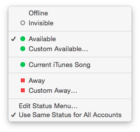
Display > Differentiate Without Color: Here’s another feature for colorblind users, although it seems to be a work in progress. According to the Apple Support page, checking this box makes Yosemite “use shapes, in addition to or instead of color, to convey status or information.” So far, the only thing that Differentiate Without Color changes is transforming the Away status indicators in Messages from circles to squares.
-
Display > Increase Contrast: Activating this achieves a few results. First, it increases the contrast of elements on the screen (such as buttons, button borders, and boxes) without changing the contrast of the screen itself. This is helpful for many types of visual impairments, including color-blindness. Second, it enables the Reduce Transparency checkbox discussed next. Third, it reverts the new flattened appearance of Yosemite’s graphical design to a more traditional look.
-
Display > Reduce Transparency: In Yosemite, Apple introduced what it calls “transparency” to menus and sidebars in the Finder and iTunes, so that users can (sort of) see the desktop through the menus and the sidebars. At first glance, this may look cool, but many users — and not just those with visual impairments — find that the menus and sidebars appear blurry and that the fonts of the menu text are too thin. This so-called “transparency” is actually translucency — and there’s no need for it in the context of menus or sidebars if it makes the interface harder to see.
-
Display > Display Contrast: This slider increases the contrast of the screen itself. You may have to experiment with the Increase Contrast checkbox and this slider in order to adjust both settings to your preferred values. (Note that sliding Display Contrast to Maximum renders the screen so bright that it may be painful for photophobic users.)
-
Display > Cursor Size: This slider increases the size of the pointer arrow, the cursor, and the spinning beach ball cursor. This feature is a double-edged sword: while increased cursor size is invaluable for many low vision users, the larger size obscures text and graphical elements underneath it.
-
Display > Open Display Preferences: This button takes you directly to the Displays Preferences, which provides options for Resolution, Brightness, and Color.
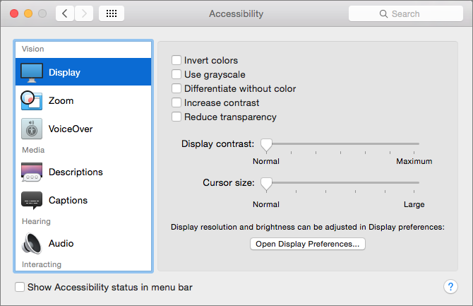
(Click the question mark icon in the lower right corner of the Accessibility window for a convenient reference.)
Accessibility Zoom Preferences — Zoom is all about screen magnification. The Accessibility > Zoom pane offers options for controlling the zoom feature in various ways:
-
Zoom > Use Keyboard Shortcuts To Zoom: This setting enables the user to toggle the zoom command itself, zoom in and out, toggle smooth images, and toggle keyboard focus following, all from the keyboard. Each of these shortcuts can be assigned in the Keyboard pane of System Preferences, in Shortcuts > Accessibility > Zoom.
-
Zoom > Use Scroll Gesture With Modifier Keys To Zoom: With this selected, zoom in and out easily by pressing the modifier key of your choice and scrolling with a trackpad or mouse. Lots of people without visual impairments use this for quick zooming in and out on too-small elements.
-
Zoom > Smooth Images: Because enlarging an image may make its edges appear more jagged, this option smooths images at greater magnification levels.
-
Zoom > Zoom Follows The Keyboard Focus: In many apps, pressing the Tab key moves the keyboard focus among text boxes and lists; thus, when Zoom Follows The Keyboard Focus is selected, pressing Tab moves the focused text box or list into view. In other words, this automates the process of finding the location of current keyboard activity so it doesn’t get lost offscreen. Note that switching the Full Keyboard Access option at the bottom of the Keyboard > Shortcuts > Accessibility pane to All Controls provides even more targets for navigating with the keyboard while zoomed.
-
Zoom > Zoom Style: Select from two choices: Fullscreen, which magnifies the entire display, or Picture-in-picture, which provides a small rectangular magnifying window that can be placed anywhere on the screen.
-
Zoom > More Options: This button displays a new dialog for Maximum and Minimum Zoom sliders, a toggle for showing a preview rectangle, and radio button options for how the zoomed screen image moves relative to the pointer.

VoiceOver — VoiceOver, the built-in screen reader for both Mac OS X and iOS, enables visually impaired users to read interface elements and text via spoken audio or a refreshable braille reader. It also enables full keyboard control. You can turn it on and off, and set a keyboard shortcut to toggle it, in Accessibility > VoiceOver. The real configuration takes place in the VoiceOver Utility, which can be opened
from the Accessibility > VoiceOver pane, along with a VoiceOver Training app.
Limitations to Accessibility Options — Unfortunately, there’s no way to set a system-wide type size; font sizes in each application must be set independently. While not difficult, many apps limit sizing on both ends of the scale. To change the default text size in Finder windows for Icon, List, and Cover Flow views, choose View > Show View Options > Select Text Size. Choose a font size of 10 to 16 points and click Use as Defaults to apply to all windows in the current view. Repeat for each type of Finder view other than Column view, which lacks that button. You can also
experiment with font sizes in the free utility TinkerTool.
Should you be running Windows in a virtual machine, the equivalent to the OS X Accessibility preference pane is the Ease Of Access Center in the Windows Control Panel. Be warned that results when running Windows in a virtual machine may be unpredictable.
Other Relevant System Preferences — These preference panes also provide options that may be helpful for low vision users:
- General: This catch-all preference pane contains myriad interface settings, including appearance colors for buttons, menus, and windows; highlight color; sidebar icon size; and scroll bar management. Many low vision users especially appreciate the “Use dark menu bar and Dock” option.
-
Dictation & Speech: This set of preferences is extremely useful for enabling control and access via voice.
-
Dock: The Dock preferences include sliders for size and magnification, position on screen, animated effect when minimizing windows, and toggles for other Dock behavior.
Tech Guides — To extend the Mac’s native capabilities, many third-party apps and utilities are worth considering. (And, because of Apple’s Accessibility API for developers, more of these can appear in the marketplace at any time.) High-end application suites can be pricey ($400 and up), but many simpler utilities are inexpensive or even free.
Because visual impairments are diverse, each user may have unique accessibility needs. In fact, TidBITS commenter G.F. Mueden astutely differentiated between “eye readers” and “ear readers.” “Low vision includes two groups, eye readers, those who still read with their eyes but not well, and ear readers, those who read with their ears via text-to-speech technology (screen readers). What helps one group is unlikely to help the other, and the professionals who deal with accessibility seem mostly concerned with helping ear readers — a complex affair, because screen readers are not all alike.”
It might take some experimenting to configure a setup that works best. Before investing time and money into software and electronic devices, the following resources offer a good start for research:
- American Foundation for the Blind’s (AFB) Living with Vision Loss guide, including Technology Resources for People with Vision Loss. Also valuable are the AFB product database and guide to screen magnification systems.
-
AppleVis community of low vision users of Apple products, as well as podcasters and iOS accessibility developers
-
Lighthouse International’s “Make Your Computer ‘Vision-Friendly’: Practical Advice from the Lighthouse”: computer tips from low vision experts
-
The National Eye Institute Health Education Program’s “Living With Low Vision” booklet
-
LVI Low Vision International: a distributor of software and electronic products for visually impaired users
Advanced App Suites — For those looking for a comprehensive solution, two companies have full suites of accessibility utilities for the Mac (there are many more options for Windows):
- Ai Squared’s ZoomText: a suite of utilities that zooms and enhances everything on a computer screen ($399)
-
MagniLink iMax: a suite of utilities including magnification, contour and contrast enhancements, pointer settings, and screen reading ($495)
Screen Dimmers and Color Adjusters — Some Mac apps offer rudimentary controls for color adjustments, such as setting white or colored text against a black or colored background. For system-wide control, though, there are a variety of screen dimmers and utilities that can adjust brightness, color, and contrast, including:
- Charcoal Design’s Shades, which is free and reportedly handles multiple monitors well
-
ACT Productions’s Brightness Slider: This is what I use. It’s simple, effective, and free.
-
f.lux, a free utility that automatically adjusts the colors and contrast of your display according to the time of day for a more circadian rhythm-friendly computer experience
-
Zhen Liu’s Dimmer Than Dim ($2.99)
-
Raj Kumar Shaw’s Work at Night ($2.99)
Some visual accessibility utilities focus on making the mouse pointer easier to see and/or control:
- Code Race’s myPoint Pro is an inexpensive suite ($4.99) of utilities that includes a crosshair, mouse halo, and locator for the pointer; horizontal and vertical line grid; mouse position coordinates; and an adjustable screen dimmer.
-
Many Tricks’s Keymo ($5) enables full control over the mouse pointer via keyboard shortcuts and can highlight the pointer position when it moves, when it’s moved by Keymo, or temporarily after a period of inactivity.
Browser Extensions — In Safari, I found it handy to use extensions that disable visually assaultive animated ads and pop-ups, set up a keyboard shortcut to disable JavaScript, and regularly view mostly text pages with Reader. I wish Reader offered more than two font sizes, color controls for text and background, and adjustable margins — and it doesn’t always capture all the text of a full page — but Canisbos’s CustomReader Safari extension for enhancing Reader may provide a workaround.
A variety of Google Chrome extensions and Mozilla Firefox add-ons provide other options for easier Web site reading. Apart from Evernote Clearly and Reasy, these mostly reformat the text.
- Evernote Clearly for Chrome and Firefox (especially helpful if you want to save to Evernote as well)
- Reasy for Chrome and Firefox (provides Rapid Serial Visual Presentation that displays the words in a single spot, so you don’t have to move your eyes)
- iReader for Chrome and Firefox
- Readability for Chrome and Safari
- EasyReader (Chrome)
- Read Mode (Chrome)
- Readable (Firefox)
- Reader (Firefox)
- Tranquility (Firefox)
Accessibility Tech Support — For specific assistance, accessibility support staff are available at the major operating system development companies:
- Apple Accessibility Support or 877-204-3930
-
Microsoft Disability Answer Desk or 800-936-5900
-
VMware Accessibility or 877-486-9273
For assistance with iOS, author and low vision expert Shelly Brisbin has recently released the iOS 8 version of her $20 ebook “iOS Access for All.”
While full accessibility for low vision users has a long way to go, improvements are often made with new releases of operating systems and utilities. Taken together, these improvements have provided more access to, and a smoother experience with, the digital world.
In the fifth and final part of this series, I will explore adaptive tech in related areas: reading tablets, audio and touch assistive devices, ergonomics, and the horizon of new innovations and future tech.
Articles in this series:
Articles in this series:
Thanks for this amazing series of articles very informative, professional and personal.
I'd like everyone to know that ZoomText Mac has a free, 30-day trial - no strings attached.
Download at:
http://www.aisquared.com/ZoomTextMac
Thanks, Doug! ZoomText is a solid product — and because accessibility needs are each so unique, the 30-day trial is very important for low vision users.
When using Safari’s Reader you can increase Reader’s font-size with ⌘+
Oops! You're correct: Safari Reader enables twelve font sizes. (The interface is confusing because at the top there is only a smaller A and a larger A, which would seem to indicate only two available font size choices.)
Ai Squared just released CamReader:
http://aisquared.com/zoomtextmac/more/camreader/
This is a document camera peripheral that comes with add-on software for ZoomText Mac. (Users must have ZoomText Mac in order to use CamReader.) CamReader works with both Mac (via ZoomText Mac) and Windows (via ImageReader).