iTunes 11 Interface Innovations: Good and Bad, but Not Ugly
What I’m finding the most interesting about iTunes 11 is not its features, which are almost entirely the same as in previous versions, but the way that it thinks about interface in a rather different way from the previous versions. iTunes is sufficiently central to the user experience of most Apple users that its interface changes could give a sense of where Apple might take OS X’s interface. That may be good or bad, depending on your perspective, but it’s certainly something you should keep an eye on.
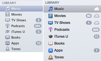
The Sidebar Returns to Oz — The last few versions of iTunes (and the Finder, and Mail) rinsed all color from their sidebars, relying solely on tiny icons and text to help users differentiate among the items. This was widely decried when it first happened, but most of the critics lapsed into sullen silence when subsequent releases maintained the monochromatic look.
Although iTunes 11 deprecates the sidebar in general, when you do show it with View → Show Sidebar, it now appears with color icons throughout. The color is still relatively understated, but works well as a visual cue when attempting to distinguish between the different icons. The screenshot compares the sidebars in iTunes 10 and 11.
I hope to see color return to other parts of the Macintosh experience. Most of us live in a world full of color, and while taking it out of our computing environment may have made a design statement, it was a step backwards in usability.
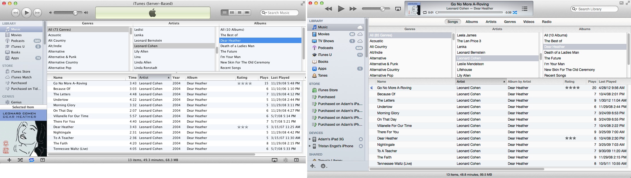
Fonts Get Bolder, with More Leading — Notable for anyone who pays attention to fonts is the switch in iTunes 11 to Helvetica, from Lucida Grande. But Apple didn’t stop there, and iTunes 11 features a significantly different approach to application typography that’s more in line with the Web or with iOS apps than with traditional Mac apps. The fonts are larger, and there’s more leading (space between lines), which renders the screens more readable, although at the cost of information density.
As you can see in the comparison windows below, iTunes 11 uses 8 percent more vertical space to display the same information as iTunes 10 did, largely thanks to the added spacing between text. The sidebar comparison screenshot above is even more indicative of this, showing a roughly 15 percent increase in height. That will mean more scrolling, especially on small MacBook screens, but overall, I think it’s a worthwhile tradeoff.
I could easily see this sort of typography come to the Finder and Mail in future versions of OS X, where it would likely have the same effect of reducing the amount of information showing on screen at any one time, in favor of making it less crowded and more readable.
Modal Screen Displays — One of Apple’s notable interface trends with Mac OS X has been the move from multi-window apps to those that incorporate most of their interface into a single window with panes and sidebars. iTunes was in many ways the poster child for this move, offering multiple sidebars and radically changing the contents of the main window based on the selection in a sidebar.
iTunes 11 continues this trend, seeming ever more like an iOS app running in constrained screen space. The loss of the default sidebar plays into this screen-based approach, since there is no longer a ubiquitous sidebar that clearly identifies the top level of the selection, as in iTunes 10. Without the sidebar showing, various menus and buttons at the top of the iTunes 11 window, just under the toolbar, control what shows underneath. The problem is that this navigation bar packs a lot of these controls in, and because they occupy only a single horizontal row, it may be clear what is selected, but it’s not clear what is available to be selected.
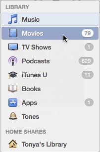
To be more specific, the pop-up menu on the far left of the window lets you select among media types (music, movies, TV shows, podcasts, iTunes U, books, apps, and ringtones; fortunately, these can also be accessed by pressing Command and a number matching their place in the list, such as Command-1 for Music and Command-2 for Movies). That’s just like the items in the sidebar, and again, while you can see what is selected, you must open the menu to see the other options. Then, the lozenge-like buttons in the middle let you either refine what appears below (such as by limiting the view to only iPad apps or audiobooks), or offer an entirely different view of the contents (such as playlists or genres). A popover toward
the right side of that top bar lets you access your iOS devices, changing the screen yet again, and the final button gives the entire window over to the iTunes Store.
Using this interface isn’t terribly hard, but when you navigate around, leave the program for a while, and then come back, it can be hard to get your bearings. This is made all the more confusing by the many different types of views that iTunes 11 supports. I count at least the following seven types:
- List, with an optional three-pane column browser (Songs)
- List, with a sidebar and an optional column browser (Playlists)
- Detail list, with one (Podcasts) or two (Playlists) sidebars
- Thumbnail (Albums)
- Thumbnail with sidebar (Genres)
- iOS device screens (which vary significantly, and add the On This iPhone and Add To screens)
- iTunes Store (which at least has a white-on-black bar at the top to differentiate it).
That’s a lot of different screens, especially given that many of the iOS device screens differ from one another while being named similarly to the media screens.
Three additional facts make this approach all the more troubling. First, unlike a Web site’s breadcrumb trail, there’s little in the way of locational cues. For any given screen, you must look at the left side of the top navigation bar to determine what type of media you’re looking at, and then at the lozenge buttons in the center of that bar to figure out what view or refinement to the listed contents is showing.
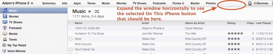
Second, at least when you are viewing an iOS device, it’s possible to shrink the window horizontally so that some of the 12 center buttons disappear entirely with no indication of where they’ve gone. Imagine trying to help someone click the On This iPhone button when the window is too small to display it.
Third, working with an iOS device not only takes over the entire screen, it requires that you click a Done button to escape back out to the media screens. If you use the Add To function to put media on your iOS device, you go down to another level that looks like the media screens in every way, except for the addition of a right sidebar and yet another Done button.

Frankly, I think Apple has rather gone off the rails here. You can quibble with the old sidebar interface, but it was always clear where you were, and what you were working on. This new approach is undeniably more attractive and probably easier to use when you are within a screen, but moving between screens with so few locational and navigational clues is going to be a major problem for less-sophisticated users. I sincerely hope that this doesn’t become a model for other Mac applications, and the fact that Apple
lets you bring the sidebar back says to me that they’re not entirely comfortable that this new approach is better — it’s unlike Apple to allow users to revert to older ways of working.
There’s another aspect of this push to a single window. Missing in iTunes 11 is the capability to open a playlist in a separate window or, more to the point, multiple playlists in multiple windows. For those, like our own Matt Neuburg, who use iTunes as a music database, the loss of that functionality is seriously problematic. But more to the point of this article, the Finder is a perfect example of an application that needs multiple windows for file manipulation. Should Apple attempt to shoehorn the Finder into a single window interface, significant power and flexibility would be lost.
Multiple Menu Types — Lastly, I find myself perturbed by some of the ways Apple has started concealing what are effectively menus underneath buttons, with no indication that the button is in fact a menu — the FaceTime button in Messages is particularly glaring. In iTunes 11, Apple has four types of these controls (ignoring the traditional pop-up menus you’ll find in all of iTunes 11’s dialogs, which haven’t changed at all from iTunes 10, oddly enough).
First is the custom pop-up menu used for choosing among media types. It’s good, because it includes a pair of arrows to indicate that it’s a menu and it responds to a click-and-hold action like a menu should, along with responding to individual clicks to open the menu and choose an item within it. It always has a required state — some media type must always be selected.
The second type of menu is a graphical button with a name beneath, much like a Finder icon. The main instances of this that I can find are the View button in the Playlists screen and the Options button in the CD import screen. These are also a good approach, since they combine text and graphics, have a downward-pointing triangle to indicate that they’re menus and not normal buttons, and respond both to a single click and to a click-and-hold. That said, these two are quite different in what they contain: the View menu
affects the display of the Playlists screen, remembers its selection, and even changes its button to match, whereas the Options menu holds commands that perform other tasks.
![]()
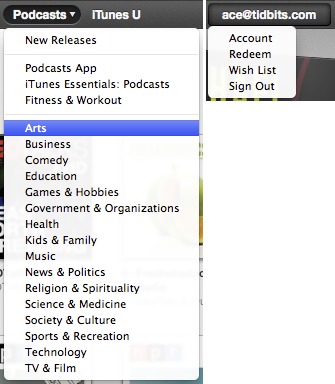
Third, we have a button/menu combination, where clicking once on the button has one effect, and clicking and holding on it reveals a drop-down menu that provides additional options — the buttons in the iTunes Store nav bar are good examples of this type. There’s no indication that these buttons also have associated menus until you hover over them, at which point a small downward-pointing triangle appears. (Usually, at least. The iTunes account button containing your email address is actually only a menu, and doesn’t get that
arrow.) They do respond properly to click-and-hold, and to individual clicks, though the latter must be precisely on the triangle to reveal the menu rather than invoking the button. Also, these menus don’t have a required state or change to indicate the selection — clicking the Podcasts button takes you to the Podcasts section of the iTunes Store, for instance, but that button’s menu just lets you dive into particular categories of podcasts and doesn’t reflect what you’re viewing.
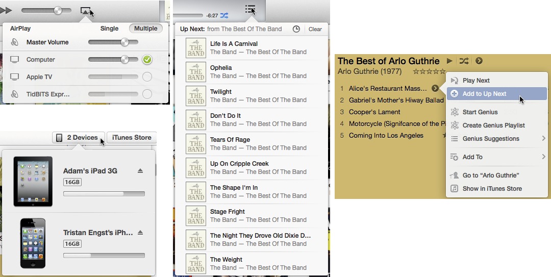
Fourth and finally, is the popover, which appeared in iOS relatively recently. Popovers are called forth by a single click on a button; there’s no indication like the downward-pointing triangle that the button will generate a popover ahead of time, and a click-and-hold won’t work. Popovers also aren’t exactly menus — what’s in them is entirely unpredictable, and may involve additional interface elements. Look at the AirPlay popover, which lets you select between one and multiple destinations, adjust
the volume for each independently, and control a master volume. The iOS device button also generates a popover showing the available iOS devices and the memory usage on each; the Up Next button (the three stacked horizontal lines) has yet another popover interface; and selecting or hovering over a particular piece of media shows a right-pointing triangle that reveals another menu-like popover.
I see what Apple is trying to do here — traditional pop-up menus are much more limiting than popovers, with their unique interfaces, and the button/menu combos are more like Web-based navigation menus. But I know that many people — including myself — find some of these buttons, particularly the obscure graphical ones that invoke popovers, utterly inscrutable, and the fact that they have become the only ways to access certain features like AirPlay worries me. Back when button bars started to become popular, it became clear that some people
simply don’t do well with arbitrary graphical images, and far prefer words. We as a people don’t share a common graphical language, and no matter how popular Apple products get, a graphical language will always be obscure and poor in vocabulary.
Because there’s no way to know what the graphical buttons do, users are forced to play iTunes like a video game, clicking everything in sight and trying to remember the sequence of clicks that reveal necessary controls. At least some of the buttons have text on them, even if they act in different ways: the iOS devices button reveals a popover whereas the otherwise identical-looking iTunes Store button next to it switches to the iTunes Store interface.
There is one aspect in which these button menus are good thing, and that’s when they bring forth functionality that was previously hidden only under contextual menus. Contextual menus are good when they provide an additional or faster way of accessing commands or options, but since they’re even less discoverable than these buttons (how would you know to Control-click something in the iTunes sidebar?), it’s a major problem when they’re the only way certain commands or options are exposed. That’s always been bad interface design.
In the end, it’s good to see Apple trying to extend interface concepts with all these new approaches in iTunes 11 and some, like the use of color and the new approach to application typography, are welcome. But there’s a distinct lack of consistency and attention to discoverability that renders the single-window model and multifarious button menus less successful than they might be. I cringe at the thought of trying to help someone use iTunes 11 over the phone — it will be nearly impossible to describe the screen successfully and to walk someone through different actions if you can’t do so in person. And that will happen, since while iTunes 11 is attractive and certain actions are simple, plenty of other actions are made all the
more difficult by some of these new interface conceits. Let’s hope Apple puts more thought in before extending these concepts to other parts of OS X.
I don't like Helvetica on the screen, Lucida Grande was much more readable. I also don't like the smaller memory indicators for devices.
Apple's UI designers don't take older folks' eyes into account, they think if their young eyes can read it everyone can...
Interesting! I found the darker, larger, more-spaced-out Helvetica easier to read, and my eyes are definitely starting to suffer the ravages of age. Clearly, there are a lot of variables that go into what one person sees well and another finds hard to read.
John Gruber has a post regarding his initial thoughts of iTunes 11. He says Helvetica looks amazing on the retina-based Macs but okay on non-retina based macs. So it's quite likely iTunes 11 is optimized for retina screens.
Now if Retina screens were widespread across the product line... :-)
As someone with severely impaired vision (for all of my 67 years), my favorite screen display font is Verdana. It is larger than Helvetica at the same point size, the stroke weight is heavier and the default leading is wider. Even so, I noticed improved type visibility in iTunes 11 without knowing the exact changes involved. And there is a choice in the iTunes preferences to use large text for list views. If you need to see more data - and your eyes can handle it - you can turn off the large text option.
As for all the new buttons and navigation tools, I haven't made up my mind whether I like them or not. They will certainly take some getting used to. But I share Adam's dismay at the prospect of trying to teach others how to use the new iTunes. I've been reading articles like this one to learn as much as I can, but I doubt most Mac users will take the trouble.
So, like Adam, I think iTunes 11 is a mixed bag in regards to what it portends for changes in the OS X UI. The gray interface came to iTunes 10 first before it infected the entire OS in OS X 10.7, Lion. I hope iTunes 11 presages the return of color to the Finder, but, at the same time, worry that the iTunes modal interface may be applied to it as well. That would indeed be a disaster. The Finder is not just another application. It's the very key to using the Mac OS. Tinkering with it is asking for trouble.
Now that Jonathan Ive is in charge of the entire Apple interface effort, it's anyone's guess whether he will restore usability as a paramount Apple value. Some of his designs, like the old Apple hockey puck mouse, have been less than stellar - despite Tim Cook's high opinion of Ive's taste. The new iMac is another case in point, where utterly pointless changes in form dictated, or permitted, a serious degradation in usability. I'm not at all clear that Ive can see a product from a user point of view. Elegance in industrial design is just vanity if it's not also useful.
I am one of the sullen grumblers of which Adam wrote in regard to our displeasure with the iTunes 10 interface. And I've not yet subsided into silence about the graying of the Finder in OS X. Given these examples, I remain skeptical of the quality of Apple's vision going forward. Tim Cook claims to be proud of how involved Apple customers are in providing feedback on Apple products. It remains to be seen if he sincerely gives a hoot or if he's just blowing smoke. If usability does not rise in Apple's esteem, in my not so humble opinion, smoke will be his legacy.
I have to say that iTunes 11 convinced me that Apple has just lost its UI mojo. It's utterly complicated, it's full of options and hard to understand modes and functions and it tries very hard to make utterly complex things look easy without actually making them easy to understand.
In fact, iTunes 11 caused me to give up any hope that Apple actually knows what it is doing UI-wise. I'm still using iTunes because I have to, but this is the first version I actually really dislike. Alone the fact that there's the main window and the mini player and the artwork windows with a Quicktime-like embedded player control (which is the ONLY way to have artwork displayed in a prominent place) just reeks of total confusion and carelessness.
It's the same as with iPhoto and nearly all other Apple apps: They get worse and worse with every version. I've long given up to get a grip on iPhoto and its confusing interface. I still use it, but I do not enjoy using it. It's over.
iTunes is a tough program, admittedly, because it's trying to do so very much. But I very much agree about iPhoto, and that's coming from someone who wrote a number of editions of a book about it. In particular, I find the full-screen mode interface of iPhoto to be difficult, and I think for many of the same reasons I find the single-window approach of iTunes to be problematic.
Both iTunes and iPhoto (and lots of other Apple apps on both OS X and iOS) have one thing in common: They're great ideas executed poorly. There's a certain odor of helplessness and confusion that's really putting me off.
I mean, why on earth they didn't integrate the cover art window into the mini player like they did with the "Up Next" list? It's separate window that even doesn't float on top, so if you want to see your cover art you have to click it into the foreground? There's an option for "always keep on top" for the mini player, but *not* for the artwork window (which has its own controls that look totally different from the mini player)? It feels totally different and unconnected.
But at the same time they removed the ability to have multiple playlist windows open. This is so wrong. Now you have a player and artwork in separate windows you have to dig for but no separate windows for another playlist you're trying to fill up for a party or CD you're about to burn for an event.
Excellent article. On balance, I think iTunes 11 is a considerable improvement over 10, but popovers in particular are poorly implemented. And I completely agree with uhuznaa, who criticises the iPhoto interface.
Quite a bit about Apple interfaces is becoming less intuitive.
I completely agree. The interfaces are becoming more "Windows"-like. It takes more clicks to do things than it used to. Especially in iPhoto.
Getting this right will take a number of iterations. I am still quite confused with the new look of iTunes, old habits die hard; perhaps someone using it for the first time may not have as much difficulty. Not sure that breaking up iTunes would help. In iOS, there is Music and iTunes There's the App Store and the Apple Store. Even worse for images. There is iPhoto, Photos, and Camera. The UI at TidBits is pretty easy to figure out. The new look at Macworld? Hodgepodge comes to mind. It's not easy getting this stuff right.
Addendum: This guy thinks MacWorld got it right. So, who knows? http://brooksreview.net/2012/11/readable/
There's another thing I totally hate with iTunes 11: The cover artwork display in the bottom of the sidebar is gone. Trying to paste/drag any kind of artwork onto a track or album is pure madness now. Depending where you are there may or not may be any way to do that at all now.
iTunes 11 somehow managed to drop most of the cover art anyway and trying to add it again is maddening.
This really is the first time in many years I'm seriously looking into alternatives to iTunes. Honestly, I think I'm basically done with Apple. It's not that others have become that much better, it's just that Apple has started to suck in so many places. How can a company with more than $100b of cash can come up with such crap?
What would be an alternative, to store and categorize and play a big collection of music, books, and podcasts, and manage and sync IOS devices?
Adam makes a number of good points about where user confusion issues might arise in the latest version of iTunes, as have several other commenters. However, speculation only takes you so far.
An effective way to find out where iTunes' usability problem areas are, and exactly the kinds of confusion they create, is to get a set of users with various levels of experience, give each of them a list of common (and not so common) tasks to perform with iTunes, and then watch carefully what happens. I can guarantee you that some of the results will be stunningly obvious and others will be just as stunningly surprising.
Having performed many usability tests, I have often found that interface elements that I thought problematic turned out not to be so, and that other elements that seemed perfectly obvious and straightforward turned out to be very confusing or misleading to users.
I would love to know a) if Apple performed such tests with the latest spin on the iTunes UI and b) the results of those tests. Though such tests won't tell a developer how to fix usability problems, they can help the developer find where the problem areas really are.
I've been using mac since 7.0.1. and have loved everything Apple's done... 'till now.
But Apple's recent UI designs have taken a nose dive since Steve passed away. The latest releases of iTunes and AppleTV seem to have replaced the former elegance with designs that strongly resemble the subtlety of the "Universal Access" option (Apple's "assisted" re: handicapped). - Big buttons for old people, Big letters for the blind, dumbed down functionality for the simple minded, garish colors everywhere. (Yuck and Yuck!).... Did my mac really need to be pimped out like this?
Maybe they just stopped putting money into UI focus groups? Because I can't understand how tragic design choices like: a UI where HUGE (touch) buttons are partially cut off at the edge of a (non touch device) screen get made. - AppleTV.
Back in 1985, Steve was alive and able to come back to fix the mess created by his ousting. Sadly, since his passing, there's no one left to save Apple from chasing the mediocrity of Windows, Roku, Android and Linux UI. What's next? Grey plastic "Dell like" laptop cases on all new Air Books? - (Cause the rebirth of the RJ45 -Laptop-dongle hasn't been a ridiculous enough comeback).
Honestly, if I could find a clean way to sync my iPad and iPhone and serve to AppleTV without iTunes I'd use something else for serving up music & video.
Maybe we should all feel comforted by the recent Mac Rumors announcement recently that Apple has bought the rights to "Clippy". Maybe that's what will display in the huge empty grey space in the iTunes mini-player when your album has no artwork!
The iTunes interface is beginning to look more and more like a Windows application...and that's not a compliment.
Yes! yes! yes!
Whatever are they thinking? Is anyone in charge of the UI?
Do they ever test it with users? Do they listen to Adam??
They should!
Thanks for the heads up. Looks like I'll be staying with iTunes 10. I use multiple playlists in multiple windows extensively and much prefer dense information to legibility.
I went up to iTunes 11 - lasted about 3 days - couldn't do anything with ease - tried all the forums for tips and workarounds - hated it even more - removed it - reinstalled iTunes 10 and realised how good it was. Apple just stop fixing things that AIN'T BROKE! They seem to have employed an infernal meddler. Sack 'em!
I also regret moving to Lion but too late to go back to Snow Leopard which was a smooth operating system. It's all part of the corporate plan to get everyone and all the software onto the wretched CLOUD - then they will control everything and have nobody able to produce cheaper software.
The latest is definitely no longer the greatest as far as Apple are concerned.
Say NO to the CLOUD!
Enjoyed the teardown, Adam. I think the best thing they could do is split iTunes out, but I doubt that'll happen. iTunes 11 has lots of fit and finish issues, but it feels much faster than 10, which is what matters to me.
Same issue with iPhoto. The interface is mostly okay, but it's such a lethargic beast of an app that it's agonizing to use.
Splitting iTunes into several different programs certainly feels like a direction that could be taken, but I'm not sure it would work well if taken to the logical extreme. Kirk McElhearn touched on that a while back when he wrote about the perception of iTunes being bloated: http://tidbits.com/article/11615
The main thing that seems as though it could be broken out of iTunes to me is iOS device management. Whatever new app were to do that would still have to have full access to everything managed in iTunes (and would manage apps itself), but that's the main thing that feels truly bolted on to iTunes now and only peripherally related to its role as a media management tool.
Great idea this split, and roll it into the App Store application. So much in common: buying apps/applications, getting updates, installing them. Must be possible to create one easy user-interface for managing this on your Mac and iDevice. One problem: Windows-users, they have no App Store application.
Windows is an issue, but the App Store application in OS X is pretty minimal - it's loading all its contents from the Web - so it wouldn't be hard to replicate in Windows. And yes, then it could take over iOS apps as well.
Having upgraded thinking, humm - looks nice, the first task I sat down to do was de-dup some of my library due to file space. Nope - that's not there anymore. OK so open a couple of windows across my two screens - nope. Where's my iTunes DJ - gone.
menu navigation started to wear me down as did loosing my view when returning to the library. Within a day I re-installed 10.7 and looks like I will stay there until something more useable comes along. The rot has set in - it felt like a Windows upgrade to me as did Lion! The least I feel angry that they haven't considered their users needs. Ivory towers
What worries me is that with each iteration of iTunes the user is less capable of exporting his music. You used to be able to drag a song to the desktop and now you can't. (You must create a duplicate song in another format first, then export it) With the move toward cloud based music (iTunes Match) your music is that much further away. You can't list the protected songs in iTunes. The formats no longer keep MP3's as MP3's. The user is constantly badgered for passwords. It would not surprise me at some point if the user will accept a license to install iTunes that in it's fine print says "The user relinquishes all ownership and control of his music..." It seems like Apple consorted with the music labels to gradually faux copy-protect everything by making it less available to you. I also dislike how difficult the user interface is becoming. There is no way to know all your options at any given point like there was in a menu based interface.
I'm not having any trouble dragging songs (from any view I've tried) to the Desktop - just grab the title and start dragging.
As far as listing protected songs, I think this hasn't changed. In the Songs view, open View Options (Cmd-J) and under the File category, select Kind.
I'm not quite sure what you mean by the formats not keeping MP3s as MP3s; I don't see any changes in my MP3s (again, easily identified with that Kind column).
I'm also not sure what you mean by the user being constantly badgered for passwords, at least on the Mac. I think the only time iTunes asks for a password in regular use is when you try to configure your iTunes account. In iOS, that's less true - there are a lot more password prompts.
I think Miguel's complaints are related to iTunes Match iCloud. iTunes Match will replace matched MP3s with AACs. Files streamed from iCloud can't be dragged to the desktop but instead of clicking the "Download from iCloud" button, my guess is he discovered converting the file format also happens to create a local file that is draggable.
As for passwords, maybe he's not saving his Apple ID in the keychain? Also, if you had a bunch of protected files purchased with different Apple IDs, you could get a lot of password prompts (at least once per unique Apple ID) if you never played those files in a particular OS X account before.
iTunes will prompt for login password every time you open it if you or an application (e.g. Cookie) deletes Apple's cookies. It took me several weeks to figure out and get it fixed by making changes to my cookie manager application.
Oh, that makes sense, given that the iTunes Store is basically a Web site, from the point of view of iTunes. So I'm not surprised it's setting cookies.
If your focus is managing podcast subscriptions (audio and video) and distributing them among multiple devices, you'll find this update an improvement.
Now, iTunes can actually find a device on WiFi whether it's plugged in to power or not. Simultaneous syncing occurs reliably to all devices. The popovers are a good interface element to manage this complexity.
I also have old eyes, so I'd like to see a preference for typestyle size, or Command + to make the whole show bigger.
Thumbs up! Thanks Apple.
One thing that certainly seems lost in the process is the keyboard shortcut Cmd+M that eased things when deleting a podcast (Bsp) and being asked if you want to Move It To The Trash (this of little use per se, but it got introduced in 10, I believe). I wish I could understand why Apple needs to regularly downgrade the GUI. Reason why I'm still with 10.6.8, I guess.
Can you provide more details about what's changed here, tingo? Cmd-M is Minimize in iTunes 10 and that hasn't changed in iTunes 11. I can't see any differences in how the versions deal with deleting podcasts, either.
I'll try to explain better, then. In the Podcast window, when I select a podcast and press Backspace to delete it (and the file is still located in iTunes' Podcast folder, i.e. I haven't moved it), I get a dialog box, I believe since iTunes 10: Cancel/Keep File/Move to Trash. The default is Keep File, but I found at some point that Move to Trash reacted to Cmd+M. With iTunes 11, it doesn't work anymore and after pressing Bsp, I have to grab the mouse to click on Move to the Trash.
Ah, now I understand. The feature you want is still there, but it's now Cmd-D, since the button is Delete File, not Move to Trash.
Sorry to have to contradict you, Adam, but I see what you're saying when I want to delete podcasts that haven't been downloaded yet. When they're downloaded on my disk and I want to delete them, I get the dialog I've mentioned, which gives me the option to keep the files or send them to the Trash (I wish I could post a screen shot here).
On the general side of things, now. One of my banks recently rehauled their GUI, general hassle for all users, and someone on some forum was asking: don't they understand that users HATE changes? Me: call it burnout, stress or just aging, but after working with computers for close to 25 years, I just want PEACE, not useless modifications, as in the case of this iT11, that change strictly nothing as far as my use of the software is concerned, just so that some people sitting at their programming desks can justify the wages they're getting (quite similar to wars that never cease, so they justify the new weapons and the factories that produce them, not?)
Aha! The difference is that I store my iTunes Media folder on a server, so the files can't be moved to the trash, they must be deleted immediately. iTunes detects that and changes the button name.
When I reset my location to the local disk, the button changes to Move to Trash and doesn't work with Cmd-M, as you say. So yes, it's a bug. I recommend filing it at http://bugreport.apple.com/
Have done, but it's the last time too. Their bug reporting doesn't work in Firefox, so I had to start by reporting a bug in the bug reporting in their totally bizarre mail format. It did work–strenuously–in Safari, after having to login three times in a row with my Apple ID.
The shortcut is not "Cmd+M," it's just "M." As is true of some (but not all) buttons in OS X modal dialogs, pressing the first letter of the button's name activates that button.
What I always do in Podcasts still works; Cmd+delete to remove selected podcasts. If it's an episode that has not been downloaded, it's simply gone, no confirmation, no sound effect. If it's one that was downloaded the usual modal dialog appears (Cancel, Keep File, Move to Trash) and pressing M activates the Move to Trash button and my system's move to trash sound plays.
Well, you're absolutely right, Curtis, thanks a lot!
“What I always do in Podcasts still works; Cmd+delete to remove selected podcasts. If it's an episode that has not been downloaded, it's simply gone, no confirmation, no sound effect.” I use Backsapace for the same purpose. What you state here also applies if the downloaded podcast file has been moved out of iTunes' Podcast folder
Adam writes "... the Finder is a perfect example of an application that needs multiple windows for file manipulation. Should Apple attempt to shoehorn the Finder into a single window interface, significant power and flexibility would be lost."
Path Finder shows how you can provide the functionality of the Finder in a single window interface that conveniently sprouts subwindows with more detailed information.
I tried working without the sidebar, but having to go Up (Done) and then drag through a popup menu to select another iOS device was a PitA. So was navigating a menu to move to a different media type. Either I just hit the Play/Pause key on my keyboard, or I tend to go through several media types, perhaps on each of 2-3 devices. So the popup menus were awful for me. With the sidebar I can just click whichever media type or device I want, and perhaps click again for a per-device media type. Much better.
I think iTunes 11 is fine, but if they keep this feature set and shift to popups only in iTunes 12, removing the sidebar, I will take a big usability hit.
I agree - hidden menus are a bad thing!
I started with OS 4 and liked it because I could find all the commands in menus instead of remembering them or reading yet another manual.
Good: in artist view, albums sorted by year (my preferred view), iTunes will now play the albums in this order, and not alphabetical.
The playlist window pane is my main method of using iTunes so in version 11 you might understand that I'm really annoyed that I can no longer manually adjust it's width. This now means I have to rename every one of my playlists into a likely unintelligable abbreviation. I must say I preferred the Lucinda Grande typeface in iTunes 10.
The most annoying thing about the mini player is the now missing play head window. I frequently listen to quite long podcasts and/or playlists and it was much easier to manually advance a track !
Great article. Very timely. I just ran into iTunes v11 shock this morning after we updated without reading ahead first. The changes are quite significant.
I updated this morning, and the first thing I did was rip a Soundtrack CD into my library. Then I went to create a Playlist to put the album in, and that's when I found out that the library you can only seem to use it with the cover-art icons, and that you cannot view the library in a list form like before. For this album, there are different artists on it, and it showed me a cover for each artist, so to get the songs into the playlist I had to drag, one at a time, and then in the playlist itself, select Track # so I could get the it in the order on the disc. I think this way of doing it is counter-productive, and I do not like it. So how do you revert to the previous version? Anyone any clues on how to do this? Thanks
To keep the songs of different artists on one album together: select first song, get info (cmd i), info-tab, tick "Part of a compilation", click the next-button and repeat.
Or select them all, get info, options tab and set Part of a compilation to yes.
Thanks Henry for that tip. Now just have to remember it for the future.
Came across this: http://apple.stackexchange.com/questions/73191/how-can-i-downgrade-itunes-11-to-10-7-in-mountain-lion
Use the Songs view instead of the Albums view to get a list.
I am not a UI expert. I'm just a user.
For me iTunes 11 is worse than 10 because Apple now seems to want to hide so much information that was in plain view before. Popovers drive me nuts. I've resurrected my sidebar so now I can make the most important UI selection from a list and not an option box, but still loads of info is missing.
And they've messed up the minimise button again.
Two things I do most often: mini player/maximise and select media type. These two things both require more effort in iTunes 11.
I can't believe Steve would have put up with this. And don't even get me started on the new App Store. Horizontal swiping to select content on a device a few inches wide? Bizarre. Who could ever think that was a good idea?
What's wrong with the minimize button? It seems to work as it should, and work the same as it did in iTunes 10. The maximize button, on the other hand, now works properly, rather than switching to the MiniPlayer, which was non-standard behavior in iTunes 10.
There are keyboard shortcuts to show the MiniPlayer, and to switch to the MiniPlayer, and it's nice that it's not an either/or situation as it was before.
Just upgraded. Bad Interface, like QT Player X. I'm desperately trying to display the contents of an album in a list. Seems to have gone. No longer a plain and clean application.
Lost functionality: I started playing a music video, then realized I didn't want to, and switched to a play list and hit...pause (no stop option). I have the playlist set to shuffle, but hitting play...unpaused the video. I tried various things but couldn't get it to start shuffling the playlist from scratch. No matter where I went it wanted to play this video. I had to start a specific song from the other playlist (then I think that was the item iTunes was "stuck" playing...but I didn't try it).
Formerly, viewing another playlist lets me stop what's playing, then nothing's playing and play would pick a song at random if it was a random playlist. I'm not sure I'm explaining this well.
I suspect this is a feature--you no longer lose what you're playing if you go elsewhere and 'stop'!--but it removes functionality. I couldn't tell iTunes "forget what you're playing now and start over with this shuffle playlist." No doubt user error, but it used to "just work."
Videos: what is it that iTunes does that Quick Time Player or VLC can't do?
It was a music video, but anyway...(shrug)...I buy few music videos, but when I do, I leave them in iTunes. (Other content too, for that matter.) Not sure how that relates to my Q, though. ;-) As I said, I bet it does the same thing going from playlist A to trying to shuffle playlist B--no reason to think it doesn't--but I'm at home and only installed the new iTunes on my laptop, which is at work, so I haven't tried that yet. I will try that soon though!
Thanks for the rundown! After seeing that disappearing menu button trick, I'm going to add a new step to my family-phone-support routine: step 1, put iTunes into full screen mode!
A quibble: In previous versions, whenever I clicked back to the MUSIC directory after going into a playlist (or Podcasts or whatever), I was returned to where I had left off – let's say the Artists around L.
Now, you are returned to the top of your directory... That's a lot of extra scrolling if my son is looking for songs to add to a playlist, checking the playlist, and then returning to the Music directory.
You're right - and to make this more than just about a specific iTunes problem, that's the sort of lack of attention to interface detail that adds up over time.
As a workaround, start playing a song where you want to jump back to, and then use Cmd-L to locate the current song (you don't even have to switch back to Music first).
Unfortunately that's not an ideal workaround for retaining previous selection with video tracks.
Where the selection/focus will be when navigating between certain views/items in v11 is often challenging or seemingly impossible (for me) to reliably predict. The amount of extra keyboard/mouse/trackpad interaction quickly became significant and frustrating.
I'm using iTunes 10.7 to access classical music stations via "Radio" in the Library. Does 11 still have access to these radio stations?
Yup, in our initial article, Agen notes that Radio appears as one of the center buttons in Music view.
http://tidbits.com/article/13419
Lost functionality or am I daft?
Can we no longer display a playlist in Shuffle order?
Also, we used to be able to GoTo the song currently playing by clicking the curved-arrow icon beside the song name in the "now playing" frame at the top of the screen. That's now replaced with a menu which is more tedious but I could live with that, if it actually worked. When the current song is not in the visible part of the list, and I press "Go to [song]", or Cmd-L, nothing happens.
Are customers meant to be happy about UI "improvements" that decrease productivity and simplicity...?
p.s. Thank you Adam for all the effort you put into sharing your knowledge with us - much appreciated :)
I think Apple would say that the Up Next feature takes over from displaying playslists in shuffle order, unless there is something I'm missing.
And yes, that little curved arrow icon is gone, but the popover that appears from the now-playing frame when you click the right-pointing arrow next to the song title has options to jump to the song, album, and artist. Personally, I just use Cmd-L, which seems to work everywhere for me.
Thanks Adam, would you mind checking this on your installation - maybe I have a configuration problem. If I am playing a song from a playlist, and then view a different playlist, Cmd-L takes me back to the original playlist and to the song that's Now Playing. However if I am viewing a different part of the same playlist that the song playing is in, Cmd-L does nothing. It neither highlights the song nor moves the view to it. So especially when I'm playing from the Library (of many thousand songs), it can take a lot of scrolling, hunting around or sorting to find the track that's playing in order to rate it or add a comment, etc.
Thanks a lot
Curious - I'm not seeing that. Cmd-L always shows me the currently playing song, regardless of where I've moved or scrolled to.
Here's an article on features removed in version 11
http://www.macworld.com.au/help/troubleshooting-itunes-11-81906/
And a forum relating to the removal of shuffled playlists:
https://discussions.apple.com/thread/4574502?start=0&tstart=0
We should really take this discussion to the full article (more complete than Ted's) I wrote about the missing features in iTunes.
http://tidbits.com/article/13432
I'd don't as yet understand how the Up Next feature isn't as useful as the shuffled playlists.
I'm not sure what a shuffled playlist is; but when I make a playlist, I expect the songs to play in the order listed. NOT in 11. This Up Next thing is ridiculous. When I clear because it's playing songs out of my order, it no longer plays beyond the current song.
Why do I need to replicate work I've already done? If Apple wants to make the order played as stated in Up Next, then the least they can do is preserve my order across upgrades.
I don't want to use iCloud. I don't use iPhones or iPads. I just want iTunes to behave logically on my MacBook.
I'm kicking myself now. In the beginning I was reluctant because I figured Apple would make great efforts to take away my app and my music along with it. Now they've done that, and I've got to find other toys.
If a playlist isn't playing in the order displayed, it's because Shuffle is enabled. When you're looking at a playlist, the name of the list is displayed in large text at the top. If you click the right-pointing triangle, it'll start playing from the first track. If you click the next icon, a pair of arrows that crossover, it will play the tracks in a random, "shuffled" order. There's also a shuffle icon to the right of the progress bar and time remaining. If that shuffle icon is blue, that means shuffle is enabled and the next track played will be random. If you click the blue shuffle link, it will turn off shuffling.
I'm very disappointed with this version. Its extremely unstable and freezes continually making me force quit it many times a day. I'm stunned actually as I've never had a piece of Apple software perform so poorly. I'm still on 10.6.8 but that shouldn't make a difference.
Actually, it might make a difference, since iTunes is integrated into the operating system, and it's entirely likely that Apple tested less in 10.6.8 compared to Lion and Mountain Lion.
Not to excuse it, of course!
There's a wonderful explication of how popovers are being used badly in this report at MacinTouch.
http://www.macintouch.com/readerreports/userinterfaceissues/index.html#d13dec2012
Great Article! Thanks. Here's one I don't get: In my list of books, if I hover over a book title a small indicator is displayed on which I can click. So, I click it. A little pop up shows which says "Add To" (no ellipsis). So, I click it. The little window changes to show a list of playlists that I can add the book to. Cool. So, I add it to a playlist. But, once added, even though it shows in the playlist I can't do anything with it. It's a wash. What was that for, I wonder...?
I'll bet playlist functionality is available for books largely because of audiobooks; it doesn't make much sense for other types of books.