iPhone App Roots Out Mobile Coverage Details
Who has the best mobile coverage in the United States? Is AT&T really as bad as reports claim? Does Verizon Wireless lead the pack? What about the other carriers?
There’s a lot of heat and not much light when it comes to the question of which mobile carrier provides the best service. Soon after the original iPhone hit the market, technology writers began to lambast the service from AT&T, the U.S. carrier that Apple had chosen to provide mobile service for its newest digital objet d’art. Dropped calls, slow throughput, and inability to acquire a signal seemed to afflict everyone—or, at least, everyone who stood to gain from sensational headlines that would attract a lot of eyeballs. Actual reports from ordinary users, however, provided spotty, anecdotal evidence that sometimes supported, and just as often contradicted, the published accounts of AT&T’s purported epic failure.
In the years since, the picture has become no clearer, although advertising dollars, corporate missteps, and the echo-chamber of the Internet have managed to solidify the common perception that AT&T has not only dropped the mobile coverage ball but has managed to kick it through their own goal posts.
Enter RootMetrics (formerly Root Wireless), an independent, privately funded service that aims to provide “an accurate, unbiased view of each carrier’s performance.” Well, we’d all like that, now wouldn’t we? But RootMetrics’ goal raises the obvious question: How ya gonna do that, Sparky?
The RootMetrics Solution — How they do it is by way of one of the more popular of the buzz-words of the day, crowdsourcing. RootMetrics’ approach is to turn the massive throngs of digital-phone-carrying folk into a wide-area sensor network and then assemble the acquired data into a fine-grained picture of mobile coverage performance. RootMetrics began with a custom-built Android app designed to measure signal strength and data throughput and link it to GPS data. They distributed their creation to some adventurous souls and began to run the returned data through their proprietary analysis algorithm in order to produce coverage maps of several U.S. localities.
The resulting picture reveals that blanket statements about service quality are worth about as much as one of the pixels used to display such statements on your screen: when it comes to mobile coverage, what really matters is exactly where you are at any particular time. That’s obvious, of course, but the colorful maps that the RootMetrics analysis produces drive the point home effectively.
The Coverage Map iPhone App — iPhone users can now add their two bits to the digital picture that RootMetrics is painting. The company has made a free iPhone app that you can use to see the coverage picture at your location. And you can do more than just see your coverage picture: with the app, you can also test the signal your own iPhone is currently receiving, and you can report dropped calls, slow data, poor signal, and lack of Internet access. Your tests and reports are added to the data that RootMetrics is aggregating.
A few days ago, I loaded the RootMetrics Coverage Map app onto my iPhone and took a look at my neighborhood. The map, which portrays coverage areas in a hexagonal grid, showed that I was on the border between an area of “best” coverage and an area of “better” coverage. That more or less matches my personal experience: if I walk south half a block or so, my phone usually shows more bars; if I walk north I usually see a drop-off.

The app also shows a comparison between the quality of service that different carriers provide in the area where the phone is located. In my general vicinity, it turns out that neither AT&T nor Verizon rule: instead, Sprint reportedly provides the best service, with AT&T, Verizon, and T-Mobile all vying for second place. This also squares with my experience—the number of bars appearing on my Sony Ericsson phone back when I used T-Mobile matched what I see today with my iPhone on AT&T.
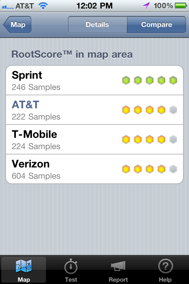
The map does not depict signal strength or data throughput speeds as such. Instead, the quality rankings are based on what RootMetrics calls a “RootScore,” which combines both decibels of signal and throughput speed. RootMetrics does not divulge the algorithm by which it calculates the score.
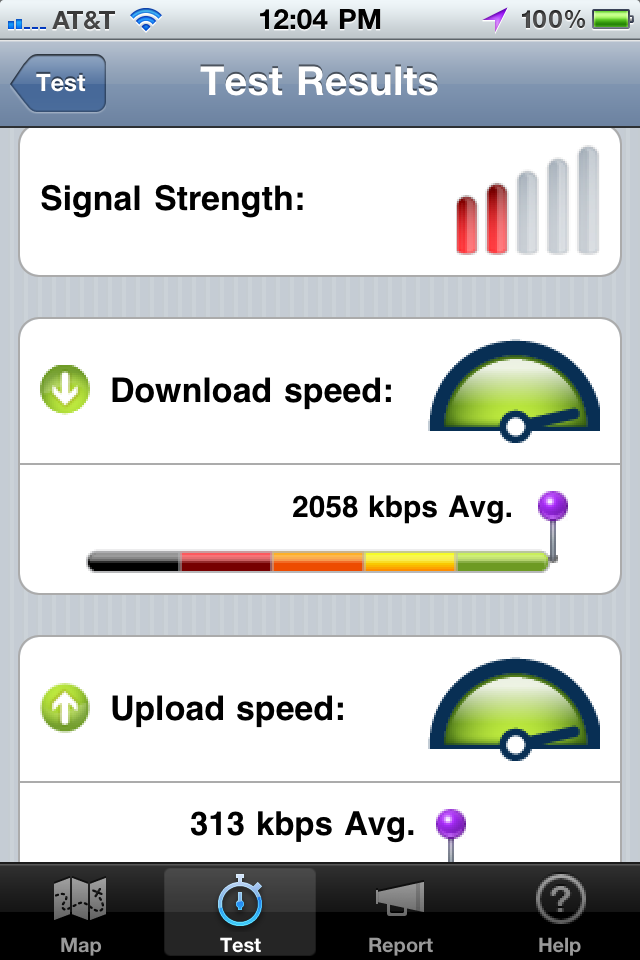
Testing Your Service — Testing phone service is dead simple with the app: touch a button, and after a few seconds you get a nice visual analysis of your service quality at that particular moment. Note, however, that each test requires that the phone upload and download some test data, roughly about 200 KB or so per test if the cellular network data usage statistics in my iPhone’s Settings app are reliable—if you have a small data allowance on your mobile plan, you probably don’t want to be running a lot of tests.
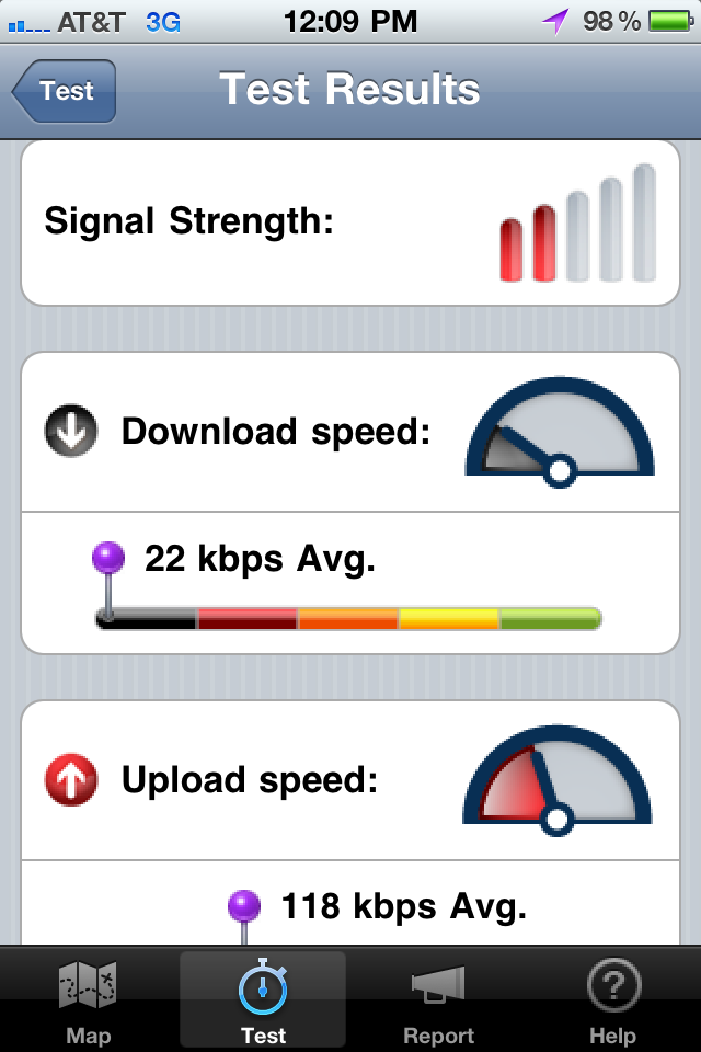
Also note that the data upload and download speeds can be quite misleading if you have Wi-Fi turned on and are using it instead of 3G: the test results show the speeds you are getting via your Wi-Fi connection instead of from your 3G connection. I suspect this is a bug and not what the RootMetrics folk intend; if so, it should probably be fixed in a later release of the app. In the meantime, if you want a true picture of your service and are within Wi-Fi range, take a trip to your Settings app and turn off Wi-Fi before
you run a test.
Coverage Map Coverage Still Spotty — The areas for which RootMetrics supplies detailed information are limited for the moment: they state that they have map data for “most of the larger metropolitan markets.” Among the 23 U.S. metro areas for which they have recent data are New York, Chicago, Los Angeles-Orange County, Atlanta, Philadelphia, Dallas, San Francisco-San Jose, and Seattle. Other areas of the country may or may not show up on the RootMetrics map. For example, my iPhone-toting brother in Portland, Oregon, will get scant help from RootMetrics at the moment, as only a very few small neighborhoods in that area are rated. Over time, RootMetrics anticipates
that growing numbers of users will help flesh out their map throughout the United States and the rest of the world.
If you happen to live in one of the markets for which RootMetrics has a good dataset, you’ll find the information provided by the Coverage Map app quite illuminating. And if you live elsewhere, you can perform a public service and help RootMetrics fill out their picture for just the cost of a few hundred kilobytes per test. Even if public service is not your thing, the test results will still tell you more about the coverage that your iPhone gets than the five tiny bars at the top of your screen. So hey, grab the app and click that Start Test button so we can finally answer these questions about carrier coverage with real data.
Sadly this app only seems to be of use in the USA and here in Australia, useless. I have just moved and my current carrier's signal is bad - one bar on 3G mostly dropping down to 2G which is good for only phone calls really on a smartphone.
Yes, it is sad, but just getting the U.S. mapped out is an enormously ambitious undertaking.
Michael, you are certainly right, but please recall that TidBITS is read internationally. Having pointed out the restrictions of the tool in the beginning of your article would have saved me some reading time.
I am sorry that you feel you wasted your time; I believe that the RootMetrics project is intrinsically interesting, regardless of one's location.
Keep in mind, too, that the current app is only an initial release, and that subsequent releases likely will provide useful features for iPhone users even beyond the U.S. borders.
Yeah, my fault - I should have made it more clear in editing. I'll fix it at the top with a few words.
Uh, if you have GPS coverage data already, then how hard is it to mash it up with Google maps and do this world-wide? Not hard. So while the root metrics app is certainly a great idea, the implementation is rather limited.
They're working on international coverage data too - just a matter of hours in the day, I imagine.
Have you thought about adding QR codes for URLs in the article? For example, in this case it would be nice to go straight to the app in the app store. Just a thought. (Interesting article too. Hoping for international coverage soon so that I can choose the best pay-as-you-go provider when I'm out of country.)
I imagine that not only will wifi cause erroneous data speed results, so will houses with a MicroCell (AT&T) or similar devices from other carriers. As will business for which carriers install special antennas and equipment inside large spaces. There are several buildings at my employers where Verizon and AT&T have installed equipment to improve coverage on the inside.