Ebooks, Footnotes, and Skeuomorphs, Oh My!
Now that Apple’s Worldwide Developer Conference has receded into the past, and the tympanum-shattering chatter about the Jony Ive-led redesign of the iOS interface and its (almost) complete abandonment of skeuomorphic design has begun to devolve into an Internet screaming match over whether the colors and gradients of iOS 7’s newly redesigned icons are the cat’s pajamas or the dog’s breakfast, reasoned discussion of when skeuomorphic design is appropriate and when it is not has been lost in the cacophony.
For those late to the polysyllabic geek-jargon game, here’s one of the several definitions of “skeuomorph” that Wikipedia offers:
an element of design or structure that serves little or no purpose in the artifact fashioned from the new material but was essential to the object made from the original
Common examples of skeuomorphs in Apple’s user interface designs cited by the anti-skeuomorph faction include such popular whipping boys as the leather and torn-paper look of the current Calendar app, or the green-felt-table appearance of Game Center — examples where the look of the app’s interface adds no real clues about how to use it but is simply reminiscent of real-world artifacts that have a similar function (you can’t tear a virtual page off the Calendar — I know; I’ve tried). Supporters of skeuomorphism in turn cite counter-examples of useful skeuomorphs, such as the buttons on the Calculator app (which are useful in a touch environment like an iPhone screen).
But not all skeuomorphs are graphic interface elements. I came across another, less obvious, kind of skeuomorphism a few months back while I was doing the preliminary research for an updated edition of “Take Control of iBooks Author” — footnotes. In my Web travels I’d encountered more than one discussion of Apple’s newly released iBooks Author 2.0 ebook authoring tool in which the writer had complained that even with the release of a whole new version of the program Apple had omitted automatic footnote numbering (“unconscionably” was the implied subtext).
My initial reaction was, “Yep, that seems really lame.” And, superficially, it seemed so, since most word processors worthy of the name can handle that task.
But then I thought a little more deeply about the issue, employing a trick that has often worked well for me: ask a simple question.
In this case, my simple question was “What is a footnote, anyway?” And with that question came a bunch of related questions, such as, “What is a footnote’s purpose?” and “Why do footnotes look the way that they do?” and, finally, the big one: “Do we really need traditional footnotes in interactive digital books?” By the time I had answered them, I had come to realize that employing numbered footnotes in the kinds of books that iBooks Author makes would actually be a form of skeuomorphism.
To understand how I reached that conclusion, let’s start with my first question: What is a footnote?
Visually, a footnote is text that appears at the bottom of a printed page, usually set off from the main text by a smaller type size, typically preceded by a superscript symbol or number. The note’s preceding symbol or number matches a similar superscripted symbol or number that appears in the main text of the page.
And the purpose of a footnote? Actually, it can serve several possible purposes: to explain or expand upon something in the main text, to provide a citation or a translation, or to make some sort of comment. Regardless of the footnote’s specific purpose, its general purpose is to provide additional information to a text without interrupting the flow of the main text: the footnote marker in the main text signals that additional content is available, without actually bringing the text to a screeching halt to present it. Instead of
the text running smack into a boulder of digression, the marker merely signals the existence of the digression, but lets the main text flow easily over it, like a pebble in a stream. It is the reader who, upon seeing a note marker in the main text, decides whether to interrupt the text to seek and to view that additional information, or ignore it and keep on reading.
In other words, the footnote marker in the text signals the existence of additional content, the footnote itself provides that content, and the marker that precedes the footnote provides a visual link between the main text and the footnote content.
Which brings me to my next question: Why do footnotes look the way they do?
There are two aspects to this question’s answer: the production aspect and the usability aspect.
From a practical production standpoint, it’s an easy task for a typesetter to include a superscripted symbol in a line of text when typesetting a book. And, while a typesetter might find that composing a page of type with two sections – one for the main text, flowing down from the top of the page, and one for the footnote content, flowing up from the bottom — is not without its challenges, it is still much easier to do than to replicate in metal type how annotations appeared in manuscript texts prior to typesetting, with their various margin notes and interlineations placed on a page wherever they would fit.

From a usability standpoint, I’ve already hinted at the answer: the markers are easy for a reader to see while not being overly distracting, and the content that they signal is easy to find. All a reader needs to do is match the marker in the text to the marker that precedes the footnote, employing just a flick of the eye.
Even in the worst-case scenario for the reader (and the best-case scenario for the typesetter), the notes can be made into endnotes instead, so the reader has to turn to another page in the book to find the note that matches the marker, but that is not a huge challenge: a finger stuck in the book, or a paper-clip, or a paper bookmark, leads the reader quickly to the note page, and, once there, another flick of the eye serves to bring the reader to the note that corresponds to the in-text marker.
But that’s in a printed book. On a screen, a whole page may not be seen at once, and a glance often won’t suffice to lead a reader from a text marker on the page to a note at the bottom. Worse, the entire concept of a page may not exist in a digital environment. Instead, a reader usually has to click the note marker to get to the note content, using the miracle of hypertext.
Again, though, clicking such a marker is not hard: mouse pointers and trackpads are accurate devices, and clicking even a small footnote marker in on-screen text is not beyond the abilities of most computer users, even if it is does require more accuracy than most mouse or trackpad gestures.
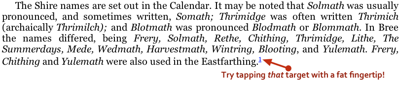
But now we come to tablets, the realm in which the Multi-Touch books created by iBooks Author are found, and things become more problematic. In that realm, the pointing device is not a precision instrument, but a blunt fingertip. And, while a tablet screen can appear quite page-like, screen size and screen resolution constrain the amount of text that can appear on a tablet screen at any one time.
Including notes on the same page as the note marker, as one may do in printed books, becomes more wasteful given the limited display area available on a tablet — and certainly not an efficient thing to do, given that tablets are computing devices, quite capable of providing a hypertext link from marker to note. It’s much better to devote the limited page space onscreen to the main text and shunt the note content to someplace else.
At the same time, replicating the print convention of a tiny superscript number within the text to signal a note’s existence, and then making that marker into a hypertext link, results in a target that’s much harder to hit accurately with a finger than with a pointing device like a mouse or trackpad.
As a result, the print conventions of footnote markers, and on-page footnotes or endnotes, become either a much less efficient use of screen real estate (in the case of footnotes) or (for hyper-linked endnotes) a frustrating hit-or-miss experience for the reader when they are translated to the tablet environment. To attempt to replicate those print conventions in iBooks Author would lead to the creation of a skeuomorph: a design element that is functionally necessary in one medium but not so necessary in another.
Note that I’m not saying that notes and their markers are unnecessary in iBooks Author books, but, rather, that the specific implementation of them as numbered notes and superscript text markers may well be.
After all, iBooks Author provides oodles of annotation capabilities:
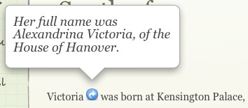
- You can take a word or phrase (a much easier target for a finger to tap than a tiny symbol) and make that into a link to transport the reader to additional content on another page, providing an endnote-like experience but with easier-to-hit targets.
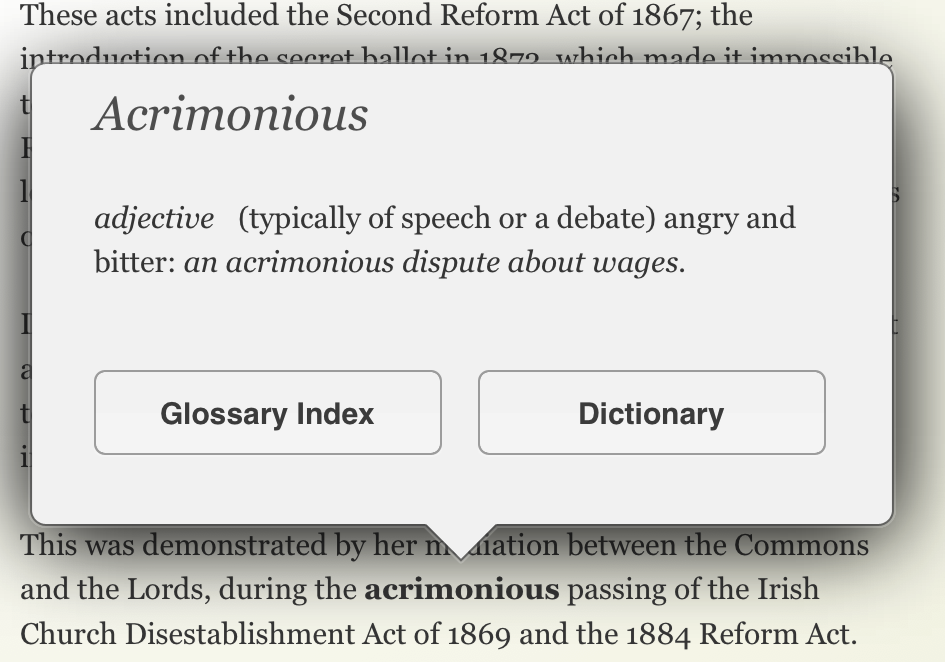
- You can make use of the built-in Glossary tool to provide pop-up definitions and explanations for specific words and phrases in the text, again triggered by an easy-to-hit target, without taking up space on the screen that could be devoted to the main text.
-
For big digressions, you can use the Pop-over widget, which links a graphic (which can be a small, yet easily tapped inline image) to a floating pane that can contain lots of text and graphics.
As a result, I’m much less upset by the lack of automatically numbered footnotes in iBooks Author than some critics are. Nonetheless, I would be happy to see them appear in some future revision of iBooks Author, even with all the problems they present in interactive text on a tablet. Why?
For starters, if tiny footnote markers in text act like pebbles in a stream, words that are highlighted by underlines, weight, or color are rather larger pebbles, and even a small embedded graphic marker is visually weightier than a traditional superscript footnote marker.
More importantly, though, the traditional footnote convention makes a rhetorical point: superscripted number markers and on-page notes look serious, much more so than underlined colored text or easy-to-tap Pop-over triggers. They have inherited that seriousness from the thousands upon thousands of books that have used them over the decades. This inherited gravitas is no small thing if it makes the reader have more confidence in a text because it looks scholarly.
Apple could certainly come up with a best-of-both-worlds solution to the use of traditional footnote marks in an interactive text: for example, a numbered footnote mark in a text, along with the word it follows, could be made the trigger of a Pop-over just as readily as an inline graphic. But even if Apple merely implemented the automatic creation of bottom-of-the-page numbered footnotes like other word processors do, that would still address the needs of those authors who want, for stylistic reasons, that traditional annotation apparatus in their interactive Multi-Touch books. Not everything in an interactive book needs to be interactive.
Like many other skeuomorphs, traditional footnotes in a digital text may not be the best interface solution to the problem of annotation, but that does not mean they have no worth. Stylistic messages are messages still, and they can have something worthwhile to convey. That, in itself, is worth considering in a time when many designers and critics have declared total war on skeuomorphism.
I want something tied to a specific footnote—marker, letter, number, or URL—so I can cite a footnote.
It's the same problem we have with ebooks and citations when there is no specific marker by which we can identify and cite a passage.
I can think of one other way that a footnote number isn't skeuomorphic (aside from "looking serious", which it very much does): it also connotes a particular type of data. With few exceptions (notably Douglas Adams and David Foster Wallace), the data hidden behind footnotes can be uniformly ignored by most readers, depending on the reasons for reading the text. When I read an academic paper, the footnotes are there to reassure me the author did his homework; I only care about the *content* of the footnote if a fact is cited that strikes me as dubious. [more]
Likewise, when starting a new book, there's a breaking-in period while the author demonstrates whether he has a penchant for Adamsian footnote whimsey. Advantage to footnotes: I can glance at the bottom of the page to immediately determine skippable/not skippable, then generally refocus on the primary text easily. Replace footnotes with another mechanism, and the hyperlink no longer signals what data is behind the link, nor gives me a rapid-eye-movement "gesture" to consider it.
Agreed that the placement of footnote symbols and text is a skeuomorphic holdover, but until such time as these no longer have *semantic* value, I'd rather not see them go away in an epub world.
Keep in mind that books come in print and digital editions. It's already difficult enough to reference a page in a digital book or link it to the same location in the digital one. Not numbering foot/endnotes makes that far more difficult. Footnote 7 on page 53 becomes nothing locatable in the digital version. And notes are sometimes like figures. At times, you need to mention them in the text and that's hard to do without a reference number.
I do think iBooks-like pop-up notes make a lot of sense. They're a lot easier that going to an endnote list, locating that reference, and then jumping back.
Perhaps a middle ground could be reached. The actual text could include a variety of markers. One would tag source references, which few consult. Another could tag additional information, which is likely to be more interesting. Yet a third might link to something graphic, such as a map or a picture of the person being discussed.
There are a lot of variants that complicate this problem: for example, Multi-Touch books created by iBooks Author do have actual fixed page numbers you can reference, as do fixed-format EPUBs, while flowing-text EPUBs have page numbers that vary depending on the chosen typeface and size for the book, which is usually under the reader's control.
The fact is that digital books are in a stage analogous to the incunabula period of print right now, with all sorts of different approaches being tried out, modified, adapted or discarded as the state of the art progresses. The scholarly community, which has a deep interest in citations and references, is going to be hard-pressed to come up with workable citation and referencing solutions while the very form and capability of digital books is still in this protean phase.
My advice to scholars right now is to cite a print edition of a book if it exists in both print and digital versions. If a book only exists in digital form, follow the current guidelines and recommendations (however insufficient they may be) from the professional scholarly organization (e.g., MLA, APA) appropriate for the book or paper in which you reference digital sources.
Someday, if the past is any guide, things will settle down and, once that happens, conventions will emerge for citing digital books. However, don't expect the publishers (except, maybe, academic publishers), to care overly much about solving the citation problem; their concern is to produce books that are readable first; ease of citation is probably low on their list of priorities when it comes to book design.
The LDS Gospel Library has footnotes (just like the paper LDS scriptures.) it has numbers, but you click on the word, which slides open a window with footnotes. It's a free program, just released as Version 3.
First, the article assumes that eBooks are new material. But for law teachers like me (and I suspect for many others), one may be putting together a book from previously written materials — in my case, usually cases. If the previously written materials had footnotes, their reproduction is inaccurate without them. "Footnote 4 of Carolene Products" is perhaps the most famous of all legal footnotes. Reproducing the case without the numbered footnote won't fly. Second, as others have pointed out, a reader needs something to point to when citing the material. "The little popup on page 427" just won't cut it.
I love the thought of a legal reference being "the little popup on page 427." :-) You make excellent points - footnotes serve different purposes in different types of works.
I draw your attention to the text of the article: "in the kinds of books that iBooks Author makes"—these are primarily interactive rich media textbooks. One would not be citing those in a legal argument (except, perhaps, in a high-school moot court).
Secondly, the reproduction of "previously written materials" is outside of the scope of the current discussion—of course, one should try to reproduce those faithfully *within* a textbook, if such reproduction is an essential component of the material being presented. That does not mean that the entirety of said textbook itself need conform to an obsolete method of presentation, including those passages where faithful reproduction is not an essential component, any more than a textbook on Shakespeare should reproduce the typographic and orthographic practices of, say, the First Folio throughout because of its subject matter.
Finally, as regards the practice of citation, standards for these vary among disciplines, and are not set in stone (or lead type): they change at need, albeit slowly, as the range and types of materials they attempt to cover expands. You'll not find guidance about how to cite Web pages in, say, a copy of MLA or APA guidelines from 1970, though you'll find such guidance in recent versions of those guidelines.
Footnote Four of Carolene Products (which, by the way, is often cited with the number spelled out, as here, rather than being presented as a numeral as it appeared in the original decision) is safe, even in this brave new world of pop-up notes and hyperlinked text.
Objection overruled.☺