Snow in Yosemite: Apple Introduces OS X 10.11 El Capitan
Remember Mac OS X 10.6 Snow Leopard? For many people, Snow Leopard was a high point for OS X, focusing on performance and stability. The time has come again: while Apple made much of the fact that 55 percent of active Mac users are now running 10.10 Yosemite, there has been a strong undercurrent of discontent with Apple’s prioritization of design and features over polish and stability. Apple would never say this out loud, but mix snow with Yosemite, and you get OS X 10.11 El Capitan, available for developers today, slated for a public beta in July 2015, and due “this fall.”
What Apple will say is that “OS X El Capitan builds on the groundbreaking features and beautiful design introduced in OS X Yosemite, refining the experience and improving performance in lots of little ways that make a big difference.” Changes will focus on two areas: user experience and performance.
Performance — There’s not much to say here, because from the user perspective, more performance is both always appreciated and, once appreciated, largely ignored. Performance gains simply become the new normal, and you forget that something that was once painfully slow no longer is.
Apple is claiming that El Capitan will launch apps up to 1.4 times faster, switch apps up to 2 times faster, open PDFs in Preview up to 4 times faster, and display the first messages in Mail up to 2 times faster. In short, Apple is streamlining code for common activities, rather than relying entirely on faster hardware.
Arriving in El Capitan is Metal, a high-performance graphics API that first appeared in iOS 8 last year. With Metal, developers can give games and other graphically intensive apps more direct access to the graphics processor, enhancing system-level graphics rendering by up to 50 percent. Metal could be a boon for game publishers in particular, giving the Mac a leg up in a world where it has traditionally had a hard time competing.
User Experience — The changes you’ll see — and perhaps appreciate more — fall into this category. But even still, they’re relatively small, and are focused on making it faster and easier to use OS X and Apple’s apps.
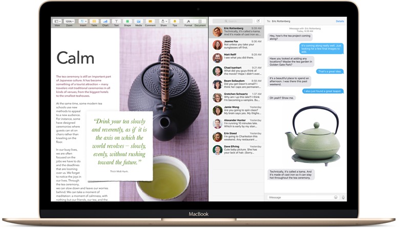
- Split View: The new Split View takes a page from Microsoft’s playbook (the Snap feature of Windows 7 in particular), fitting windows from two apps on the screen precisely. Utilities like Mercury Mover (see “Move/Resize Windows from the Keyboard with MercuryMover,” 19 May 2008) and the free BetterTouchTool have long provided similar capabilities, but having it built into OS X will make it more accessible to a wide audience.
-
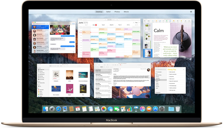
Mission Control: Apple’s window management feature Mission Control has been a part of Mac OS X since 10.3 Panther, and has seen numerous enhancements over the years. With El Capitan, Apple continues to tweak Mission Control, theoretically simplifying how you can put windows into new desktop spaces, and even put them in Split View directly. I personally don’t use Mission Control, since I find maximum productivity with multiple monitors, but if you do, the refinements may be welcome.
-
Find Your Cursor: Now this one I’ll love! With today’s huge monitors, it’s all too easy to lose your cursor, and while there have long been utilities that would locate it with the press of a key (try Mouse Locator or PinPoint), El Capitan expands the cursor briefly when you shake your mouse or shake your finger back and forth quickly on the trackpad. Simple, but effective.
-
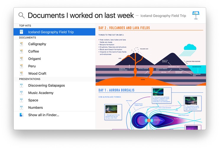
Spotlight: In Yosemite, Apple significantly extended Spotlight’s reach, enabling it to display formatted search results from data on your Mac and from the outside world. In El Capitan, Apple has given Spotlight a wider lens, enabling it to deliver answers for searches surrounding the weather, sports, stocks, Web videos, and more.
More interesting is that Spotlight gains a natural language parser, so you can ask for “documents I created in June 2014” or “email from Tonya last week.” These natural language searches also work in the Finder and in Apple Mail.
-
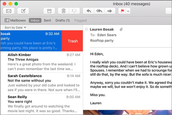
Apple Mail: — Speaking of which, Mail picks up a few features from its iOS sibling. Swipe right on a message to mark it as read or unread, or swipe left to delete. When you’re in full-screen mode, you can now dock a message you’re composing at the bottom of the screen. If you’re juggling multiple email threads, you can switch between them using tabs.
Mail also tries to identify events and contacts in email messages; offering to add them to your calendar or contacts list with a single click. This is probably just an enhanced interface for Apple’s long-standing Data Detectors technology, but if exposing it differently is what’s necessary for people to make use of it, great.
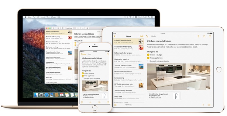
- Notes: — The Notes app may be the most changed of any in El Capitan, gaining the capability to use styles, create and manage checklists, save content from other apps, and insert and view attachments (photos, videos, map locations, and Web links). Content syncs via iCloud, so you’ll have access to your Notes from any of your iCloud-connected devices.
-
Photos: Apple didn’t feature Photos during the WWDC keynote, but the company is now promising a few heavily requested features for its replacement for iPhoto and Aperture. Most notable among these is support for third-party editing extensions that will be available from the Mac App Store and accessible within Photos itself. It doesn’t sound as though that will enable external editing in Adobe Photoshop, say, but it will go a long way toward enhancing the editing capabilities of Photos.
Apple also says that it will be possible to add a location to a single photo or to an entire Moment, and you’ll be able to sort photos within albums by date, title, and other metadata. Finally, a streamlined workflow is aimed at making it faster and easier to identify faces.
-
Safari: — Apple’s Web browser gains three useful features. First, you can “pin” sites to the left side of the tab bar to keep them handy and away from the rest of your tabs. They’ll stay active and easily accessible, and links you click from within a pinned site will open in new tabs. Google Chrome and Firefox have had a similar feature for years; they’re great for Web apps and other sites you keep open all day long.
Second, a new mute button appears in Safari’s Smart Search field if any open tab is playing audio; a single click silences the sound without forcing you to go hunting for the offending tab. Clicking and holding the mute button pops up a menu showing tabs that are playing audio so you can deal with them more easily.
Third and finally, AirPlay can now play video from a Web page to your Apple TV without showing everything else on the desktop.
- Maps: — Apple has finally added transit directions to Maps, and while the feature has been a long time coming, it looks like the company has done a nice job. When you ask for transit directions, the display focuses on public transit lines instead of roads, and in places like New York City, where a subway station might lie under several city blocks, Apple has put a lot of effort into identifying exits in order to provide useful walking directions once you emerge, blinking, into the sunlight. Transit directions will be available in 12 cities around the United States and Europe to start, plus another 12 cities in China, and Apple said over 300 more were in the works.
Maps on the Mac is mostly for route planning, of course, but you can send a route to your iPhone with a few clicks.
-
International Features: It’s clear that Apple is putting ever more emphasis on the Chinese market, such as with the transit support in Maps. El Capitan will also feature a new Chinese system font, enhanced keyboard input, and improved trackpad handwriting. Japanese gets similar attention, with four new Japanese fonts and improved text input that can transform Hiragana into written Japanese as you type.
Details — At the moment, all we know about El Capitan’s availability is that it will arrive “this fall” and will be free. Give Apple’s past performance, that points toward a mid-to-late October release. Nothing was said about hardware compatibility at the keynote, but it turns out that El Capitan will run on all Macs that run Yosemite, Mavericks, and Mountain Lion. That’s an impressive record of backward compatibility.
We’re happy that Apple has seen fit to pull back from the features in OS X in order to focus on refining and polishing what’s already there. Here’s hoping that El Capitan also squashes some of the bugs that have persisted through the intermediate versions of Yosemite.

I'm really disappointed quality/bugfixes weren't the on-stage focus. Is Apple listening to the continuing gripes? (Last week I found the keyboard I've been using for years won't work on a brand-new Mini, nor on a Mini that it used to work on that was updated to 10.10.3. So much for "bring your own keyboard...")
A lot of these 'bells and whistles' don't interest me, I've never used Mission Control, and as a touch typist, having to move off the keyboard for a 'swipe' is often a distraction rather than a feature.
We'll see if ElCap does provide a needed fix to Apple's recent software problems.
I'm not at all surprised Apple ignored the software quality issue - this is still a marketing event, and while they may occasionally poke fun at the previous version, they're not going to come out and say, "Yeah, Yosemite has all these bugs and we're going to fix those." Here's hoping they do, though!
Any improvements to the new Photos app will be welcome. I expected a 'Pages' type approach with certain features missing from the initial release, but have been disappointed with the pace (can you say none) of new releases with bug fixes and improvements.
If this is an attempt at a Snow Leopardization of Yosemite, let's all, including Apple, remember that getting from 10.6 to 10.6.8 took 23 months. I'm no fan of OS updates on a yearly schedule and really hope that Apple takes its time cleaning up the code and undoing what Ive did to the interface.
The regard for User Experience seems to have taken a back seat to Ive's ill advised attempt at UI design. Apple needs to regain its devotion to user experience.
Precisely!!! Send Ives back to hardware and hire Bruce Tognazzi or someone who understands user interface usability instead of being fixated on imbecilic grey on grey low contrast unreadable idiocy aggravated by hiding all the useful features, including the options to restore the useful functions.
For instance, hiding your folder list in Mail, or the left sidebar in nearly all recent apps. And not only hiding the folders, but also hiding the "Show" button unless you chance to mouse over it by accident in the featureless grey background. Could it get any stupider?
"...Apple’s prioritization of design and features over polish and stability"
Please make that *alleged* prioritization. It's an opinion (even if shared by a whole lot of users). It's likely not an opinion Apple would agree with! Nor would all users; Yosemite runs wonderfully for some, including me (both on an MBA and a 2008 iMac).
Otherwise, a fine overview! Looking forward to much more from TidBits as El Capitan details come out.
Let's call it "apparent" prioritization. Prioritization isn't a crime to be alleged, but while outsiders can't prove that Apple worked more on design and features than it did on polish and stability, longtime Mac users can see all kinds of areas where Apple's traditional attention to detail is just missing. I have a copy of Apple's Human Interface Guidelines from 1992; they set a standard for usability and thoughtfulness that's never been surpassed, but many of the principles set out there have been ignored since the introduction of OS X. I wish someone at Apple would rediscover them.
longtime Mac users can see all kinds of areas where Apple's traditional attention to detail is just missing
I started using the Mac in 1986 and I don't see it.
First of all, its too early to tout El Capitan as the next Snow Leopard!
Snow Leopard was truly refined over its 7 updates to be - I said it! - the most stable of all the OS X releases till date. Its stability and peace/ease of use was, needless to say, is legendary.
I have no gripe with the route they took with Lion. By choosing to iOSify OS X they came up with some nifty new features, especially multi-touch. I do EVERYTHING on my Macbook Pro via multi touch. Mission Control was great too.
But while Apple has focussed on and acheived the blending of OS X and iOS, they've tried to do it at a very rapid rate (annual OS X updates) which is impossible to keep up with. Thus all these new features came with a price - Bugs.
This year, Apple is claiming to focus on User Experience and Performance, but who knows whether they will actually fix the god-awaful bugs that have been plaguing users since Lion.
Adding the ability to "swipe" messages in Mail sounds more like a bug to a feature to me. As a touch typist working on MacMini, I want keyboard controls, and don't use a touchscreen.
I suspect it won't impact keyboard users at all.
Uh...Apple doesn't make a touch-screen computer. Swipe obviously (to me) refers to the touchpad on a laptop Mac or the free standing touch pad they sell as a mouse alternative. Meanwhile, there are already a number of swipe gestures; distinguishing the new ones from the old will be a challenge for users.
As someone who is still using Snow Leopard - I have 3 iMacs - and happy with it, the details you have provided re this forthcoming OS is the first time that I would seriously consider updating.
Ditto! Snow Leopard has been the most stable OS I have used and do not want to upgrade. However, it is getting harder and harder for Safari to work on websites. I constantly get the warning that my version of Safari won't work on a website, but I ignore it! Plus, so many games I own --- will they work on an update? Only updating will answer that!
The real problems are the PowerPC apps that rely on Rosetta in Snow Leopard. They simply won't work in anything newer, and there's no workaround. See
http://tidbits.com/article/12156
Ditto! How about the Adobe Reader, Silverlight and other upgrades that can't be added to Snow Leopard? I watch hulu and nerflix from my computer and they upgrade and want me to upgrade. Of course, snow leopard doesn't align with some of the new upgrades like Google Chrome,either. If they don't get us a new stable system as good as snow Leopard I'll soon be forced to add an external drive to utolize the newer options I'm forced to acquire
Hmmm. An external drive for other operating systems sounds interesting. How would one go about installing 10.11 when it is released on a new external drive? Is there a TidBITs article on that or does a Take Control book cover it?
What we usually recommend in our "Take Control of Upgrading to..." books is that you make a bootable duplicate of your drive before you install, such that you can revert if necessary. Obviously, this assumes that you're likely to want to run the new operating system; if you think you're unlikely to want to run it and just want to test it, you could just install on the external bootable duplicate instead by selecting that drive when installing.
Are you sure it's Safari that's at fault with websites? My understanding us that the. Website designers can cater for any OS they like.
I await your review after it is released and the comments in TidBITS Talk.
By October my Mini will be 3 yr old hardware. Considering I just had to revert the machine to Mavericks from Yosemite to get everything working fast and properly, I live in hope that the new one will be usable.
I'm using Yosemite on an Early 2011 MacBook Pro and find it runs better than it did under Mavericks.
If you've had any problems with Yosemite, your own experience should warn you off upgrading to El Capitan when it first comes out. Wait awhile till the less cautious early adopters have reported on it. And back up your current system before you upgrade.
Another priority Apple has been ignoring since the introduction of Lion is usability. The gray ghost Finder sidebar with gray on gray icons makes navigation more difficult – color and custom icons were once key tools for quickly identifying items and locations. Yosemite made this worse with low contrast window elements and more gray on gray and gray on white text. Nowhere is this disregard for usability more on display than in Apple's own web site where low contrast text is the new normal. For Apple, twenty-three years after the passage of the Americans with Disabilities Act, accessibility has been all but forgotten. Design is king – and bad design at that. Usability is an afterthought, if it gets any thought at all. There is certainly no evidence that it is a priority. And yes, it's quite simple to see what Apple's priorities are. They are evident in Apple's products, especially in their software, which has gone from insanely great to insanely lame.
I agree the upgrade schedule for OS X is largely responsible for the decline in quality. Yosemite is all the evidence you need for that. They will apparently be fixing the biggest problem in Yosemite in the 10.10.4 update – by downgrading the WiFi technology to the previous version, the one that actually worked. It's been almost a year since OS X 10.10 was released and they've only now figured out what they did wrong. So count quality control as another low priority at Apple.
I don't blame all of this on Tim Cook. These problems were evident before Steve Jobs left the scene. And Tim doesn't do software design, for instance. But he's responsible for the people who do.
So I have only the lowest expectations for El Capitan. They may polish the apple a bit, but they won't do anything about the worm that's gnawing at it's heart.
Yes, the reduction of colored item and increase in similar grays is much less productive and more frustrating.
It is peculiar. My first Mac was a black and white SE model, around 1987. For years we clamored for color. Then we finally got 256 color and everyone rejoiced! And any 101-level course on instructional design will make clear how critical color can be to learning. Yet Apple has now gone back to black and white. Design and usability are not even afterthoughts; they're not thoughts at all anymore.
You got it, Jefferson. Design doesn't get worse than low contrast grey on grey, unless it's stupidly hiding most of the the useful features of many programs, and then compounding that to another whole level of stupidity by also hiding the "Show" button!!!
Oh . . . and auto-UN correcting what you actually typed to what some software program thinks you should have typed, retroactively, so you think you said one thing and find the #$%^&* program changed your text to something else.
As someone working on a Mac in Japan in a largely Windows workplace, it's interesting to note how updating my OS sometimes changes the likelihood of my being able to read the Japanese names of files coming from colleagues. After having few problems for a number of years, Snow Leopard messed everything up (i.e. most file names became unreadable). Then Lion put it right. Then Mountain Lion messed it up again, and it's been uniformly bad since. I wonder what could be at the root of these changes.
Any word on the hardware requirements for El Capitan? I have a 2008 iMac that runs great on the latest Yosemite 10.10.4 as long as I don't have too many apps open.
As the article says, they're the same as for Yosemite (and Mavericks and Mountain Lion). So you should be good.
I suppose it's too much to hope for some improvements in iBooks for OS X? The ability to update some of the metadata for books would be useful for example, to have the app respond properly to click-through, to be able to set it to default to single-page view and things like that.
Are there any changes to iBooks in 10.11?
iBooks for Mac is the only reason I'm still running Mountain Lion -- because I refuse to allow Apple to destroy my 1500+ title ebook collection.