
Google Revamps Gmail’s Web Interface
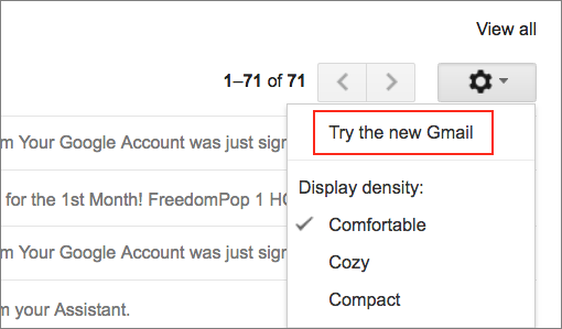
Gmail’s Web interface on the desktop has just undergone a significant overhaul, the first in some time. This won’t make any difference to those who read Gmail via an app like Mail on the Mac, and even if you use Gmail in a Web browser or via Mailplane, you won’t be dumped into the new interface automatically. To switch to the new version of Gmail, you must click the gear icon in the upper-right corner and choose “Try the new Gmail.”
Many of these changes come from Google’s alternative Inbox email interface, which, at least for now, isn’t going anywhere. Along with visual tweaks such as a new typeface and less reliance on light-gray accents, the new Gmail interface offers a number of substantive improvements.
New Message Actions & Quick Replies
First off, Gmail has learned some new tricks. You can “snooze” emails that you want to put off for a while. Snoozing a message moves it out of sight to a Snoozed folder until the specified time, at which point it reappears in your Inbox. To snooze a message, hover over it and click the clock button.
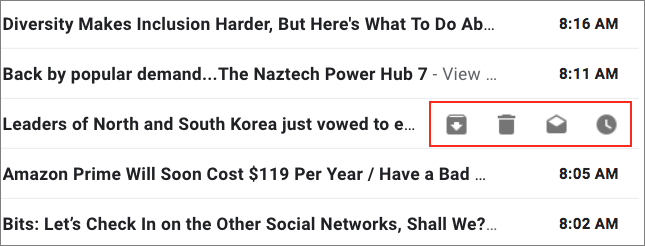
Along with the clock button, other buttons appear to archive (the folder with an arrow icon) or delete (the trash icon) the message, or mark it as unread (the open envelope button).
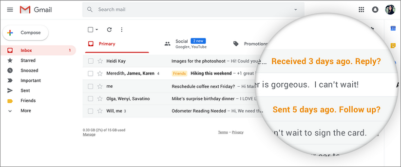
When Gmail sees that you haven’t responded promptly to messages, it will nudge you via orange alerts on the right-hand side of the subject/snippet line.
Also, in another feature brought over from Inbox and the mobile app, Gmail now gains “smart replies,” in the form of short, canned answers derived via artificial intelligence from an email’s content. They are good for quick replies to simple messages, and spookily prescient at times.
Improved Attachment Display
Assuming you’ve set the display density to Default, rather than the tighter Comfortable or Compact, attachments are displayed prominently in your inbox so you don’t have to dig for them in lengthy email threads.
![]()
Collapsible Left Sidebar
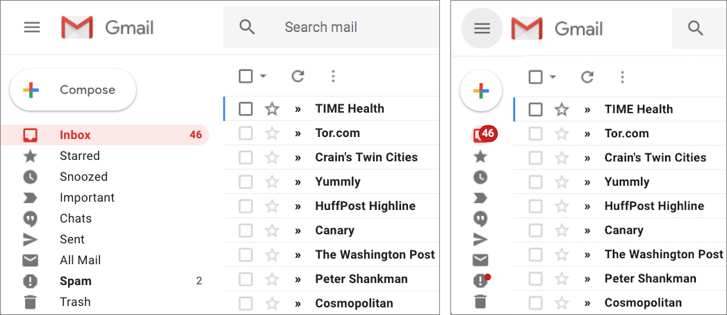
A click of the hamburger button on the upper left collapses the left-hand sidebar of labels, providing more horizontal space for Subject lines and message previews. While collapsed, the sidebar expands automatically if you mouse into it, or another click restores the expanded view.
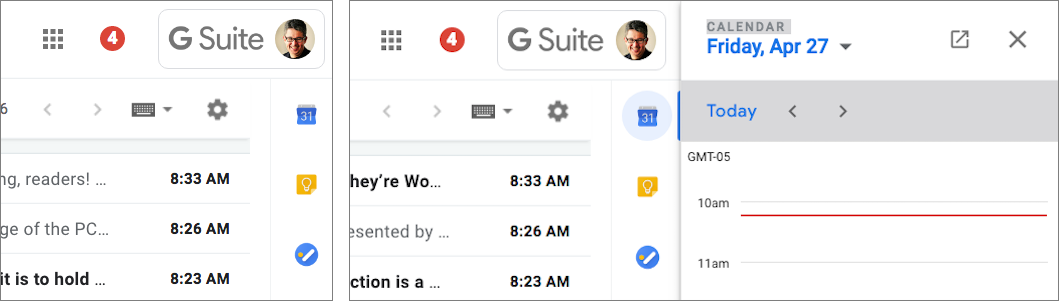
Right Sidebar of Google Apps
On the right side of the screen, a new sidebar displays clickable icons for Google apps, including Google Calendar and the Google Keep notes app along with a new Google Tasks app, which gains a standalone version for iOS devices too. The sidebar also accommodates third-party Gmail add-ons such as Boomerang, which helps you schedule email for later sending and reminds you if certain messages don’t get replies.
Clicking one of the app icons expands the narrow sidebar into a wider one for working in the corresponding app.
Enhanced Security
Google has enhanced Gmail’s security features too. (Or, at least it will; Google promises that some of these features are “coming soon.”)
For messages within Gmail (remember that many organizations rely on Gmail as part of Google G Suite, and thus everyone in the organization would be using Gmail), you can now prevent your outgoing messages from being forwarded, copied, downloaded, or printed. Of course, there are a variety of ways around those limitations. You can also send messages that self-destruct after a predetermined time period, revoke previously sent emails, even require authentication via a text message to access a message.
Gmail now warns you about possibly risky messages, too, displaying a big red banner for phishing attempts.

Evaluating the Changes
As a longtime Gmail user, I have mixed feelings about the new look and features. I like the old Gmail interface. I’m not crazy about the new typeface, and there is also a slightly blurry quality about the new interface that Google needs to tweak.
On the plus side, however, despite the visual updates, it’s still fundamentally Gmail — a service that, at least for me, is as good as any desktop email client, and lets me blaze through my voluminous daily stream with minimal effort.
Some of the new capabilities are interesting, too. Better integration with Google Calendar and Google Keep will be a boon for my daily workflow since I rely heavily on both. And I quite like the features borrowed from Inbox that make acting on messages faster and easier.
Even if the security features won’t be of use for all email, the additional warnings of risky messages are welcome. Kudos to Google for helping users avoid falling prey to phishing.
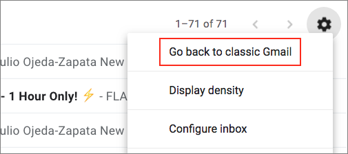
If you’ve checked out these changes and you’re not enamored of them, you can switch back to the old interface for now. Click the gear icon and choose “Go back to classic Gmail.”
There’s no telling how long Google will let you use the previous interface, but other Google services that have received interface overhauls have kept their old looks available for quite some time. Nevertheless, despite some initial discomfort, I’m going to stick with the new interface.
I still hate their last update.
Diane
This one is no better. Any useful functionality seems to be entirely gone or very well hidden.
I like this update. I’ve been using Google’s InBox app as my primary smartphone mail app since it’s been available, and love in particular snoozing emails for later, but, of course, stock Gmail on a web browser could not do that. Also, the web app for inbox.google.com, which can, has been pretty slow and almost unusable. I’d started just pulling out my phone or iPad to snooze mails when I was using Gmail on my Mac. Adding snoozing to the stock gmail app (I can just hit a lower case “b” to snooze a mail now) means I won’t have to do that, or use the inferior inbox.google.com.
There are things I don’t like about the update (namely, when you delete mail, Gmail puts a dark box telling you that its deleted and offering to undo it, which cannot be dismissed with a kestroke, partly covering up the list of messages), but my issues with it are minor. Nice update IMO.
I like the new features and the new look. But as is almost always the case, Google only rolled it out to personal Gmail accounts, not Gmail for Business—so I can’t actually use the new features and security where I actually need it.
Organizations that use one of the various flavorts of Gsuite can enroll in
the early adopter program so they can access the new interface before it
become standard for Gsuite subscribers.
How does one enroll?
James Dempsey
http://www.thegraphicmac.com
Can anybody suggest a workaround?
Whenever I did any action, a message bar popped up stating what I’d done and gave me the option to undo. This window always vanished on its own after a few seconds. With new gmail, the same window appears but now requires the mouse to get rid of it. I have tremor dominant Parkinson’s and so I try to use the mouse as little as possible. Anybody have a fix for this? I would rather not have returning to the old gmail be the only fix. thank you!
If we’re talking about the same little black box in the lower-left corner, you don’t have to dismiss it. It will go away on its own when you do anything else in Gmail.
Here is the information you want straight from Google.
That box that cannot be dismissed is annoying. One way to dismiss it without a mouse is to open a message (type “o”), preferably one that you have already read, which disappears the box, and then press “u” to return to the list of messages. I’ve provided feedback to Google; I hope that they either move the box back to the top, or provide a key to dismiss it (“esc”?)
Or just tap “i” to reload the inbox (all these shortcuts may require that you enable keyboard shortcuts in the settings). I haven’t been bothered by this new dialog at all, since it disappears so quickly in normal use.
That’s interesting, because it’s been way too sticky for me.
(I just deleted a message to time it. It takes one full minute to disappear on its own.)
hi adam…
not true with the new gmail.
thanks for the reply.
kind regards,
rev. michael day
Are you sure about that? I have the revised interface with my own G Suite account. I don’t have it with my employer’s G Suite, but that’s because they don’t want to turn it on. Boo.
Note that the interface has to be explicitly activated in the admin console, which I did with my own G Suite account.
Doesn’t look like it goes away on its own, Adam… at least not quickly.
But why would you sit and look at the screen at all, much less for a minute? As soon as you load another message or do anything else in the Gmail interface, it disappears.
Got it. Thanks all.
James Dempsey
http://www.thegraphicmac.com
Not everything else. If you use Gmail’s tabbed inbox, using the “~” and “`” keys to switch between tabs doesn’t clear the message. Also, using “j” and “k” to move the current message focus up or down the list of messages also does not clear it. (For people who don’t know, Gmail’s tabbed inbox interface separate your in box into tabs for Primary, Social, Promotions, Updates, and Forums. This and Gmail’s superior spam filter is likely to keep me with Gmail going on, as I only get notified of the messages that come to the “Primary” tab and can deal with everything else when I want to.)
So, a typical use case: I wake up in the morning, and open the Gmail. I read the messages in the Primary tab that I want to read, then use the “x” key to mark and the “j” key to move to the next messages to mark the ones that I want to delete, and press “#” (well, Shift-3) to delete the marked messages. This puts that message on the screen, partially covering the list of messages in the in box. Then I press “~” to move to the next tab, and this is the problem: pressing that key does not clear the “deleted message” box. Now I can’t “x” and “j” through all of my new messages in the Promotions tab (where there are typically a lot) because I can’t see the name of the sender or even which message I am marking.
Fair enough! Sounds like Google needs to revisit how the keyboard shortcuts dismiss that dialog. I don’t use the tabbed inbox, nor do I ever deal with any message without looking at it, so in my use case, the dialog always goes away with the next action.
When I woke up this morning, the message box after deleting messages is now half the height that it used to be, taking up much less space, and is much easier to deal with. Excellent.
Below I’ve quoted something I posted over a week ago.
A bunch of you kind folks replied but…
none of you really had a helpful suggestion for me.
Alas…I believe I have absolutely found one.
Next to the settings gear icon, there is an icon with three lines entitled:
TOGGLE SPLIT VIEW MODE.
I chose vertical mode and it solved the black notification box nicely.
Now the black box no longer gets in the way of reading the next email.
In fact, it is so much out of the way, I never have to manually get rid of it now.
Also…vertical mode AND leaving the tasks/calendar/keep window open
now makes this a much more powerful email setup for me than it was before.
This is cool!
I have never before been the one to offer a solution to a problem I posted.
Thanks for all your replies!
kind regards,
rev. michael day
Congrats! It always feels fantastic to find a solution to a frustrating issue
Diane
Alas, I have no such icon on Gmail’s new interface.
https://www.youtube.com/watch?v=z4HDq6Uc5tE
In the new Gmail interface, you turn that feature on with settings / advanced / preview pane, which I believe is disabled by default (and which is probably why I wasn’t seeing it.) I just tried turning on the new interface for the first time on a secondary Gmail account and the preview pane setting is off.
I still like the old interface’s method of putting that message box in the header of the page, rather than covering any of your messages.
It’s a damn shame that Google is so horribly bad at design. The interface of pretty much everything they do absolutely sucks, and Gmail is no exception.
In this case, they made it a little better in most areas, but worse in a few. I like the new design, but that’s not to say it’s good.
For what it’s worth, the new Gmail interface finally got on my nerves and I switched back to the old one on my personal Gmail. My employer-issued Gmail account didn’t allow access to the new design until today, ironically. I switched briefly, but switched back. I’m old-school across the board now.
Yeah, I tried it briefly too with Mailplane 4, but I found it too irregular—lines didn’t line up, images shown in the message list made scanning for text hard, and the way things “folded” hid stuff that I sometimes wanted to see.