
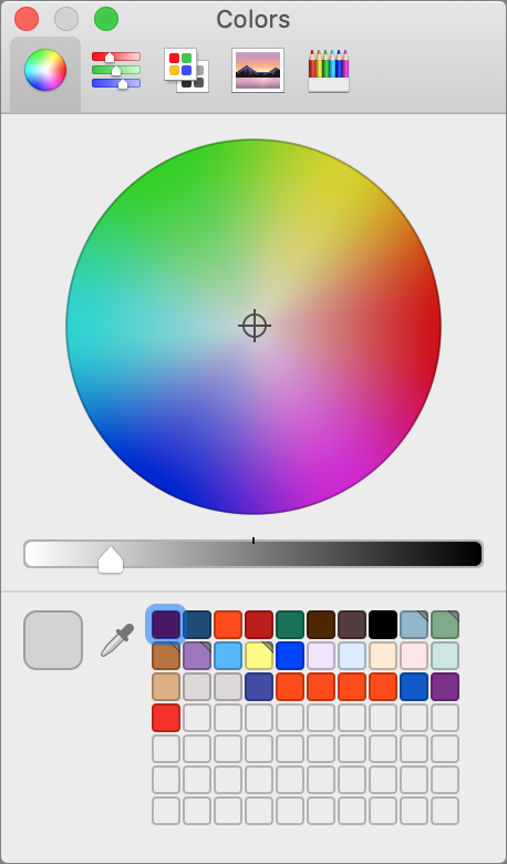
 If you work with color on the Mac, you’re probably painfully aware that the macOS Colors palette hasn’t changed in years. It offers several different types of color pickers, an eyedropper tool for sampling a color from the screen, and wells for storing color swatches. It’s functional for occasional use but becomes clumsy quickly—try remembering which red is which when you’ve saved multiple similar versions. Many graphics apps offer their own color tools, but they’re useless as soon as you need to work in another app. Luckily, there’s a solution: Sip.
Sip is a $10 menu bar app that allows you to pick colors anywhere on your Mac, quickly organize them into palettes, and smartly use those colors in other apps. Brothers André Gonçalves and Rui Aureliano designed Sip with advanced features for professional developers and designers, but its core functionality is simple enough that any Mac user might find it useful for color management.
Sip Basics
The first thing you’ll do with Sip is pick some colors. You can open the color picker—which is a circle that magnifies a small portion of the screen underneath it—by clicking the menu bar icon or pressing a keyboard shortcut (Command-Control-Option-P). Sip provides plenty of shortcuts, all of which you can change in its settings.
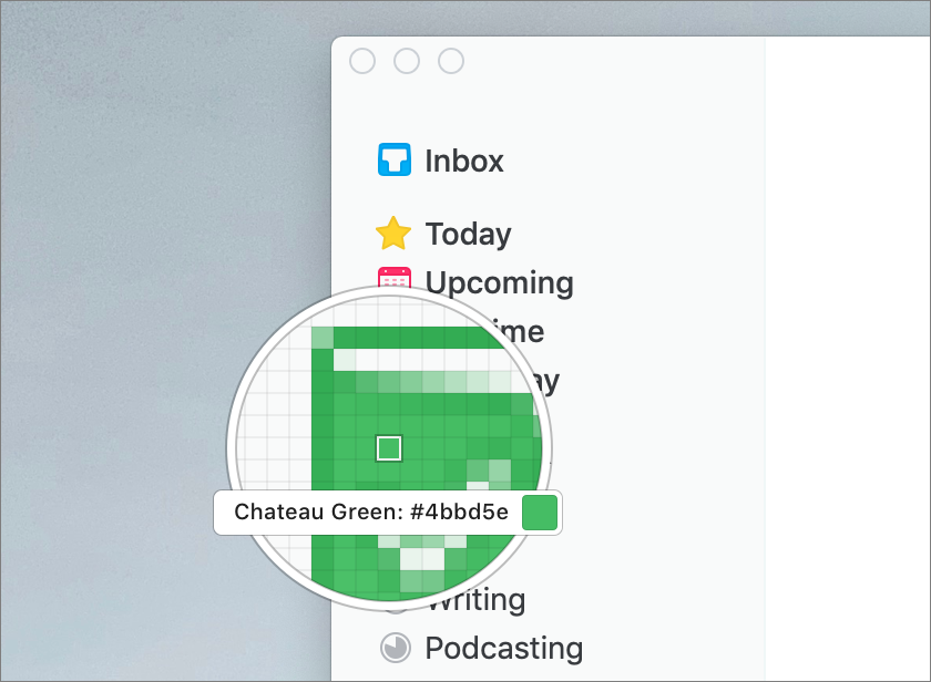
To pick a color, position the color picker over the desired hue, wherever on the screen it may be, and click. That adds the color to Sip and copies it to your clipboard. Press a modifier key while picking a color to add additional tweaks:
- Shift: Adds multiple colors in a row.
- Option: Automatically creates a new palette and puts each color you pick in that palette (more on palettes shortly).
- Control: Creates a new palette with the colors you’re picking.
- Command: Sends the color directly to the app in which you’re working, if it’s one of the 17 currently supported apps, including Web development apps like Coda and Espresso, and Adobe’s Illustrator, InDesign, and Photoshop.
For more precise color picking, use Sip’s keyboard shortcuts to increase or decrease the zoom of the color picker, to make the color picker’s grid larger or smaller, and to move the color picker around in 1- or 10-pixel increments. This is great for grabbing a 1-pixel border color or the color of small text.
You can also send colors to Sip directly from Sketch or Photoshop using the Sip shortcuts for Get Border Color or Get Fill Color. Clicking the color wheel in the top right of the menu bar window opens a Photoshop-like color editor where you can pick a color or enter hexadecimal or RGBA values.
Once you have some colors in Sip, you’ll probably want to create palettes to keep them organized. You might want a palette for brand colors, another for a project you’re working on, and a few more for colors that inspire you.
To create your first palette, click the hamburger menu in the menu bar window and then choose New Palette. All the colors you’ve picked so far will already be in your color history. Drag colors from your color history into your new palette. You can also drag to rearrange the colors within any palette.
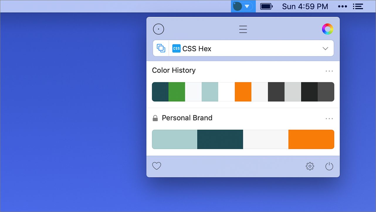
Control-clicking the palette gives you options to rename, duplicate, lock, or favorite it. Favorites are helpful once you have a bunch of palettes. Clicking the heart in the bottom left of the menu bar dropdown will show only your favorite palettes.
Clicking the name of the palette takes you into a list view of all the colors in that palette. Sip automatically generates names for your colors like Sunglow or Blue Haze, but you can Control-click any color in the list view to rename it. I like naming my colors by use case, such as Background, Highlight, Header Text, and Body Text. Control-clicking any color in the list also provides options to delete, replace, or edit the color with a Photoshop-like color editor.
Once you’ve organized your colors into palettes, you can begin using them in other apps. Selecting any color from your history or a palette in the menu bar window copies the color to your clipboard. Sip can also show a draggable color dock on the edge of your screen; you can define which of your palettes appear in this dock. Selecting a color in the color dock works the same as the menu bar window.

Your color palettes, color history, and settings sync between Macs, and Sip automatically backs them up by taking snapshots that are saved locally in case you accidentally delete something.
Sip Formats
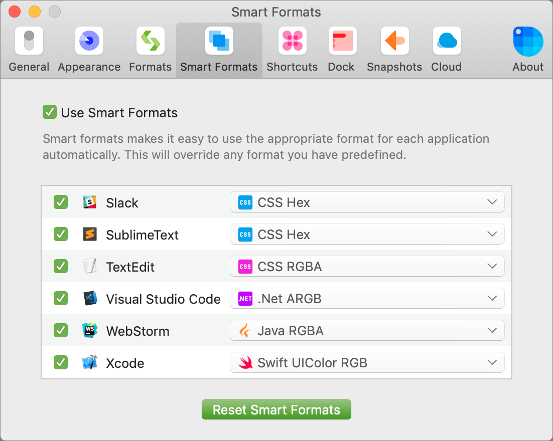
If you find yourself using different color formats in different apps, like hexadecimal in Photoshop and CSS RGBA in Sublime Text, Sip has you covered. You can turn on Smart Formats, define which format is used with each app, or simply use the presets. With Smart Formats on, when you paste colors from Sip into an app, it will automatically use the correct color format.
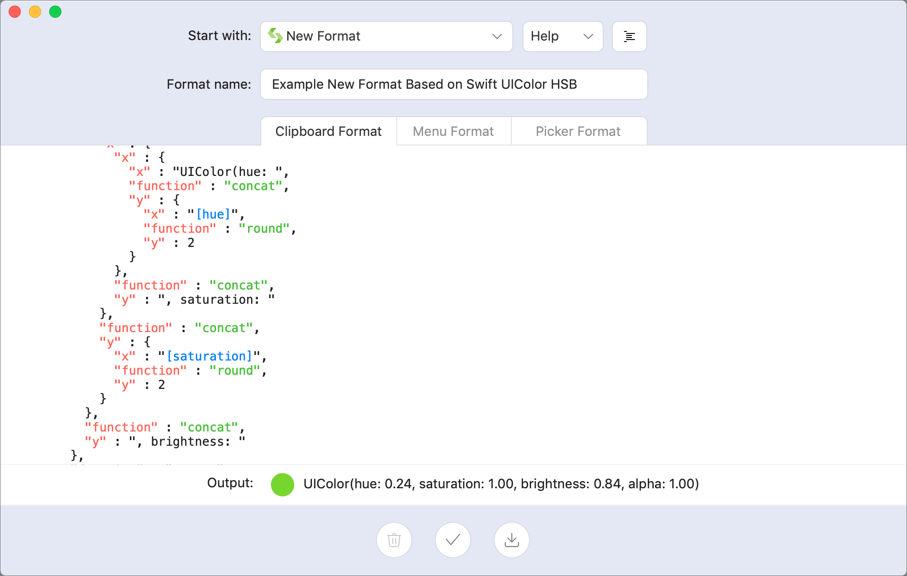
I’ve never had to create a custom format, but if the list of built-in formats lacks something you need, you can create your own based on any of the existing formats or from scratch. You’ll find the Custom Format editor within the hamburger menu in the menu bar window. It allows you to define separately how the color is saved to your clipboard, viewed in the menu, and viewed in the picker.
Sip Accessibility Tools
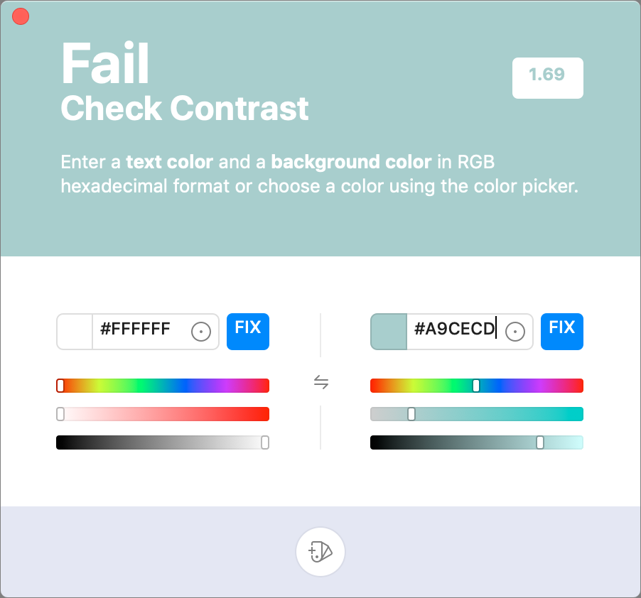
Sip’s Check Contrast feature helps you make sure that the contrast of the colors you are using is accessible to people with low vision. To check contrast, choose Check Contrast from the hamburger menu. Then pick a background color and text color. Sip will provide a numeric score as well as an overall grade of AAA (great!), AA (acceptable contrast for type smaller than 18 point), A Large (acceptable for type larger than 18 point), or Fail.
While I was using this feature to take screenshots for this article, Sip showed me that a white-on-seafoam color combination I was using on my Web site wasn’t accessible. I was able to make a simple color change to my site, and now it’s more usable for people with low vision.
Taking a Sip
You can try Sip for free for 15 days. After the free trial ends, you’ll need to purchase the app.
Sip uses a pricing model popularized by the design app Sketch. It costs $10 for one year of app updates on one computer. If you want to license more than one computer, you’ll receive a discounted rate: $8 each for 2–5 computers, $7 each for 6–9 computers, $6 each for 10–19 computers, or $5 each for 20 or more computers. Once the first year is up, you can purchase another year of updates for half the cost of your first year, or you can keep using the version of the app you’re currently using for no extra cost.
If you’ve struggled with color management between apps, Sip is well worth the price, and it’s easy to test the trial version to see if it will improve your workflow. I know it has improved mine.
Start the discussion in the TidBITS Discourse forum