Bringing Back Keyboard Flags in macOS 12.4 Monterey
When Apple released macOS 12.4 Monterey, it seemed like a minor update (see “Apple Releases iOS 15.5, iPadOS 15.5, macOS 12.4, watchOS 8.6, tvOS 15.5, and HomePod Software 15.5,” 16 May 2022), but it included a small undocumented change that has irritated some users: it removed the colorful national flags associated with each keyboard input source. Previously, in System Preferences > Keyboard > Input Sources, you would see an American flag for the US keyboard, a Canadian flag for the Canadian English keyboard, a British flag for the British keyboard, and so on.
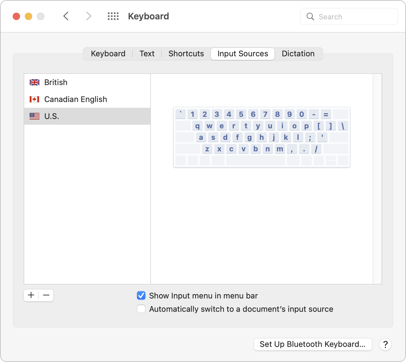
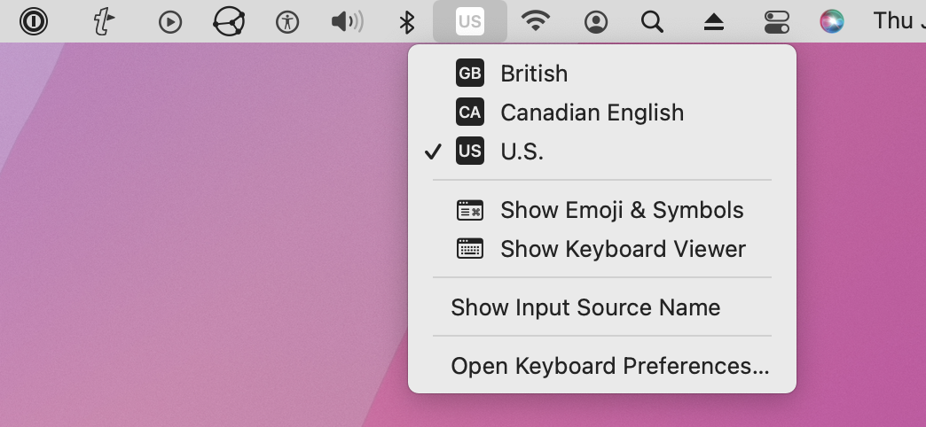
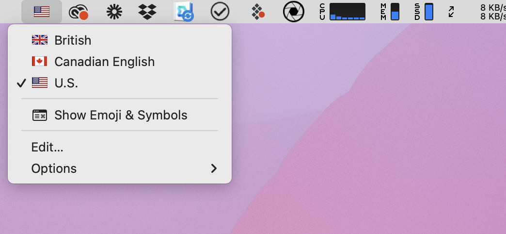
More importantly, you would also see these flags in the menu bar’s Input menu, with the currently selected keyboard’s flag as the menu icon.
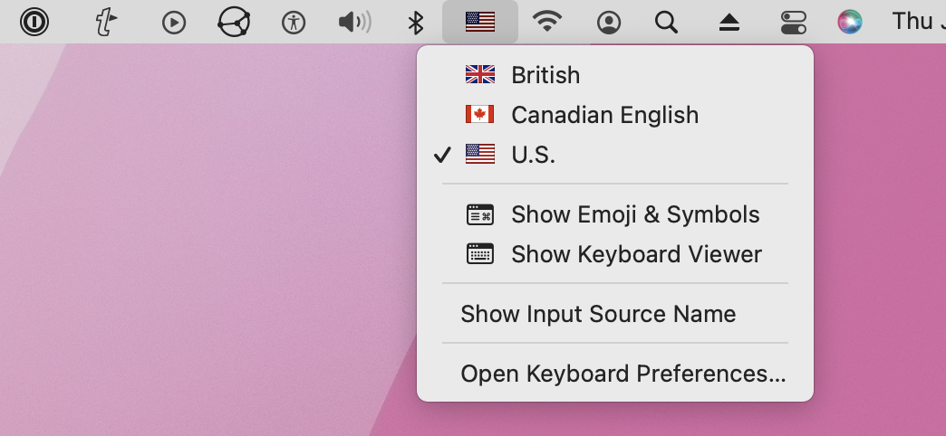
With macOS 12.4, Apple chose to replace the flags with drab, monochromatic blocks containing a one- or two-character code to identify keyboards, which are nowhere near as visually distinct.
Apple has seemingly been on a war against color for years, most notably with respect to Finder window sidebar icons. However, Daring Fireball’s John Gruber says that a “little birdie” told him it was a deliberate move on Apple’s part to avoid denoting languages using national flags.
That makes some sense because languages aren’t always neatly tied to countries. But why now, after decades of presenting input languages this way? Especially considering that macOS has long used these little blocks to distinguish languages that don’t correspond to countries, such as Cherokee and Uyghur, and even some languages that seem to match up, like Japanese and Thai.
Regardless, several simple apps can restore the colorful flags to your menu bar.
Keyboard Flag Solutions
John Gruber highlighted a couple of App Store apps to solve this problem: the $0.99 Colorful Input Menu Flags and the $1.99 Keyboard Switcheroo. Neither app collects personal data. I decided to try out Keyboard Switcheroo on Gruber’s recommendation since he felt it was the more polished of the two.
Keyboard Switcheroo works much like Apple’s old Input menu, with the key exception being a first-launch splash screen that offers basic instructions and prompts you to start Keyboard Switcheroo at login. Click Get Started to bypass that, and if you ever need to bring it back, choose Options > Help from the Switcheroo menu.
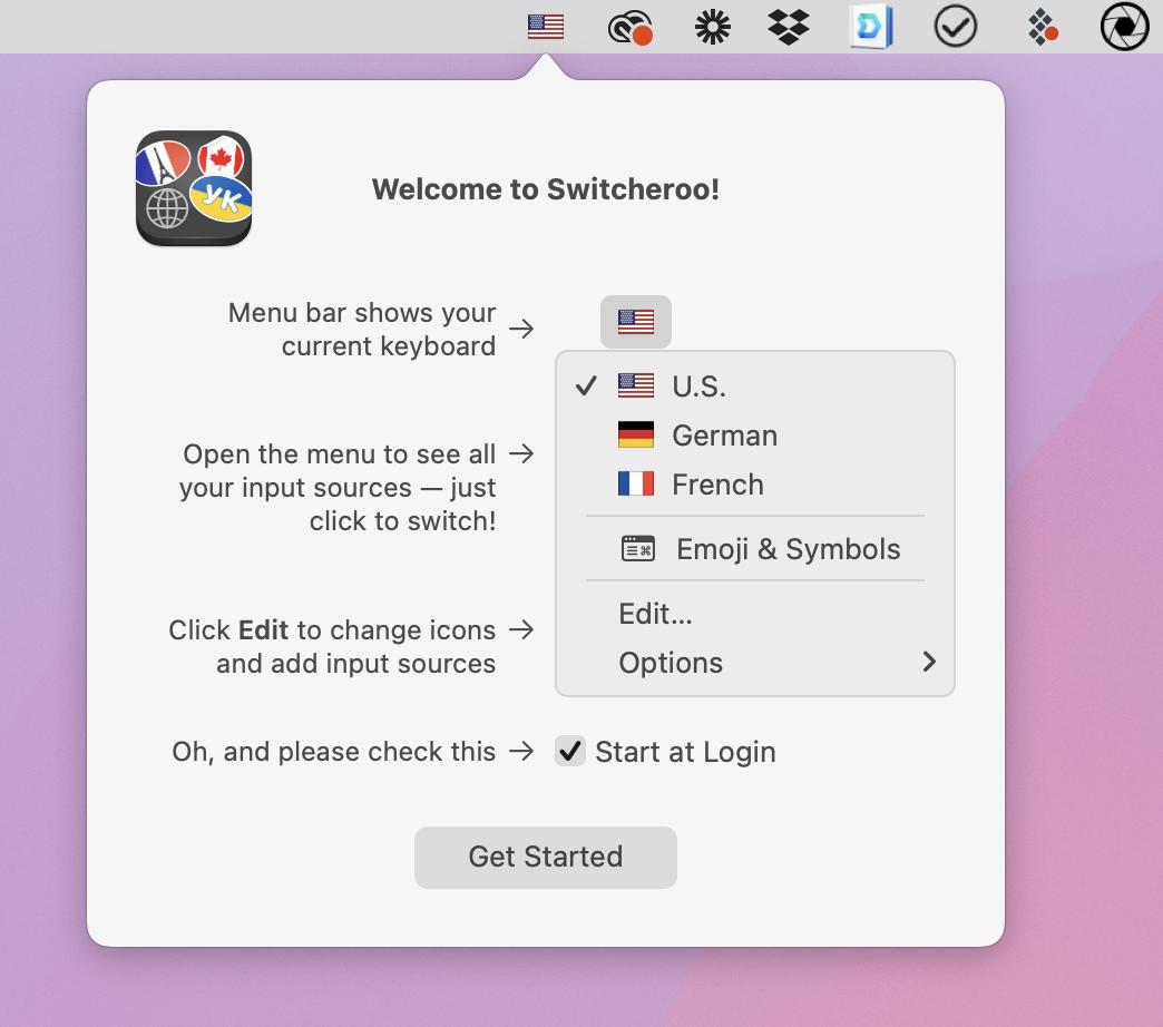
When I first installed Keyboard Switcheroo, it placed the icon at the far left of the menu bar. You can hold down Command and drag a menu bar icon to move it wherever you want, apart from the locked right-most positions.
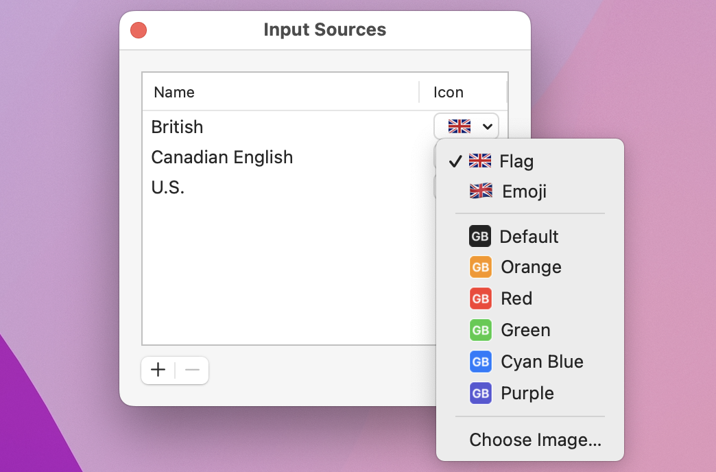
If you choose Edit from Keyboard Switcheroo’s menu, you can add languages directly without delving into System Preferences. (Note that changes in Keyboard Switcheroo aren’t reflected in System Preferences and vice versa.) You can also customize the language icons, choosing from the standard flag image, the flag’s emoji, text labels, or any image on your Mac.
So there you have it: a simple solution for a small but potentially annoying change in macOS 12.4.
I guess it depends on your point of view. I deliberately set my keyboard to Irish so I didn’t see the Union Jack sullying my screen. So I was very happy the Apple had got rid of the flags.
I’m glad you’ve found a solution. I agree that the “modern” Apple design choice of flat grey-on-grey is very dull. The lack of colour fails for those of us who need extra clues because of our ageing eyes.
The association of language and country is causes wars, and other problems so is not to be encouraged. But I don’t see how replacing national flags with country codes helps there. Trouble is, there isn’t really a good alternative for visual representation of a language.
This is the opposite of Sherlocking then. Kcolrehsing.
> Apple has seemingly been on a war against color for years, most notably in the sidebar icons of the Finder.
Crazy stuff IMHO. I don’t even see the icons in the Finder side bar anymore, they became absolutely meaningless blobs to me when they turned grey and now blue. I know a few people who think it is the best thing Apple ever did to the Finder, but it works squarely against me. I can’t figure out for the life of me what sent Apple in this awful direction…
Most of the icons are not “country” codes but abbreviations for the language name, normally in the script that it uses, often using the first two letters of the native name. It looks like Apple made them up itself rather than taking them from any standard code.
The three illustrated in the article are ISO 3166 country codes, as are, afaict, most codes for European languages that use a Latin script. Welsh is an exception, where they use CY, the country code for Cyprus (which uses mainly Greek or Turkish, I imagine.). There may be other exceptions.
The removal of national flag icons is yet another example of Apple disregarding the vast majority of its users to avoid upsetting the fragile sensibilities of a tiny minority.
Given the many millions of macOS users, it doesn’t take a math whiz to estimate the comparatively few that regularly use multiple keyboard layouts then, of that already small group, the few that are triggered by the sight of the flag icon.
I’d much rather Apple spend its time tweaking those functions used by far greater numbers, not the least of which would be returning the 5-minute “snooze” option in Reminders. One hour, as the shortest interval, is too long.
Strange how the word ‘English’ appears after Canadian but not the other two. The list could be simplified to just two: ‘English’ and ‘American English’.
I’m not sure if you’re being snarky or just unaware of the differences between branches of English. Canadian English is, in many ways, closer to American English than it is to British English. Australian English is closer to British than it is to Canadian or American. Of course they’re all way closer to each other than different, but no two are identical to each other, in spelling, grammar, or sound. And all have slang and idioms all their own. Also, at some level, there’s no such thing as British English or American English, both differ, sometimes greatly, across the countries (I don’t know enough about Australian or Canadian, but suspect the same thing occurs there). And there are of course more than four dialects of English, all with their own similarities to and differences from all the others.
I do agree though that it’s odd that Canadian is the only one with “English” after it. But combining all non-American English into just English doesn’t match reality (not that Apple’s always constrained by reality…)
I’m pretty sure that’s because there is also Canadian French, since it’s prevalent in many areas (e.g. Quebec).
You’re forgetting the context. We’re not talking about defining the language or the culture. We’re talking about keyboard layouts.
For instance, Shift-3 produces “#” on US English, but “£” on UK English. Option-3 is “£” on US English, but “#” on UK English. Option-2 produces “™” on US English, but “€” on UK English. Shift-Option-2 produces “€” on US English but “™” on UK English.
But there doesn’t seem to be a difference (at least none that I could tell) in keyboard layouts for US and Canadian English. I’m not sure why they are separate options, unless it’s just to avoid offending Canadian English users.
And there is a massive difference between French and Canadian French keyboard layouts, so there should be no question about why those two must both exist.
The other thing that 12.4 brought for this is the option to have the input source icon autoswitch between dark and light appearance. The problem is that this is restricted to strictly black and white images (bit-depth 1), so it doesn’t leave a lot of room for subtle variation.
It is a bit to do with keyboard layouts but also the language used in software, manuals, even Apple events.
We non-American English speakers have little trouble understanding other speakers of English - British English, Australian English, Singlish, Irish English, Uglish and so on. We all use the word ‘fortnight’ and use the correct form ‘metre’. Of course Apple uses American English and so we in the southern hemisphere cop the word ‘Fall’ and so showing Apple’s geographical reality is that of the northern hemisphere and that of the US.
But to give Apple its due, Apple does provide access to many, many languages. My Siri speaks Irish English.
I put my folders with customised icons into the Finder’s tool bar, where their colour is retained.
Agree that lack of colour in the side bar is a retrograde step — guess we need to be grateful that they are there at all, and not only come into view when hovered over.
While we have entered the topic of the gray on gray icons in finder windows side bars and no colorful flag icons in the keyboard input source(s), I find many of Apple’s retrograde changes disturbing. The one I really miss are the 3D looking icons for many things that got dropped for flat designs, that happened sometime about OS-X 10.5. I thought those excellent looking 3D icons really spruced up the look and showed OS-X was far superior to the competition of the time.
Let’s stay on the topic of keyboard input flags, not general complaints about interface changes.