Why Did Apple Change the watchOS 10 Interface?
Some operating system releases mainly offer refinements and clean up details behind the scenes, like the mythical Mac OS X 10.6 Snow Leopard (in fact, Michael Steeber and Jeff Johnson suggest it was a myth). Other releases introduce major user interface changes, like iOS 7. watchOS 10 falls into the latter category. Many users have welcomed its interface changes, but others thought the old interface was just fine, thank you. This article is not a comprehensive review of watchOS 10; it is just an overview of the most notable changes, especially those with reassigned user actions. Then we’ll look at how and why Apple decides to change an established interface.
In watchOS 10, Apple updated the design language in most of the apps and watchOS screens to match iOS 17 more closely. Most notably, the company added the Smart Stack, with its customizable widgets. But Apple also changed how you access basic features using physical buttons, causing some users to exclaim, “Who moved my cheese?”
While watchOS 10 has enjoyed a generally positive reception—the Snoopy watch face is particularly popular—there has been some grumbling about how Apple redefined established actions to trigger new behaviors. It’s safe to assume that inside Apple, people also grumbled as familiar button presses generated entirely different results. But after using internal builds of watchOS 10 for months, Apple obviously decided the changes were worthwhile.
Smart Stack
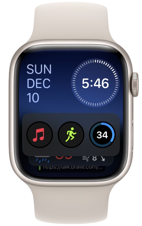
Apple is sufficiently proud of watchOS 10’s new Smart Stack collection of customizable widgets to make it a top-level feature. To ensure that users could access the widgets as easily as possible, Apple’s designers wanted to provide quick access from the watch face. Turning the digital crown is one of the most accessible actions on the Apple Watch, so Apple repurposed it to bring up the Smart Stack and scroll through the widgets.
The Smart Stack provides several interface improvements. Apple believes that most of the time, people are just looking for a snippet of information, like the current weather, and don’t need to open a full app. The Smart Stack comes with widgets connected with bundled apps, but you can add more, rearrange them, and pin your favorites to the top (touch and hold any widget in the Smart Stack to start editing). These widgets provide concise data, and you can customize the details by editing the widget. If you really want the full app, tap the widget; it doubles as an app launcher. Apple thinks the Smart Stack will provide the data you need most of the time, and it’s easier than opening an app.
In previous versions of watchOS, turning the Digital Crown from a watch face adjusted the watch face (for some faces). Now the crown brings up the Smart Stack; to adjust an interactive watch face like Kaleidoscope, you must tap first (and when you’re using the Siri face, turning the Digital Crown works only with that face and won’t bring up the Smart Stack). The engineers probably looked at user data and realized users seldom play with interactive watch faces once they’re past the novelty.
It’s unclear why Apple felt the need to add widgets to the Apple Watch, given that watchOS apps themselves are often widget-like companions to full iPhone apps and watch face complications provide at-a-glance access to even more discrete bits of information. When I worked on early versions of watchOS, we had no model for the “right” user interface for a tiny wrist-mounted screen, so much of what we were doing was throwing spaghetti against the wall to see what would stick. The introduction of Smart Stack widgets suggests that this may still be happening. I see three possibilities for how it came to be:
- Launching apps on the Apple Watch is awkward, requiring either a lot of scrolling in list view or tapping a tiny icon in grid view, and Apple’s analytics showed that most people seldom open apps. The Smart Stack attempts to surface the most relevant data from apps in a way people will use.
- Although complications provide another way of surfacing relevant data from apps, they’re tiny and fiddly to add, and Apple’s analytics may show that they’re infrequently used. Plus, quite a few watch faces, including the popular Snoopy, provide few or no complication spots. The Smart Stack lets users access data without relying on complications.
- Apple’s interface wonks may wield enough power to push something like the Smart Stack through, even if it doesn’t offer enough new functionality to make a difference. Not all interface decisions are backed by analytics.
Home Screen and App Switcher
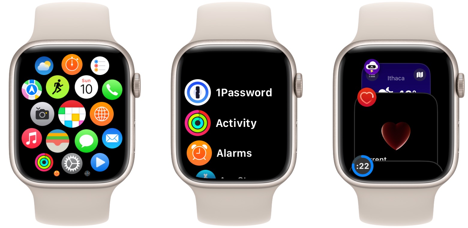
Apple changed the Home Screen grid view of apps so it scrolls only up and down and no longer moves from side to side. I think this adjustment makes it easier to find apps on the small screen, although even easier yet is the list view that sorts all your apps alphabetically and doesn’t require you to see and interpret tiny icons. List view hasn’t changed much, though it now always defaults to the top of the list rather than remembering your position. You still enter the Home Screen by pressing the Digital Crown, and you can switch between the views using a button at the bottom.
To get into the App Switcher (which replaces the Dock), you now double-press the Digital Crown instead of pressing the side button. I think this button swap makes more interface sense because then you push the Digital Crown once to access all apps (Home Screen) and twice to access recently used apps (App Switcher). Recently used apps appear at the bottom of the App Switcher, represented by a static image of their last screen.
Previously, double-pressing the Digital Crown switched you back and forth between the last two apps, much like pressing Command-Tab on the Mac. Since most people probably don’t multitask much on the Apple Watch, losing that feature shouldn’t bother too much of the user base. However, transitioning from the Dock to the App Switcher means we lose the ability to pin and access favorite apps. Apple likely sees the Featured App widget in the Smart Stack providing that option, albeit only for three apps.
As a slight tangent, you can swipe left on an app in the App Switcher to force-quit it, just as you can force-quit an app in the iPhone App Switcher by swiping up. Some people do this routinely, mistakenly thinking they’re freeing up memory. In reality, iOS, iPadOS, and watchOS reclaim memory from background apps when more memory is needed. Force-quitting them in advance does nothing useful, and it’s actually counter-productive. The next time you launch that app, it must be loaded from storage, which takes extra time and consumes more battery power. You should only force-quit an app when it’s hung and not responding.
Control Center
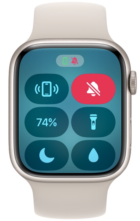
Control Center now appears when you press the side button, replacing the Dock. Previously, accessing Control Center required that you swipe up from a watch face; from other apps, you’d touch and hold, then swipe up. Pressing the side button is both more uniform and more discoverable. Apple’s user data probably showed that users frequently open Control Center, such as to ping a misplaced iPhone, so the engineers looked for an easier way to access it. (Remember that you can choose which buttons appear in Control Center—and in what order—by tapping Edit at the bottom of Control Center.)
Apple may have seen that people used Control Center a lot from the watch face but seldom accessed it directly from apps, instead returning to the watch face before invoking Control Center. Many people likely never realized they could touch and hold and then swipe up from an app. Or, Apple may have received more direct feedback about user behavior via Apple store employees, phone support, and marketing surveys. It’s even possible that Apple’s design group just made a unilateral decision.
In my experience, normal users rarely find interface elements that involve touch and hold. Apple tried incorporating the haptic 3D Touch technology on iPhone and Apple Watch models but eventually dropped it, presumably because it wasn’t used sufficiently to justify the added hardware cost.
Switching Watch Faces
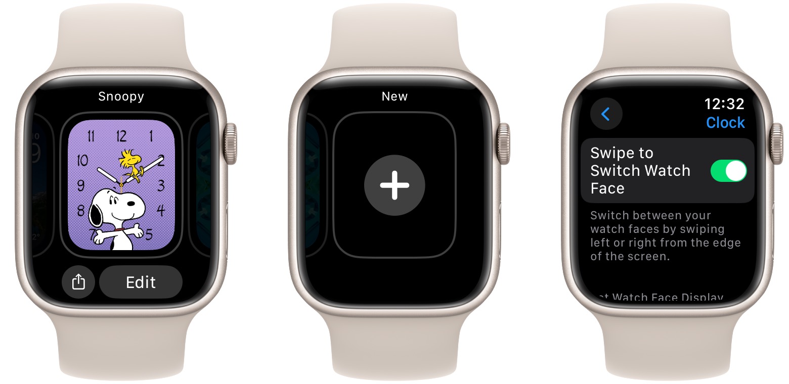
Previously, swiping left or right on a watch face changed watch faces. In watchOS 10, you must touch and hold to enter a selection mode, then swipe to switch. (To add a new face, swipe left until you reach the New screen.) Apple’s user data may have shown people changing watch faces, then immediately changing back, suggesting an accidental change. It’s also likely that Apple support fielded calls from people who were confused when an accidental watch face switch completely changed their Apple Watch experience without them realizing, leaving them with no known way to get back. Overall, this change is likely for the best, although Apple bowed to user complaints and added a setting in watchOS 10.2 to revert to the old way for those who regularly switch between faces. Find it in Settings > Clock on the watch itself.
Gathering Data for Analytics
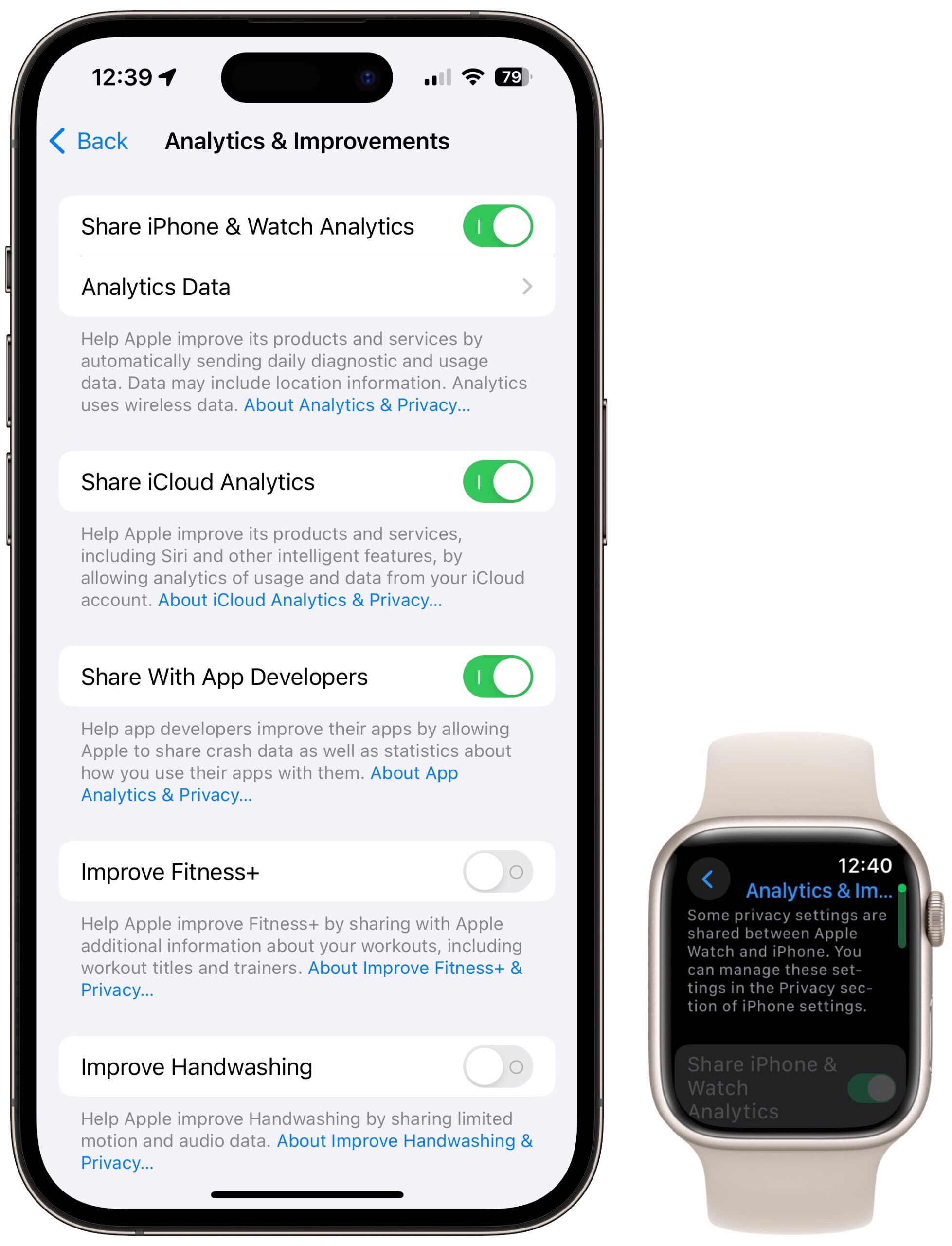
Apple has excellent telemetry on what people do on their Apple Watches and all other Apple devices. When you agree to share watch analytics with Apple during setup (you can adjust it later on the iPhone or Apple Watch in Settings > Privacy & Security > Analytics & Improvements), you’re helping Apple learn which apps and features are used the most, and which features users never seem to discover. The data includes how often you use your watch, which apps and features you use, which controls (Digital Crown rotate, Digital Crown button, side button) and gestures (tap, swipe, touch and hold) you use, and in what context. These stats tell Apple which parts of the product are used most and help Apple decide where to direct its limited development resources.
You might think a company as rich as Apple has essentially unlimited resources to do whatever it wants, but you’d be wrong. Throwing more money at a feature often doesn’t help since people are the bottleneck in creative work—and software development work is creative. Apple can’t necessarily find the developers it needs, or the developers with the necessary knowledge and experience to solve a problem correctly are needed elsewhere. Coordinating increasingly large teams and interlocking features brings additional challenges, especially in a system as tightly integrated as the Apple Watch,
The list of interesting new feature ideas is always longer than the development team can achieve. Implementing a new feature takes more than just writing the code to support it. The feature must be tested, documented, and translated into multiple languages. Marketing copy must be written, as well as training content for tech support and Apple store employees. Finally, Apple is committing to supporting this new feature for years to come. When people ask, “Why doesn’t Apple just do my favorite feature,” they don’t understand how significant a commitment that really is.
When thinking about analytics, it’s worth remembering that the data Apple collects is completely anonymous, and the company endeavors to collect the minimal amount of data possible. When I worked as an engineer on the Apple Watch, employees were trained on Apple’s security and privacy policies. These included collecting the least amount of data that satisfies the business need, never collecting additional data, and absolutely never collecting personally identifiable data.
When I added code to watchOS to collect user data, I wasn’t even allowed to check it into the source code repository until it had been reviewed by the privacy engineering panel to ensure I wasn’t accidentally collecting personal or extraneous information. Plus, when I reviewed the collected data, I couldn’t see data from individual Apple watches, only aggregate data. Apple may not be perfect, but the company tries very hard to protect user privacy.
Interface Redesign
How does Apple decide when to overhaul a user interface? It’s both art and science, with a dose of business and politics thrown in. Interface designs start out looking fresh and clean, but over time, they lose their luster and eventually feel stale, like that bathroom remodel from 1995. People buy new devices because they look vibrant and convey style. This is why car companies overhaul a car’s design every 5–8 years, even if the old design worked well. When a new model looks different, suddenly your old device, which was fine yesterday, now seems dated, encouraging replacement. Apple is in the business of selling new hardware, but there’s much less room to change the look and feel of hardware than software.
Occasionally, interface design changes because someone new takes charge. iOS 7 included a major interface update that was as much political as technical. Jonny Ive, who had led Apple’s hardware design team for years, took over software design too and wanted to leave his mark. He ripped out the old skeuomorphic design in favor of a clean, modern aesthetic. Unfortunately, he went too far in preferring form over function. Users had trouble deciphering which interface elements were controls and which were just labels. Limited contrast hindered people with low vision. iOS 7.1 cleaned up the most egregious interface missteps.
Apple usually tests new interface ideas internally. When a new feature is proposed, designers sketch out a half dozen different interface approaches. Product managers, engineering, marketing, and management give their opinions, and a few interface ideas are coded up to try out. Employees on the product team try out the new features on their devices. They report bugs and discuss whether the interfaces are working well. The designs are refined, the least successful ones are dropped, and employees try the updated versions. It’s an iterative process, with more employees added in each round. Ultimately, hundreds, if not thousands, of employees use a new feature before it ships to customers.
Apple knows it inconveniences users by changing an established workflow. The fact that Apple rarely does this lets you know how seriously the company takes it. Nevertheless, for the most part, Apple truly believes that the new design is—or at least will eventually be—better than what it replaces.
For instance, when Apple released Final Cut Pro X with significant changes from the workflow in Final Cut Pro 7, angry users complained about the new approach and the lack of features from the previous version. However, after Apple added back those features and smoothed the rough edges in the first six months after release, most of the complaints died down. Many video editors now agree the Final Cut Pro X workflow is better. (But some still prefer the old workflow!)
Similarly, when Apple’s Swift programming language was new, its developers regularly added features to improve it. But after a few years, the Swift developers decided it needed some rethinking, so Swift 3 incorporated significant changes. Most old code wouldn’t compile anymore. My team spent weeks rewriting our code to work with Swift 3. There was plenty of grumbling. But over time, I realized the changes were all good. Swift 3 code was easier to write and easier to read.
Apple is willing to take—and inflict—short-term pain for a longer-term gain. Whenever any change makes it to users, you can be sure that employees have been living with the changes internally for months (“eating your own dog food,” in the industry parlance), and the product managers have decided that the new way really is better, once you reprogram your muscle memory and expectations of how things “should” work.
An iPod Story
Years ago, I worked on the iPod’s Voice Memo feature. The user had to click through three screens to start a recording. Ste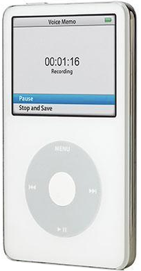 ve Jobs didn’t like it. He thought it was too complicated. But try as we might, no one could come up with a more straightforward design that wasn’t missing key features. Steve didn’t know how to fix the design either; he just knew it wasn’t good enough. Even though the voice recorder worked, it didn’t ship in that year’s iPod model.
Several months later, someone on the team had a brainstorm to simplify the interface while preserving all the features. The user had to click through only two screens to start a recording. The Voice Memo feature shipped a year late, but the interface was much better. In my opinion, that was the right tradeoff.
Users never knew how much effort went into simplifying that interface. A good interface feels obvious, but it usually takes intensive work on the part of many people. In a quote commonly misattributed to Mark Twain, the 17th-century French mathematician and philosopher Blaise Pascal said, “I have made this longer than usual because I have not had time to make it shorter.” The same applies to user interfaces.
Such a great article. Thanks.
One small change: list view used to remember where you were in the list between uses. Now it always dumps you to the (alphabetic) top of the list.
I miss the old behavior, because I frequently used the app launcher only to launch a few apps, and - of course - those apps tend to be at the end of the alphabet.
The new grid view, though, is a huge improvement, and I’ve simply decided to use that and drag my important apps to the top of the grid.
I’m glad you mentioned that because I’ve been perturbed by it always being at the top but didn’t remember that it retained its position in the past. Retaining the position is helpful since I don’t use 1Password or Activity as standalone apps much. :-)
I also found the change annoying, since the app I usually want is Overcast. I don’t find it annoying enough to switch to grid view, though, since I’ve never liked that.
The only app I ever manually launch regularly is Workout, which is at the very bottom!
But fortunately I was able to add a workout complication and moved a rarely used complication to the Smart Stack, so all is well.
For me, it’s Intervals Pro and Strava. But after editing David’s article, I’ve managed to retrain myself to double-press for the App Switcher, since those two apps are always fairly high in the stack.
I think that David has revised the article. The sentence now reads:
"List view hasn’t changed much, though it now always defaults to the top of the list rather than remembering your position. "
I look forward to Apple providing an update that allows one to switch to the former default, as they did with changing watch faces.
In the meantime, I use a workaround. I make Shortcuts one of the apps in the multifunction widget, which is pinned to the top of the Smart Stack. I then have a shortcut for each app I commonly want to open It contains only an Open App action. Unfortunately, the app needs to have an IOS version for this to work. When you tap the Shortcut icon in the widget, the first 3 Shortcuts display with a button at the bottom to display the rest of the list, so manually ordering the list allows quick access to the 3 most favorite apps and slightly delayed access to the rest.
Or you can arrange your favourite apps to be at the top of the apps grid view, and launch them them after one click on the crown wheel. You can have 17 apps visible in grid view without scrolling….better than old list view that only had 10 and required scrolling for more than top few.
Exactly what I have done. And you can do this on the Watch app on the phone rather than try to do so on the watch’s small display.
I am one of those that has welcomed the new watchOS way of doing things. There is only one thing that I have trouble with and that is the start and stop of audio. The new interface is close to the bottom and requires that you do not touch the outer rim. You have to have your finger descend tip first. I have never used my little finger before to select things on the watch, but I now find that using it I have fewer misses.
I have a Apple Watch Series 4, 40 mm. I wonder if users of bigger watches have less problems with this?
I’m one of the ones who vociferously complained about losing the quick swipe of watch faces, so I’m very glad to see the new option to re-enable it. However, watchOS 10 still has to refresh the face display once you swipe to it, whereas previous versions had the current screen elements already updated when the face displayed.
Any idea why this is? It makes face swapping still seem markedly slower than before.
Hmmm Hold the crown and say "Open/Launch . seems simple enough.
I’m sitting here with my Watch SE recently updated to 10.2. I push the Digital Crown, and it brings up the list of apps with my most-recently used app (Settings) showing. I’ve repeated this several times. Now I use the Messages app. Go back to my watch face. Push the Crown, there’s Messages. What am I doing right?
How do you re-enable it?
On the Watch (not your iPhone), go to the Settings app and then the Clock app. It should be the first item.
On my Watch 8, the delay is a fraction of a second. I see the hands rapidly move into position rather than just being there. My model is that when a watch face is hidden, it’s stored as ready to edit. When you select it, it pops into active mode, jumping to the current time and activating any complications.
The delay may be longer on an older watch.
Yeah, the delay in absolute seconds is small, but it seems longer. And I have the 9, so it’s not being slowed by age.
Also, if I’m wanting to swipe 2 or 3 faces from the current one, I feel like I need to pause after each one to let the display update. But maybe not.
Are you double-clicking the crown? That’s what has replaced what used to be the dock (single press of the side button), though it’s really more like the multitask screen on the iPhone, since you can swipe the cards that represent the apps to force close them.
Single click of the crown while you are on the watch face brings up the app launcher - either grid view or list view. Single click of the crown while you are in an app brings you back to the watch face. This hasn’t changed at all with watchOS 10.
Good article. I only take issue with one thing:
They aren’t the same thing, so no it wasn’t. The Dock is gone. I still don’t understand why this got the axe. I’ve gotten used to the new way, but the Dock was somewhat unceremoniously killed off-screen, as it were.
Yeah, I get it. I added that in editing, and I’ll recast slightly to “which replaces the Dock.”
Yes,
The dock was my repository for my favorite apps, which I used daily or wanted quick access to. The initial problem with the Smart Stack was that not all these apps had widget equivalents. So, it required some work, including learning the basics of Shortcuts to reclaim that functionality.
True that they aren’t the same thing, but Apple seems to have decided that the old dock was also an app switcher, and it’s what their support document now calls it. I have also heard Apple employees call the new App Switcher the dock.
I also prefer and miss the old dock, because I did use it to access favorite apps. But I’ve grown accustomed to the new ways, so no more grumbling from me.
Apple has made it pretty clear that widgets are the new hotness. I expect most apps to include widgets soon, if they want to remain relevant.
Thanks for the article. Just addressing the myths around SnowLeopard, it wasn’t a myth that the goal was “no new features”. I was a MacOS engineer at Apple during the time, and even internally it was pressed very hard that the primary goal was to streamline, size down, and make things more stable. SnowLeopard was the first MacOS to drop processor support for PowerPC and because of that the installed space requirements were almost halved. Unfortunately, this “no new features” time allowed a lot of teams to refactor their code, so instead of just applying bandages on top of old major bugs, the refactors exposed some deeper issues which were unknown until the OS was released to millions of users. A decade and a half later I don’t recall all the details, but there were also some underlying services being implemented for more iCloud support, migrating off the old MobileMe, which was one of the reasons why it was priced so low ($30), to encourage people to upgrade so we could more fully deprecate a lot of old MobileMe stuff.
So in the end it’s true that it doesn’t feel like SnowLeopard was a “bug fix release”; it should probably be called a “refactor release”, since it didn’t fix bugs per se, it just swapped out for a new set of bugs that were hopefully easier to fix going forward. But I’ll agree that at the end (10.6.8) it was definitely one of the best OS’s Apple has released, and I kept my personal machines on it for a long time.
Interesting article! In general, I liked the older interface better, but like apparently a lot of users, I don’t go into and out of apps, etc., much anyway. I do use one or two complications frequently (weather and workout).
I did like the restoration of the easy watch face swipe, though it seems to have a lag it didn’t have before.
Re Snow Leopard: That Mac OS worked the best for me of any before or after. I still have an affection for it.
I tend to do the same things and prefer the items to be available the same way, quickly. The swipe up used to be used a ton. Now I have to figure out which button (bottom). Really don’t like the changes. Swiping up now gives me widget like stuff which I don’t need or use. I have no idea of how to swap to my other watch faces. Ugh.
Widgets replace the Dock in earlier versions. If you used an app in the dock, hopefully, you can find an equivalent widget. If not, you may need to get creative.
When WatchOS 10.0 was released, the procedure for swiping watch faces changed (as discussed in the article). Apple believed many folks were accidentally swiping faces when they didn’t want to (probably based on the quantity of support and genius bar calls). So they made it more difficult. However, after the change, the volume of folks who didn’t like the change caused Apple to provide an option in the Watch 10.2 update to reinstate the old behavior, swiping from the edge. To get that, you need to open the Settings app on the Watch, and then the toggle should be the first option in the Clock app settings. Folks have noticed that the change isn’t as smooth as before but is still close to instantaneous.
I more or less thoughtlessly ‘downgraded’ my watch from 9 to 10 and deeply regret doing that. I really hate the new UI and desperately want to restore WatchOS 9. I have not been able to find a way to do that. Any TidBITS readers that can point me to a way to restore WatchOS 9 on a series 6?
There is no way to downgrade. There was a time when you could ask Apple to do that, and I believe they had to send your watch out for a few days, but I don’t believe they offer that service anymore. (Actually they may have only offered that service during the beta period of a new version after WWDC in case a beta puts your watch in a non-working state.) Perhaps it’s worth a try to see if you can get that service, but don’t get your hopes up.
Your only chance is probably if you find someone who is selling a Series 6 that was never upgraded.
@ddmiller is right, but I’d encourage you to call Apple Support and calmly tell them all the ways that watchOS 10 isn’t working for you and ask how you can revert to watchOS 9. I doubt they’ll be able to help you, but at least you’ll have had the opportunity to provide feedback and encourage them to send it up the chain.
Are you sure it’s a downgrade? Most of us don’t like change, and I fault Apple for not adequately preparing folks for the the major change that Watch OS 10 is.
In my case, I initially reacted very negatively to the change, as I had refined the Dock to be the base for many of my interactions with the watch. So, I needed to see if the new widget structure could adequately replace that. Long story short, after discovering how to create and modify Watch shortcuts, I succeeded in creating a more satisfying interface for myself. It worked so well that I was able to change my complication-heavy watch face (Infograph) for a complication-free one (Snoopy).
So, before you call it a downgrade, think about how you work with the Watch and see if there are opportunities in Watch OS 10 to provide an equivalent or better experience than you had before. If you have already done that, I apologize for the rant.
Thanks to everyone for replying. I guess I’ll just have to learn to live with WatchOS 10 as restoring to 9 sounds like too much of a hassle to me. And yes, I will be giving Apple feedback via their feedback page.
@aforkosh, no need to apologize for the ‘rant’, I found it insightful. I did look at the ‘smart stack’ and tried to customize the widgets, but in the end did not really find anything there that I could not reach more easily via one of my watch faces (I have 3 customized for specific needs and swipe left or right from my main watch face to quickly access what I want). So it bothers me that I now need to press the side button to get to the control panel, which I use a lot, because Apple did not provide a setting that allows me to choose how I want the watch to behave!
What intrigues me in your post is that you mention creating and modifying Watch shortcuts. I did look at shortcuts, but found no way to create one to, for example, open the control panel? Perhaps you could point me in the right direction?
Other than that, I have other issues with WatchOS 10. For example,
The new design of several apps now have screens that are almost illegible (for example temperature prediction of the Weather app), even with reduce transparency, increase contrast and bold text turned on.
The Activity app used to be a single page I could position so that I could see all 3 graphs in one glance, now it is a multi page thing that does not allow that anymore, forcing me to scroll where that was unnecessary before.
In the first few days that I have been using WatchOS 10 the watch has completely frozen on me twice, necessitating a reboot. That fortunately has not happened since.
I have experienced sudden unresponsiveness while swiping the watch face multiple times
and, last but not least,
WatchOS 10 seems to use a lot more power. Where I used to have about 30-35% battery left after a day, that is now reduced to 15-20%. I have already turned off background refresh for almost all apps and reduced the brightness setting in the hope this will help.
All in all, there is enough to dislike for me to call it a downgrade.
You need to create shortcuts on your iPhone and tap a checkbox to have them appear on the Watch. So, the action components of the Shortcut need to be either system functions that make sense on both the iPhone and the Watch or apps that appear in both places and have actions that are appropriate to the Watch. For example, I can work with the Autosleep app via a Shortcut (since it is an iPhone app with relevant Watch Shortcut triggers), but I can’t open the Blood Oxygen app (since it exists only on the Watch).
I don’t believe that’s a specific action for opening the control panel, but you can do things like changing the Focus via Shortcuts. If you had to access the control panel before to make changes, it’s mainly a matter of retraining yourself to tap the side button to open it rather than scrolling down on the Watch face. Similarly, you need to retrain yourself to scroll down to access the Smart Stack rather than hitting the side button to access the Dock.
A long thread on Tidbits Talk includes discussions of creating shortcuts for the Watch and organizing the Smart Stack to make best use of them.
I’ve had this happen a few times but not swiping. Occasionally I can’t end a workout session necessitating a hard reboot to resolve.
Very interesting to me that someone who uses control center often is complaining about it being switched to the side button. That really does make the control center easier to use, particularly when you are using an app and not in the watch face - for example, while you are in a workout and want to open control center. Prior to watchOS 10, unlike when the watch face was showing, you needed to press and hold a bit on the bottom until the control center started appearing and then swipe up - simply swiping up wouldn’t work, because many apps, including the workout app starting with watchOS 9, could have multiple pages. watchOS 10 still has this UX with notification center. On the watch face you can simply swipe down to open Notification Center, but while you have an app running you need to press and hold for a bit on the top of the display until the display blurs and then you can pull down notification center. Having the side button always open control center makes it much easier.
I’m not like you - I rarely open control center but I used the customized dock of icons multiple times per day, so losing that functionality with watchOS 10 was a big loss for me.
That said, almost six months on and I have almost full adjusted to watchOS 10. I do use the Smart Stack swipe up from the bottom quite often, but mostly just to either start a timer (which I have on the ribbon of three icons pinned to the top) or to control media playing - when media is playing the Now Playing widget sits at the very top.
To replace the dock I have switched away from the list view of apps back to the grid view and I have put all of the apps that I use at the top of the grid so they are easy to get to. I also use the double-click of the crown to open the multitasking screen to switch between apps - double-clicking the crown used to switch between two apps automatically, but now it’s added an extra step. I do this often enough that I miss the old behavior a little bit, but I can live with the change.
I am actually quite happy that the swipe to change watch faces is no longer the default because I used to hate that - my watch would frequently (generally once or twice a week) be in the wrong watch face, probably because of a mistakenly sensed swipe from my sleeve or something similar (maybe the watch brushing against my other arm or hand?). Now when I want to change watch faces - yes, it’s harder, but the watch face I want stays until I change it (or a focus changes to for me - I have several foci set to specific watch faces.)
I know that I’ve seen a few people complain about this, but the same data is easy to see in the Fitness app or the Health app on the phone (also, there is a widget with this detail that you can add to the Today screen or a Home Screen), and I just don’t often need to see the actual detail myself. It’s rare when I open the Activity app on the watch.
This was definitely true prior to version 10.1 (or it may have been 10.1.1), but for me the battery usage is pretty close to what I saw with watchOS 9 and the changes can be partly explained by the maximum capacity being down to 93% after 17 months. But, yes, it does seem to use a little more power, but, for me, not that much more.
Just an FYI - there is now definitely no reason to try to downgrade to watchOS 9 unless you want to keep iOS 17.3.1 or older. iOS 17.4 will no longer sync with a watch running watchOS 9 - it prompts you to upgrade the watch to watchOS 10 before it will continue syncing.
I must confess that, based on the many negative responses to watchOS 10, I was prepared to dislike it, but after being forced to update due to iOS 17.4 I quite like it. As to its main feature, I don’t use widgets on any platform and couldn’t care less about them on the watch.
I am delighted with the way watch faces are changed - after accidentally changing faces so often when my shirt rubbed over the screen, I got so tired of this that I eliminated all faces but the one I mostly use. The new approach is much better in my opinion.
I like the large numbers in the activity app allowing me to read them without putting on my reading glasses. I also like the increased use of the Digital Crown instead of swiping to scroll through a list - a much better UI than swiping.
I don’t mind the button changes. In fact, I prefer a button push to swiping to show the control panel.
Perhaps Apple should take a cue from camera manufacturers and let the user set buttons and gestures to their preferred function.
I’d be happier I think, but if there is anything that we know from Apple after almost 50 years, that is not the Apple way.