Do You Use It? Widgets See Middling Adoption
Our last Do You Use It? poll asked how frequently you use widgets. There are so many implementations of widgets in the Apple world that we had to break the question into nine separate questions to cover the iPhone, iPad, Mac, and Apple Watch and discern the difference between widgets in different parts of each device’s interface. Just because you use Home Screen widgets on the iPhone doesn’t mean you use Notification Center widgets on the Mac.
Along with a three-tier answer for how much people use widgets (Heavily, Slightly, Don’t Use), we took two other possibilities into account. Some people can’t use certain types of widgets at all due to system requirements—iPad Lock Screen and Apple Watch Smart Stack widgets appeared only with iPadOS 17 and watchOS 10, for instance, and thus aren’t available to those using earlier versions (that’s the Not Available answer). Plus, just because a feature exists doesn’t mean everyone knows about it—part of the goal of these surveys is to introduce people to features they may not have heard of before (the Didn’t Know answer).
Before we dive into the results, let’s make sure we’re on the same page about what widgets are. An iPhone support page notes that widgets provide “timely information from your favorite apps at a glance on your Home Screen, Lock Screen, or Today View.” In essence, apps can use widgets to display information without you having to switch to the app. You might want to have weather conditions, sports scores, flight tracking, your to-do list, or a weekly budget available at a glance.
Widgets first appeared in Today View to the left of the Home Screen (iOS 12 and iPadOS 13) but became more interesting once Apple allowed them to appear in more prominent locations. They first migrated to the Home Screen (iOS 14 and iPadOS 15) and the Mac Notification Center (macOS 12 Monterey), followed by the Lock Screen (iOS 16 and iPadOS 17). This year, widgets made their way onto the Mac desktop (macOS 14 Sonoma) and the Apple Watch Smart Stack (watchOS 10). Each link above points to Apple’s widget documentation for the associated operating system.
As it turns out, however, at-a-glance information might not be as valuable as Apple seems to imply, to judge from the responses from roughly 350 people to our poll questions.
Widget Usage Results by Platform
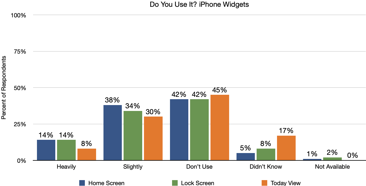
Let’s start with the iPhone. The most common response for whether respondents use Home Screen, Lock Screen, or Today View widgets was Don’t Use, followed by Slightly. Only 14% of respondents use Home Screen and Lock Screen widgets heavily. Interestingly, Today View widgets are both the oldest and the least popular—17% of respondents have either never heard of them or, more likely, forgotten about them. Vanishingly few people have iPhones that are too old to use widgets.
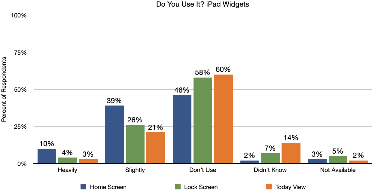
On the iPad, the widget story is even less favorable. Home Screen widgets ranked first, with 10% of people using them Heavily and 39% using them Slightly. However, 46% of respondents don’t use Home Screen widgets at all, more than any of the iPhone Don’t Use numbers, and that’s the good news—58% and 60% of respondents don’t use Lock Screen or Today View widgets on the iPad. Despite the lower usage levels, respondents were slightly more aware of iPad widgets than iPhone widgets. More people had iPads that were too old to support various widgets, but those responses are still in the low single digits.
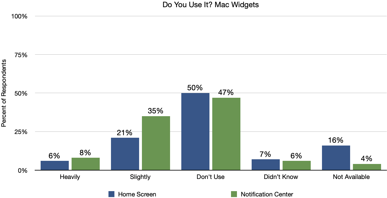
On the Mac, there are only two types of widgets: the Notification Center widgets that debuted in macOS 12 Monterey and the new Home Screen widgets in macOS 14 Sonoma. Nevertheless, the trends continue, with about half of users saying they never use widgets on the Mac, and only 27% (Home Screen) and 43% (Notification Center) responding either Heavily or Slightly. Interestingly, the Mac’s Notification Center widgets are more heavily used than the equivalent Today View widgets on the iPhone and iPad. Those unaware of widgets on the Mac were in the mid-single digits, and unsurprisingly, 16% of respondents aren’t running Sonoma and thus can’t use Home Screen widgets.
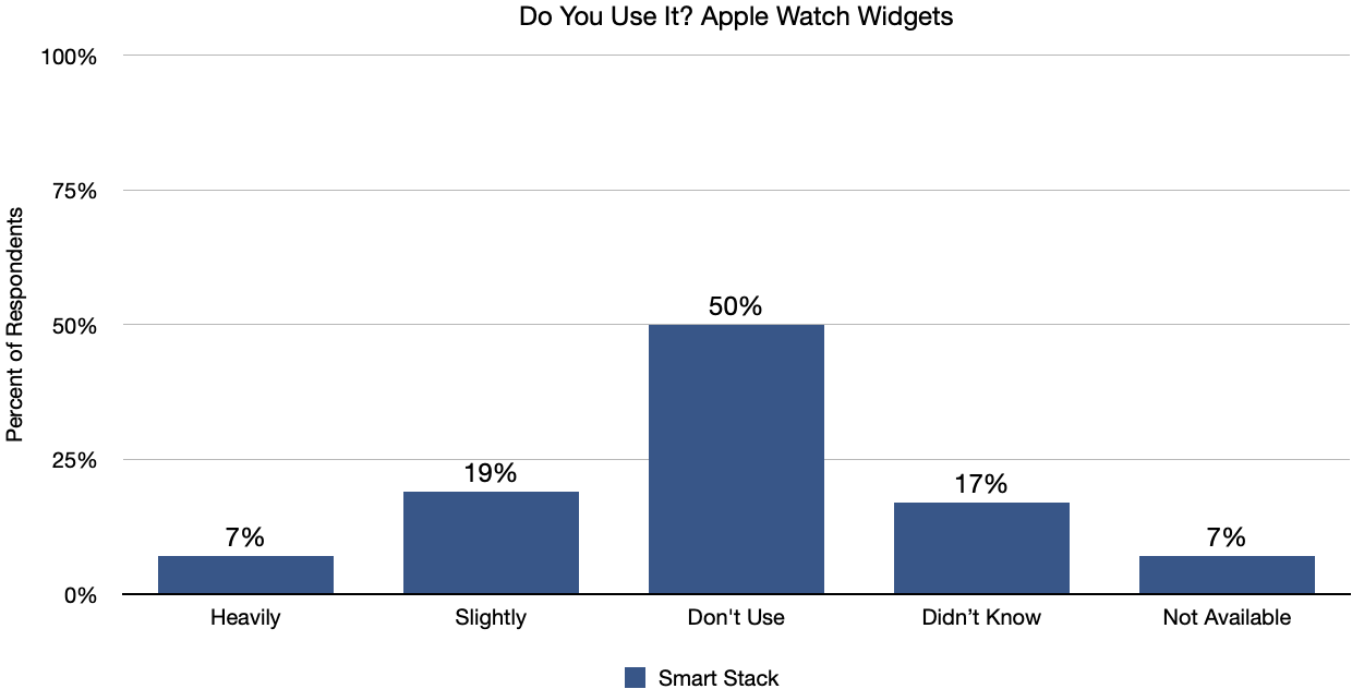
Since the Apple Watch’s Smart Stack widgets appeared only a few months ago in watchOS 10, they fare almost surprisingly well. Half of all users don’t use them, in line with the other platform widgets, but 26% of users have found and adopted them already. Many (17%) didn’t know about them (in watchOS 10, turn the Digital Crown to bring up the Smart Stack), and 7% have older Apple Watch models or haven’t upgraded yet.
Why Aren’t Widgets More Popular?
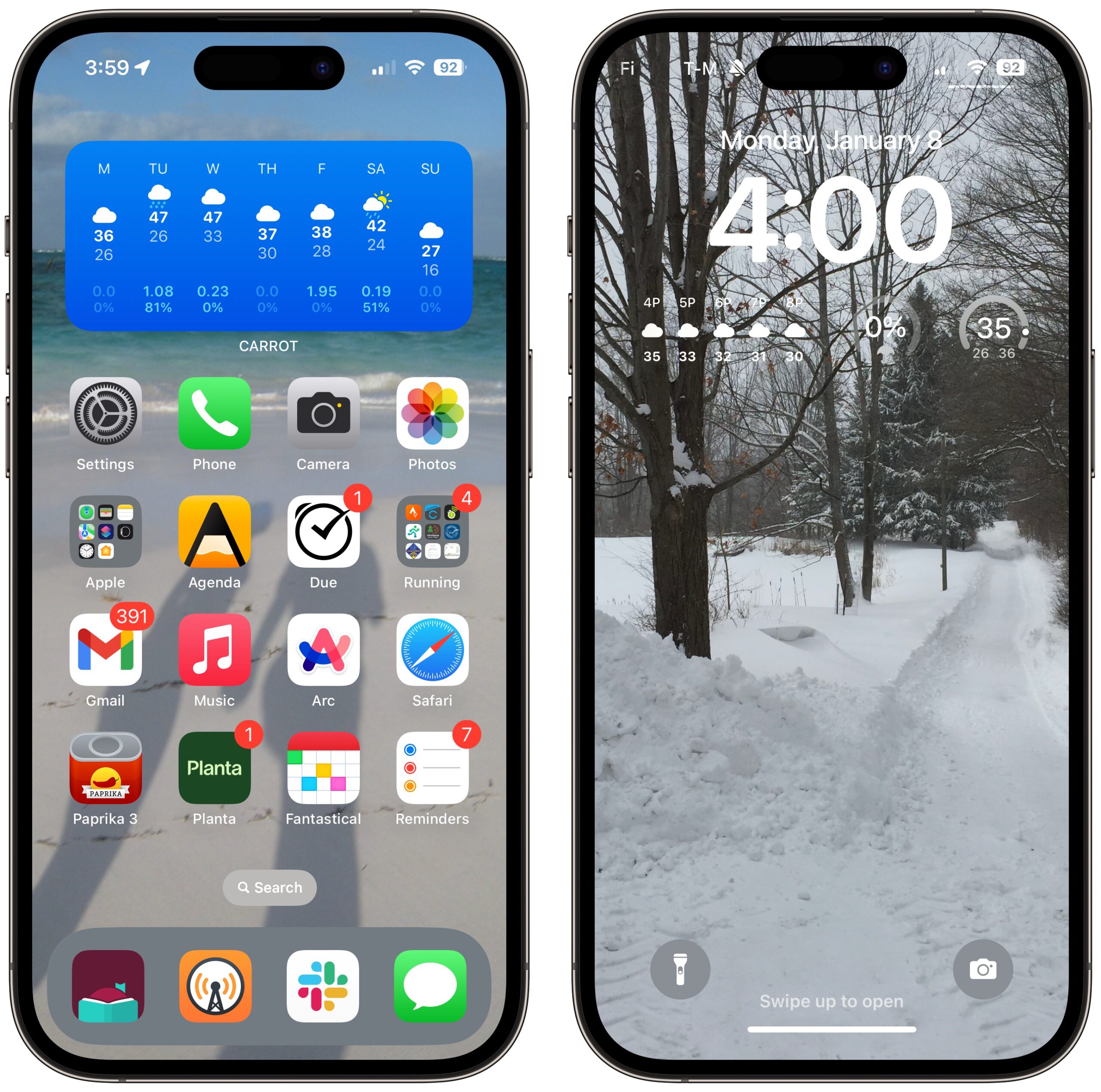
I’m no poster child for widget usage. The only widget I use is CARROT Weather’s forecast widget, and only on my iPhone. On the Home Screen, I have a prominent stack that alternates between CARROT Weather’s 12-hour forecast and 7-day forecast, and although I peruse those sometimes, I’m more likely to tap the widget to open the app for a full-screen view. On the Lock Screen, I have the 5-hour forecast widget, but I can’t really read it, so I use it only as a shortcut to open the CARROT Weather app. Two other small widgets on the Lock Screen fill the space, one showing precipitation likelihood and the other showing temperature, but the fact that I had to look closely at them to write this sentence suggests I never use them.
I seldom turn my iPad on at this point, so there’s no point in having widgets there. On my Macs, I’ve tried widgets in Sonoma, but my desktop is obscured by windows unless I reveal it to work with files, and then I’m focused on what I’m doing, not looking at widgets. On my Apple Watch, I prefer the Modular watch face with complications for the timer, my next calendar event, the temperature, and a few apps. I tried the amusing Snoopy watch face, and because it allows no complications, I configured Smart Stack widgets to simulate my complications. Snoopy was fun, and the Smart Stack worked, but I disliked having to invoke it rather than just glancing at my wrist, so I returned to Modular and stopped using the Smart Stack.
Why do widgets fail to inspire so many people? The monochrome iPhone and iPad Lock Screen widgets are too hard to read against photos—I could imagine those being more popular if they were more readable.
More generally, I’m not sure that the concept of widgets is as compelling as Apple seems to imply. There are a few bits of information many people want at a glance, but I’m willing to bet that the main one is time, followed by date. That’s why the Mac has long had a menubar clock, the iPhone has always shown the time on the Lock Screen and in the Home Screen status bar, and the Apple Watch exists at all. I look at all of those regularly to ground myself in the flow of time, and they solve the at-a-glance problem for most people. Heck, the Apple Watch is essentially a dedicated widget that “shows timely information from your favorite apps.”
The problem may be not with widgets but with the assumption that they should be attractive to most Apple users. A more charitable interpretation would be that a fair number of people—between 25% and 50% of users—have some specific desire for at-a-glance information beyond time and date. Those desires are probably not broadly shared. A sailor or kite flyer might care deeply about wind speed and direction; the rest of us, not so much.
Ultimately, you shouldn’t feel like you’re missing out or being a bad Apple user if widgets have little or no appeal. Simultaneously, it’s worth acknowledging that widgets are one of those features that might make a big difference to others. Apple can’t please all the people all the time, but widgets can please some of the people some of the time.
On the survey I said I didn’t use the Today View – I hadn’t heard of that and I assumed that was some new thing I didn’t use. But in the article you mentioned it’s the view to the left of the iPhone screen, and I do use that quite often. (It’s a stupid name for that view. I never in 100 years would have guessed that’s what it was called.)
That’s where my Battery widget resides and it’s the only way I can see the battery level of my AirPods Pro, for instance. I have a Battery widget on my lock screen, but it just cycles through various devices on its own schedule and never the charge level of the item I want, so it’s rather pointless. I certainly wouldn’t want a Battery widget on my home screen – it wouldn’t be needed 90% of the time and would be a waste of space.
I also have a couple legacy widgets there that I still use (though usually just to launch the main app as the interactive aspect is so limited as to be nearly useless). On my iPad running an old OS I still have the old Stock widget there – it shows more stock quotes than the lame new one which even at the biggest size only has room for a few stocks. Often the newer widgets are worse than the ones they replaced!
I don’t really use Today View on my iPhone because I have to swipe to see it. Meh.
On my iPhone, I do use a widget smart stack on my main screen. It’s weather, battery levels, my groceries reminders, and appointment. The main issue I have with Widgets is they take up valuable real estate on my phone. I can only display 24 apps per screen. My Smart Stack knocks it down to 16. That widget better be really, really useful.
On my Mac? Not really. My desktop is the least important thing on my Mac. I have apps I’m running which cover it.
I know that widgets were a premium feature of Android. It was one of the big things that allegedly made Android so much better than the iPhone. Most of the time, the only widget I saw on an Android Phone is a clock. Then a few scattered icons for apps. Most of the time, the Android users just open their App Draw to find the app because trying to add apps to the Home Screen was too much trouble.
If having widgets on the iPhone Home Screen is a feature that helps Android users switch, Apple may feel it’s worth it.
I wonder if your survey skewed heavy to long time users who are use to not having widgets, so don’t miss them. And therefore, don’t see the fuss.
Like the majority, I never use widgets. I wonder why Apple spends so much time and money on these things. Emojis also baffle me. Apple has added so many emojis that I have quit using them or looking for one to add to a message.
The Finder is so lacking in features the Windows had 25 years ago that I scratch my head in wonder.
I could go on, but won’t.
I don’t use Widgets a lot either.
But I thought the most interesting comment that Adam made was “I seldom turn my iPad on at this point”. I feel the same way. My iPad hasn’t been used in forever. My iPhone and my Macbook are all I ever use.
In my opinion, Apple widgets are useless doodads on every Apple device I own. I haven’t tried to use them since the earliest days, when they seemed cute but ultimately added nothing useful to my computer-using experience. If some people find them useful, that’s fine with me; but for Apple to use their valuable resources enhancing the widget experience or making it more widely available is a waste of time inho.
“The monochrome iPhone and iPad Lock Screen widgets are too hard to read against photos—I could imagine those being more popular if they were more readable.”
Interesting point that hadn’t occurred to me. Unlike the photo on Adam’s lock screen, the photo on mine has an expanse of blue sky at the top and the widgets show up perfectly well against that background.
On the Lock Screen the widget color matches the text color of the time on the lock screen. Adam could edit the color of the text to try to make the widgets more readable if he wanted, though of course it may then make the time unreadable.
It’s too bad that you can’t edit the colors separately, as they could be in different backgrounds - as they are in Adam’s example. What’s also too bad (and this has nothing to do with widgets) is that the top stays bar icons always seem to be white. It seems strange that there isn’t come sort of machine learning that can adjust those colors to a more pleasing though readable color.
The color and contrast is one thing. The incredibly small font size another. I cannot adjust that. I cannot as a user set it up such that it takes up more space since I don’t need all that vast space below for tons of notifications because I turn off most notifications and clean out quickly the very few that I do allow to come through. The way Apple has forced lock screen widgets into using this small space with this teeny tiny font and zero user adjustability makes them pretty much useless to me. Even if I were somehow allowed to maximize contrast, I still couldn’t decipher what they’re displaying due to size.
Possibly? But widgets have been around for years now in one form or another, and with a few exceptions, people seem pretty aware of them. In general, of course, these results only reflect the view of TidBITS readers, and that’s not a representative population. But in this case, I don’t see a huge reason why TidBITS readers should be that different than others.
I use Photo Shuffle on my iPhone Lock Screen, so there’s no telling what photo will be behind the widgets. Some are better than others, but they’re seldom highly readable.
Thanks for reminding me of that! In fact, I apparently had the leftmost color circle selected, which I think means that it takes on some aspect of the background coloring, making the time and widgets less contrasty. I switched it to pure white after some experimentation, and we’ll see if that makes a difference. None of the colors worked for me.
My iPads are used primarily for ePubs but when I travel, I take them now that my MBA died.
Adam - That one sentence in the final paragraph was worth more to me than the entire column, as it perfectly addressed my long-lurking thoughts on widgets.
Oh, and one more thing… probably 95% of the regular reading I do in email and the web is on my iPad. It’s so much more comfortable to lay on the couch or bed and use it — sorry Mac mini and iPhone! LOL
Thank you for running this survey and it proved what I believed - most users don’t use widgets despite the pushing by Apple. I am like others who commented, Apple should stop playing with widgets and emojis and transfer the programmers to fix up Apple application software.
Maybe a survey could be run asking us what Apple application software we think needs to be fixed immediately.
Unlike some, I used to like widgets. I now have weather on my mac, but wish for something like a web-cam or Orbi (netgear) widget that monitors connections or I can see what camera status is, etc, without launching an app. And I like that we should have had weather, and more, on iPhone home screen. Even now, with weather alert widget and temps, there is so much space for INFORMATION on the home screen to just look at, without unlocking etc…
Thanks for the survey!
Keep in mind, that’s just not how the world works. Apple has thousands of developers working in groups on many different platforms, apps, and features. There’s no benefit in the company transferring a handful of engineers who work on the OS support for widgets, say, to do something else that already has a team. (And emoji support is just baked in; when new emojis are approved, all Apple really has to do is design an Apple version and add it in.) In software development, throwing more resources at a problem doesn’t necessarily help and may be counter-productive. See the Mythical Man-Month.
More to the point, as I noted at the end of the article, even if 25-50% of users find widgets useful, that’s still hundreds of millions of people.
By the same logic this would also indicate a billion or so people who do not want them. To them it’s nothing at best, bloat at worst. Not a problem for me, but nevertheless wanted to point out that is not an argument one way or another, really.
Bottom line, Apple has chosen to do this and not do other things. Some of us will like that, others won’t. And both are entirely legitimate positions. What’s not legit IMHO is those liking it telling those who don’t they’re seeing it wrong, and conversely, those not liking it telling those who do that all is lost with this Apple. There are different opinions on the matter (as with so many others). And that’s perfectly justified. There is absolutely no need for everybody to agree on one universal stance. The one thing though I would suggest all agree on is a) Apple makes the ultimate call (and thus carries the responsibility of justifying that) and b) one personal preference is on a broader scale not any more or less valid than somebody else’s.
Precisely. The entire point of these Do You Use It? polls is to see how you, whoever you are, compare with other TidBITS readers in terms of adoption. The last line of the article:
That’s really all that’s necessary, and none of us should begrudge others the features they find useful.
The problem with this so often quoted phrase is that it leads to nothing. If you believe throwing more resources at a certain problem is counter-productive, you have one choice left: keep everything as is or reduce resources working on the problem (fire people). Usually, the latter is not very popular. Keeping everything as is tacitly assumes the presently achieved level is the best we can do, because obviously, we just concluded that more or fewer resources wasn’t going to help. And, that, is effectively claiming that whatever the present situation, we cannot do better. Well, I don’t in the least subscribe to such fatalism. We always can do better. And usually the way to start doing that is to change how we do things. So if QC is a problem with Apple’s software (and I’d wager it likely is considering the last few Apple report card scores assembled by Snell et al.), it is a highly relevant question to ask if they should be devoting fewer/more or different resources. And since all HR resources are limited, that usually begs the question: at whose expense? All perfectly valid questions. Even on a board full of Apple lovers.
Both are oversimplifications.
Throwing more people at a task may or may not speed it up. It all depends on the specifics, including:
How much of the work can be done in parallel among multiple people vs. work that must be done sequentially (which would result in extra people waiting for others to complete their tasks)
How many parallelizable tasks are there on the project?
How much ramp-up time will the new people require. Even expert developers need time to get familiar with new code and quite a bit of time to become experts with it.
Which means that if you only need people for a short period of time and the tasks require a lot of ramp-up, you may no longer need them by the time they’re ready to be productive.
In this particular discussion thread, it was suggested to take people off of implementing new emojis (a task which requires great artistic skills, but very light programming skills) and put them onto bug fixing tasks for applications.
Assuming that the emoji-implementers have the required skills for the job (a questionable assumption by itself), it’s going to take several weeks, if not months, for these people to develop the expertise needed to debug and fix problems within apps like Mail or Safari.
Is that really a productive use of their time vs. hiring new people or moving people from some other application-development project? Without having lots of information (which nobody outside of Apple’s project management will have) about the skills of available engineers and the skills needed for the bug fixing tasks, it’s impossible to say, but my gut feeling would be no, it wouldn’t help.
It would be silly to go that route and take such project/schedule risk.
But framing it that way only makes sense if you want to shoot down the overall idea. However, if you’d actually want to attack it head on there are smarter things you can do. You could, for example, bring on additional people dedicated to the task of QA/QC. There are dedicated experts you can hire for this. Or, if you prefer to rely on existing expertise, you backfill for QA/QC experts already at Apple that you pull over to start focusing on fixing this situation. The problem this raises is where’s the money? Well, you save it by letting go of some of those people you mention who can design emojis but cannot fix broken code. At my wife’s company (a very large international software company) for the price of 3 designers they can hire 1-2 experienced coders. That is how you would go about this if you truly wanted to make it happen within the existing resource limits.
The reason I even go through the trouble of spelling this all out (all of this is quite OT) is not because I have an opinion on how Apple should be doing what, but because I believe there is no simple right vs. wrong here. You can frame things one way to make it sound unrealistic or silly, but if you wanted truly to make it happen, you can also duly find ways to attack an issue. So rather than folks arguing ad nauseam about which one way is right or which single path makes sense, it’s IMHO much more appropriate to assume there’s more than one valid path to betterment. Now that all said, without doubt only Apple gets to choose the one path it takes, but there are perfectly valid opinions for how those choices could be made differently. No need to shoot any of them down just because somebody personally disagrees with it or because it seemingly disagrees with the path Apple has taken.
Well, I’m not trying to “attack the issue”, and to attempt to do so in this forum is pointless because none of us actually know what “the issue” is and none of us know what Apple’s development resources actually are.
I was simply pointing out that the offhand comment of “let’s put emoji designers on bug fixing” is nuts, and explaining why adding more talent to a big project in a way that can actually increase productivity is often easier said than done.
Which is equally shortsighted. I guarantee you that most of Apple’s application developers are not graphic artists capable of designing high quality emojis.
And the emoji work must be done, because they need to keep pace with the Unicode standards. Apple doesn’t want people complaining about stupid things like “my brother sent me a text message and all I got were blank squares”.
Perhaps Apple should feel a responsibility to justify decisions that affect many users, but they obviously don’t. They do whatever they feel like doing, whether it makes good sense or not.
I also do not agree that all personal preferences are equally valid. It’s like saying that all people are equally intelligent, equally educated, equally experienced, equally sensitive, etc.—which is most definitely not true despite the fact that it is considered politically correct to suggest otherwise.
Let’s focus on widgets and not get into the weeds of what’s justified in terms of behavior.