Better than the Printed Page: Reading on an iPad
Apple’s Web site makes the iPad sound like a gift of God for graphics, but the company hardly mentions the iPad’s main purpose for some of us: reading books. Nor I have ever heard of anyone who switched on a new iPad, saw the screen, and exclaimed: “What a pleasant way to read! Surely I ought to empty my bookcases and put all of my books onto this.”
I suspect the marketing moguls at Apple do not care much about reading books, because if they did, they could set it up to induce that reaction. Indeed, after fiddling with the settings and buying some cheap apps, my wife Daphne and I both find ourselves preferring the iPad to paper. Not only do we buy ebooks by choice, we have even found ourselves buying ebooks to replace hardcovers on our shelves, because reading on the iPad is quicker and easier.
We have optimized the iPad for reading by working with our knowledge of visual perception. Daphne is a prominent visual scientist and I have worked and written with her extensively. In this article I shall share our approach.
Black on White — To begin I feel obliged to point out the obvious — or at least what ought to be obvious but appears not to be in the curious world of Web designers: our brains are built to read black on white, not white on black. From the first day of life we prefer dark-on-light and the preference never stops. It is built into the brain. However old you are, and however much experience you have had viewing photographic negatives or working on ancient video terminals, your visual system will still find it easier to process black on white.
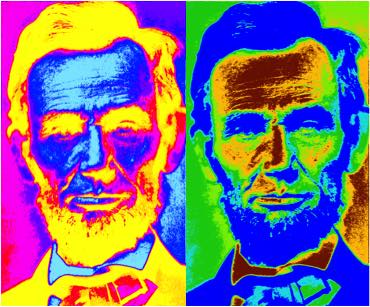
This preference does not stem merely from custom and familiarity. You can see this in the pictures below, where all of the colours are bizarre. The colours are so bizarre that familiarity is not a factor, yet the dark-on-light portrait on the right is easier to identify. Although light type on a dark background may look spiffy, and you may have managed to get used to it, it is intrinsically more difficult to read.
Unless you want to read in the dark, don’t waste your time with white type on black. If you see a Web page designed that way, tap Safari’s Reader button — the stacked bars that sometimes appear at the left end of the address field. However, that button is often unavailable or fails to capture the whole page, so it is sensible to set up an alternative to keep at hand, a “bookmarklet” that runs a JavaScript to redisplay the page sensibly. Bookmark some page — any page — and put the new bookmark in the Favorites bar. Now
edit it. Change the bookmark’s name to “Clarify” and change its URL to this text:
javascript:styles='*%20%7B%20color:%20black%20!important;

%20background-color:%20white%20!important;%20background-image:

%20none%20!important;%20%7D%20a:link%20%7B%20color:%20%2300007F

%20!important;%20%7D%20a:visited%20%7B%20color:%20%23007F00

%20!important;%20%7D%20a:hover%20%7B%20color:%20%23FF0000

%20!important;%20%7D%20a:active%20%7B%20color:%20%23FF7F00

%20!important;%20%7D';%20newSS%20=%20document.createElement('link');

%20newSS.rel%20=%20'stylesheet';%20newSS.href%20=%20'data:text/css,'

%20+%20escape(styles);%20document.documentElement.childNodes%5B0

%5D.appendChild(newSS);%20void%200
Tapping this Clarify bookmark will not bring up a new Web page. Instead, it will usually (JavaScript permitting) reload the current page with black type on a plain white background. This makes almost any white-on-black Web page easier to read unless it depends upon white graphics or white controls. It ought to work in any browser on any device.
Brightness — I now hear somebody grumbling in the background: “But the white screen of an iPad is hard on my eyes.” Yes indeed, it can be hard on the eyes. It must be tamed. Paper reflects about 90 percent of whatever light strikes it, but the iPad’s glow is constant and often brighter than anything else indoors. It must be matched to the ambient brightness. Unless you are outside, when the screen may not be bright enough, you will likely need to reduce the iPad’s screen brightness by a lot. iOS’s automatic screen dimming can do this to a certain extent, but I frequently find my finger fiddling with the brightness slider in Control Center.
Tint — Diagrams of the brain are usually overly simple. They show one function here, another function there, and no interaction between them. The reality is complex. Neurons fire more like shotguns than rifles, so neuronal activity spreads broadly. To one extent or another, different parts of the brain commonly interact.
One such interaction is between areas perceiving colour and areas perceiving lines. These interactions can affect reading. Unfortunately, this is a topic that has seen extravagant claims, sloppy research, and scientific interest damped by patents in North America. However, some good research has come out of the UK, largely by Arnold Wilkins. Wilkins has shown convincingly that real interactions do exist, and these interactions affect a large minority of the population. Little else is known for sure but:
- Coloured overlays can help many people read the printed page.
- Tinted computer screens can help many people read a display.
- Tinted eyeglasses can help many people read anything and/or can lessen migraines.
- The tint will be unique to the individual.
To see if you may be helped by a tinted screen, I created this test using colours that Wilkins suggested. It’s a rough electronic equivalent of a test he developed using transparent plastic overlays. Click through its different colours. If one of them makes the text clearer or more stable or easier to read in any other way, then tint your iPad’s screen. Don’t expect to duplicate the colour of the test exactly — it’s just a starting point — but fiddle with the hue and intensity sliders in Settings > General > Accessibility > Display Accommodations > Color Filter.
Most likely you’ll see no difference on the test, but if a colour makes the text stabler or clearer or easier to read, you might also benefit more generally from tinted eyeglasses, especially if you get migraines from time to time. In the UK, many opticians prescribe and dispense tinted lenses inexpensively under the National Health Service, based on technology that Wilkins developed at Cambridge University. Outside the UK this technology is available sparsely, but a sales force set up by Helen Irlen is ubiquitous. See Cerium and Irlen.
Matching Light — If you see no difference with the colour test above, you can still make reading more comfortable by matching the colour of your screen to the colour of the ambient light.
To see how much ambient light varies in hue, take a look at the photo below. It shows the light I see in the background while reading in my easy chair. Cloudy days see all of the window shades up and all of the colours cool; sunny days see all the shades down and all the colours warm; nighttime sees no sunlight at all, just light from lamps that are warmer still. The colour of light doesn’t matter at all when reading paper, because paper always reflects the ambient tint, but if a screen glows a different colour than the background, it will distract.

Apple’s True Tone control in Settings > Display & Brightness is supposed to modify the display’s colour to match the ambient light. It provides a modest improvement, but the iPad’s default tint is unlikely to be ideal. You can tickle this default in Settings > General > Accessibility > Display Accommodations > Color Filters. For me, what works best is to slide the hue slider rightward one-eighth of the way.
Also, True Tone never makes the screen warm enough to match artificial lighting at night. To warm the screen more at night, I schedule Settings > Display & Brightness > Night Shift to sunset-to-sunrise, and I slide its colour-temperature slider two-thirds to the right.
Reading — When you look around the world, your eyes do not see all that you perceive. You stare for a half-second or so at one spot then move your eyes suddenly to another. While you fixate on a spot, your eyes see a small spot of sharp lines surrounded by a ring of blur; between the fixations your eyes see nothing. Almost all that you perceive, your brain infers from rings of blur.
This holds when you are reading too, which has significant implications for the layout of a page. The illustration below shows circles of text your eyes might see clearly enough to read while scanning the first paragraph. At the bottom, I’ve copied the text from the first paragraph contained within each circle. This is the information your eye might have picked up.
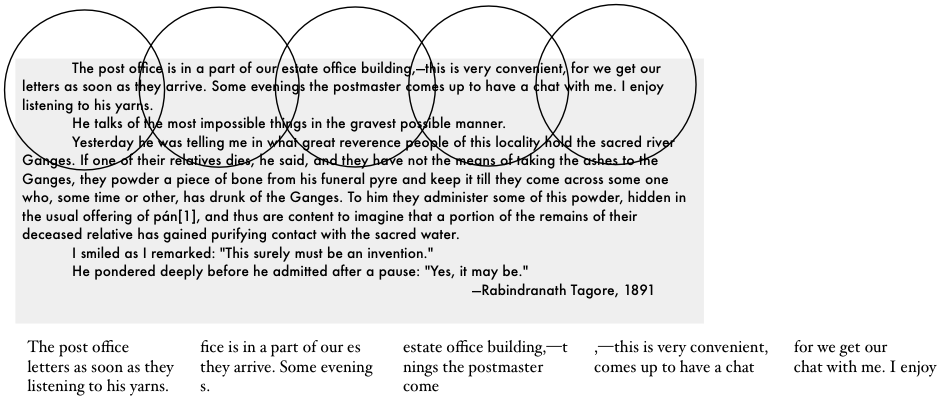
Here is the same text laid out in a column. Here each circle presents more of the text, and the circles overlap, so more of the meaning comes through.

Of course, in neither layout could your brain process all of the text at once. In both layouts, your eyes will zigzag across and down the page. However, every fixation on the vertical layout feeds the brain more information than any fixation on the horizontal, making the words easier to process.
On the other hand, these are individual words and meaning comes more from phrases than from words. Phrases are the molecules of language, words are merely atoms. Thus, the optimal width of a column is determined by how clearly it presents phrases, not words. This varies with the complexity of the text.
At one extreme is
a modern newspaper.
Newspaper prose
builds simple words
into short phrases,
so narrow columns
display them well.
In contrast, the considerate cadences,
the sesquipedalian and Latinate vocabulary,
and the archaic usages and structures
of Georgian literature — all of these several
attributes condense and assemble themselves
within the brain most sensibly and clearly
when traced by the eye across broader lines.
Newspapers and magazines often use columns appropriately but books seldom do. That’s because the layout of a printed book is optimized not for readability but for sales. A publisher can sell X copies if he can keep the price to $Y, but that requires using a small, thin font at its default spacing with minimal margins, and filling the page with text. Moreover, to sell in a shop the book needs to look attractive, so the text will be justified neatly on the right.
None of this is good for reading. A larger and possibly thicker font would be more legible. The default spacing of type is the minimum possible but reading comfortably requires some space between the lines. Justifying the right edge of text requires varying the spacing between words and letters, a variation that’s a form of noise the brain needs to ignore.
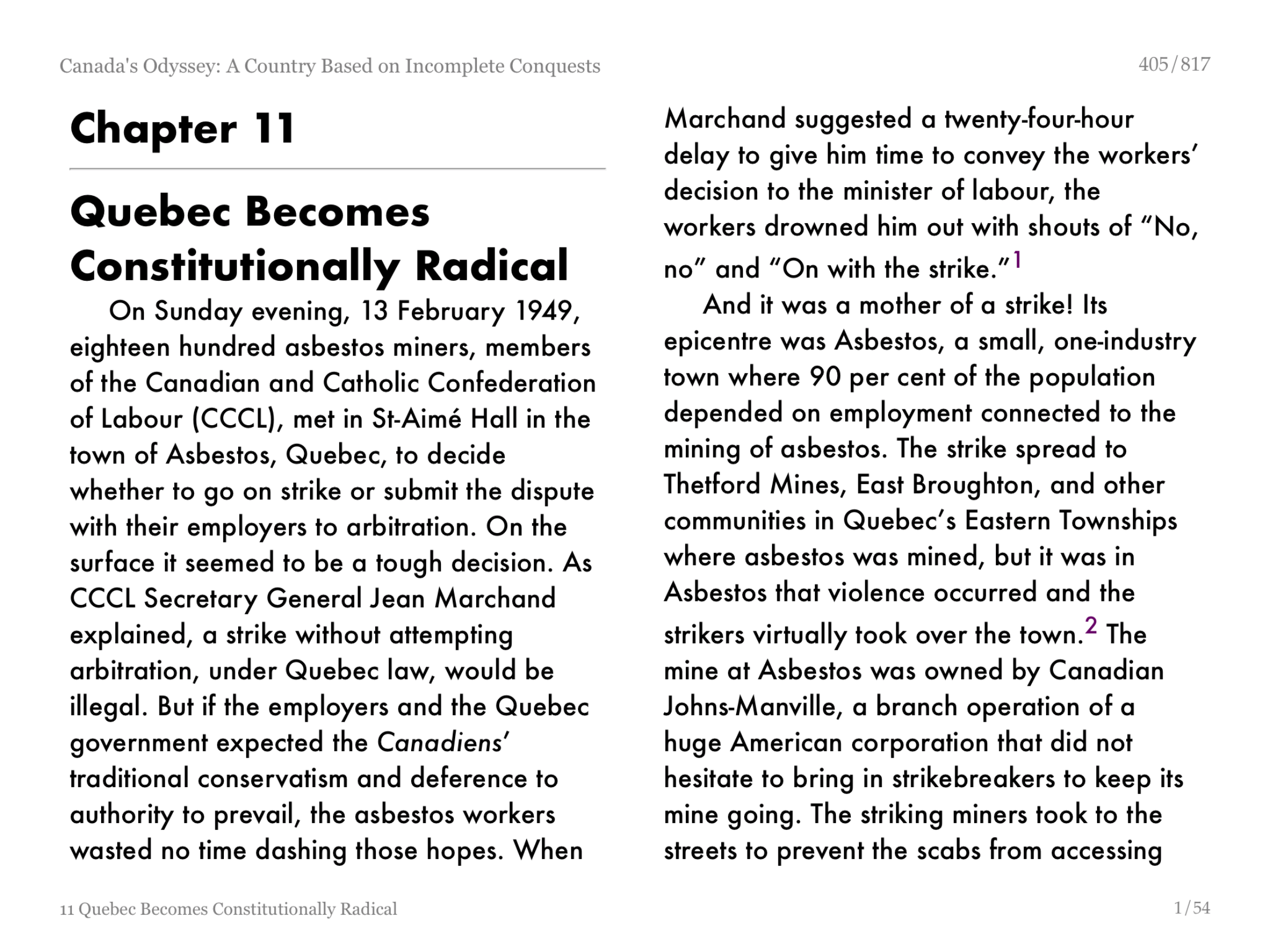
On an iPad, I can adjust all of those parameters and more, not with iBooks but with the third-party app MapleRead. I can also switch off hyphenation so that the eye does not need to process broken words. The next two screenshots show how I set it up for two different books: a serious history (horizontal) and a modern novel (vertical). The font is Futura. To my eye, Futura is the clearest for full pages of text on an iPad (although not on my Macintosh), but your eyes will differ, so experiment with different fonts. Some of Arnold Wilkins’s work suggests that Verdana would be a good font to try.
MapleRead is designed to read books in EPUB format. That is the standard, generic format for ebooks, the format used by virtually every source of ebooks other than Amazon. Amazon uses the Mobi format for its Kindle books. Both formats are similar under the hood but Mobi is locked to Amazon’s products, so if an ebook
I want is available only from Amazon, I convert it to EPUB.
I convert Kindle books on my Mac in a cross-platform shareware product called Calibre. Calibre also stores my books on my computer, where they are automatically backed up, and sends them to my iPad either by mail or over the Web.
Neither Calibre nor MapleRead will open any book that is protected by digital rights management (DRM). However, anyone living outside the United States may legitimately search for a Calibre plug-in that will automatically remove DRM from ebooks, and then may legally download and use any such plug-in he may find on any ebook that he buys. That is my situation living in Canada.
Unfortunately, in the United States, the U.S. Digital Millennium Copyright Act applies. This law not only forbids U.S. residents full and free access to their electronic purchases, it also forbids U.S. publishers like TidBITS from describing workarounds. Thus, I may not discuss here my own legal attempts to remove DRM. I may state, however, that, whether or not I have easily found DRM-removal tools for most ebooks, I have found no way to remove the DRM from ebooks purchased through Apple.
On the other hand, DRM is irrelevant to classic literature. A vast number of books that are in the public domain can be downloaded for free from Project Gutenberg. (It’s worth checking Project Gutenberg’s Canadian and Australian sites, too, since I have found books there that are not on the U.S. site and vice versa.) You can also download complete works of many classic authors for a few dollars from Delphi Classics. I find Delphi’s editorial work to be well worth the money.
EPUB is the most practical format for reading most books but only PDFs will do a good job with pictures. Also, many ebooks and nearly all journal articles are available only as PDF files. PDF basically gives you a printed page in electronic form, so a PDF file is almost always most legible when printed on paper. That said, skimming and reading PDFs on the iPad can save a lot of time and trees. Calibre can extract the text from a PDF and convert it to EPUB format, but the result is usually grotesque. I prefer to leave them as they are, but I do usually magnify the pages and read them not in iBooks but in DjVu. This app
lacks gimmickry that gets in the way of reading and, unlike most other PDF readers, it maintains its magnification across pages.
System Settings — A winter wonder of downtown Toronto is women wearing high heels to walk on ice and snow. Nothing could be less sensible but thus does appearance sell clothing — and iPads. Just look at this clever animation! So what if the needless movement distracts you. You no longer need to read, just as you no longer need to walk.
Many of these graphical high heels are built into iOS and cannot be changed — for example, the login screen, where the virtual keyboard shows grey characters on grey instead of black on white. However, some of them can be changed and may improve your book-reading experience. Here is a list of some additional settings that make the iPad less spiffy but easier to use. All are buried in Settings > General > Accessibility:
- Bold Text > On
- Button Shapes > On
- Increase Contrast > Reduce Transparency > On
- Increase Contrast > Darken Colors > On
- Reduce Motion > On
- On/Off Labels > On
Finally, you might try the $4.99 keyboard PadKeys. As you can see in this comparison with Apple’s default keyboard (top), PadKeys (bottom) is easier to see. The letters are a little larger, but more importantly they are not crowded by symbols. When your eye is searching for a letter, Apple‘s grey symbols create visual noise, the visual equivalent of hearing other people talking while you’re trying to hold a conversation. Also, PadKeys makes the numbers and punctuation marks much larger and black instead of grey.
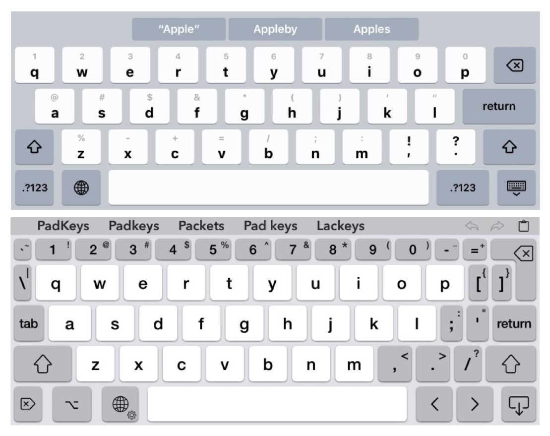
PadKeys is also easier to use because its layout more closely approximates a conventional keyboard. It even includes left-right cursor-control keys plus buttons for undo, redo, and paste.
Like Apple’s keyboard, PadKeys lets you type alternate characters by flicking your finger, but PadKeys has you flick your finger upward rather than downward — toward the character you want, not away from it. This feels more natural. You can also drag your finger from key to key if you prefer, although that requires teaching PadKey’s autocorrect dictionary that you usually mean, for example, “dessert” rather than “desert”. I prefer to type with one or two forefingers and forgo the keyboard’s attempts to help me choose and/or spell my words.
I suggest setting PadKeys to use the bold theme with All-Caps Keycaps and Dark Mode switched off, and with Show Shift Hints switched on.
[If you found the information in this article valuable, Charles asks that you pay a little for it by making a donation to the aid organization Doctors Without Borders.]
 Steve Nicholson
 Grant
Grant
 Adam Engst
 Jeff Porten
 Greg
Greg
 Laine
Laine
 Minus van Baalen
 Peter U
 Charles Maurer
 Tommy Weir
 Wuchmee
 Jim S
Jim S
 B. Jefferson Le Blanc
 Suzanne R Brown
 robmorrison
 Dennis B. Swaney
 David Byrum
 Gary Macomber
 Michael B
 Robert Morgan
 Terry Brown
 Alan Hedin
 Dave Heap
 Nancy Woodward
Are there any other suggestions for good ePub readers? I downloaded and tried MapleRead, but I’m really turned off by it. On my iPhone 6S, it’s very buggy. The thing I really care about are my notes and highlights. I want those preserved in a way that I can get at them easily.
I find iBooks by far the best ebook reader. It’s the reason that I convert all of my Kindle book purchases to ePub. I don’t highlight much, but I don’t think I’ve ever lost one.
This is a question for Charles Maurer (if you are still tracking comments on your excellent article after all this time). Why don’t you use Mapleread for PDFs?