Colour & Computers
A cynic might be tempted to say that there are two categories of photographer, those who admit they have problems matching colour, and liars. Matching colour ought to be simple, according to the ads, yet it rarely seems to be.
The problem is not you, the problem is that colour is astonishingly complex. Controlling colour is a minefield. You need to know where you can walk, where you cannot, and where the path is uncertain. In this article I shall map the minefield and suggest one safe route through it.
Colour Basics — We learned in school that all colours are formed from combinations of red, green, and blue. Unfortunately, this explanation is a distortion of reality and is so overly simple as to be wrong.
Colours do not exist in nature, colours exist solely within an observer’s head. Colours are perceptions. Light striking the eye triggers a chain of neurochemical reactions that end in perceptions of colour. Light has no colour itself, it is merely electromagnetic radiation. Different wavelengths of light induce different perceptions of colour but the relationship between wavelength and colour is neither simple nor straightforward. Consider:
- Any number of different wavelengths can induce the same colour.
- The same wavelength can induce different colours in different circumstances.
- Two people viewing the same wavelength may see different colours.
All of the eye’s colour receptors respond to a broad range of wavelengths but they each respond to some wavelengths more readily than to others. The receptors fall into three groups with different ranges of sensitivity. If you look at the light that each group is most sensitive to, you will perceive red, green, and blue: that is why red light, green light, and blue light can induce any colour. However, although there are three primary colours of light, there are actually four primary colours. Red, green, yellow, and blue are perceptual primaries: all other colours can be identified as variants of them, even in cultures that do not distinguish any colours by name.
In short, three sets of wavelengths will induce three colours of light and mixtures of those wavelengths will induce variants of four colours. Moreover, the colours induced by any particular combination of wavelengths may differ from one circumstance to the next or from one person to the next.
This is the reason that everyone has problems matching and balancing colour. The transformation is not a straightforward mathematical function nor even a constant one. Balancing colour is like cooking fudge that will be sweet enough for all and overly sweet for none.
Engineers can deal with wavelengths but they cannot deal with mathematical functions that change in shape like an amoeba. To get around this, to relate wavelengths to colours, a group of scientists and engineers have got together to define the shape of those amoebas. This group is the Commission International de l’Eclairage (CIE). The CIE has defined several amoebas suitable for several purposes. Standard Observers they are called. All of the CIE’s standards are based on them, as are most instruments that measure light, including exposure meters and spectrophotometers.
These standards are designed to facilitate repeatable and precise measurements of mechanical and electronic devices, of sensors, dyes, pigments and the like, and to standardize information. Thus, engineers create an image sensor that corresponds as closely as possible to the latest CIE standard amoeba in terms of how it matches wavelengths of light to specific colors. They measure how their sensor deviates from the standard, and they note those deviations in a profile. Other engineers create a printer, trying to make its output correspond as closely as possible to the standard amoeba. They also note the deviations between their printer’s output and the standard in a profile. Then, when a computer sends the image file captured by the sensor to the printer, it adjusts the image according to the two profiles. The resulting picture comes out of the printer using colours that more or less match the relationships between wavelength and colour defined by that standard amoeba.
This approach to matching colour would be all you’d need if you invited the Standard Observer to dinner and wanted to impress him with your photos. However, if he came, he would not deign to look at them hanging on your living room wall without repainting the wall a particular shade of grey. He would also insist on drawing the curtains to block out the sun and installing a special lamp. Moreover, this would not be a normal social experience. He would not view them before dinner when he was hungry, or during dinner when he is distracted, or after dinner when he is relaxed.
Put bluntly, it is never practical to match colours based solely and precisely on CIE specs and the Standard Observer. Realistic calibration is imprecise at best, and more an art than a science. The specifications (ICC.1:2003-09) for International Color Consortium (ICC) profiles – the profiles used by Apple’s ColorSync technology – make this clear:
"Clearly, there is considerable art involved in shaping the tone-reproduction and color-reproduction characteristics of different media and much of this art is based on subjective, aesthetic judgments. As a result, the substrate and the colorants used in a medium will be exploited to impart a particular personality to the reproduction that is characteristic of the medium. In reproducing an image on various types of media, it may be desirable to adjust the colorimetry to accommodate the differing characteristics of those media. In any case, it is necessary to accommodate the gamut differences. Such considerations go beyond the simplistic matching of color stimuli or even of color appearance. These adjustments need to be incorporated in the color transforms of the device profiles."
<http://www.color.org/ICC1-V41.pdf>
The reality is that matching colour is a chimera. The colour of a person’s face as you perceive it may change with the background or a hat. When different pigments and dyes are involved, matching colour becomes a game spread across two ballparks. Except by accident, flesh tones on a monitor will never look just like the flesh tones in a print when the two are compared directly.
On the other hand, it does not matter if the monitor and print do not match. These two versions of the picture will never be compared under normal circumstances. What matters is that the flesh tones (or whatever) always look appropriate within their context. The flesh tones on the monitor need to look natural within the photo. The flesh tones on the print need to look natural within the print and next to the other portraits on the wall.
Your task is to calibrate your monitor and printer not so that their images match, but so that when a picture looks good on the monitor, it also looks good printed out. How the two compare side by side is immaterial.
Colour Profiles — It is possible to spend a lot of time and money calibrating equipment to absurd levels of precision. Since fudge is a basic ingredient of profiles and colour-matching, ICC profiles from different sources will give different results, and there is no way to tell whether you will like a profile without buying it and trying it. Fortunately, most people don’t need to profile their printer at all and can get by fine with the default settings. Long ago Microsoft and HP proposed, and the computer industry adopted as a formal standard, a colour-matching technology that’s simpler than the full ICC standard while still being sufficient for most people outside the graphics-arts industry. All devices are assumed to be able to produce a range of colours that will fit within a range or "colour space" called sRGB. A standard set of numbers defines every colour within this space. All devices are supposed to interpret those numbers sensibly. It is the norm for photos on the Web, and most commercial printing services use it, so I’ve set my Mac to use sRGB by default (ColorSync Utility > Preferences pane > Default Profiles tab > RGB Default pop-up menu).
Most inks on most papers are limited to the range of sRGB, although some do exceed sRGB’s range. From some inks a larger colour space defined by Adobe, called "Adobe RGB," allows more vivid colours. The difference is likely to matter in print competitions and some corners of the graphic arts trade, but it not clear to me that it would matter elsewhere. Using a larger colour space incurs a cost: it is likely to require 16-bit colour, which requires more storage and processing time. A good description of those and other colour spaces is at:
<http://www.babelcolor.com/download/ RGB%20Coordinates%20of%20the%20Macbeth%20ColorChecker.pdf>
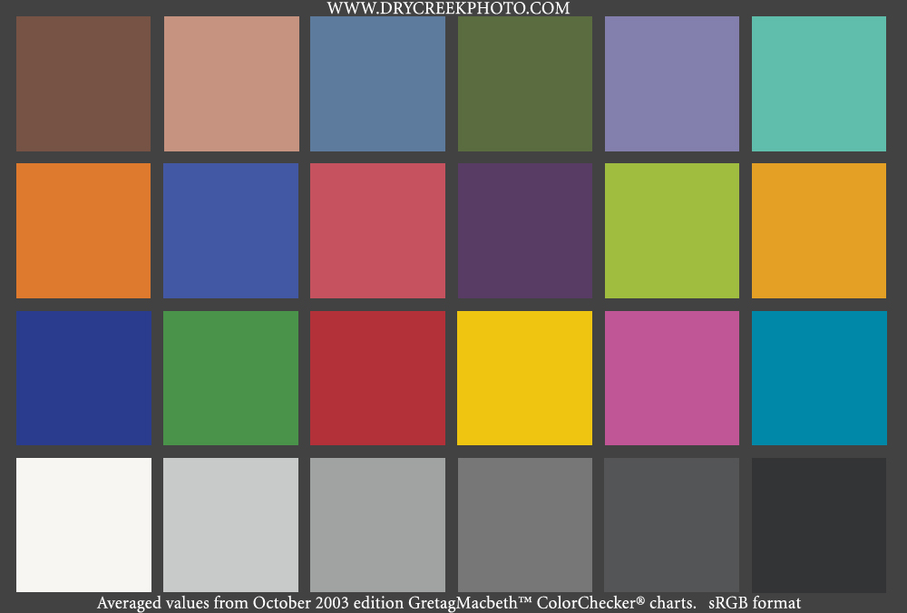
The sRGB standard ought to make colour-matching simple and invisible but Microsoft is not known for support of standards, even its own. When I was exploring some of Photoshop’s preferences, I noticed some curious results. The pure green on the Macbeth ColorChecker showed up with these different amounts of red using different programs and different versions of the sRGB profile:
| | Profile | |
| | sRGB | sRGB IEC61966-2.1 |
| Photoshop using ColorSync | 0% | 11.0% |
| Photoshop using Adobe Color Engine | 0% | 5.9% |
| Preview and GraphicConverter | 0% | 5.5% |
The first profile was supplied by Apple as part of Mac OS X. The second was supplied by Microsoft, was installed as part of Photoshop, and is built into some other applications as well. I don’t know which of these is correct but it appears to be the profile that Apple supplied. In any case, that profile is consistent, which is more important.
Calibrating Your Equipment — Before you can use a monitor to balance the colour of photographs, you need to calibrate it under its normal ambient lighting. I work with my PowerBook sometimes under incandescent lighting and sometimes under fluorescent lighting, so I have calibrations for both and switch between them. Apple’s calibrator, accessible from the Display preference pane, is adequate to set up a computer for ordinary purposes but it is not good enough for editing photos. I suggest instead the $20 shareware package SuperCal. However, do not use it with the photo built into the program. Instead use an electronic version of the Macbeth ColorChecker (free from the second link below). If you are taking the sRGB route and using only a single printer, then it would be reasonable just to compare your monitor directly to a printout of that file, but if you are using a different colour space or want to use multiple printers, compare it to a real Macbeth card. In any case, be sure to set the gamma to 2.2. That is the de facto standard for working with colour. The Mac’s standard of 1.8 was intended to make a grey-scale monitor look like a printed page.
<http://www.bergdesign.com/supercal/>
<http://www.drycreekphoto.com/images/Charts/ MacbethCC-sRGB.jpg>
Your goal in calibrating the monitor should be to make the two images of the ColorChecker match as closely as possible overall and to fudge the inevitable differences so that none of the colours is further off than any other. From such different technologies any kind of real match is impossible; you are after the best approximation.
To compare the target photo to the monitor, and to assess the colour of prints, you don’t need fancy instruments – you are pleasing your eye, not the Standard Observer – but you do need a suitable lamp. Ideally this will be the same kind of lamp you always view your pictures with, but since most pictures are viewed under a variety of conditions, you really need an average lamp. Although there is no such thing as an average lamp, there is a graphic-arts standard for judging colour. It is an arbitrary standard that has proven to be functional. Ordinary light bulbs are redder than this and most fluorescent tubes are too green. A reasonable compromise is a desk lamp that combines a 60-watt incandescent bulb with a circular fluorescent tube. If you need to buy something, you might find a desk lamp that uses a compact fluorescent tube and replace the tube with an Ott-Light TrueColor.
If you want professional-looking 8" x 10" prints that are tough and durable, and if you want to keep things simple, then you might take the sRGB approach with a $500 Olympus P-440 dye-sublimation printer. That’s what I do. If you use the P-440 from a Macintosh, all you do is switch it on. It needs no special set-up and, to my eye, its native colour management works better than any ColorSync profile I have found for the machine, including a couple from the QImage folks and the one supplied by Olympus themselves. The printer requires no cleaning and uses no liquid ink that can dry up. The running cost is $2 per 8" x 10" print, which is less than good ink-jet paper and ink work out to be if a print head ever dries out. Its range of colours is not the broadest – it lies completely within sRGB space – and when I compare prints of the Macbeth ColorChecker made from it and from my darkroom, the tones from the Olympus look a bit more restricted. However, this is not a comparison people normally make and the P-440’s prints on their own can be stunning. The prints I get from it do not look digital even under a loupe. (Do note, however, that I use special-purpose scaling software, I do not merely send the printer a file and have it fill the paper. Pictures scaled by PhotoZoom Pro are sharper than pictures scaled in the usual ways, even with PhotoZoom’s sharpening switched off. See "Editing Photos for the Perfectionist" in TidBITS-748 for more details on PhotoZoom Pro.)
<http://www.olympus.com/cpg_section/cpg_product_ lobbypage.asp?l=1&bc=23&p=19& amp;product=935>
<http://www.trulyphotomagic.com/products/ photozoom/>
<https://tidbits.com/getbits.acgi?tbart=07832>
[Editor’s note: I can vouch for the quality of these prints. Charles passed through Ithaca recently while on a trip and brought me pictures he’d taken while on a trip through the Himalayas in July. He used a Sigma SD-10 camera and the Olympus P-440 printer, and the prints were utterly gorgeous. -Adam]
I have found only two glitches with the P-440. The first is trivial: the printer driver will not accept images at the advertised spec of 3200 pixels, it requires them to be three pixels shorter. The second is more serious: if the line voltage in your house fluctuates too much, then the printer will produce random blotches and lines. Fluctuating voltage is not common in cities but it can happen in rural areas. I need to plug the printer into a voltage regulator. (The computer’s UPS would have done but I happened to have an old voltage regulator in the basement.)
Last-minute addition: Kodak just announced the release of a comparably priced dye-sublimation printer that prints pictures up to 8" x 12". Kodak is aiming this printer at professional photographers, which is an important market for them and one that it has always served well. This printer looks very interesting.
Balancing Colours in Photos — Once you have a system that is calibrated, you need to get to work balancing the colour of individual photos. The easiest way I know to do this is to relate everything in the picture to some spot that is some shade of neutral, colourless grey. There is one such spot in just about every photo. It may be merely the reflection of a lamp on a metallic surface, it may be only a few pixels across, maybe just the glint off a ring, but it is almost certain to be there somewhere. Once you’ve found that neutral spot, adjust the overall colour balance so that the red, blue, and green values for that spot measure the same using DigitalColor Meter or the equivalent function in Photoshop or your raw converter. (The raw converter is the best place to do this. In Photoshop you can just click on the spot with the eyedropper.)
Now every colour of a similar brightness ought to be properly balanced. Find a colour that is particularly sensitive to colour casts – most likely skin tones – and look for differences in that one hue between highlights and shadows. Those differences indicate colour casts that vary with brightness. In Asiva Shift+Gain (again, see the previous article in TidBITS-748 for details) it is easy to select the range of brightness that is off and correct it by nudging the hue slightly warmer or softer. If that one tone is corrected so that it looks the same at all levels, then other tones ought to be similar as well, although there may be anomalies if the picture was taken in mixed or fluorescent or high-intensity lighting. If some specific tones show an anomaly, select just those tones in Asiva Shift+Gain and fix them.
<http://www.asiva.com/products/plugins/ ShiftGainTrial.php>
The Eyes Have It — The approach to controlling colour that I have outlined here is the simplest and cheapest I know of. It would be a sensible approach to start with and would be a good one to retreat to if you are having problems doing it another way. However, this is certainly not the only way to control colour nor can it achieve the highest quality possible. Enough time and enough money can buy better results. If you decide to aim higher, though, do always keep in mind that colour is a variable perception; it is not a stable, objective phenomenon. There is rarely an intelligent way to answer the question, "Does this profile (or printer) give better colour?"
Perception also ought to be kept in mind when buying a digital camera. The specifications of digital cameras are not what they seem to be if you consider them from the perspective of the eye. My next article will examine cameras from this angle. Among other things it will calculate a finite and surprisingly low answer to the question, "How many pixels are enough?"
PayBITS: If Charles’s recommendations for matching colours
helped, he asks that you make a donation to Doctors Without
Borders: <http://www.doctorswithoutborders-usa.org/donate />
Read more about PayBITS: <http://www.tidbits.com/paybits/>