Peering at iOS 7 for the Vision Impaired
Over the years, Apple has shown a strong commitment to accessibility in iOS, improving on it with each major version of the operating system. This year is no different, as iOS 7 adds accessibility options — such as Dynamic Text and Increase Contrast — that are sure to be appreciated by users who rely on such capabilities to interact with their iOS devices. Being legally blind, I appreciate them, so follow along as I share the most noteworthy of iOS 7’s vision-related features.
Dynamic Type — One of iOS 7’s marquee features is Dynamic Type, which enables you to resize text, at least in apps that support it. To change the text size, go to Settings > General > Text Size and adjust the slider to your liking. It may take some time before most non-Apple apps support Dynamic Text, but a few apps have jumped on board early, such as the latest version of the Digg newsreader.
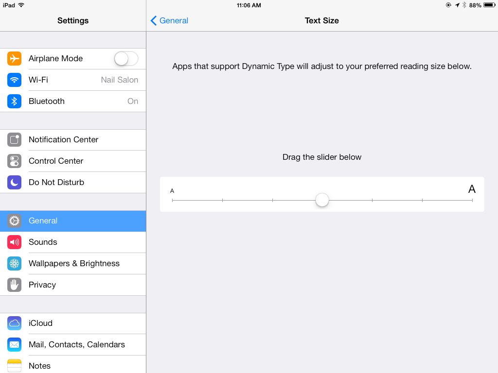
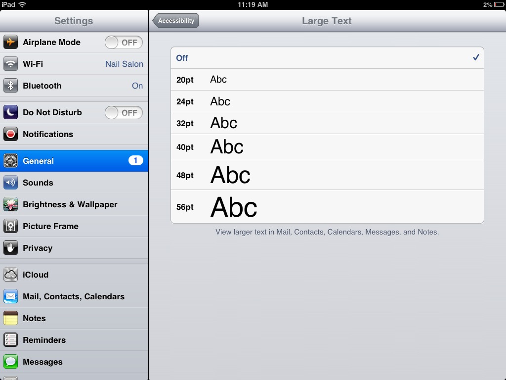
If you need even larger text, iOS 7 has you covered, with Larger Dynamic Type, a reworking of the Large Text feature in iOS 6. As its name implies, Larger Dynamic Type lets users adjust font sizes beyond what’s allowed in the Dynamic Type setting. To enable it, go to Settings > General > Accessibility > Larger Type, flip the switch, and drag the slider until you’re happy with the text size.

While I appreciate Larger Dynamic Text, I prefer the iOS 6 interface for setting it. In that version, Large Text presented users with size options ranging from 20 point (where I like it) all the way up to 56 point, with graphics illustrating the change in size. The explicitness of the point sizes and the pictures of the corresponding letters made it easier for me to gauge my settings. In iOS 7, Apple has done away with the numerical size ranges. It took me longer to measure the slider notches to find the setting I was most
comfortable with than it did with the old system. You wouldn’t think that an Accessibility option would become harder to use, but the new slider in iOS 7 is just that.
Despite this annoyance, one of the aspects of iOS 7 that I appreciate, accessibility-wise, is its redesigned typography. The new typography is so readable and the overall user interface so clean that I can use smaller text sizes, and still be comfortable enough to read without too much eye strain. I have the Larger Dynamic Text slider set just to the left of middle, and it works great. However, be sure to read the comments on this article, since others having more trouble.
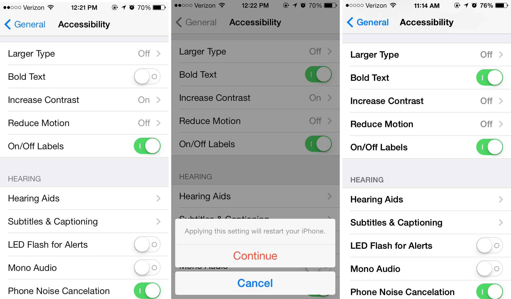
Bold Text — iOS 7’s Bold Text feature is a one-trick pony: it makes all system-based text bold-faced. From texts to email messages to menu items, any text that is rendered by standard system calls becomes bold, although apps that use custom text rendering aren’t affected by it. I presume that Apple added this feature because text in iOS 7 is thinner and lighter than in iOS 6 (at least it got thicker during the beta period, or we would really have been in trouble).
To enable Bold Text, open Settings > General > Accessibility, and flip the Bold Text switch. You must then restart your device to finish enabling it, a strange and unwieldy requirement that’s entirely unlike Apple.
In my testing, I found Bold Text to be quite nice, although I won’t be using it full time. The main problem I found is that it seems to eliminate any differentiation between headers (which would already have been bold) and normal text. For instance, I found messages in Mail harder to read with Bold Text on because, to my eyes, the message metadata (sender, subject, etc.) blended in with the body of the message itself, and I found it off-putting.
Thanks to this loss of certain typographic distinctions and the annoyance of having to restart my device, I won’t be using Bold Text. But my vision is just good enough to get away without it; for others it may be essential.
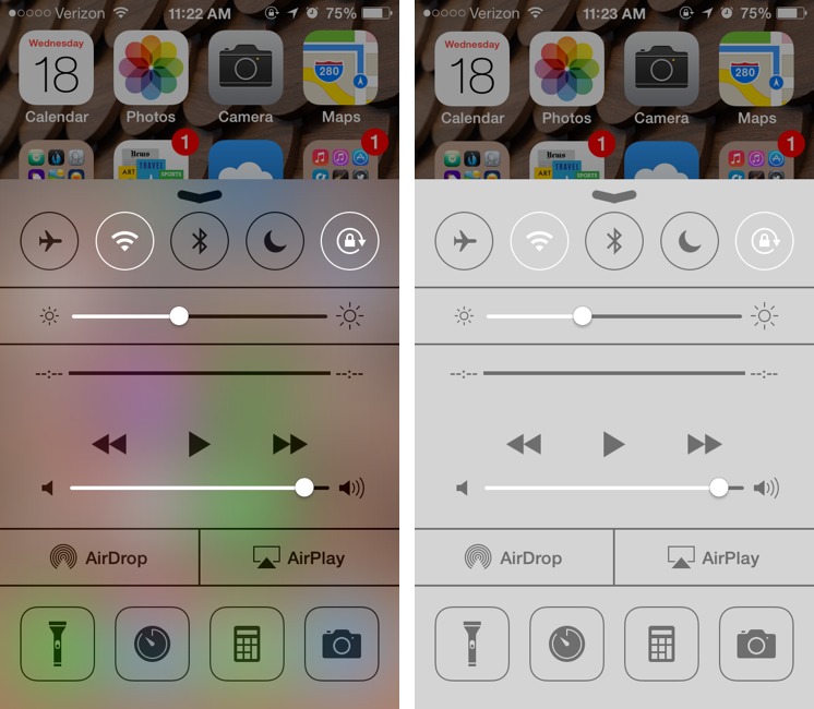
Increase Contrast — Compared to iOS 6, iOS 7 has markedly lower contrast — the degree of difference between colors. One of the hallmark changes in iOS 7’s visual overhaul is the use of translucency. For example, look at Control Center; if you’re in Messages and swipe up to reveal Control Center, you’ll see a faint blue or green hue underneath, coming from the obscured message bubbles.
While the translucency certainly looks spiffy and, as Jony Ive says, can give users a sense of context, the lack of contrast can be troublesome to many visually impaired users. Acknowledging this problem, Apple has added an option to increase contrast, which it does by removing the blur effect from things like Control Center, Notification Center, and keyboards in order to increase legibility.
To increase contrast, open Settings > General > Accessibility > Increase Contrast and flip the switch.
I like the translucency, aesthetically, and find that it doesn’t negatively affect my vision. As with Bold Text, I don’t feel a need to use Increase Contrast. On the other hand, while TidBITS publisher Adam Engst has roughly normal vision, he finds random colors bleeding through Control Center and Notification Center distracting and thus quite likes the Increase Contrast option. And a number of commenters have expressed significant problems with the keyboard, even with Increase Contrast turned on.
Reduce Motion — iOS 7 features subtle parallax 3D effects that give an illusion of depth to the Home screen, Safari’s tab view, and other interface elements. If you find this distracting, you can turn it off in Settings > General > Accessibility > Reduce Motion.
By turning on Reduce Motion, you can rid yourself of the parallax effect, as well as “reduce the motion of the user interface,” whatever that means. Although it does eliminate the parallax effect, as far as I can tell, enabling Reduce Motion on my iPhone 4S did nothing to stop fancy transitions like the icons swooping in to fill the Home screen after unlocking the Lock screen. That’s fine with me, however, since I happen to like the animations and don’t find them visually distracting. As for the parallax effect, I don’t tend to notice it, so I couldn’t tell any difference.
On/Off Labels — In what may be one of the worst design changes from iOS 6, the heavily used On/Off switches in iOS 7 are far less visually and functionally accessible.
Say what you will about skeuomorphism, but from an accessibility standpoint, the On/Off switch was one of the best visual elements of iOS, and I dearly miss it in iOS 7. The switch used not only color (blue) to indicate an enabled setting, but also a clear text label that reported both On and Off states. Plus, each switch was visually indented, which gave it a useful visual separation from the rest of the interface.
In iOS 7, setting switches are just nubs that slide to the right and turn green if enabled, but are otherwise left-aligned and white when disabled. By default they have no text labels at all — an odd decision for a redesign that has often traded graphical buttons for textual buttons. Because they don’t need room for the On and Off words, they’re also much thinner than in iOS 6, making them a smaller target that’s harder to hit accurately.
You can make this a little better by enabling On/Off Labels in Settings > General > Accessibility. Once enabled, you’ll also see a small visual glyph to help distinguish whether a setting is on or off: a vertical line if on and a circle if off.
This choice may be a nod to iOS’s ever-increasing acceptance internationally, since the glyphs are the International Electrotechnical Commission’s symbols for power on and power off.
For many of us, these symbols aren’t nearly as clear as in iOS 6, which plainly stated, in text, whether a setting was “On” or “Off.” To the visually impaired, such obvious cues are important because one’s vision might not be strong enough to detect only color or tiny symbols that masquerade as labels.
Apple’s design in this regard is disappointing. I have the labels turned off, since they don’t help enough to bother, and I see these switches as one of the worst aspects, accessibility-wise, of iOS 7’s redesigned user interface. I can only hope that more explicit labeling along the lines of iOS 6 is brought back in a future update.
A Last Look — Because of its radical visual facelift, iOS 7 is, in my mind, the most significant change we’ve seen to the operating system, not only for normal-sighted users, but also to visually impaired users like myself.
The specifics are a mixed bag, with some design changes helping those with normal vision (or at least offering a different aesthetic) while potentially causing problems for people like me. But, simultaneously, it’s clear that Apple was aware that the new interface could be jarring or difficult for the visually impaired, and took pains to add these vision-focused features to iOS 7’s Accessibility settings to compensate. Whether they’re entirely successful is another question, but Apple should still be applauded for this effort, since it shows the company’s commitment to delivering products that are usable by everyone.
The On/Off label travesty notwithstanding, I feel the new visual Accessibility features are generally implemented well, and will be appreciated by many, ranging from those of us who are legally blind to people who just don’t see as well as they used to. Regardless of where on the vision spectrum your eyes fall, take a few moments to explore these various options to see how they might improve your experience with iOS 7.
I enjoyed this article and most aspects of IOS7 but being a visually impaired person like yourself, I have a problem with the new keyboard. I was able to use the old keyboard without any assistance since it was easy to read the letters and their was contrast. The new keyboard however is much harder to read for me due to the thin fonts and almost white background. I have to turn on invert colors in order to use it most of the time. A great edition would be to be able to turn on just a high contrast keyboard and not have to use inverted colors for the whole interface. Thoughts?
I agree. I have "normal" vision (don't even need glasses to drive!) but this iOS7 has turned my iPhone into a very expensive paperweight. I cannot see the keyboard. I cannot find the text box to put my finger in to start typing. I cannot read my own texts (due to the white font on green background.) The font is terrible - too wispy thin. The colors are useless - I cannot read that light blue stuff on white. I adored my iPhone until I installed this update. Now I cannot use it to text or email anyone.
Do the Bold Text and Increase Contrast options help, Kathy?
I'm not wild about the new keyboard look either - it feels harder to use, particularly with determining if the Shift key is down. The color there was useful in iOS 6, and I think the monochrome-only keyboard in iOS 7 is a distinct step backward. The Increase Contrast setting helps a little.
I tried everything. If I increase the size of the text, I can only read a few words at a time in a text. Bold text makes it better on the green text bubble background, but it looks muddy (for lack of a better description) in other situations. The increased contrast does help a bit with the keyboard, but the letters are still too wispy-thin.
I do like the FEATURES of the new iOS, but I wish Apple had a "classic look" option for this OS. If they allowed us to switch back to the look of iOS 6, I'd be thrilled.
I agree! My mother has RP and has extremely low vision. While iOS 6 opened doors to a whole new world for her, iOS7 has slammed them shut and locked them. The accessibility features the writer praises are useless to her. All she can see is a blank white screen on her iPad.
She is distraught over this and I am absolutely livid that Apple refuses to allow users the option to return to iOS 6. My mother is legally blind, not a hacker looking to jailbreak and resell phones!
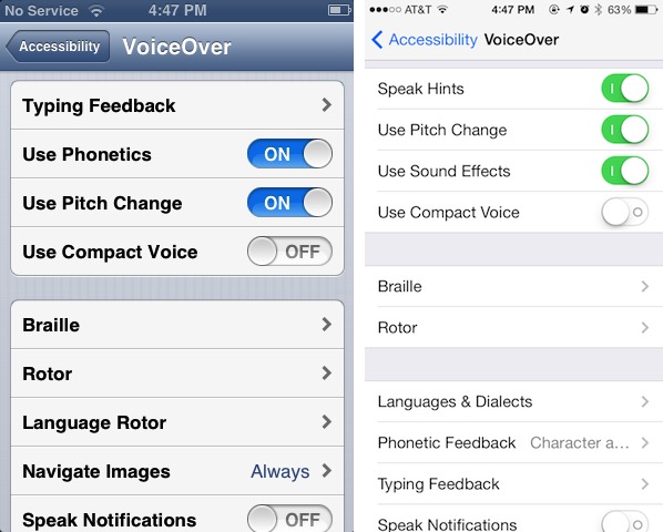
I agree. I have macular degeneration, and have used IOS6 for 2 years quite successfully. With IOS 7 I see only a white screen. I cannot find the icons at the bottom of Safari on my iphone, sinc they are drawn with such thin lines. I have gone from being a low vision user to a blind user, and now must use VoiceOver in order to use my phone at all. I am looking into switching to an Android device and am trying to find out what other low vision users think of the accessibility options in the Android platform. I am just sick that I can't return to IOS 6, and I don't even know what avenue to take to express this to the Apple company.
Like you, I also have to use "Invert Colors" to use the phone now. But, by accident, I found a way to turn "Invert Colors" on and off fairly easily, so I don't have to have it on for the entire interface.
Go to General -> Accessibility, and go right to the bottom of the page, where you'll see something called "Accessibility Shortcut". Press it, and you'll get to another page where you'll see five accessibility options listed (Voice Over, Invert Colors, Zoom, Switch Control, and Assistive Touch. Press "Invert Colors", and you'll see a check mark beside it.
Now, go to the Messages app (just an example - this works for every app). Once in the app, triple-click the Home button on the phone. Your colors should now be inverted. Triple-click again to get them back to normal.
Hope this helps.
I no longer love my iPhone like I did two days ago (pre-IOS7), but at least I can use it.
Thanks,
Peter
Wow, Peter, thanks for that tip on making the Invert Colors work by pressing the Home Button 3x. I hadn't been able to use the iPhone since iOS 7 went on. When I posted the problem in Apple Discussions, Apple deleted the post as a rant, when I simply said I couldn't use the phone anymore with the bright-white screen glare and tiny Grey or Blue icons in 1Pt size.
I feel it was very unprofessional of Apple to toss out a Discussion comment, simply over an eyesight issue, which is out of my control, after their iOS 7.
Because you shared your comment on the Home Button triple-press setting, I can at least use the phone again.
Thank you !!!!
Apple discussions deleted my post too! It seems they don't want to hear any criticism about this upgrade. All I want is the ability to restore iOS 6. Apparently it was possible to do that at first, but Apple no longer has a signature for it so your phone won't recognize it. Or something to that effect, I'm not that tech savvy.
Bottom line is, it is no longer possible to go back to iOS 6 on a device that has been upgraded. I'm told all I can do is try to buy a device on eBay that still has 6 on it. No longer an Apple fan!
Can you go to an Apple Store and ask a Genius about this? I'm really curious to hear what they'd say to someone who actively can't use their iPhone any more under iOS 7.
I agree completely. I restored my 4s back to IOS 6. Was going to get a 5s. IOS 7 is so difficult for me to read. Keyboard is terrible to try and see. John Ive please come and talk to me. Will hold on to my 4s now until it dies or Mission critical apps don't work any more. Thanks for the review it was well done and spot on. keep up the good work.
Russell, please provide the steps you took to roll your iPhone back to the previous ios version (did you just restore from iTunes?). Though I love some of the new features in 7, it hurts my eyes SO badly (and I have "normal" vision) I may have to stop using it. Thanks.
Very useful, thanks.
Hello
I have Fuch's disease, that is my corneas are going opaque. The iOS 7 changes have dramatically worsened my ability to read normal text, notes, keypad figures . . . In fact everything. I can't have inverted colours on all the time to improve accessibility as it wrecks images.
What I don't understand is why Apple do not offer users the ability to adjust background colours.
The bold text option sounded great, but it does not improve my readability.
In short, my iwonderul pad3 has been rendered significantly less functional and no longer wonderful. I feel very annoyed as I really enjoyed the previous look. Now, everything g looks like a white cloud. While it may look sleek to those without a vision impairment, for people with Fuch's disease, ios7 is the equivalent of removing a ramp for wheelchair users.
I'm surprised vision impaired persons are not given the opportunity of testing new systems.
Is there any way I can return back to ios6?
Mire
Try this:
http://www.macworld.com/article/2049091/unhappy-with-ios-7-downgrade-while-you-still-can.html
Unfortunately, Apple is now preventing downgrades. :-(
Look at the notepad. Yellow text on white background. Not readable. Not changeable. Including the icons.
Look at the phone dialing pad. Hard to see.
All of the things mentioned in the above - bold txt, high contrast, larger text don't help with yellow on white.
It's not so much the choices , it's the fact I can't customize that makes me angry.
And I am normally sighted.
If you did a backup you should be able to wipe the phone and restore.
That's odd: on my iPhone both the notes and dialler are black text on white background (apart from a bit of the chrome).
Thank you for your comments. I too am a visually impaired person now going mad trying to use the keyboard with ios7. I called Apple and was told that they wouldn't help me revert to ios6 because ios7 had so many more features. The man didn't get that I now can't use the phone to write a text or email or type in a number!! Not helpful, Apple.
Can you visit an Apple Store, Meg? I would be very interested to see if someone at the Genius Bar could do something for you that the phone support people can't.
Thanks for the short cut tip. I now tap the home button three times and invert the colours.
BTW, I agree with the other comments about the keyboard. My husband with good eyesight finds it difficult to read.
I'm really disappointed in the low contrast, thin font, poor color choice interface of iOS 7. Like others, I find that after trying the phone it is much harder to use than iOS 6. I used to rely on screen zoom for using the iPhone, with very occasional switches to inverted color. After trying a friend's iPhone 5S, I have come to the conclusion that I will now have to mainly be in inverted color mode, with occasional switches to normal color mode to look at images and take photos.
I relied on VoiceOver to use the keyboard before, so that won't change in iOS 7.
It seems like Mr. Ives (now in charge of iOS design) was less concerned about enhancing functionality than "simplifying" the UI. Time will tell.
I have an iPhone 5S here sitting on my desk unopened. I can't seem to bring myself to open it and switch from my iPhone 4 with iOS 6 to the new phone after trying my friends phone, with all the accessibility features. What to do... Maybe I can still buy an iPhone 5 with iOS 6 someplace
I've looked into this a bit more, and I'm hearing that Apple Genius Bar staffers are being told not to discuss downgrading. So the next thing for someone who is having very real problems to do is to call 1-800-MY-APPLE and try to get through to customer relations or corporate relations.
Well it seems that I don't need to add anything as it's all been said! I went to an Apple Store today to make the point about the ios7 keyboard and was told flatly that there is nothing that can or will be done about it. Basically friends it needs each and every one of us to write to Apple. Why not start with a letter to: Apple, I Infinite Loop, Cupertino, CA 95014, USA and drop an email to, for example, [email protected] . I've done that today. PLEASE do. I also now have severe difficulty using Calendar and finding the browser bar plus other things. Should you not be aware, there is a great support group called AppleVis, [email protected]. Www.applevis.com. DO PLEASE MAKE APPLE DIRECTLY AWARE OF ACCESS ISSUES WITH iOS 7
There was a post earlier about reloading iOS. 6. Nooo! What we have a right to is all the other advantages of the upgrade, such as the improved VoiceOver, but without this silly keyboard. There should be a switch enabling VI people to opt for the old one. Write and tell them!
I have not upgraded my iPad to IOS7. After reading these comments I won't upgrade. I was considering a new iPad but will not be buying one now.
Hi everyone,
I agree with all of your comments. I am a long time Iphone user who is legally blind. iOS7 is driving me crazy! Here are a few apps that might help everyone though. I found a lot of these recently with the struggles I have been having with IOS7:
EyeFriendly - Large text font option for Facebook, Twitter and Google. I love this app. Twitter you can enlarge the font but Facebook has the tiniest font that you can not change. This app works great for Facebook. I highly recommend. The only down side to using Facebook on this app that I can find is that the scrolling is slower as you look at your news feed. Small price to pay for large font on Facebook.
Large Print - This is messaging large print function that allows you type messages (white on black or black on white) in large font for email, text, Facebook and Twitter. The down side is the app is not great when you are having a conversation over text messages and you can not tag people in Facebook post. Otherwise I am enjoying the app.
Jumbo tacts - A large font app for contacts. I never really have trouble reading the contacts but with IOS7 i have trouble reading/editing content inside of an individual contact. This app is great for that.
Zoomer - internet browser that has zoom text functions. I have not played with it too much but could be a nice function for tough to read websites.
MegaTunes - large font itunes. Great app!
I hope these apps help people.
Good luck everyone.
Rob
Rod, thanks! .. I'm hoping more apps will be made to help with the other problems the "upgrade" has caused. I'll be downloading the apps you mentioned for sure!
The upgrade to i0S7 has been a downgrade for most of us with vision issues. The calendar, weather, dial pad, calculator, clock / alarms and the notes app visibility were the very reasons I selected an IPhone. All of these are now unreadable and unusable for me. Feels like they ruined the product I bought .. is that legal? They should be forced to give refunds ... or put this new version update on recall and restore what they sold me!!
As I wrote above, I think the best thing you could do is call 1-800-MY-APPLE and try to get through to customer relations or corporate relations. Tell them that your iOS device is now unusable for you and that you want to downgrade. Then report back!
My friend has low vision, about four percent. iOS 6 worked good for her. Once I showed her where things were, she could get around and use some of the Apps. iOS 7 messed all that up. Now she can't see anything on the screen. I've adjusted settings as much as I could in hopes of making things better, but it hasn't helped. I feel bad because I'm the one who updated it. I thought it was going to be an improvement. I didn't know Apple was going to change the look of everything. I think it looks horrible, too. It was much better before.
I am following this thread. I wrote to Apple (no reply) a month ago. My 85 year old neighbor upgraded himself and then called me in a panic to help him downgrade (not possible).
The device is now unusable. He has returned to using a Nokia feature phone for SMS and he cannot get his e-mails anymore because he cannot navigate the mailbox. The keyboard is a real disaster for him.
He said the same thing you have - this is not what I bought and I would not have bought it had it been this way.
I am taking him out shopping next weekend. We'll look at a Galaxy Tab and a Surface. Who knows - perhaps Kindle is the best thing for him.