Image by Stephen Hackett
Travel Back in Time with Stephen Hackett’s Aqua Screenshot Library
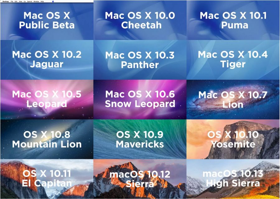
Stephen Hackett should be knighted. Or perhaps sedated. He has gone through every version of the Macintosh operating system since the Mac OS X Public Beta and taken representative screenshots that illustrate the overall user interface, System Preferences, and bundled apps. It’s fascinating to trace the evolution of Apple’s interface thinking over the years. You can navigate left and right through all the images in an operating system version, but it would be even better if navigating up and down showed that particular screenshot across different versions of macOS. Regardless, Hackett’s Aqua Screenshot Library is a tremendous resource for anyone who needs to, for instance, confirm what a Mac looked like when running Panther.
SL is often considered one of the most stable and focused OS X releases. I just now realized that not only that, but it was also the last OS X to allow for some color in the Finder to help finding things. With Lion came gray and low contrast everywhere. Truly a shame. SL still looks very good to me.
I noticed the loss of color a long time ago—when I upgraded to Lion on my old Mac Pro cheesegrader. There was a great hack that worked for years to restore that color, but Yosemite was the last version of OS X that supported it.
I actually used color and custom icons in the Finder sidebar for navigating through my files, what the Finder sidebar was supposedly designed for. But with Lion usability and accessibility fell off Apples priority list, replaced by a gothic sensibility the color of Steve Jobs’ ashes that serves neither function. Steve Jobs’ illness and death infects the macOS to this day. To all appearances the macOS is as dead as Steve is. The one thing that remains from Steve’s day is Apple’s high-handed disregard of users’ wants and needs. For example, I found out only a few days ago that Apple has discontinued production and sale of every iPod model except the iPod touch, which itself hasn’t been updated since 1915 and is chalkfull of old tech.
You may say “switch to Windows if you hate the Mac so much” but that would be jumping from the frying pan into the fire. In any case, I don’t hate the Mac or Apple. But that’s not to say they can do no wrong.
By the way, if the cancellation of most iPod models was remarked in TidBITS I missed it.