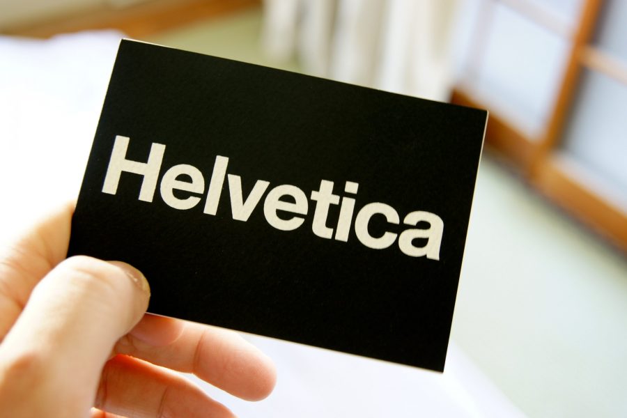
If you’re a connoisseur of fonts, or just appreciate a visual challenge, check out photographer David Friedman’s online quiz, “So you think you can tell Arial from Helvetica?”—it dates from 2009 but is still fun. He has taken 20 famous logos that were originally designed in Helvetica and redone them in Arial, and the quiz asks if you can tell which of the two is the real Helvetica. For those who aren’t font geeks, Helvetica is one of the most popular typefaces of all time, and Monotype designed Arial as a metrically identical alternative to Helvetica. But if you pay very close attention, you can tell the difference. After you see how well you fared on the quiz, it’s worth taking a minute to follow the links above and read their histories on Wikipedia.

In short samples like those, it makes no difference. But in the 20000 word printed material I used to publish in the 90s, Helvetica takes up less space. More space = more money in printed material.
An all-caps logotype that uses none of the telltales (G, Q, for instance) will be very hard to distinguish. There are significant differences in the lowercase letters. Helvetica was designed for universal appeal, and Arial for personality.
So it should be obvious that I scored 18 out of 20, missing the Staples and Mattel logos.
I found that in a lot of the examples, Helvetica was heavier and darker. Then I looked at letters like: c, a, r, and R—Helvetica seemed to favor stronger verticals and horizontals, whereas angles seemed to indicate Arial.
I goofed on Staples and Mattel also. Kerning is usually a dead giveaway with Ariel, and it’s harder to do with logos.
There’s an excellent movie, “Helvetica,” available on Amazon streaming and Netflix DVD. Even if you’re not interested in typography, it’s a great description about how influential and versatile this typeface has been in the modern era. It’s beautifully directed, and the commentators and interviewers are funny and enthusiastic. It’s also available on YouTube, but it would look so much better in higher res.
To me that’s the best indication.
I still ended up getting Mattel wrong. I’m not a font or typography buff (I am interested though) so I’m feeling really good about myself right now. ;)
My problem with Arial is that the letterforms don’t seem to work well together. To me, words tend to look clutzy and sentences and paragraphs look jumbled. Helvetica is better proportioned and more readable.
I made lickety-split gut decisions and did 16 out of 20! Happy enough about that.