
Image by PublicDomainPictures from Pixabay
Less… Is More? Apple’s Inconsistent Ellipsis Icons Inspire User Confusion
As I’ve been exploring iOS 13 to write the just-released Take Control of iOS 13 and iPadOS 13, I’ve become concerned about what seems to be an increasingly frequent pattern in iOS software design. What finally pushed me over the edge into writing this article was documenting Apple Card’s user interface in Wallet (see “How to Get the Most from Your Apple Card Benefits,” 14 August 2019), because I found myself typing the same character over and over and over…
That’s right, I’m talking about the increasingly ever-present ellipsis ••• buttons in iOS (technically, we generally render a user-interface ellipsis in running text as three bullets to make them more easily seen).
Now, I don’t have a grudge against the ellipsis itself; it’s a perfectly valid character that writers can use in interesting and flexible ways. The most formal usage is probably as an indication of the intentional omission of a word, sentence, or section from a larger body of text. For instance, Apple inserts an ellipsis in a file name when it’s too long to display in the allocated space. But the ellipsis has also come to be used to indicate, as Wikipedia suggests, “an unfinished thought, a leading statement, a slight pause, an echoing voice, or a nervous or awkward silence. … When placed at the beginning or end of a sentence, the ellipsis can also inspire a feeling of melancholy or longing.” If only our technology could be so subtle.
That’s in writing. In the Macintosh interface, the ellipsis has long had a specific meaning. An ellipsis following a menu item means that choosing that item will result in a dialog, rather than an action being performed immediately. Choosing File > Save saves the current document; choosing File > Save As… displays a Save dialog where you can enter a new name and location for the file. In technical writing, we drop the ellipsis when referring to menu items to avoid confusion with the more traditional uses of the ellipsis.
But in iOS—and even in some Mac apps—Apple has started using the ellipsis in random ways that muddy its meaning. Let’s take a look.
Apple’s Use and Abuse of the Ellipsis
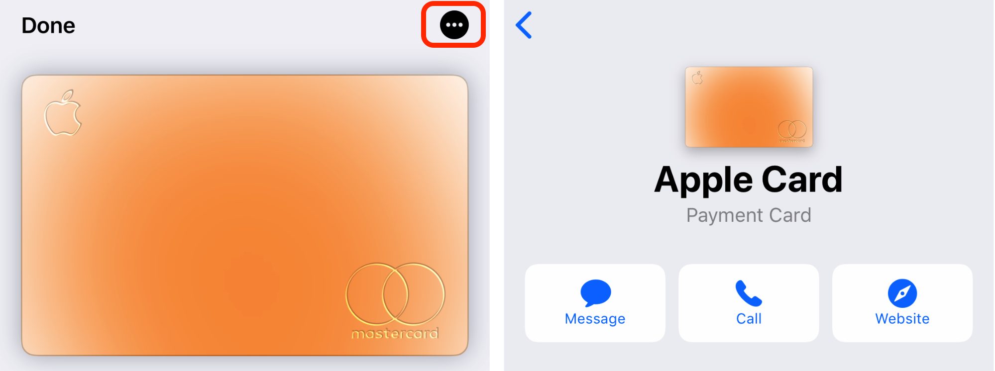
First, let’s return to the Wallet app, where you tap the ellipsis button to access information about a credit card and its settings.
In this example, the ellipsis button is akin to choosing File > Get Info on the Mac to open the Get Info window, which displays metadata about the selected file. Interestingly, Wallet only recently switched to using the ellipsis button; before that, it relied on a button that looked like the lowercase letter i. Perhaps the i was awkward when localizing the interface into other languages and script systems, but it is an ISO standard symbol.
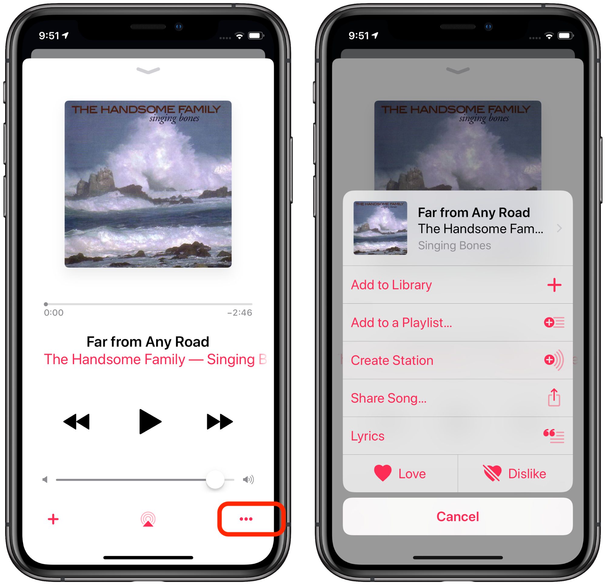
Let’s say you then switch to the Music app to play some tunes. While playing a song, you see yet another ellipsis button. You might assume that tapping it would display more information about the song, perhaps like what you can see in iTunes when you choose Edit > Song Info. But no, the ellipsis button in the iOS Music app brings up a list of track-specific actions, like adding it to your library, adding it to a playlist, creating an Apple Music station based on it, and so on. At least the Add to Playlist and Share Song menu commands honor the standard use of the ellipsis to indicate that a dialog will appear next.
We’ve now switched from the ellipsis button indicating that tapping it will provide information and settings to it acting as a contextual menu of actions you can perform on the selected song. That’s a jump.
Speaking of the soon-to-be-defunct iTunes, it goes way over the top on ellipsis usage, especially when browsing for music by Artists.
While having so many ellipsis buttons—of two different types—seems excessive, at least Apple uses them consistently here: clicking any of the ellipsis buttons displays a contextual menu for the given item. But visually, this interface is a mess. Unfortunately, it’s similar in the Music app in the current beta of macOS 10.15 Catalina.
Speaking of betas, the iOS 13 beta presumably reflects Apple’s most recent design thinking. Since Apple is now beta testing iOS 13.1, iOS 13.0’s visual interface is likely locked down. (If you’d like to get a head start on your iOS 13 experience, check out Take Control of iOS 13 and iPadOS 13.)
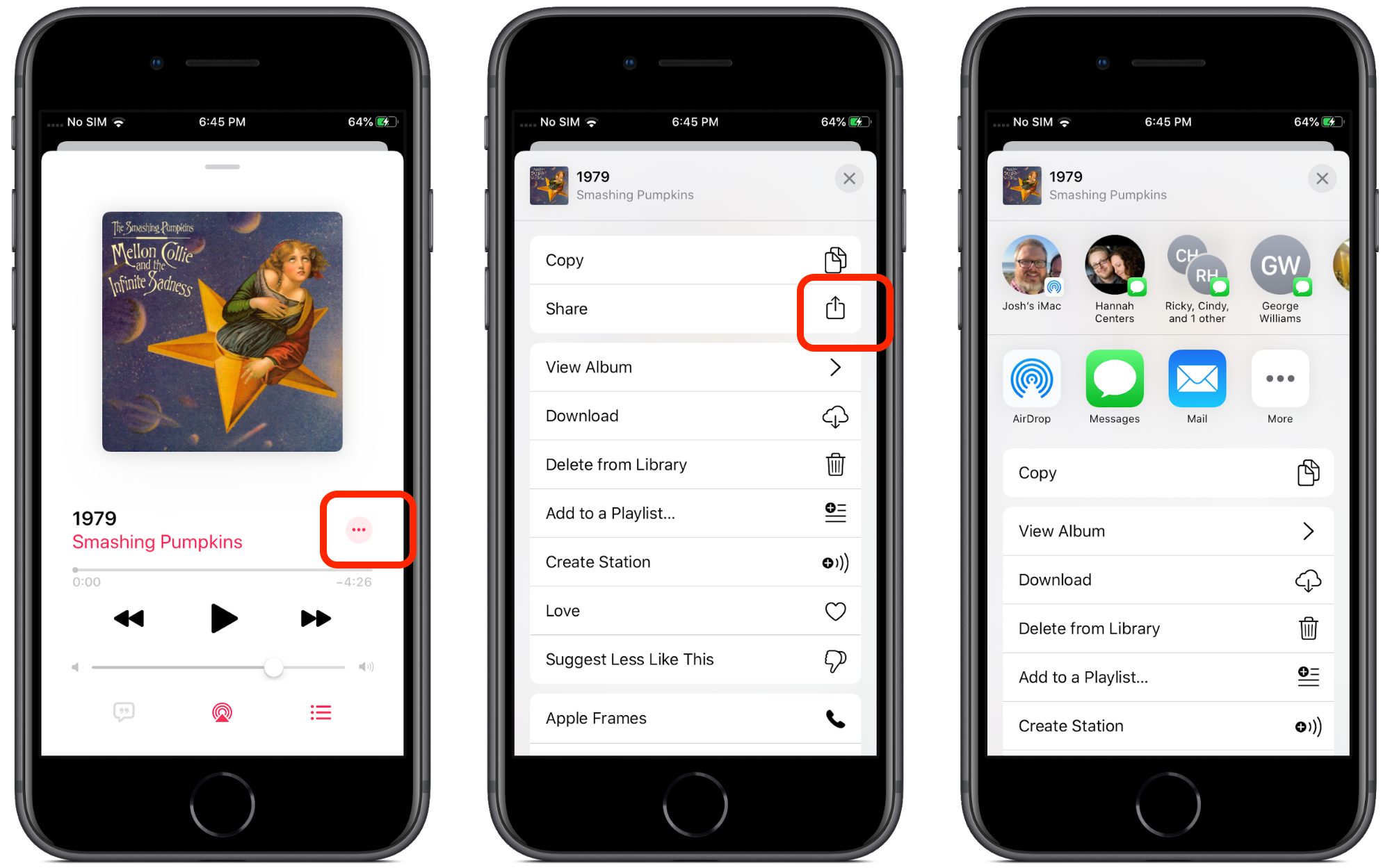
iOS 13 tweaked the ellipsis button in Music, but not in a particularly helpful way.
First, Apple changed its position, but more importantly, tapping it now opens an activity view instead of the action sheet that iOS 12 used. In interface language, should an ellipsis open an activity view or an action sheet? It may seem like a small difference, but any time an interface does something unexpected, users lose trust in their abilities.
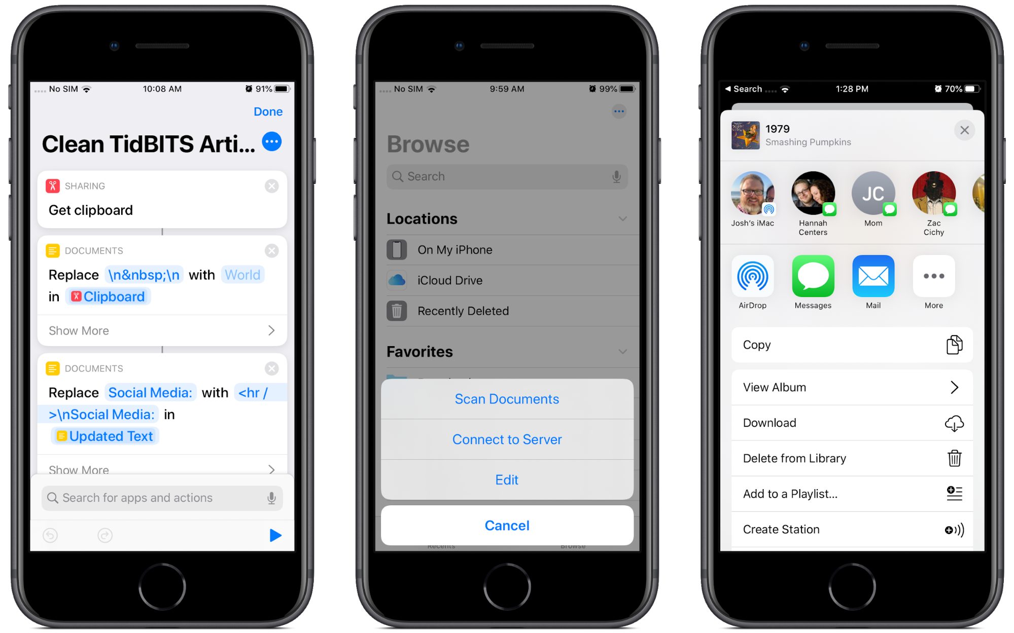
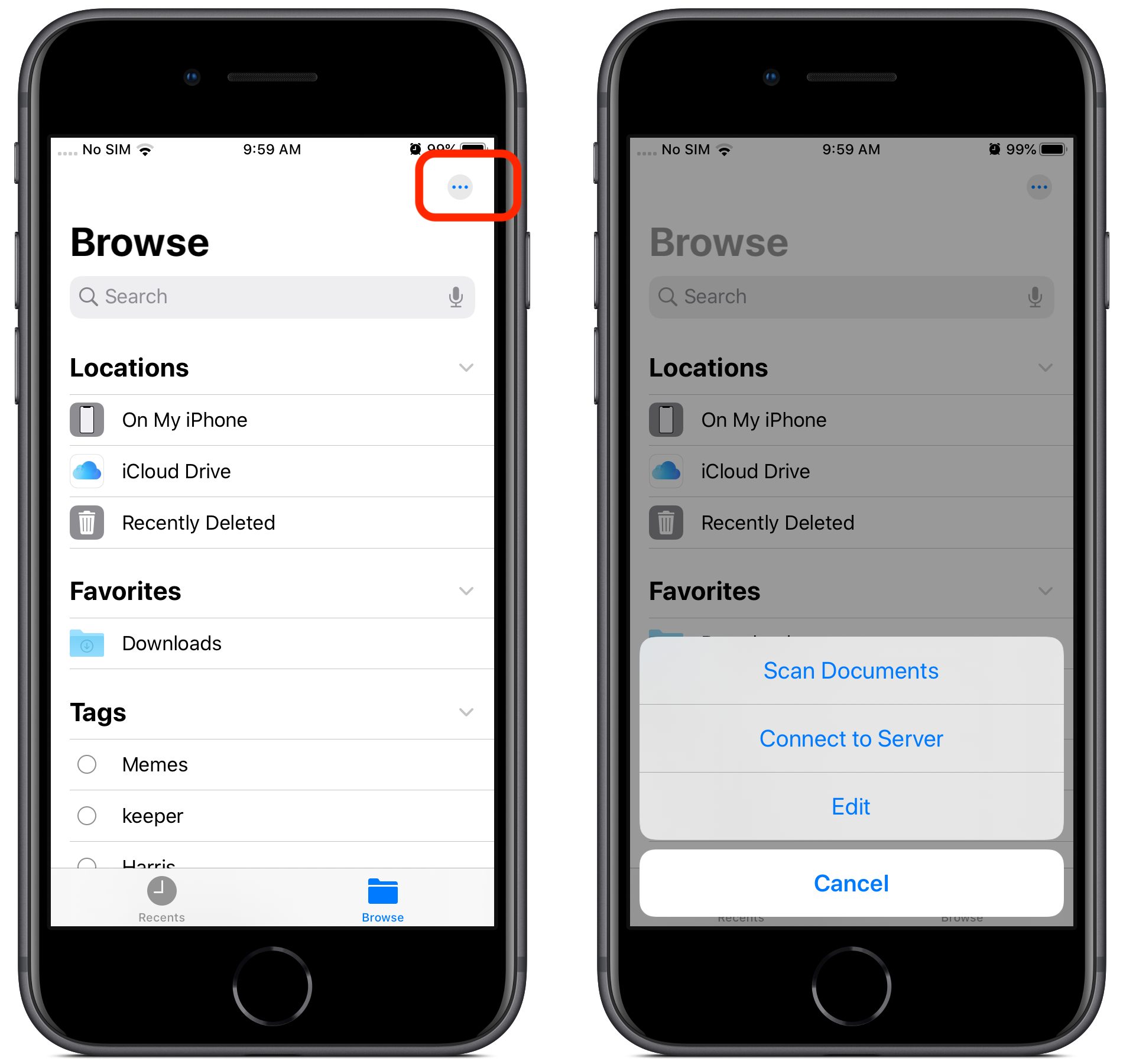
These interface confusions extend to the Files app in iOS 13 as well. Much like with Wallet, Apple replaced a perfectly understandable Edit link with an ellipsis button. What does it do this time? Settings, perhaps? Sharing options?
No, this time it offers commands for scanning documents, connecting to servers, and the options to edit locations, favorites, and tags. These are very different actions. The Edit command makes sense for manipulating the lists of items underneath, and the new feature for connecting to a server fits well too, but scanning documents? Nothing else in Files relates to creating documents.
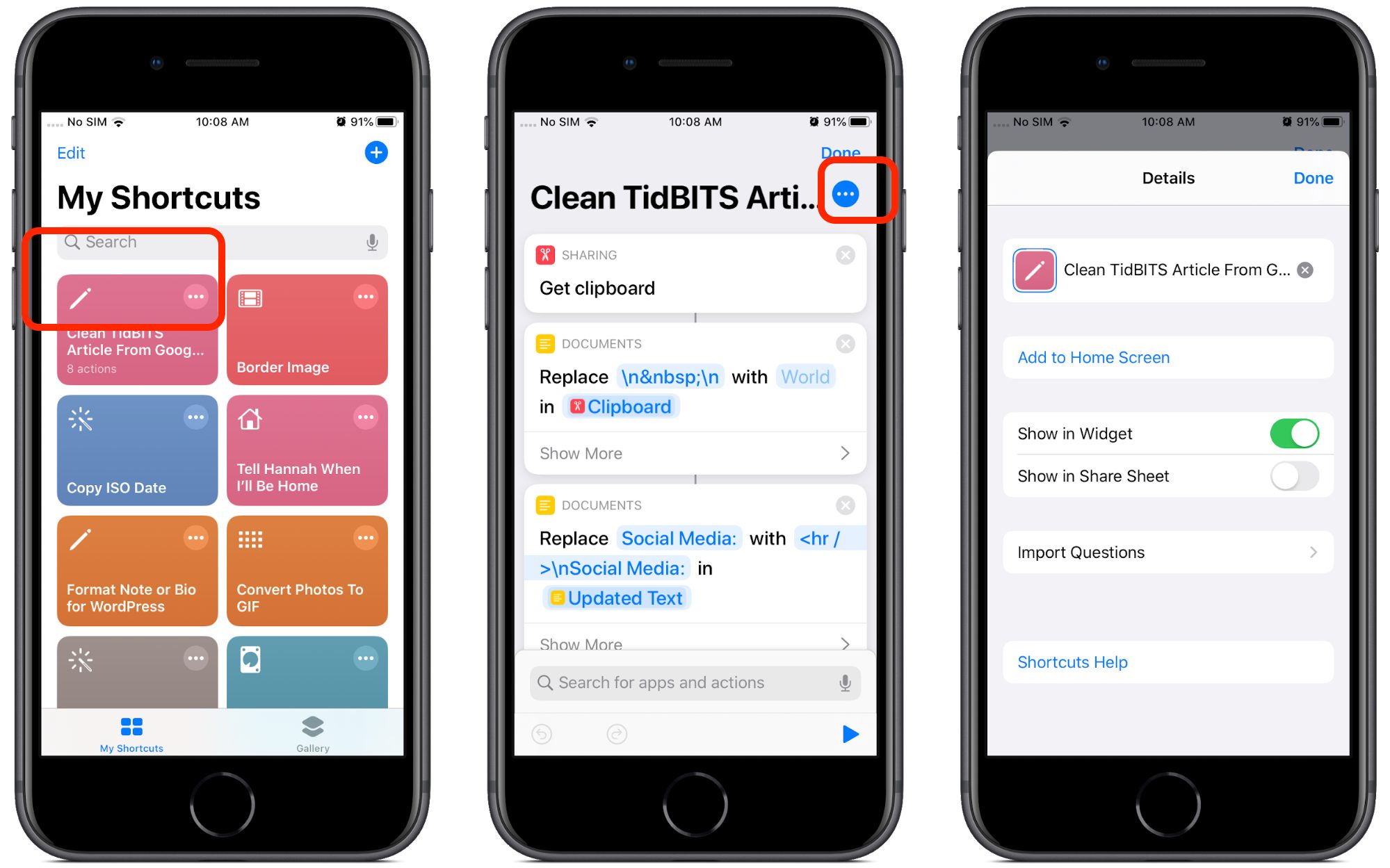
Perhaps my favorite abuse of the ellipsis button is in iOS 13’s Shortcuts app, where tapping it on a shortcut takes you to the shortcut actions, but tapping it while viewing shortcut actions takes you to the shortcut’s settings, although the sheet is labeled “Details.”
In the first instance, the ellipsis button means “Edit,” whereas in the second, it means “Settings.” This is once again a step back from iOS 12’s Shortcuts app, which uses a distinct settings icon with toggle switches for a shortcut’s settings. Why did Apple replace a visually clear icon with a generic one?
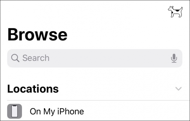
That’s exactly what the ellipsis buttons in iOS have become: generic icons that indicate that there’s something more to see, but you never know what. You could replace the ellipsis with Clarus the Dogcow, and it would be every bit as visually clear (and more interesting).
To make matters worse, in each of the above examples, the ellipsis button triggers a different sort of interface. Sometimes you get a separate screen, sometimes an action sheet, and sometimes an activity view. It’s disorienting because there’s no consistent behavior.
And of course, there’s yet another completely different context for the ellipsis, the incoming message indicator in Messages.
Don’t try tapping it—nothing will happen.
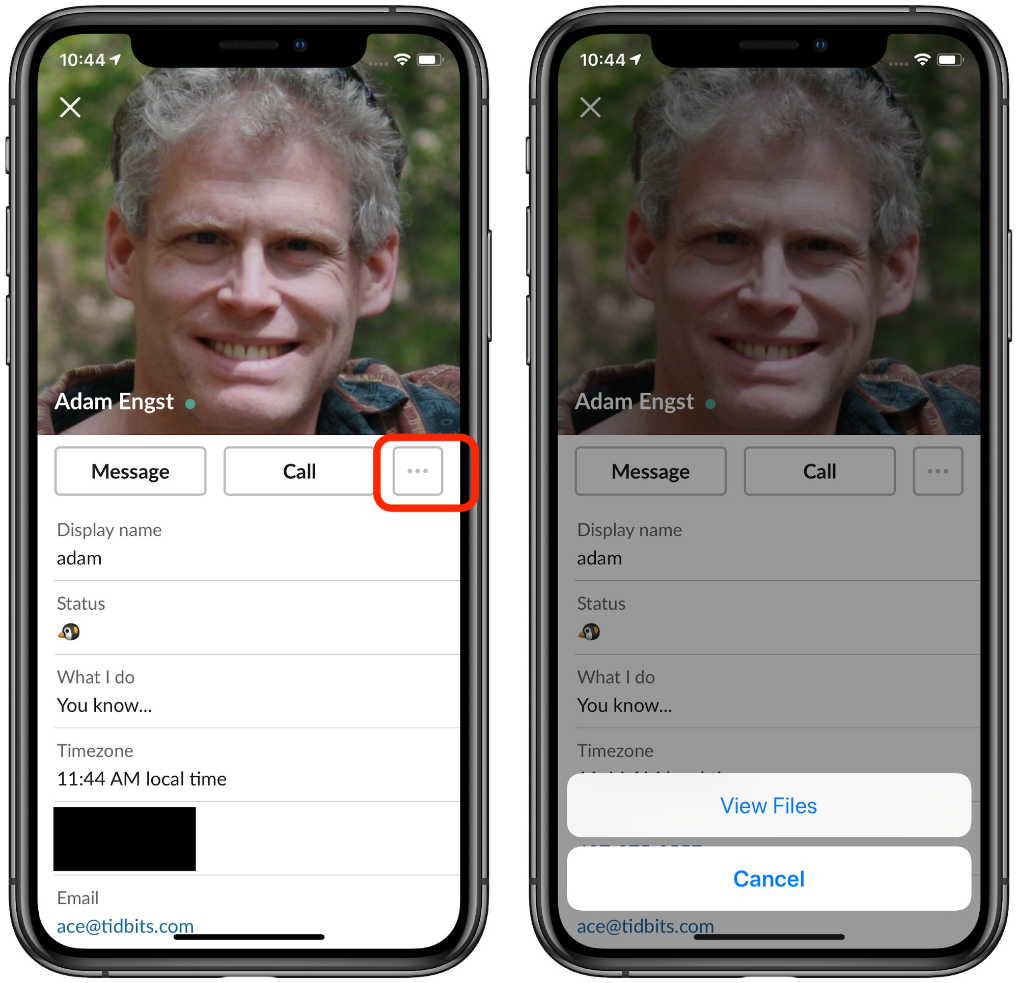
Unfortunately, Apple’s bad practices have infected third-party developers as well. Check out this example from Slack’s iOS app.
An ellipsis button just for a single View Files option! Why not just put a View Files button next to the other buttons?
What Is “More”?
You might be thinking that it’s obvious that the ellipsis buttons and icons simply mean “More,” but there’s no way to know this for sure.
The good news is that Apple has introduced a standard library of icons in its upcoming operating systems, called SF Symbols. Until now, developers had to create their own icons or borrow them from a third party.
Unfortunately, the descriptions generally document only what the icons look like, not what they’re meant to mean. So the names don’t give developers any idea about why to use these icons, just what they look like, which is already obvious.
(SF Symbols isn’t a standard Unicode font, so there’s no way for tech writers to use them when documenting Mac and iOS apps. Worse, Apple’s license seemingly prevents their use in documentation anyway, saying “Your use of Symbols obtained from Apple’s SF Font is limited to creating mock-ups of user interfaces for software products running on Apple’s iOS, macOS and tvOS operating systems.”)
Names like ellipses.bubble and ellipsis.circle aren’t helpful. Interestingly, it’s not as if Apple can’t describe how specific icons should be used. The company does so for icons that developers are allowed to use only to indicate specific Apple features.
Developers and users can be sure that the icloud icon can only refer to Apple’s iCloud service, but good luck deciphering what ellipsis.circle means. Maybe it means “More,” maybe it doesn’t. Apple is being intentionally vague here.
The broader issue here in terms of usability isn’t the philosophical issue of “what is more,” but the practical issue of what “More” means to the user. As you saw in the above examples, tapping an ellipsis button can activate a widely varied range of user interface elements. Unlike, say, the Share icon, which consistently presents an activity view that contains sharing-related options, the behavior of ellipsis buttons isn’t predictable or consistent, which leads to user confusion. It confuses me, and I’ve spent years documenting iOS!
Let’s examine a competing approach to representing “More.”
Google to the Rescue?
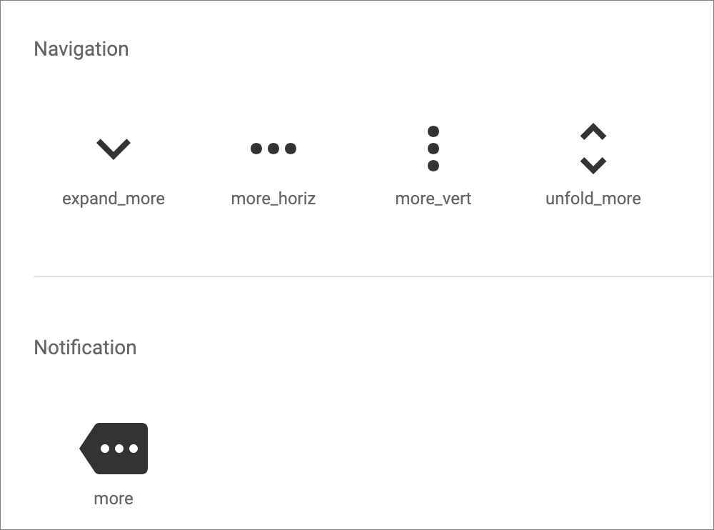
Believe it or not, Google might have outdone Apple on design here. Google gives developers a clear design standard, called Material Design, that comes with color palettes, templates, and icons. Each of Google’s open-source icons clearly states its purpose.
For the most part, Material Design doesn’t name its icons based on what they look like, but instead for what function they should represent. Unlike Apple, Google doesn’t call the gear icon “gear.” Instead, it’s named “settings” to indicate that tapping it should provide access to settings. Material Design also provides an array of other settings icons for different things, like Bluetooth and brightness.
To be fair, Material Design also includes the ellipsis button, though it puts “more” in the name to indicate that tapping them should provide more of something.
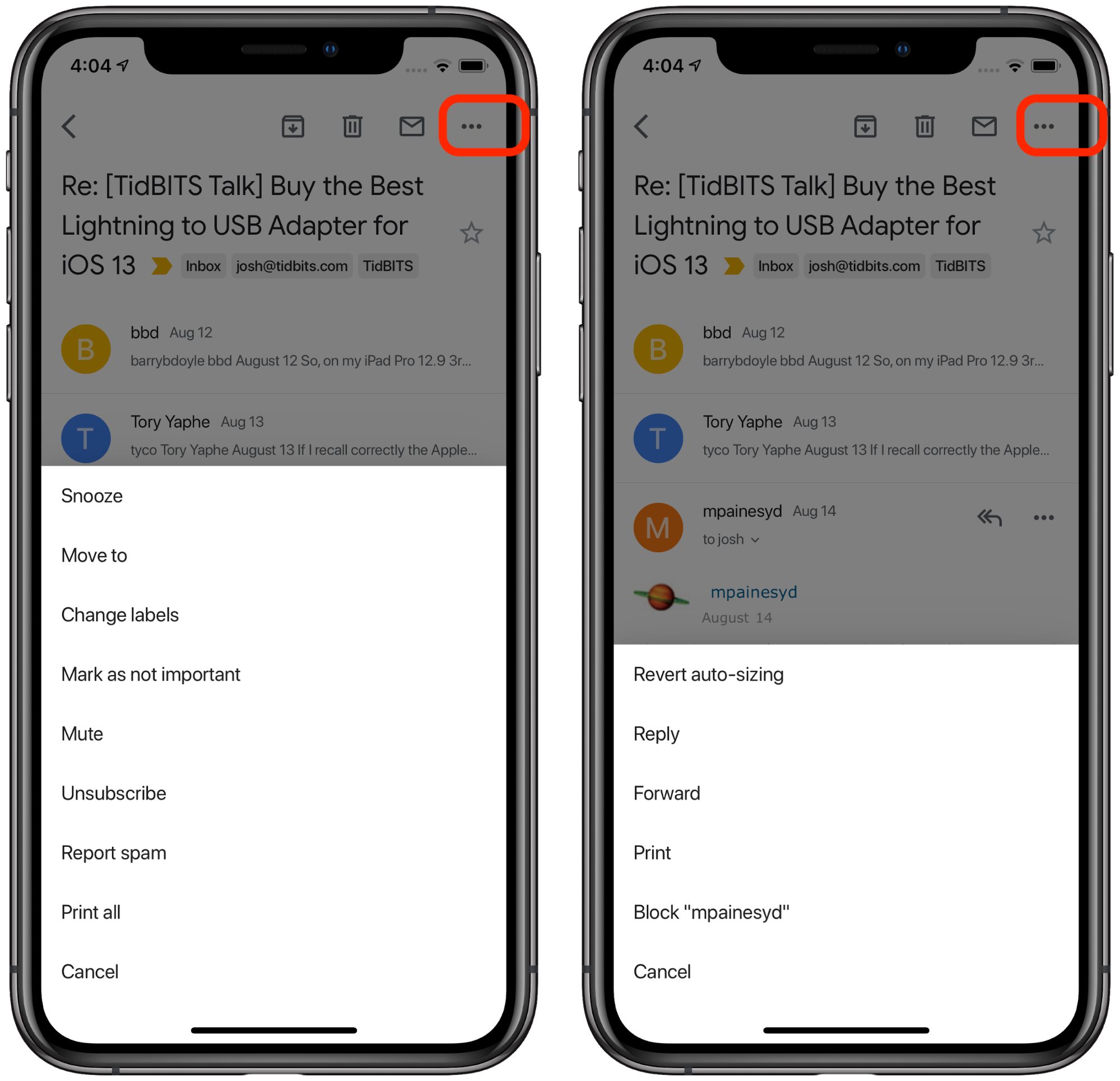
Let’s look at how Google uses ellipsis buttons in its iOS apps. Gmail shares iTunes’s annoying tendency to nest ellipsis buttons, and like iTunes, it uses them in an internally consistent way.
Tap the ellipsis button associated with an email thread to bring up a menu for that thread. Tap the ellipsis button associated with the message to bring up a menu for that specific message. As with iTunes, it’s not pretty, but it’s consistent and it works.
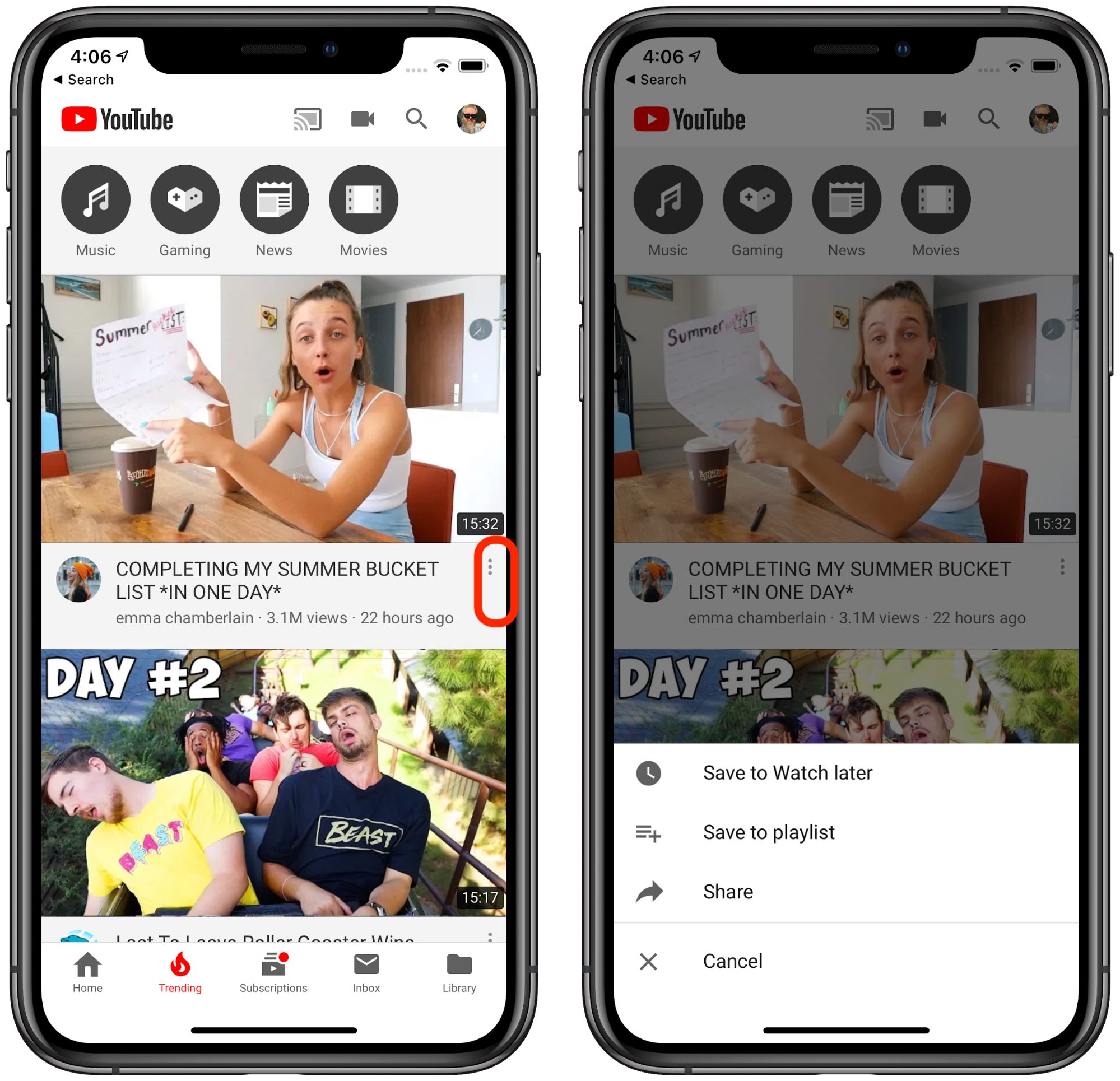
The ellipsis button (vertical this time, presumably to take up less horizontal space from the video title) works the same way in YouTube: tap it to see a menu of extra actions much like Gmail provides. The only difference is that each action has an icon to the left of it, which would be nice to have in Gmail.
Just as with Gmail, the menu pops up from the bottom of the screen. Thankfully there’s no nesting here.
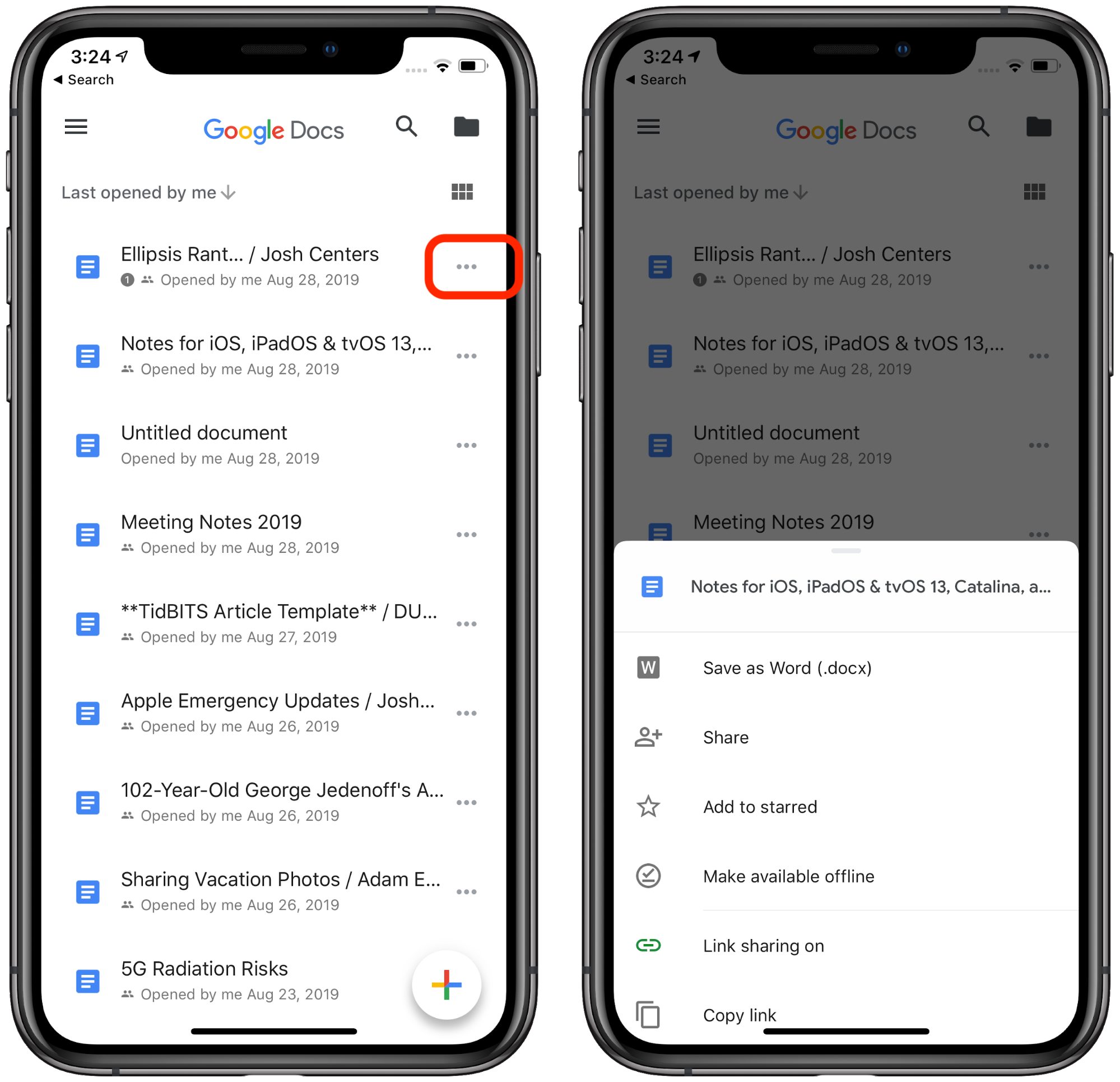
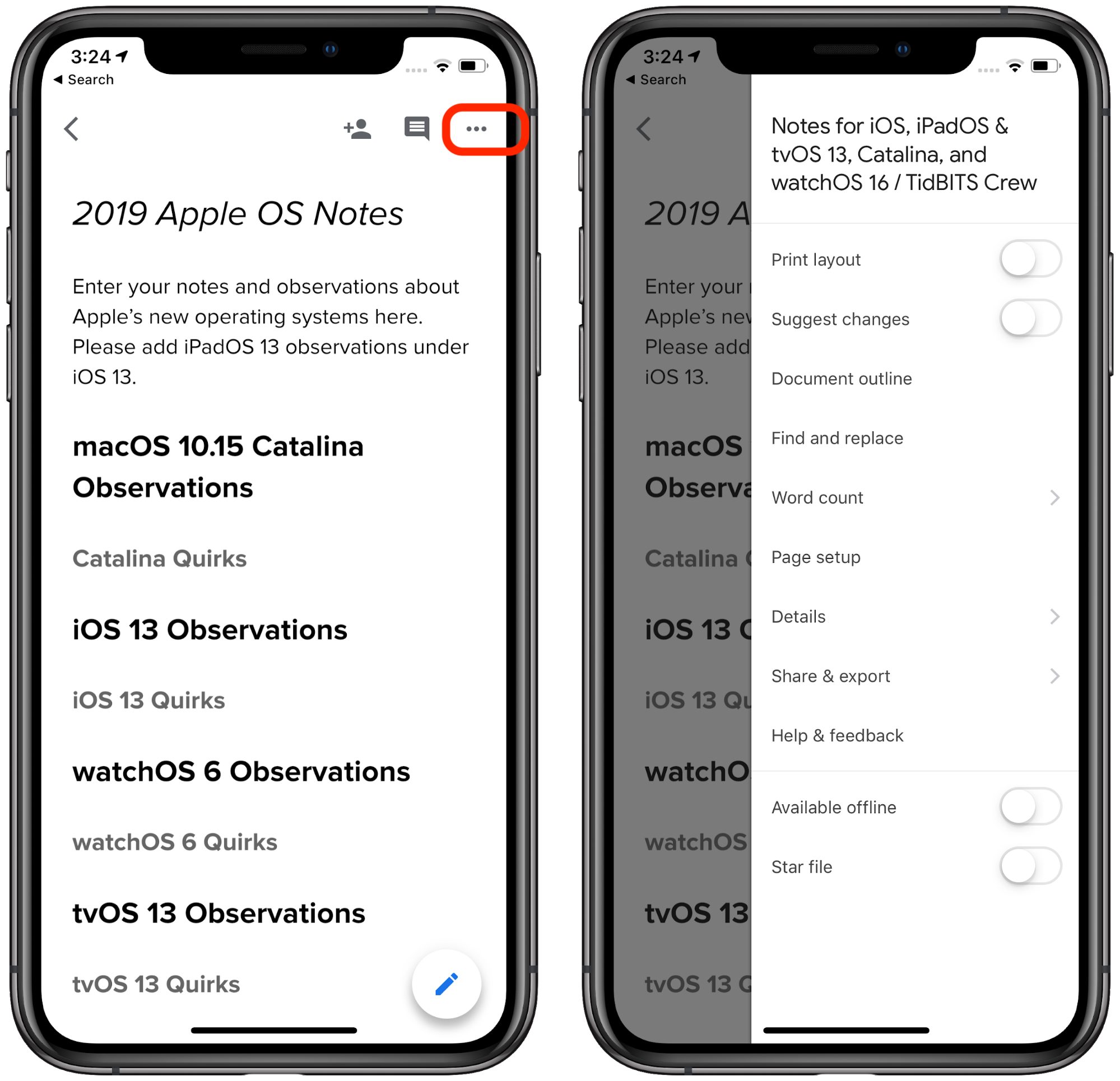
In Google Docs, ellipsis works much the same way: tap it to reveal a menu of hidden actions. In the file view, the menu pops up from the bottom like in Gmail and YouTube.
But tapping the ellipsis button while viewing a document causes the menu to pop out of the side of the screen. Given the length of the menu, that small inconsistency makes some sense, but I can’t help but think that a “hamburger” button (which Material Design calls a “menu” button and which Google apps use as well for app-level menu options) would be more appropriate.
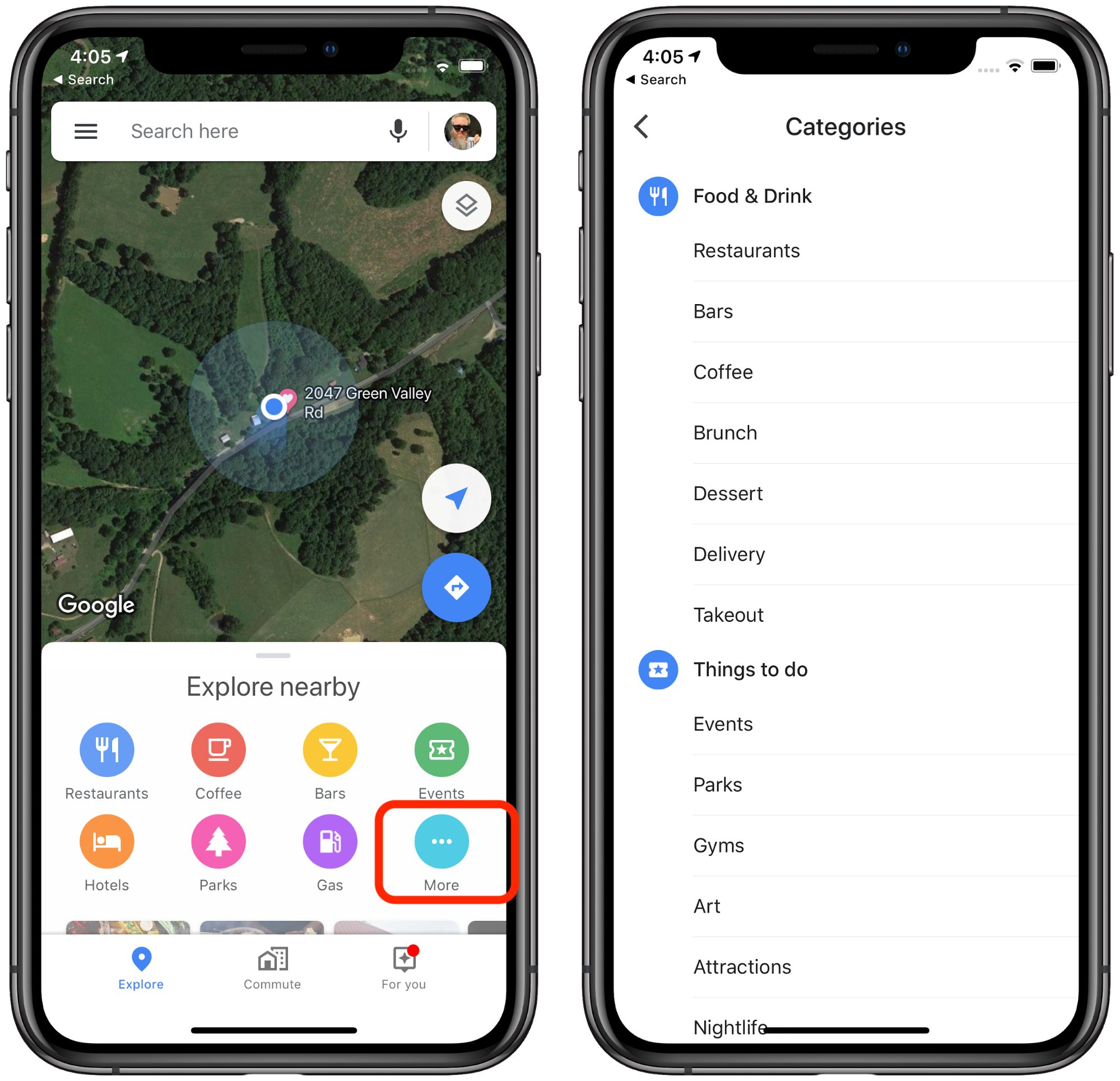
Google Maps breaks this convention somewhat. Tapping More in the Explore Nearby pane opens a full-page menu of place categories.
But this isn’t an entirely fair comparison, as this ellipsis button doesn’t look like most other ellipsis buttons—it matches the nearby colored icons and provides a text label. I like this particular usage because you can intuit what will happen when you tap that clearly labeled More button.
Of course, what you prefer is a subjective choice, and it’s not as if Android developers (including Google) follow the Material Design guidelines exactly. However, I think Google’s usage of ellipsis buttons is clearer and more consistent than Apple’s.
It’s disappointing that Apple, supposedly a leader in interface design, has resorted to such uninspiring, and I’ll dare say, lazy design in its icons. I don’t claim to be a usability expert, but it seems to me that icons should represent a clear intention, followed by a consistent action. To quote Apple’s Human Interface Guidelines:
A consistent app implements familiar standards and paradigms by using system-provided interface elements, well-known icons, standard text styles, and uniform terminology. The app incorporates features and behaviors in ways people expect.
The ellipsis button may be system-provided, but even Apple isn’t using it to initiate app functions in ways that people expect.



Nice piece, Josh.
I have this suspicion that this proliferation of the ellipses is the result of Apple trying to rely on a symbol rather than text. It appears to me that most of the confusion you describe could be solved by instead of the ellipses using buttons like “More…” or “Settings…”. And I believe this also used to be more common on iOS. Perhaps, there are translations where those become too long or cumbersome. Perhaps Apple doesn’t like text buttons. Either way, the solution would be to come up with better icons, possibly several, and use them in one consistent fashion.
I don’t mind the ellipses per se, but it’s too vague of a symbol for many uses. And what I really detest with vigor is the vertical ellipses. I get that it’s space saving, but while the horizontal ellipses is easily explained by its typographic origins …, the vertical one is just plain devoid of obvious meaning unless you tilt your head.
I agree with Simon and have from my first classic Mac - Use Text. And just to be clear, text is a kind of icon. I guarantee the coming word in quotes is not a “tree.”
Designers sometimes refer to these widgets as “overflow buttons” or “overflow menus,” and they are typically used like the “Miscellaneous” folder on people’s hard drive: “I got this command that I need to expose in the UI, but there’s just no room left, and it’s not used that often either. Oh, hey: overflow menu. Of course!”
And the outcome is typically just as usable as their Miscellaneous folder brethren: in most cases, it’s extremely difficult for users to predict what they’ll find when they access them. Add to that a poor choice of commands that get stashed away in these menus, and you’ll end up with sub-par UX.
Using a more expressive label for such buttons, as suggested by @Simon, would be extremely helpful with regards to “information scent,” but, as he already points out himself, there might just not be enough room to accommodate localized text, particularly on smaller mobile phone screens.
Here’s an example from a current localization effort of our SaaS platform: the German translation for “sign” is “unterschreiben.” Now, make that fit in the space of those ellipses…
That said, overflow buttons/menus can be a great choice of widget — if used sparingly and consistently. For example, showing a simple ellipsis in table rows makes context menus in those tables more discoverable and easier to use (because they only require a regular click to open vs. a control- or right-click) without giving them excessive visual prominence in the overall table.
By the way, popular nicknames for the horizontal and vertical ellipsis are “meatball” and “kebap,” respectively. Hmmm. Meatballs. Rolls off the tongue much easier than “horizontal ellipsis,” no?
It’s funny, I get what you’re saying, but I’ve never found the
•••confusing, I’ve always assumed they meant ‘more actions’ or similar. This matches nicely with their traditional use on the Mac in menu commands, where it should be noted that you can get quite different interfaces resulting from a menu command ending in…. The fact that there are different interfaces for the resulting actions/information on iOS doesn’t strike me as a problem necessarily, and creating specific icons that are meaningful across cultures can be difficult. Saying that, I can see there are cases where more specificity would be better (the Shortcuts settings icon being a great example).I’m not sure holding Google up as a better example works too well. They are a bit more consistent, but that’s probably because the scope of their apps is much more limited – they’re not providing the variety and OS services that Apple is (and even within this limited scope, they’re not fully consistent). It would be interesting to see how consistent they are on Android where they have an expanded set of interface issues to solve.
And the bigger problem is that the Google apps are not using the standard iOS interface conventions, which I find far more disorientating than Apple having different iOS interfaces resulting from )
)
•••. Maybe that’s because I don’t use any Google apps, so seeing your screenshots was pretty jarring, but I think largely following platform conventions is a more important principle. (This is aside from the fact that subjectively, the Google apps look ugly to me, so I’m glad I don’t need to use them.Yeah, I think it’s hard to remember that some languages have significantly longer words. But since there are a lot of words that are used throughout Apple apps in iOS, I wonder if Apple is slowly whittling the set of words used down to those that do localize well.
Hamburger menus and meatballs! Must drive the vegetarian designers crazy. ;-) Where does “kebap” come from? (Or do you mean “kebab,” as in the skewered meat dish?)
Apple made a big shift to text labels in iOS 7 but they’ve dialed back from that. It was a bit of an accessibility problem, since the text wasn’t clearly identified as clickable, and iOS 7’s thin, wispy fonts didn’t help. And as Jochen said, some words are absurdly long in other languages. However, I’m generally in favor of the idea when there’s space on the screen. The Slack example could easily just be a text button under the ones already there.
Thanks for the insight and the terms of art!
Yup, “kebab:” picture a skewer with three small chunks of meat — or cherry tomatoes for the vegan faction — on it.
P.S.: “Kebap” is the usual spelling back in Germany.
Josh, the issue with the text-only “buttons” did affect accessibility, but not just in its more traditional sense.
Even for users with good vision, it is often difficult to tell what text on the screen is static, and which is interactive. To make that distinction easy-to-see, changing just the text’s color is way too subtle. Yes, it looks cleaner, but just how bad is it to add an outline to a button?
This nonsense has become prevalent in design in the last couple of years, with many designers giving aesthetic considerations higher priority than ensuring rock-solid interaction design. In fact, this lack of decent “perceived affordances” in the iOS 7 redesign is something I’ll always consider unnecessary and borderline inexcusable, particularly for a company with Apple’s history of UX prowess.
P.S.: The term “perceived affordance” was coined by Don Norman, and here’s his very own explanation of what he means by it.
Haha, I think that’s another case of localisation – three dots look nothing like a kebab in this part of the world (though anecdotally, I’d also never heard those terms used to refer to an ellipsis button).
http://blog.unitee.eu/societies/cultural-influences/kebab-for-beginners-a-visual-guide-to-european-variants
The name of the “kebab” button (three vertical dots) comes from shish kebab, “an English rendering of Turkish: ÅiÅ (sword or skewer) and kebap (roasted meat dish).”
I don’t think this will be a real problem to anyone, because whether or not it’s officially “more” that seems to be what it means in practice.
That said, there is a problem here… just not one requiring 2,500 words. I hope you reported it, and I hope Apple clarifies the guidelines and straightens this out going forward.
I’d loved to have written a shorter article, but there was no getting around providing so many examples, and we can’t just dump screenshots in without context. As far as reporting goes, consider the 2500 words I wrote to be the report. We know that at least a few Apple employees read TidBITS, and they’ve fixed things we’ve publicly complained about in the past.
Another issue with reliance on text for small screens, ideograph heavy languages (Chinese, Japanese, to an extent Korean) can get REALLY hard to read when the fonts get smaller
For those who have trouble with this in iOS, Settings > General > Accessibility > Button Shapes can add some graphical callouts to text buttons.
I will admit that part of the problem I have with the increased reliance on graphical buttons is that I don’t parse them well myself. I’ve never liked little toolbar buttons because I often can’t see them all that well, and even when I can, I don’t think graphically, so a little boxy thing that might look like a dot-matrix printer doesn’t say “Print” to me. I’m sure others have different opinions, but give me words any day.
I’m afraid the same is 100% true for me as well.
One thing I always hated about the various Windows icon bars is that they consisted of a huge number of tiny icons of which at least half to me meant nothing at all. The floppy disk or dot matrix printer might have worked, and I’d even get the scissors, but what the heck is an icon with four blue squares where two are enlarged and solid blue supposed to signify? Now you need to either add text or you require people hover over it with their mouse to get what UI means. That’s tedious and tiresome to me. IMHO either icons need to be perfectly self explanatory or you’d have to resort to text labels. I don’t see another way.
They have been doing these kind of reductions in display data to save power.
Adam, UX research has shown time and again that the combination of icons and text labels work best, and I agree that all-too-often, graphical representations are not nearly as “intuitively” meaningful as their designers assume.
That would be quite the mindblowing conspiracy if all those UX/IxD designers, who have included overflow menus in their applications, did so just to make the battery life of Apple’s next iOS release look good…
P.S.: Sorry, @jcenters. Couldn’t resist using an ellipsis right there!
Sorry, but that makes no technical sense. Even if you could make an argument that an icon somehow used fewer pixels than an equivalent word, there’s no way to attach power savings to using individual pixels in different ways (with the exception of totally black pixels on the OLED screens used by the iPhone X, XS, and XS Max). See the first answer here:
When you reduce the line thickness of the display font, you save processing power. When you replace dimensional, well designed icons with flat squares with ugly mono colors, your save processing power. When you remove the useful ports and the electronics they need to operate, you save processing power. The list goes on, but when the useful features and user pleasing graphics are removed from Apple products, Apple advertising touts, “More power and longer battery life”.
Phil
I really don’t think any of that is true. What pixels you draw to the screen are really irrelevant as long as they’re static. Actions like navigating with GPS, talking on the phone, and streaming a movie impact battery life in a big way. Even screen brightness is a big deal. But whether iOS is drawing an ellipsis button or the word More doesn’t make a difference.
So they made the UI sub par just for kicks?
In essence, yes. Design isn’t a situation where there’s a right answer. It evolves with the times and the products, competes with alternatives, and sometimes leads to places where no one has gone before. Changes aren’t always successful, particularly for those who were expert with a previous design, but they’re always intended to make things better in some way. Designs are also aimed at particular audiences, so a younger or less experienced audience might have different opinions than an older or more experienced audience.
It’s tricky to criticize a design based on aesthetics, which are largely subjective, but what Josh did here was point out how Apple’s overuse of the ellipsis button might be making iOS apps harder to use. At least in theory, design should never do that.
I agree that the ellipsis is not an improvement. I disagree that Apple is ignoring the years of having regular humans determine what apps and hardware are easily navigable. Like too many clicks to accomplish a task that only requires one.
Eliminating all the ports and the optical drive wasn’t done to improve the usefulness of Apple products, but it made the benchmarks look like they improved the processing power and even increased battery time, even though they used the same processors and batteries.
But as you have stated, the article is about ellipsis overkill instead of using a simple word like; More.
I think you may be conflating several things into one. There were several drivers for Apple to remove optical drives and ports. In some ways, it did increase battery life but only because removing ports freed up internal space so the size of the battery could be increased. Removing the optical drive (which is rarely used anymore) saves a lot of weight and allows for a much thinner machine. So there are other important considerations above processing power and battery life.
My least favorite ellipses are in Facebook posts. In my experience very few people know that they can click on them to edit the mistakes in their posts. For some reason in closed FB groups the ellipsis is replaced with a downward-facing arrow (upside-down caret).
Also available under those ellipses is the powerful “Find Support or Report Post” link which is the ideal place to report a bogus or criminal account. Of course you can also do this Quick Help question mark icon in the menubar and choosing Report a Problem, but there you have to click “Abuse Content” which sends you right back to the ellipses without actually saying they are ellipses: “ The best way to report abusive content or spam on Facebook is by using the Find Support or Report link that appears near the content itself.” You could search a long time before figuring out that said link is actually indicated by three little dots.
I like that Apple uses semantic naming for their glyphs (which is recommended in development). However, I think that Apple should allow us to search for a glyph by its meaning (eg searching for “settings” in the SF Symbols app should show the
gearglyph as a result).I also think that Apple should:
ellipseglyphs for more actions or navigating to an activity sheet, an activity view, a popover, etcchevron.leftandchevron.rightglyphs for more content or navigating to a child viewinfo.circleglyph for “Get Info…” and similar functionsgearglyph for “Settings…”, “Set Up…”, “Configure”, and similar functionsline.horizontal.3glyph for menusI would also like Apple to be more consistent with their use of their glyphs. For example, Apple says that the
bookglyph should only refer to Apple Books, yet they use it in Safari to refer to bookmarks (even though they have abookmarkglyph). (Also, what glyph should we use if we want to refer to books but not Apple Books?)Wouldn’t semantic naming mean using
settingslike Google does rather thangearlike Apple does? Apple seems to be using descriptive naming unless I’m misunderstanding how the term “semantic” is used in this context.Nice article, Josh.
I’d like to point out that Apple used to define this stuff, as well as when to use what. The Human Interface Guidelines (anyone remember that?). Apple’s UI groups seem to have abandoned guidelines some years ago.
–julian (Principal Engineer for Apple QuickDraw 3-D)
Yes, Sir. I sure do.
Something I and several others here have bemoaned for quite a while already I’m afraid. Maybe with the recent shake up in Apple related to design and UI there could be some movement there though. Unlikely perhaps, but I guess still possible.
Apple does have a Human Interface Guidelines site, so I’m curious how it compares with the venerable Human Interface Guidelines book from yesteryear. Does anyone have a copy kicking around to compare against?
I read the article (ok most of it) the other day in the Tidbits Newsletter. But I thought it did not particularly relate to me. Then today I wanted to delete an expired boarding pass in my Wallet. I could not for the life of me, on my own, figure it out. So I went to search the internet and found several methods described but none of them were visible on my wallet. Then I remembered this ellipses article. Sure enough, clicking on the pass there is an ellipse on the screen and that took me to a place I could delete the pass. Apparently the method had changed with OS versions, and my searching had not brought up the latest version. So thanks for the ellipse article!
I’m glad it helped you! Another thing about the ellipses buttons is that they’re not exactly search engine friendly either.
It’s interesting that in the same issue where you acknowledge that loyal readers lean older rather than younger, you seem to ignore a common way in which youngsters interpret and use the ellipsis in text messaging communications: they use it as an indicator of impatience or annoyance, as though it was a tapping finger or fingers drumming on a table. Just as a period is used to put a little pepper on a remark, and multiple exclamation points are necessary to convince your interlocutor that you are sincere/caring, so the ellipsis is being used to convey a mildly negative emotional tone.
There’s at least one designer at Apple who can still create great icons.
I have a printed copy from the early ’90s, covering System 7. Yes, it’s one of my most prized design-related possessions.
It’s vastly more detailed, extensive, rigorous, and coherent than the current HIG website(s). If you’re interested, I can take a few pics from the book for comparing with the current sites.
Thankfully, there’s a really helpful set of library files for Sketch, Photoshop, and XD on the Apple Design Resources webpage, though, that provide some decent information on layout details that are not covered in HIG.
It would be fascinating to see how the old discussions compare with the new ones, @jochen. And if there is a section talking about the ellipsis, that would be particularly compelling.
The HIG version that I have is Copyright 1992 and contains about 380 pages, many of which are beautifully illustrated.
Before showing some page shots, let me start by pointing out how amazing even the book’s appendices are.
One Appendix contains a huge bibliography, grouped into sections such as Cognitive Psychology and Human Factors, Environment Design(!), and Graphic and Information Design.
Another appendix provides an well-curated 12-page checklist, although of its items sounds delightfully anachronistic these days: “Do you always design for black and white first and then colorize your design?” or “Are your black-and-white designs two-dimensional?” [Note the proper use of hyphens, BTW: they’re included in the adjective, “black-and-white,” but not in the noun, “black and white.” Love it!]
Before the book explains the macOS-specific design guidelines, it covers the fundamentals of human-computer interaction:
The Mac-specific contents go into a detail that the current HIG simply don’t have anymore:
One aspect of the current state of UX Design is that so many products still ignore “small” fundamentals that make a huge different for users, such as providing meaningful — to the user, mind you! — error messages. Check out this really simple example, which is more than a quarter century old. Dvelopers and designers still get this stuff wrong. All. The. Time. That’s just inexcusable.
Finally, that ellipsis stuff, @ace! The book only addresses ellipses in menu items, but it does so in very thoughtful detail, taking up some 4 pages, net.
The current macOS HIG still provide a wealth of good design advice, but almost everything is chopped up into little chunks of advice.
In contrast, its printed pre-decessor is, in fact, on par with a well-written text book. It’s a great and enlightening read in its own right, which helps readers get much more of a big-picture understanding of the topic than they could hope to get from perusing today’s checklist-formulated guidelines.
This is still relevant in today. Not only are there non-color e-ink devices like the Kindle but there are accessibility features in macOS and Windows to change or remove colors from the interface. One of the Web Content Accessibility Guidelines (which are useful in non-web cases) is 1.4.1 Use of Color: “Color is not used as the only visual means of conveying information, indicating an action, prompting a response, or distinguishing a visual element.”
Also, designers shouldn’t get too wedded to colors, clients and other non-designers love to weigh in on them, “does it have to be so blue?” or “we’ve changed our corporate branding color scheme, this design needs to use them.”
What a lovely post, @jochen! Thanks for sharing all these pictures and examples.