The Verge Mapped Broadband Access Across the United States
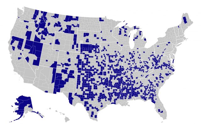
The Verge has used data compiled from Microsoft to map broadband access in the United States. It paints a much darker picture than the US Federal Communications Commission broadband map with self-reported ISP numbers. The Verge’s map lets you mouse over each county in the United States to see the percentage of people using the Internet at speeds of 25 Mbps or more. Blue areas indicate areas in which less than 15% of the population has access to those speeds.
The past year of remote work and school has highlighted the need for greater broadband access throughout the country. Broadband hasn’t been a luxury for a long time—it’s a basic utility in the modern world.
(That said, this data may not demonstrate quite what it purports to show. It claims that only 36% of households in Macon County in Tennessee, where managing editor Josh Centers lives, use broadband speed. However, nearly everyone in the county has access to fiber-optic broadband with no installation costs and reasonable monthly fees. If people aren’t buying that level of Internet access, it’s either due to poverty, which is a much bigger problem, or just not wanting the service, which may or may not be a problem. Also, the local power company has been rolling out fiber in neighboring counties.)
Hmm, my county is apparently at 99%, which is pretty impressive, but probably a good bit higher than it is in reality.
15% is a ridiculously low threshold! Turn that around, and it means that 85% do NOT have broadband. Really? Is that considered acceptable?
I have a cabin on a lake in the Adirondacks with DSL which has a rated speed of 185 kbps but feels like dialup. If more than one device is on, nothing gets through.
However, 2 companies are running fiber, so maybe next year my internet will finally arrive in the 21st century.
Not only is 15% a low threshold, but the avaraged data don’t point to disparities within counties. Some parts of the Chicago/Cook County area, for example, might be closer to 80%, while others are much lower. There are only two providers in my part of the city (despite its proximity to a major university), and only one offers speeds greater than 12Mbps down.
Interestingly the map seems to remind me of the Bible-belt. Coincidence?