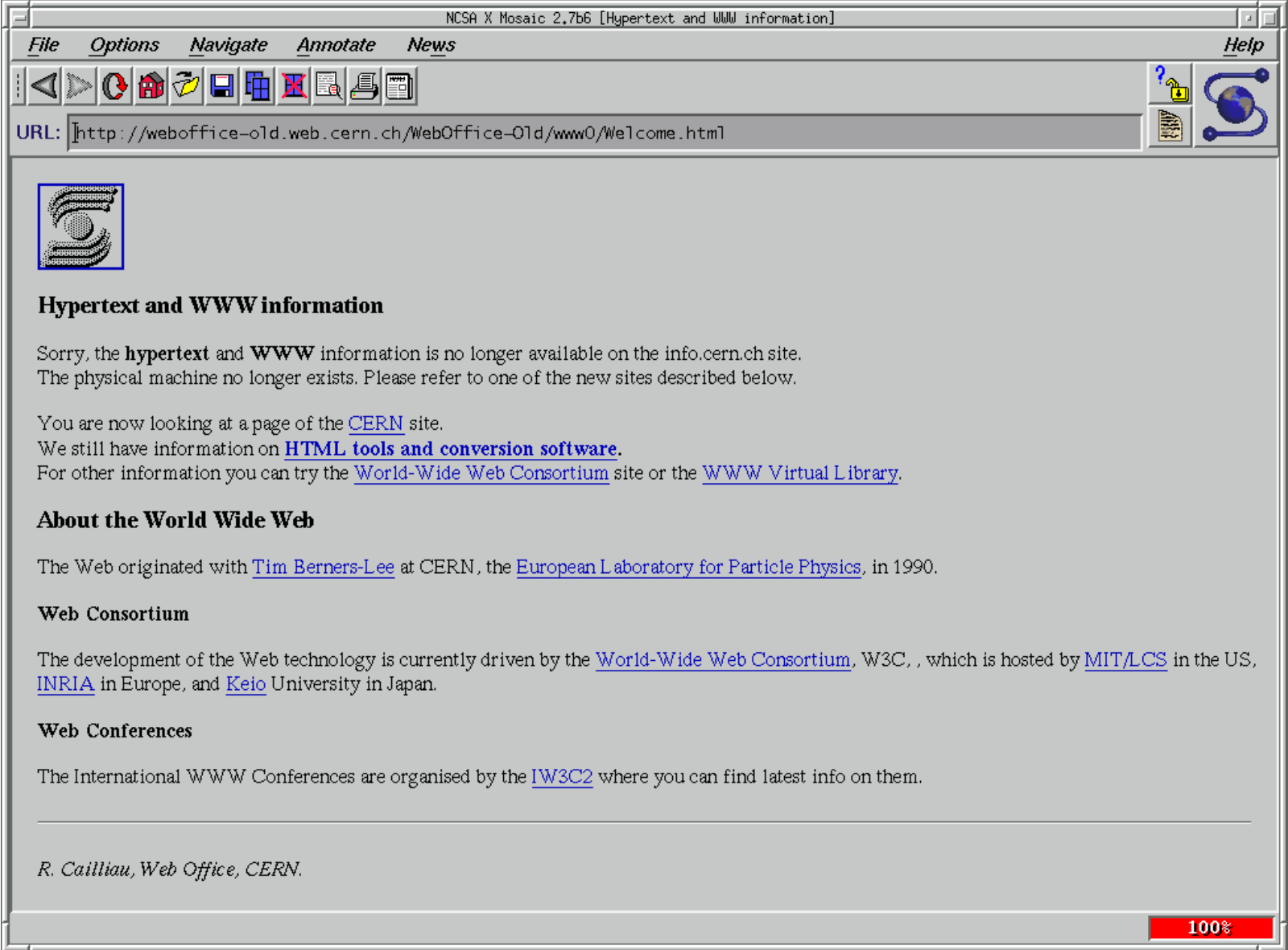
The Mystery of Why Web Hyperlinks Are Blue
Why is blue the default color for hyperlinks in Web browsers? In a Mozilla blog post, Elise Blanchard explores the mystery, tracing the first underlined hyperlink to Windows 1.0 and the first use of the blue underlined hyperlink to version 0.13 of the NCSA Mosaic browser, launched in April 1993. Mosaic was the first popular graphical Web browser, and the color just stuck.
As for the exact reason why browser developers chose blue, it’s still a mystery, but Blanchard offers some theories. Some say it’s a standard to maximize contrast, but it’s not a particularly high contrast color choice, and Mosaic predates the W3C Web standards organization by nearly a year. Instead, Blanchard leans toward the booming popularity of color monitors in the early 1990s and the fact that Mosaic was so ubiquitous.
However, it could be as simple as a key programmer liking the color blue—some decisions really are arbitrary. Even if Blanchard fails to unearth a definitive answer, her trip through history is fun to read.
That color of royal blue solves two accessibility problems. The first involves contrast between the type and the background page color (usually white). That darker royal blue is dark enough to work for readers with poorer vision. But it’s not so dark that it “blacks out,” or becomes easily confused with black when presented as thin type.
Why blue at all? Blue is just about the only color that remains a real color for everyone, including all the colorblind variants. Fire engine red becomes nearly black to one of the red/green colorblind types. Blue becomes teal for the some colorblind types, but still remains a distinct color from black. Since an estimated 8% of men genetically have colorblindness of some sort, I imagine one of the earliest programmers, or somebody else in their workspace asked for comments, was colorblind. I don’t have any proof of the process, but in the creative fields I’ve seen, the creator usually asks his or her colleagues what they think. Blue was likely the consensus color that worked for everyone there at the time.
This has been a wake up for me. I’ve been designing textbooks for decades, and the last several years have seen a real increase in designer attention to ADA issues involving vision. Now if someone can just get Apple to stop using microscopic pale gray type on important data like serial numbers….
All true. I would love to know if that was actually a consideration for Mosaic 0.13 (where the blue/purple colors appear to have been introduced).
I wonder if someone with the ability to contact Marc Andreessen or Eric Bina (who authored those release notes) could ask whether there was a particular reason for those colors of if it was just because they looked good at the time.
And to stop using red type on a black background in WatchOS especially. Can’t read it at all in sunlight.
As one of the 8%, I have found it amazing that designers across the board but especially of electronic text don’t ever seem to have learned this lesson. The case that peeves me most at the moment is the use of minuscule red/green on/off indicator lights in my Chevrolet. Can’t tell if the switch is on/off in any sort of daylight.
For any designers reading this, there’s a free app on Apple’s App Store called Sim Daltonism. It’s 64-bit, but not yet compatible with M1 Macs. It shows a window that can be overlaid on top of whatever else is on the screen allowing a good approximation of how different colorblind people see the screen material. You can toggle through multiple colorblind views to make sure what you’re designing works for everyone.
I can’t imagine many designers making it through art school if they were colorblind. Just as my tiny hands make me completely unsuited to be a basketball player or even a good pianist, people with less than excellent color vision are hobbled in most areas of art. We just don’t realize what the 8% experience, and I never learned it in art school. The app helps me understand things better.
Interesting article, though it plays a bit fast and loose with terminology. The first ‘hyperlink’ it claims used underlining were buttons in Windows 1.0. Various other examples given in the article are UI elements. I don’t think that any selectable or clickable UI element is a hyperlink. Hyperlinks specifically link one piece of content to another. Menus and buttons are not hyperlinks in my understanding of the word.
Thank you for pointing out this app (Sim Daltonism). It is enlightening.
Also: this was the era when only a small number of colors would display consistently across platforms. Of the three single-color options in RGB: FF0000 red, 00FF00 green, and 0000FF blue, the blue was the one that had the best contrast on both sides (lighter than black but dark enough to be legible) and was ok for the most common form of color blindness.
Dave
The palette was limited to 256 colors:
And I’m glad those days are dead and gone.
At the time Mosaic 1.0 was released, 16-color displays were fairly common. A VGA-standard display (introduced 1987) supports 256 colors at 320x200 (generally too low a resolution for a Windows desktop) or 16 colors at 640x480. Later SVGA cards had better capabilities, but it was still not unusual for mainstream video cards (those most people could afford) to only offer 16 colors at their highest resolutions (800x600 or 1024x768), and these were the resolutions typically used for Windows desktops.
On PCs, the default color palette for 16-color mode would typically be the CGA-standard palette. Any other colors would either be substituted for one of the 16, or the application would use dithering to try and approximate them. Although software could change the palette, doing so would affect the entire Windows desktop, so it was generally only done for full-screen applications (which web browsers were not).
Workstations (including those from Sun, HP, SGI and others) typically had much more capable color displays, offering 256 colors (or sometimes even 16- or 24-bit color) at their maximum resolutions, but Mosaic was designed to be portable to Windows, so it is unlikely they would choose colors that most Windows users at the time wouldn’t be able to see as intended.
Within those constraints, it’s not too surprising that blue and magenta were chosen. They are easy to read against the gray (and later white) background used by Mosaic and they don’t have an implication of something bad (e.g. had red been chosen).
Jeez…Mosaic…a blast from the past. Since I don’t have our copy of the first edition of Adam’s Internet Starter Kit handy, I can’t remember if it was included in the disk of handy dandy software that came along with that excellent book. And if it wasn’t for the Kit and the included software, my husband and I might never have gotten online.
That blue was the standard color for text highlighting on X Windows setups at CERN at the time. Probably others too. I suspect they just carried over the idea for highlighting links.