Hot New Features in Safari in iOS 15 and iPadOS 15
iOS 15 has brought some of the most significant revisions to Safari since the iPhone’s introduction. The address bar is on the bottom! Where’s Private Browsing? What are Tab Groups? Why does the color of the top of the screen keep changing?
Let’s walk through the major new changes, see if we can help you make sense of them, and show how to turn some of them off. I cover these and many other new iOS 15 and iPadOS 15 features in Take Control of iOS 15 and iPadOS 15.
Safari Upside Down
When iOS 15 came out, people were suddenly baffled by the fact that Safari seemed to be upside down.
Earlier betas of iOS 15 boasted an even more radical design that concealed many common functions. The first betas hid the refresh, share, and tab buttons entirely. The screenshots below come from a later beta, where Apple was still trying to cram more controls into the tab itself. I shudder to think of the response if Apple had shipped that design.
Thankfully, after a litany of complaints from beta testers, Apple dialed things back to a more familiar interface. Just upside down.
Apple made this switch for good reasons. Prior to the iPhone 6, iPhones were much shorter, and most people’s thumbs could easily reach the top of the screen. During that time, Apple even made this a selling point against then-enormous Android phones with its “thumb” TV ad. (Ah, for the days when “common sense” suggested screens could match the size of most people’s hands.)
Over the years, iPhones have become ever taller. Even people with large hands have to really stretch to reach the top of the screen, where Safari’s address bar was. To address that concern (Reachability doesn’t seem to be a huge hit), Apple converted it to a “tab bar” and moved it to the bottom of the screen, where everyone can easily reach it. Tap it to enter a URL or search term, just as you would have in the old address bar.
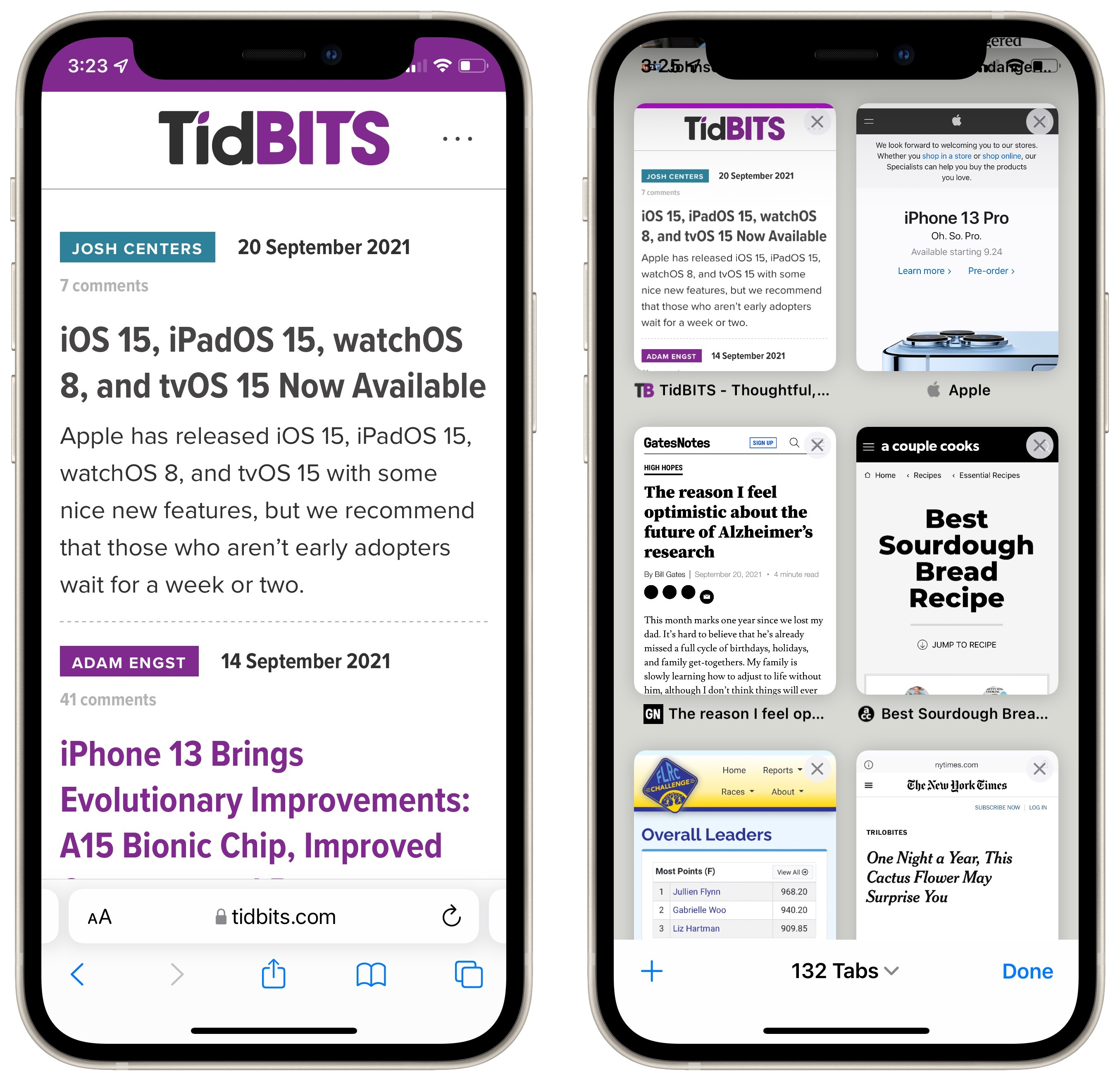
The bottom-mounted tab bar features another nice touch: you can now swipe left or right to switch between tabs quickly. Along with tapping the tab button in the lower-right corner, you can also swipe up on the tab bar to reveal all tabs, although that gesture is a little tricky on a Face ID-enabled iPhone since you have to start just above where you’d normally swipe up to return to the Home screen.

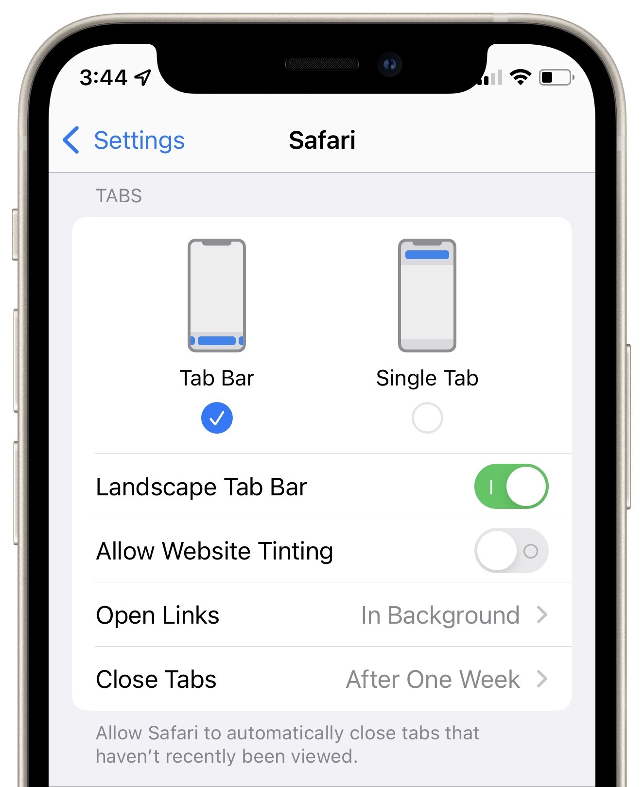
Although the new position makes sense and feels actively easier to use, it does require that you rewire your muscle memory. If that proves too difficult or you prefer the old approach, you can switch back. Go to Settings > Safari, scroll down to Tabs and select Single Tab.
However, I encourage you to try the new way for a few days, since it’s easier to use and less RSI-provoking once you get used to it.
Safari’s Rainbow
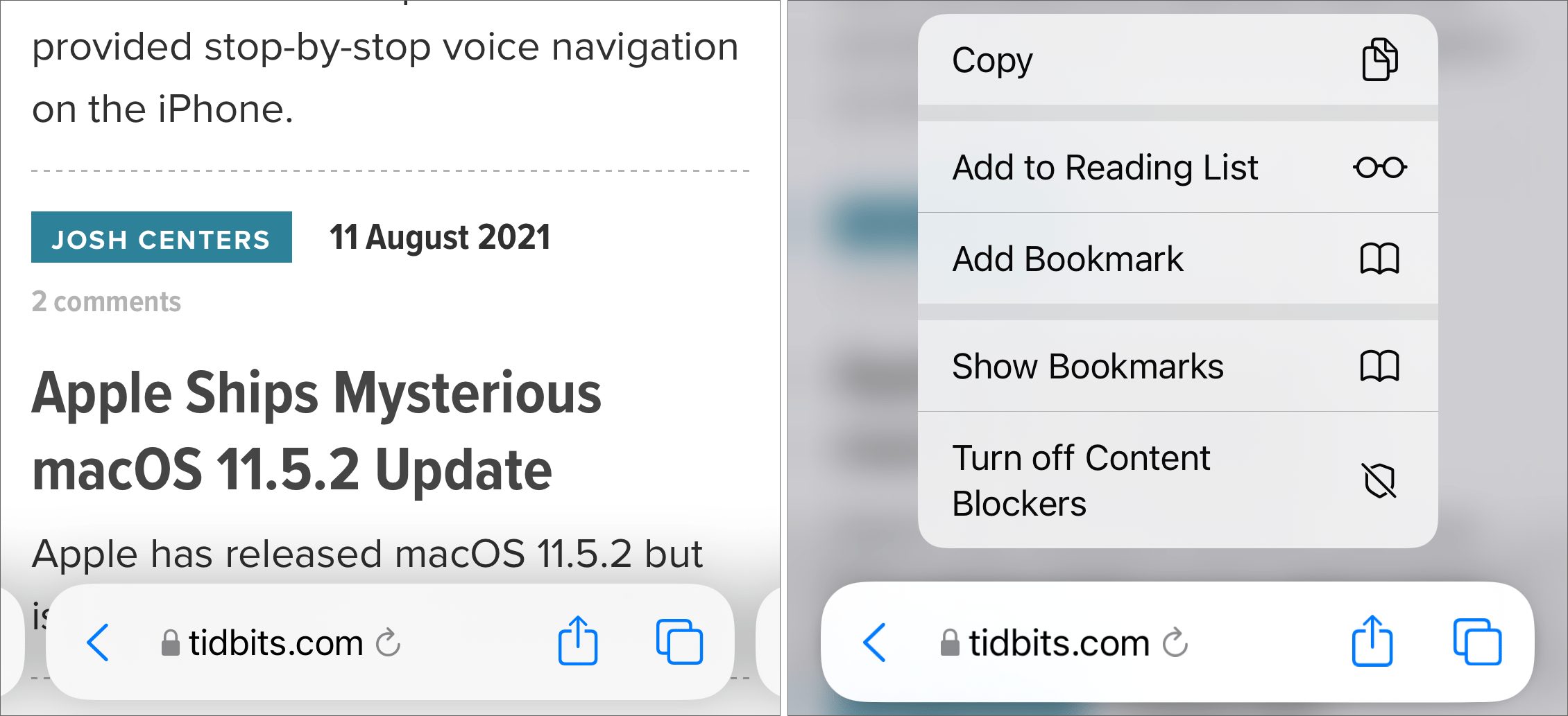
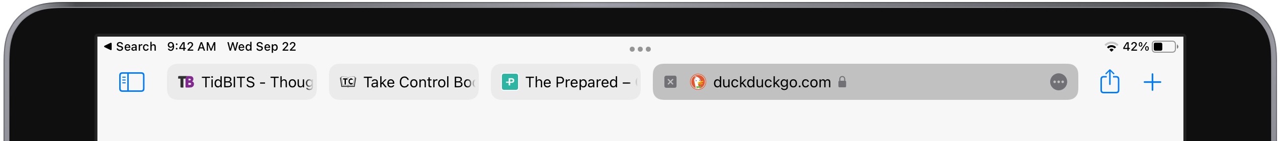
There’s another tab-related setting in Settings > Safari that you might want to disable to revert to previous behavior. As you may have noticed in the screenshot at the top of this article, Safari on the iPhone colorizes the status bar area at the top of the screen in an attempt to match the “color” of the site. I quote “color” because it often picks up an accent or logo color—it doesn’t necessarily take its cue from the main site background color.
As a result, loading the TidBITS site turns the status bar a deep purple and keeps it that way even if you scroll down (below left). If you don’t like the effect, you can disable Allow Website Tinting and return the status bar to a translucent overlay (below right).

(We’ve since changed our meta theme-color to white to remove the purple bar in Safari when viewing the TidBITS website.)
Safari in iPadOS 15 didn’t see as radical a redesign as Safari in iOS 15, but it doubles down on this color change approach. Where Safari in iOS changes just the relatively small status bar area, Safari in iPadOS turns its entire tab bar the dominant color of whatever website you visit. The idea is to make it easier to figure out which site you’re viewing as you switch between tabs.
You may not find it helpful because there’s no predicting what color any given site will be. It can also be a rather glaring effect. Worse, it’s logically confusing, since not all of the controls in the tab bar are associated with the current site, so it makes no sense to connect them by color.
As with the iOS version of Safari, you can revert to a calm gray tab bar if you prefer. Go to Settings > Safari and turn off Show Color in Tab Bar.
Compact Tab Bar in iPadOS 15
If you want a look at Apple’s original concept for Safari’s tab bar in iPadOS 15, go to Settings > Safari, and under Tabs, select Compact Tab Bar.

It combines tabs with the address bar to save screen real estate. I find it cluttered and bewildering, so I’m glad it’s not the default.
You might wonder where the back and forward arrows have gone—they only appear when there’s a page to which you can tap them to navigate. Even more confusingly, there’s no obvious way to view all open tabs. You have to open the sidebar and tap the tab icon to the right of the number of tabs—tapping the text isn’t sufficient.
Voice Search
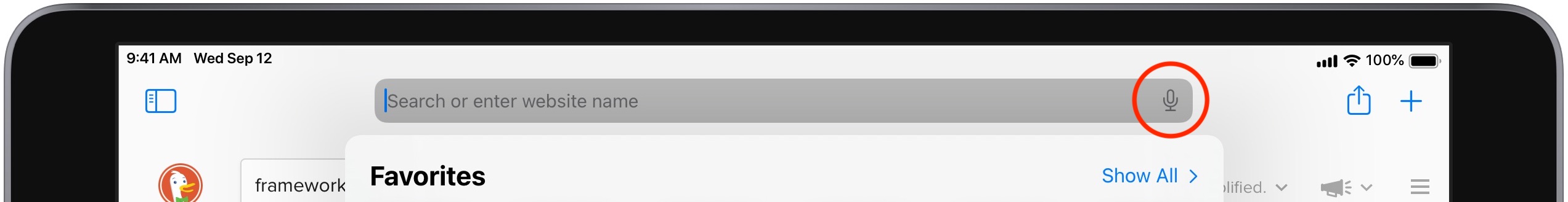
Apple has a mixed record with dictation and voice recognition, but Safari’s new voice search feature is incredible. Tap in the address bar, tap the microphone icon, speak a search query, and Safari will search using your default search engine. There’s no need to tap Go or anything else—the search activates as soon as you stop speaking.
In some but not all cases, a voice search may take you directly to a particular site. If that’s desirable, you can ensure that it navigates directly to a site by saying its URL, as in “tidbits dot com” or even “talk dot tidbits dot com.” We anticipate using this feature heavily.
Safari 15 on the Mac doesn’t include the voice search button, which is a crying shame.
Tab Groups and Private Browsing
Another high-profile new feature in Safari is Tab Groups, which lets you create and switch among collections of tabs. The idea behind Tab Groups is to help solve the problem so many of us have: having hundreds of unrelated tabs open at once.
You can make as many groups of tabs as you like. You could have one tab group for your work, another for an upcoming trip, and a third for research for something you’re looking to buy.
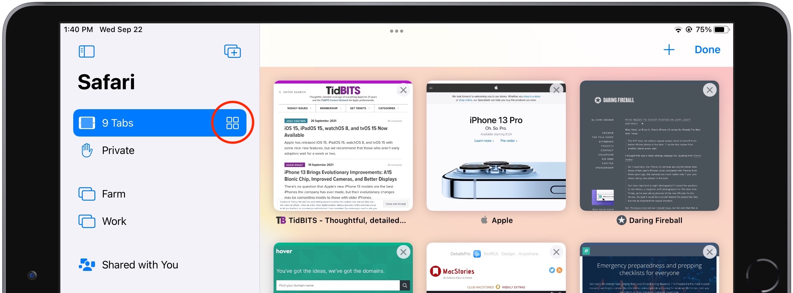
To work with tab groups, first open the tab switcher by tapping the tab icon or (if your tab bar is on the bottom) swiping up on the tab bar. Tap X Tabs, where X is how many tabs you have open, to reveal the Tab Groups menu. Then:
- To create a new tab group, tap New Empty Tab Group, give it a name, and tap Save. You can also tap New Tab Group from X Tabs to create a tab group from the tabs you currently have open.
- To switch to a different tab group, tap it in the Tab Groups menu.
- To delete a tab group, swipe left on it to reveal a delete icon.
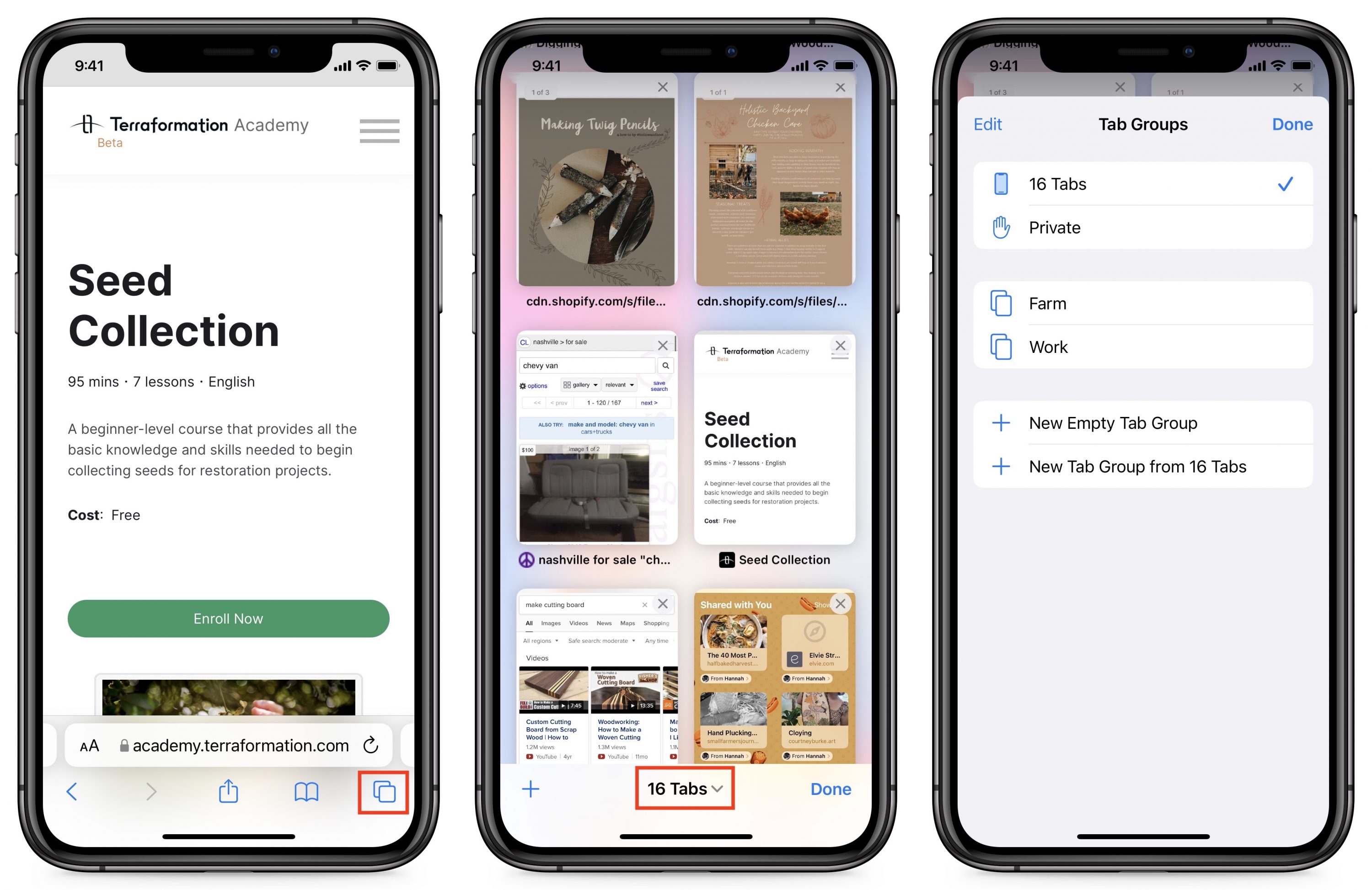
If you regularly use Private Browsing to prevent Safari from remembering anything about your browsing session, note that you now access it like any other tab group—it’s called Private in the Tab Groups menu.
The Tag Group interface is similar on the iPad, though the tab icon has changed to better represent the tab switcher interface there. You can also access Tab Groups from the sidebar.
Personally, I find Tab Groups a bit confusing, at least on the iPhone, since I often switch between projects and don’t remember to switch to the appropriate tab group first. Then I lose track of even more tabs than I used to because they’re tucked away in some other tab group. Tab groups do sync among your Apple devices, so it’s possible that they would work better for me if I browsed with Safari on the Mac (see “Safari 15,” 21 September 2021), which adds Tab Groups to Safari in macOS 11 Big Sur and 10.15 Catalina).
Tab Grid
Another nice new change in iOS 15 is that Safari now formats its tab switcher as a grid instead of a card stack, just like on the iPad. The grid makes it much easier to see which tabs are open, plus you can press and hold a tab to move it around. You can swipe tabs to the left to close them or tap the somewhat obscured X button, which Apple oddly put in the upper-right corner like Windows. It would have made more sense to mimic the offset upper-left corner approach used when deleting apps in the App Library.

Want to close all open tabs so you can start fresh with Tab Groups? Press and hold the Done text label to reveal the secret option. Why Apple hid it there is baffling, and there’s zero indication that “Done” would have any secondary function.
Shared with You
Have you ever dug through a Messages thread trying to find an article someone sent you? Shared with You, a new feature in some of Apple’s built-in apps, corrals these links so you can access them all in one place.
On both iOS 15 and iPadOS 15, you can get to Shared with You from Safari’s start page, which you see whenever you create a new tab or tap in the tab bar. (You may have to scroll down to see it, under the Favorites and Frequently Visited collections.) Tap Show All next to Shared with You to see all the links. On the iPad, you can also find Shared with You in the sidebar. (At least in theory—it doesn’t appear on Adam’s iPad Pro running iPadOS 15, even after I explicitly sent him a link that does appear in Shared with You on his iPhone 11 Pro running iOS 15.)

Other Features
Those are the most significant new features, but Apple also added some smaller features that are less likely to impact your everyday usage:
- Customizable start page: I describe how to edit the start page in detail in Take Control of iOS 15 and iPadOS 15, but in short: create a new tab, scroll down to the bottom of the start page, and tap the Edit button.
- Pull to refresh: Loren Brichter introduced the pull-to-refresh gesture in Tweetie over a decade ago, and it has become a standard iOS convention since, used even in some Apple apps. Apple has finally integrated it into Safari. When you’re at the top of a Web page, pull down on the page to reload it. This gesture is why Apple initially hid the refresh button in earlier betas.
- HTTPS upgrade: If you visit a website that supports encrypted HTTPS but is also loading insecure content over unencrypted HTTP, Safari will now ensure that you connect to it over HTTPS so your entire connection is secure. This feature emulates the Electronic Frontier Foundation’s HTTPS Everywhere browser extension and really should be the default for every Web browser, as it is for Brave and Firefox.
- Web extensions: Safari in iOS and iPadOS finally supports full Web extensions just like on the Mac. Extensions may or may not be a big deal for you, but they add essential features for some people, so I’ll explore that topic in-depth in another article.
In the end, the new version of Safari in iOS 15 and iPadOS 15 offers numerous changes, many welcome, some less so. It’s clear that Apple wanted to make even more sweeping interface adjustments but moved too far in the direction of condensing and hiding controls. Luckily, options let you reverse most of the major interface changes if you don’t find them helpful.
What do you think? Which of these features and interface tweaks improve your Safari experience? What would you like to see Apple do in the future to make it even better?
I just discovered a new feature: Multiple timers on the Apple Watch.
I tried to set a timer via Siri for 25 minutes, but it got a five minute timer. So I tried again. Five minutes later, the five minute timer (which I thought got canceled) beeped, but the 25 minute timer was still counting away.
I can even label the timers which is great when cooking lots of stuff for Thanksgiving (“Set cake timer for 30 minutes. Set gravy timer for four minutes. Set turkey timer for 90 minutes…”)
For some reason, this doesn’t work with the iPhone.
One other thing: labeled timers only work when they are created with Siri. If you start a timer from the timer app itself, you cannot label it. (You can start multiple timers from the app, though, too.)
A good rundown of all that is new in watchOS 8:
Great article. Re closing tabs on iPhone, you can also swipe one to the left in Tab Grid to remove.
Thanks, I’ve fixed that now. I must have swiped right and then assumed you couldn’t close tabs by swiping.
One “improvement” of Safari on the iPad I would pay money to reverse: Apple switched the appearance of foreground and background tabs, so that the darker, greyed-out, apparently disabed tab is actually the one you’re reading.
One of Appe’s competitive advantages over Microsoft used to be a consistent and sensible appearance of controls. Apple have slowly been vitiating this for years.
Super article Josh. Thanks. Two comments:
re: “there’s no obvious way to view all open tabs. You have to open the sidebar and tap the tab icon…”
On my iPad, there’s a tab icon in the upper right corner — in the same “row” as the address bar.
One change that I don’t think you mentioned (and which is a change I don’t like) is that you no longer see the tabs of other Mac and iOS devices you own (iCloud tabs) — when you select to view open tabs. Instead (unless there is an option to modify this that I haven’t found), I have to open a Start page and scroll down. Ugh!
Also on the Mac, there’s a “Show tab overview” button that can be put in the top window bar.
On Mac Safari there’s a dedicated “Show iCloud Tabs” button for the window bar. No such widget on iPadOS Safari? (on iOS Safari those show in a list under tab view)
BTW, the capitalization above is taken verbatim from tooltips. Whatever happened to consistency and care to detail, Apple?
The tab overview is simply the tabs for the currently open tab group arranged in a grid. You can delete or rearrange the tabs in that view.
What would I like to see Apple do in the future to make Safari even better? Wow - answering that would take an enormous amout of time so I’ll just post the first ones that come to mind.
Have a setting to open all pages with all animation initially disabled (except perhaps those on one’s white list). Animation could be activated as needed for a page. This would separate Apple from Google and evil as much as anything else I can think of. Many people like me cannot tolerate very much animation and a lot of that has to do my vision. Animation is perhaps the most abused feature on web pages. Of course it would be a large task to implement this drastically needed option.
Have an indicator for the current page that effectively tells you when that page was last fully loaded and if the page updates dynamically. This will save billions of unecessary reloads and keep all of us from missing important information when we thought we had a fresh page but didn’t. It wouldn’t be perfect because some items (including images) get cached in numerous places and it’s hard to force immediate reloads from the host on some things, but an effort to provide the status of what’s displayed really matters.
In iOS Safari, trying to view and edit the URL in the address bar is an unmitigated disaster. It drives me crazy how the current implementation can be deemed acceptable. I know I can choose “email the page” just to capture the URL and work with it from there, which I do, but it’s wrong.
In iOS Safari, selecting and copying text in HTML pages (and actually everywhere else) is way harder than it should be. Things have barely improved, if at all, in the history of iOS. There needs to be a major effort focused just on this which can relieve an untold amount of pain. (I don’t mean copying text that the owner has tried to protect from copying, although bypassing foils might not be a bad idea either since if someone wants some displayed text bad enough, they will always get it.)
In latter versions of iOS Safari on the iPad, rearranging tabs has been an incredible nightmare and it’s far too easy to unintentionally drag a tab into a separate and new Safari process. Futhermore, there should be an immediate way to undo the last organizational or whatever change because many are by accident. Being offered recently closed tabs to reopen is a start and already available but it’s usefulness is limited. I also think that deleting anything by swiping ideally should be reversable because things can be lost with the slightest unintended swipe.
In iOS Safari, there should be a button or something to jump to the bottom of the page. I use a bookmark to do this which I think is Javascript.
In iOS Safari, it would be a good idea if Apple could isolate the “find in page” text search function. It’s a bit awkward combining it with web search.
Apple should assist us in dealing with certain ridiculous web page designs. The above request for disabling animation is critical for several reasons including making it possible to navigate through a simple article which is unnecessarily spread over many web pages to get in their 100 to 1 ads over content bloat. These unscrupulous pages are almost always avoided but they’re everywhere and anything that fights garbage is good.
There’s also the bottomless pages that continuoulsy load additional content when one reaches bottom. Sometimes one has no idea what they’re getting into and navigation in many of these pages can become perilous on any browser anywhere, but it’s epecially bad in a mobile OS. Perhaps the browser can set a limit on dynamic end-of-page loads and then fool (and foil) the server and use additional tabs for the abyss. I do not know what actually might work or help (I’ve only begun to think about it), but it’s only the browser and the user that can do anything to discourage runaway pages. Sometimes the problem is just lame page design but it’s also a gimmick.
If you haven’t already, it sounds like you should go to System Preferences > Accessibility > Display and check “Reduce motion.” Doing so won’t make Safari automatically stop animations but it sets a media query property that site authors can check for. Conscientious authors can have a design variation that doesn’t use motion. In addition to honoring that OS setting, the home page for Nintendo’s Animal Crossing has an on-screen button to reduce motion on that page (it prominently features big motion animation).
Thanks Curtis for reminding me. I checked the reduce motions settings on my iPad and they are mostly the opposite of what I want. I checked my iPhone and the motion settings were already set to my desires. Perhaps my iPad settings got lost when I upgraded my iPad. I forgot how much difference it makes in Safari but I’ll find out. It should be better than nothing.
Thanks for the kind words. I was referring to the Compact Tab Bar option, in which there isn’t an obvious tab button.
Fair enough to say that this is not obvious, but a pinch of two fingers diagonally (e.g. a zoom out gesture) shows the open tabs in that window. Zoom gesture on one of the tabs makes that tab open as the current tab (though why you would do that rather than just tap the tab?)
Yes you were. I wound up re-reading that sentence “out of context.” And that led to my comment. My bad.
Yep…that’s terrible UI.
It’s surprising how Apple is flip-flopping on this.
With Big Sur the active window (and the active tab) became lighter, and backgrounded windows became darker. The exact opposite of how it was on previous versions of macOS.
Now with Safari 15, Safari appears to be going the reverse. Light tabs now indicate backgrounded tabs, while the foreground tab is lighter.
It would be nice if Apple made up its mind and then stuck with something for more than 18 months at a time.
I’m confused on how to work with windows in Safari in iPad OS 15… I think i’ve figured out the Tab Groups, which sort of make sense, but… I now have several windows open, each with multiple tabs, or just the start page. How do I close one? Why are tab groups in one place and windows in another? Why do my tab groups persist across windows? Can I turn it all off?! Can I move the … that invokes the split view window things? It’s smack in my muscle memory spot for ‘go to top of page’ and ‘go to url bar’.
After some futzing around:
Grumble
Cheers,
Dave
You can also close a window that you are not actively using by tapping the multitask three dot control on the top, which will show icons for all of your Safari windows at the bottom (so, for example, you can switch to another window,). But you can swipe any of the non-active windows up to close the window (and all of its tabs, so be careful,)
The long-press the window control icon and merge windows is not new - that’s been around since split view and slide over started (iOS 9?)
In Safari on iOS 14 I had things set up such that when I launched a new tab or hit the address box, I would see a bunch of icons representing links in one of my bookmark folders. I cannot for the life of me figure out how to get that back in iOS 15. Every time I now open a new tab or hit the address bar, I see an empty page telling me something about Reading List. Any suggestions how to get back previous behavior?
Edit: finally got it. Hidden behind the Edit button. I was searching for it in Safari prefs since I initially assumed the Edit button pertained to Reading List in which I had no interest.
Hit the + to open a new tab. Scroll to the bottom - there should be an edit button. This lets you customize the start page. You probably want Favorites turned on and at the top of the list.
I’ve actually been enjoying the new URL bar at the bottom. Not so much because of having to type at the bottom (still wrestling with my muscle memory on that one), but because it makes tab navigation so simple. Swiping between tabs is so convenient. As is being able to open a new tab by just swiping beyond the last tab. The one last thing I’m looking for to no longer have go into the tab interface at all, is some kind of swipe or press to close the current tab. I noticed there’s no option for that in the menu that opens after tap and hold. Any ideas?