Do You Use It? Clear and Tinted Icons Are a Hard Pass
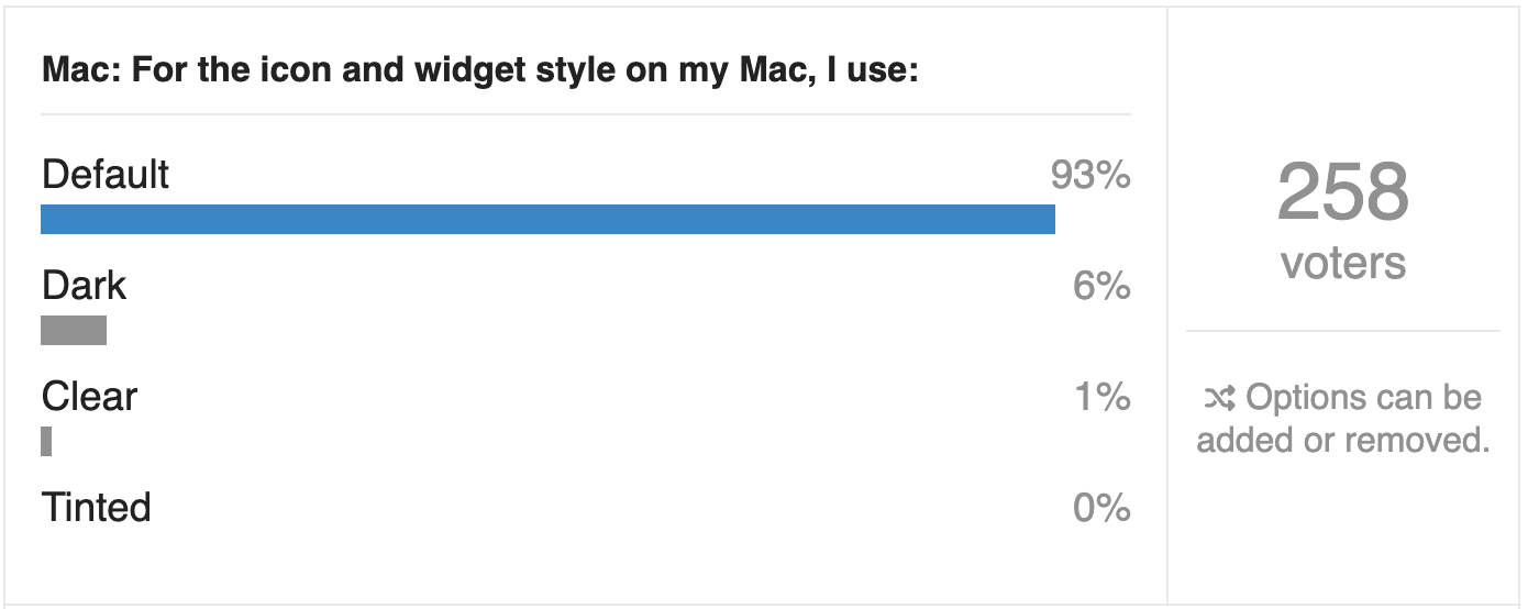
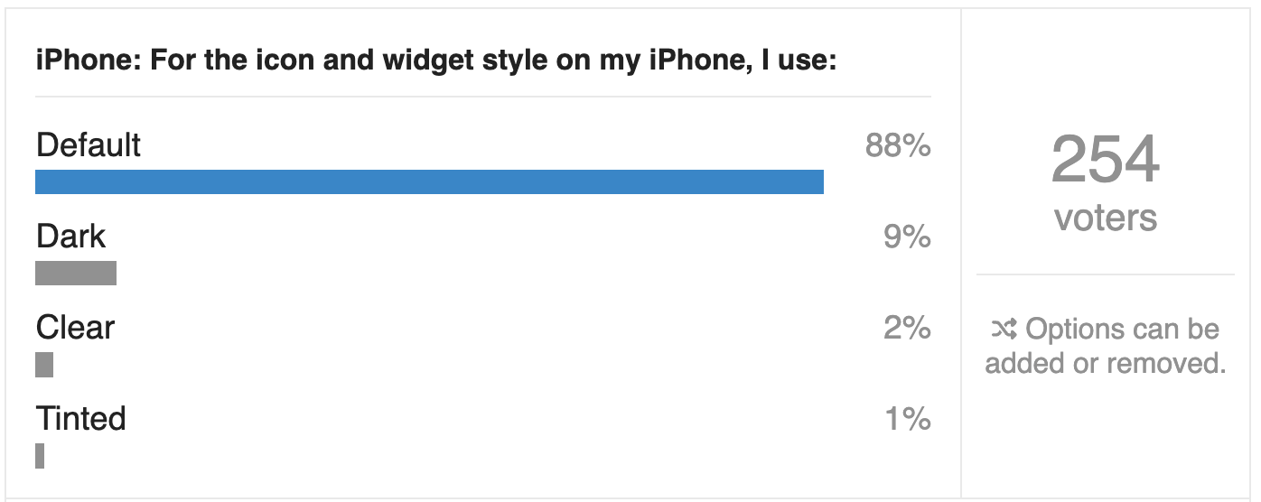
I’m always interested to see the results of our Do You Use It? polls, but some surprise me more than others. Our latest poll, “Do You Use It? Clear and Tinted Icons” (23 June 2026), was not one of them. It asked if you use Apple’s new clear or tinted style for your icons (and widgets) on the Mac or iPhone, and unsurprisingly, almost no one does.
Of the TidBITS readers who chose to respond to the poll, only 1% said they use clear icons on the Mac, and no one admitted to using tinted icons. On the iPhone, clear icons were twice as popular—a whopping 2%!—and just 1% of respondents said they use tinted icons. Dark icons, which retain color, were slightly more popular, but still couldn’t escape single digits, with 6% on the Mac and 9% on the iPhone.
TidBITS readers are perhaps the least likely demographic to switch to clear or tinted icons, because we have had many years to become accustomed to distinguishing icons by color. I even know people who organize their apps by color. Color is good!
The entire point of icons on the Mac and iPhone is to serve as the visual identities of apps, so you know which app you’re launching. Anything that makes it harder to distinguish between apps loses usability points.
Free Mac Icons from Squircle Jail
But remember that the poll’s real impetus was a related usability complaint: starting in macOS 26 Tahoe, Apple forces all app icons into a squircle shape, stripping away another key differentiator. Just as we distinguish icons and objects in the real world by their color, we also distinguish them by shape. After our conversation that triggered this poll, Paul Kafasis wrote an impassioned Free the Icons plea where he shows how icons suffer both aesthetically and functionally from “icon jail.” As Paul says:
Past icons weren’t just more expressive. They were also more usable. Having distinct shapes provided a useful way to tell icons apart. Tahoe eliminates that cue by forcing everything into the same squircle, leaving color as the primary way to tell icons apart at a glance.
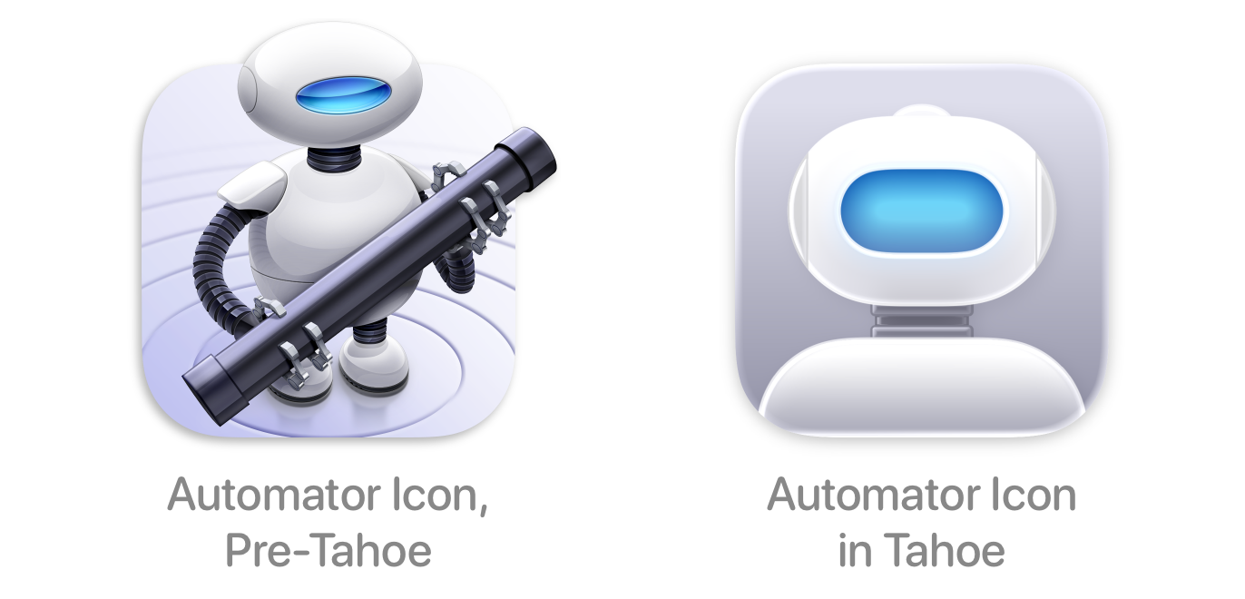
Automator is the poster child here, going from an easily distinguished and thoroughly engaging little robot oozing with personality to a bland mugshot of a staring automaton that wouldn’t feel out of place doing maintenance in Apple’s “1984” ad. (I was amused to discover that the filename of Paul’s Automator comparison screenshot is a quote from The Godfather: lookhowtheymassacredmyboy.png.)
At his Unsung blog, designer and interface wonk Marcin Wichary explores the topic of icons, pointing out that iOS is highly spatial, so icon location matters as much, if not more, than icon color, and helps explain why Apple has always required squircle icons in iOS. macOS, in contrast, is much less spatial—you can’t depend on app icons to be in the same place in the Finder, Spotlight, or App Switcher, and even the Dock is quite malleable. Without location as a primary way of identifying apps, color and shape matter more. His summary:
Apple has not done a good job shepherding their app iconography system. The system feels too rigid, and some of its ostensible benefits (dark mode, color tinting, glassification) have been executed poorly.
At least clear and tinted icons are just ill-conceived options that we can—and most people do—ignore. Forcing all app icons into squircles harms usability, hurts aesthetics, and erases app personality.
Apple, free the icons!


I can’t be bothered to track down how Apple described clear and tinted icons when they were introduced, but I am curious about the adjectives they used.