TidBITS#1288/07-Sep-2015
Here at TidBITS, we’re getting ready for this week’s kickoff to the Apple upgrade season, and now you can too, with Joe Kissell’s “Take Control of Upgrading to El Capitan” and Scholle McFarland’s “El Capitan: A Take Control Crash Course.” Grumpy about the annual upgrade cycle? Adam Engst feels your pain, but explains why you really should keep pace with upgrades. If you’re overwhelmed by unwanted digital chatter, Josh Centers spells out how to clean up your Twitter timeline using the Tweetbot client. Turning to the digital detritus that collects on all our computers, Joe Kissell shows you how use CleanMyMac 3 to freshen up your Mac. Glenn Fleishman takes a look at the early reviews for Google’s OnHub router, and they’re not pretty. Looking for an alternative to a pricey Apple Watch? Julio Ojeda-Zapata joins us to review the affordable Pebble Time smartwatch. Notable software releases this week include TextExpander 5.1.1, Alfred 2.7.2, and Carbon Copy Cloner 4.1.4.
Prep for El Capitan Now with Take Control Books
Here we go again! Apple plans to release OS X 10.11 El Capitan this fall with under-the-hood improvements aimed at increasing performance and zapping bugs, along with changes to the Finder and core Apple apps (for details, see “Snow in Yosemite: Apple Introduces OS X 10.11 El Capitan,” 8 June 2015). Because it’s only a matter of time before your Mac starts nagging you to upgrade to El Capitan, we have the early-bird release of Joe Kissell’s “Take Control of Upgrading to El Capitan” available now and Scholle McFarland’s “El
Capitan: A Take Control Crash Course” available for pre-order. If you want to get ready in advance, either book is available now for 20 percent off, or you can save 30 percent on both. These discounts will expire once El Capitan ships.
“Take Control of Upgrading to El Capitan” is the ninth installment in our long-running series of “Upgrading” titles. In this 74-page early-bird version, Joe helps you with hardware and software compatibility, problem prevention, prepping your drive, and picking the best installation method. Whether you’ll be upgrading from the 10.11 El Capitan public beta or from 10.4 Tiger — or anything in between — he coaches you through making a bootable duplicate of your main drive and gives you pointers for eliminating digital clutter and handling last-minute preparations. Until El Capitan ships, the ebook is 20 percent off, dropping the $15 price to
$12.
Once Apple releases El Capitan, we’ll publish a version 1.1 update with full installation steps, post-installation advice, troubleshooting help, and more. Look for “Meet Me Back Here on Upgrade Day” in the ebook to learn how to get the free 1.1 update, or just watch for an email message with direct download links.
“El Capitan: A Take Control Crash Course” will — once it ships — help you explore changes in the Finder and new features in apps like Safari and Notes, and update your know-how of key Apple technologies, including notifications, iMessage, Handoff, iCloud Drive, AirPlay, AirDrop, and Family Sharing. You’ll also find directions for working with Finder tags and Finder window tabs, plus special topics on user accounts and troubleshooting. As with all our Crash Courses, this book is designed to make it easy to dip in and read quickly, picking just those topics that interest you. During the pre-order period, you’ll save 20 percent, making the $10 cover price
only $8.
When you pre-order this ebook, you’ll download a one-page PDF. After Apple makes the official release of El Capitan available, you’ll be able to click a button in the PDF to get the full ebook (in PDF, EPUB, and Mobipocket formats) and start learning about El Capitan. We’ll also send you email with download links.
If you want both books — for assistance in upgrading and then learning El Capitan’s new features — you can get them in a bundle for 30 percent off (this link puts the books right in your cart). The discount drops the combined list price of $25 down to $17.50.
Thanks for supporting Joe and Scholle — they do great work in bringing you high quality, in-depth content!
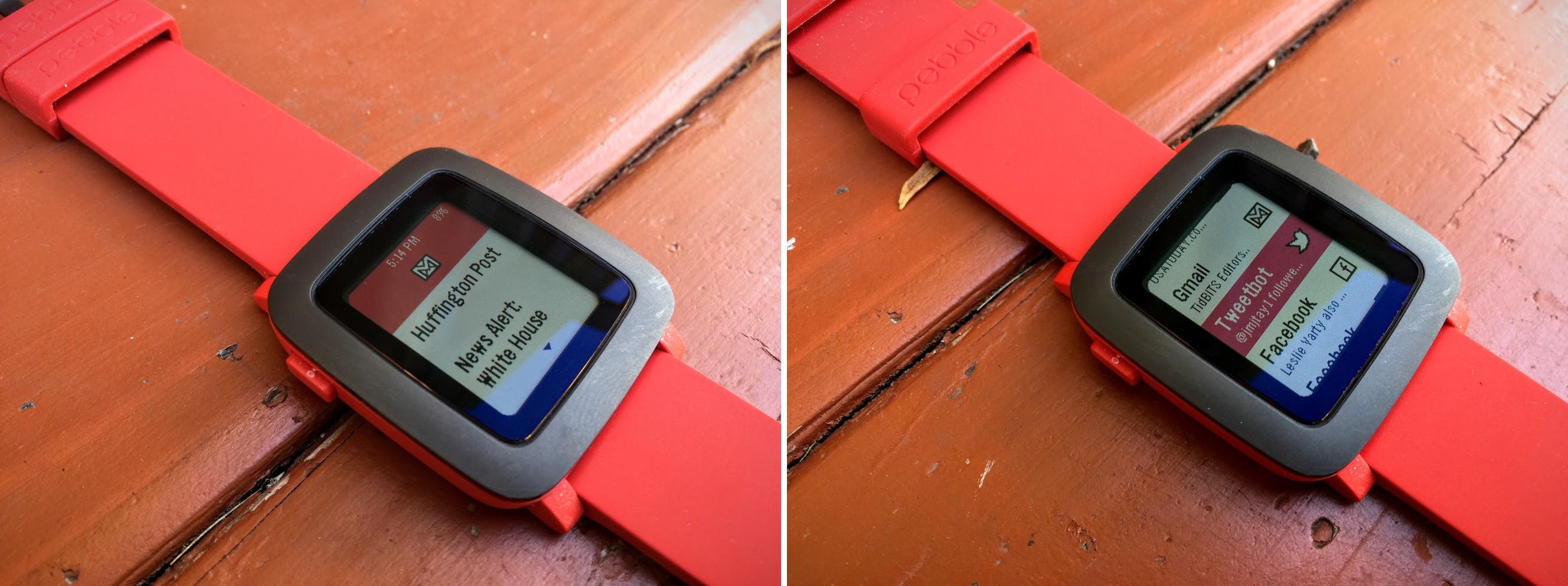
How to Mute Unwanted Tweets in Tweetbot
Tired of your Twitter timeline being trumped by tedious topics? If an otherwise interesting person has a side obsession with something that annoys you, the temptation to unfollow her can be swift. But before you take your puck and go home, try muting, which can filter out uninteresting or even offensive tweets from people you otherwise enjoy following.
Twitter has its own muting functionality, but like many native features from the company, it’s weak, since you can mute only people, not keywords. As always, other Twitter apps do a far better job. Twitterrific for iOS and TweetDeck for Web and Mac are two of the more popular clients that offer this functionality, but my muting client of choice is Tweetbot by Tapbots, which comes in Mac ($12.99) and iPhone ($4.99) versions that sync perfectly. Its muting
functionality is highly customizable, which is essential when it comes to filtering the crud from your Twitter stream.
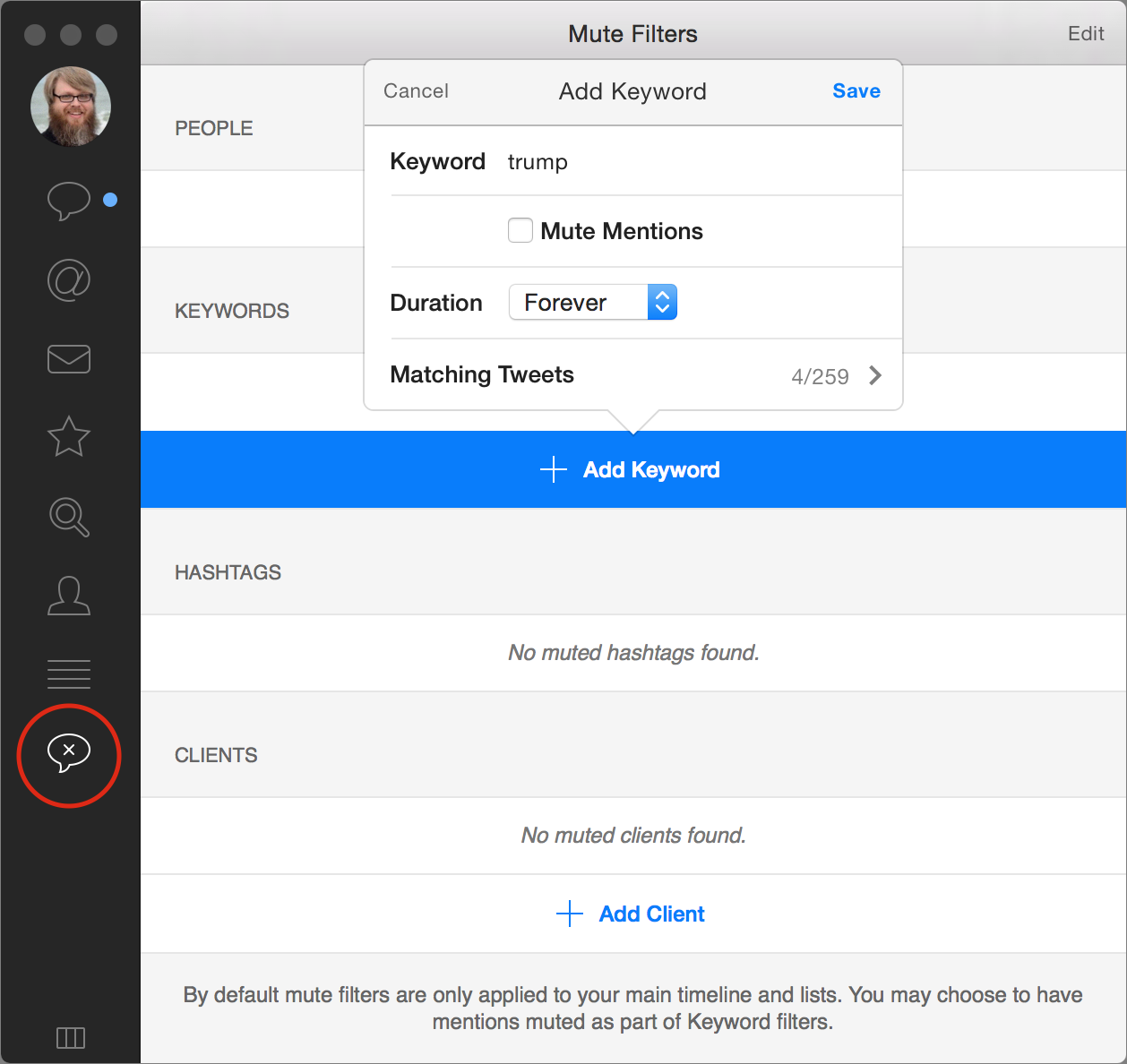
Muting in Tweetbot for Mac — To create and manage mutes in Tweetbot for Mac, click the Mute Filters screen (the speech bubble icon with an X in it) in the sidebar to see your existing mutes, add a new keyword mute, or mute a Twitter client.
To mute a specific word so that tweets containing it never show up in your timeline, click Add Keyword. Enter the keyword you don’t wish to see, and choose a duration of forever, one month, one week, or one day. By default, you’ll still see @-mentions directed at you even if they contain that keyword, but selecting Mute Mentions prevents even those tweets from appearing. A nice touch is that under Matching Tweets, Tweetbot lets you know how many current tweets the mute filter would have blocked. When you’re finished, click Save in the upper right. Tweetbot asks if you want to remove tweets that match your new mute filter from your timeline, which you probably want to do.
You can also block a Twitter client here, by clicking Add Client and selecting a client from the list. This may seem like an odd feature, but some apps, like Foursquare, can fill your timeline with unwanted automated tweets, and you can use this to block them entirely. Woz, I’d love to hear anything from you other than your Foursquare check-ins.

If you change your mind and want to unmute something, click Edit in the upper right, and then click the red delete button to the left of an entry.

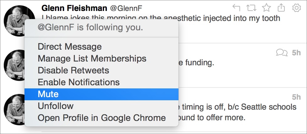
Oddly, you cannot mute a user or a hashtag from the Mute Filters screen. To mute a user, go to his profile, click the gear icon to the left of his avatar, and select Mute from the pop-over. You will be asked how long you want to mute that user: forever, one month, one week, or one day. You can also mute a user by Control-clicking his avatar in your timeline, or by Control-clicking an @-mention in a tweet, and choosing Mute.
Why mute a user instead of just unfollowing her? Perhaps you know her personally and don’t wish to offend her. Or maybe you normally enjoy following her, but she’s gone on a tweeting binge and you want her out of your timeline temporarily.
Likewise, to mute a hashtag, Control-click it in your timeline and select Mute. Some users tag their tweets with hashtags, making it easy to filter out entire topics.
Muting in Tweetbot for iPhone — On the mobile side, muting in Tweetbot for iPhone works similarly.
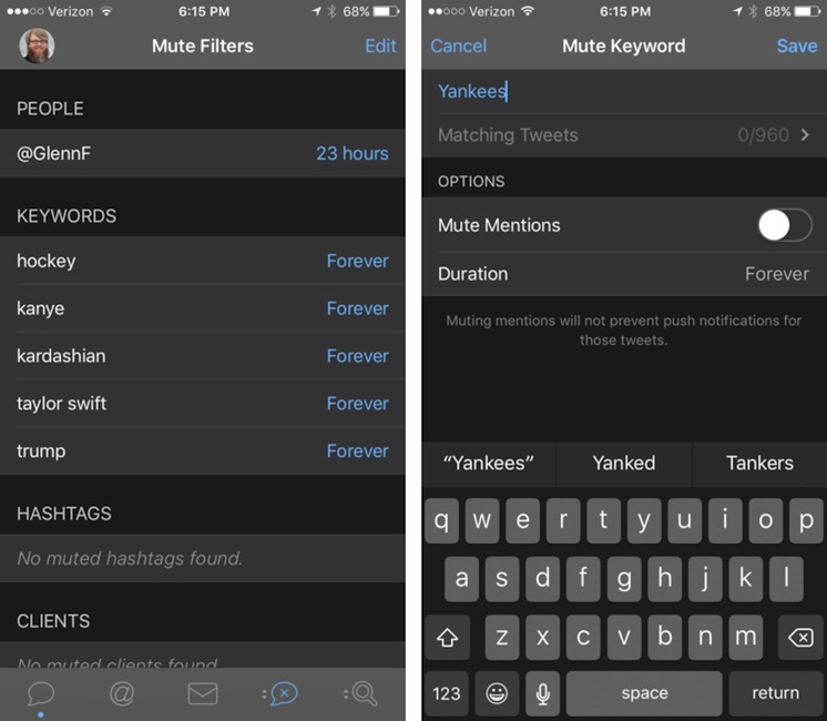
First, you have to find the Mute Filters tab. The last two tabs can be configured to contain different things, as alluded to by the arrows next to their icons. Press and hold one of those buttons and select the Mute Filters button (as on the Mac, it’s an X in a speech bubble).

If you’ve already set up mute filters in the Mac client, you’ll see them here. If you don’t see editing controls, tap Edit in the upper right. Just as on the Mac, you can delete existing filters by tapping the red delete buttons, and you can add new filters for keywords and clients by tapping the + in the upper-left corner.
Muting keywords is nearly identical to how it’s done on the Mac. Enter a keyword, choose a duration, decide whether or not to mute mentions, and Tweetbot will tell you how many tweets your filter matches. Likewise, muting clients works the same way as on the Mac: simply select a client from the list to mute it.
To mute a user, go to his profile, tap the gear icon, tap Mute, and choose a duration: forever, one month, one week, or one day. To mute a hashtag, press and hold it until a menu appears, and then tap Mute.

Of course, any mute filters you create in Tweetbot on the iPhone will be synced back to Tweetbot on your Mac.
I hope these tips help you increase the signal-to-noise ratio in your Twitter feed — keeping up with the service may be like drinking from a fire hose, but at least you can strain out the bits that leave a bad taste in your mouth.
Google’s OnHub Router Gets Rough Treatment in Early Reviews
Google announced its OnHub Wi-Fi, Bluetooth, and smarthome router just a couple of weeks ago, and released units to a few reviewers for articles that just appeared. The news is not terrific. (Google says OnHub is available for pre-order, but it’s listed as “out of stock” at its own site, and Amazon offers no purchase options except for third-party sellers, who can’t possibly have units.)
While most reviewers praised the ease of setup, the consensus is that many of OnHub’s features aren’t fully baked or fully implemented. Firmware updates will clearly bring improvements, but some problems may be related to hardware implementation. (For more on its features, see my preview, “Google OnHub Router Aims to Simplify Wi-Fi for Everyone,” 19 August 2015.)
In particular:
- Even though the OnHub is designed as a smarthome hub — supporting Google’s Weave, industry standards Thread and ZigBee (via 802.15.4), and Bluetooth Smart Ready — there’s no way to use those standards in the units that reviewers received.
- The USB 3.0 port is used only for a hardware-based restore. It can’t yet be used for hard drive or printer sharing.
-
A touted interference-avoiding feature designed to reduce congestion didn’t work for some reviewers and performed inconsistently for others. This feature also may have a key flaw that no reviewers mentioned but I’ll explain below.
-
While the OnHub is a simultaneous dual-band router, there’s no provision to set the 2.4 GHz and 5 GHz network names distinctly, as on gear from Apple and other makers. This can be useful for segregating high-throughput devices for video streaming (in 5 GHz) from other gear that just needs consistent and long-range access (in 2.4 GHz).
-
The OnHub can’t access some features — like seeing which devices are connected and changing its name — via the local network if there’s trouble with its Internet connection. Google loves its cloud, and functionality is compromised when the Internet goes down.
-
The way in which cables are plugged in bothered reviewers because there’s not much space inside the outer sleeve. The OnHub comes with low-profile cables, but regular cables may not work.
The reviewers who seemingly tested coverage and features the least had the best things to say about the OnHub; those who performed more complete tests were the least impressed.
Mixed Reviews Recommend Watch and Wait — The Wirecutter had the bluntest and most thorough review because the timing was right to put the OnHub through the testing developed for its wireless router buying guide update. (Disclosure: I did an edit of that update, but didn’t work on the OnHub review.)
In particular, The Wirecutter liked the ease of setup, and the capability to allow someone to configure it remotely, useful for getting a family member or technical friend’s help. They wrote about the OnHub:
This AC1900 [600 Mbps plus 1.3 Gbps] router is half as fast at long distance as routers half its price, and its current features are very limited compared to the competition — even compared to what Google advertises. Like Google’s Chromecast, there’s a lot of potential for Google to update the OnHub and pack it full of amazing features in the future. Wait to buy it then, if you must; don’t buy it now.
Other reviewers’ thoughts:
- IDG’s Mike Brown was more measured. He, too, is in the middle of 802.11ac router reviews, and was able to benchmark the OnHub against similar routers in the same circumstances. Brown didn’t like Google’s automatic channel reassignment, which didn’t seem to work at all for The Wirecutter, and he thinks power users will find it maddening. Overall, however, he found even the initial OnHub a good choice for a user who doesn’t want to fiddle with settings.
-
Ars Technica frankly admitted it didn’t have a battery of routine tests set up, but the OnHub didn’t fare well in a less formal approach. “It was fast enough and seemed stable, but it couldn’t match the performance of a ‘real’ $200 router.”
-
The Verge had a more upbeat tone. The reviewer found that swapping the OnHub into an existing network with a comparable router resulted in better performance, and it did a good job of filling in dead zones.
-
The Wall Street Journal was very positive, saying “it blows the AirPort away,” but the reviewer doesn’t describe rigorous tests. Rather, he anecdotally noted that an older laptop worked much better with the OnHub than with his current AirPort Extreme.
Don’t Flip That Channel! — Now, my note about interference avoidance. What I didn’t realize from Google’s announcement was that the OnHub’s 13th antenna and software check for network or signal congestion, and then dynamically switch the OnHub to a new channel without rebooting. There’s a huge problem with this approach. The basic Wi-Fi spec doesn’t let a base station tell a client adapter to change channels.
There is a mechanism to do this that’s part of the 802.11h standard, which was adopted way back in 2004 to allow use of the middle part of the 5 GHz band. The standard incorporates a few ways to back off active usage if radar signals are detected, as the U.S. government uses some of that range in parts of the country. A compromise between the military and the FCC allowed the general public and businesses to overlap so long as there was a way for base stations to avoid interfering. (There’s a dispute about whether base stations at their low power level could even interfere, but the deal was settled years ago.)
One part of the standard — Dynamic Frequency Selection (DFS) — does allow an access point to tell a client to change channels, and coordinates how to time it. This standard is built into all standard Wi-Fi chipsets that are used for client hardware and access points. However, I can’t find any reference to whether DFS is used at all in 2.4 GHz or if it’s used in 5 GHz outside those special channels, numbered 52 to 64 and 100 to 140. Most consumer base stations don’t even offer access to those channels. Any operating system or Wi-Fi chipset that lacks this support for other channels would simply be disconnected. (Thanks to Andrew von Nagy for running down the details!)
In any case, all modern operating systems automatically reconnect to networks with the same network name if they’re unexpectedly disconnected. When the OnHub changes to a new channel, it first disconnects all currently connected devices and then fires up the new set of frequencies. Once that happens, Wi-Fi devices scan and reconnect to the network — or at least, they should.
It’s unclear what happens if you’re in the middle of streaming video, engaged in a download, or using other session-based Internet protocols when the base station does its channel switch. The OnHub allows address reservation, so DHCP-assigned network addresses don’t change when a device disconnects and reconnects, but without that in place, every device could suddenly have a new local address, which would break many “stateful” or persistent Internet connections.
If Google is smart, the OnHub should monitor network traffic, and the congestion switch would occur only during sustained severe degradation or when traffic was extremely light and didn’t include any streaming media. (It could also notify an authorized user when congestion was severe, and suggest this sort of change.) But who knows? It wasn’t tested thoroughly in any of the reviews I saw.
Interim Buying Advice — I haven’t gotten my hands on a review unit yet, so I can’t speak from experience. However, given the clear factual issues plus consistent details from other reviews, Google would need to sort out problems, update firmware, and enable the router’s special wireless and hardware features before I could recommend it instead of an Apple AirPort Extreme ($199 list; $180 at Amazon right now) or Time Capsule ($299/$399), or a less-expensive competing router, like the highly regarded (if ungainly) TP-Link Archer
C7 ($139.99 list, $94 at Amazon now).
Save Space and Uninstall Apps with CleanMyMac 3
In the early days of Mac OS X, Apple made a big deal about how most applications were, by design, self-contained. To install them, you dragged them to your Applications folder, and to uninstall them, you dragged them from there to the Trash. Done! Everything you needed was contained in the application package — a folder that looks and acts like a single file. That was the theory, anyway.
Of course, it wasn’t quite true that apps were self-contained. Even for simple drag-to-install apps, there would nearly always be preference files, logs, and a few other items stored elsewhere. As Mac OS X evolved, more and more apps needed to put more and more files in more and more places. Running an installer or opening an app for the first time might scatter files all over the place, particularly in various subfolders of /Library and ~/Library, such as Application Support, Caches, Frameworks, and LaunchAgents. An app might also add login or startup items, System Preferences panes, Dock icons, menu bar doohickies, and assorted background processes.
Pretty soon, figuring out how to get rid of all that extra stuff when you wanted to stop using an app became a serious concern.
In 2010, Macworld asked me to write an article about uninstallers. The two questions I was tasked with answering were “Are they safe?” and “Do they work?” Long story short, the answers were “Yes” and “Yes,“ with various qualifications (see “Mac utilities: Do uninstallers work?”). I tested four of the most popular uninstaller apps available at that time, and found that although they all missed certain files, and some were easier to use than others, they seldom removed things they shouldn’t — and even when they did, it was rarely a serious problem.
The uninstaller landscape has changed since then, but uninstallers are still as important as ever. And since most Mac developers (for reasons I can’t quite fathom) don’t provide their own, a third-party uninstaller utility is handy to have around. That’s how I mainly think of CleanMyMac 3, even though the developer, MacPaw, positions it as an all-purpose cleaning and maintenance app. I’ve found it to be a great way to find and eliminate stuff I don’t need on my Mac — especially on my MacBook Pro, whose too-small SSD is constantly on the verge of filling up.
A Reality Check — Before I get into the specifics of what I like about CleanMyMac, I want to take issue with a marketing assumption that underlies nearly all Mac maintenance apps, including this one: that deleting files is a magical cure for your Mac’s problems. While it’s true that your Mac can slow way down and exhibit all sorts of misbehavior if you run out of disk space entirely (or come close to it), someone with 1 TB of free space is no better off, performance-wise, than someone with 100 GB of free space. There are good reasons to delete things you don’t need even if you’re not short on disk space (such as preventing or resolving software incompatibilities,
and reducing the time and disk space required for backups), but if you already have plenty of free space and you’re looking only for a performance boost, deleting stuff may be a waste of your time.
Likewise, a lot of the ostensible “junk” that maintenance utilities remove is in fact useful (which is not to say essential). All those gigabytes of cache files, for example, may seem worthless but are in fact helping numerous processes on your Mac to run more quickly and efficiently; removing them may slow down your Mac rather than speed it up. And, because Mac OS X rebuilds caches automatically anyway, that space savings you achieve by deleting caches will soon disappear.
And I should also point out that no matter how thorough a maintenance app may be, no app, by itself, handles all the preventive maintenance tasks you should perform regularly to keep your Mac in top working order. I talk about a great many more in my new book “Maintaining Your Mac: A Joe On Tech Guide,” which also covers a variety of other maintenance apps.
So, you should approach CleanMyMac, or any app of this sort, with the right expectations (and a bit of circumspection). It will help you find and remove files you don’t need, uninstall unwanted apps (including all those pesky, scattered files), and perform other useful maintenance tasks. But it might not improve your Mac’s speed, and if you want the best and safest results, you should carefully examine all its recommendations before agreeing to let it delete anything.
Cleaning Features — Let’s get down to specifics. CleanMyMac divides its features into two sets — cleaning (that is, deleting stuff) and utilities (including the Uninstaller and a long list of other tools). When you launch the app, you’re initially presented with a Smart Cleanup screen, which gives you a simple way to run all the cleaning tasks at once. Your first step — which is, itself, nondestructive and safe — is to click Scan so that CleanMyMac can figure out what may be ripe for deletion.
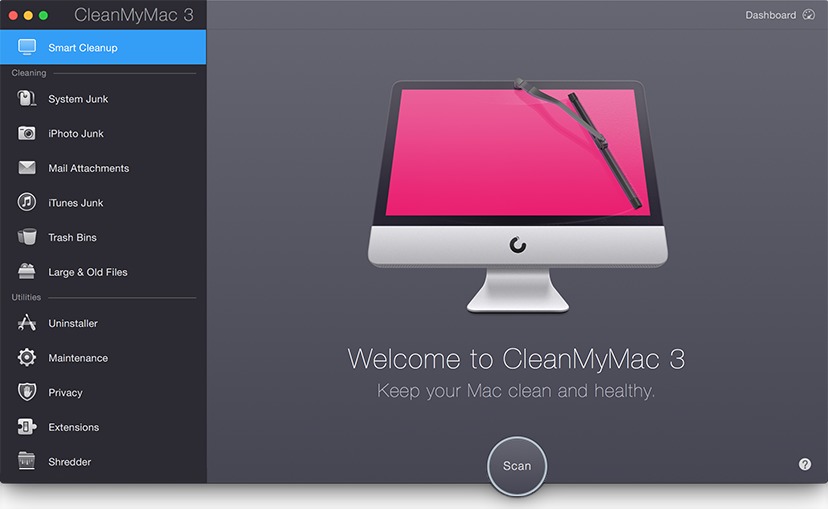
Do click Scan and wait for the results, but don’t click Clean until you’ve reviewed all the candidates (which you can do by selecting a category and then clicking Review Files or Review Details) and deselected anything you want to keep.
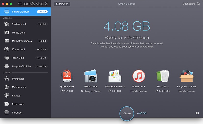
Here are the categories CleanMyMac considers:
- System Junk: This broad category encompasses a dozen types of data, including user and system caches, user and system log files, broken preferences and login items, “leftovers” (files that belong to software you’ve since uninstalled), your iOS photo cache, and “development junk” (redundant files created during an app’s installation or configuration). All those things can be deleted safely, although as I said, deleting caches isn’t necessarily a win, so I deselect the caches for the apps I use most frequently.Also in the System Junk category are a few items that are less clearly junk. Language Files (resources needed to run apps in other languages) are selected by default, on the grounds that if you’re only going to run your app in one language, all those extra files are worthless to you. Years ago, I saw cases where removing extra language files (using a utility such as Monolingual rendered certain apps inoperative, such as those in the Adobe Creative Suite. I haven’t seen that problem with CleanMyMac, which appears to have a well-curated internal list of what can safely be removed and what can’t. The same goes for OS X Localizations, which allow OS X itself to display its interface in other languages; as far as I can tell, removing them is safe. Similarly, leaving Universal Binaries selected removes code that’s inapplicable to your Mac’s processor (as in, removing PowerPC-specific code when running on an Intel-based Mac). But if removing any of these components from an app’s package makes you nervous, you can easily deselect that category.
- iPhoto Junk: CleanMyMac can remove the original versions of images in iPhoto that have been rotated or had red-eye reduction applied, since those can be restored to their original states if necessary. It can also optionally remove other sorts of original images, if you’re sure the versions you modified are all you need. Notably, however, it doesn’t offer similar cleaning for Aperture or Photos.
- Mail Attachments: With this option selected, CleanMyMac removes the extra copies of attachments that Mail stores if you open an attachment from within a message. It doesn’t remove the original attachment from the message, however, nor does it remove attachments you’ve manually saved outside Mail. In other words — and this is a general theme with CleanMyMac — it defaults to removing only those files you can easily recover.
- iTunes Junk: Depending on how you use iOS devices, iTunes may store copies of iOS apps, software updates, and outdated device backups that you can safely remove. But, if you have an important reason to preserve an older backup or software version, you can deselect it. iTunes Junk also includes partial downloads that never completed.
- Trash Bins: CleanMyMac can empty not only your Mac’s Trash (as you can do by choosing Finder > Empty Trash) but also the Trash in Mail, Aperture, and iPhoto. (Again: no, not the Recently Deleted items in Photos.)
- Large & Old Files: By default, CleanMyMac lists — but does not select for deletion — files over 50 MB, which you can sort by size, access date, and other criteria. This makes it easy to identify not only the largest files on your Mac but also smallish files that you simply haven’t used in a long time. You must manually select the items you want to remove, and you can choose to delete them outright, move them to the Trash, or relocate them to another folder or volume.
Although CleanMyMac’s cleaning features are no panacea, I’ve found them to be both effective and safe. But they’re just a part of what this app can do.
Uninstaller — My favorite feature in CleanMyMac 3 (and the first one listed under Utilities) isn’t flashy, but it’s effective: the Uninstaller. After you’ve scanned your disk, it lists all your apps. Select any app to see all the files CleanMyMac thinks are related to it. You can then check the box next to the app’s name to select all the related files, or individually select or deselect any files you want to keep. To erase the selected files, you then click Uninstall. (You can also click an Application Reset button to delete only preferences and supporting files, returning the app to its original post-installation state.)
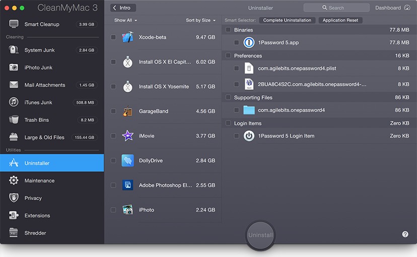
You can uninstall multiple apps at once, and search for apps by name. The Uninstaller also lets you sort apps by size, name, last launch date, and so on, and lets you filter the display to show old, unsupported apps that are no longer compatible with your Mac anyway.
Other Utilities — The remaining utilities are features that, with one exception (Extensions), I consider largely filler — they’re no big deal and there are other (free) ways to do the same thing:
-
- Maintenance: The Maintenance category gives you access to seven features, each of which can be run with two clicks. That’s nice, although every one of these tasks can also be accomplished on the command line in Terminal, or in some other way — you don’t need an app for it. The tasks are:
- Run Maintenance Scripts: Force Mac OS X’s built-in daily, weekly, and monthly clean-up scripts to run right now. (Normally they run overnight, but no harm will occur if they never run at all.)
- Repair Disk Permissions: Identical to the feature in Disk Utility (which, as you may have heard, will be disappearing in OS X 10.11 El Capitan — and not a moment too soon; Apple has made it unnecessary).
- Verify Startup Disk: Just like clicking Verify Disk in Disk Utility.
- Speed Up Mail: Deletes the files that make up Mail’s envelope index, which facilitates searching on message metadata such as sender, recipient, subject, and dates. (This can solve certain search-related problems, but I would not say it speeds up Mail.)
- Rebuild Launch Services Database: Fixes problems with documents being associated with the wrong apps or having the wrong icons; also rebuilds the Open With contextual menu that appears when you right-click or Control-click a file (sometimes it shows duplicate apps, or fails to show compatible apps).
- Reindex Spotlight: Forces Spotlight to rebuild its entire index. This can fix certain search problems, but be prepared to wait a long time (perhaps hours) as Spotlight does its thing.
- Flush DNS Cache: Fixes network problems that are caused when a server’s DNS entry changes but Mac OS X still has its old IP address cached.
- Privacy: As much as I appreciate privacy, this category is one I’d personally stay away from because it can too easily delete important and useful data. It includes Browsing and Surfing on the Internet (clearing information from your browsers such as autofill values, browsing and download history, cookies, and tabs); Instant Messaging (removing conversation, call, and file transfer history from Skype, Messages, AOL Instant Messenger, Jabber, and Yahoo); and Viewing Items on Mac (clearing the Recent Items submenu of the Apple menu). For all these categories, you can select or deselect specific items and also choose a time range (including just the last hour or two, the last day, the last week, or everything).
- Extensions: Your Mac contains all sorts of things that load on startup or login and add features of various sorts. CleanMyMac gives you a central location where you can see and manage all these things. Not only can you delete them selectively, you can also disable them without deleting them, which I find incredibly convenient for troubleshooting. Items in the Extensions category include Audio Plugins, Contacts Plugins, Dictionaries, Finder Plugins, Growl Plugins, Internet Plugins, Launch Agents, Login Items, Mail Plugins, Preference Panes, Quick Look Plugins, QuickTime Player Plugins, Safari Extensions, Services, and Spotlight Plugins. Whew! For most of these, you should exercise caution when deleting them,
but being able to turn these things on and off without a lot of digging around in the Finder is wonderful.
- Maintenance: The Maintenance category gives you access to seven features, each of which can be run with two clicks. That’s nice, although every one of these tasks can also be accomplished on the command line in Terminal, or in some other way — you don’t need an app for it. The tasks are:
- Shredder: This feature can delete files securely by overwriting them. It doesn’t offer a configurable multi-pass overwrite, as Disk Utility and other apps do, but it’s handy nonetheless.
Dashboard and Menu — CleanMyMac 3 has two other components worth mentioning. The Dashboard, which you can reach by clicking the Dashboard button on the CleanMyMac window, provides real-time statistics about disk space, RAM, and CPU usage, as well as your battery level (if applicable). You can hover over the graphs with your pointer for more details (though it would be far better if CleanMyMac did not hide them in the first place).
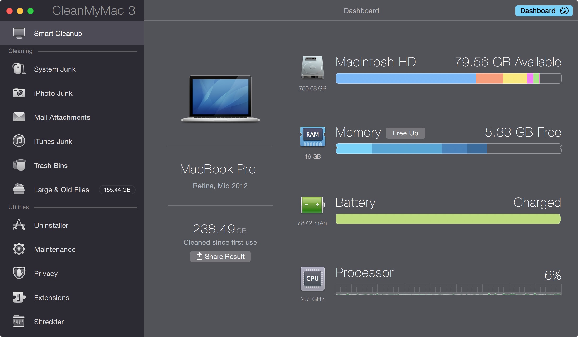
Next to the Memory label is a Free Up button; you click it to “free up” extra RAM. MacPaw doesn’t say exactly how this works. Sure, the amount of “free” RAM goes up after you click the button, but I suspect it’s merely purging RAM contents that OS X itself would have purged as needed (somewhat like the purge command-line tool). So the increase in free RAM might be largely illusory.
There’s also an optional system-wide CleanMyMac menu, which is enabled by default. This menu shows the same data as the Dashboard (including a Free Up Memory button if you hover over the Memory category). But in addition to displaying statistics on demand, the menu component includes a background process that watches for certain conditions and alerts you when they occur.

When I started using CleanMyMac 3, I felt the menu component was excessively chatty and intrusive. Notifications frequently reminded me to perform cleanups, for example, but I don’t want or need to be reminded. You can change the reminder frequency, or turn off reminders, in CleanMyMac 3 > Preferences > Scheduler. Similarly, you can change or disable the notifications that appear when you get low on disk space (where “low” is whatever figure you choose), or when your Trash exceeds a certain size, in CleanMyMac 3 > Preferences > CleanMyMac 3
Menu. Additional notifications you can’t disable without turning off the menu entirely include impending disk failure (as reported by a drive’s S.M.A.R.T. monitoring system), battery failure (which OS X itself will report), and excessive RAM usage.
The menu also notices when you drag an app to the Trash and asks if you want CleanMyMac to uninstall it completely. That’s not unreasonable (as it prevents having useless, leftover files), but if you dislike this behavior, you can turn it off in CleanMyMac 3 > Preferences > CleanMyMac 3 Menu. The same pane also lets you turn off notifications that appear when an app isn’t responding, and you should definitely turn it off. I found that even if an app failed to respond for a few seconds because it was clearly busy doing something important, CleanMyMac prompted me to force-quit it. But doing so would only mean the app would have to restart that task when I launched it again. If an app is truly hosed, I can force-quit it with
Command-Option-Esc; I don’t want or need CleanMyMac’s help.
Bottom Line — The presence of a few “meh” features notwithstanding, I’ve found CleanMyMac3 to be both effective and safe. It’s easy enough for a beginner to use, the explanations of each feature are useful, the Help is helpful, and I even happen to like the little animations and sounds that accompany most actions in the app (though you can turn them off if they bother you). CleanMyMac 3 runs on OS X 10.8 Mountain Lion or higher. It costs $39.95 for one Mac, $59.95 for two Macs, or $89.95 for five Macs, and is a 31 MB download. A free trial version lets you delete up to 500 MB of data and use up to three of the maintenance utilities.
To learn how CleanMyMac fits into an overall strategy of preventive Mac maintenance, be sure to check out “Maintaining Your Mac: A Joe On Tech Guide.”
Why You Should Upgrade (On Your Own Terms)
We’re heading into Apple’s annual upgrade season again, with the upcoming releases of OS X 10.11 El Capitan, iOS 9, and watchOS 2, along with innumerable associated apps. Every upgrade is touted as the next best thing, teasing us with hot new features and promising improved performance, reliability, and security.
Unfortunately, these constant upgrades fill many people with dread, or if that’s overstating the case, with weary resignation. As the saying goes, if it ain’t broke, don’t fix it, but most changes foisted on us by technology companies are no longer aimed at fixing bugs or making everyday usage easier. Bugs are fixed, certainly, and security vulnerabilities blocked, but those under-the-hood improvements are part and parcel with checklist features from the perky twenty-somethings in Marketing and whatever visual tweaks were deemed trendy by the hipsters in Design.
I know many of you are tempted to scream, “Stop this bus! I want to get off!” And many people did just that some years back when the misbegotten OS X 10.7 Lion was on offer — there’s a vocal group still happily (or at least defensively) using 10.6 Snow Leopard. There’s probably still a set of iOS 6 users holding out against the flat look of iOS 7 and iOS 8 too. None of you are wrong. You may be merely postponing a world of upgrade hurt, but you’re not wrong.
Here’s why, and this is the great chasm that separates Silicon Valley from the real world: different is not better. For many, different is by definition worse. We are finite beings, living finite lives. We should never turn down an opportunity to learn — that’s the secret to eternal youth — but there’s a distinction between learning more about our role in the universe and figuring out where some previously obvious interface control has been hidden. iTunes updates alone over the past few years may have cost society millions of wasted hours.
Plus, we become attached to the things in our lives. We build relationships, not just with people, but with our environments. I’m no psychologist, but the emotion I most commonly see in response to changes forced on users by the tech industry is anger. How would you react if you got in your car one day and all the buttons were in a different layout, with dark grey on black labels? “That’s the new look,” you’re told, “You’ll love it. In addition, your gas mileage is now 10 percent better and hackers can no longer take control of your car remotely. Oh, and we’ve decided that the steering wheel should be polished aluminum and the brake pedal should move a few inches to the left so it lines up better visually. Really, you’ll love it.” Sure, all that might happen if you buy a new car, but that’s your decision. When you have little or no choice but to accept unwanted changes, a bout of anger is entirely understandable.
The reason all this is happening is that your opinions don’t matter once you’re a customer. The tech giants are competing purely for new customers, and doing so with features and interfaces that cause those moving from a crusty PC or a flip phone to go “Ooo, shiny!” But the real catch is that each one is trying to lure you into a closed ecosystem, and once you buy in, whether we’re talking about Apple, Microsoft, Google, or Amazon, you’ll be captive in a walled garden. Better hope the fruit is tasty, because it’s hard to scale the wall, and all that’s on the other side is another walled garden.
So yeah, I hear your frustration and I understand your anger. You’re not wrong. But, as much as it pains me to say this, you probably can’t opt out. You have to upgrade, and you have to do so at least semi-regularly, if any of the following would affect you:
- New hardware is inevitable. Macs and even iOS devices can run for years, but eventually you’ll want or need to buy something new. That’s not inherently a problem — it can just be new — but the greater the generational difference, the harder it will be to bring old data and apps forward. I just heard from someone who is having trouble migrating his iPhoto library to Photos on a new Mac because he hadn’t kept up with iPhoto updates; hopefully the iPhoto Library Upgrader will do the trick.
- Community knowledge and technology tools fade away. The iPhoto-to-Photos conversion story above is a perfect example of this problem — the guy in question had gone to an Apple Store for help, but wasn’t told about that older utility, and even I didn’t think about it until I was writing this article. I’ve also seen this happen with people who postpone switching away from Eudora — the longer you wait, the harder conversion utilities are to find and the less those of us who knew a lot about Eudora remember (that’s why I wrote “Converting Email from Eudora: Why I No Longer Live at the P.O.,” 6 September 2011). The more time passes, the harder the upgrade will be, perhaps even to the point of losing data in an unsupported program.
- No Mac is an island. Actually, at this point, it’s far more likely that someone would have an iPhone but not a Mac, or any other computer at all. But if you do have multiple devices, keeping them working together fluidly often requires upgrading them all regularly. And a single decision can lead to a chain reaction of upgrades. Imagine that you have an iMac running 10.6 Snow Leopard and an iPhone 4S with iOS 6, and you receive an Apple Watch as a gift. Suddenly you need to buy a new iPhone running iOS 8, and you’ll need to upgrade at least iTunes, and likely jump from 10.6 Snow Leopard to 10.10 Yosemite to take advantage of iCloud (which requires at least 10.7.2 Lion — I wrote about this catch nearly four years ago in “Apple’s Planned Obsolescence Schedule,” 2 November 2011).
- New and upgraded apps stop being available. This isn’t obvious to normal users, but Apple introduces new and highly attractive options for developers with every new operating system. That’s great, but puts developers in the uncomfortable position of having to maintain both old and new code to retain backward compatibility. Keeping apps compatible with older operating systems is a difficult business decision, particularly for a small developer. So getting off the upgrade bus can prevent you from taking advantage not just of new apps, but also of useful upgrades to apps you already rely on. (This is why we always list the minimum operating system requirements in TidBITS Watchlist articles about Mac app updates.)
- Security vulnerabilities remain unpatched. Apple continues to release security updates for two operating system versions before the current one, but pushes the last one off the bus with every upgrade. So, 10.8 Mountain Lion users, prepare to tuck and roll with the release of OS X 10.11 El Capitan, since you’ll never see another security update. Personally, even though my security-conscious friends might disagree with me, I think the danger of running older versions of OS X is overrated. Yes, older, unpatched systems are vulnerable to known exploits. But at least in the Mac world, they’re also in the minority and are thus less likely to be targeted by evil software than more common operating system versions.
- Technology makes life better. This is the kicker — alongside the nonstop releases of worthless upgrades that add pointless features or revamp an interface just to look hip, there are technological advances that truly improve our lives. We would be far poorer without today’s Macs, iPhones, and iPads. And it’s equally hard to imagine life without Google’s search engine, without Amazon’s massive online store, without Netflix’s vast library of TV and movies, without Facebook for bringing friends and families closer, without Skype video calls to far-flung relatives, without PayPal’s easy online payments, and goodness knows what else. For better or worse, constant change is implicit in the tech world, and opting out of
upgrades makes it hard to benefit from the life-changing bits.
I’m not saying that you should drop everything to upgrade as soon as Software Update alerts you to the latest and greatest. In fact, apart from certain security-related updates that would be good to get sooner rather than later, I think waiting a decent amount of time before upgrading makes a ton of sense. Immediate upgrades are for those of us whose business revolves around the latest details — we’re the penguins diving off the ice floe first so the rest of you can jump in without worrying about leopard seals. Wait a bit after a major upgrade, and for a minor update or two to address bugs that became obvious only after widespread public release. We may have early-bird releases of “Take Control of Upgrading to El Capitan” and “El Capitan: A Take Control Crash Course” available now, with updates planed for El Capitan’s release day, but we also continue to refine those books after launch.
So wait if you want, but don’t wait too long. Community knowledge doesn’t go back that far any more — there’s just too much to know, and too many facts that quickly stop being relevant. Options disappear too — drag your feet on upgrading to the mature Yosemite now, and in a month or so, Apple will replace it with El Capitan, and you won’t be able to download a fresh copy of Yosemite, just as you can no longer get a new copy of Mavericks from the Mac App Store. (And yes, people are still getting “Take Control of Upgrading to Yosemite” for just this reason.)
In short, take a deep breath, relax, and go with the upgrades. But do so intentionally, and on your own terms.
Pebble Time Offers Low-Budget Apple Watch Alternative
Before the Apple Watch, there was the Pebble.
The Pebble smartwatch, spawned from the third-most-successful Kickstarter crowdfunding campaign of all time, became a darling of iOS and Android users alike upon its release in 2013.
For iPhone users especially, it was the one to get since most other top smartwatches (like those running Android Wear) could not easily be made to function with Apple handsets. That made the Pebble’s primitive black-and-white screen and limited capabilities forgivable.
Now an upgraded Pebble smartwatch dubbed the Pebble Time has arrived, with a color screen no less, but Pebble no longer has iPhone owners to itself. It competes directly with the Apple Watch, and cannot come close to matching Cupertino’s souped-up wrist gizmo. The Pebble Time and Apple Watch are barely even in the same tech-product category.
While the Apple Watch is upscale with a high-quality display, a wide selection of luxury bands, advanced metal construction, and state-of-the-art software, the Pebble Time has an inferior screen, a toy-like plastic body, lackluster apps, and limited capabilities.

Both are positioned as Bluetooth-connected smartphone sidekicks, functioning as wrist-worn extensions for such fundamental tasks as notification monitoring and audio control.
But the Apple Watch has more potential to become a computer in its own right, thanks to more powerful hardware and an upcoming software update that looks to loosen its iPhone leash considerably. The Pebble Time does some basic things such as alarms on its own, but it’s even more tightly tethered to a smartphone.
And yet, I come not to bury the Pebble Time, but to praise it.
The Pebble Time can boast, after all, the top Kickstarter campaign of all time, with a $20,338,986 take that nearly doubled the $10,266,845 raised by the original Pebble.
And, in my short time with a loaner device, I came to enjoy the Pebble Time immensely.
For what I’d pay for one – $199.99, compared to $349 for an entry-level Apple Watch – I’d get considerable utility and value. It isn’t for everyone, notably those who crave the most powerful and feature-laden watches, but it’s a decent budget option that earns its keep for those with simpler needs.
And Pebble has a trump card to play with the Pebble Time: it’s designed to be expandable, with the potential for third-party accessories that would add extra capabilities.
On the downside, the Pebble Time can’t live up to its full potential for iPhone users, given that a number of features work only in conjunction with an Android smartphone. Apple doesn’t want the competition.
Pebble vs. Pebble Time — For context, let’s start by comparing the Pebble Time to its predecessor, the first-generation Pebble. That watch is still for sale, and is a steal at $99.99, but the Pebble Time improves on it in some ways.
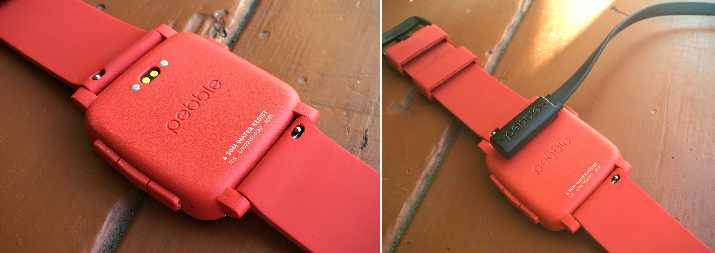
Both are plasticky, but the Pebble Time is a thin, trim, near-square with rounded edges compared to the bulkier, rectangular Pebble. The Pebble Time features a new metal bezel around its screen, which protects and beautifies the watch. The physical screen itself, though of the same size and dimensions, is now made of durable Gorilla Glass.

Both Pebbles have rubber watch bands, but the one on the Pebble Time is more comfortable, more pliable, and softer to the touch, not unlike the fluoroelastomer bands Apple bundles with its entry-level Apple Watch Sport.
Neither Pebble watch has a touchscreen. Instead, both have a physical home button on the left and three navigation buttons on the right, which is how users browse the menus, bring up apps and watch faces, and set alarms and timers. This is clunky, though I’d argue the Apple Watch’s digital crown control and side button aren’t much better.
The Pebble watch’s screens use E Ink, like many ebook readers. The Pebble Time’s color version of this screen technology looks nice – though with just 64 colors, mediocre clarity, and a striking resemblance to an old Game Boy screen, it’s hardly state-of-the-art. But E Ink has the virtue of conserving battery life, enabling the Pebble Time to work for up to a week on a charge.
It’s tough to say which of the two Pebble displays is more readable. I had the two devices out on my front steps in bright sunlight and, depending on how I angled them, I could get one or the other to seem more legible. It’s kind of a tie, so users of the original Pebble shouldn’t upgrade to the Pebble Time in the expectation that they would see a dramatic improvement in clarity.

The Pebble Time is waterproof, like the first Pebble, and fine to use in the shower, or while swimming at a depth of up to 30 meters. Below that, take a dive watch and avoid the bends.
Both recharge via power cords that snap magnetically onto charging ports (not unlike the Apple Watch), but the Pebble Time hides its port on the rear of the watch face instead of exposing it on the left side, as the original Pebble does.
The Pebble ecosystem has an extensive app library, but the original Pebble has difficulty taking advantage of this since it can hold only about eight apps at a time. This forces users to swap apps in and out of an App Locker. The Pebble Time remedies this problem with room for dozens of apps. If you run out of room, your least-used apps are consigned to the locker.
Pebble apps are installed via a companion smartphone app but the Pebble Time and the original Pebble have separate iPhone apps.

The Pebble Time’s software improves appreciably on the original. Its best new feature is the timeline, which sequentially displays appointments, news updates, weather forecasts, and other time-specific information in a, well, timeline – from the recent past and the present to the near future – all accessible via physical up and down buttons for navigation.
The original Pebble lacks the timeline but, according to the maker, was supposed to get it this summer.
The Pebble Time’s software is a great upgrade overall, with whimsical animations, such as a wall-clock icon that has a swinging pendulum, and a smiling-sun icon in the timeline that quickly draws itself onto the display to announce a sunny forecast. There’s also an animated star when a watch face is added, a tiny puff of smoke when a notification is dismissed, and a brief glimpse of a cartoon skull when a timeline entry is deleted. The simpler screen of the original Pebble has none of this playful activity.
The Pebble Time, in short, is unmistakably Pebble, but in a way that advances the state of its art in fun and useful ways.
Pebble Time Testing — I’ve been using the Pebble Time for weeks and generally enjoying it despite its obvious inferiority to the Apple Watch in just about every way, save that lower price.
Like other smartwatch aficionados with a sophisticated grasp of the Pebble and Apple platforms, I had to place myself into a mindset of not expecting as much from the Pebble Time as I had with the Apple Watch (which I’ve reviewed on my tech blog).
But, as I noted in that review, I am budget-minded and therefore open to technology that is not necessarily the most advanced in its category, but that improves my life appreciably while saving me a bundle.
I don’t need the fanciest smartwatch just to receive notifications from my iPhone, for instance. The Pebble Time does that job nicely with clearly formatted (and whimsically animated) alerts, a powerful buzz when an alert comes in, and a screen that puts notifications in an orderly list that incorporates icons denoting email messages, social media updates, and the like.
Reading alerts was sometimes a bit of a challenge due to inferior display tech, however. E Ink is highly readable in bright sunlight (much more so than the Apple Watch’s screen) but suffers in dimmer indoor settings, meaning I had to hit the home button for (anemic) illumination. The Pebble Time’s color display is always on, though, compared to the Apple Watch’s lovely but battery-draining display that has to turn itself off after a few seconds of idle time.
Getting to the alerts was a bit of a multi-click chore until I figured out how to configure one of the right-hand navigation buttons to pull up a notification screen with a long press. (I mapped another button to pull up the settings screen.)
The timeline is a wonderful feature, and one that is simple to access – press the up button on the right side to journey into the past or the down button to see future calendar items, weather events, and much more. You can select an item for more information, or delete it.
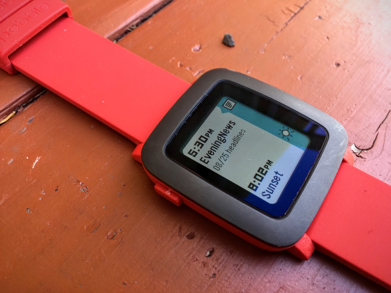
The timeline can even be customized by “pinning” info from third-party apps to the chronological stream. For instance, a news app fed me the latest headlines, via pinned timeline items, several times a day. Sports aficionados can add sports updates to the timeline with the ESPN app. Watch the video to see what it’s like.
Heck, the timeline is so useful that Apple appears to have ripped it off with an upcoming watchOS feature called Time Travel.
As an app platform, the Pebble Time is underwhelming. I felt this way about the Apple Watch too, but Apple has a gloriously diverse and sophisticated app ecosystem compared to Pebble’s equivalent. Yes, there is an abundance of Pebble apps, but they are of wildly inconsistent quality, and I had difficulty finding must-have ones.
Big-name apps that made the cut include Evernote, Pandora, and Foursquare’s Swarm, all decent extensions of parent apps on my iPhone, though quite limited in and of themselves. Evernote gives me rudimentary access to my notebooks and their contents, for instance, but this is not necessarily productive on such a small screen.
Other notable Pebble-app players include Domino’s, Eventbrite, PayPal, TripAdvisor, Uber, and Yelp along with the fitness-related Fitocracy, Jawbone, Misfit, and RunKeeper.
Those fitness apps make the Pebble Time a nifty fitness companion, though one that is largely dependent on corresponding iPhone apps. On a RunKeeper-monitored power walk, for instance, I used the Pebble Time and its RunKeeper app as little more than an iOS-RunKeeper remote. The Apple Watch is a bit more of a fitness tracker in its own right, thanks to its additional sensors, though it too requires an iPhone for most activities beyond timing, step tracking, and heart-rate monitoring.
Navigation between apps is straightforward, though a bit awkward. Each appears as a card filling the screen, and you press buttons to scroll upward and downward for the app you want. This takes a while if you’ve loaded lots of apps, and your patience may flag after you’ve done this repeatedly. The Apple Watch’s cloud of circular app icons requires less interaction, though the little orbs are more challenging to pick out with a fingertip than the big Pebble app cards.
Pebble watch faces are also a mixed bag. Many still are of the black-and-white variety with the original Pebble in mind, but I like the Real Weather watch face with the time, date, and temperature, along with a cool color representation of the current weather and time of day.
Pebble watch faces tend to be simpler than the Apple versions, with fewer “complication” customization options.
As for the Pebble Time’s toy-like appearance, I’m fine with that provided I have an understated black model; Pebble lent me a red version that I found embarrassing to wear due to its garish, hey-look-at-me appearance. The Pebble Time also comes in white.
The Pebble Time is very comfortable courtesy of its smaller size, slightly curved bottom and soft rubber band, so I wore it all the time. I was nervous about taking it into the shower, but I shouldn’t have been, since it held up just fine.
Pebble’s reliance on plastic comes at an eventual cost; the physical buttons on my review unit got dinged up in relatively short order. The bezel also got dented or scratched in a couple of places.
Sadly, I was unable to test a number of the Pebble Time’s features, at least when it was linked to an iPhone. While Android-based Pebble Time users can perform a range of actions on incoming notifications, such as archiving Gmail messages, iPhone users can only dismiss notifications. The Pebble Time builds in a microphone for such tasks as voice memos and responding by voice to texts, too, but only Android users can do that. Android users can also respond to messages with canned responses or emoji, but iOS users cannot.
Pebble has said it is working to remedy at least some of these shortcomings, though these are largely due to restrictions in iOS that don’t exist in the more open Android.
The Pebble Time is missing many features found on other smartwatches, too, including GPS, NFC, and heart-rate monitoring.
Variations and Innovations — Pebble’s technology has additional permutations, some available now and others yet to come.
Those who hate plastic can opt for metal options. A $149.99 sibling of the original Pebble called the Pebble Steel has a classier appearance and more durability, and Pebble also recently released the $249 Pebble Time Steel. I’ve used neither Steel model, but from what I can glean in pictures the Pebble Time Steel is a knockout with a metal body and metal buttons in a choice of three colors, along with a modest selection of leather and metal bands.
Pebble has also announced a Pebble Time Smartstrap program that will enable third-party accessory makers to add watch features – such as GPS, secondary batteries, or fitness monitors – using specialized straps that jack into the charging port on the watch’s bottom. This would make Pebble more competitive with Apple, assuming Smartstrap developers come through with appealing accessories to turbocharge the Pebble Time.
Pebble Time replacement bands don’t need to be “smart,” though. As with the Apple Watch and Android Wear models, stock bands can be swapped out with ones from third-party makers in a variety of fashionable designs. The Pebble Time features a quick-release mechanism, which includes a standard 22-millimeter lug that makes it compatible with many straps from other companies. This would allow me to ditch my Pebble Time’s garishly red band, though I’d still be stuck with the red on the watch itself.
Clocking Out — I can’t see smartwatch buyers with ample budgets picking up the Pebble Time. If you use an iPhone and have the bucks, why not snap up an Apple Watch, and cost be damned?
But not all of us are rolling in money, and even the entry-level Apple Watch is spendy at $350. The Pebble Time is an appealing alternative at $200. While it is not the Apple Watch’s equal in capabilities, it does quite a bit for the money. And Pebble’s Smartstrap program points to a potentially promising future for the Pebble Time as a platform for tech innovation.
Fans of the original Pebble will be delighted with the Pebble Time’s improvements, including its color screen, its timeline, and its greater app capacity. I wouldn’t recommend buying an original Pebble right now, despite its $100 price, at least until the timeline feature arrives for first-generation hardware (though, I am guessing, with fewer animations).
Having said that, owners of the original Pebble need feel no urgency to upgrade since the Pebble Time’s functionality is largely the same.
If you don’t like plastic, go for the Pebble Time Steel at a price that’s still $100 lower than that of the Apple Watch Sport.
In short, the Pebble Time may be primitive by the standard of the Apple Watch, but it’s hardly worthless or obsolete, with lots of room to improve. If you’re on a tight budget but are interested in getting notifications on your wrist, give it a look.
TidBITS Watchlist: Notable Software Updates for 7 September 2015
TextExpander 5.1.1 — Smile has released TextExpander 5.1 with bug fixes for OS X 10.11 El Capitan. The update to the text expansion app resolves expansion failures in file name popovers and file save dialogs of sandboxed apps. It also no longer stores invalid passwords to URL-based groups on Keychain, updates localization for Inline Search, and updates DevMateKit to version 1.2. ($44.95 new with a 20 percent discount for TidBITS members, free update for version 5.0 licenses, 17.0 MB, release notes, 10.10+)
Read/post comments about TextExpander 5.1.1.
Alfred 2.7.2 — Running with Crayons has released Alfred 2.7.2 with enhanced focusing behavior, which should improve how clipboard history paste works with a multi-screen setup, among other things. The keyboard-driven launcher also enables you to add and edit UTIs in the Features > Default Results > Advanced preferences, improves logic for auto-discovery of 1Password bookmarks, fixes a crash that occurred when using Alfred’s hotkey to hide Alfred when Quick Look is showing, removes irrelevant items from the iTunes Mini Player, and provides a better result order for Spell and Define. (Free, £17 for Powerpack, 3.7 MB, release notes, 10.6+)
Read/post comments about Alfred 2.7.2.
Carbon Copy Cloner 4.1.4 — Bombich Software has released Carbon Copy Cloner 4.1.4 (CCC) with support for OS X 10.11 El Capitan. The backup utility also now accommodates SMTP usernames that contain special characters, no longer re-launches the user agent after changing the preference that shows the CCC icon in the menu bar, fixes a bug that occasionally caused CCC to get stuck on unreadable files, addresses a time zone adjustment issue for cases where a task was created in one time zone but scheduled in another time zone, and adds custom VoiceOver descriptions for the task status images in the Task History window. ($39.99 new, 12.0 MB, release notes, 10.8+)
Read/post comments about Carbon Copy Cloner 4.1.4.
ExtraBITS for 7 September 2015
In ExtraBITS this week, Hulu is offering a (mostly) commercial-free option, Apple admits that Apple Music needs more work, Amazon Prime Video debuts offline viewing for iOS devices, we give you yet another reason to not jailbreak your iPhone, Apple is reportedly testing a move into video content, and the NFL takes a step closer toward the Apple TV.
Hulu Now Offering an “Ad-Free” Option — Tired of the repetitive commercials on Hulu Plus? The good news is that the streaming TV service is now offering a commercial-free version for $11.99 per month, with the ad-laden version still available at $7.99 per month. However, some shows, like ABC’s “Marvel’s Agents of S.H.I.E.L.D.,” will still feature ads.
Apple Admits that Apple Music Needs Work — In an interview with The Guardian, Apple’s Vice President of iTunes International, Oliver Schusser, said that there is “a bit of homework to be done” to improve the Apple Music streaming service. “There’s a lot of work going into making the product better. Our focus is on editorial and playlists, and obviously we have teams all around the world working on that, but we’re also adding features and cleaning up certain things,” Schusser said. He added that an Android app and Sonos support are coming this fall.
Amazon Prime Video Offers Offline Viewing for iOS Devices — Amazon Prime members just got a big bonus: the Amazon Video app for iOS now allows users to save Amazon Prime Instant Video shows and movies to their devices for offline viewing. The feature is currently available for Amazon Prime members in Austria, Germany, the UK, and the United States. Pressure is now on Netflix to match the feature with offline viewing of its streamed shows and movies.
A Reminder to Not Jailbreak Your iPhone — An estimated 225,000 Apple accounts, most of which are in China, have been compromised by malware installed on jailbroken iPhones. The malware, dubbed KeyRaider, intercepted iTunes traffic from the iPhones to nab usernames, passwords, and UDIDs. It’s another reminder that jailbreaking your iPhone opens you up to significant security vulnerabilities.
Apple Testing a Move into Original Video Content — Variety reports that Apple may be entertaining the idea of producing its own original content. Several media executives told Variety that they’ve had talks with Apple, and Apple reportedly bid on the new show from the former hosts of Top Gear (Amazon won in the end). Such a move could put Apple at odds with Apple TV mainstays like Netflix and Hulu.
NFL Pass Comes to Apple TV — The Apple TV’s NFL Now app has been updated to add support for the new NFL Pass service. A one-year subscription to NFL Game Pass costs $99.99 per year, and offers full video of all games after they air, as well as live streams of out-of-market preseason games. Unfortunately, it doesn’t offer live streaming of regular season or playoff games.