Photo by Apple
Explore the Dark Side of Mojave: Understanding, Enabling, and Customizing Dark Mode
Do you find your Mac’s screen too bright for comfort, even after you’ve dropped the brightness setting in System Preferences > Displays? Apple has been sensitive to lighting issues for years, enabling the Mac to adjust screen brightness automatically to match ambient light and adding Night Shift to shift the colors of the display after dark. On the MacBook Pro, even the keyboard is backlit for easier typing in the dark, and it too can adjust its brightness in low light. And in previous versions of macOS, there was an option to make the menu bar and Dock dark.
More significant than these options, though, is macOS 10.14 Mojave’s Dark mode, the first major visual change in macOS in a long time. Apple promotes it generally, saying:
Dark Mode is a dramatic new look that helps you focus on your work. The subtle colors and fine points of your content take center screen as toolbars and menus recede into the background. Switch it on in the General pane in System Preferences to create a beautiful, distraction-free working environment that’s easy on the eyes — in every way.
It’s not clear that Dark mode is a win for everyone, but light-sensitive people such as Josh are thrilled by Dark mode because it radically reduces the amount of light coming from the screen.
Dark mode is easy to turn on and off in System Preferences > General, where you can click Dark or switch back to the traditional look with a click on Light. There’s no shortcut for switching, but developer Benjamin Kramser has just released NightOwl, a menu bar utility that makes switching easy and also provides a schedule for automated switching, much like Night Shift. That might be helpful if your work environment is light during the day, but dark at night, when a bright screen may be less comfortable.
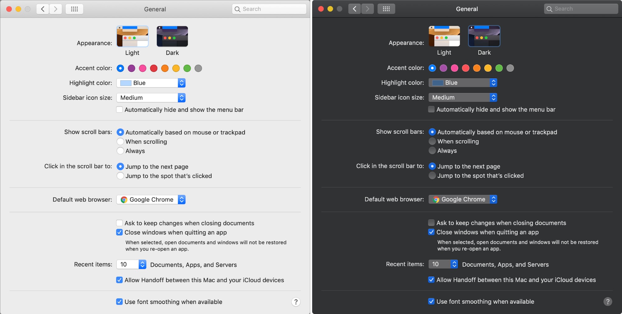
When you switch into Dark mode, macOS immediately swaps dark text on light backgrounds for light text on dark backgrounds, changing the menu bar, windows, interface elements, and more in the Finder and supported apps. As you can tell by the increased number of releases in our Software Watchlist, developers have jumped on Dark mode with enthusiasm, so nearly every app that claims Mojave compatibility is specifying support for Dark mode. Older apps won’t gain Dark mode support without an update.
Josh has made a video showing how to turn it on, and offering some examples of how it looks. Even though not every app supports it, it still makes a big difference!
Precisely what aspects of an app get dark is another question, however, and this is one of Dark mode’s challenges. Open a new document in TextEdit or Pages while in Dark mode, and while the toolbar and controls will all be dark, the content area will be the same bright white that it always was before. Same with Safari and many Web sites. Worse, the contrast between a bright content area and dark controls is more jarring than when the controls were on a light background. Help may be available from Denk Alexandru’s Dark Mode for Safari, a $1.99 extension for Safari that gives you control over Web site themes.
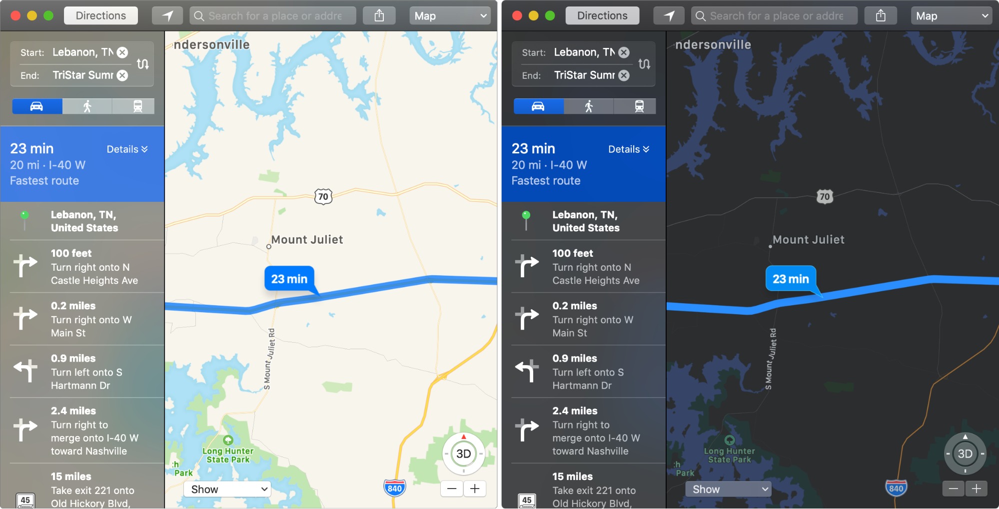
Some apps have their own internal settings specific to Dark mode that let you pull back on how dark it is. For instance, when you’re in Dark mode, Mail displays a new “Use dark backgrounds for messages” checkbox in Settings > General that lets you choose between dark and light backgrounds when reading and composing messages. Similarly, when running Maps in Dark mode, you can choose View > Use Dark Map to switch the map style between the standard light style and a dark style. You’ll have to poke around in your favorite apps in Dark mode to see if they offer such adjustments.
Another challenge for Dark mode is that light text on a dark background doesn’t have nearly as much contrast, so it’s harder to see, particularly for the majority of the population that isn’t light-sensitive. If you find reading text in Dark mode difficult because it seems blurry, but you prefer the dark look otherwise, you may be able to make it more to your liking by changing the font or style to make it bigger or bolder, such as in Mail’s Settings > Fonts & Colors settings. For system-wide improvements, though, visit System Preferences > Accessibility > Display.
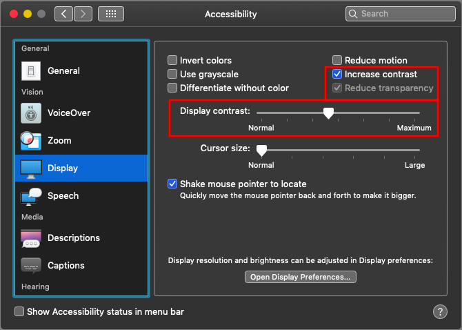
The Display Contrast slider here lets you make text whiter and backgrounds dark, which goes a long way to improving the readability of text. Select Reduce Transparency to make items like the Dock and menus solid, rather than allowing the background to show through slightly. And to separate dark and light even more, select Increase Contrast—it turns up the brightness on divider lines as well, which can make windows easier to interpret.
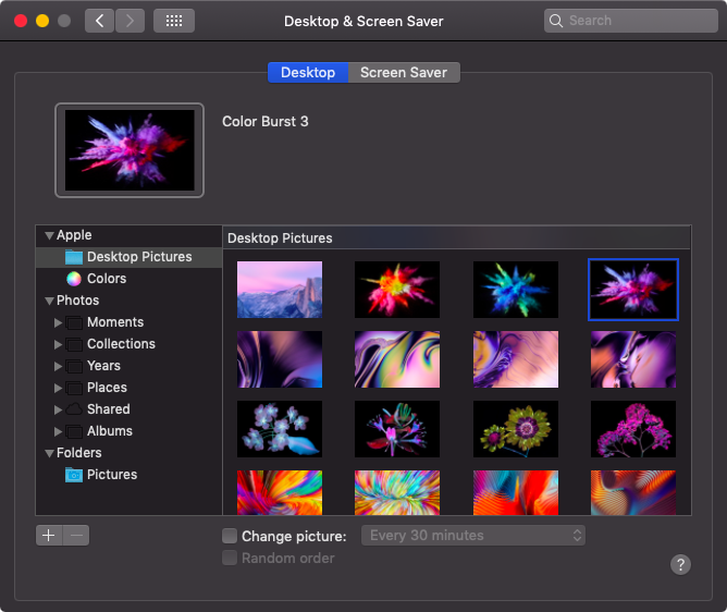
Finally, if you’re using Dark mode, you’ll probably want a dark desktop picture to keep the overall screen brightness down and avoid too much contrast with the dark windows and controls. If you look in System Preferences > Desktop & Screen Saver, you’ll find new wallpapers that won’t blow out your eyes.
Should you give Dark mode a try? Absolutely! It’s trivial to turn on and off again and has no lasting effect on anything apart from your retinas. Most people aren’t light-sensitive, and for them, especially during the day when room lighting is generally quite bright, the traditional look will likely be the most comfortable and easiest to read. However, if you recoil in pain from too-bright screens, particularly in dimly lit rooms, Dark mode may be a boon for your eyes. And if you have no issues with either the light or dark look of macOS, feel free to pick whichever you prefer aesthetically.
What’s your opinion of Dark mode? Let us know in this single-question survey.
I genrally like the Dark Mode. I’ve gotten used to it in Adobe applications like InDesign and Photoshop.
After trying it in Mojave both with Dark and Light, what I’ve done is to install the NightOwl utility (free!) to view Dark after sunset, and Light during the day (you can set a different schedule). I’ve had no problems with the utility, and I like that it switches automatically. It gives a little “night owl” hoot when it switches mode.
Small correction: The setting in Mail to change the mode of messages is in Preferences > Viewing, not Preferences > General.
Is it coming to iOS?
I don’t have much use for dark mode on MacOS but on iOS it would be great – I love to read the Economist on my iPad when in bed, because its app has a “dark mode” – which doesn’t disturb my wife who tends to sleep before me
I’m still liking f.lux which also switches to it’s own version of “Dark Mode” at night, along with dimming the screen gradually in the evening.
I haven’t tried it yet. But after reading this article I have to say it sounds a bit finicky. I feel like my usual manual adjustment of overall brightness will continue to serve me well. Like Peter I would, however, be interested in a dark reading mode on iOS. I really enjoy the dark reading mode in iBooks when I’m reading in bed. It would be great if that were also available in Safari Reader for example.
Safari Reader does have a dark mode. For Reader preferences, while in Reader, click on the “aA” button at the right end of the address/search bar.
Ha! Never noticed that. Thanks for the tip, Jeffrey.
I have only one complaint with Dark Mode. Safari displays insufficient contrast between active and inactive tabs. The contrast is also reduced in Light Mode, but not so much that it is unusable. This really needs to be fixed. I’m not sure that this one bad feature can be fixed with a global setting in Accessibility without introducing other problems.
It appears that any app that uses WebKit will probably still have light/white background. I’m not sure I want my browser to make that kind of decision for me anyway, nor would most web designers! Perhaps Apple can work with W3C to enable user controls to basically invert bright and dark objects based on a minimum amount of contrast or luminosity. Sounds like a lot of problems for web designers who pretty much want to set the colors, contrast, etc. and may also have mandates from clients. Most brands have specific color values for their logos.
I thought the dark text on light colored background vs the opposite argument had been settled years ago… guess not.
Howard Oakley has identified some bugs with Dark mode: