How Tahoe’s Menu Icons Undermine Usability
After 34 years, should we still pay attention to Apple’s Macintosh Human Interface Guidelines from 1992? Software engineer and UI designer Nikita Prokopov argues that:
the principles—as long as they are good principles—still apply, because they are based on how humans work, not how computers work.
Humans don’t get a new release every year. Our memory doesn’t double. Our eyesight doesn’t become sharper. Attention works the same way it always has. Visual recognition, motor skills—all of this is exactly as it was in 1992.
In his post, Prokopov references Apple’s 1992 advice and uses numerous screenshots to illustrate how the menu icons in macOS 26 Tahoe negatively impact usability.
- Icons should help users find what they’re looking for
- Icons should be consistent within and between apps
- Icons should represent a single, specific action
- Icons should be clearly distinguishable from each other
- Icons should be easily recognizable from a distance
- Icons should employ appropriate metaphors
- Icons should avoid using text whenever possible
- Icons should not reuse standard system elements
When these principles are violated, as they are regularly in Tahoe, users spend more time scanning menus and make more mistakes.
While browsing through the HIG, I came across an even more pointed piece of advice, which states bluntly:
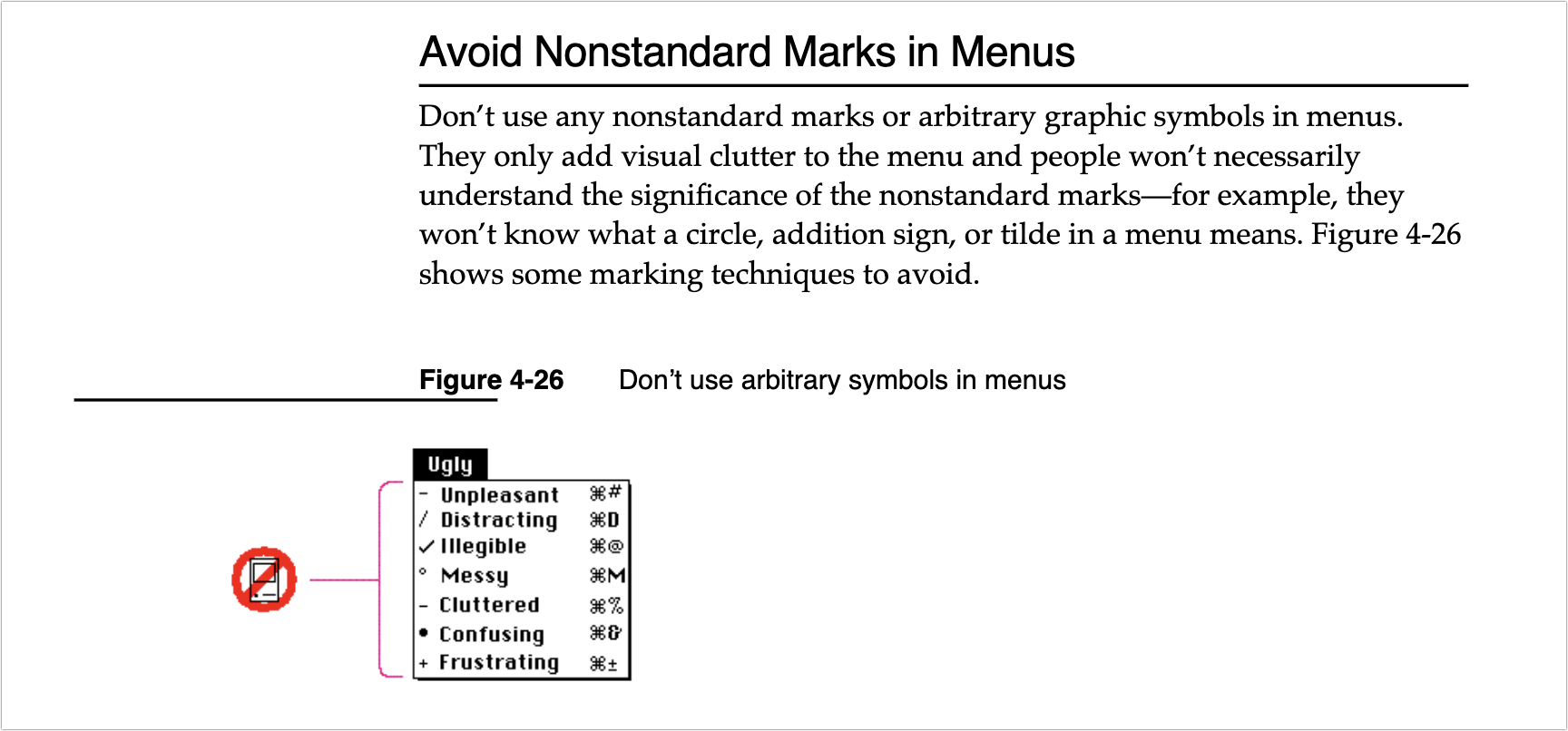
Don’t use any nonstandard marks or arbitrary graphic symbols in menus. They only add visual clutter to the menu and people won’t necessarily understand the significance of the nonstandard marks—for example, they won’t know what a circle, addition sign, or tilde in a menu means.
I’m not personally all that perturbed by Tahoe’s icons because I barely see them. I’m extremely text-focused, so I can’t help but read every word in my field of view, but small monochrome icons are merely background noise. Many of them mean nothing to me, so when I’m forced to use them, I just map a cluster of pixels to some action. That’s why I have trouble with toolbar- and palette-intensive interfaces in apps like Microsoft Word and Adobe Photoshop. When all the icons look basically the same to me, I have to rely on tooltips and relative placement to accomplish much of anything.
For many users—especially those with low vision—Tahoe’s menu icons increase visual search time and hurt recognition, directly undermining the HIG’s guidance. Read through Prokopov’s examples while thinking about accessibility and then glance at your own menus: do the icons help or hinder?
I do appreciate this essay and I think it is totally correct.
However I have a hard time getting past the irony of someone going into deep details of good design on a website with a searing yellow background or snow falling all over the text.
It almost has to be on purpose.
I saw those background issues initially too, but decided not to say anything about them because I can’t reproduce them reliably. When I load the page in a new browser, it’s bright yellow to start, but then switches to blue, without snowflakes.
I immediately switched to Reader Mode to avoid the distraction.
I’m the same,
but there is one thing that bugs me: the new icons that they’ve added to menu items have basically broken custom keyboard shortcuts. For example, the Tools menu in the Preview app has a “Rectangular Selection” submenu item that has no defined keyboard shortcut , so I’ve long had a custom keyboard shortcut for that mapped to Cmd-Opt-R.But Tahoe has added a rectangle icon to that menu item, and because the shortcut needs to be mapped to the exact text of the menu, it’s now impossible to assign a shortcut - there is no way to add the rectangular icon to the shortcut definition.I scanned Prokopov’s post, but I didn’t see that issue mentioned.[edit - it turns out that deleting the keyboard shortcut - the one that has always worked for many releases of macOS - and then adding it again worked.]
How are you assigning the shortcut? I just checked and mine work fine under “App Shortcuts” in Settings. I have ^C set to do “Compress” in the Finder. It now has an icon, but that’s not part of the text command, so ^C still executes the Compress action.
See my edit above. My long-working shortcut (over many MacOS versions) did not work. Editing it did not work. Removing it and then adding it back - something I had not tried until now - did work. Go figure.
What a great article (the original post). I remember reading the book on UI (author starts with a T, but name escapes me) and being struck by the fact that none of it was arbitrary. There was a well-thought-out reason for everything, even how the mouse works near the top of the screen. Propokov doesn’t just whine, like I would, he shows examples and in every case he makes really good sense. the one thing that occured to me is that iOS is much more icon driven, and these symbols tend to be used on buttons and things, like the (confusing) MS ribbons. I hate on Finder that you can turn off the text hints on the icons in the toolbar. When I’ve helped new users, I always turn it back on so everythiing isn’t a mystery to be solved.
Super article. Scathing and oh so true.
Do we think Apple already knows this, or will hear this, or will be tone deaf to it?
Apple’s Human Interface Guidelines was (is?) a wonderful tome and anyone developing for Macs should read it and follow it’s sage advice. I forget which System it was - maybe OSX - which threw all those silly ideas out the window and all of a sudden we were getting apps in all shapes & sizes and colors and bgnds etc etc. I miss the elegant simple look of yesteryear. Or do I?
UI designers of today seem to be scared that we will find clear, simple interfaces boring. Not me - an app is to do a job not become a questionable feast for the eyes.
My first thought: what icons? I had to go looking. Obviously, they are no use to me. Hope I forget about them so I do not waste time trying to understand what message they bring.
I keep an archive of every available revision of Apple HIG (and NeXT etc), for those who might be interested. ~35 in total so far, I’m sure there are more out there.
Eras:
This is my issue; I can’t tell that they are icons, sometime, or what they are meant to depict. Mostly I’ve just ignored the menu icons; I use keyboard shortcuts a lot, and after years of using the applications I depend on, I rarely resort to menus.
While nitty-gritty rules from 1992 may not be applicable, the underling principles are still valid.
Bruce Tognazzini Tog On Interface. I learned so much from this book.
I don’t really mind the menu icons. I even like some of them.
The problem is when every single manu item has an icon. Then it’s just overwhelming. If they are used sparingly, just for the most important / most common commands, they are fine. I don’t know exactly how helpful they are, especially if the are inscrutible, but they don’t harm anything as they aren’t that noticeable and I rarely use menus that much anyway (I use keyboard-shortcuts).
(I can picture some of these being helpful for newbies. Like the scissor icon next to Cut, etc. But only it they are there for a few common commands.)
I was looking at the icons in Apple Mail and I rather like their use there. Not every menu item has them and the ones that do look pretty good (for the most part). But then I checked Safari as I was writing this and they are horrible there. Every single menu has icons, even stupid ones. Click “Close Tab” has small box with an x in it and “Close All Windows” as a slightly bigger box with an x in it. Why??? I see no point. It’s not a command I use often, if ever, and what help does the x in a box serve?
And then every single open window on the “Window” menu has an identical icon. Why? It’s overwhelming and lame and pointless.
I think Apple will revise some of this in the future and tone it down.
I only saw the blue background, nothing yellow with snowflakes, on the linked site, so not sure what you mean.
This is part of what drew me to Apple products in the early days (1980s).
I’m not seeing the reason for adding these icons to the menus.
Certainly times, society, use of digital gadgets have changed since 1992. Perhaps there is now more variety in these human characteristics. Those who watch television/videos and spend a lot of time on gadgets watching videos, consuming ‘social media’ etc have a different attention span and perception, so I can see how designing for a broader range of users can be a challenge.
That said, back to the OP, I don’t see the logic/reasoning behind adding inconsistent icons, and so many of them, in Tahoe. I wish they could be turned off, they only use up space for me. My computing experience is degraded thanks to them.
But yes I am old school, grew up pre-computer, don’t use ‘social media’ or watch videos. My usage is more in the direction of text and still photos. So the 1992 guidelines apply for me.
I saw a flash of yellow before it changed to blue using Arc. Using Firefox with NoScript’s “Untrusted” setting, the page was yellow. When I changed the setting to allow scripts, it turned blue.
The one thing we in the press have noticed is that Apple doesn’t like negative attention. It mostly applies in situations like Paris Buttfield-Addison’s account being locked, but it also holds true in cases where enough outlets and enough individuals are complaining that Apple prioritizes a fix. Perhaps that’s just to shut us all up, but if it’s effective, so be it.
I’m actually not happy about this, since I would prefer that Apple understand these issues and either avoid them entirely or fix them quickly on their own. I don’t like writing negative articles.
So I’m hoping that the coverage this is getting will have an effect.
Disappointing to read this. However, have yet to “move” from Sequoia to Tahoe, as I am waiting for the official release of SuperDuper! v4.x, which will be fully compatible with Tahoe. Meanwhile Sequoia, V 15.7.3, is solid and working just fine.
It’s not just Apple. Big Tech has been doing this for over a decade. I saw it when wireless companies wouldn’t talk with me about the lousy quality of cellular voice a dozen years ago. They want to control the media, and our job in the press is to tell the truth.
Great essay.
Blogger Jim Nielson on Tahoe Menu Icons
John Gruber at Daring Fireball has weighed in:
I think it renders differently on mobile or it was changed recently. When I first saw it on desktop it was as described, but looking later on mobile it just has the blue background with no snowflakes, which is fine.
Considering the Alan Dye saga, it’s hard to say. On the one hand it’s very worrying that they let him do so much damage with such free reign and then he just left on his own, apparently much to leadership’s surprise. So there clearly is/was a problem at the top with basic judgement here.
The only hope is that this debacle has finally opened their eyes to just how badly they let it get, and that Dye’s replacement is already making plans to undo the worst mistakes. Like this clearly fundamentally misguided directive to add icons to every menu item for no particular reason.
Until I read this article I have not even noticed that there are sooo many icons in the menus now.
I use shortcuts whenever possible and when using the menus I just ignore the icons.
(Just my personal opinion)
Siri says: so true!
Niki’s brilliant takedown of Apple’s poor interface implementation should be mandatory reading for all graphic information designers and UI designers. Pretty ‘stuff’ should not be used just for embellishment. It should serve a purpose. A bit like some of the Liquid Glass shenanigans eg when I can’t see the buttons to enter the passcode on my iPhone then something is seriously wrong with the design team and sign-off process at Apple.
As someone who does not have dyslexia or a similar reading disability, could it be true that using icons makes it easier for people with disabilities to understand and recognize individual menu elements based on icon rather than text, or perhaps as a combination? (I ask humbly as I simply do not know the answer, but I am thinking that there may be people on this forum who are trained to know the answer definitively.)
Yes, if the icons are meaningful, consistent, and clear. Tahoe’s menu icons fail on all three counts here. Their meanings are often obscure in relation to the menu items they’re used with, they’re not used in any consistent manner (both with one menu item having different icons in different apps and with one icon being used with different menu items in different apps, or even sometimes in the same app), and they’re so small that their actual form is extremely blurry and hard to discern.
That’s why these icons are drawing so much negative attention: they add nothing of actual communicative value to the menus, and in fact make things more confusing if you pay attention to them than if you just ignore them altogether. They feel very much like “we did it because we can” rather than “we did it because it should be helpful”, even though those who decided to do this probably were thinking the latter.
Weirdly, until I read this article I literally never noticed all the menu icons at all. I paid attention only to the menu text.
Now that I do see the icons, I can’t unsee them…and wow, are they annoying.
Can the menu icons (as distinguished from the menu bar icons) be turned off?
I still don’t notice them. If they had been there for years I never would have been able to tell you how long they were there. Perhaps part of that is that I use a lot of keyboard shortcuts and taskbar icons.
There’s a part of me that still thinks I’m being gaslit with all of the negative tech press about Tahoe. To me, with the exception of the rounded window corners and an issue with the mail app when it reports syncing increasing numbers of messages over time, it’s just fine. And the rounded corners are only mildly annoying. And the mail issue - which doesn’t affect performance at all - is easily solved with a quit and restart.
Not in menus like these; the reason that these icons are rightly and intuitively considered “interference” is that even when we humans are reading a menu, we (a) have already voiced our intent internally and (b) are reading these icons using words, and they don’t match our intention. For example, we don’t want to use a trash can in front of the word “Delete” because our intention is, “I need to delete this file,” not “I need to trashcan delete this file.” Commands in menus like those on the Mac should be verbs, and they should not have iconic decorations in front of them.
(On the other hand, toolbars, ideally but not always made up of distinct, intuitive, scannable icons that save space, can often benefit the user by having clarifying labels under them.)
I think that Apple now does things because everyone else is doing them. Google and Android apps have been full of this type of pointless decoration for years.
In my case, literally. Using a Studio Display, and needing reading glasses, the upper lefthand corner (for instance) of the Finder is a place where I can read the text on the pulldown menu, but without a careful look, none of the line-drawing icons stand out (at least in Dark Mode, which is what I use). Looking right now, the App Store and Shut Down… icons make sense when I pull doen the Apple menu, but none of the other ideograms.
Why does Apple even have them?
One possible reason is so automation can select a menu item by its icon, instead of by text which varies by language.
I hope not. Automation shouldn’t be screen-scraping to look for graphical elements.
Every GUI system has a standard API for menus. An automation system should be able to get the underlying IDs for each menu item (which should be well-known for standard apps like the Finder) and send corresponding events to the app.
I’m certain that these icons are there entirely for looks because someone thought they were a good idea.
Not likely, as many menus have identical leading icons on different items.
As the leading icons become just visual noise, the signal to noise ratio decreases, reducing ease of comprehension.The lack of standard icons (see stop and yield signs) leads to time devoted to “WTF” instead of productive activities. UI is not supposed to be a game of “develop some new and inconsistent grammars to fool grandpa”. Any engineer and most any efficiency expert should be able to explain that to the UI designers.
Maybe what we are seeing in Tahoe’s many interface changes, is a new generation of employees in the responsible section of Apple, who grew up with these gadgets and not with books, typewriters, radio, etc and these are their first mistakes, from which they will hopefully learn.
I barely noticed the icons, but it seems the number of items has gotten longer and less organized; but to some extent I probably conflating right click options in the Finder or other apps.
Wish that this were true, but this is about leadership. Jobs paid attention to these details and the people he hired to get the results he wanted—and generally that works for all of us .
I appreciate this TidBITS article and the article that it references. I have noticed nothing as being better in the Tahoe and iOS 26 interfaces, and countless things that are worse for me. At the age of 71, the interface changes amount to an element of age discrimination. The changes make it harder to use the Mac and iOS/iPadOS for anyone with any kind of vision impairment, including aging.
It’s an interesting thought. Intentionally or not, the changes cause real accessibility issues for many people, and the result indeed may amount to de facto age discrimination.
It would be really funny if some retired lawyers got together and sued Apple on UI age discrimination grounds. :-)
Rogue Amoeba has an interesting post about how Apple has uglified RA’s apps with the new icons:
They’re implementing special code to remove the icons in the next versions of their products.
Just a follow-up that the shortcut did not survive a reboot, and deleting and reinstating the shortcut is also not working.
With the exception of a few major Apple settings (like always showing scrollbars, reducing transparency, etc.) I’ve all but given up customizing Apple environments. I used to customize happily, but Apple has shown again and again that preserving user preferences is not a high priority.
Out of curiosity, have you tried using Keyboard Maestro to assign the shortcut? (I went back to your original comment, and I don’t think you mentioned KM–apologies if that is what you’re already using.) It would be interesting to know whether it can overcome the issue causing your shortcut to fail.
No KM - I do not own it. I try not to use too many third-party utilities like that.
Here is the weird thing - if I open Preview without a document open, the shortcut shows in the menu next to “Rectangular Selection” (grayed out, of course).
When I open a PDF document, it disappears.
Cannot resist throwing in a link to an article written by Don Norman and Bruce Tognazzini in Nov 2015 for Fast Company. As two people who worked on HIG (and in Tog’s case literally wrote the book at Apple), they have a lot of experience… Especially in regards to “The Missing Principles” they saw absent/lacking then:
They go into detail on each of these principles, discussing how they developed based on and in response to human interaction, and how they were crucial to the success of the Mac. How much have each of these areas changed, improved or stayed relatively the same?
“How Apple Is Giving Design A Bad Name” by Don Norman and Bruce Tognazzini, FAST COMPANY, Nov. 2015
I was fascinated by the diagram by Michael Meyer showing the change in Apple’s user interface guidelines over 20 years (1995 to 2015):
Although I appear to be in the minority, the icons do not bother me, and indeed I sort of like them. I also think they might even be helpful to infrequent, inexpert, or new users as many of the little graphics indicate the purpose as well or better than the words.
(For information, I am 75, my vision is not perfect, and the icons seem okay to me.)
Agreed that icons can be helpful, but a big part of the problem with these is that they’re inconsistent in both directions: one menu command may be represented by different icons, and one icon may represent different menu items, depending on the app and sometimes even the context within a single app. That’s not very helpful.
This reminds me of DOS back in the day (early 1990s?), when one program might have ctrl-X for exit (i.e., what we now call quit) and another might indeed have ctrl-Q for quit. The story I am remembering is when a friend of mine excitedly showed me some DOS apps (in Win 3.11 or uh whatever it was, pre-Win 95 though) that had this issue (that was not why he was showing me, I just noticed that along the way since we had to quit one app to load another) and I tried to explain that, no, there was a better way to do the interface, there were interface guidelines, and that standards could help you focus your mental resources on other items and help flatten the learning curves. It was lost on him. I was immensely annoyed. Still am, 30+ years later.
So, Apple had these fantastic guidelines for interfaces, and it appears the people in charge have forgotten those guidelines. This is sad.
Funny, I had almost exactly the same recollection. As a college student, I had a part-time job manually transferring accounting data from the university’s mainframe to Lotus 1-2-3 spreadsheets on DOS to do custom reporting and close out the books. (It was more cost-effective to do it that way than to work with IT to run the reports directly on the mainframe.) Anyway, it probably was 1986 or 1987, and I remember explaining to the head accountant that the Mac’s interface allowed more efficient transfer of data between spreadsheets, word processors, and presentation programs because of shared conventions around copy-paste and other commands. By 1988, the department was using Mac II computers, and I had my first computer consulting business.
Has anyone tried this Terminal command yet?
512 Pixels is I think a fairly reputable site, but I’m unfamiliar with their source, an as I am a real novice in Terminal activities, I like to check multiple sources before using unknown commands.
I have, and Stephen Hackett is one of about 3 people I trust for something of the sort (Adam is another). Steve-Troughton-Smith is a solid developer, with deep roots in the iOS & MacOS communuties.
I really notice the difference espercially with apps I use regularly but not daily, so rely on menus more. They are much less cluttered and easier to read.
I have a note to myself to write and thank both.
Excellent, thanks @LisaS ! I’ll give it a whirl.
I think this video probably sums up what is going on.
Not just at Apple
Ok it seems some of the icons are gone, in some apps. It’s inconsistent but… there you have it. I might write to the TinkerTool developer and see if he can take care of it more fully.
Thanks again for the tip!
It’s already in TinkerTool, at least now in version 11.5, in General > Menus
Looks like Apple has admitted this is a bad idea.
Gruber is also a fan.