TidBITS#1152/03-Dec-2012
The big news this week is iTunes 11, slipping in under the wire of Apple’s second promised ship date and bringing with it a completely new interface and a few new features. Agen Schmitz runs down all the new features, Jeff Carlson looks at how you’ll manage your iOS devices differently in the new version, and Adam Engst examines the new interface elements in iTunes with an eye toward how they might appear in future versions of OS X. Also this week, our new Take Control Live video series debuts with Joe Kissell talking about working with your iPad, Josh Centers shares the fix to an Apple TV update problem, and Adam gets into the holiday spirit with the tale of how we can brighten some children’s Christmases by giving away old electronics on Freecycle. Notable software releases this week include Hazel 3.0.15, CloudPull 2.1.7, Snapz Pro X 2.5.1, TweetDeck 2.1, Audio Hijack Pro 2.10.6, and Thunderbolt Firmware Update v1.1.
Introducing “Take Control Live: Working with Your iPad”
You know all those iPads that you and 100 million other people have bought? Lots of people want to use an iPad to go beyond browsing Web pages, watching videos, and reading books, to replace a laptop and get real work done. We’ve been helping people do just that for years, with several editions of Joe Kissell’s “Take Control of Working with Your iPad.” But we’ll be honest — the field is exploding, and a new ebook would be out-of-date the week it was released.
So we’re embarking on an experiment to bring you the same meticulously researched, real-world information that you’re accustomed to getting from Joe, but in a different way. Instead of publishing hundreds of pages of text accompanied by static screenshots, we’re going to give you Joe himself, live and in person. Or rather, he’ll be live and in your Web browser, doing show-and-tell with his trusty iPad over the next four months.
That is the premise behind “Take Control Live: Working with Your iPad.” In each of four live online video presentations — the first of which is coming soon, on December 6th! — Joe will convey the same details he would have put in a book, but he’ll supplement them with live demos, answers to your questions, and updates to previously covered topics. I’ll manage the video side, chatting with the audience and feeding questions to Joe, much as we’ve done in our free TidBITS Presents videos, which have been watched by thousands of TidBITS readers. You can read more about what we’ll be covering at the linked page, plus see Joe’s trailer video and purchase your
season pass.
Those who buy the season pass can watch upcoming presentations live and ask questions, or tune in any time afterward. There’s no need to take notes, since we’ll update the season pass PDF after each show with concise notes and links to everything that Joe covers. So you’ll end up with not only four hours of video, but also the distilled essence of a Take Control ebook.
We’re approaching this experiment with some trepidation, since Joe, Tonya, and I have been learning new skills en route to what is essentially a public performance. We’re accustomed to putting our effort in up front and publishing a polished product, but with Take Control Live, we’re instead stepping out on a high wire.
So if you’re interested in learning how to get work done on an iPad, please come watch Joe and me juggle iPads on our metaphorical tightrope. We may not be Cirque du Soleil, but I can promise a good show exceeding anything we’d do at a conference costing hundreds of dollars, all in the comfort of your own home or office. For “Take Control Live: Working with Your iPad,” we’re charging $49.99, but through the end of December 6th, 2012, we’re offering the season pass for half price: only $24.99.
As always, if you’re unsatisfied at any time, we’ll happily refund your money, though I won’t promise “no questions asked” because I can never restrain myself from trying to learn more about what we could have done better.
Thank you for your support of Take Control, and we hope to see you in the audience for our first Take Control Live presentation on Thursday, December 6th!
As an aside, I want to assure everyone that we in no way plan to cease publishing the ebooks you’ve come to expect from us. Take Control Live is an exciting chance to try something new, but in the end, we’re word people, and we love nothing more than sculpting text.
Apple TV Update 5.1.1 May Fail over Ethernet
Apple last week released Apple TV Software Update 5.1.1 for second- and third-generation Apple TVs, adding support for the new Up Next feature that debuted in iTunes 11, along with performance and stability improvements. However, there are a number of reports of problems updating over wired Ethernet connections. In some cases, the Apple TV may fail to boot after a failed update.
The solution is to unplug the Ethernet cable and update over Wi-Fi. That has worked for many people for whom the update wouldn’t install. However, if your install failed such that the Apple TV won’t boot at all, you can manually restore the Apple TV by unplugging the power and HDMI cables, and connecting it to your computer with a micro-USB cable (for a third-generation Apple TV, you’ll have to reconnect the power cable after this). Open iTunes, select the Apple TV from the Source list (located in the sidebar in iTunes 10 and from the Devices button in the upper-right corner in iTunes 11), and click Restore.
Of course, it may also just be worth holding off on the 5.1.1 update entirely if you don’t need the Up Next feature and aren’t experiencing any other problems that the update might fix. Apple will likely release either 5.1.2 or a new version of 5.1.1 shortly.
Redesigned iTunes 11 Brings iCloud Streaming and New MiniPlayer
After missing its promised October ship date and nearly missing the revised promise of a November ship date, Apple has finally released iTunes 11 with a redesigned interface that attempts to get rid of the clutter that had bogged down previous versions. In addition to its streamlined good looks, iTunes 11 also introduces the Up Next song queuing feature, unified search across all your media, and the capability to stream previous purchases from iCloud (without requiring a $24.99 subscription to the iTunes Match service).
You can download iTunes 11 for free via the App Store (in OS X 10.8 Mountain Lion), Software Update (in 10.7 Lion or 10.6 Snow Leopard), or directly from Apple, and it requires Mac OS X 10.6.8 or later.
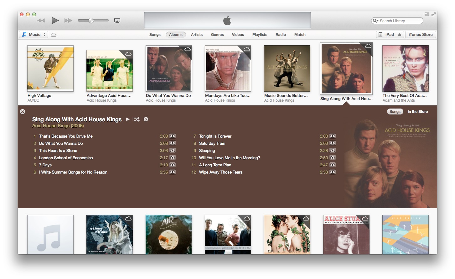
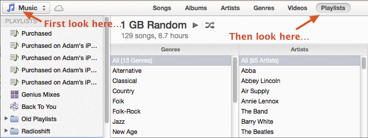
Stripped-Down Interface (That Can Dial Back to 10) — On its initial launch, iTunes 11 looks quite spare in comparison to the busy user interface of version 10.7. Reminiscent of the iOS Music app on the iPad, you’re greeted with an edge-to-edge grid display of album covers from your music library along with the familiar playback controls in the top left corner, a display of what’s playing in the center, and a search field in the top right.
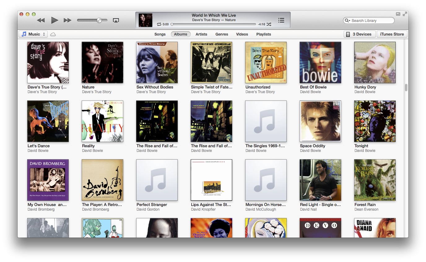
Rounding up several view elements that were previously sprinkled hither and thither, iTunes 11 consolidates its music view options in the bar directly under the toolbar, adding Videos, Radio, and Playlists to the standard Songs, Albums, Artists, and Genres (iTunes 11 drops the Composers and Cover Flow views). Switch among different media types such as movies, as well as shared iTunes libraries on your network, using the pop-up menu below the playback controls. Click the buttons on the right side to access available iOS
devices and the iTunes Store.

Single-clicking an album displays an expanded view of the album’s individual songs below the thumbnail, tastefully rendering this view using the primary hue of the cover as the background color as well as using secondary colors for text. Similarly, clicking the thumbnail in Movies displays the title’s details (such as cast, genre, and running time), while a TV Show expanded view displays a list of episodes. (If you double-click a thumbnail, iTunes starts playing the first song of an album, the first episode of a TV show, or
the movie.)
If the rejiggered interface of iTunes 11 feels like a push over the cliff, you can bring back many of the interface elements of iTunes 10 without much hassle. Head to the View menu to choose Show Sidebar (Command-Option-S) to bring back the familiar view of media libraries, connected iOS devices, shared libraries, and playlists. Additionally, choosing Show Status Bar (Command-/) displays a selected file’s size and play time at the bottom of the iTunes window.
One under-the-hood change to the interface takes place in the search field, which now features unified searching across all your media types — music, movies, and TV shows, as well as apps, podcasts, and books. In iTunes 10, you could search only within the contents of a selected media type (such as music). If you want to return to that more-focused method of searching, click the search field’s magnifying glass menu and then deselect Search Entire Library. Your searches then return queries pulled from just the media type you are currently viewing.
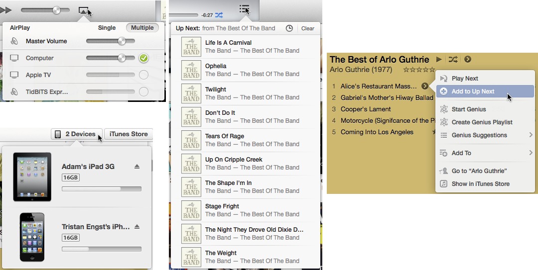
Up Next Feature and Revamped MiniPlayer — Exclusive to music playback, the new Up Next feature enables you to view the songs that are slated to be played next. To view upcoming tracks, click the three-line Up Next icon at the right of the “now playing” area to view a popover showing a list of tracks (or press Command-Option-U). What appears in the Up Next popover depends on where you start playing music. If you start playing a song within the Albums view, you’ll see just the remaining tracks from that specific album. However, if you start playing a song in either the Songs or Playlists view and then check what’s Up Next, you’ll see a list of the next 20 songs
listed in the current sort order.
The magic of the Up Next feature is the capability to add tracks to the play queue on the fly. To do so, click the circular arrow icon next to a song (either in Songs view or in the expanded area underneath a thumbnail in Albums view) to bring up a popover. Clicking Add to Up Next places the song ahead of the previous play order, and any additional songs added to Up Next are subsequently placed in the order that they were selected. If you want to ensure a song is played directly after the current song ends, click Play Next in the popover and that song floats to the top of the Up Next list. This trick also works within the Up Next popover to shift songs to the top. At the top of the Up Next popover, you can clear the entire list or go
back to previously played songs by clicking the clock icon.

The Up Next feature is also fully accessible from the new MiniPlayer, which you activate by clicking the small rectangular icon next to the Full Screen icon in the top right corner of iTunes. Pressing Command-Option-3 reveals the MiniPlayer; pressing Command-Option-M reveals it and hides the main iTunes window. As you’d expect, the MiniPlayer displays title and artist information about the currently playing song, along with playback controls when positioning the pointer over the MiniPlayer. You can also access the Up
Next list, search field, and AirPlay controls from the MiniPlayer.

The iCloud Streameth — As you explore your media library, you may notice that it has been bulked up with albums, movies, and TV shows that you don’t actually have stored on your Mac’s hard drive. This is because iTunes displays all purchases you’ve made from iTunes (from the account that you’re currently signed into) and enables you to stream them from iCloud. To determine which music, movie, and TV show files are stored in iCloud, look for a cloud icon in the top right corner of a thumbnail.
![]()
You can stream songs without having to download them first, enabling an iTunes Match-like functionality that’s limited to media purchased from the iTunes Store. It’s mostly useful for avoiding storing files locally, which is handy for those with Macs with limited space, such as a MacBook Air with only 64 GB of flash storage. To preserve a local copy of an album or song on your hard drive, click the iCloud icon (on the album thumbnail or next to a song) to download it. Additionally, you can use the Up Next feature just as
easily with streamed tracks as you can with local music files (but you’ll need an Internet connection for this to work).
To start streaming a movie or TV show, double-click the thumbnail to start the movie or the first episode of a TV show (or click an episode from the expanded view underneath the thumbnail). You can save the video file to your hard drive by clicking the iCloud icon in the thumbnail (or expanded view). If you decide to view a video at a later date, you’ll have to re-stream the video unless you downloaded the file to your hard drive.
Note that if you stop watching a video file that’s streaming, the digital bits continue to download in the background (you’ll be able to see the progress of the download in the “now playing” area). It seems the only way to stop the stream from downloading is to start playing another item from iCloud (whether it be a song or another video).
Finally, if you don’t care to see your iCloud music purchases mingled with the files residing on your hard drive, you can turn off this option by selecting Hide Music in the Cloud in the View menu. To hide videos as well, switch to Movies and TV Shows and choose Hide from the View menu for each of those media libraries.
iTunes 11 Thinks Different about iOS Devices
iTunes 11 promises a simpler interface for interacting with your media library, but don’t forget that iTunes is also a central hub for working with your iOS devices. If you sync and configure an iPhone, iPad, or iPod touch using iTunes (versus doing it all via iCloud), the new version may initially be confusing.
The Hidden Sidebar — In iTunes 10 and earlier, iOS devices show up in the sidebar at the left side of the screen. When you select a device, the main iTunes window reveals options for choosing which media to sync, which apps to include, and so on.
iTunes 11 doesn’t have a sidebar — at least, it doesn’t appear so initially. If you prefer the old look, choose View > Show Sidebar (or press Command-Option-S) to reveal it.
Tasty Popovers — If you’d rather give the new approach a try (and you should), iTunes 11 handles iOS devices in a new button at the right edge of the toolbar. If you have only a single iOS device, clicking the button (named for the device) displays its settings; if you have more than one, clicking the button (now named Devices) shows a popover listing connected devices, along with how much storage is being used and current battery level.
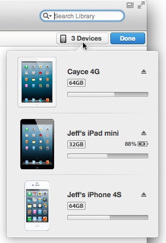
If your devices are set to sync wirelessly, they show up whether they’re physically connected or not, although the battery level appears only for physically connected devices. (You enable Wi-Fi syncing in the iTunes Summary screen with “Sync with this iPad over Wi-Fi” in the Options box. If you’ve turned off Wi-Fi sync, you need to connect using a cable to re-enable it in iTunes.)
Click a device name to access its settings, but beware that it may take a few seconds to appear if you’re using Wi-Fi syncing. When you’re finished, click the blue Done button at the upper right to return to your media library.
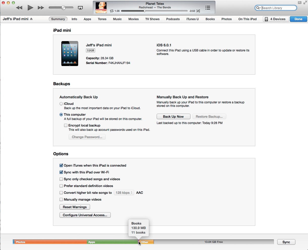
Redesigned Controls — The device syncing options are similar to what appeared in iTunes 10 and earlier, with a few notable differences:
- The storage indicator at the bottom of the window incorporates labels for each type of media into the bars, instead of listing them below it. That means labels don’t appear at all for small items, such as books in the screenshot above. For any media type, hover the pointer over a section to reveal how many items there are and how much space they take up.
-
The data backup options have become more obvious. You can choose to back up data automatically to iCloud or to the computer, as was available previously, but now there’s a Manually Back Up and Restore section in the Summary screen. Click the Back Up Now button (previously hidden in a contextual menu when you Control-clicked the device in the sidebar) to back up your data to the hard disk. If you normally back up to iCloud, this feature gives you a local backup; that’s great if you’re about to travel and want to be able to restore your data quickly if necessary when a lengthy iCloud download isn’t feasible. Should you want to revert to an earlier backup, you need only click the Restore Backup button — previously, you had to
Option-click the Restore button. -
On the Apps screen, Apple has brought a dedicated search field back to the app list. In iTunes 10, the main Search field at the upper-right corner of the window switched to apply to the app list when the App screen was visible, which was confusing.
-
Also on the Apps screen, the apps list now includes an action button for each program: Install for apps that reside in iTunes but not on the device, and Remove for apps that are already installed. This functionality was present in iTunes 10 as well, via the checkboxes next to each item, but it’s decidedly more clear now.
-
If the normal sidebar isn’t showing, a new On This iPhone/iPad/iPod button shows the content stored on the device, with an unusual new left sidebar look. This option is particularly helpful if you subscribe to iTunes Match and don’t store much media on the device itself.
You can add new items individually here by clicking the Add To button (which flips the sidebar to the right side, oddly), and then dragging them from your library to the device. However, you can’t add music if you also use iTunes Match.
-
When a device is syncing, you can cancel the operation by clicking the sync indicator (the two arrows following each other in a clockwise circle).

Overall, the changes related to iOS devices in iTunes 11 aren’t as dramatic as they first appear. You can go back to the familiar behavior of accessing your iPhone, iPad, or iPod touch in the sidebar, or enjoy a less-cluttered interface by jumping to dedicated screens for each device. And some of the ways Apple moved previously hidden functionality out into the open is certainly welcome.
iTunes 11 Interface Innovations: Good and Bad, but Not Ugly
What I’m finding the most interesting about iTunes 11 is not its features, which are almost entirely the same as in previous versions, but the way that it thinks about interface in a rather different way from the previous versions. iTunes is sufficiently central to the user experience of most Apple users that its interface changes could give a sense of where Apple might take OS X’s interface. That may be good or bad, depending on your perspective, but it’s certainly something you should keep an eye on.
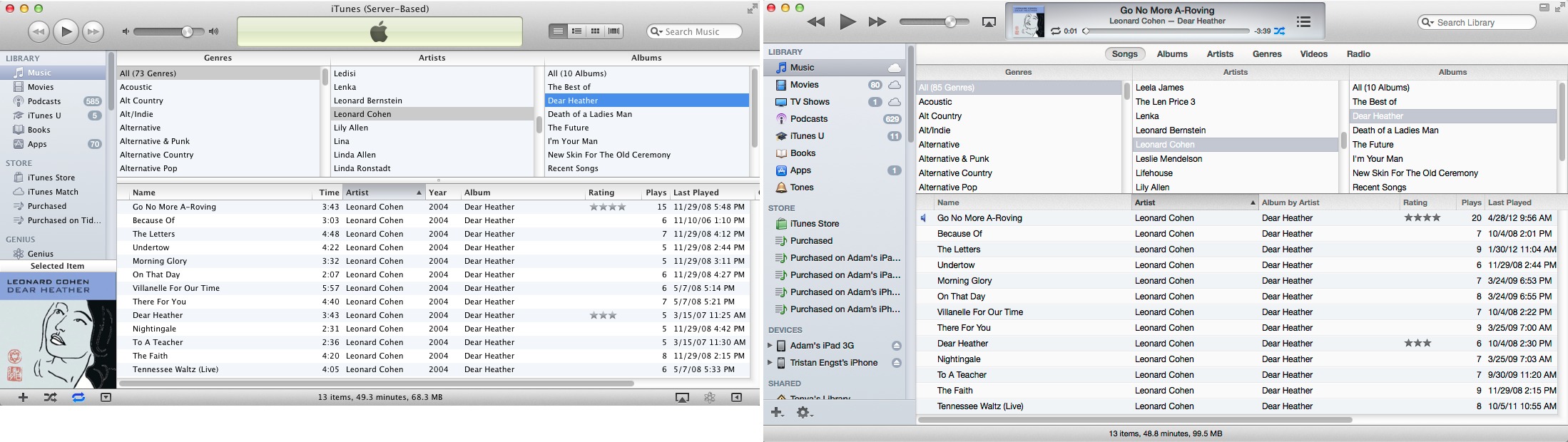
The Sidebar Returns to Oz — The last few versions of iTunes (and the Finder, and Mail) rinsed all color from their sidebars, relying solely on tiny icons and text to help users differentiate among the items. This was widely decried when it first happened, but most of the critics lapsed into sullen silence when subsequent releases maintained the monochromatic look.
Although iTunes 11 deprecates the sidebar in general, when you do show it with View → Show Sidebar, it now appears with color icons throughout. The color is still relatively understated, but works well as a visual cue when attempting to distinguish between the different icons. The screenshot compares the sidebars in iTunes 10 and 11.
I hope to see color return to other parts of the Macintosh experience. Most of us live in a world full of color, and while taking it out of our computing environment may have made a design statement, it was a step backwards in usability.
Fonts Get Bolder, with More Leading — Notable for anyone who pays attention to fonts is the switch in iTunes 11 to Helvetica, from Lucida Grande. But Apple didn’t stop there, and iTunes 11 features a significantly different approach to application typography that’s more in line with the Web or with iOS apps than with traditional Mac apps. The fonts are larger, and there’s more leading (space between lines), which renders the screens more readable, although at the cost of information density.
As you can see in the comparison windows below, iTunes 11 uses 8 percent more vertical space to display the same information as iTunes 10 did, largely thanks to the added spacing between text. The sidebar comparison screenshot above is even more indicative of this, showing a roughly 15 percent increase in height. That will mean more scrolling, especially on small MacBook screens, but overall, I think it’s a worthwhile tradeoff.
I could easily see this sort of typography come to the Finder and Mail in future versions of OS X, where it would likely have the same effect of reducing the amount of information showing on screen at any one time, in favor of making it less crowded and more readable.
Modal Screen Displays — One of Apple’s notable interface trends with Mac OS X has been the move from multi-window apps to those that incorporate most of their interface into a single window with panes and sidebars. iTunes was in many ways the poster child for this move, offering multiple sidebars and radically changing the contents of the main window based on the selection in a sidebar.
iTunes 11 continues this trend, seeming ever more like an iOS app running in constrained screen space. The loss of the default sidebar plays into this screen-based approach, since there is no longer a ubiquitous sidebar that clearly identifies the top level of the selection, as in iTunes 10. Without the sidebar showing, various menus and buttons at the top of the iTunes 11 window, just under the toolbar, control what shows underneath. The problem is that this navigation bar packs a lot of these controls in, and because they occupy only a single horizontal row, it may be clear what is selected, but it’s not clear what is available to be selected.
To be more specific, the pop-up menu on the far left of the window lets you select among media types (music, movies, TV shows, podcasts, iTunes U, books, apps, and ringtones; fortunately, these can also be accessed by pressing Command and a number matching their place in the list, such as Command-1 for Music and Command-2 for Movies). That’s just like the items in the sidebar, and again, while you can see what is selected, you must open the menu to see the other options. Then, the lozenge-like buttons in the middle let you either refine what appears below (such as by limiting the view to only iPad apps or audiobooks), or offer an entirely different view of the contents (such as playlists or genres). A popover toward
the right side of that top bar lets you access your iOS devices, changing the screen yet again, and the final button gives the entire window over to the iTunes Store.
Using this interface isn’t terribly hard, but when you navigate around, leave the program for a while, and then come back, it can be hard to get your bearings. This is made all the more confusing by the many different types of views that iTunes 11 supports. I count at least the following seven types:
- List, with an optional three-pane column browser (Songs)
- List, with a sidebar and an optional column browser (Playlists)
- Detail list, with one (Podcasts) or two (Playlists) sidebars
- Thumbnail (Albums)
- Thumbnail with sidebar (Genres)
- iOS device screens (which vary significantly, and add the On This iPhone and Add To screens)
- iTunes Store (which at least has a white-on-black bar at the top to differentiate it).
That’s a lot of different screens, especially given that many of the iOS device screens differ from one another while being named similarly to the media screens.
Three additional facts make this approach all the more troubling. First, unlike a Web site’s breadcrumb trail, there’s little in the way of locational cues. For any given screen, you must look at the left side of the top navigation bar to determine what type of media you’re looking at, and then at the lozenge buttons in the center of that bar to figure out what view or refinement to the listed contents is showing.
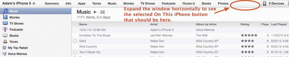
Second, at least when you are viewing an iOS device, it’s possible to shrink the window horizontally so that some of the 12 center buttons disappear entirely with no indication of where they’ve gone. Imagine trying to help someone click the On This iPhone button when the window is too small to display it.
Third, working with an iOS device not only takes over the entire screen, it requires that you click a Done button to escape back out to the media screens. If you use the Add To function to put media on your iOS device, you go down to another level that looks like the media screens in every way, except for the addition of a right sidebar and yet another Done button.

Frankly, I think Apple has rather gone off the rails here. You can quibble with the old sidebar interface, but it was always clear where you were, and what you were working on. This new approach is undeniably more attractive and probably easier to use when you are within a screen, but moving between screens with so few locational and navigational clues is going to be a major problem for less-sophisticated users. I sincerely hope that this doesn’t become a model for other Mac applications, and the fact that Apple
lets you bring the sidebar back says to me that they’re not entirely comfortable that this new approach is better — it’s unlike Apple to allow users to revert to older ways of working.
There’s another aspect of this push to a single window. Missing in iTunes 11 is the capability to open a playlist in a separate window or, more to the point, multiple playlists in multiple windows. For those, like our own Matt Neuburg, who use iTunes as a music database, the loss of that functionality is seriously problematic. But more to the point of this article, the Finder is a perfect example of an application that needs multiple windows for file manipulation. Should Apple attempt to shoehorn the Finder into a single window interface, significant power and flexibility would be lost.
Multiple Menu Types — Lastly, I find myself perturbed by some of the ways Apple has started concealing what are effectively menus underneath buttons, with no indication that the button is in fact a menu — the FaceTime button in Messages is particularly glaring. In iTunes 11, Apple has four types of these controls (ignoring the traditional pop-up menus you’ll find in all of iTunes 11’s dialogs, which haven’t changed at all from iTunes 10, oddly enough).
First is the custom pop-up menu used for choosing among media types. It’s good, because it includes a pair of arrows to indicate that it’s a menu and it responds to a click-and-hold action like a menu should, along with responding to individual clicks to open the menu and choose an item within it. It always has a required state — some media type must always be selected.
The second type of menu is a graphical button with a name beneath, much like a Finder icon. The main instances of this that I can find are the View button in the Playlists screen and the Options button in the CD import screen. These are also a good approach, since they combine text and graphics, have a downward-pointing triangle to indicate that they’re menus and not normal buttons, and respond both to a single click and to a click-and-hold. That said, these two are quite different in what they contain: the View menu
affects the display of the Playlists screen, remembers its selection, and even changes its button to match, whereas the Options menu holds commands that perform other tasks.
![]()
Third, we have a button/menu combination, where clicking once on the button has one effect, and clicking and holding on it reveals a drop-down menu that provides additional options — the buttons in the iTunes Store nav bar are good examples of this type. There’s no indication that these buttons also have associated menus until you hover over them, at which point a small downward-pointing triangle appears. (Usually, at least. The iTunes account button containing your email address is actually only a menu, and doesn’t get that
arrow.) They do respond properly to click-and-hold, and to individual clicks, though the latter must be precisely on the triangle to reveal the menu rather than invoking the button. Also, these menus don’t have a required state or change to indicate the selection — clicking the Podcasts button takes you to the Podcasts section of the iTunes Store, for instance, but that button’s menu just lets you dive into particular categories of podcasts and doesn’t reflect what you’re viewing.
Fourth and finally, is the popover, which appeared in iOS relatively recently. Popovers are called forth by a single click on a button; there’s no indication like the downward-pointing triangle that the button will generate a popover ahead of time, and a click-and-hold won’t work. Popovers also aren’t exactly menus — what’s in them is entirely unpredictable, and may involve additional interface elements. Look at the AirPlay popover, which lets you select between one and multiple destinations, adjust
the volume for each independently, and control a master volume. The iOS device button also generates a popover showing the available iOS devices and the memory usage on each; the Up Next button (the three stacked horizontal lines) has yet another popover interface; and selecting or hovering over a particular piece of media shows a right-pointing triangle that reveals another menu-like popover.
I see what Apple is trying to do here — traditional pop-up menus are much more limiting than popovers, with their unique interfaces, and the button/menu combos are more like Web-based navigation menus. But I know that many people — including myself — find some of these buttons, particularly the obscure graphical ones that invoke popovers, utterly inscrutable, and the fact that they have become the only ways to access certain features like AirPlay worries me. Back when button bars started to become popular, it became clear that some people
simply don’t do well with arbitrary graphical images, and far prefer words. We as a people don’t share a common graphical language, and no matter how popular Apple products get, a graphical language will always be obscure and poor in vocabulary.
Because there’s no way to know what the graphical buttons do, users are forced to play iTunes like a video game, clicking everything in sight and trying to remember the sequence of clicks that reveal necessary controls. At least some of the buttons have text on them, even if they act in different ways: the iOS devices button reveals a popover whereas the otherwise identical-looking iTunes Store button next to it switches to the iTunes Store interface.
There is one aspect in which these button menus are good thing, and that’s when they bring forth functionality that was previously hidden only under contextual menus. Contextual menus are good when they provide an additional or faster way of accessing commands or options, but since they’re even less discoverable than these buttons (how would you know to Control-click something in the iTunes sidebar?), it’s a major problem when they’re the only way certain commands or options are exposed. That’s always been bad interface design.
In the end, it’s good to see Apple trying to extend interface concepts with all these new approaches in iTunes 11 and some, like the use of color and the new approach to application typography, are welcome. But there’s a distinct lack of consistency and attention to discoverability that renders the single-window model and multifarious button menus less successful than they might be. I cringe at the thought of trying to help someone use iTunes 11 over the phone — it will be nearly impossible to describe the screen successfully and to walk someone through different actions if you can’t do so in person. And that will happen, since while iTunes 11 is attractive and certain actions are simple, plenty of other actions are made all the
more difficult by some of these new interface conceits. Let’s hope Apple puts more thought in before extending these concepts to other parts of OS X.
Be a Freecycle Santa
[I wrote this article almost a year ago, but too late to do much good before the holiday season, so I’ve dusted it off for this year. It’s still entirely accurate and relevant, and I strongly encourage everyone to think about clearing out electronic clutter in this fashion, as I too will be doing once again. -Adam]
Several years ago, I raved about how quick and satisfying it was to dispose of old and potentially dodgy electronics via the Freecycle Network, a loose affiliation of mailing-list based groups of people who exchange reusable goods for free (see “Freecycle: Disposing of Good Old Stuff,” 6 August 2007). Every so often since, I resubscribe to the Ithaca Freecycle list whenever I come across something that I’d far rather give away than throw away — a portable chair that didn’t fit either me or Tonya, an old tabletop that was taking up space in the garage, a houseplant that had outgrown our living room, and so on.
I was recently bemoaning the fact that we had some elderly iPods and a PlayStation 2 that Tonya had gotten to play Dance Dance Revolution (but stopped using because she didn’t like the music), all of which were perfectly functional, but none of which had been touched in years. They weren’t worth the effort of selling, given the prices for comparable or better items I’d seen on craigslist. Then I had a brainstorm — many people on Freecycle would surely want these items, despite their age, and even better, given the time of year, I could require that they be used only as presents for kids who wouldn’t otherwise receive such a gift.
Posting them on Freecycle was a huge success — I immediately received email from numerous people who were interested, and I set up pickups for the people who I felt had the most need and the kids who were most likely to appreciate the gifts. The PlayStation 2 went to the 7-year-old daughter of a single mother working two jobs while undergoing a divorce. The iPod photo went to the teenage daughters of another single mother working two jobs, and the third-generation iPod will be shared by the five children of a woman who couldn’t work because of a medical condition.
Perhaps most gratifying was the iPod nano, which a teaching assistant at a local elementary school is giving to a third-grader whose family (a single mother of four kids who is working double shifts at a hotel) can’t make ends meet, to the extent where teachers at the school have been helping with necessities like food, clothing, and required dental care. When the teachers asked the third-grader what he liked to do outside of school, the kid said, “I know what you’re trying to do, but don’t worry about me and just get things for my little brother. I’ll be fine.” I hope he likes the iPod; the teaching assistant is also giving him an iTunes gift card and helping him set the iPod up on a school computer.
The only hard part about giving these old electronics away has been hearing from all the people who are similarly deserving. I could have given away a dozen PlayStations and twice as many iPods if only I’d had them.
But some of you do have them. So I’d like to encourage everyone out there with old iPods, digital cameras, game consoles, or other unused but functional electronics to don a virtual Santa hat and see if you can brighten some kid’s Christmas this year via Freecycle. The most difficult barrier to clear with Freecycle is simply getting started. Here’s what you have to do.
- Go to the Freecycle Network site and search for your town. You can also browse through lists to find a nearby group.
- For groups hosted on the Freecycle site, posts will appear, along with Sign Up/Log In and Search Posts buttons (once you’re logged in to the Freecycle site, that first button changes to Join This Group). For older groups that are still hosted on Yahoo Groups, there’s a small “Visit the group and see the posts” link, way at the bottom of the screen.
-
For Freecycle-hosted groups, log in and click Join This Group. For Yahoo Groups-hosted groups, follow the link to Yahoo Groups, and click the Join This Group button. You’ll have to log in with your Yahoo ID.
-
Once you’re a member of the group, you can post. The Freecycle site has a Web form for this, which I haven’t used, since the Ithaca group is hosted at Yahoo Groups, but I presume it’s basically the same as sending email to the list submission address. The Subject line of the post must start with the word OFFER and then list what you’re giving away. In the body of the message, be explicit about the item, the condition it’s in, and any other relevant details. I recommend including links to more information or pictures, if that’s easy (I often take a photo with my iPhone, put it in my
~/Dropbox/Publicfolder, Control-click to copy the public Dropbox link, and paste the link into the
email message). -
At the end of the post, provide details about how you’ll choose from among the people who reply — this is where you should be explicit about wanting the item to be a gift for a deserving child and ask that people provide a little background to help you choose. Be sure to say roughly where you’re located (not your address, just your neighborhood) so people can evaluate how far away you are, and also ask that people tell you where they’re coming from and when they can meet you, so you can take schedule and unnecessary gas consumption into account in choosing a recipient.
-
After you post your message, you’ll start receiving replies. Don’t respond to them at first; it’s better to wait a few hours to make sure you have a representative sample. Then you can pick the most deserving recipient, reply via direct mail to set up a pickup time and place (either your home or office, or a nearby public space), and meet with the recipient. If you post in the morning, you can often give the item away by the evening — it’s seldom a drawn-out process.
-
Finally, once you’ve chosen someone, post another message to the list with the same Subject line, replacing the word OFFER with the word TAKEN. That’s sufficient for alerting the people you didn’t pick, although there’s certainly no harm in replying to them individually as well.


The incredible response I got to this rather offhand idea was what prompted me to write this article (I even received a number of extremely kind messages from people who just wanted to thank me for helping kids in this way). I encourage you to follow suit while there’s time before Christmas, and honestly, even if you’re reading this article after the holidays, there’s nothing stopping you from giving away unused items and saying that you want some item to be a belated Christmas present for a child whose holiday was otherwise pretty bleak.
TidBITS Watchlist: Notable Software Updates for 3 December 2012
Hazel 3.0.15 — Noodlesoft released Hazel 3.0.14 to enable you to edit notification options from the file cleanup utility when running in OS X 10.8 Mountain Lion. Accessed via the gear pull-down, you can select Notification Center or Growl (if you have the latter installed) and specify which kinds of notifications should be displayed. (By default, Notification Center gets the nod if both are available.) The update also fixes instances of Hazel not keeping track of Trash if it is empty on startup and more reliably matches patterns with accented characters. Noodlesoft subsequently issued version 3.0.15 to fix a crash in
notification options and a disabling of the gear pull-down when notification options are available but no folders are present. ($25 new, free update, 6.2 MB, release notes)
Read/post comments about Hazel 3.0.15.
CloudPull 2.1.7 — With CloudPull 2.1.6, Golden Hill Software has updated its Google-data backup application to reflect changes in how Google exports documents and spreadsheets. Specifically, the new release ensures that filename extensions and formats reflect changes Google has made to documents (switching from the .doc format to .docx) and spreadsheets (changing from .xls to .xlsx). After installation, CloudPull will download current versions of spreadsheets and documents as new versions. (Presentation files also get updated, even though Google has not changed the file extension from its current .ppt. Golden Hill notes
that CloudPull will be ready for a switch to .pptx should Google make that change.) Additionally, CloudPull now updates its record of special mail folders to reflect changes in account language between backup iterations. A separate CloudPull 1.5.8 update brings these changes to the pre-Lion version of the utility.
Shortly after version 2.1.6 was released, Golden Hill issued version 2.1.7 to fix a bug that crashed the app if the user selected a Google Drive folder that contained at least one subfolder. ($9.99 through 31 December 2012 via direct download or via the Mac App Store, free update, 8.4 MB, release notes)
Read/post comments about CloudPull 2.1.7.
Snapz Pro X 2.5.1 — Ambrosia’s Snapz Pro X screen capture utility gets updated to version 2.5.1 with a fix to a positioning problem that Adam Engst called out in his recent write-up of the screen capture utility’s update to version 2.5 (see “Snapz Pro X 2.5 Finally Makes Nice with Mountain Lion,” 16 November 2012). The new release now properly remembers the selection position on multiple monitors. Other fixes include improved hotkey handling, removal of an incomplete Italian localization, and changes to the installer to address some instances of failed
installations. ($69 new, free update, 13.8 MB)
Read/post comments about Snapz Pro X 2.5.1.
TweetDeck 2.1 — Twitter has released TweetDeck 2.1, an update that adds a smattering of features to the company’s column-based client. The new release adds support for photo and player cards (the latter of which can play video and audio), plus it enables you to edit and refine search columns using the new column options (click the magnifying glass icon at the top of a column). It also adds the capability to type “n” to start a new tweet and press Command-Enter to send a tweet. Also included are fixes for Retina display support and profiles that didn’t load under certain circumstances. (Free,
1.4 MB)
Read/post comments about TweetDeck 2.1.
Audio Hijack Pro 2.10.6 — Rogue Amoeba has updated Audio Hijack Pro to version 2.10.6, which also updates the Instant On component to version 6.0.2 in order to improve audio capture from VMware Fusion (as well as other unspecified apps). The latest version Audio Hijack Pro also improves capture from the Zoiper and Bria 3 softphone apps, adds ID3 tags to AIFF recordings for viewing in iTunes, fixes a bug that caused future timers to fail to be scheduled, addresses multiple AppleScript support issues, corrects display of the 4FX plug-in in the Effects area, and restores audio capture from iSight cameras. ($32 new
with a 20-percent discount for TidBITS members, free update, 5.6 MB, release notes)
Read/post comments about Audio Hijack Pro 2.10.6.
Thunderbolt Firmware Update v1.1 — Apple has released Thunderbolt Firmware Update v1.1, which addresses a problem with the mid-2012 MacBook Pro (when using certain Thunderbolt cables) that prevented some bus-powered Thunderbolt devices from working as expected. The update requires Mac OS X Lion 10.7.4 or later. (Free, 442 KB)
Read/post comments about Thunderbolt Firmware Update v1.1.
ExtraBITS for 3 December 2012
You may already know about the Mac app Fantastical, which replaces the Calendar app under OS X. Fantastical is also now an app for the iPhone, which Matthew Panzarino reviews at The Next Web. Also this week, we learn that Barnes & Noble can wipe out one’s library of purchased ebooks if a credit card expires, and News Corp. shutters The Daily iPad app.
News Corp. Ceases Publication of The Daily — Peter Kafka at All Things D (itself owned by News Corp.) hits the nail on the head in his coverage of the shuttering of The Daily, the much-ballyhooed iPad-only news app that had the blessing of Apple. “While the app boasted lots of digital bells and whistles, in the end it was very much a general interest newspaper that seemed to be geared toward people who didn’t really like newspapers.” That’s in line with the title of our article covering The Daily’s launch: “Why The Daily Is So
Yesterday” (3 February 2011).
Fantastical for iPhone Gets Rave Review from The Next Web — Over at The Next Web, Matthew Panzarino reviews Fantastical, a new calendar app for the iPhone that rethinks the way we interact with calendars on a small screen. It’s an in-depth piece, and if you’ve been frustrated by Apple’s Calendar app, it’s worth reading to see if Fantastical is the replacement you’ve been waiting for.
Barnes & Noble DRM Fails with Expired Credit Card — Yet another reason why DRM is wrong. When a Barnes & Noble customer tried to download a previously paid-for book, an error message appeared, stating that the download had failed because the credit card on file had expired. As the cool kids say, “Epic fail.” The expiration status of a credit card for a previously purchased book should be entirely irrelevant for a later download, and to extend the scenario, there should be no requirement that the account be linked to a credit card at all after the
purchase has been completed.