TidBITS#1276/15-Jun-2015
In this week’s issue of TidBITS, we traverse a wide variety of topics. Apple has combined its developer programs for OS X, iOS, and Safari into one convenient package. Josh Centers describes three alternative ways to wear your Apple Watch Sport and examines the Robinhood stock trading app for the iPhone. Dan Moren joins us to explain how Doodle can make scheduling meetings a snap, and Steve McCabe tells us about his Apple Pay experiences around the world. We also bring you news of the SummerFest 2015 software sale and welcome a new sponsor: Bushel, a cloud-based service that simplifies Apple device management for small organizations. Finally, TidBITS newcomer Alexandre Leroux explains how to unlock the full potential of the iTunes visualizer in our latest FunBITS installment. Due to many developers being in San Francisco for WWDC last week, the only notable software release this week is GraphicConverter 9.7.
Bushel Sponsoring TidBITS
We’re particularly pleased to welcome as our latest long-term TidBITS sponsor Bushel, the cloud-based mobile device management (MDM) solution for Apple devices in the workplace. What’s MDM? Put simply, it’s the automation of standard setup and maintenance tasks for iPhones, iPads, and Macs so when a new device arrives, you don’t have to manually configure email, distribute apps, or enable necessary security settings. Created by JAMF Software, Bushel is designed for small to mid-sized organizations that have outgrown manual configuration but aren’t at the size where JAMF’s enterprise-level Casper Suite is warranted for MDM.
Much of the difference comes down to features and price — while Bushel offers only some of the core features that Casper does, it is much more affordable at $2 per device per month. And you can give Bushel a try for free with up to three devices.
Julio Ojeda-Zapata reviewed Bushel several months ago in “ITbits: Bushel Helps Small Companies Manage Apple Devices” (31 March 2015), concluding that “it’s simple, easy to understand, and inexpensive — a perfect combination for allowing the part-time IT administrator to get back to her other tasks.”
That’s why I’m particularly happy to have Bushel as a TidBITS sponsor — while it’s good business for Apple to focus on the mainstream consumer market, with its games and chats and social networking, I really like it when TidBITS can help people who use their Apple devices for actual productive work. If that part-time IT administrator can tell her boss that she has rationalized all device management for less than $25 per year with Bushel after reading about it here, that makes my day.
Thanks to Bushel for their support of TidBITS and the Apple community!
SummerFest 2015 Sale on Artisanal Software
“Love looks not with the eyes, but with the mind.” ―William Shakespeare
That bit of wisdom from “A Midsummer Night’s Dream” came to mind when some of our favorite developers approached us about participating in their SummerFest 2015 sale. We spend our days researching, writing, and editing, so a sale on artisanal writing tools from small teams that are as passionate about their apps as we are about our text seemed like an ideal match. This isn’t a gimmicky bundle with apps you’ll never use — just a simple 25-percent-off sale on six great programs and our Take Control books, through 30 June 2015.
The curated collection includes a number of apps we rely on daily or have covered over the years. DEVONthink Pro is superb for storing notes and research materials. Eastgate Systems’ Tinderbox helps you organize, plan, and map your thoughts. You can plot out the chronology of any story with Aeon Timeline. Literature & Latte’s highly regarded writing studio Scrivener helps you turn your research and ideas into a manuscript. If references are essential in your writing, Bookends helps you collect, annotate, curate, and cite published information. For working with editors and polishing your final draft (plus any imaginable text manipulation need), Nisus Writer Pro is unparalleled. And, of course, our Take Control library of books helps you better use these apps — including titles about DEVONthink Pro and Scrivener — and your Mac in general.
The links for the apps above are all for more information; to take advantage of the 25 percent discount, click through from the main SummerFest page or use the SUMMERFEST2015 coupon code when ordering.
If you take your writing seriously, do yourself a favor and invest in the tools and training that let you focus on the best way to convey your ideas to the world.
Apple Combines Developer Programs
In an entirely sensible move, Apple has combined the previous Mac Developer Program ($99 per year), iOS Developer Program ($99 per year), and Safari Developer Program (free) into a single $99-per-year Apple Developer Program. As of 8 June 2015, only one membership in the Apple Developer Program is necessary to build and distribute apps for OS X, iOS, and watchOS, along with extensions for Safari. This essentially halves the cost of developing for both the Mac and iOS, though those who were previously only in the free Safari Developer Program now face a $99 charge.
How will the transition work? If you were enrolled in only the Mac Developer Program or the iOS Developer Program either as an individual or as a team, your membership expiration date and number of Technical Support Incidents will remain the same. If you were previously in both the Mac and iOS Developer Programs, your expiration date has been extended to include the sum of the days that remained in both programs, and Technical Support Incidents associated with both accounts have been combined. For teams, roles have been consolidated and members retain the role with the most permissions.
Those who were only in the free Safari Developer Program will need to join the Apple Developer Program to submit extensions to the Safari Extensions Gallery for El Capitan. Current extensions will remain available for download on the existing Safari Extensions Gallery until the release of OS X 10.11 El Capitan in the fall.
For teams in the iOS Developer Enterprise Program, your account has automatically been updated to the Apple Developer Enterprise Program, which also includes resources for developing Mac apps. Otherwise, expiration dates, number of Technical Support Incidents, and member roles remain unchanged.
Regardless of what sort of account you have, you must log in to the Member Center and accept the new Apple Developer Program license before you can access development resources.
Doodle Helps You Schedule Meetings
I schedule many, many events. When you’re trying to line up six panelists for a podcast, email quickly becomes unwieldy, which is when I turn to Doodle, a Web service that allows you to poll people about their availability and figure out which time works best for as many people as possible.
For event organizers, starting a Doodle poll involves opening its Web interface and clicking Schedule an Event. You can create a Doodle account for free, but you don’t even need to do that in order to schedule an event or register your availability for someone else’s. An account is merely a matter of convenience if you use Doodle frequently, letting you keep track of all your open polls, both as an administrator and a participant.
When creating an event, all you have to enter is a name — descriptions and locations are optional. You can pick days from a monthly calendar or choose more specific times from a detailed weekly calendar view. There’s also a free text option if you don’t want to lock your event down to specific dates — i.e. “every other Monday.“
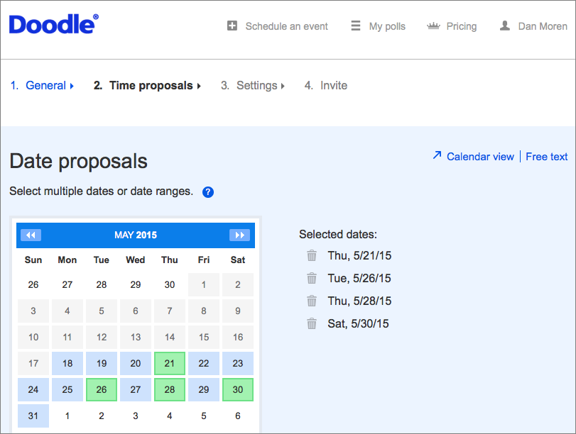
In today’s far-flung virtual society, it’s particularly helpful that Doodle offers support for time zones, letting you associate the times you offer with a particular time zone. That makes it much easier to wrangle participants from across the country or around the world. Also helpful is how the service gives you the option of adding as many time slots as you could reasonably want, as well as letting you copy your list of time slots from one day to the others, so you don’t have to tediously duplicate all that info.
By default, invitees can mark whether they are available or not at a specific time; as an advanced option, you can allow people to choose an “If Need Be” option. You can also limit participants to choosing only one time period, and close the poll after a certain number of people have entered their availability. In the latter case, it would at times be more convenient if you could specify closing the poll once a quorum of people have selected a time in common. Finally, you can create “hidden” polls, in which the results are shown only to the administrator, not to other participants.
Doodle conducts most of its business by email, sending messages to the people you invite to the poll (or letting you send the link manually to anyone you want to participate). That’s a plus, because email remains the lowest common denominator for electronic communication. The fact that participants don’t have to sign up for Doodle in order to register their availability is also great, since it removes barriers to people actually filling out the poll.
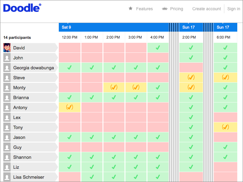
The Web interface for Doodle is pretty good, if not the most attractive. As an administrator, I particularly like the efficient way it collapses time slots with fewer responses, highlighting the times that the most people have in common. Color coding of slots — green, yellow, red — makes it easy to see at a glance when people are available. As a participant, it’s easy enough to click a link and fill out availability — I’ve used a Google Sheet for attendance tracking before, and it works well, but it takes far more setup than Doodle
does to get the same level of features and polish.
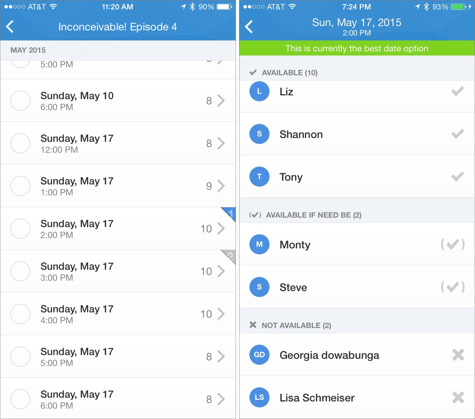
Doodle also has a free iOS app, and while it has recently been redesigned, I still have a few issues with it. First, there’s no iPad native version; it’s iPhone-only.
Second, I find the app’s interface difficult to use at times. For example, when I loaded a poll that I had created, it showed me a long scrolling list of times but acted as though I hadn’t filled it out — which I hadn’t, since as the creator of the poll, I had only put down times that worked for me. While it also displayed the number of people who said they could make a certain time, it wasn’t immediately obvious that tapping that number would show me who was available at that time — as opposed to anywhere else in that row, which marked my availability. There’s no demarcation at all between those two tap areas. It’s also hard to figure out at a glance who is available at the various times and compare
them. To its credit, the app does at least identify which times have the most people in common.
But my biggest frustration is also one of Doodle’s smartest moves. So much of Doodle is free that you’d be excused for wondering how the company makes enough money to keep the service afloat. Though the service does have ads, Doodle also offers premium features, some of which are pretty niche: SSL encryption if you’re concerned about the security of your poll, the option to request additional information (like postal address), and automatic reminders.
But the most attractive of the premium features, at least to me, is integration with your existing calendars from Google, Outlook, iCloud, and so on. This is particularly a big deal on the mobile app, because when I open a poll in it, I constantly need to flip back and forth between the Doodle app and my calendar to figure out if I’m available at the times listed. That integration will cost you $39 a year; businesses can also opt for an additional level of customization starting at $69 per year and rising depending on the number of premium users.
Overall, despite my gripes with the iPhone app, I find Doodle to be an invaluable scheduling tool. It turns what used to be a painful process of email lists, reply chains, and hair-pulling into something that is pretty much seamless. With such a low learning curve, it’s entirely worthwhile to invest the time in setting it up. And if you can afford to pay for the premium level of calendar integration, doing so makes Doodle even better.
Three Alternative Ways to Wear the Apple Watch Sport
The Apple Watch may be Apple’s most personal product yet. We’ve found it almost impossible to review, since everyone has a different take on it, and everyone seems to end up with different uses for it.
For such an individualistic product, most everyone wears the Apple Watch in the same way. But while wrists may largely fit within certain shapes and sizes, the standard approach may not be the most comfortable for your particular wrist. We at TidBITS have found a few alternative ways to wear the Apple Watch Sport that you may find more to your liking. (We’ve tried these only on the Apple Watch Sport with its plastic band; your mileage may vary with an Apple Watch or a different band.)
Reverse the Bands — Out of the box, the Apple Watch Sport features the shorter band piece with the metal peg on the top, with the longer band piece and its sizing holes on the bottom.
You can switch these around, if you wish. To do so for each piece, hold down the small button on the back of the Apple Watch body, and slide the band out of its slot. Then simply reinstall each part of the band in the other slot. It looks a little odd at first, but works equally well.
Why do this? You may find the Apple Watch easier to put on this way, because you can grasp the top band with your fingers and then hook your thumb into the peg to guide it to the desired sizing hole.
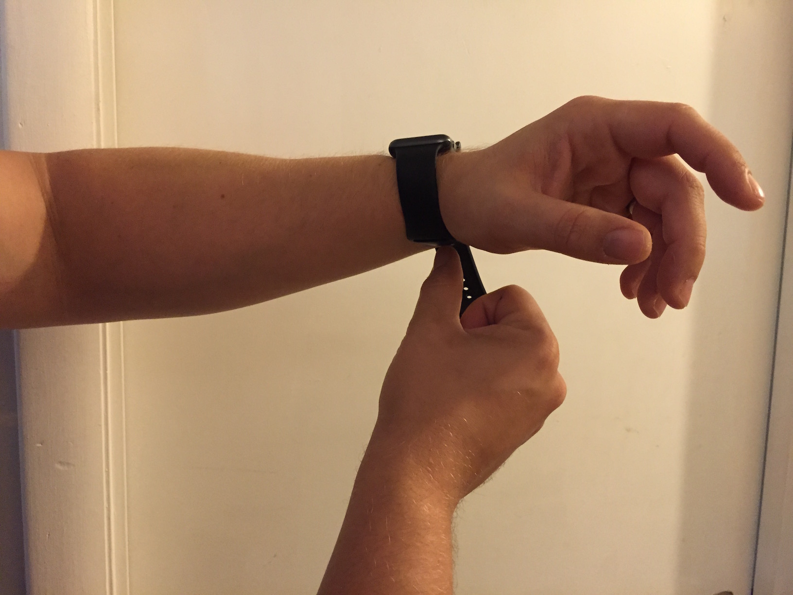
This approach may snag arm hair or pinch skin differently when you slide the end of the band into the slot. For some of us, it was more painful; for others, less so.
Upside Down — This one comes courtesy of developer Craig Hockenberry. Do you like scrolling with the Digital Crown (as opposed to swiping on the screen), but find that scrolling with your index finger feels unnatural?
Try this: remove the Apple Watch and put it on upside down, so the Digital Crown faces your elbow instead of your hand. Then open the Apple Watch app on your iPhone, and in the My Watch view, tap General > Watch Orientation, and change the Digital Crown side (so if you wear the Apple Watch on your left wrist, select Digital Crown on Left Side).
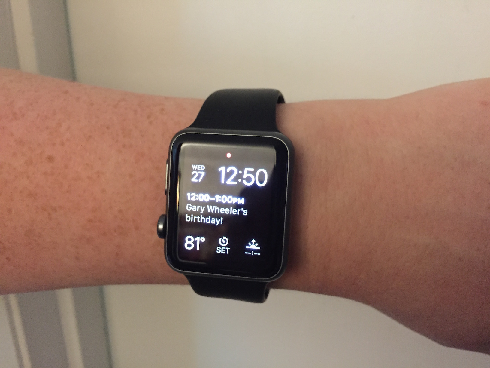
This setup makes it easy to scroll and press the Digital Crown with your thumb. On the downside, the crown may dig into your arm.
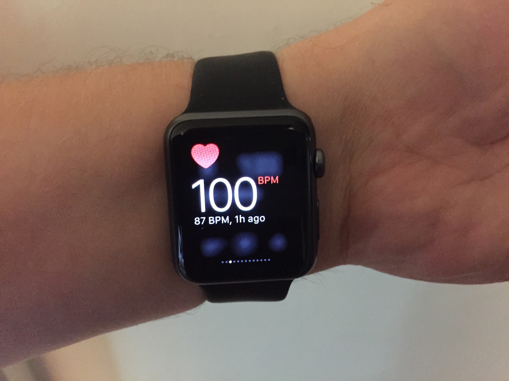
Underhanded — Back in “Apple Watch First Impressions” (27 April 2015), Adam Engst lamented, “It doesn’t seem that you can wear the watch on the inside of your wrist, since its accelerometer doesn’t reliably detect that you’ve raised the watch when it’s worn in that position.”
But it turns out that you can, with some caveats. Unfortunately, as Adam noted, the Apple Watch can be persnickety. While raising my wrist to activate the screen does work most of the time when the watch is in this orientation, it’s not as fast as if it were on the outside of my wrist, especially when I’m sitting down (if it activates at all while I’m seated). And while the heart rate sensor usually works on the inside of my wrist, it does fail on occasion. When it works, its readings are similar to when the watch is mounted on top of my wrist.
Why would you do this? Perhaps it’s just what you’re accustomed to, maybe you want to protect the screen from scratches or other damage, perhaps not having to turn your wrist over is helpful in your profession, or maybe you have a tattoo on the outside of your wrist that prevents the heart rate sensor from functioning (see “Apple Confirms that Tattoos Block Apple Watch Sensors,” 4 May 2015).
Ultimately, there is no wrong way to wear the Apple Watch, thanks to Apple’s design forethought with the bands and watch body orientation. Feel free to experiment with these approaches to see if one of them proves more comfortable than the standard method, and if you discover yet another way of wearing it, let us know in the comments.
Robinhood Opens Stock Trading to All
I’ve been an investor my entire adult life, but I’ve always leaned toward mutual funds, and more recently, low-cost index funds. Trading individual stocks felt like gambling to me, though I often lament not buying AAPL when it was at $17 many years ago. (Editor’s Note: Of course, as journalists covering Apple, it would be inappropriate for us to own stock in the company. -Adam) But with high minimums and fees for every trade, trading in individual stocks seemed like a waste of money.
But a new iPhone app has changed my view a bit. Robinhood offers free trades with no minimums, all wrapped up in a friendly, attractive interface. It’s free in the App Store, but note that it’s so far only available for U.S. residents who are at least 18 years of age and have a valid Social Security number. Australian residents can sign up for Robinhood’s waitlist to get early access when it arrives.
Since Robinhood charges no fees, you may be curious as to how the company makes money. Steal from the rich? No, it’s more subtle than that; Robinhood collects the interest from the uninvested cash balance in your account. The company also plans to offer margin trading in the future, in which you will be able to borrow money to invest, and Robinhood will collect interest on what you borrow.
While Robinhood promises that “Signing up takes less than 4 minutes,” expect it to actually take up to a week to set up your account. Thanks to the Patriot Act, you must hand over your Social Security number, birth date, mailing address, and employer information, and wait to be approved, which takes about a day. Then, Robinhood will make two small verification deposits into your linked bank account, which again takes a few days. After verifying your account, you select an amount to deposit with Robinhood, and again the transfer takes a few days.
Thankfully, after that ordeal, Robinhood is about as simple as a stock trading app can be. The main screen shows the value of your portfolio, with a chart showing change over time. Scrolling down displays your stocks, along with your watchlist — which is composed of stocks you’ve searched for.
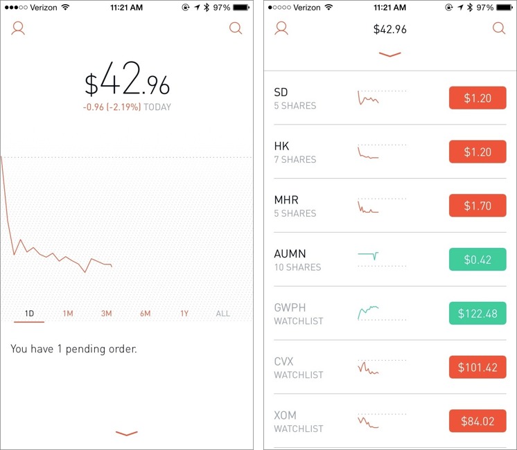
To search for a stock, tap the magnifying glass in the upper right of the main screen. As you enter a company name or stock symbol, suggestions pop up underneath the search box. Tapping a company shows you information about it and adds it to your watchlist. To remove a stock from your watchlist, search for it again, and tap the checkmark to remove it.
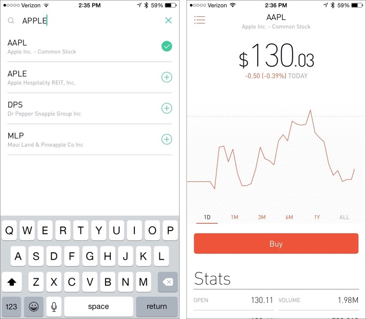
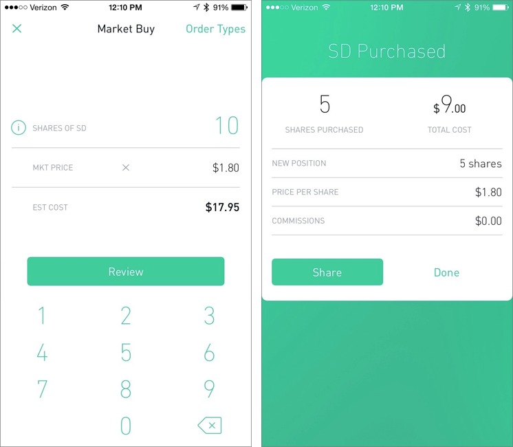
On the company information screen, you can tap the Buy button to purchase shares. Enter how many shares you’d like, tap Review, and then confirm your purchase.
You can also choose different order types by tapping that text label in the upper right:
- Market: A simple share transaction, executed immediately.
- Limit Price: Specify the maximum that you’ll pay for a share. The order will not be fulfilled until the stock drops to that price.
-
Stop Loss: The opposite of a Limit Price, in which a market order will not be placed until the stock hits a set price.
-
Stop Limit: A Stop Limit order combines the last two, so that a market order will not be placed unless the stock price is within a specific range.
Robinhood doesn’t yet offer more exotic orders, like Fill Or Kill or All Or None. And you can’t yet short a stock with Robinhood.
As for the stocks Robinhood offers, you can expect the usual assortment of stocks and exchange-traded funds. However, Robinhood doesn’t yet offer bonds, mutual funds, options, OTC equities, or warrants.
If you own a stock that pays dividends, those are processed automatically and credited as cash in your account, but not automatically reinvested.
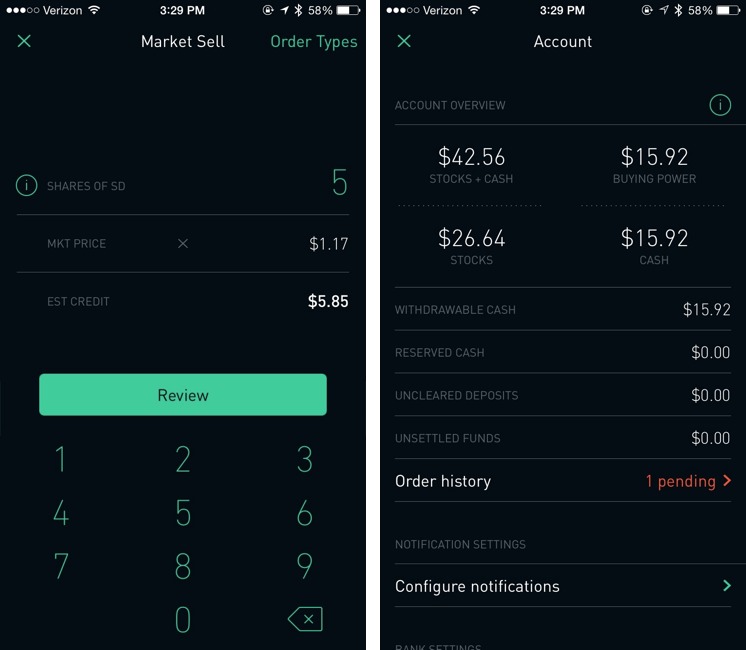
Selling stock is as easy as buying. Select your stock, either from the main screen or via a search, tap Sell, enter the number of shares you wish to sell, select the order type (Market is the default), tap Review, and confirm your trade. Note that there is a $0.02 regulatory fee per sell order, which is out of Robinhood’s hands.
Unfortunately, it takes up to three days for your funds to “settle” after selling a stock, so you can’t sell a stock and then use those funds to buy another immediately. Robinhood says it’s working on speeding this up. You can see your unsettled funds, along with settings and other information by tapping the person icon in the upper-left corner of the main screen.
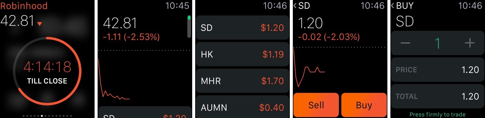
Robinhood also works on the Apple Watch, featuring a glance that shows your balance and a full-featured app that lets you buy and sell stocks.
One frustration with Robinhood is that it can’t yet notify you of changes to stock prices, so you have to keep a close eye on your stocks to decide when to buy or sell. On the plus side, the app can be secured with Touch ID, so a fingerprint is required to see your information.
Hardcore traders may be frustrated by Robinhood’s limitations, as well as its simplistic presentation of data. However, for those just dabbling in the stock market, Robinhood offers an easy, low-risk way to get started. If you’ve ever been curious to see how you could do in the market, give Robinhood a try. Personally, I think I’ll stick to index funds and burying gold.
Around The World With Apple Pay
Apple Pay is currently offered only to holders of some American debit and credit cards, but the system can be used far beyond the borders of the United States. I recently took a round-the-world trip, and used the opportunity to research Apple Pay globally for TidBITS.
Apple Pay requires a recent iPhone (an iPhone 6 or 6 Plus, or a iPhone 5 or later paired with an Apple Watch) with a credit or debit card’s information recorded on it. So far, only cards issued by select American financial institutions can be used, but Apple is planning to engage banks in other territories to expand coverage. Some countries will present more of a challenge than others.
I started my research in my home country of New Zealand. EFTPOS — electronic funds transfer at point of sale — is so entrenched in New Zealand that the country is largely cashless. From the largest retail outlets to mobile coffee vendors parked at the side of the road, almost anyone who will sell you something will take your payment electronically. As vendors update their EFTPOS terminals, MasterCard’s PayPass and Visa’s payWave are steadily gaining ground; if I see the radio-waves logo on a payment terminal, I take out my iPhone 6 Plus and make
a payment, effortlessly, using Apple Pay and my American bank account (a perk of having moved to New Zealand from the United States). No additional setup is required for the retailer — the card reader sees my iPhone as though it were a credit card.
Across the Tasman Sea in Australia, contactless payments are similarly widespread, and as I passed through Sydney, my wallet stayed in my pocket as I paid for train tickets, coffees, a hotel room, and a bottle of water from a vending machine at the airport. There was one surprising holdout, though — the Apple Store. Apple’s retail presence in Australia currently uses card readers built into large iPod touch cases, and these machines read magnetic stripes, meaning that possibly the largest retailer in Australia not to support Apple Pay is Apple.
The United Kingdom, another stop on my journey of Apple Pay discovery, similarly has embraced contactless payment, with many banks issuing compliant cards, and an increasing number of retailers ready to handle them. Indeed, when I tried to pay for a pint of milk in a Tesco Express in Salford with my iPhone, the cashier apologised that their machines did not support contactless payment — clearly, the technology is becoming sufficiently established that its absence, not its presence, is notable. Indeed, after my trip, Apple has announced that Apple Pay will be officially available in the UK in July.
In these countries, then, Apple should have little problem in promoting the use of Apple Pay. Merchants increasingly have the required kit in place. Banks, having implemented payWave and PayPass in their cards, are presumably amenable to further customer-experience enhancements, and will want to see themselves on Apple’s Web site, alongside their competitors, as Apple Pay partners.
More problematic was Japan. I spent the 1990s in Japan, and saw an almost glacially slow movement away from an essentially cash-based retail economy. Even today, while larger shops and department stores accept credit cards, for many smaller retailers, even in Tokyo, cash is the preferred means of payment. Change is starting to happen, slowly, but not entirely in a direction that Apple might prefer.
Suica is an electronic payment system that was conceived originally as a prepaid travel-card system for the Japan Railways East network; it’s now accepted increasingly by chain stores from convenience-store chains such as FamilyMart and 7-11 to larger retail groups such as Yodobashi Camera. While it’s primarily a Tokyo-focused system, the Tokyo area’s 32 million people represent a quarter of the population of Japan, and the Suica card is increasingly becoming compatible with Pasmo, another Tokyo-based payment system, and other local payment systems across Japan.
Operating alongside Suica and Pasmo is Osaifu-Keitai. The name comes from two Japanese words meaning “wallet” and “mobile phone”; the system is, essentially, a Japanese analogue of Apple’s Passbook and Apple Pay systems. Osaifu-Keitai is based on the FeliCa electronic payments NFC chip; any mobile-phone manufacturer can implement an Osaifu-Keitai solution in its phones simply by incorporating a FeliCa chip. The chips are not found in iPhones; since this is a rival system, developed and controlled by Sony, it seems unlikely that Apple will be willing to incorporate FeliCa into the iPhone.
This means that if Apple hopes to make inroads into the Japanese retail economy with Apple Pay, it will need to pitch Apple Pay as an alternative to Osaifu-Keitai and Suica, which will be difficult. The Japanese culture is not known for embracing change, and these two locally developed payments systems could prove to be as much change as Japan is willing to buy into. A typical Japanese consumer currently has a Suica card in his or her wallet, is increasingly likely to have a FeliCa-enabled smartphone, and is now becoming accustomed to paying for everyday purchases using one of these two methods.
The use of credit cards, at least as a Western visitor might understand the idea, remains about as unusual as it was when I was shopping in Tokyo in the 1990s. When I tried to pay for a few souvenirs in Omiya’s Lumine department store, or Tokyu Hands or Kinokuniya in Shinjuku, my American MasterCard debit card was accepted, but not my iPhone. Indeed, in all three shops, I handed my card over to a shop assistant who swiped it through a card reader that was out of my reach and then placed the card on a little blue plastic tray to return it to me — reimagining this system to enable contactless payment with a card reader
on the counter might be a challenge, even for Apple. Contactless terminals are common at station kiosks, speeding up the buying of a manga for the morning commute, but they talk to the Suica or Pasmo networks, not the banks.
However, Osaifu-Keitai is slowly but steadily spreading as a means of credit-card payment. With this homegrown system already in place as Japanese consumers begin to embrace credit-card payments through their phones, it seems likely that Osaifu-Keitai will become the de facto standard in Japan for electronic money.
NTT DoCoMo, the company that is spearheading the use of Osaifu-Keitai in Japan, is working with MasterCard to expand use of the system, across Japan and possibly globally. The implication is that a MasterCard card, perhaps regardless of issuing bank, would be a prerequisite for customers wanting to use Osaifu-Keitai. Contrast this with Apple, which, by listing cooperating banks and credit unions, suggests that individual institutions, rather than the network over which payments are processed, are essential for uptake. If it hopes to tap into the Japanese contactless-payments market, Apple would thus need to work with a significantly
larger number of institutions, which may prove difficult.
No airline flies from Tokyo to Manchester, England, so I found myself breaking my journey in Dubai. I spent a relatively short time there, but did manage to visit the Dubai Mall, reputed to be the largest of its kind in the world. Shopping is, indeed, a significant activity in the Emirate, and Apple will, it seems fair to say, want a part of the payments action. Fortunately for them, my brief excursion through the city suggested to me that credit-card payments are sufficiently common that, if the hardware is available, Apple Pay should be able to establish itself quite well.
Having travelled to Australia, Japan, the UAE, and the UK to explore Apple Pay around the world, I next found myself in the United States. Specifically, in Clearwater, Florida, which I called home until 2009. I had assumed that I would be able to pay for anything and everything in Florida with my iPhone; I was surprised by how wrong I was.
As I had learnt from my experiences in New Zealand, Australia, and the UK, Apple Pay works only if a shop has a payment terminal that handles contactless payments; if that hardware is in place, Apple Pay is effortless, but without it Apple Pay is a non-starter. The latter proved true in a surprising number of instances. Starbucks, a company that has wholeheartedly embraced Apple’s technologies in the past, has enabled some form of Apple-related payment in their outlets, but buying a flat white in Starbucks requires use of a dedicated iOS app, rather than the standard Apple Pay mechanism that even the smallest, most remote coffee shops in New Zealand can handle.
Other stores were better set up to handle Apple Pay — Home Depot’s self-service checkouts, for example, took a payment from my iPhone. But the most interesting non-complier was to be found further inland.
While in Florida, I took my family to Walt Disney World; I was in Florida; how could I not? Thanks to Steve Jobs’s position on its board, Disney is as closely partnered with Apple as any other company in America. But it also has its own ideas about payments. We checked into the Port Orleans, our favourite Disney hotel, and were issued with Magic Bands, contactless payment devices that were, in effect, Disney Pay (you’re welcome, George
Kalogridis). As well as opening the doors to our rooms, in much the way that an iPhone can open the door in a Starwood hotel, our Magic Bands also paid for our meals and held park-admission data. Paying for food and merchandise on Disney property was easy — I just held the band up to a reader.
And so Apple’s Apple Pay challenges in America started to become apparent. In smaller countries, such as New Zealand, or those that tend to follow U.S. technology trends, as is the case in the United Kingdom, for example, Apple Pay should be able to step in quite readily. But in the United States itself, where nationwide chains are big enough that they can start to develop their own systems, there is the possibility of rival systems emerging that will require retooling for compatibility with what might be perceived as a competitor. That said the main one, MCX’s CurrentC, which is backed by Walmart, Best Buy, CVS, Lowe’s, Rite-Aid, and more, has been dogged by criticism and may never be able to
achieve sufficient momentum for liftoff.
But even if an otherwise large company lacks the resources required to develop its own alternative to Apple Pay, it might find itself stumbling under its own size. A single store can switch out credit-card terminals overnight. But a corporation the size of Starbucks will not be as nimble. Sticking with Starbucks as a classic example of how this problem could play out, let’s say that the company decides to switch to contactless terminals, in part to accommodate Apple Pay. Starbucks currently operates, either directly or through franchises, nearly 12,000 branches across the United States. Retooling payments on this scale is non-trivial, and training on the new equipment would be required in all 12,000 stores.
Apple will need to provide a compelling business case for companies like Starbucks, one that demonstrates a healthy return, in order to convince them to adopt Apple Pay. Apple might also have to work directly on the few holdouts, such as CVS or Rite Aid, who are actively blocking Apple Pay (see “The Real Reason Some Merchants Are Blocking Apple Pay… for Now,” 26 October 2014), and other near-field communications payment systems, in favour of their own alternatives. Other chains, such as Home Depot, have been inconsistent in their policies toward Apple Pay, but my experiences around the world suggest that companies
either make a conscious and specific decision to prevent the use of Apple Pay (Rite-Aid), generate their own parallel payment systems (Disney), or simply get caught up in the momentum of contactless payment (as is the case across the UK, New Zealand, Australia and many smaller American stores).
American restaurants will also struggle, incidentally. Wait staff currently take cards away from customers to process them at a remote terminal, and then bring card and receipt back to the customer. It’s not immediately obvious how these payments will be managed using an iPhone; I can’t imagine many customers will hand over their phones for payment, even if some way of circumventing Touch ID were implemented. This is a function of how bills are paid in American and British restaurants. In Japanese, Australian, or New Zealand restaurants, customers pay for their meals at a cash register on their way out — and tips aren’t expected. I understand that in at least some restaurants in Canada, which uses the chip-and-PIN system
that’s commonplace everywhere except America, a waiter will bring a portable payment terminal to a diner’s table to complete the transaction. But as long as meals are paid for at the table, restaurants will need to make significant upgrades to their payment terminals to accommodate Apple Pay.
In short, Apple Pay looks set to gain ground in many, but by no means all, major territories around the world. More surprising is that the United States, Apple’s home turf, might turn out to be one of the toughest nuts to crack.
FunBITS: Be a VJ with the iTunes Visualizer
There’s an underused gem of creative software installed on hundreds of millions of computers worldwide: iTunes. Yes, that’s right, iTunes. You may have thought it was just a media player, or perhaps a management utility for your iOS devices, but it has a little-used visualizer that can enable anyone to create stunning animations.
Here’s how to have fun with iTunes’ built-in visualizer and become a VJ — VJing being described as creating a “real-time visual performance.” Once you’re aware of a few important facts and tips, it becomes a joyful experience to control beautiful and colorful live 3D animations, with nothing required other than iTunes and music you love.
In 2001, Apple licensed and integrated a special version of SoundSpectrum’s G-Force visualizer into iTunes. In September 2008, Apple introduced the current default built-in visualizer in iTunes 8 (see “iTunes 8 Adds Genius; iTunes Store Adds HD TV and NBC,” 9 September 2008). What you may not realize is that what is today’s default visualizer was originally a third-party plug-in named Magnetosphere and developed by The Barbarian Group. The iTunes version of this visualizer has not evolved much since then.
What’s wonderful about the iTunes visualizer is that you can control — in real-time — a number of its components, such as the type of visualization and its colors, brightness, rotation, and other factors, enabling you to create surprisingly nice animations. To dive into the experience, start a song in iTunes and press Command-T, which brings up the default iTunes visualizer. Pressing ? reveals a few keyboard commands, but not all. The following table lists all of the iTunes visualizer’s keyboard commands.
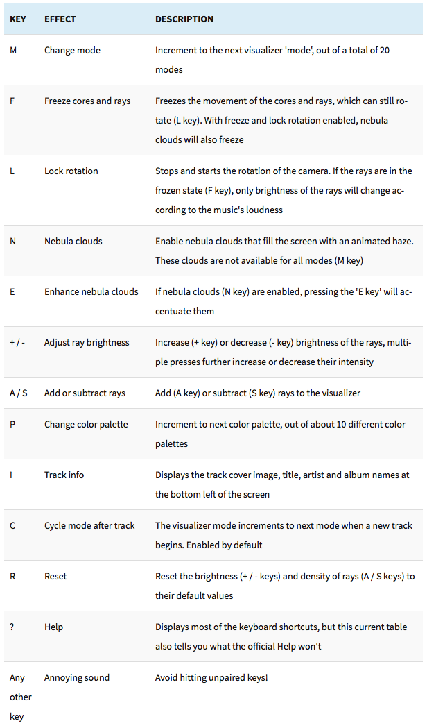
Now that you know which keys to press, it’s time to learn how to leverage those controls to enhance the experience. While I can’t help you with the artistic process of creatively tapping the M, L, F, N, and P keys in rhythm with the music to create something beautiful, I can tell you what I found about the
mechanics of the visualizer. There are three main visual components: the cores, which are the moving spheres; the rays, which flow out of the cores; and the nebula clouds, which fill the whole screen and impact the ambiance.
Here are a few tips:
- If you play a song that has rhythm and a varied frequency, you’ll get livelier visualizer animations than when playing a monotone track. The selection of the track will significantly influence the whole experience.
- Increase the presence of features on the screen by pressing
Aand+a few times. -
There are 20 modes for you to enjoy. Cycle through them with the
Mkey. Take the time to explore the various modes since they have the biggest impact on visualizations. -
When freezing is disabled, it’s easy to forget if you’ve locked rotation (
L); to make certain, simply freeze (F) the animation and if the cores move, then rotation is unlocked. -
Don’t underestimate the nebula clouds (
N) — they radically change the ambiance and can also be toggled on/off rhythmically. PressingEwill enhance the nebula clouds, making them more prominent. -
Cycle through the color palettes (
P) to alter the general feel of the animation. -
If you want your whole screen to be filled with shimmering lights you control, here’s the recipe: while rotation is unlocked (
L), freeze (F) the cores and wait until they get much closer and fill the screen. Once they do, lock the rotation (L) and the cores will remain close to the viewer and continue to fill the screen. Now is the time to rhythmically improvise with theM,F,N, andPkeys to modulate the ambiance. But don’t unlock rotation (L) until you want the cores and rays to go back to the background and stop filling the screen.
To demonstrate some of what you can do, I’ve created a few sample videos based on music I improvised with the award-winning Animoog app for iPad ($29.99). Music made on mobile devices is quickly growing in popularity with tons of innovative musical instruments disguised as apps being available for iOS. The Animoog solos accompanying the videos are not exactly Top 40, but the album has been featured by Moog Music and got some positive
reviews. That said, you should try the visualizer with some of your favorite songs from different genres.
In my first video, I did not use the recipe I explained above and thus the animations often appear distant and don’t fill the screen, offering an arguably less enveloping experience. My second video shows more cases where the action is set closer to the viewer, filling the whole screen. The third demo I created for this article goes to the extreme — I locked the cores close to the view and essentially played with the mode (M) and freeze (F) controls alone while never unlocking rotation. The resulting animation exhibits less variety but fills the screen the whole duration.
You have everything needed to record similar videos of your own iTunes visualizer performances. The approach I used involves recording the screen with QuickTime Player (File > New Screen Recording; I had to lower the display resolution in System Preferences to avoid stuttering), and then editing the video and audio track in iMovie with one of its default themes.
While there are many third-party music visualization tools available for OS X and iOS (my favorite being Uzu), iTunes is nearly ubiquitous and is perfect for getting a taste of what can be done. Magnetosphere continued to improve for a while outside its iTunes version, as demonstrated by these two 2010 Magnetosphere videos by Robert Hodgin, a former member of the development team. Although Apple hasn’t updated the iTunes visualizer in seven years, I hope the company eventually sees value in releasing an updated version. Meanwhile, the current visualizer is there to liberate your
inner VJ.
TidBITS Watchlist: Notable Software Updates for 15 June 2015
GraphicConverter 9.7 — Lemkesoft has issued GraphicConverter 9.7 with several new features and enhancements for the venerable graphic conversion and editing utility. The release adds support for browsing the Photos for Mac database, brings new Crop to Ratio and Anaglyph batch actions, enables display and extraction of PDF previews from Pages documents, adds a complete EXIF editor, improves DICOM import, reduces the size of Save As options for small screens, and updates Japanese, Portuguese, Czech, French, Italian, and Danish localizations. Note that as of this writing, the Mac App Store edition of
GraphicConverter remains stuck at version 9.6.1. ($39.95 new from Lemkesoft or the Mac App Store, free update, 236 MB, release notes, 10.7+)
Read/post comments about GraphicConverter 9.7.
ExtraBITS for 15 June 2015
In ExtraBITS this week, Daring Fireball’s John Gruber talks to Apple’s Phil Schiller, while Mashable’s Christina Warren talks to Apple CEO Tim Cook. We revisit After Dark’s flying toasters, warn you of a scary iOS security vulnerability, and alert you to this year’s Apple Design Award winners.
Apple’s Phil Schiller Talks to John Gruber — On a special live version of The Talk Show podcast, Apple Senior Vice President of Worldwide Marketing Phil Schiller sat down for an interview with Daring Fireball’s John Gruber. Gruber quizzed Schiller on Apple’s software quality, the capitalization of watchOS, iOS 9, OS X 10.11 El Capitan, and sports.
Revisit the Flying Toasters via CSS — Remember the After Dark screensaver, and its famous flying toasters? If so, you’ve just dated yourself (via screenochronology, natch), but you can re-energize those neurons for a few moments with Bryan Braun’s recreation of the core After Dark screensaver modules in CSS. Be sure to say hello to the fish as well.
iOS Bug Could Lead to Stolen iCloud Passwords — A bug in iOS 8.3 prevents the Mail app from stripping risky code from email messages. In a proof-of-concept attack, security researchers inserted code into email messages that displayed a fake iCloud login prompt. While this hasn’t yet appeared in the wild, there’s an easy way to tell if an Apple login dialog is real: press the Home button. A real login dialog is modal, which means that pressing the Home button will do nothing until the dialog has been addressed.
Apple Announces 2015 Design Award Winners — Apple recognized ten apps at this year’s Apple Design Awards, plus two student efforts. The winners include three apps we’ve reviewed in TidBITS: Fantastical, Robinhood, and Workflow. Also honored were the games Crossy Road, Does Not Commute, Metamorphabet, Shadowmatic, and Vainglory; Mac illustration app Affinity Designer; music mixing app Pacemaker; and student entries Elementary Minute and jump-O. Congratulations to all the winners!
Tim Cook Takes the Blame for Apple’s Lack of Diversity — Apple CEO Tim Cook sat down with Mashable’s Christina Warren to discuss Apple’s diversity, or lack thereof. Apple’s first diversity report from last year showed that Apple’s workforce is 70 percent male. “I think it’s our fault — ‘our’ meaning the whole tech community. I think in general we haven’t done enough to reach out and show young women that it’s cool to do it and how much fun it can be,” Cook said. Cook hopes to increase Apple’s diversity by reaching out to female students and historically black
colleges. Apple has also extended WWDC scholarships to STEM organizations in order to bring in more diverse attendees.