TidBITS#1359/06-Mar-2017
This issue of TidBITS kicks off with some news: Bare Bones Software is replacing its free TextWrangler text editor with the equally free but more capable demo version of BBEdit, and Dropbox is rebranding its paid Pro tier and getting rid of the Public folder. Julio Ojeda-Zapata takes a look at the nostalgic Elago W3 Apple Watch stand, which bears a striking resemblance to a 128K Macintosh, and Josh Centers shows you how to set up Philips Hue lights as a high wind alarm. To wrap up the issue, we take a deep dive into the macOS Dock. Notable software releases this week include Nisus Writer Pro 2.1.7, RapidWeaver 7.3, EagleFiler 1.7.4, iFinance 4.2, and SpamSieve 2.9.28.
Bare Bones Drops TextWrangler for BBEdit’s “Free Forever” Demo
Over a decade ago, Bare Bones Software replaced the free BBEdit Lite with TextWrangler, which at the time cost $50 (see “Bare Bones Rustles Up TextWrangler 1.0,” 3 March 2003). With version 2.0, Bare Bones made TextWrangler free to raise the bar for competing text editors (see “Macworld Expo San Francisco 2005 Superlatives,” 17 January 2005), and since then TextWrangler has served as an ambassador for BBEdit. That started to change with BBEdit 11.6, which introduced a free indefinite “demo” mode (see “BBEdit 11.6,” 11 July 2016).
Now Bare Bones Software is officially sunsetting TextWrangler. When the next version of macOS ships, Bare Bones Software will keep updating BBEdit but will no longer update TextWrangler.
If you use TextWrangler, this means you should switch to the latest version of BBEdit soon. You can use all of BBEdit’s features for a 30-day evaluation period, after which you can continue to use it indefinitely, albeit with a reduced feature set and markers on the disabled commands. Even in this mode, BBEdit 11.6 has many more features than the current version of TextWrangler. Along with ponies, other options include synced settings via Dropbox or iCloud Drive, live previewing of HTML and Markdown documents, and access to BBEdit’s power from within Automator workflows.
Educational institutions that want to distribute BBEdit without buying a full license, such as on loaner machines or classroom Macs, can request a special license code from sales@barebones.com. Copies of BBEdit licensed in this way won’t display the paid-license menu commands at all, and there will be no evaluation mode prompts. In other words, it’s just like using TextWrangler in the past, but with extra features. For educational discounts on one or more copies of the full version of BBEdit, contact Bare Bones, and of course, any organization
interested in site licensing should contact Bare Bones for discount pricing.
Overall, this move is a win for everyone. TextWrangler users get more features for free and can see more easily if upgrading to BBEdit would be helpful, the upgrade path becomes significantly more obvious, and Bare Bones doesn’t have to spend additional time on a separate product.
Dropbox Changes Pro to Plus, Drops Public Folders
There are a couple of changes coming to the Dropbox cloud storage service, one minor and one more significant.
First, the company is rebranding the paid Dropbox Pro tier as Dropbox Plus. No other changes are being made, as Dropbox repeats to a hilarious degree in its FAQ. The paid tier still costs either $9.99 per month or $99 per year and offers 1 TB of storage space. Nothing else has changed, it’s just called Dropbox Plus now.
Second, Dropbox is dropping its Public folder feature for Dropbox Basic (free) accounts. Dropbox has been threatening to do this since 2012 (see “Dropbox Public Folder Leaves and Returns,” 14 July 2012), and accounts created after 4 October 2012 weren’t given a Public folder at all. On 15 March 2017, Dropbox will convert all Public folders on free accounts to private folders, breaking existing links. Dropbox now recommends using a shared folder or shared link for sharing files with others. Dropbox Plus and Dropbox Business users can continue to use the Public folder until 1 September
2017.
Similarly, Dropbox removed the capability to render HTML files stored in Public folders from Dropbox Basic accounts last year (see “Dropbox to Discontinue HTML Rendering, Breaking Hosted Sites,” 7 September 2016). That capability will also disappear for Dropbox Plus and Dropbox Business users on 1 September 2017. Many users took advantage of this feature for free Web site hosting, and Dropbox apparently didn’t like that.
It may seem as though Dropbox is just removing features and not adding new ones, but that’s not entirely the case — the company added a few new things last year, as “Take Control of Dropbox” author Joe Kissell outlined in “Catch Up with the Latest Dropbox Features” (3 March 2016). Although it’s annoying to lose the Public folder and its HTML rendering capability, Dropbox remains useful because it’s integrated so well into the Mac and iOS experience, and it just works.
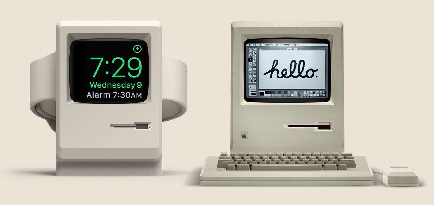
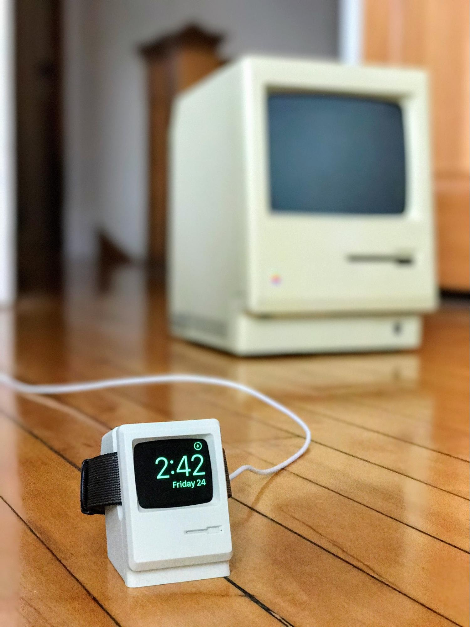
New Apple Watch Stand Looks Like the 128K Mac
I hadn’t planned to write about Elago’s W3 Stand, an Apple Watch charging stand in the shape of a classic 128K Macintosh. I mean, what is there to say? “It’s an Apple Watch charging stand in the shape of a classic 128K Macintosh.” The end.
But I realized Elago had concocted something brilliant when a buddy last week bestowed the product upon me — a thoughtful gesture after a recent death in my family — and other friends around a taproom table erupted with delight and a bit of envy.

I was even more surprised later that day when my wife spotted the accessory on my desk and went gaga over it.
You must understand a couple of things about my wife: She does not own an Apple Watch, has no interest in ever getting one, and has never been steeped in Apple lore. She adores her MacBook Air, but only in a utilitarian sense.
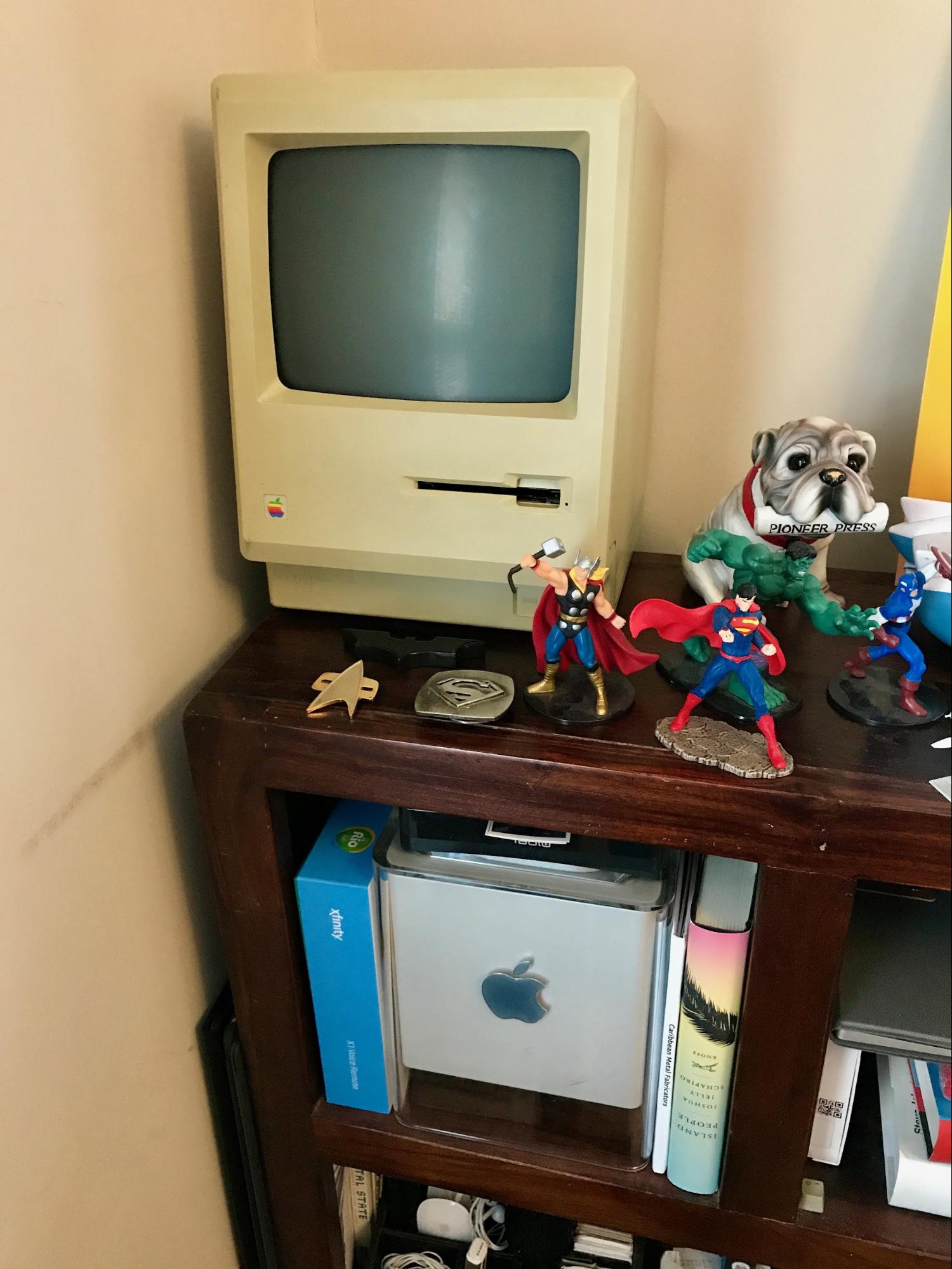
Yet, hovering and cooing over the W3, she told me she wanted one – just because. So did I when I first heard about it. After all, I own a nonfunctional 128K Mac, a decorative prop that has a place of honor in my home office right near my Power Mac G4 Cube.
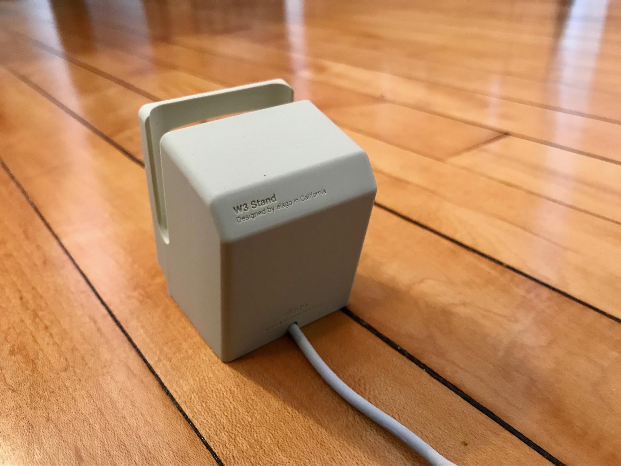
The Elago W3 fits right in at Julio Geek Central. I have the $14.99 tan-colored model that approximates the color of the original Mac. Elago also sells a $15.99 dark-gray version, which is a strange color choice in the Mac sense, but matches darker-colored watches and straps.
The stand is a simple yet substantial little thing made of soft, sturdy rubber. It’s a mini-Mac, but with a vertical slot for the Apple Watch to slide in.
Within the stand, there’s a circular cutout for Apple’s watch charging pad.

The W3’s cable threads downward through the accessory and out the back, mimicking the look of the classic Mac’s power cable.
The stand’s screen is just a cutout, so when the Apple Watch drops into place, its face becomes the actual, functional “Mac” display.
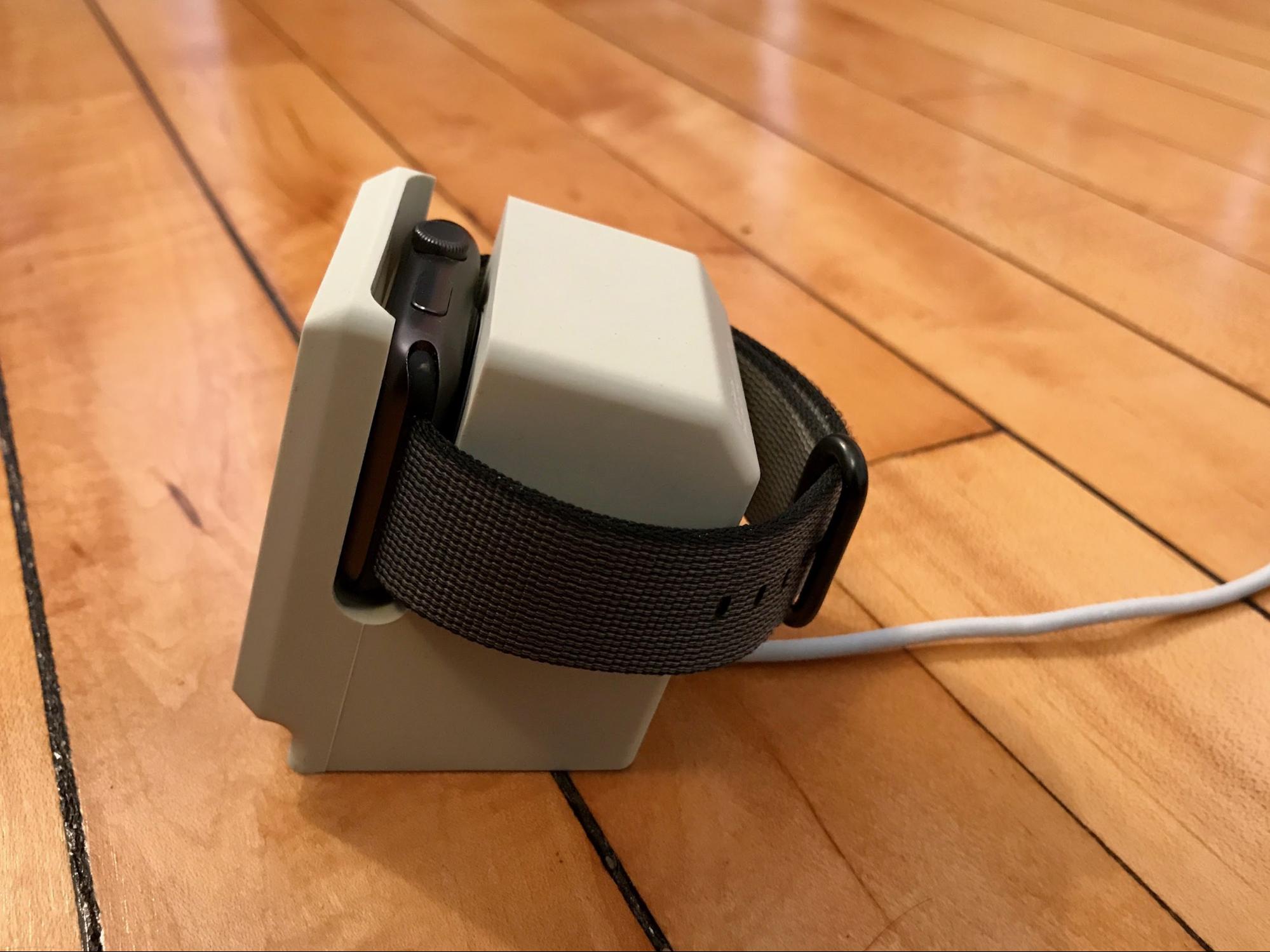
The Apple Watch sits on its side, which activates Nightstand mode and transforms the W3 into a nifty bedside clock with a classic-Mac look and feel. It even has details such as a faux floppy-disk slot, complete with a tiny paperclip-eject hole, but no Apple logo that might attract legal attention.
I’m using the Elago in the bedroom with a first-generation Apple Watch (my Series 2 watch charges up in my home office on the far-more-utilitarian Griffin WatchStand Powered Charging Station that also charges my iPhone). I put the original Apple Watch on my night table in Airplane mode to keep activity to a minimum and left it there as a permanent fixture. In fact, I am experimenting with using the Apple Watch strapless to heighten the classic-Mac
effect:
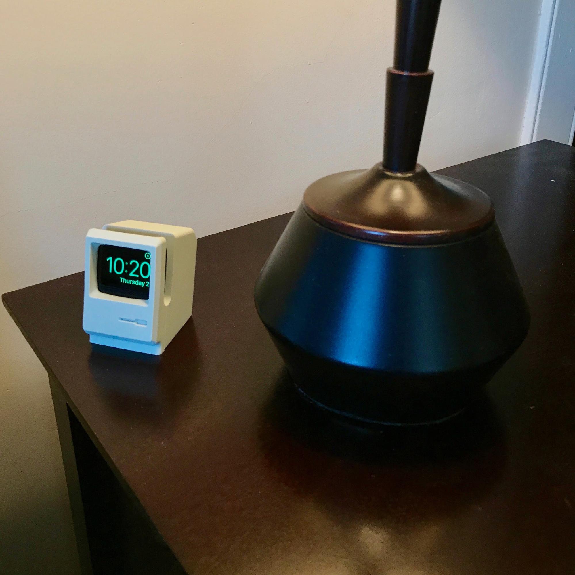
But I suspect the mini-Mac clock will quietly migrate to my wife’s side of the bed before long. That’s fine, anything to foster marital bliss.
I hope whoever came up with this cute product at Elago got a bonus. And I wonder if sequels might be in the works — a Bondi Blue iMac charging stand, perhaps?
Using Philips Hue Lights as a Hurricane and Tornado Alert
The other morning, I was rudely awakened when my wife, a teacher and the household weather hawk, started panicking about a tornado watch, which means that conditions are ripe for twisters. It soon became a tornado warning, which means that one is imminent. Not the best news to get first thing, particularly before coffee.
Tornados are no joke, especially here in Tennessee. A severe tornado in 2008 destroyed part of my town and killed several people. It was so bad that then-President Bush visited to survey the damage.
After that, the town installed a warning siren, but this time it was drowned out by the noise of high winds and pouring rain on the roof. Thankfully, I had a battery-powered radio tuned into a weather station and the local TV news to stay up to date on the storm’s direction. It didn’t end up hitting us, but I would have liked a little more warning.
When it comes to winds so powerful they can toss around cows, you can’t have enough warnings to take cover. You know how in Star Trek, when something bad is going down, the entire bridge turns red? That gave me an idea of how I might use the Philips Hue light bulbs (see “Getting Started with the Philips Hue Smart Light Bulbs,” 1 August 2016).
Apple’s HomeKit automation framework is great, but limited in what it can do. For its line of Hue bulbs, Philips provides its own API with many more capabilities, such as integration with the Internet automation service IFTTT (see “IFTTT Automates the Internet Now, but What Comes Next?,” 20 December 2013).
I initially thought about using the Philips Hue Severe Weather Alert applet, but the National Weather Service considers all sorts of things “severe” that fall well below the level of “There’s a tornado coming!” So I went looking for a more customizable solution and found it in the form of IFTTT’s Weather Underground integration.
It doesn’t include severe weather alerts, but it can use wind speed as a trigger. I made an IFTTT applet that turns on all my Hue lights and makes them red when the wind speed nearby exceeds 60 miles per hour (hurricane wind speed starts at 73 miles per hour, so I set it to 60 to be safe). Unfortunately, IFTTT no longer allows sharing of applets, so here are the steps to make your own:
- Set up accounts with My Hue and IFTTT.
- From the IFTTT Web page, click your username in the upper right to reveal a drop-down menu and choose New Applet.
-
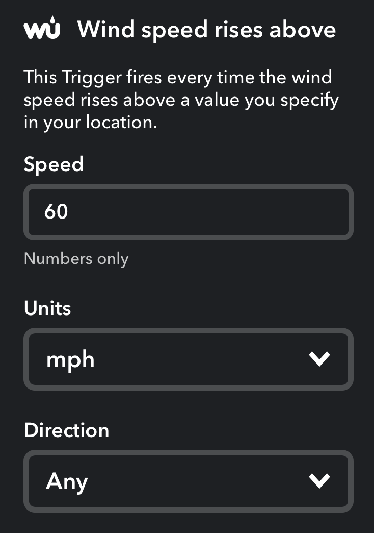
Click +this in the sentence, choose the Weather Underground service, and then choose the Wind Speed Rises Above trigger. When you first connect Weather Underground to IFTTT, it prompts you for your location.
-
On the next screen, specify the trigger wind speed and the units. Keep the wind direction on Any, and click Create Trigger.
-
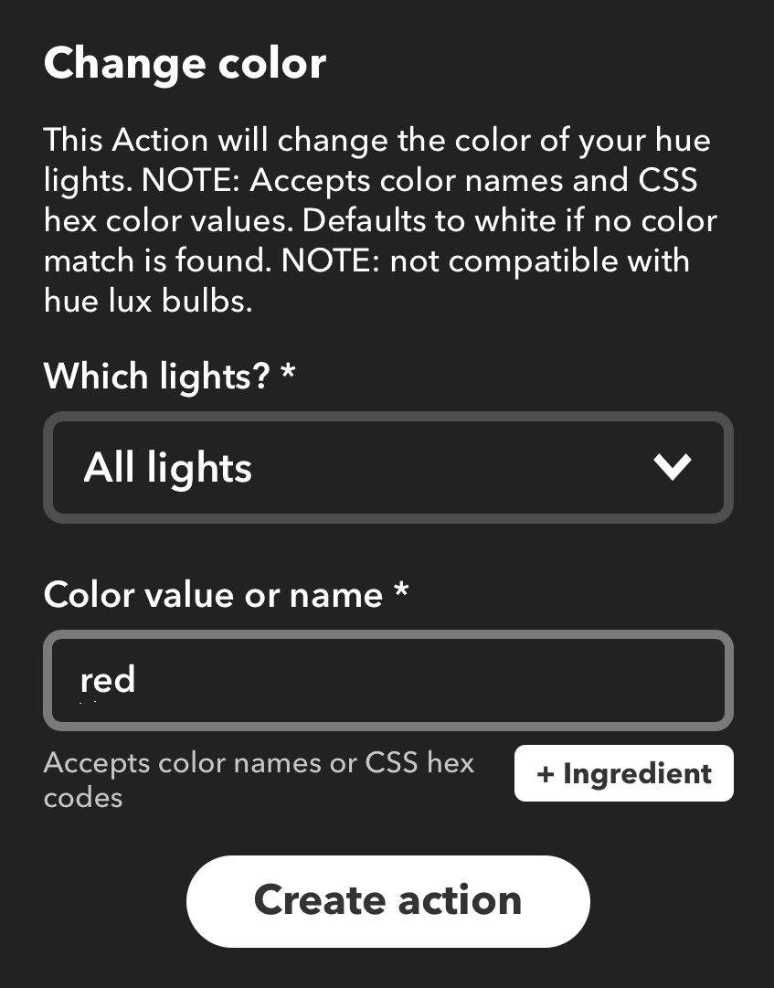
Next, click +that, choose the Philips Hue service, and select the Change Color action. Under Which Lights, choose All Lights, and under Color Value or Name, enter Red. You can use any standard color you like, or even specify a color hex code to be precise.
-
Click Create Action to finish.
Now, when wind speeds reach 60 miles per hour near you, all your lights should turn red. The next question is, how can you test this setup without an approaching hurricane or tornado?
I created another applet to try the actions first. It used a simple text message as a trigger, and when I activated it, it turned on all my colored Hue lights and made them red. My white Hue lights also turned on but obviously didn’t change color. I then created an applet to test Weather Underground’s triggers — it turned my living room lights blue when Weather Underground reported that it was sunset. It fired at 5:40 PM on the dot. So both the Weather Underground triggers and Hue actions worked. Feel free try other triggers and actions to test instead.
Of course, I wouldn’t recommend using this system as your only tornado or hurricane alert, since there are a lot of “moving parts.” If your power or Internet service cut out, as would be likely in high winds, this system wouldn’t work. Plus, latency could cause it to not work in time. (IFTTT says it could take up to an hour for an action to trigger, although my tests above worked much more quickly than that.) Unfortunately, I won’t know for certain how well this system works until we get high winds again. However, I’m willing to bet that I’ll see it in action before the spring is over.
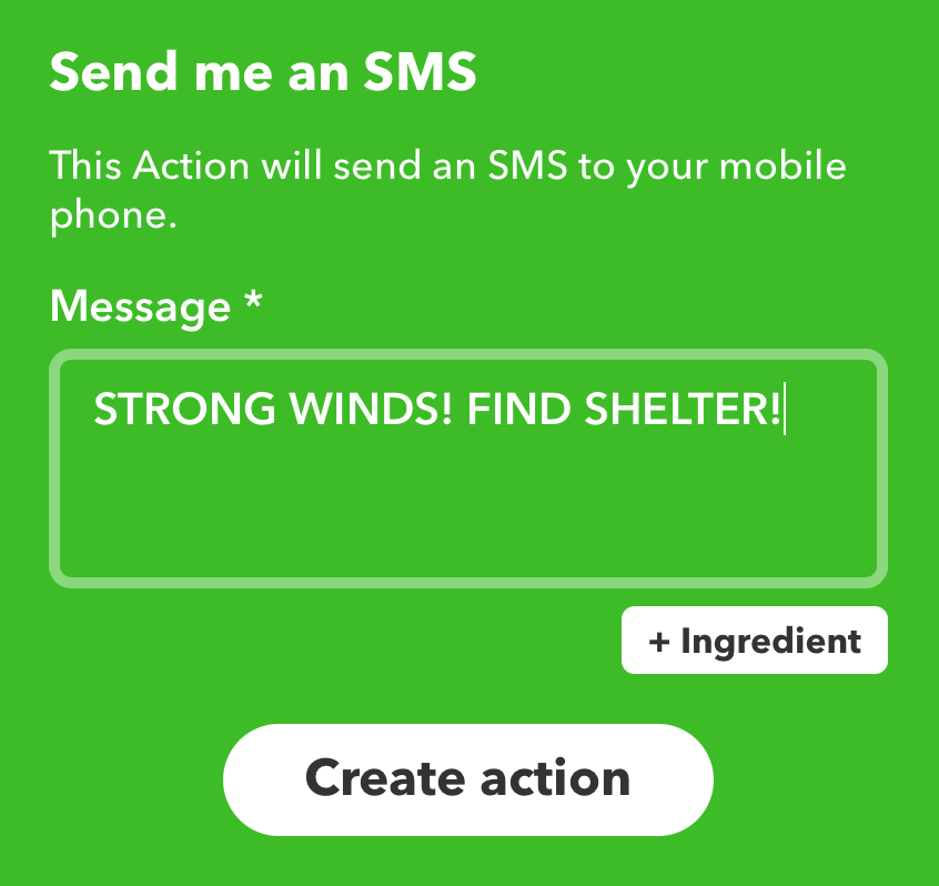
What if you don’t have Hue bulbs, or would like an additional warning that you’ll see even if you’re not home? Create the same IFTTT automation, except change the “that” part to the SMS action and choose Send Me an SMS. The default message tells you the wind speed, but I prefer something a bit more to the point.
Although this is a good real-world example, I’m sure you can come up with other ways to use IFTTT with Hue bulbs. For instance, Philips provides an IFTTT automation that turns your lights blue when it’s raining. As amusing as that might be once or twice, I avoid such automations for fear of “haunted house syndrome” — things happening in your house seemingly at random. But if you’re interested, spend some time
exploring IFTTT to see what other triggers inspire you.
macOS Hidden Treasures: Dominate the Dock
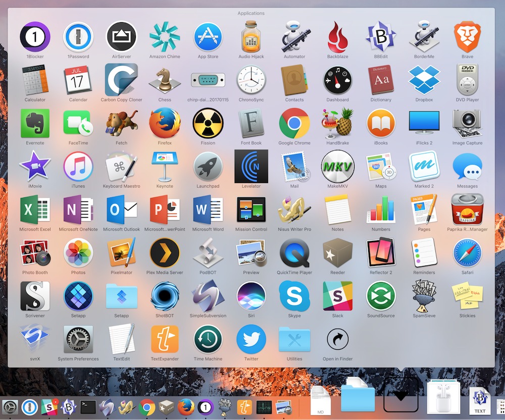
The Dock has been a core aspect of the Mac experience since the earliest days of Mac OS X. In fact, the Dock actually predates Mac OS X, since it was also prominent in NeXTSTEP. It displays open applications, offers a quick way to launch favorite apps, and holds shortcuts for documents and folders.
You’ve probably used the Dock so often and for so long that you don’t think about it. We’ll explain everything the Dock does, from the basics to tweaky capabilities that may be new to you.
Today’s Dock is split into three sections, marked by dividing lines: Handoff, apps, and a third area that contains documents, folders, and the Trash.
Using Handoff in the Dock — Let’s dispense with Handoff first, since it’s a one-trick pony and not something that many Mac users who we know use.
The Handoff section contains only a single icon and appears only if your Mac is receiving a Handoff signal from another iOS device or Mac.
For instance, if you open a Web page in Safari on a compatible iPhone, you might see a Safari icon at the left or top of your Dock. Click that icon to open the iPhone’s Web page in Safari on your Mac. You might also see icons for Mail, Reminders, or other Handoff-savvy apps.
For more on Handoff, check out Scholle McFarland’s “Sierra: A Take Control Crash Course,” which has an entire chapter about it.
Opening and Switching to Apps via the Dock — More commonly, the first section of your Dock contains apps that are either currently open or that you have saved to the Dock for quick access. Clicking an app either opens it or switches to it. In macOS 10.12 Sierra, open apps are denoted by a small dot underneath the icon (or on its side, if you’ve moved your Dock to the left or right edge of the screen). In earlier versions, the Dock gave open apps other markings, such as triangles.
If you don’t recognize an icon in the Dock, hover your mouse pointer over the icon and a tooltip appears showing the app name. This also works for documents and folders, where it’s even more useful, since their icons are often somewhat generic.
When your goal is to end up with a particular document open in an app, a more efficient way to open or switch to that app is to drop a compatible file onto it. For example, if you drag a text file from the Finder and drop it on TextEdit’s Dock icon, TextEdit opens with that document.
If you see an app icon with a question mark, it means that the source file has been deleted, thus breaking the Dock’s alias. You’ll need to figure out what happened to it in the Finder.
Although it’s hard to imagine anyone bothering to do this, you can also open an app via its contextual menu. Access it by clicking and holding, Control-clicking, right-clicking, or force-touching the Dock icon, and then choose Open.
Other App Actions from the Dock — Although the contextual menu is a silly way to open an app, it provides access to a wide variety of more useful actions that you can perform on apps:
-
- Quit an app: To quit an open app from the Dock, choose Quit from the contextual menu. Unless you’ve set that app to stay in the Dock, its icon disappears from the Dock when it quits. Pressing Command-Q in the app is easier.
- Force Quit an app: If an app is frozen and won’t quit via the usual method, open the app’s contextual menu and hold Option to turn Quit into Force Quit. Remember that Force Quit closes the app instantly, without prompting to save your work. We’ve found this more successful than the dialog you get by choosing Force Quit from the Apple menu.
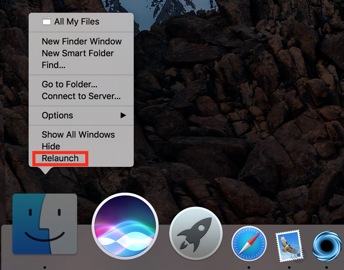
- Relaunch Finder: You can’t quit or force quit the Finder, but you can relaunch it if it’s giving you trouble. To do so, hold Option as you invoke the contextual menu and choose Relaunch. Note that Relaunch won’t appear if you press Option after opening the contextual menu, as it does for Force Quit.
-
- Keep an app in the Dock: If you’d like to be able to open a currently running app from the Dock at a future time, choose Options > Keep in Dock from the contextual menu. A check mark appears next to Keep in Dock.
Another way to keep a running app in the Dock is to move it anywhere within the Dock. Click, drag, and drop, and the app will stay in the Dock.
Of course, you can also just drag any app icon from the Finder to the Dock to add it, whether or not it’s running.
- Remove an app from the Dock: The most intuitive way to remove an app from the Dock is to drag it far enough out of the Dock for the Remove popup to appear and then release. If you change your mind mid-drag, either drag the app back to the Dock or press the Escape key.
To remove an app from the Dock via the contextual menu, choose Options > Remove from Dock if the app is closed or Options > Keep in Dock if it’s open. (Remember, a check mark appears next to Keep in Dock if that option is engaged.)
Note that removing an app from the Dock doesn’t affect the actual app, since the Dock icon is merely an alias. If you delete an app from the Dock, you can still find it in the Finder, usually in the Applications folder.
- Hide an app: If you don’t want to quit an app, but instead merely get it out of your way, you can hide its windows by choosing Hide from the contextual menu. Click the app’s Dock icon again to reveal the hidden app.
An easier approach is to Option-click the Desktop, any other app window, or any icon in the Dock. Or just press Command-H while the app is in the foreground.
Of course, you can also minimize a single app window to the Dock, as explained below.
- Hide all but the selected app: To focus on a single app, you can hide all other app windows. Open the app’s contextual menu and press Option to turn Hide into Hide Others.
Again, a quicker way to Hide Others is to Command-Option-click the app’s Dock icon or press Command-Option-H while the app is in the foreground.
- Show all app windows: To invoke Mission Control in Application Windows view, choose Show All Windows from the contextual menu. Click a window to bring it to the front.
Another way to invoke Mission Control is to force touch the app’s Dock icon, if you have a sufficiently capable trackpad.
- Open an app at login: From the contextual menu, choose Options > Open at Login. A check mark appears next to Open at Login. To stop the app from opening at login, choose the same option again, and the check mark should disappear.
You can verify that this has happened by looking in System Preferences > Users & Groups > Login Items.
- Show an app in the Finder: Maybe you want to delete an app that’s in the Dock, or maybe you forgot where it’s stored. To reveal its actual location, open its contextual menu and choose Options > Show App in Finder.
- Assign app windows to a desktop: If you use multiple Mission Control desktops, it can be helpful to tie an app’s windows to a specific one. Under Options in an app’s contextual menu, you’ll see a Desktops header with a list of your desktops. Choosing a desktop moves that app’s windows to that desktop and keeps them there.
- Keep an app in the Dock: If you’d like to be able to open a currently running app from the Dock at a future time, choose Options > Keep in Dock from the contextual menu. A check mark appears next to Keep in Dock.
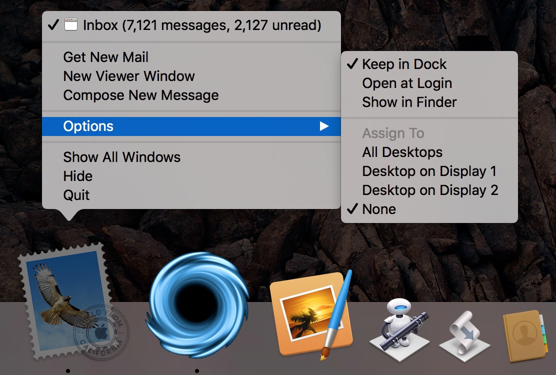
- App-specific commands: Apps can add their own commands to their contextual Dock menus. So, for instance, Mail lists open windows in its menu and offers commands for Get New Mail, New Viewer Window, and Compose New Message. Every app with custom commands will be different, so be sure to check your most-used apps.
Docs and Minimized Windows in the Dock — The Dock can also hold documents and minimized windows. To add a document, or, again, an alias to that document, to the Dock, drag it to the right side of the Dock, to the right of the divider. If your Dock is vertical, drop at the bottom, below the divider.
Click a document icon in the Dock to open it. The contextual menu offers a few extra options, but not many: Remove from Dock, Open at Login, and Show in Finder, the last of which is more useful than it is with apps.
You can even add Web shortcuts to the Dock. In Safari, click in the URL bar to reveal the full URL. Click and drag the favicon at the left of the URL bar down to the document section of the Dock to add a bookmark to that Web page to the Dock. This technique also works in Google Chrome and Firefox.
When you minimize a window, either by clicking the yellow minimize icon or choosing Window > Minimize, it shrinks into the same section of the Dock. Click a minimized window to expand it again. The contextual menu doesn’t offer any options for minimized windows other than opening them, and opening a minimized window is the only way to remove it from the Dock for good. Note that minimized windows look just like thumbnails of their windows with their app’s icon as a small badge — the badge differentiates a minimized window from a document icon.
Working with Folders in the Dock — Just as with documents, you can drag and drop folders to the right or bottom of the Dock. Clicking the folder in the Dock reveals a preview of the folder’s contents, but if you Command-click the folder, it instead opens in the Finder. You can also drag Finder items into a Dock folder to move them into that folder.
The Dock’s contextual menu for folders offers several options that let you customize how folders display in the Dock. First, you can set how the Dock preview sorts documents in the folder: by Name, Date Added, Date Modified, Date Created, or Kind.
You can also choose whether the folder appears in the Dock as a folder or a stack. Displaying it as a folder uses the same blue folder icon as in the Finder, while the stack shows a stacked preview of the files in the folder. This is purely an aesthetic choice, although the contents of some folders may lend themselves to one approach or the other.
More interesting is how you can customize the folder preview. Fan, which is an option only when the Dock is positioned at the bottom of the screen, shows the enclosed files in a curved stack with icon previews. Grid shows preview icons for the folder’s contents in a rectangle. List shows just a pop-up menu of file and folder names, and Automatic tries to choose which display to use based on how many items are in the folder.
Grid view is the most useful in general. It clearly shows all the files and folders in a format that’s easy to scan. You can also scroll through the files to see everything. Fan view shows too few items and is just strange, while List view is a bit too bare bones.
The Grid and List views also let you navigate into nested folders. Click a folder to reveal its contents in the Grid view; you can click the back button to go up one level. In List view, you can access nested folders via a hierarchical menu.
The main thing you’ll do in any of these views is open files and folders by clicking or selecting them. However, in Grid view, you can also drag files and folders from the preview to the Desktop, other folders, apps, and more.
Working with Trash in the Dock — Since the advent of Mac OS X, the Trash has lived in the Dock. It’s simple to use: click the Trash icon to open the Trash in the Finder, drag items to the Trash to delete them, and to empty the Trash, Control-click its icon and choose Empty Trash. Obviously, there are other ways of deleting files (we like pressing Command-Delete) and emptying the Trash (choose Finder > Empty Trash).
![]()
If you have an external drive that you want to dismount, or some form of removable storage (like a DVD) that you want to eject, start dragging it and the Trash icon becomes an Eject icon. It’s not intuitive, but matches the classic Mac behavior of dragging floppies to the Trash to eject them. You can also select the drive and choose File > Eject or press Command-E.
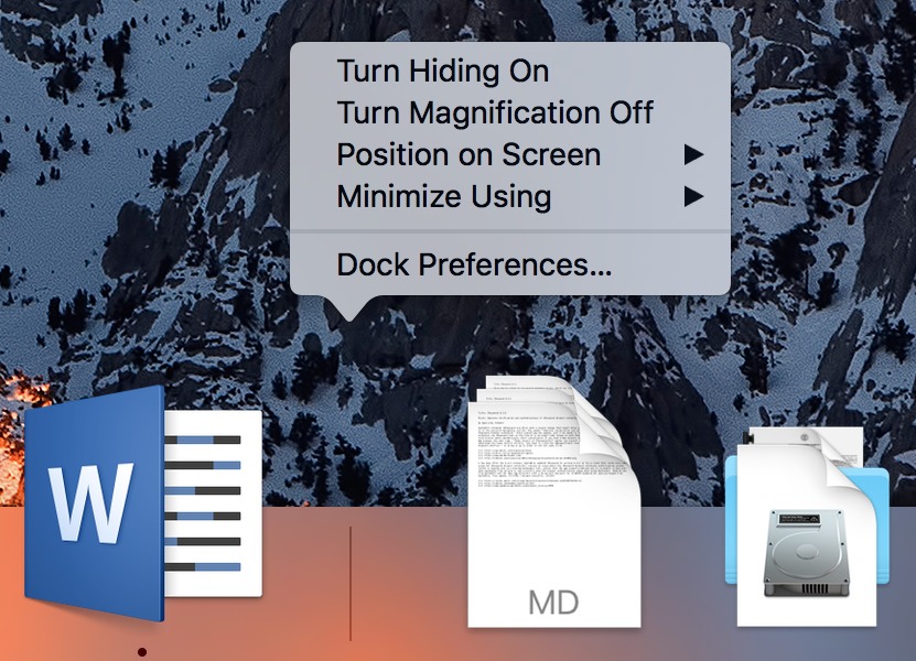
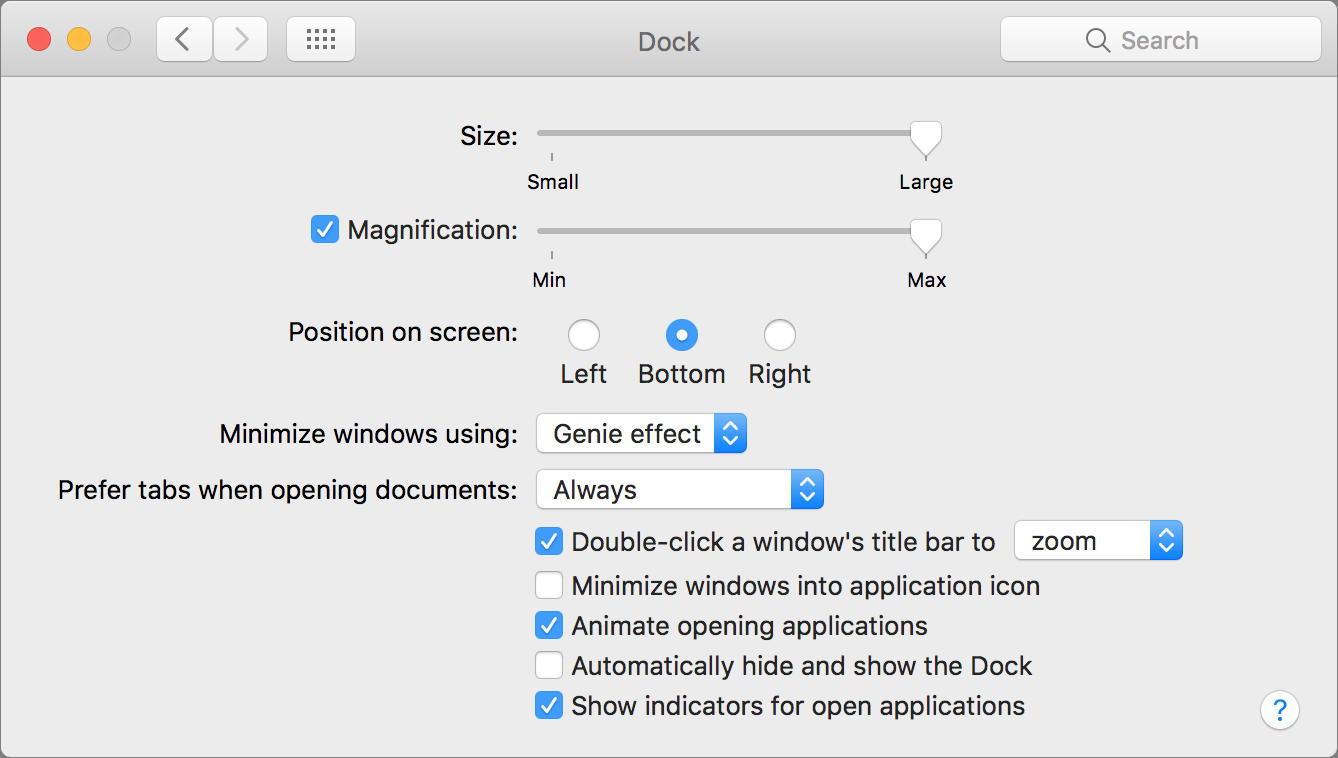
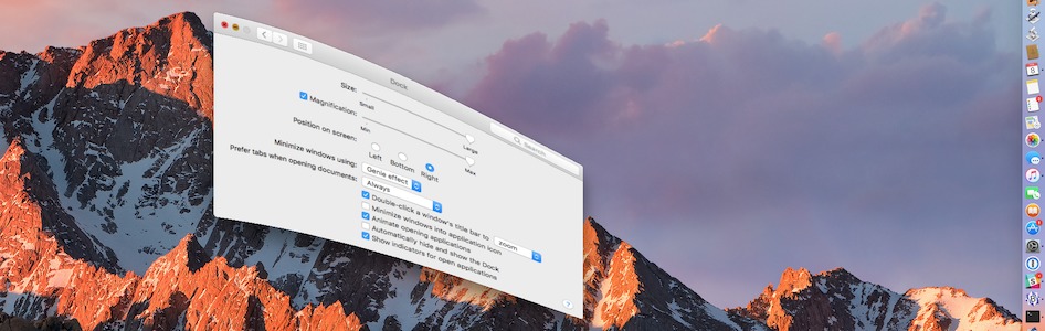
Customizing the Dock’s Look and Feel — There are a handful of ways you can customize how the Dock as a whole looks and works. To get started, open System Preferences > Dock. You can also access the Dock preference pane by Control-clicking the divider between the app and document sections of the Dock and choosing Dock Preferences (when you mouse over the divider, the mouse pointer turns into a double-ended arrow).
The first setting is the size slider. If you have the screen real estate, larger is usually better. At its largest size, the Dock automatically scales to the size of the screen based on how many icons it contains.
You can also resize the Dock directly. Move the mouse pointer over the divider between the app and document sections until it becomes a double-ended arrow. Click and drag to adjust the Dock size.
Next, you can choose to turn on magnification and set how large you want the magnified icons to be. When magnification is enabled, Dock icons enlarge as you mouse over them. It’s a cool effect that makes it easy to see icons that would otherwise be small.
The third option lets you change the position of the Dock — it’s perhaps the most important setting. By default, the Dock is displayed horizontally on the bottom of the screen. However, that’s almost always an inefficient use of space since nearly all screens are wider than they are tall, whereas most document windows are taller than they are wide. That leaves extra space on the sides of your screen, so it makes sense to pin your Dock vertically on the right or left.
Which side is better? Adam Engst prefers the right side because he uses two monitors, and positioning the Dock on the right side of the right-hand monitor prevents it from showing up awkwardly in the middle of the Desktop. Apple also offers a bit of guidance here. On the iPhone Plus models, when the phone is in landscape orientation, the iOS Dock appears on the right side of the screen. That makes sense in macOS too, since it keeps the Trash in the lower right of the screen.
The remaining Dock preferences provide mostly cosmetic tweaks:
-
- Minimize Windows Using: You can choose to minimize windows using either the Genie or Scale effect. It’s purely a cosmetic choice — try both and see which you prefer. Here’s an eye-candy tip: hold Shift as you minimize a window to see it sucked into the Dock in slow motion. Similarly, holding Shift as you click a minimized window (or folder!) expands it slowly.
- Prefer Tabs When Opening Documents: Why is this setting associated with Dock preferences? It makes no sense! The default is Always, but you can set it to In Full Screen Only or Manually. Unless you find app tabs useful in Sierra, you might want to set this to Manually.
- Double-click a Window’s Title Bar to: By default, this option zooms the window, but you can instead set it to minimize the window if you prefer that behavior. Of course, you can just use the green and yellow buttons in the upper left of any window to zoom and minimize too, or the appropriate commands in the Window menu.
- Minimize Windows into Application Icon: When this checkbox is selected, minimized windows don’t show up in the document and folder section of the Dock, but instead disappear into their associated app. That seems less useful to us, but your mileage may vary.
- Animate Opening Applications: This checkbox controls whether or not apps bounce in the Dock while opening. Seeing when apps take longer than expected to launch can be instructive when troubleshooting, so we recommend leaving it on.
- Automatically Hide and Show the Dock: When this setting is enabled, the Dock disappears unless you slam the mouse pointer to the edge of the screen that the Dock normally occupies. It’s a handy option for small screens — think about the 11-inch MacBook Air. You can also hide and show the Dock with the Command-Option-D shortcut, which you can change in System Preferences > Keyboard > Shortcuts.
- Show Indicators for Open Applications: This option is on by default, and we can’t see any good reason to turn it off unless you’re offended by the little dots.
Outside of the Dock preference pane, System Preferences offers a few more relevant settings:
- Icon Badges: If you see a red circle in the upper-right corner of an app’s Dock icon, that’s a badge. Badges tell you things about the app, like how many unread messages Mail contains or if Slack has new messages. To turn badges off or back on for any given app, open System Preferences > Notifications, select the app in question and set the Badge App Icon checkbox as desired.
- Dark Mode: To darken up your Dock, open System Preferences > General and select Use Dark Menu Bar and Dock.
- Parental Controls: If you have a small child using a non-administrator account that’s managed by parental controls, you can prevent that user from modifying the Dock. Choose System Preferences > Parental Controls > user > Other and select Prevent the Dock from Being Modified.
The Dock is easy to take for granted, but it’s a key part of your everyday Mac experience. Mastering its nuances will help you work faster, more comfortably, and more efficiently. That’s all we can think of to share about the Dock, but it’s entirely possible that we’ve missed something. If so, let us know in the comments.
TidBITS Watchlist: Notable Software Updates for 6 March 2017
Nisus Writer Pro 2.1.7 — Nisus Software has released Nisus Writer Pro 2.1.7 with added support for the Touch Bar on the 2016 MacBook Pro and improved support for tabbed documents in macOS 10.12 Sierra. Tab-related changes include displaying all tab menu commands on the View menu, adding a New Tab command that always opens a blank document, and maintaining tabs when reopening at launch. The powerful word processor also ensures that autosaved Untitled files are cleared away after documents are saved explicitly, fixes bugs related to table of contents and indexing, and resolves crashes related to the Touch Bar. Note that Nisus Software
also updated Nisus Writer Express to version 3.5.7 with most of the same changes. ($79 new with a 25 percent discount for TidBITS members from Nisus Software and the Mac App Store, free update, 225 MB, release notes, 10.8.5+)
Read/post comments about Nisus Writer Pro 2.1.7.
RapidWeaver 7.3 — Realmac Software has released RapidWeaver 7.3 with the addition of a site-wide search feature and added support for theme updates. The Web design and publishing software fixes a bug that caused future publishes to fail if an export or publish were canceled, correctly saves Header & Footer text in the sitemap plug-in, prevents a crash when the offsite page URL is left empty, avoids a hang caused by installing lots of themes, and fixes a bug that prevented the add-ons installer window from closing. ($99 new, free update from version 7, $59 upgrade, 87.7 MB, release notes, 10.11+)
Read/post comments about RapidWeaver 7.3.
EagleFiler 1.7.4 — C-Command Software has released EagleFiler 1.7.4, adding the capability to capture entire mailbox hierarchies from within Apple Mail. The document organization and archiving app also now works with newer AudioNote files that are packages, improves the speed of message display and indexing (particularly for large .eml files), fixes a bug that could cause the app to lose track of a file if the library was stored in Dropbox, works around a WebKit error when importing certain Web pages, and prevents several crashes. ($40 new with a 20 percent discount for TidBITS members from C-Command Software or from the Mac App Store, free update, 18.0 MB, release notes, 10.6.8+)
Read/post comments about EagleFiler 1.7.4.
iFinance 4.2 — Synium Software has released the financial management app iFinance 4.2 with new features and other enhancements. In addition to supporting the Touch Bar on the 2016 MacBook Pro, the update adds interactive 3D charts, the capability to copy and paste transactions and split transactions between accounts, support for importing and managing PDF format bank account statements, and new document icons. The release also improves the speed of CSV imports, improves reliability and speed of Wi-Fi sync, updates charts so they show the total sum of incomes or losses, and enables you to merge address book contacts
directly with iFinance contacts.
Synium has discounted both iFinance for Mac and iFinance for iOS by 25 percent through 19 March 2017, with the Mac app priced at $29.99 (normally $39.99) and the iOS app priced at $6.99 (regularly $9.99). ($39.99 new from the Mac App Store, free update, 23.4 MB, release notes, 10.10+)
Read/post comments about iFinance 4.2.
SpamSieve 2.9.28 — Michael Tsai of C-Command Software has released SpamSieve 2.9.28 to ensure compatibility with Apple Mail in macOS 10.12.4. The spam filtering utility continues to improve filtering accuracy, modernizes various bits of internal code, makes sure that the Save Diagnostic Report in the Help menu works with all supported versions of macOS, works around an issue that could cause a crash when creating a diagnostic report, fixes a bug where Apple Mail messages trained as good didn’t move to the inbox when running in Russian, and updates the Danish and German localizations. ($30 new with a 20 percent discount for
TidBITS members, free update, 13.6 MB, release notes, 10.6+)
Read/post comments about SpamSieve 2.9.28.
ExtraBITS for 6 March 2017
In ExtraBITS this week, Apple is losing ground to Google in the classroom, YouTube TV plans to challenge pay TV providers, and Apple has a solution to its expiring provisioning profile problem.
Apple’s Grip on the Classroom Slipping — Apple has long had a strong position in the education market, but the New York Times reports that the company is losing ground to Google, with Apple’s iPads and Mac laptops now ranking third behind inexpensive laptops running Google’s Chrome OS or Microsoft’s Windows. Unfortunately, for those familiar with the education world, Google’s rise isn’t all that surprising, given the advantages Chromebooks have over iPads: they’re cheap, they have keyboards, there’s not much on them that students can mess up, and they’re
backed up by services such as Google Classroom.
YouTube TV to Offer Another Alternative for Cord Cutters — Google will soon be competing with the likes of Sling TV, PlayStation Vue, and DirecTV Now. Set to debut within a few months in a new standalone app, the $35-per-month YouTube TV service will feature about three dozen channels, including ABC, CBS, NBC, and Fox, as well as cable stalwarts like ESPN and Fox News. Google says the service will be designed primarily for mobile but will also work with computers and its Chromecast streaming devices. It’s slated to have a cloud-based DVR with unlimited storage and a Google
AI-powered recommendation system. We’re guessing YouTube TV will be limited to U.S. viewers, but no details on international possibilities were mentioned.
Apple Kicks Provisioning Profile Expirations Down the Road — Provisioning profiles have been expiring recently, causing popular apps like 1Password and PDFpen to stop working suddenly. Apple has “solved” this problem by making it so that Developer ID provisioning profiles generated after 22 February 2017 will be valid for a whopping 18 years, regardless of the expiration date of the associated certificate! That puts the problem off for so long that only institutions and individuals trying to keep historical systems functional will be likely to suffer. After all, some of us still have decades-old Macs
that can run software of the 1990s without difficulty.