#1406: Bad Apple #2 on Settings app, Live Photos to the rescue, 13 Qi wireless chargers
In iOS 11, Live Photos aren’t just a gimmick because you can use their video to rescue otherwise lousy photos — Josh Centers shows how. Adam Engst has penned his second Bad Apple column this week, taking Apple to task for the layout of the iOS Settings app. Finally, Julio Ojeda-Zapata returns with a look at 13 Qi wireless chargers for your iPhone 8 or iPhone X. Notable software releases this week include Bookends 13.0.6, Fantastical 2.4.6, Parallels Desktop 13.3, Keyboard Maestro 8.1.1, 1Password 6.8.7, and Airfoil 5.7.
Rescue Blurry Photos with Live Photos in iOS 11
I love the idea behind the Live Photos feature baked into new iOS devices because it lets me capture short videos of my son doing something cute. But when it comes to snapping a photo of an expense receipt or a particularly attractive pot of butter chicken I’ve cooked, it’s hard to justify the extra storage space a Live Photo consumes for the few seconds of extra video. Thankfully, iOS 11 introduced new features to help make it worthwhile to leave Live Photos on.
Apple advertised one such feature heavily in the WWDC keynote. Swipe up on a Live Photo and you see different effects you can apply to it: Live (the default), Loop, Bounce, and Long Exposure. Jeff Carlson wrote about the last one in “Using Long Exposure in iOS 11’s Photos App” (12 October 2017). Long Exposure and the others are neat, but Apple didn’t do much to tell people about what may be the most useful Live Photo feature of iOS 11: choosing a new key photo.
The key photo is the still image you see of a Live Photo in the Photos app. If you tend to take pictures of fast-moving subjects, you have undoubtedly run into this problem: you line up a perfect shot but before you can press the shutter button, your subject moves. That may result in a blurry photo, or one that misses the moment you wanted.
But here’s the thing! In iOS 11, with Live Photos enabled, the Camera app actually captures 1.5 seconds of video before you press the shutter button. So when you choose a new key photo, it’s like editing your photo with a highly precise time machine that can show you every moment of the second and a half before the photo was taken. Here’s how you do it in Photos for iOS, but it works exactly the same in Photos for Mac:
-
- Choose a Live Photo in the Photos app and tap Edit in the upper-right corner.

- At the bottom of the screen, you’ll see a strip of images that Apple calls the frame viewer.
- On the frame viewer, you’ll see a white square that indicates the current key photo. Tap, hold, and drag that square to move through the frames of the Live Photo until you find a better one. It’s best to do this slowly.
- When you stop and let go of the square, a Make Key Photo popover appears. Tap that to change the key photo to the frame that you’ve selected.

- Choose a Live Photo in the Photos app and tap Edit in the upper-right corner.
Photos marks both the original key photo and the selected frame with a dot. If you have a 3D Touch device, you’ll feel a click when you select one of those dotted images. If you tap Done to finish editing and decide you don’t like the key photo you’ve chosen, you can always go back in and pick another one or tap Revert to undo all edits to that image.
Don’t set your expectations too high. The alternative key photos may not be perfectly sharp either, but you can often make a dramatic improvement and rescue an otherwise terrible photo!
For more helpful iOS tips, check out my book, “Take Control of iOS 11,” and thanks for making it my best-selling book yet!
Bad Apple #2: Alphabetize Settings in iOS
Welcome back to my Bad Apple column, in which I chastise Apple — constructively! — for poor decisions that are easily changed. TidBITS readers have sent me lots of suggestions for this column, and for that, thank you! For those who are sharing personal horror stories, my condolences, and I’ll try to help, but for Bad Apple, I want to focus on problems that any Apple user could encounter, not things that are specific to a particular account or machine.
This time around, I want to look at the Settings app in iOS, which has become a morass of muddlement. It doesn’t help that Apple seemingly reorganizes it with nearly every major release of iOS, sometimes even within minor releases. For instance, the relatively new settings item at the very top of the Settings app, which combines options for Apple ID, iCloud, iTunes & App Store, and Device Info all in one is seemingly helpful, but it’s devilishly hard to write about, since it’s named for the user, not for what’s inside.

But my gripe with Apple isn’t about this new personal settings item’s name; it’s about what it represents, or how Apple tries to group items in the Settings app by function and relationship, making it difficult even for experienced users to scroll to the right spot in Settings. Apple may have a rationale for its groupings, but it’s not obvious to anyone outside Apple. All too often, I give up trying to tap my way through Settings and instead pull down to reveal the Search field, before being reminded that searches in Settings often fail.
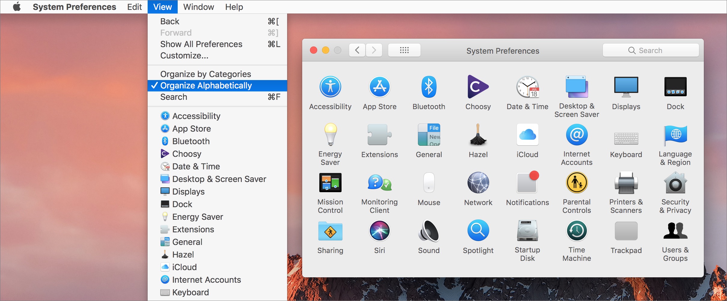
Apple’s grouping approach isn’t completely irrational, but it assumes a great deal more familiarity with the Settings app — and with iOS in general — than nearly any user has. It’s worse even than the System Preferences app in macOS, which at least shows all preference panes without the need to scroll. In fact, System Preferences points to the simple way Apple could rearrange the Settings app to make it easier to navigate.
Did you know that when System Preferences is the frontmost app on the Mac, you can go to the menu bar and choose View > Organize Alphabetically? No more hunting for Accessibility in the bottom-right corner, or wishing that so many of the icons weren’t blue blobs. System Preferences still displays its icons in a grid, making the alphabetical organization a bit less useful than it would be in a linear list, but you can return to the View menu for that. (Remember, if you’re reading on the TidBITS Web site, click any image to expand it.)
So why doesn’t Apple provide a similar alphabetical organization within iOS’s Settings app? (Yes, I realize alphabetization would vary by language, but that’s a solved problem.) Some functional groupings could remain, but within each grouping, rather than Apple grasping at logical straws that few users understand, why not just organize everything alphabetically? And why doesn’t each collection at least have a label that would give the user a hint as to the connection between the various
settings? Bad Apple!
(As an aside, if you want even more evidence that Settings has spun out of control, look no further than the mindmap that Allison Sheridan created of all the settings in iOS 11. If I’m calculating correctly from her Markdown version, Settings has over 1200 items total!)
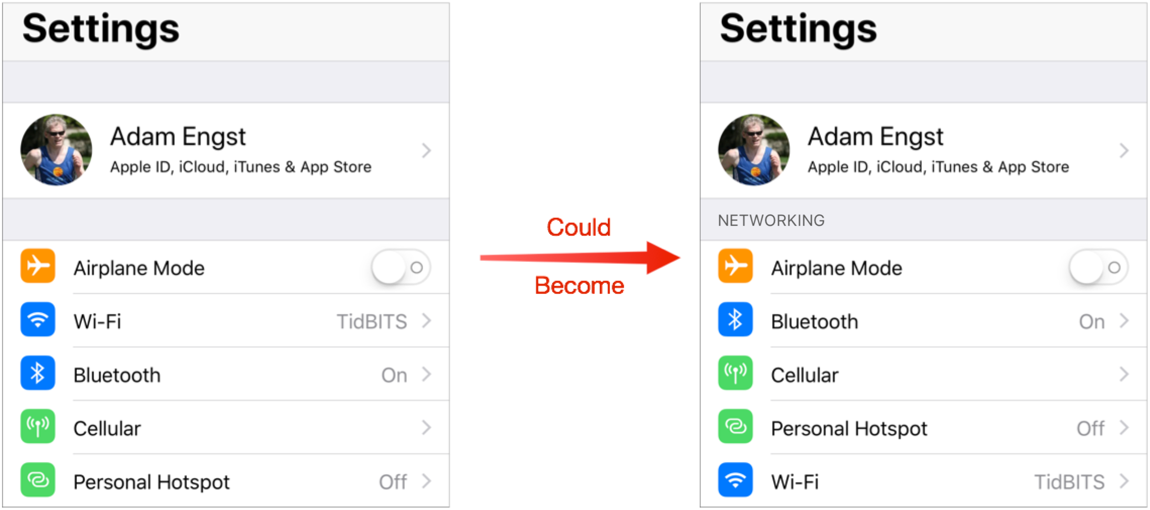
Let’s consider the possibilities of what the main screen of Settings could look like. (These screenshots all come from iOS 11.2.6, running on an iPhone X. You may see slight differences on other devices and iOS versions.)
Networking — I’ll start at the top, with what I call Networking. As it stands, Airplane Mode is the first setting after the personal settings collection. That’s presumably for ease of access for business travelers who fly weekly, though the vast majority of iOS users probably touch it at most once or twice a year. But whatever; it starts with A, so we can leave it there. After that, Apple has Wi-Fi above Bluetooth, perhaps because people access Wi-Fi settings more often? And then Cellular comes before Personal Hotspot, which is slightly sensible under the assumption that Personal Hotspot is subordinate to Cellular. In fact, Personal Hotspot is duplicated within the Cellular settings.
This group of settings isn’t hard to parse — there are only five — but is it any harder to parse if they’re simply listed alphabetically, as in the right-hand screenshot below? I think not.
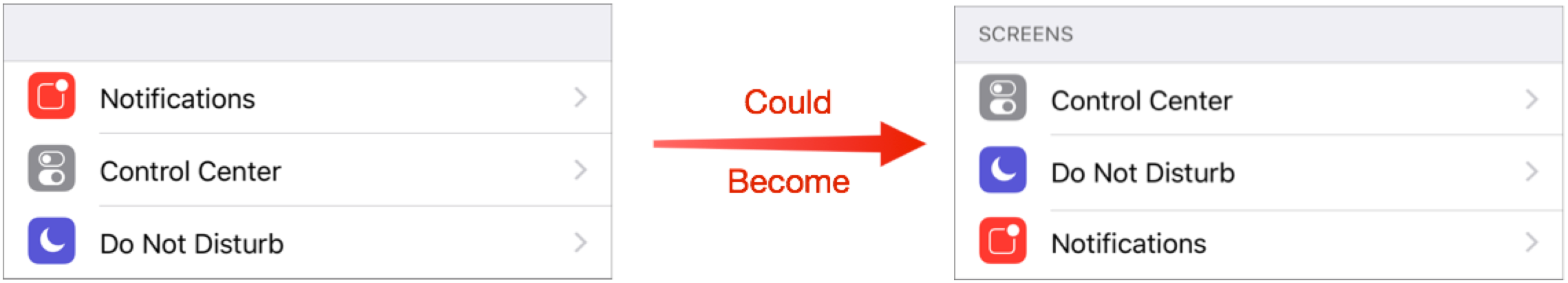
Screens — My label for this next collection of settings is poor, but that’s because the grouping of Notifications, Control Center, and Do Not Disturb makes little sense today. My guess is that Apple once considered Notification Center and Control Center as parallel screens, and it was reasonable to position Do Not Disturb near Notifications. But Notification Center no longer exists; you see your notifications on the Lock screen when you swipe down from the top of the screen.
Frankly, I believe this grouping should disappear, with its items merged into the next group, but in the assumption that there’s a good reason for lumping these items together, let’s take it alphabetical. At least that puts Do Not Disturb and Notifications next to each other, which wasn’t even true before.
System — The next group looks like a grab-bag, but when you scrutinize it, you realize that it’s basically all the settings for iOS and your device’s hardware. The problem is that it’s almost entirely random. Having General come first makes some sense, I guess, since it’s, well, the most general. Display & Brightness and Wallpaper are conceptually somewhat related, but after that, there is no apparent organization at all, forcing you to absorb the entire list to pull out a particular item. Bad Apple!
When I alphabetize the group, Battery comes first, which is a nice side effect, since it’s a commonly used option by anyone with an older device. After that, the alphabetical order just makes it easier to jump directly to the item you want. And I see no reason Control Center, Do Not Disturb, and Notifications wouldn’t fit in here.
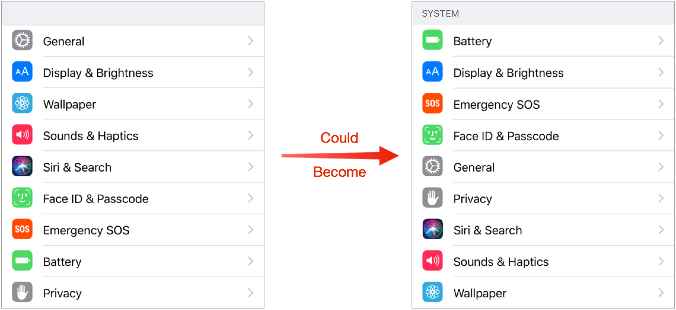
This isn’t the place to get into details, but General is itself a mishmash. What’s the rationale for putting things like Accessibility, Keyboard, and Software Update in General? Or maybe Display & Brightness and Wallpaper should be inside General? Who knows!
Stores & Payments — The next group has only two options and they’re already alphabetized, so the only change I’ve made is to add a label that clarifies why they’re together.

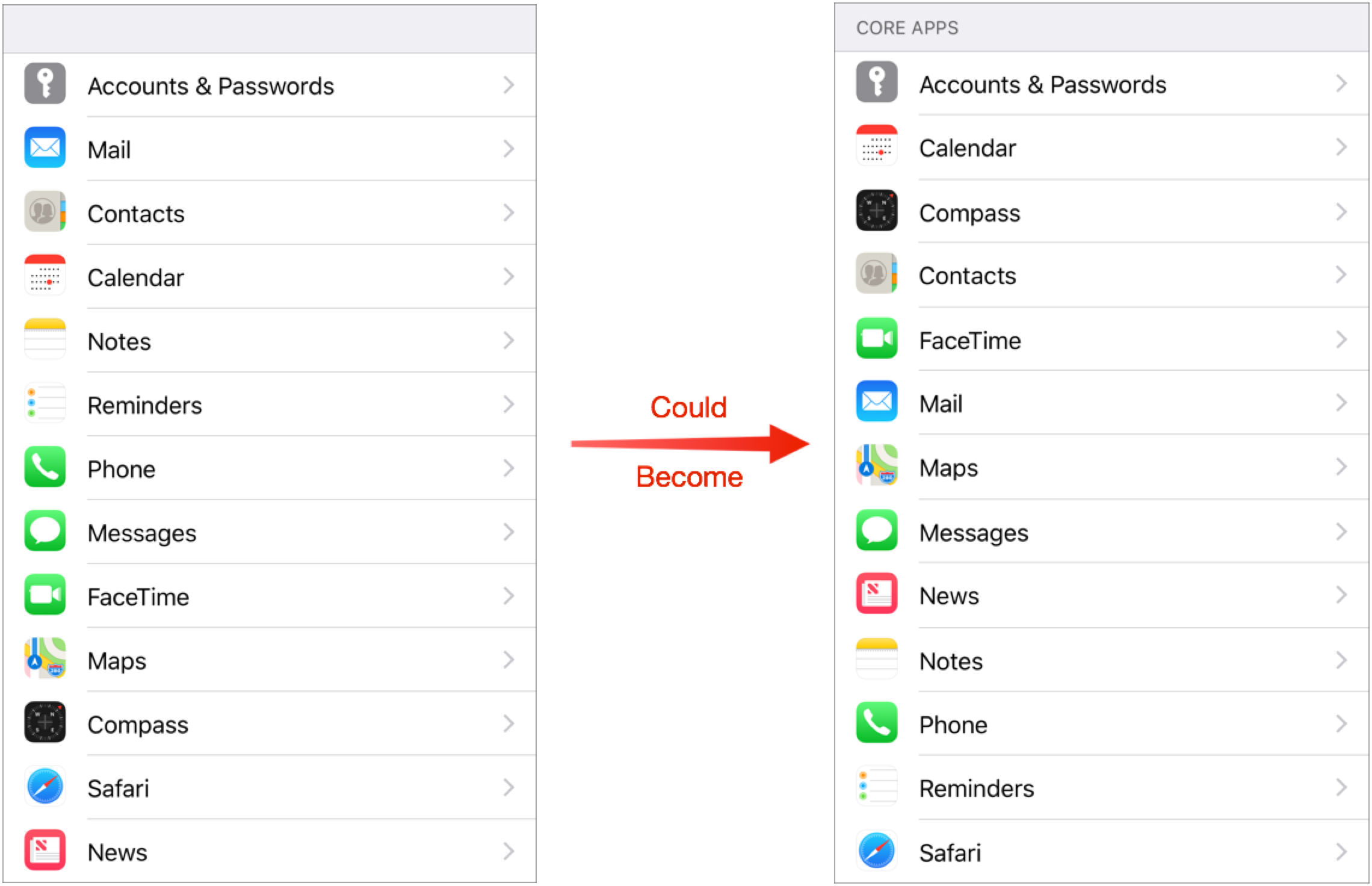
Core Apps — This next grouping has a good deal of logic behind it, but not enough to leave it alone. Accounts & Passwords feels out of place and isn’t itself an app, but it’s where you configure the accounts for Mail, Contacts, Calendar, Notes, and Reminders. Weirdly, Apple did not duplicate the account settings inside each of those subsequent settings screens, so if you’re just looking for your mail account, you won’t find it in Mail. The other reason those three go together is that, long ago, they were a single entry called “Mail, Contacts, Calendar.” But if you didn’t remember that, or know it to start, the grouping may feel arbitrary. That said, Notes and Reminders feel related, as do Phone, Messages, and FaceTime. There’s even an argument for why Maps and Compass are next to each other, even though hardly anyone uses Compass (and its only setting is Use True North). But then why are Safari and News shoved down to the bottom?
Regardless of whether or not there are some internal sets within this collection that make sense, taken as a whole, it’s random and difficult to navigate, especially if you’re looking for Safari or News. You have to read every item in the list every time you look at it. Contrast that with a simple alphabetical sort. It loses any logical grouping, but you know exactly where you are in the list and what’s coming next as you read.
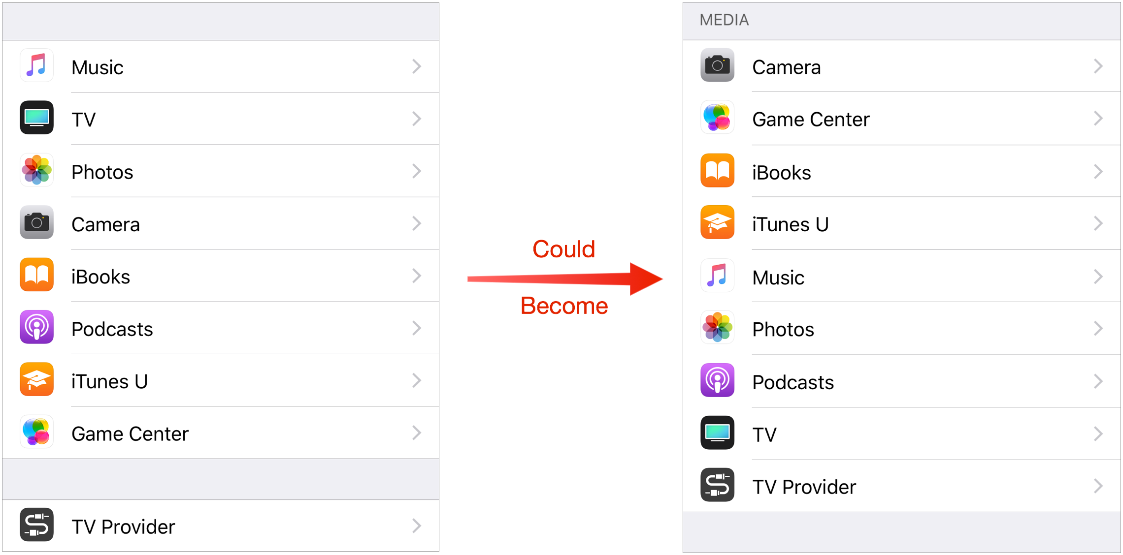
Media — The final Apple-provided collection of settings is clearly related to media. Or rather, it would be the final collection except for Apple’s inexplicable decision to emphasize TV Provider by putting it in a group by itself. Bad Apple! As best I can guess, Apple is arranging these in perceived order of importance, with Music and TV at the top and iTunes U and Game Center at the bottom.
But since not everyone views the world in the same way, it’s far more sensibly arranged alphabetically, with TV Provider lumped in. No, TV Provider isn’t an app like the rest, but there’s no good reason to break it out. After all, Apple lumped Accounts & Passwords in with the core apps above because it controls settings common to several. TV Provider is similar, in that it provides a setting that other media apps would use. And it’s still at the bottom, right next to TV.
A Is for Apple — A few closing thoughts. Suggesting that Apple alphabetize more of the contents of the Settings app shouldn’t be a radical proposal. After all, once you scroll past the Media settings, you get to the options for third-party apps you’ve installed, which, you’ll notice, are listed alphabetically! Similarly, whenever you see any other list of installed apps, such as in the Cellular Data, Notification Style, or Search & Siri Suggestions lists, they’re alphabetical. Nothing else makes sense.
But whenever Apple provides a list of its own apps or services, it throws them together in one of these inscrutable hodgepodges. Just look at the lists in Apps Using iCloud or in Privacy — if they’re not random, the organization scheme is so unintuitive that it may as well be random.

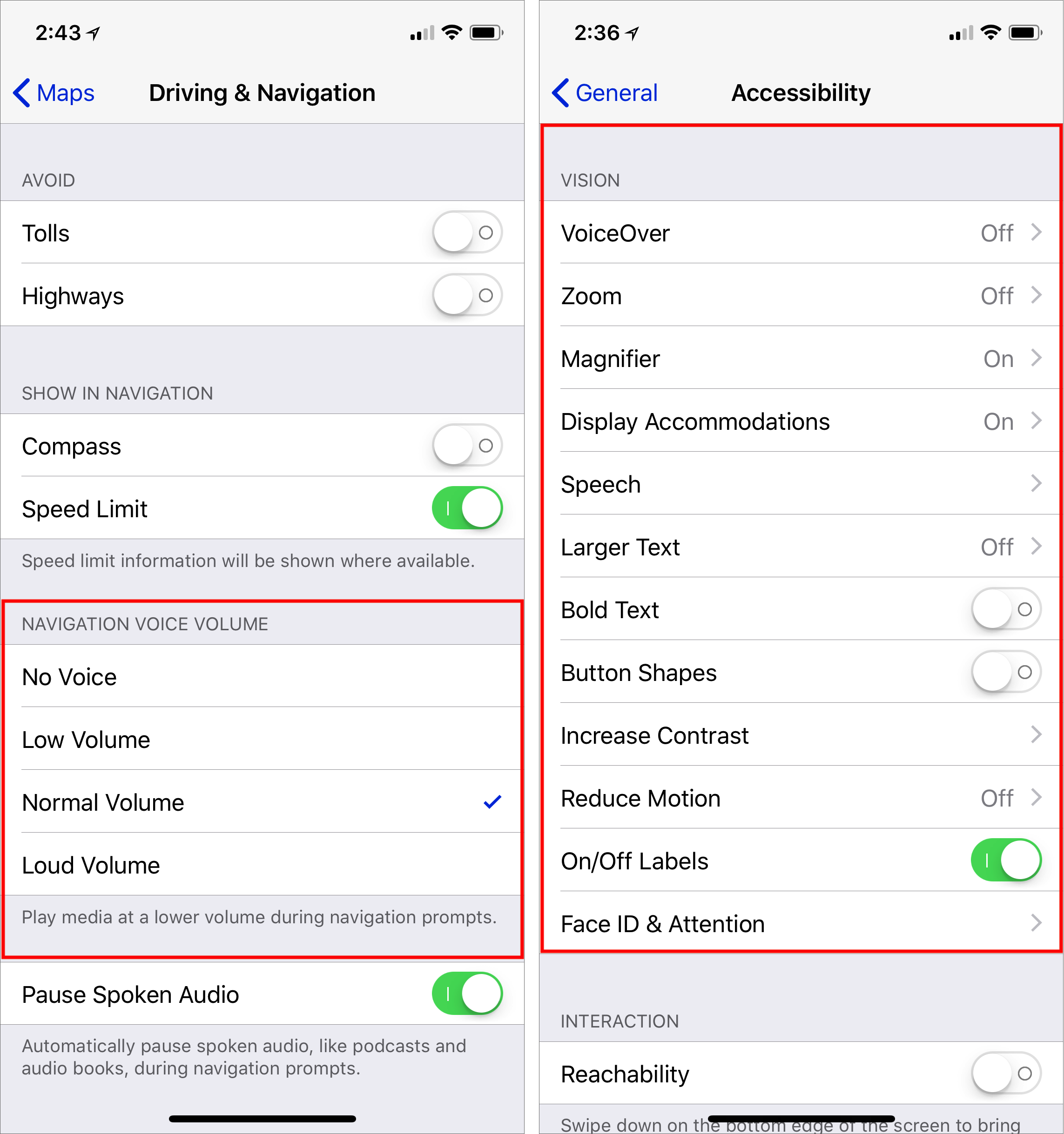
Don’t get me wrong. I’m not suggesting that Apple alphabetize everything slavishly. For lists of five or fewer items, you can take in all the items in one gulp and see the one you need. In some cases, such as Navigation Voice Volume, there are other approaches (low to high) that make much more sense (left, below). But for longer lists without such an obvious organizational scheme, such as the Vision settings in Settings > General > Accessibility (right, below), why not alphabetize them? Seems like that would be more accessible for all of us.
13 Qi Wireless Chargers for the iPhone Reviewed
Wireless charging via the Qi standard is not new, but Apple building it into the iPhone 8, iPhone 8 Plus, and iPhone X has been a big boost for the once-somnolent technology.
As a lot more Apple users are now aware, wireless charging involves placing a phone on a flat pad or upright stand for automatic power-ups, without having to plug a charging cord into the phone itself.
Wireless charging has been available in non-Apple phones for years. The Palm Pre was one of the first, Nokia-made Windows phones had it, and Samsung has consistently built the tech into its smartphones. But until recently, wireless charging has not been a must-do for handset makers. Notably, Google has omitted the feature in two generations of its flagship Pixel handsets after building Qi into older phones.
But, with wireless charging now a part of the Appleverse, Qi accessory makers are scrambling to get their products in front of iPhone owners. I have been awash in review gear — more on those products in a bit — while fielding non-stop pitches for coming wireless chargers.
One of these pending devices is from Apple. The company last year announced its AirPower, a combo charging pad roomy enough to charge a compatible iPhone, an Apple Watch Series 3, and a set of AirPods in a forthcoming Qi-compatible case. The AirPower is due sometime this year — the latest rumors point to late March.
For now, Apple is giving its blessing to a pair of third-party wireless-charging pads from Belkin and Mophie — detailed later in this article — and carries them in its online store as well as in its brick-and-mortar retail stores.
Wireless Charging Basics — Wireless charging is a nice but not necessary technology. “What’s so difficult about plugging in a charging cord?” I wrote five years ago, and I still feel that way. Even so, it’s impossible not to appreciate the simplicity of setting an iPhone on a charging pad and seeing its green charging indicator pop up.
Wireless charging may seem miraculous, but the underlying technology is not. In simplest terms, sets of coils in the handset and in the pad interact if brought close to each other, triggering a charging session via a process called electromagnetic induction. These coil sets have to be lined up just so, which makes wireless charging a bit fiddly. Apple provides a help article about proper charging techniques.
Happily, wireless charging works regardless of whether the phone has a case, generally speaking, but cases that are very thick or have a lot of metal (including battery cases) may pose a problem.
In terms of charging time, wireless charging can be on the slow side — especially compared to some wired charging. For the speediest possible charging of newer iPhones and iPads, you want Apple’s 29-watt USB-C Power Adapter along with one of its USB-C to Lightning cables, or similar (see “iPad Pro Charges Faster with MacBook Adapter and New Cable,” 27 April 2016). Wireless charging is much slower than such a setup (though roughly equal to using Apple’s dinky 5-watt adapter to charge an iPhone).
The duration of a wireless charging session is primarily determined by wattage, which ranges from 5 to 15 watts, depending on the charging pad. The greater the wattage, typically, the quicker the charge session — assuming both the phone and the charger’s wall adapter support the same wattage and are otherwise fully compatible.
Apple’s iPhones supported only 5-watt wireless charging until recently. A software update enabled 7.5-watt charging — assuming the iPhones are being used with 7.5-watt chargers. The two Apple-sanctioned chargers, Belkin’s Boost Up Wireless Charging Pad and Mophie’s Wireless Charging Base, do 7.5-watt charging.
It’s sometimes unclear which other wireless chargers also charge iPhones at 7.5 watts. Some pads with high wattages — well in excess of 7.5 watts — drop down to 5 watts when used with an iPhone, but makers don’t always make this clear. If you want to be sure you are getting the full 7.5 watts, use a charger with a clear iPhone-at-7.5-watts guarantee, like the Belkin or Mophie models.
Honestly, though, wattage is not something most people should obsess about. If you put your iPhone on a charger overnight and grab it fully juiced up in the morning, even a low wattage will do fine. Besides, tests by Matt Birchler and others show only a marginal charging-speed difference between 5 and 7.5 watts.
Choosing a Charger — Competing wireless-charging technologies once jostled for supremacy. Now Qi, backed by the Wireless Power Consortium, reigns supreme after a competitor called the Power Matters Alliance has all but collapsed.
Shopping for a wireless charger can still be confusing given a proliferation of chargers with a wide range of configurations and capabilities. Along with wattage, here are key factors to take into account:
- Design: Many chargers are simple, flat pads, but there are other options. Some chargers are angled or upright, which makes them viewing stands along with charging pads. Of these, some hold a phone in a portrait orientation and others in a landscape orientation; some can accommodate both positions.Look for design touches such as charging indicator lights and grippy surfaces that keep handsets from sliding off while they are charging. The latter can happen if a phone vibrates with an incoming call and jitters its way across the charging pad’s surface unless held in place.Some chargers are understated; others pile on the bling. Some are office and home devices; others are meant to be used on the go. You can buy Ikea furniture and lamps with built-in charging pads. High-end sedans increasingly incorporate wireless-charging pads, too. Even some desktop computers, like Acer’s Aspire S24 all-in-one, have Qi charging pads built in — which makes me wonder whether such a charger could be incorporated into the iMac’s flat metal stand.
- Juice: How are wireless chargers powered? Some have industry-standard Micro-USB or USB-C ports that can be used with just about any cable and wall adapter, which gives them extra versatility. Others (such as the two Apple-approved models) won’t work with any cable or wall adapter other than their own. Mobile chargers often incorporate battery packs for juice on the go.In many cases, wireless pads come only with cords and, maddeningly, not wall adapters. If you are expected to supply your own adapter, make sure it has a wattage comparable to that of your charging pad. Some charging pads have more stringent rules, requiring an adapter that supports Qualcomm Quick Charge tech for fast charging to work.
- Brand names: As with other tech gear, you’re usually better off with reputable brands. These include the likes of Belkin, Samsung, Satechi, and Scosche, to mention just a few. Avoid no-name sellers on Amazon.
- Price: You can score a charger for as little as $10, but name-brand models will typically cost more, up to $60. A cheap unit might cut corners, such as skimping on the charging coils or leaving out a wall adapter. Buyer beware.
- Certification: I think Apple’s blessing of third-party pads carries weight. You should also check for certification from the Wireless Power Consortium, which keeps a database of approved Qi products. Look for “certified” elsewhere in this article with Qi products I have tested that are in the database (or I have otherwise confirmed are certified and slated for addition to the database).
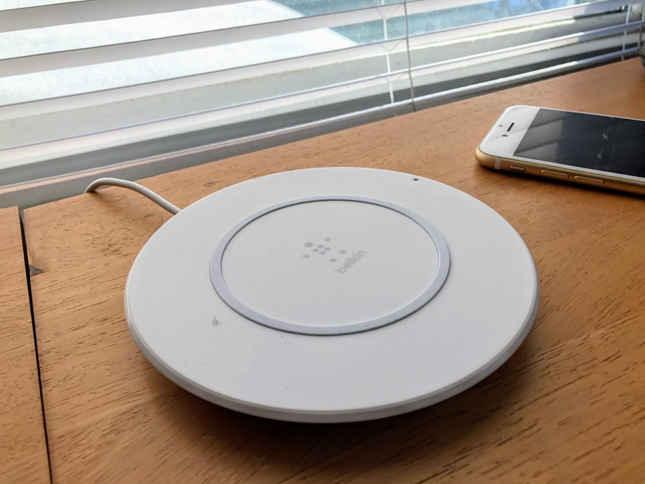
Apple-Recommended Chargers — Until the AirPower is here, the Apple-sanctioned 7.5-watt Belkin and Mophie products are the next best thing.
The two are similar: flat, circular surfaces with proprietary cords and wall adapters. The $59.95 Belkin Boost Up Wireless Charging Pad (certified) has a wider diameter, a charging cable that can detach from the charging pad (but not the wall adapter on the other end), and a white color that makes it stand out.
Mophie’s $59.95 Wireless Charging Base (certified) is a smaller and more understated black platter with a cord that also detaches from the plate but not the wall adapter on the other end.
Both chargers have agreeably grippy surfaces. They work as advertised. Apple likes them. There isn’t much more to say.
Other Flat Chargers — In the universe of wireless chargers, the flat ones appear to be the most common. Here are a few I liked the most:
Satechi’s $34.99 Aluminum Wireless Charger (certified) is a lovely aluminum platter with chamfered edges in a range of colors. Its striking appearance makes me forgiving about its slippery surface, so maybe keep your iPhone off vibrate while it’s charging on this pad. It doesn’t include a wall adapter.
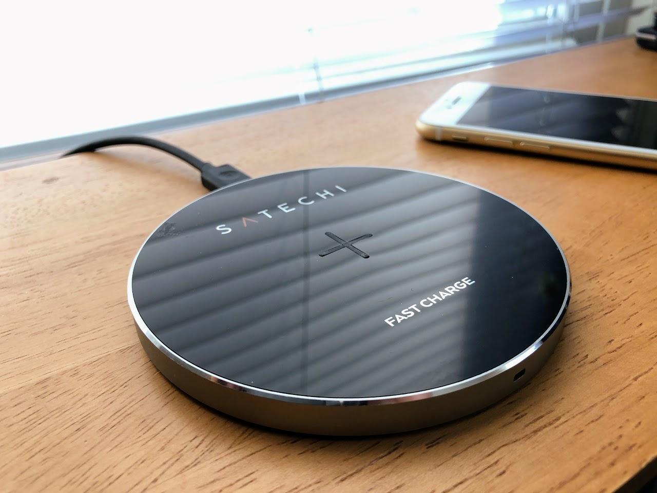
It does have a charging light, but with a big gotcha for iPhone users: the indicator won’t go from blue to green when the charging session is finished, as it does with other handsets. You’ll also notice this annoyance with other chargers, such as RAVPower and Samsung models described further on.
The Satechi will charge at 9 watts with compatible phones. With iPhones, though, it does only 5 watts and not the full 7.5 watts Apple handsets support.
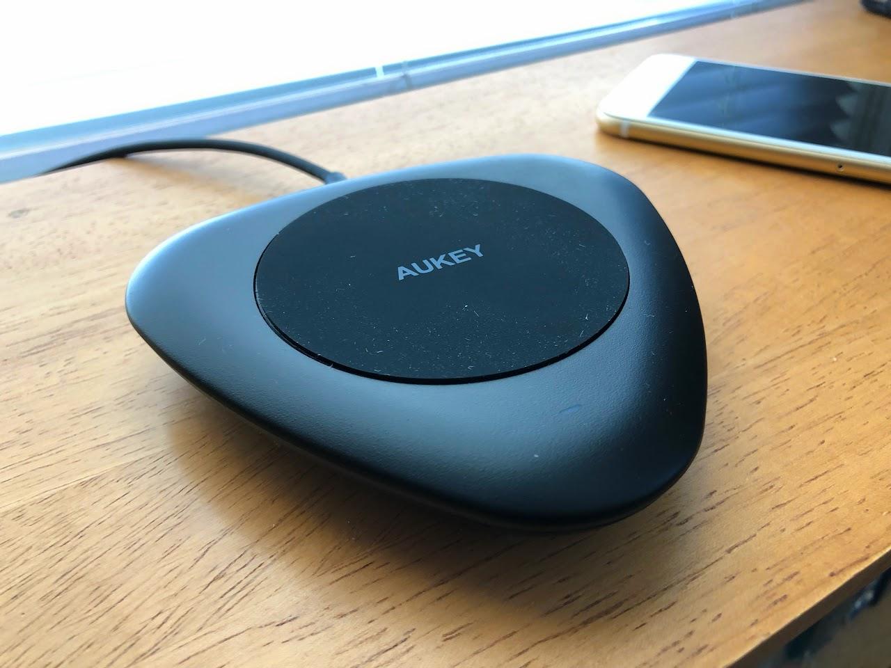
Aukey’s $24.99 LC-Qi Wireless Fast Charger looks a bit like a jumbo guitar pick. It charges at up to 10 watts with non-Apple handsets, but the maker confirms iPhones will only charge at 5 watts. The unit connects via a USB-C port and includes a cable but not a wall adapter. The charger also has a cooling fan, but I never heard it activate. It might only turn on when charging non-Apple handsets at higher and hotter wattages.
Bezalel’s $49.99 Futura X is a shiny, thin, slightly bulbous square with rounded corners that looks somewhat like a drink coaster (in white or black acrylic). It comes with a Micro-USB cable but not a wall brick. It charges at only 5 watts, but it makes up for this with high style and extreme portability.
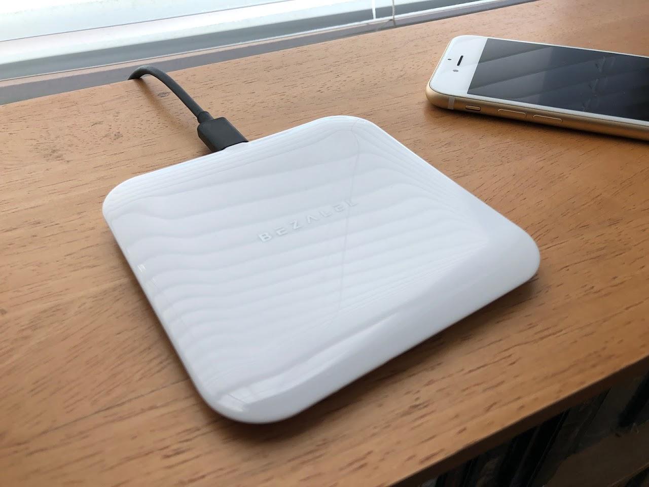
Bezalel says that, later this year, it will offer a stand-like add-on accessory so a phone can be charged on the shiny pad in an upright position.
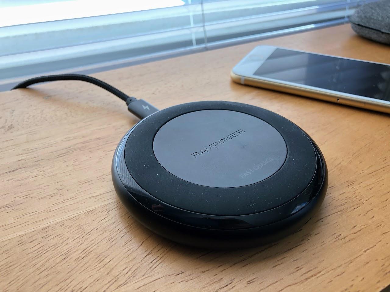
RAVPower’s $49.99 Fast Wireless Charger is my favorite in this roundup. It is a compact, sturdy, weighty, stylish disk that — praise be! — comes with both a wall adapter and an extra-rugged, braided USB-C cord. It charges at 10 watts with phones that support that wattage. It is billed as a “7.5W for iPhone X, 8 & 8 Plus” charger, too, which means it is a decent option for Apple users.
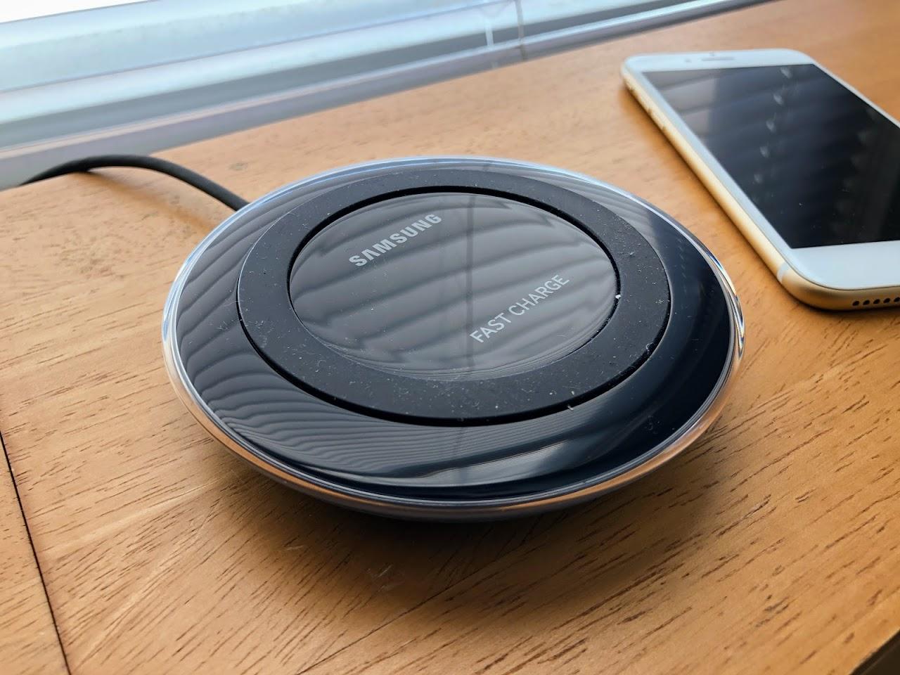
Samsung’s $49.99 Fast Charge Wireless Charging Pad (certified) is a large, raised, subtly translucent disk that is available in white, blue and black/sapphire. It includes a power adapter along with a Micro-USB cord. It charges at 9 watts (I didn’t hear back from Samsung about iPhone-charging wattage) and has a cooling fan built in.
Standing Chargers — These accessories accommodate an iPhone at an angle, which is useful if you want to keep an eye on incoming messages, have FaceTime chats, and the like while the handset charges. With the iPhone X, an angled stand is handy for authenticating via Face ID without having to pick up the handset.
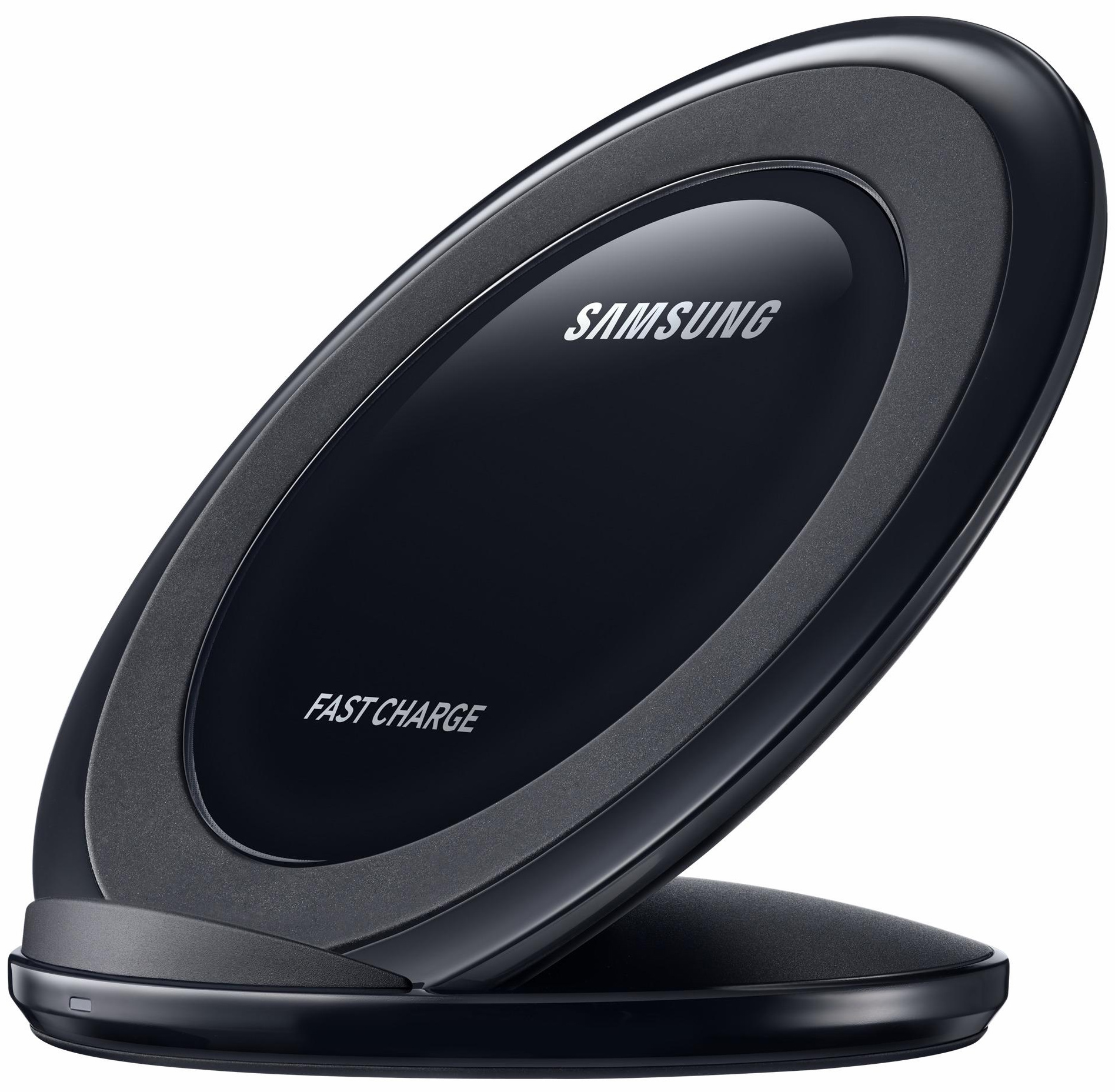
Samsung’s $39.99 Fast Charge Wireless Charging Stand (certified) looks a great deal like the company’s aforementioned Fast Charge Wireless Charging Pad — minus the translucency and with an angled design that is handy for charging a handset in landscape or portrait mode. It too tops out at 9 watts, offers a cooling fan for heat dissipation, and comes with both a Micro-USB cord and a wall adapter.
Samsung’s $58.96 Fast Charge Wireless Charging Convertible (certified) has a premium feel and a price to match, with its platter wrapped in a leather-like material.

The platter can slide on its base from an angled position to a flat one, and charges in either. When upright, a phone can be positioned in landscape or portrait mode. This charger works at 9 watts and includes a fan to dissipate heat. It has a USB-C cord and wall adapter.
Other Chargers — Some wireless chargers incorporate other features, such as wired charging and built-in battery packs for on-the-move power.
Bezalel’s shiny white or black $59.99 Prelude Wireless Charging Power Bank starts with a portable battery for wired charging of a phone or other gizmo while on the move via the accessory’s USB-A port. It then adds wireless charging on top.
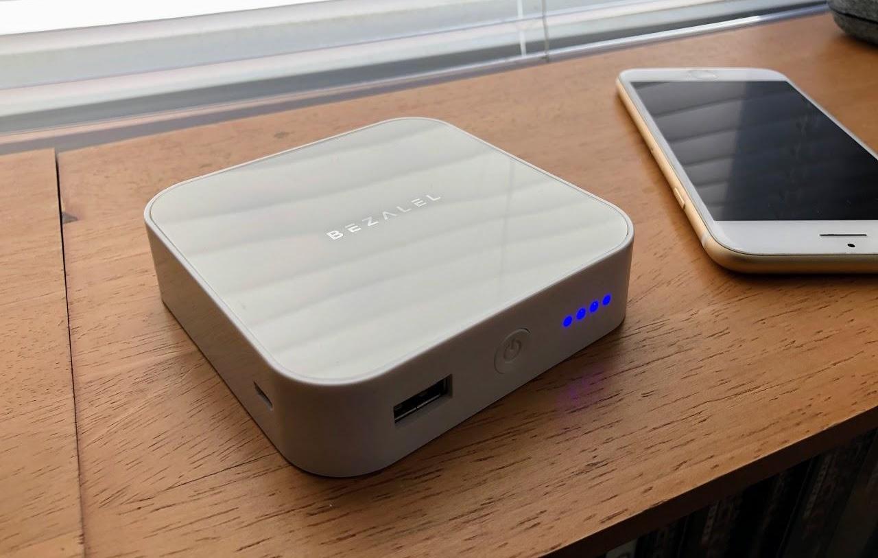
Charge the power bank via a Micro-USB port, then disconnect and go. A power button also activates a row of four blue LEDs to indicate how much of the battery capacity remains. Wireless charging is at 5 watts. It’s a nifty, albeit bulky, product suitable for travel.
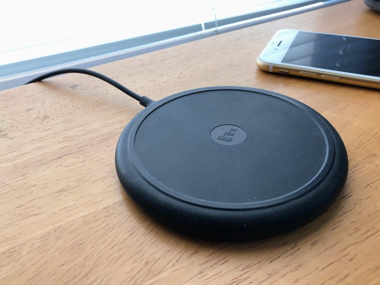
Nomad’s $79.95 Wireless USB Hub is a four-port USB hub (with a USB-C port, two high-output USB-A ports suitable for iPad and iPhone charging and two standard USB-A ports that could charge AirPods and other accessories). The hub, which looks like an oversized hockey puck, includes a 7.5-watt wireless-charging surface on top to set it apart from the maker’s other two puck-style USB hubs.
I was initially thrilled with this product because it looks fantastic, and offered me versatility by providing wired and wireless charging. However, my loaner died a few days into my testing and, as you read this, I am investigating what happened (I’m chalking it up to a faulty unit). I am still keen on Nomad gear thanks to spotless experiences in the past, so I’m not dismissing this product out of hand, but be sure to have a refund option if you buy.

In-car docks for phones are not new, but wireless charging is a novel angle.
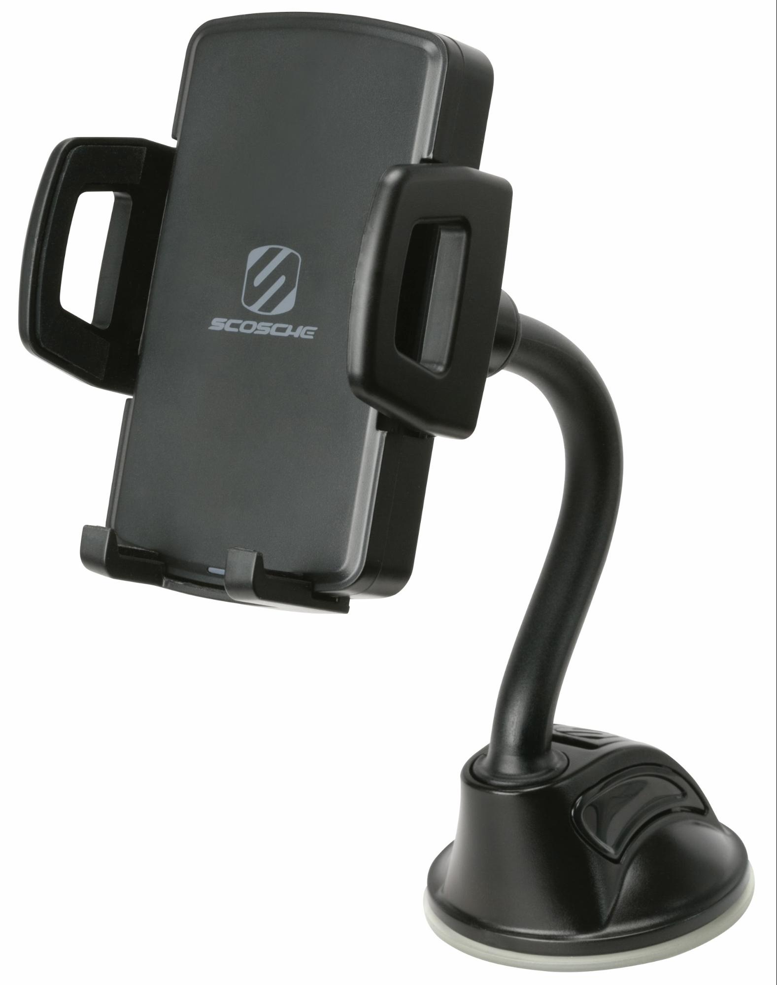
Scosche’s $49.99 StuckUp Qi Wireless Charging Universal Window/Dash Mount (certified) is a standard car mount that adheres to your dashboard or windshield and incorporates a twisting arm with a clamp-style dock attached.
What sets this dash mount apart is a wireless-charging pad that gets power via a USB-C cord and a power adapter that jacks into the car’s accessory port. This works well, but you have to adjust the dock’s clamping mechanism to accommodate smartphones of different sizes or they might not charge properly.
The dock is plasticky and seems a bit fragile, but that’s sadly nothing new with products in this category.
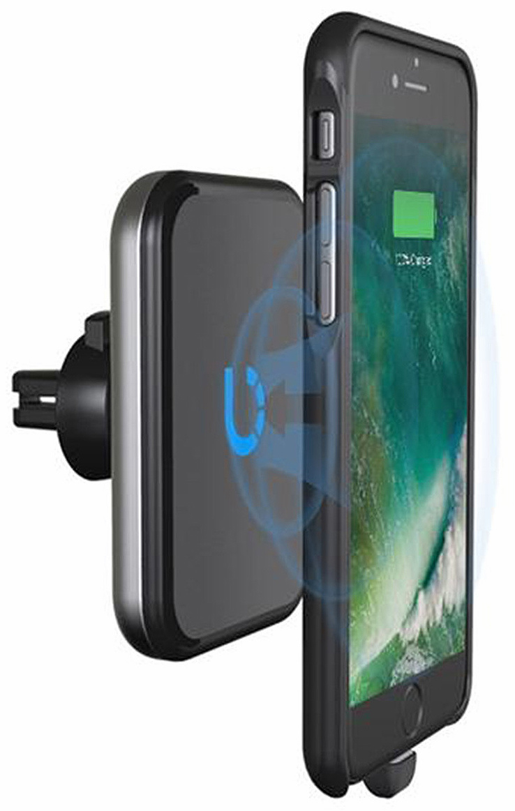
Bezalel’s $59.90 Omnia attaches to an air vent. The part the phone rests upon is a small plate, unlike the big clamp-style Scosche dock, and relies on a magnetic connection to keep the handset firmly in place.
To achieve such secure mounting, Bezalel provides iPhone cases that add magnetic adhesion. Even older iPhones as far back as the iPhone 6 can join this party since Bezalel also sells “receiver cases” that provide wireless charging (via a physical connection to the Lightning port) along with magnetic mounting.
The magnetic adhesion also works with other Bezalel products, including the previously mentioned Futura X and the Prelude, which all but eliminates the annoying trial-and-error nature of positioning a phone on a charging surface. If you have a Bezalel case on your iPhone, it will snap into place on either Bezalel charger. Nice.
More Chargers Coming — I could write an entire article about wireless chargers that are in the pipeline, but I will mention just a few.
At the recent Consumer Electronics Show in Las Vegas, Belkin took the wraps off a line of wireless-charging products for the home and car. RAVPower is readying a handful of Qi devices — including a mobile power bank with built-in wireless charging — for release in a few weeks. And Aukey is offering a 10-watt charger that supports 7.5-watt iPhone charging.
In the crowdfunding sphere, a company called Plux is raising Indiegogo dough for an AirPower-like combo wireless charging pad (also called Plux) to charge an iPhone, Apple Watch Series 3 and AirPods at once, in either an upright or flat configuration. The campaign has wildly exceeded its $5,000 goal — but, as with all crowdfunding projects, temper your expectations because some such efforts have famously foundered.
The Wireless Way — I became enamored with Qi charging for a time years ago, but since I was mainly an iPhone user, Qi wasn’t all that relevant and I soon moved on. Besides, although Qi had a foothold in the consumer-tech world, it wasn’t taking it by storm.
Apple has changed that by pulling Qi technology into its ecosystem. The company has raised Qi’s profile and generated excitement among accessory makers, so we can all look for an ample selection of iPhone-friendly wireless chargers in the months to come.
TidBITS Watchlist: Notable Software Updates for 26 February 2018
Bookends 13.0.6 — Sonny Software has issued Bookends 13.0.6, updating the reference management tool’s database engine. The update also now inserts corresponding Copy Citation and Copy Formatted text automatically in Apple Pages documents, improves metadata found with Crossref searches, enables rotation of PDFs in the PDF viewer, improves the Cited inspector (enabling import into the library via drag and drop), and works around a problem with the Web site for Science so automatic PDF downloading functions again. ($59.99 new with a 25 percent discount for TidBITS members, 46.8 MB, release notes, 10.9+)
Read/post comments about Bookends 13.0.6.
Fantastical 2.4.6 — Flexibits has released Fantastical 2.4.6, adding notifications when an invitee responds to an invitation on Microsoft Exchange. The calendar app now enables scrolling in the Day view for events with lots of details, improves the appearance of Spotlight results when using the menu bar and Dock dark theme, fixes an issue where daily repeating events that span midnight appeared incorrectly in the Week view, ensures that the Travel Time menu shows home and work addresses all the time, and resolves an issue where the Week or Month views would sometimes appear blank at launch. ($49.99 new from Flexibits and the
Mac App Store, free update, 15.3 MB, release notes, 10.11+)
Read/post comments about Fantastical 2.4.6.
Parallels Desktop 13.3 — Parallels has issued version 13.3 of Parallels Desktop with bug fixes for the virtualization software. The update addresses disproportionately scaled windows after installing a Windows update, resolves an issue with Boot Camp-based virtual machines not starting in version 13.2, avoids a crash after a virtual machine is networked to another Mac using Thunderbolt Bridge, resolves a number of nagging issues in Windows virtual machines (including slow login, unresponsive Start Menu, and the inability to use a keyboard with some apps), and fixes a bug with Parallels Tools not working in macOS
10.13 High Sierra virtual machines. ($49.99 upgrade), $99.99 annual subscription for Pro/Business Edition ($49.99 renewal for Pro), 251 MB, release notes, 10.10.5+)
Read/post comments about Parallels Desktop 13.3.
Keyboard Maestro 8.1.1 — Peter Lewis of Stairways Software has released Keyboard Maestro 8.1 with several additions to the Prompt With List action, including an initial search string plus configurable and automatic widths. The automation and clipboard utility also gained another parameter to the Execute Macro action title, fixed a possible crash with Custom HTML Prompt if JavaScript closes the window immediately, and fixed selecting New… in Named Clipboard pop-up menus. Shortly after this release, Stairways Software issued version 8.1.1 to fix the Append to File action, resolved an issue with Trigger Macro by Name, and
fixed a problem related to creating dictionaries and dictionary keys with AppleScript. ($36 new with a 20 percent discount for TidBITS members, free update, 22.3 MB, release notes, 10.10+)
Read/post comments about Keyboard Maestro 8.1.1.
1Password 6.8.7 — AgileBits has released 1Password 6.8.7, addressing log-in issues with some specific Web sites (such as Bank of Montreal, UBS, Citi, and DOCO Credit Union). The password manager also makes general improvements to Identity and Credit Card filling, improves filling of the expiration date and cardholder name on Swedish credit card forms, resolves an issue where filling on the WordPress re-authentication prompt would use the wrong fields, and improves Identity filling on Facebook’s registration page. ($64.99 new from AgileBits and Mac App Store or free with a $2.99 or $4.99 per month subscription, free update, 48.7 MB, release notes, 10.10+)
Read/post comments about 1Password 6.8.7.
Airfoil 5.7 — With Airfoil 5.7, Rogue Amoeba adds full support for sending audio from any Mac source to Apple’s new HomePod (see “HomePod First Impressions: Let the (Apple) Music Play,” 12 February 2018). Airfoil can also handle volume and playback commands sent by the HomePod, with playback commands passed on to supported Mac audio sources, including Spotify and iTunes. The wireless audio broadcasting app also adds support for enhanced metadata and remote control with
Downcast on the Mac, adds title track support to djay Pro 2, stops obscuring entries in the passcode field used for the Apple TV, and clears keychain items when performing a factory reset. ($29 new with a 20 percent discount for TidBITS members, free update, 14.2 MB, release notes, 10.10+)
Read/post comments about Airfoil 5.7.
ExtraBITS for 26 February 2018
In ExtraBITS this week, Apple is ending iTunes Store access for the first-generation Apple TV, Tim Cook is positive about his time at Apple, and a federal judge has ruled that embedded tweets can infringe copyright.
Apple to End iTunes Store Access for First-Generation Apple TV — If you’re still using a first-generation Apple TV, be aware that Apple will cut off its access to the iTunes Store on 25 May 2018 due to security changes. These security changes will also prevent PCs running Windows XP and Windows Vista from accessing the iTunes Store. The hard-drive equipped first-generation Apple TV shipped in January 2007 and was available through September 2010. The second-generation Apple TV and later will continue being able to get content from the iTunes Store.
Tim Cook: “I’ve only had good years” — Apple CEO Tim Cook sat down for a wide-ranging interview with Fast Company’s Robert Safian. Cook is feeling pretty good about his tenure at Apple, saying up front that he has “only had good years.” Despite the excellent performance of Apple stock, Cook expresses misgivings about the stock market and discusses Apple’s patience in developing products (“Because we don’t believe in using our customers as a laboratory.”), how he reads customer feedback (“I tend to weight the ones that are most thoughtful.”), and how
Apple wants to help its customers do the right thing (such as with Do Not Disturb While Driving).
Federal Judge Rules Embedded Tweets May Infringe Copyright — If you thought the U.S. legal concept of copyright had caught up with the Internet, you’d be wrong. District Court Judge Katherine B. Forrest has ruled that you could infringe copyright by embedding someone else’s tweet on a Web page. The case in question involves a photo of New England Patriots quarterback Tom Brady that the photographer, Justin Goldman, posted to a Snapchat Story. Others then tweeted the photograph, and those tweets were embedded by various publications, which
Goldman is suing. The problem is that in-line linking is one of the core capabilities of the Internet, and if the logic surrounding this ruling were extended more broadly, it would have a chilling effect on common Internet behavior. (Too bad no one listened to Ted Nelson in the pre-Web days, since his Xanadu hypertext system understood the importance of maintaining — and paying for, with micropayments — ownership of embedded content.)