TidBITS#809/12-Dec-05
Charles Maurer returns with a detailed discussion, informed by perception and painting, of how digital cameras can produce more naturalistic photos than film cameras. Mark Anbinder looks at the addition of NBC shows to the iTunes Music Store, Glenn Fleishman passes on news of new Wi-Fi driver options for Tiger users, and we examine updates to Firefox, Firefox’s Flashblock extension, SETI@home, the Prograph programming language, and "Take Control of Mac OS X Backups."
Firefox 1.5 Released
Firefox 1.5 Released — The Mozilla Corporation has released Firefox 1.5, the latest version of the popular open source Web browser for Mac, Windows, and Linux. Important new features include an automated update capability, improved navigation performance, drag-and-drop reordering of tabs, improved pop-up blocking, a one-step method of clearing private data, more-descriptive error pages, automatic RSS discovery, better accessibility, a wizard for reporting broken Web sites, enhanced support for Mac OS X (including profile migration from Safari and Internet Explorer), and numerous security enhancements. Firefox 1.5 requires Mac OS X 10.2 or later and is a 9.4 MB download.
<http://www.mozilla.com/firefox/>
Ironically after my article about simplifying installation in TidBITS-807, the Firefox disk image provides only graphical instruction that’s actively confusing. An arrow leads from the Firefox icon itself to a smaller, greyed-out version of the Firefox icon that is presumably being dragged, to judge from the non-Mac-like pointer and + badge, and then to a greyed-out icon that looks like the Applications folder. Unfortunately, it’s all representational – the Applications folder is just a picture, and not a symbolic link, and there are no textual instructions to clarify what to do. I’ve already heard of people not realizing they had to copy the Firefox package and instead running it from the disk image. Worse, the instructions on the Firefox Web site say "double click the Firefox Disk Image to open it in Finder, and then drag the Firefox application onto your hard disk. Drag the icon to your Dock if you want it to appear there." I’m sure there are people who will promptly drag the Firefox icon from the disk image to the Dock, instead of copying it to the Applications folder and then dragging the copied version’s icon to the Dock. Obviously, there’s nothing all that hard here, but that’s no reason not to make it easier yet.
<https://tidbits.com/getbits.acgi?tbart=08346>
In comparison, applications that deserve kudos for using this installation technique include Jim Matthews’s Fetch (of course!), James Thomson’s PCalc, and Frank Reiff’s A Better Finder Rename, with extra points to Rainer Brockerhoff for using the technique for his XRay utility since 2003. Some disk images don’t force icon view if the user has Open New Windows in Column View set in the Finder preferences, which eliminates any graphical or textual help that would otherwise appear. I’m not yet sure how to force icon view in all situations. [ACE]
<http://www.fetchsoftworks.com/>
<http://www.pcalc.com/>
<http://www.publicspace.net/ABetterFinderRename/>
<http://www.brockerhoff.net/xray/>
SETI@home Moves to BOINC Client
SETI@home Moves to BOINC Client — If you’re anything like me, you don’t pay much, if any, attention to SETI@home clients you may have running on machines with CPU cycles to donate to the search for extraterrestrial life. But Jim Carr, one of the top members of the TidBITS SETI team, alerted me recently that the classic SETI@home client is being turned off as of 15-Dec-05, and everyone who wants to continue donating spare CPU cycles must move to the new BOINC (Berkeley Open Infrastructure for Network Computing) client that supports not just SETI@home, but a variety of other distributed computing projects. The SETI@home page has the necessary instructions for downloading the latest BOINC client and requesting your account information. Unfortunately, it’s a slightly obtuse process, and I wasn’t able to convince BOINC to attach to the SETI@home project, but the error message implied temporary server problems (which the SETI@home folks have mentioned on their news page). I recommend waiting a bit before converting; either check the SETI@home site every so often to see if they’ve resolved their technical difficulties or look for another note in TidBITS. If you’re new to the SETI@home project and want to join the TidBITS team, follow the third link below and click Join once there. [ACE]
<http://setiathome.berkeley.edu/>
<http://boinc.berkeley.edu/>
<http://setiathome.berkeley.edu/team_display.php ?teamid=30293>
DealBITS Drawing: GarageSale Winners
DealBITS Drawing: GarageSale Winners — Congratulations to Doug Breckenridge of gmail.com, Peter Pinch of rcn.com, and Simon Sunatori of hyperinfo.ca, whose entries were chosen randomly in last week’s DealBITS drawing and who each received a copy of iwascoding.com’s GarageSale 1.9. Even if you didn’t win, you can save 20 percent off the purchase price of GarageSale by placing an order using the third link below; this offer is open to all TidBITS readers through 22-Dec-05. If you’re planning to attend Macworld Expo in San Francisco next month, you can find iwascoding.com and GarageSale at booth 948. Thanks to the 612 people who entered, and keep an eye out for future DealBITS drawings! [ACE]
<http://www.iwascoding.com/GarageSale/>
<http://www.tidbits.com/dealbits/iwascoding2/>
<http://order.kagi.com/?3W91&lang=en>
<https://tidbits.com/getbits.acgi?tbart=08344>
DealBITS Drawing: Classic Solitaire
Solitaire card games have long been a mainstay of computer gaming, especially for those who don’t care for blood-and-guts first-person shooters. If you’re looking for an implementation of Solitaire for the Mac, it’s worth giving dogMelon’s Classic Solitaire a try, since it includes cards with professionally designed graphics, 20 different Solitaire games and, most important for those of us who have never even heard of games like Idiot’s Delight and La Grande Imperiale, an explanation of the rules for each in the online help.
<http://www.dogmelon.com.au/sol/Mac_ Solitaire.shtml>
In this week’s DealBITS drawing, you can enter to win one of five copies of Classic Solitaire, each worth $29.95. Entrants who aren’t among our lucky winners will receive a discount on Classic Solitaire, so be sure to enter at the DealBITS page linked below. All information gathered is covered by our comprehensive privacy policy. Be careful with your spam filters, since you must be able to receive email from my address to learn if you’ve won. Remember too, that if someone you refer to this drawing wins, you’ll receive the same prize as a reward for spreading the word.
<http://www.tidbits.com/dealbits/classic- solitaire/>
<http://www.tidbits.com/about/privacy.html>
Prograph Spelled Backwards Is Marten
Prograph is back! Perhaps you have to be some kind of weird programming nerd to think this is intriguing news, but personally I think anyone interested in programming, from a beginning learner to an old hand, should care. Prograph is a wonderful visual, dynamic, object-oriented programming language; instead of writing lines of textual code, you draw a diagram of how you want the data to flow. Not long after I reviewed it in 1996 ("Get Your Hands on Prograph" in TidBITS-312), Prograph started to wither on the vine, and by the time Mac OS X came in, I had abandoned all hope of ever using it again.
<https://tidbits.com/getbits.acgi?tbart=01160>
<http://en.wikipedia.org/wiki/Prograph>
It turns out, however, that what was withering was Pictorius’s product, Prograph CPX. The Prograph language itself is an idea, and ideas are free. Unbeknownst to me, some nutty developers had reverse-engineered the Prograph language and the Prograph CPX environment, with a view to making Prograph available on BeOS. When BeOS died, the effort was ported to Mac OS X and is now available commercially under the name Marten.
<http://andescotia.com/products/marten/>
I haven’t tried Marten, and I have no idea to what extent or how easily it can be used to generate a native-looking application on Mac OS X, but I am told that the Marten editor is itself written in Marten, which is certainly something. And even if it can’t be used to write the next killer app, it’s so enjoyable and educational to express a task in the Prograph language and environment that those who, like me, have been pining for it will probably be more than happy to pay their $65 and give it a shot.
NBC Universal Brings More TV to iTunes
When Apple introduced its new video-capable iPod in October, the early iTunes Music Store video offerings were limited to ABC and Disney Channel television programs. Don’t get me wrong, I like "Desperate Housewives" and "Lost," but I yearned for this new service to explore more of its potential. Last week’s Apple announcement of a deal with NBC Universal realizes that dream for me.
<http://www.apple.com/pr/library/2005/dec/ 06nbc.html>
Now available is a much broader selection of entertainment, featuring such NBC drama as "Law & Order" and "Surface," the nightly shows of Leno and Conan, science fiction masterpiece "Battlestar Galactica" from the Sci-Fi Channel, and the USA Network hit "Monk." But of more interest to me, since I can already watch all of those shows via DISH Network, is the collection of vintage NBC shows like "Adam-12," "Dragnet," and even "Knight Rider," plus the first season of "Law & Order."
<http://www.apple.com/itunes/videos/>
Episodes of each show are available for $1.99, with new episodes available the day after they air on television. (Currently, TV shows are available only in the U.S., and availability of other videos varies by country.) Just as music albums often offer songs for a total price lower than 99 cents each, TV series "seasons" are typically available for a lower total price than $1.99 per episode.
NBC Universal and Apple are cleverly taking advantage of the recent surge in DVD sales of old TV shows. If you’ll buy old "Bewitched" episodes on DVD, why not grab an old "Alfred Hitchcock Presents" episode to take on the morning commute? The programs are all commercial-free, in contrast to announcements last month that the NBC and CBS networks would offer 99-cent on-demand shows with commercials via DirecTV and Comcast Digital Cable, respectively. Noticeably absent is the NBC Nightly News Netcast with Brian Williams, available for free in Windows Media format on MSNBC.com each weeknight after 10 PM Eastern.
Apple says iTunes Music Store customers have purchased more than three million videos since the service’s debut less than two months ago, for viewing in iTunes or the Front Row application included with the latest iMac, or on an iPod. Add me to the list; my first TV show download, of the long-ago pilot episode of "Law & Order," is almost finished. Would you believe, considering how many times a day "Law & Order" airs on TV, I’ve never seen the pilot?
Flashblock Update for Firefox 1.5
The Flashblock extension for Firefox lets you control whether Flash animations automatically start playing on Web pages (see "Firefox Flash Blocker" in TidBITS-794). With the release of Firefox 1.5, I was bereft! No update! Andrew Lawrence pointed out via iChat that Flashblock had an update – the extension has forked into two separate versions. For Firefox 1.0.x, you can use Flashblock 1.3.3; for Firefox 1.5, Flashblock 1.5.
<http://flashblock.mozdev.org/>
<https://tidbits.com/getbits.acgi?tbart=08225>
Installing extensions within Firefox is a breeze:
- Visit the Web page containing the extension.
- Find the install link.
- The extension should download (if it’s blocked, see below); click Install.
- Quit Firefox and launch it again to load the extension.
If the extension doesn’t download in Step 3, that’s due to Firefox’s clever way of disallowing software installations from sites you haven’t approved.
Here’s how to approve the site:
- Click the download button or install button on the Web site.
- A gray bar appears across the top of the Firefox browser warning you the installation was blocked.
- Click the Edit Options button at the far right of this gray bar.
- The domain name is prefilled in the pop-up window; click Allow to add the domain to an approved list.
- Click the Close button.
- Try Step 1 again; if it works, go to Step 4 in the installation steps.
Non-Apple Wi-Fi Options Expand for Mac Users
The Taiwan-based chipmaker Ralink may be the solution for many users of Mac OS X 10.4 Tiger trying to find a Wi-Fi adapter that works with their particular machine. Although few companies make Wi-Fi products that include or support Tiger drivers, several companies use chips from Broadcom, Apple’s Wi-Fi chip supplier, which enables their products to work on a Mac without additional software.
However, Broadcom’s competitors have made inroads into the Wi-Fi market, and some products that worked six months ago – for instance, a Belkin 802.11g PCI Card – have been re-engineered to save costs and no longer use Broadcom chips. Manufacturers rarely directly disclose which chips are in which products to avoid making promises about the underlying technology; they’re promising functionality (i.e., a Wi-Fi connection).
That’s what makes Ralink’s unsupported drivers for Mac OS X 10.2 through 10.4 and Linux so interesting: if you wind up with a Ralink-based device, you can still use it with your Mac. Ralink has been listening to its indirect Mac customers, because they recently updated their drivers for Mac OS X 10.4 Tiger, and they seem to release regular bug fix updates as well.
Ralink’s driver page contains downloads for supported products, but it’s organized by internal chipset and product names. I hope some enterprising soul will figure out which products and versions from major makers use Ralink chips, expanding Mac users’ options.
<http://www.ralinktech.com/supp-1.htm>
Belkin’s 802.11g PCI Card (part number F5D7000) claims to have Mac OS X 10.2 and 10.3 (not 10.4) compatibility on its detail page, but doesn’t offer drivers for download via the linked page. Al Varnell wrote in point out that you must take a different route to find drivers by visiting Belkin’s download section and navigating to the product. I have no idea why the drivers aren’t properly linked in both directions! The drivers were updated in April, 2005 and include no mention of Tiger compatibility. (Belkin also has Panther drivers for other products.)
<http://catalog.belkin.com/ IWCatProductPage.process?Merchant_Id=1& amp;Section_Id=&pcount=&Product_ Id=136479>
<http://www.belkin.com/support/download/ download.asp?category=9&lang=1& amp;mode=>
There are now Tiger-supported USB 2.0 adapters for Macs – I found this out almost by accident. The ZyXEL AG-225H, a Wi-Fi hotspot detector with a built-in LCD screen, doubles as an 802.11a/b/g adapter using USB 2.0. ZyXEL provides Mac drivers for both Panther and Tiger; I haven’t tested them but have been told that they work by other Mac users. I reviewed the ZyXEL unit, looking primarily at its Wi-Fi finding functions, for Mobile Pipeline back in September, 2005. It’s about $75 from several online retailers.
<http://us.zyxel.com/support/download.php>
<http://www.mobilepipeline.com/showArticle.jhtml ?articleID=171000509>
Thanks to Dave Goldman for this tip!
Reality and Digital Pictures
People often ask me if I think digital photography is as good as film or will ever become as good as film. I reply that for all but a few special purposes, digital is better already. Technically, my digital photographs are at least as good as the best conventional photographs I ever took with 2-1/4" x 3-1/4" (6 cm x 9 cm) film, and pictorially they are better. With my digital camera I can take pictures in the street that used to require a studio.
In this article I shall explain what digital technology can do that conventional photography cannot – how computers can produce more naturalistic pictures, not how they can produce special effects. To do this I’m going to start with perception, pass through art, and enter computers by the back door. Although this is an unusual route, it approximates the way I think when taking a photograph and it provides the only way I know for negotiating the maze of manipulations offered by photo editors. Although I shall mention some specific products (all of them available for the Mac as well as Windows), I shall not describe any in depth. The difficult part of digital photography is figuring out what must be done in the computer and which application can do it. Knowing that, it is rarely difficult to figure out how to make the application do its job.
This article is illustrated with a number of pictures. To see them appropriately, your monitor ought to be in rough calibration. If you have never calibrated your monitor, I suggest that you do it now. It takes about two minutes. Open the Displays preference pane, click the Color tab, click Calibrate to launch the Display Calibrator Assistant, select the Expert Mode checkbox, and then follow the instructions. When you come to the screen asking you to set the gamma, select 2.2.
For one reason that will become clear, I find some version of Photoshop to be necessary. For this reason I shall assume its use as a photo editor, although you need not own it to understand the article. Along the way I shall mention the differences among the last three versions (CS, CS2 and Elements) that matter for my approach.
Eye vs. Camera — To begin with, let’s dispel the notion that a camera records what the eye can see. It does not and it cannot because a camera functions nothing like the eye. With a lens of normal focal length, a camera records an image with a diameter of approximately 45 degrees. It records the entire image at once and the image ends up as a print with a range of intensity from black to white of approximately one hundred to one. In contrast, the eye sees an area about 180 degrees across but it sees most of this with acuity that ranges from bad to dreadful. It sees sharply just in the central 1 to 3 degrees. To see a scene clearly, the eye must scan it and the brain must assemble the accumulated information. However, the eye rarely has time to sample more than small portions of a scene with its spot of clear vision so most of what you see has no optical source, it is an inference. Your brain infers information largely by generalizing from what it has encountered before. In doing this the eye and brain have to handle contrasts of light that exceed one million to one.
In short, when you look at a snapshot you took at the beach, the limitations of the camera mean that three-quarters of the scene will have been lopped off, the range of tones will be compressed tenthousandfold, and the information that remains will never be what you saw. Any appearance of realism will be an inference informed by learning and shaped by convention. It is not realism but verisimilitude.
Photographs may seem realistic but the technology of film prevents escaping photographic conventions, which are actually quite limiting. Less limiting is a paintbrush. A brush can produce every effect a camera can plus a great many more. Before photography, skilful and observant artists spent millennia working out how to represent reality on flat surfaces using this superior tool. Their work forms the most complete guide available on realistic ways to put pictures onto paper.
Most artistic techniques cope with two basic problems, problems that reflect the architecture of the visual tissue of the brain: how to imply something about form and space using (1) areas of brightness and (2) lines. These problems are not discrete and isolated any more than the tissue of the brain is, they are two sides of the same coin, but it will simplify our thinking to make a fuzzy distinction between them.
Contrast — The eye does not see light per se, it sees changes in light – contrast. If two objects do not contrast with one another, to the eye they meld into one. This fact makes controlling the contrast of adjacent details to be paramount in importance. However, the real contrast of any scene can rarely be reproduced. As I said, the range of reflectance from the lightest to the darkest objects in a scene is rarely less than one thousand to one and often exceeds one million to one, yet the range of reflectance of pigment against paper or canvas is approximately one hundred to one. On the other hand, even within a contrasty scene, small areas can have very little contrast indeed.
From contrasting tones the brain infers three-dimensional objects. It does this through association, by matching patterns it has encountered before: a bright spot is a source of light, brilliant yellow may be fire and hot, areas that are darker tend to be removed from you or from light, bright areas tend to be near you or near light, tiny highlights on a face indicate sweat and heat, etc. To paint realistically, painters use associations like these to create optical illusions. This is easy because the eye scrutinizes only tiny areas at a time, so the brain cannot easily compare colours and tones across broad distances. As long as adjacent tones vary naturally, distant tones can be impossible optically yet still look right. You can see this in Rembrandt’s painting of Belshazzar’s Feast, linked below. The main source of light on the faces appears to be the writing on the wall, yet it is no brighter than the faces. It is not white but fiery gold, yet it is so far away from his face that nobody notices the optical absurdity. Also, with writing on the wall as the main light, the secondary light reflected off the invisible wall on the left ought logically to be much dimmer than it is.
<http://www.tidbits.com/resources/809/ BelshazzarsFeast.jpg>
In other parts of the painting Rembrandt increased contrast where he had to maneuver within too limited a range to limit himself to variations in brightness. Look at the woman’s red dress to see an example. Not only do the folds look three-dimensional overall, each tiny portion of every fold looks three-dimensional, even if you restrict your eye to small areas, areas where there is little difference in brightness from highlight to shadow. Every tiny part of the dress contrasts with the part adjacent to it. Rembrandt could do this because he did not vary brightness alone, he varied hue and saturation as well – independently. If you open the picture in Photoshop and set the Info window to HSB, you can move the mouse around and see some of this variation that has survived the miniaturization of the painting. (The real thing, which somebody long ago trimmed to a smaller size and different angle, is 66" by 82" or 167 cm by 209 cm.)
Filmmakers and commercial photographers create realistic photos similarly, by "cheating" lamps that are put on the set as props, lighting the set so that the light seems to be coming from those props. An example is the picture of the blacksmith at the link below. A logical analysis shows that no illumination can have come from the fire, but the eye is not a logical analyser. However, cheating like this takes more time than cheating on your taxes, especially in a still photograph where the illusion does not flit past your eye. That photograph took me a day to plan and a day to execute. (Among other things, I needed to wrap the entire workshop in aluminum foil, to prevent light from coming through chinks in the walls.)
<http://www.tidbits.com/resources/809/ Blacksmith.jpg>
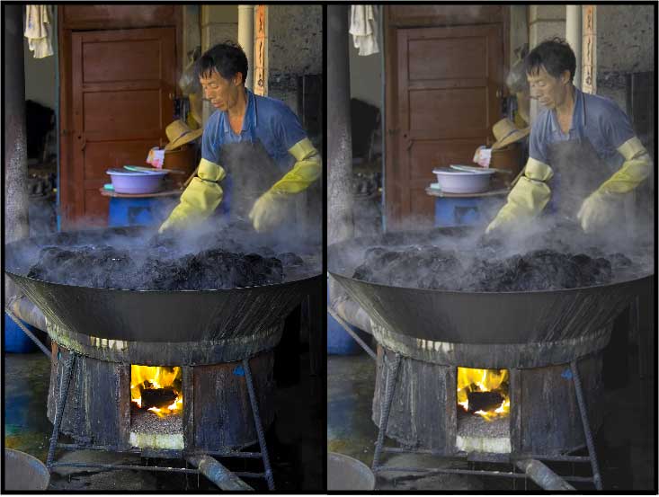
On the other hand, equivalent results can often be obtained without cheating by using a good digital camera and re-balancing the light digitally. An example is the dyer in the picture linked below. The version on the right shows the scene as film would have caught it; the version on the left shows it as it felt and as I remember it to be. It is probable that before I took the picture, I noticed that the room light was bluer than the firelight – I do tend to notice such things – but my overwhelming perception was overwhelming heat and that heat is what I wanted to portray. To the visual system, so many cues to heat are present that the firelight in his face looks natural although it’s logically absurd.
<https://tidbits.com/wp/../uploads/2005/12/Dyer.jpg>
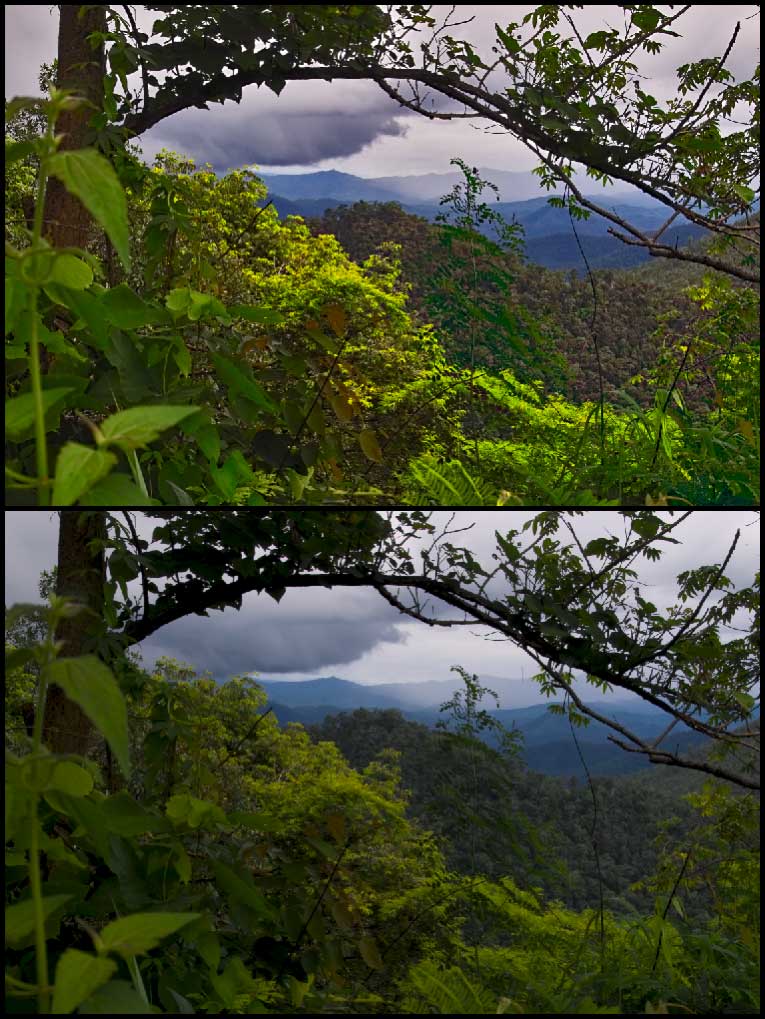
The next example shows a more ordinary picture. The image on top shows what the scene looked like: a brightly lit bush in the foreground with a jungle of trees in the hills behind, gradually diminishing in size and clarity. However, although my brain perceived the bush to be bright, it was actually dark compared to the sky and the jungle was even darker. The scene presented a range of tones that nothing man-made can come close to reproducing. My camera’s sensor "mechanically" compressed those tones into the image on the bottom. Slide film would have done the same. To make the picture look more realistic, I brightened the bush in the foreground and painted contrast into the jungle by varying saturation and brightness independently from each other and from hue.
<https://tidbits.com/wp/../uploads/2005/12/Jungle.jpg>
To manipulate contrast in this way requires three things:
Capturing the information that you want to bring out.
Making that information visible by lightening shadows and/or darkening highlights.
Adjusting colour not to make it look accurate – that is impossible – but to bring out whatever contrasts are necessary to make it look right
To meet the first requirement, you need a raw, unprocessed image (not a JPEG) from a camera that can record a broad range of contrasts. In today’s market this means a single-lens reflex camera. (For more information, see the "Image Quality" section of my article "Picking a Point-and-Shoot Camera: Panasonic DMC-FX7" in TidBITS-783.) When I convert the file to a standard format (I prefer the generic TIFF to Adobe’s PSD), I set its levels of tonality to run the full extreme from black to white, with the middle set to look as good as possible.
<https://tidbits.com/getbits.acgi?tbart=08136 >
Lightening shadows and darkening highlights comes next, with Adobe’s Shadows/Highlights control. Photoshop defines shadows and highlights as dark or light areas larger than a certain number of pixels across. CS, CS2 and Elements all enable adjusting the amount of lightening or darkening but CS and CS2 also enable adjusting the size of what Photoshop sees as a shadow or highlight. I find that adjustment to be very important, and I use it for maybe one photo in three.
(Most of what Adobe left out of Photoshop Elements I do not care about – Elements is already more complex than it needs to be – but I found this one adjustment almost reason enough by itself to forgo Elements for the full Photoshop. The other reason is that Elements has limited facilities to handle 16-bit colour. Although 8-bit colour is usually sufficient, pulling apart tonality often requires finer intermediate colours to be present.)
Now look at the Rembrandt picture again, at the detail on Belshazaar’s cape. The detail stands out because it is formed by brush-strokes with extremely high contrast from one to the next, extremely high local contrast. I make detail stand out in a photograph the same way by using an incidental feature of PictureCode’s Noise Ninja, which is primarily a noise-reduction package (and one of the best). This feature is a slider that enhances local contrast. I often use it by itself without any noise reduction at all.
<http://www.tidbits.com/resources/809/ BelshazzarsFeast.jpg>
<http://www.picturecode.com/>
Now comes the paint. If an artist wants to adjust a colour on his canvas, he may change its hue, or he may daub on spots of complementary colours to reduce its saturation, or he may add some black or white touches to reduce or increase its brightness. With digital photographs I want to do the same. The product that enables me to do this is Asiva Shift+Gain.
Shift+Gain is a Photoshop plug-in that lets you select areas or lines (useful to remove colour fringing) by any combination of hue, saturation, and brightness, and then alter those parameters individually. No other product can do this, except for a stand-alone package from Asiva that is too slow to use. Indeed, incredible as it may sound, Asiva has a U.S. patent on this approach to manipulating pictures.
Shift+Gain works differently from any other application and took some time to understand. However, although it was confusing at first, it soon came to seem simple. To accomplish in Photoshop most of what I do in Shift+Gain would require far more skill and patience than I can supply.
I find Shift+Gain to be an indispensable tool for digital photography – the only indispensable tool, the only tool for which I do not know of any functional equivalent. Unfortunately, it will not work in any application other than Photoshop, not even applications like GraphicConverter that can run most other Photoshop plug-ins. It is compatible with any recent version of Photoshop, but it does require Photoshop, which is why I am ignoring possible alternatives to Photoshop in this article.
Those three sets of tools can handle nearly all the manipulations of contrast and colour that I have had any need for: (1) the controls in Photoshop CS/CS2 for levels, shadows and highlights, (2) the local-contrast control in Noise Ninja, and (3) Asiva Shift+Gain. Occasionally I also use one of Asiva’s other plug-ins, which work similarly but do slightly different things. I have found that Asiva’s plug-ins, combined with Photoshop’s basic selection tools, obviate the need for masking to achieve ordinary pictorial effects.
Only one of Photoshop’s colour adjustments do I find to be particularly useful. Sometimes, after I have adjusted the colours to bring out contrasts, the picture shows an overall tint. Now, no tint exists on its own, a tint is merely an offset from a standard of comparison. In a photograph, the eye’s standard is usually a pure white highlight or the paper’s margin. If a neutral white or grey looks coloured in comparison, then we see a tint. Removing a tint is usually a simple matter of shading the picture just enough to neutralize that white or grey. Every other colour changes a bit, but the contrasts among them will remain. It’s difficult to remove a tint manually because the brain adapts so readily to changes in colour that a wide range of adjustments seems okay until you print out the picture. Photoshop can remove a tint mechanically; the mechanism is hidden in the Match Color command.
One final consideration about colour comes with dim light. In sunlight we see in colour; in moonlight we see in monochrome; in transitional "mesopic" levels of dim light we see partially in monochrome and partially in colour. When painters want to represent dim light, they portray it mesopically. You can see this with the musician at the back of the Rembrandt and you can see it even better in the Gross Clinic by Thomas Eakins, the picture on the left at the link below. The students in the shadows are nearly monochromatic but the monochrome contains hints of colour, often quasi-random streaks and blotches. (Note that the original painting is 96" by 78" or 243 cm by 198 cm.)
<http://www.tidbits.com/resources/809/ GrossAbattoirFlowers.jpg>
Film does not portray dim light in this way, nor do most digital sensors, but the Foveon sensor does. (See "Sense & Sensors in Digital Photography" in TidBITS-751 and my followup for a discussion of sensor types.) Film and digital sensors generate low levels of granular noise. When a normal amount of light strikes the film or sensor, the noise is usually hidden within the image, but when little light strikes it, the noise becomes more evident. At some dim exposure to light the image disappears within the noise: that defines the limit of sensitivity. The random dots of this noise can be smoothed over but detail becomes smoothed over with them and at the limit of sensitivity, all detail disappears. However the Foveon image sensor works differently so its granularity looks different. The Foveon shows fewer specks but replaces them with intrusions of incorrect colour. At first this reduces saturation then, at the lowest levels of sensitivity, it causes random streaks and blotches.
<https://tidbits.com/getbits.acgi?tbart=07860>
<https://tidbits.com/getbits.acgi?tbart=07906>
Reduced saturation and random streaks and blotches of colour are exactly the techniques that artists use to represent dim light, and the Foveon’s noise can be used to do the same. I smooth out the granular noise with Noise Ninja – there is rarely so much of this that Noise Ninja loses any detail – then I use Shift+Gain on selected areas to control the discolouration. My goal is sufficient discolouration to add contrast for the eye but not so much as to be noticed. You can see the effect in the Chinese abattoir to the right of the Gross Clinic painting you just loaded.
Do note, though, that desaturation and blotchiness are not the norm in Foveon photos. They are normally hidden in depths of black and become evident only if you bring them out by pushing the sensor to its limits. More normal is the picture of the flower market – the third one on the page. I took both pictures indoors and exposed them at ISO 1600.
Perspective — So far we have been talking about how to represent space using tonality, now let’s shift to representing space using lines. This is the problem of perspective.
During the Italian Renaissance, artists worked out a geometry of linear perspective, geometry that appears superficially to fit perceptual norms. In fact, however, it does not. The "laws" of linear perspective need usually to be broken, else the picture will look wrong.
The laws of perspective dictate that parallel receding lines converge. They converge if they are receding horizontally like railway tracks and they converge if they are receding vertically like skyscrapers seen from the street. But consider vertical perspective. If the angle of view portrayed is only a little bit upward, then your brain may not infer that objects are converging at a distance above you, your brain may infer that the objects are not plumb. Of course, if those objects are walls of buildings, then your brain concludes that they are not falling inwards, for just as you assume that boards are straight, so do you assume that walls are plumb. However, for the same reason – because you assume that walls are plumb – buildings look more natural when all the vertical lines are upright and parallel. You can see an example of this issue in the two images of the temple pictured at the link below. A correction like the top image with film would have required the careful adjustment of a view camera on a tripod but it took me two minutes in Photoshop. (Elements or CS can fix perspective but CS2 makes it easier through a new Lens Correction item in the Filter > Distort sub-menu.)
<http://www.tidbits.com/resources/809/ VerticalLines.jpg>
The same adjustment is useful for horizontal lines. When horizontal lines converge, buildings can appear to be constructed on a hill and roofs can seem to have unusual inclines. To minimize ambiguity, vertical lines ought to be plumb and horizontal lines ought to be level unless the reason for them not to be is obvious. Clear verticals and horizontals provide a frame of reference that lets oblique lines stand out.
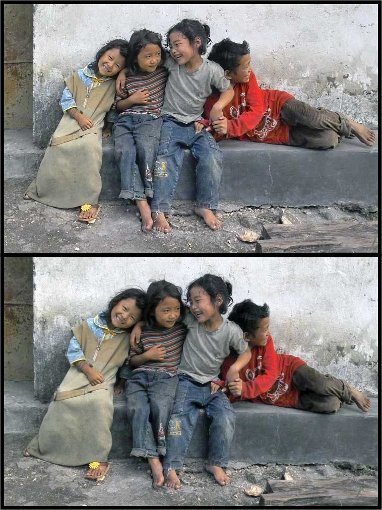
Pictures of buildings obviously benefit from this approach, but often pictures of people do too, although more subtly. You can see an example in these two pictures of children, linked below. The picture on the top is stronger because the children are sitting on a level platform, not a tilted one.
<http://www.tidbits.com/resources/809/ Children.jpg>
In fact, the laws of linear perspective need to be violated even when photographing something straight on. If you look straight at a picket fence or a wall of bookshelves, an optically correct perspective would have the lines of the fence or bookshelves converging both to the left and to the right. This would look so silly that nobody would paint them this way. For the same reason, camera lenses are corrected to distort linear perspective so that a rectilinear object casts a rectilinear image.
This presents an interesting problem that can be solved with a brush or computer but not with film. The farther out from the centre an object extends, the farther its lines will be pulled apart and thus the more it will be enlarged, yet objects in the centre will never be enlarged, distorting relative sizes. The wider the lens’s angle of view, the greater the distortion. This distortion can be seen with any wide-angle lens and becomes disproportionately more severe the wider the angle of view. When straight lines are not involved – in many landscapes – it often looks more natural when relative sizes are maintained at the expense of convergence. This can be approximated in Photoshop CS2 by adding convex "barrel" distortion, a distortion that reduces the rectilinear correction of the lens.
(Note that only CS2 offers that control. CS2 also makes it significantly easier than CS or Elements to correct converging and tilting lines, once you find the new controls. In CS2, all of the lens corrections are buried under Filters > Distort, although File > Render still shows the subset of corrections that is shared with CS and Elements.)
Of course, adding convex distortion is unacceptable if straight lines are involved. A certain amount of convex distortion may not be noticed in landscapes, but curvature stands out absurdly in pictures containing buildings. An alternative fudge is to squeeze the picture from the sides. To do this I use a $20 Photoshop plug-in called Squeeze.
<http://www.theimagingfactory.com/>
I also ought to mention the portrayal of depth through having only one plane of the picture in focus. This effect can be achieved with a brush, but it rarely is, because it does not mirror what the eye sees or the brain perceives. The eye sees only tiny spots sharply, and it sees tiny spots wherever it looks: from these the brain perceives infinite depth of field. To control attention and suggest different qualities, a painter will vary the softness of edges across a picture, but this variation is much more subtle than a mis-focussed lens.
To vary hardness and softness within a picture, I used to use a view camera that allowed me to tilt and swivel the lens, and I varied the character of the light. A digital camera makes this a lot easier. My digital camera usually provides infinite depth of field with no special measures and I can use digital techniques to control softness like a painter, as I did in the flower market example previously shown. The flowers just behind the smiling girl are soft, but the ferns behind them are sharp, as is every other object in the picture except for the woman moving into it.
This was possible for two reasons, both tied to the camera’s image sensor. First, the ISO speed of negative film is based on the least exposure necessary for acceptable snapshots. To extract high quality usually requires doubling the metered exposure. In contrast, to extract the best quality from my digital SLR, I usually halve the exposure. That is two f-stops’ difference, which represents a lot of depth of field. On top of that, the sensor in my camera is smaller than 35mm film, which means the same f-stop gives more depth of field. The difference is 1-2/3 stops. Thus, for any given amount of light, I obtain nearly four f-stops’ more depth of field than I would get were I shooting 35mm negative film.
When everything is sharp within a photograph, photographic compositions open up. People don’t just look at my pictures, they look inside them, combing them for detail – and they find it, because I have controlled the details’ contrast. With so much information to look at, my 8" x 10" (A4) printer seemed too small. Next week you can read a discussion of printers and my search for a larger one.
Finally, to finish up my comparison of the various versions of Photoshop, I ought to mention two new features of CS2 that are useful for preparing enlargements, a "spot healing brush" and "smart sharpening." The former I find to be a modest but significant convenience, but the latter is an important feature. It tightens up a lens’s inescapable spreading of points into blurry circles, and it reduces blur from movement. In my mind, this feature combined with CS2’s improved distortion controls makes the upgrade from CS worth the purchase. I detest a Windows-like copy-protection scheme that Adobe have begun to employ – it prohibits the fair use of your purchase if you work in different locations – but I swear at CS2 less often than I did at its predecessors because it permits me to hide from sight the vast number of menus that I never use and to edit or remove keyboard shortcuts. With CS2, no longer do windows fly about the screen and change their colour because one of my fingers inadvertently touched a key.
PayBITS: If you found Charles’s discussion of visual perception
and digital pictures useful, please support Doctors Without
Borders: <http://www.msf.org/msfinternational/donations/>
Read more about PayBITS: <http://www.tidbits.com/paybits/>
Take Control News/12-Dec-05
"Take Control of Mac OS X Backups" Updated to 1.2 — Do you have an effective strategy for backing up your work files, not to mention your growing collection of iTunes purchases and digital photos? Don’t wait until disaster strikes. Get help now by reading our latest release of "Take Control of Mac OS X Backups," which has already helped thousands of Mac users. In this significant 1.2 update, you’ll find the latest advice for developing a backup strategy that fits your budget and style. The ebook now covers the many changes made to backup hardware and software in the past 10 months, looks at Apple’s Backup 3 for .Mac users, and offers more than 20 pages of detailed directions for using the popular Retrospect backup software. It also includes new sections about backing up photos and video.
"Take Control of Mac OS X Backups" is now 138 pages and costs $10. If you own an earlier version, you can download the update for free by clicking the Check for Updates button in the lower-left corner of your ebook’s first page.
<http://www.takecontrolbooks.com/backup- macosx.html?14!pt=TRK-0014-TB809-TCNEWS>
"Take Control of Buying a Digital Camera" 2.0 Released — Anyone who wants to buy the right digital camera at the right price can now find up-to-date info and more tips in the second edition of "Take Control of Buying a Digital Camera," written by Seattle-based professional photographer and instructor Larry Chen. Larry walks readers through the entire purchase process, providing help with budgeting and understanding what types of photos you want to take, friendly advice about the many possible camera features, expert guidance on reading camera reviews and evaluating picture quality, and suggestions on where to shop. The ebook, which we mentioned briefly last week, comes packed with photography tips, case studies, and color photos illustrating the discussions, plus a significantly enhanced section about buying a digital SLR camera. Readers will find a 2-page printable shopping worksheet, which they can print out, annotate as they read, and take with them when they shop. The ebook also includes an appendix summarizing popular cameras in different categories and a glossary covering common photography terms.
The second edition of "Take Control of Buying a Digital Camera" has grown to 107 pages and costs $10, though it’s 50 percent off through 26-Dec-05 as part of our holiday consumer electronics ebook sale. If you own the first edition, you can download the update for free by clicking the Check for Updates button in the lower-left corner of your ebook’s first page.
<http://www.takecontrolbooks.com/buying- digicam.html?14!pt=TRK-0015-TB809-TCNEWS>
Hot Topics in TidBITS Talk/12-Dec-05
The first link for each thread description points to the traditional TidBITS Talk interface; the second link points to the same discussion on our Web Crossing server, which provides a different look and which may be faster.
Applications folder symlinks ease installation — Readers discuss various ways of installing applications more easily. (8 messages)
<https://tidbits.com/getbits.acgi?tlkthrd=2807>
<http://emperor.tidbits.com/TidBITS/Talk/650/>
Moving over user accounts without migration assistance — So exactly how do you move a user account from an old Mac to a shiny new one, without using Unix? (2 messages)
<https://tidbits.com/getbits.acgi?tlkthrd=2809>
<http://emperor.tidbits.com/TidBITS/Talk/654/>
Bluetooth cell phones for Mac OS X — You’re a Mac user and you want a Bluetooth-capable cell phone that’s compatible with iSync and Salling Clicker, and that you can use as a modem to connect to the Internet from your Mac. TidBITS Talk readers come up with a couple of suggestions, but the pickings seem to be slim. (3 messages)
<https://tidbits.com/getbits.acgi?tlkthrd=2811>
<http://emperor.tidbits.com/TidBITS/Talk/656/>
New DRM causing problems playing audio CDs? Is a Mac’s inability to play music CDs a new form of DRM or, more likely, just a bad drive? (7 messages)
<https://tidbits.com/getbits.acgi?tlkthrd=2812>
<http://emperor.tidbits.com/TidBITS/Talk/657/>