Big Sur Makes Changes to Many Apple Apps and Basic Features
macOS will have a different overall look and feel in Big Sur (see “Apple Takes macOS to Big Sur… and to 11,” 22 June 2020), but Apple hasn’t ignored its key apps. Maps and Messages get long-overdue overhauls, while Safari adds privacy-reporting features and more locked-down extensions, and Photos and other apps receive minor tweaks. A grab bag of other changes will appear, too, such as facial recognition in the Home app that links the Photos app and home security cameras.
We assume Mail for Big Sur will change somewhat, too, based on details shown for Mail in the iPadOS preview. But Apple didn’t demonstrate Mail for macOS in the keynote or include it in the initial feature list.
Messages
In many ways, Messages hasn’t changed much from its long-ago origins. Apple has tweaked elements and tacked on new features, but Messages remained a list of conversations at left and individual messages at right.
In Big Sur, Messages changes its focus from text messaging to something akin to threaded group-messaging software—it begins to look much more like Slack. You can @mention someone in a group chat to highlight them and set up your own notifications to get alerts only when you’re @mentioned. Replies can be threaded in groups, too. Groups can also get their own avatar, which can be a photo, Memoji, or emoji, and it’s shared across all group members.
Instead of a simple chronologically organized list of conversations at left, you can now pin important conversations at the top—a total of nine that sync across iOS, iPadOS, and macOS. As actions happen in pinned conversations, indicators—including the Tapback reaction icons—appear above the pin. In a group chat, messages since you last checked are indicated by a ring of icons corresponding to other members in that conversation’s list item.
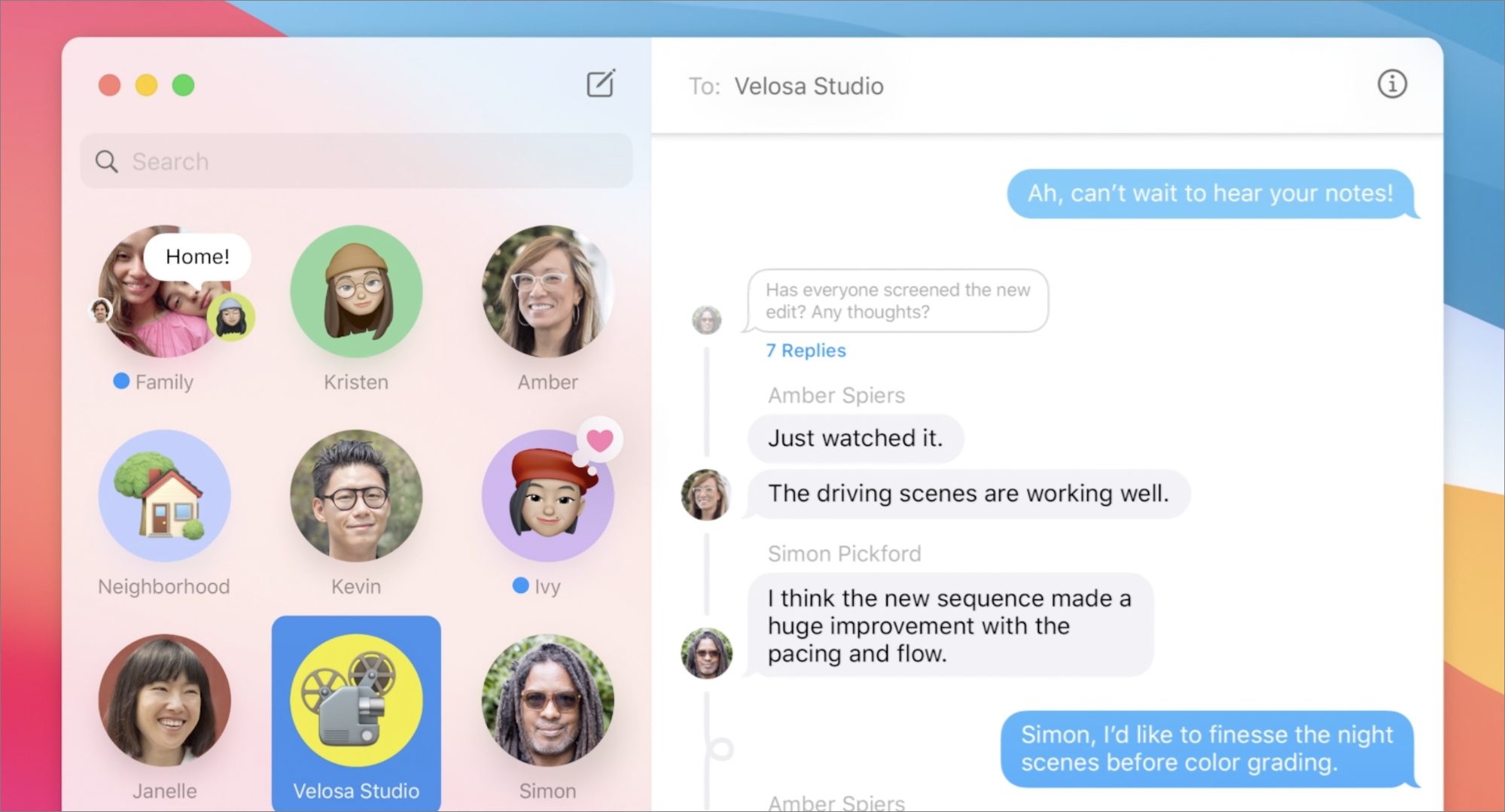
Search has been a wasteland in Messages for a long time, and Apple has brought finding text (including phrases), links, and photos into a more comprehensive and usable set of results.
Messages adds a missing feature by letting you share your name and photo with another party who doesn’t have you listed by your iMessage email or phone number in their contacts. It has always been mystifying to people who receive their first iMessage from you, even an expected one, in that way. You’re given a variety of options to control how you share that information: you can disable it, share it with everyone, or just with people in your contacts (who ostensibly lack you in theirs). You can also choose to push it to another party when you start a conversation or only after they reply to you.
Because Messages is used heavily for social and family purposes, Apple has boosted the fun quotient, trying to meet features found in other popular messaging apps. A sort of “intensity” control lets you can control how “loudly or gently” you send a message to produce a similar effect on the recipient’s side—teens can “slam” a message to their parents, which I am sure will be greatly appreciated. (Insert sarcasm emoticon here.) Apple also lets you add popular images that are trending on social media, something familiar to Twitter and Giphy users. Memoji have become more nuanced, letting you design one that resembles you even more closely than in previous iterations, as well as creating stickers you can share and use. To fight fire with fire, whatever.
Finally, the media picker in macOS in general and Messages in particular has been poor for some time. Apple has enhanced that to make it easier to select recent photos and albums to share in messages.
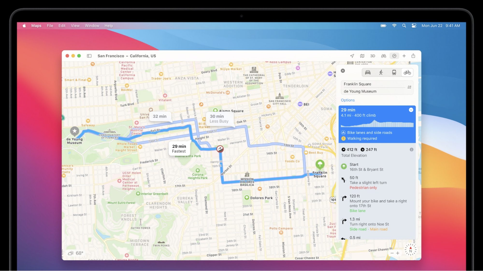
Maps
Apple has focused more on improving its Maps app and mapping data in iOS and iPadOS, which makes sense given those devices are mobile. This has left Maps for macOS trailing behind. Big Sur pushes Maps into something closer to parity with its mobile siblings, while adding new features that will be found in all operating systems.
This lets you take better advantage of a large screen for research and previewing. When you go mobile, you can shift routes or details to your mobile device, or pull it up via iCloud syncing.
Many changes relate to planning and visualizing your route or the area you’re heading to before you begin a trip. Electric-vehicle drivers can plan a route that both includes charging stations and calculates charging time. With iPhone and electric car integration, Maps for macOS can provide more precise information based on current charge and the type of charger used by your car. We’re uncertain if this will require dropping tens of thousands of dollars on a new car, as so often seems to be the case with freshly integrated automotive features.
Cyclists get a promotion to first-class citizens, including details of how busy streets are and elevation, necessary calculations for riders. You can transfer planned routes to an iPhone for navigation while riding.
In the future, when we once again travel recreationally, new Apple Guides created by partner travel companies offer shopping, food, cultural, and entertainment suggestions. You can also create your own and share them with people you know. One of the best ways I’ve found to prep for a trip is to get some ground-level views. For some cities, Apple now offers interactive 3D 360-degree panning around and along city streets.
The new Maps incorporates indoor features, too, so you can figure out where in a mall—to the extent that malls continue to exist—you can find a given store. Apple highlights the issue, too, of figuring out if a restaurant an airport is located before or after security.
As more cities manage traffic with congestion zones, which can limit which cars may drive on certain days or include tolls for entering the zones, Maps now includes them—and lets you route around them where possible. In China, you can enter your license plate number to check if you have access to drive through urban areas that restrict entry. (Apple noted that license plate data is stored securely and only locally within the Maps app.)
Maps for macOS also gains an iOS 13 feature to share your ETA. You can tell other people when you expect to arrive, and they can receive an updated time and follow your journey with your permission. While you’re highly unlikely to lug an active laptop with you while in transit—even tethered via an iPhone or iPad—this addition lets you start sharing from your Mac and then handle location updates from your mobile device.
Safari
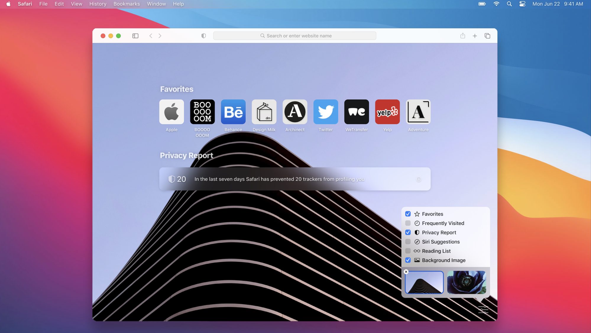
Safari has seen more updates than nearly any other Apple app for macOS in recent years, with consistent streams of largely under-the-hood improvements, particularly in restricting unwanted tracking and ad-technology targeting. Big Sur goes deeper on privacy, but adds support for a new category of extensions—or, rather, welcomes them back—and has a number of more modest interface changes, too.
Apple’s privacy features in Safari are extensive but largely hidden. A big chunk of my book Connect and Secure Your iPhone and iPad picks apart all the features and explains how they work, as there’s little way to see them in action. With Big Sur, Apple added privacy reports, so you can understand exactly what actions Safari is taking on your behalf.
A general Privacy Report shows the last 30 days of trackers that Safari has blocked with Intelligent Tracking Prevention, which blocks trackers intended to follow you across different Web sites. You can also look at a summary for each site you visit, which lets you understand—and potentially complain about—practices engaged in by the site. Apple notes you can add a Privacy Report as a start page and see it every time you open a new window or tab.
Safari now integrates with a not-yet-disclosed tracking database of password breaches, and it alerts you if any account for which there’s a password stored in Safari is connected with data breaches that have become public. Billions of account records have been disclosed in recent years, and many people reuse passwords across accounts, as much as we don’t recommend it. Safari includes tools for updating passwords found in breaches. (Apple, like 1Password, may be relying on the massive database run by Have I Been Pwned, an Australia-based effort operated by a security researcher.) The new Safari can also import saved passwords from Chrome, along with bookmarks and your browsing history.
Apple has shifted its approach on third-party extensions to Safari once again in Big Sur. Its first formal system in 2014 relied on JavaScript and Web technologies, making it accessible to a larger group of programmers than those developing Mac apps with Objective C. For security and other reasons, Apple started restricting this approach in 2017 and eliminated it in September 2019 with the release of Safari 13 for old macOS releases, and shipped the next month as part of 10.14 Mojave.
In Big Sur, Web extensions are back—and seemingly far better than before. Apple says it has adopted common specifications from the three other major browsers—Chrome, Firefox, and Edge—and will offer conversion tools for developers of extensions for those browsers to bring them easily to Safari for macOS. (Safari 14 will also support these extensions in Mojave and earlier compatible macOS releases.)
Apple will continue to support native extensions for Safari and will spotlight them with a separate section on the Mac App Store. Currently, extensions are mixed in with other software, and it can be hard to find them. These native extensions can access more advanced capabilities than Web extensions and, like all App Store items, pass Apple’s review process, are cryptographically signed, and are delivered only by Apple.
Instead of allowing extensions to work everywhere by default, Safari in Big Sur adds them to site-specific controls. You can approve extensions to work on a site-by-site basis, like pop-up windows, downloads, and location acquisition. This includes a pop-up menu that explains the access you’re granting to an extension, which is currently found only in Safari’s site preferences. An extension grant can, like location, be for a day or forever. Access can be revoked through preferences, too. (We haven’t seen the precise settings yet, but it’s likely you can mark an extension as approved for all sites, too.)
For those of us who like to keep only one Safari window with many dozens of tabs open, Big Sur lets you hover over a Safari tab to see a quick preview of the hidden page. Safari also displays tabs more efficiently, letting you see more at a glance in a single window. Apple promoted in its Big Sur announcement the appearance in tabs of favicons—the tiny icons Web sites show as little logos in the Location field. However, that has been a feature since Mojave, turned off by default. As far as I can tell, it’s now just turned on.

Safari also improves performance, with Apple claiming it’s now 50% faster at loading pages than Chrome on frequently visited sites. In another dig, Apple says Safari is “optimized specifically for Mac”—as opposed to developed in cross-platform environments—allowing for substantially less power consumption for video and somewhat less for general Web browsing than Chrome and Firefox.
An interesting new feature available in beta at release lets you translate pages within Safari, instead of visiting a third-party site or copying and pasting text. A translation icon appears for sites that note in their underlying HTML code they’re in a language other than the one set for your operating system. Click it to translate into English, Spanish, Chinese, French, German, Russian, or Brazilian Portuguese.
A Potpourri of Improvements to Other Apps
Apple doesn’t leave other apps behind, though it’s likely the list of apps and changes to them will grow en route to Big Sur’s eventual release.
- Photos: Those who are hoping for more out of Photos largely want more performance, better search, and a more reliable experience. Apple didn’t mention any of that—the proof will be in the picture of the pudding in the release version—but did say that it has tweaked quite a few individual aspects. Photos will receive a bump in its editor for a few image characteristics, but the biggest change is improved retouching, which switches from pure image analysis to machine learning to fix up problems in an image, like dust and scratches. Video editing in Photos lagged behind photo editing, and the latest version adds controls already available for still images.
Apple also promises what it calls “easy, fluid navigation” in finding and viewing media across the many different organization methods found in Photos. While it’s not a macOS feature, Apple calls out that “captions”—formerly called descriptions—now sync across iCloud Photos to iOS and iPadOS, which can view and add them, too. The Memories feature of Photos, which uses machine learning to make sense of our grouped days and media and runs a soundtrack under them, receives “more relevant” selections of photos and videos and a great variety of music. - Apple Arcade and Game Center: For Apple Arcade subscribers, the service is more deeply integrated with macOS than before. You can view the entire game category and sort and filter it, interact more fully with friends in Game Center, and examine achievements, progress, goals, and milestones. Game Center now includes a dashboard that appears within Arcade games.
- Music and Podcasts: The Music app, new in Catalina, has been tweaked in Big Sur to add Listen Now, which centralizes a lot of different features for discovering and listening to music and interviews in one place. Apple says search has been upgraded to provide more custom results based on what you listen to. A similar feature added to Podcasts also helps advise you on what to play next and discover episodes you haven’t heard from podcasts you already follow. Podcasts also gains editorial suggestions.
- Reminders: You can now assign reminders to people, get smart suggestions based on previous reminders for where and when a reminder should get tacked, use emoji and other symbols in your lists, pull in suggestions from Mail, and organize smart lists. Apple has also improved searching here as elsewhere in Big Sur.
- Voice Memos and Notes: Voice Memos was more of an application stub in Catalina, and in Big Sur, it grows up. You can mark favorites, organize recordings into static and smart folders, and reduce echoes and noise with a click. Notes similarly gets a few improvements, producing better search results, making it easier to format text quickly, and improving scans when you use Continuity to access an iPad or iPhone.
- FaceTime: In a nod to the hearing-impaired community, FaceTime will recognize when a participant is using sign language in a Group FaceTime call and make that person’s rectangle larger.
- Weather: We see the fruits of Apple’s acquisition of machine-learning weather forecasting company Dark Sky with the addition of predictions of rain and snow in the next hour (only in the US). The Weather widget will now also suggest if conditions in the next day will become warmer, colder, or wetter. Severe weather alerts have been added for the US, Europe, Japan, Canada, and Australia.
- Spotlight: Spotlight is a much-loved, often-maligned feature, as it’s invaluable to search all text, files, folders, and other matter across your drives and bring in external information about weather, sports, general knowledge, and more. But it’s often sluggish, and results sometimes feel arbitrarily presented. Apple promises Big Sur’s Spotlight is “faster than ever” and streamlines the list of results you see. You can now also use Quick Look within Spotlight, letting you preview the contents of files and manage some aspects of PDFs—including signing them! Spotlight is now the default search technology in Safari, Pages, Keynote, and other apps.
- Home and HomeKit: The Home app sees the light with adaptive controls for light bulbs that can use different colors across the day, letting it automatically adjust the color temperature throughout the day—like Night Shift for smart bulbs. Home also lets you match people you’ve identified in Photos with recognition from video captures by compatible home security cameras and doorbell cams. Cameras that work with HomeKit Secure Video can also now set specific activity zones for notifications or video capture within the full camera view. Finally, Apple has reorganized Home to provide a graphical dashboard at the top of alerts and status changes.
A Grab Bag of Other Big Sur Changes
Finally, Big Sur brings a big box of miscellaneous enhancements.
- Privacy: Apple always likes to stress privacy improvements. The Mac App Store will require developers to provide details on their apps’ privacy practices and will display those details in a standard fashion before you purchase, just as the App Store will in iOS 14. Apple relies on self-reported practices from the developers, and we’ll see how well Apple can enforce them—and whether we will ignore them quickly, just as almost no one reads a whole EULA before agreeing to a software license.
- Battery Health: Apple calls out Optimized Battery Charging for Big Sur, but the feature first appeared in 10.15.5 Catalina (see “macOS 10.15.5 Update Adds Battery Health Management,” 26 May 2020). It’s still a great feature: it matches charging to your usage patterns to reduce battery wear that occurs when charging a battery to full capacity whenever it’s plugged in.
- Faster updates: Big Sur handles software updates largely in the background before a restart, requiring less time to complete. It can manage this by cryptographically signing the system volume, a step up from the read-only separation of system and user data that appeared in Catalina. The digital signature allows the updater to be certain that files exist precisely in the expected location, allowing them to be effectively updated in place while the current system continues to run and be usable. This should reduce the time noticeably that you watch the long progress bar showing a system update.
- AirPods device detection: Apple has significantly improved the ability of the AirPods and AirPods Pro to switch automatically across all your devices linked to the same iCloud account. The same is true for all Apple and Beats headphones with the H1 chip. A pop-up banner in Big Sur will show which device is streaming audio to the AirPods.
- Siri: Apple claims that Siri has become smarter, able to answer a wider variety of broad questions instead of what seems to be a limited set of specific ones. Apple suggests that Siri can now answer, “How do hybrid cars work?” and “What causes seasons?” We’d settle for Siri just working reliably.
- Subscriptions and Family Sharing: You can now share third-party app subscriptions in all App Stores with Family Sharing. Previously, Apple only allowed purchases to be shared from apps that participated—which is most apps—while excluding subscriptions and in-app purchases. That was particularly awkward, given that Apple encouraged developers to focus more heavily on recurring subscription revenue instead of a one-time app purchase price.
Apple says Big Sur will ship “this fall,” with a public beta to come in July 2020. We’re betting on the usual September or October date, and we sincerely hope that Apple has resolved its quality control issues from Catalina (see “Six Reasons Why iOS 13 and Catalina Are So Buggy,” 21 October 2019).
Too bad they didn’t talk about Mail. Possibly because it’s the most frustrating Apple app to use and it’s the one I use the most. I don’t care what else they do, as long as they get rid of the damn hide-and-seek interface (not just in Mail, but that’s where I notice it the most). As a Mac consultant, I find myself having to explain to clients that they must magically know to hover the mouse in a certain area to see a control they know must be somewhere.
I long for the days of Jef Raskin. We are deep in the territory of form over function.
They may not have been ready. I expect it’ll look like iPad Mail, which was demoed and I was not that big a fan of the new look.
Like you, Colleen, I would have also liked to hear and see more about Mail. Ironically, it’s Mail they chose to show the refreshed UI. But just very little detail, unfortunately.
Thank you for sharing your clients’ problems with hidden controls, Colleen.
As Don Norman said:
If an indicator of such a “meaningful, useful action” is hidden unless the pointer is close to it, you obviously cannot easily answer that question. Especially in highly complex applications, there can be good reasons to hide some less-commonly used controls to reduce the perceived complexity of the overall UI (“progressive disclosure” is the technical term).
That typically applies to applications for expert, and well-trained, users, but not for something as mundane and widely-used as a mail client. Or a browser. Or a to-do list. Etc.
In other words, the ubiquity of such hover-only controls across all kinds of applications just isn’t justified. It’s simply bad design.
That’s why I appreciate hearing first-hand from people who disagree that “everybody knows how this works these days,” as so many designers claim these days.
Actually, my complaint goes back to the beginning of the hide-and-seek interface, which has been around for lo these many years now, and I’m not any fonder of it, not one bit. Jonny Ive was brilliant at hardware, but as I said before, the software is now so form-over-function that it’s really hard for a lot of people to figure out. Apple’s user interface is just not so friendly anymore. My first Mac was a 512K Macintosh, so I guess I’m getting old and cranky.
I read this on my iPad, with the large blank area on the bottom, and the cryptic curved arrow that brings up a dozen options. Let me put some of those options on that blank space rather than having to click on the arrow, then click on…
Here’s a very nice collection of macOS and app windows. Catalina on the left, Big Sur on the right. (Unfortunately, Mail is missing).
And if you want to see a comparison of just icons, that’s here.
While Apple pioneered the standardization of GUI and even wrote the book on it (Macintosh Human Interface Guidelines from the '80’s), the younger software engineers were essentially instructed by Jony Ive to not read the book (as he never absorbed its intent). But let’s think for a moment about how “progressive disclosure” is potentially a death-dealing philosophy.
The Boeing 737MAX debacle was a result of Boeing altering the 737 design to accept larger engines in an effort to increase the range of the aircraft. But this re-design changed the center-of-gravity of the plane and required some goofy software hacks to the control systems in order to correct the deficiencies. Then Boeing decided to completely automate that system hack and hide it from the pilots so they (Boeing) could claim that retraining wasn’t necessary in order to transition pilots from the 737 to the 737MAX. Then the system catastrophically failed in two planes and the pilots, who had a few minutes to correct the system, had no specific instructions to enact the corrections; instead, they had to rely upon progressive disclosure - they had to learn on-the-fly (pun intended) how to alter the flight characteristics of the aircraft having never been specifically trained how to do so…and they failed.
So, Apple, you can take your progressive disclosure and shove it up your USB port.
BTW, the deficiency of the 737MAX was bad design and Boeing’s attempt to fake out the control systems is completely wrong. The airframe is inherently dangerous and I will not fly in one again.
Do you have any reputable sources for this? I couldn’t find any. But I did find a lot of references about how HCI was added to Ive’s portfolio after the skeuomorphic interface design disaster, and how he cleaned up the messes and brought back a clearer and less distracting and confusing interface:
All one has to do is read the Human Interface Guidelines books (I still have mine) and then simply examine the horrors inflicted upon us with Ive’s “peek-a-boo” process of discovery. It’s been insulting to the users and stresses some sort of “cleanliness” of design by withholding useful knowledge in an homage to Ive’s clean sheet of paper approach. Note that I am not referring to “starting with a clean sheet of paper”; Ive’s design aesthetic ends with a clean sheet of paper. Anything beyond that detracts from…whatever it is that Ive tries to push on the masses. Lose the keyboard, lose the ports, lose the mouse; if the apps require those details, well, then, cripple the apps.
Actually…
If you have the 1992 issue of the HIG, have a peek (no pun intended…) at page 35:
UGH. It isn’t just the hide-and-seek problem I object to; they have removed important borders between toolbars and content. Borders and backgrounds help us locate and recognize important screen regions; lack of borders and backgrounds makes this more difficult. It’s hard to believe Apple’s HI team has sunk so low. I really hope there is a huge outcry against these pointless form-over-function changes.
If you enable Reduce Transparency and Increase Contrast in System Preferences > Accessibility > Display, the borders and edges become a LOT easier to see. So a lot of it will come down to what your eyes prefer.
What if you use your computer to edit photographs as I do?
What I see and what others see will not be the same, correct?
I think these settings just affect the interface, so things like toolbars and window borders and the like.
But vision is highly individual anyway, so there’s no way to know if anyone else will see what you do anyway.
I’ve said it elsewhere, and I’ll say it here: Jony Ive was simultaneously one of the best and worst things to happen to design at Apple. Best because he made groundbreaking hardware designs that, like them or hate them, you could not fail to notice them. That gave much-needed media coverage to Apple during a critical period.
Worst, though, because everything was a distraction in his mind. Hide everything that isn’t immediately important. Make the user inconvenience themselves to do things, simply because making it convenient is “ugly”. This is the design philosophy that puts a Bluetooth mouse’s charging port on the underside, where it can’t be simultaneously charged and used, because the user shouldn’t have to see the port.
I can’t even honestly call this design philosophy “form over function”—it’s more like “form replaces function”. Borderless buttons. Invisible-until-hover controls. Hidden scroll bars. Bezel-less all-screen phones that you can’t grip without touching an active screen area. These attempts at aesthetic minimalism actually inhibit functionality and make devices less useful.
To be perfectly honest, I miss the old skeuomorphism. It may have been cheesy-looking, but it made it much clearer what was functional on your screen. I’d take the look of iOS 6 with the capabilities of iOS 14 in a heartbeat if I could.
Thanks for the tip. I’m not talking about ones that are low-contrast, but ones that are missing altogether. It is trendy now in Silicon Valley to remove borders everywhere, so that areas of the screen which have different purposes, control types, and content types bleed together visually, and unfortunately Apple is starting to copy Google and others in this as well as in the hide-and-seek design fad. (Maybe they show up if you turn on settings in Accessibility—but we shouldn’t have to correct bad design decisions through Accessibility settings.)
The famous architecture/Bauhaus design theory, posited in 1866, is 'form follows function," and it’s a huge difference. There’s an excellent summary about how this plays out differently in the digital era, with Jony Ive’s iPod Shuffle interface and hardware design being the shining example of how “when function is hidden, there is free space for form to vary.” And “In some cases, function is concealed by the outer shell. I will not blame you if you cannot guess what this thing is supposed to do – playing music.” The author posits: “function is a reflection of requirement or purpose of the design which comes from human needs and wants.”
And I also give Ives lots of interface design credit for getting rid of skeouomorphic interface design.