TidBITS#1035/12-Jul-2010
It was a thankfully slow summer week here, and this issue’s articles revolve around a variety of electronic devices, anchored by Charles Maurer’s illuminating discussion of how not to buy a digital camera. Glenn Fleishman compares the costs of Virgin Mobile’s new contract-free MiFi with the approaches of Verizon Wireless and Sprint Nextel, and with AT&T’s iPhone tethering and iPad plans. Doug McLean examines the results of a Princeton University study testing the usability of the Kindle in academia. And Adam reviews the iPad Recliner, an adjustable stand for the iPad. Notable software releases this week include BusyCal 1.3.2 and PDFpen/PDFpenPro 4.7.
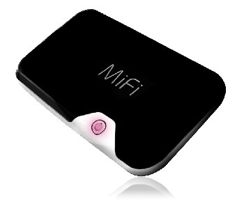
Virgin Mobile Offers MiFi Mobile Hotspot without Contract
iPad and iPhone owners now have another alternative for mobile broadband. Virgin Mobile has added the MiFi, a portable cellular router that acts as a mobile Wi-Fi hotspot, to its pay-as-you-need-it broadband service. Virgin charges $149.99 for the device without a contract. You can purchase mobile broadband in increments as needed.
Virgin Mobile offers four prepaid data plans: $10 for 100 MB consumed within 10 days, while 30-day usage plans cost $20 for 300 MB, $40 for 1 GB, and $60 for 5 GB. There are no overage fees; you simply add another time-limited plan, just as AT&T does with 3G iPad service offerings. Unused data expires at the end of the period. Virgin Mobile is a subsidiary of Sprint Nextel, operated as a separate entity, and uses Sprint’s network.
The MiFi has become a popular device for frequent travelers who need ubiquitous access to the Internet from multiple devices. A mobile broadband USB modem might plug into a laptop, but then the laptop has to be turned on and sharing set up to enable connections from other devices. The MiFi simplifies that by acting as a cellular data gateway for up to five Wi-Fi devices.
The MiFi supports robust WPA2 Personal Wi-Fi encryption, making it a better choice than a Mac laptop. Apple has bizarrely lagged in allowing its software base station option (System Preferences > Sharing > Internet Sharing) to support only the outdated and useless WEP encryption method.
Previously, only Verizon Wireless and Sprint Nextel offered the MiFi for their EVDO networks. Verizon charges $269.99 without a contract and $49.99 (when purchased online) with a two-year contract. Sprint charges $299.99 without a contract, and nothing at all with a two-year contract. (Novatel Wireless, the firm behind the MiFi, also makes an HSPA version that would work on AT&T’s network, but it’s unclear if it would support T-Mobile’s unique 3G bandwidth setup.)
Both Verizon and Sprint charge $59.99 for a 5 GB combined upstream and downstream monthly cellular data plan, and $0.05 per MB for data above that ($50 per GB), which is egregious given that the data doesn’t magically cost several times as much when you cross that threshold. (The overage fees are a combination of profit center and discouragement to reduce network usage.)
Verizon also offers prepaid, contract-free usage: $15 for 100 MB used within 1 day, $30 for 300 MB used within 7 days, and $50 for 1 GB used within 30 days. Those plans are paltry and expensive compared to Virgin Mobile’s, especially since you’d pay nearly twice as much for the MiFi up front.
Compare these MiFi offerings to AT&T’s tethered smartphone option: the $25 DataPro plan is required, which includes 2 GB of usage within a 30-day period, as is a $20 “because we can” tethering fee from AT&T. Each additional 1 GB used in that same period is billed at $10, making a 5 GB plan cost $75 on a smartphone. Further, tethering limits use to a laptop, although you can share the connection as with a 3G modem. (iOS 4 is required in the United States; carriers in other countries have offered tethering with entirely different terms since iPhone OS 3 was released.)
The 3G iPad can’t act as a host to a tethered iPhone, and its own data plans are quite expensive when you top a few gigabytes. AT&T charges $25 for each 2 GB increment used within 30 days. Consume over 4 GB within 30 days, and you’re paying $75 (three times 2 GB at $25 each) for the privilege.
That’s the level at which Virgin Mobile’s deal for the MiFi looks attractive. One device, quite portable and battery powered, which could feed a Wi-Fi-only iPad ($130 cheaper than the 3G model), an iPhone (which otherwise would be consuming AT&T’s mobile broadband), and a laptop – if you happen to travel with all three.
The MiFi also breaks down limits that Apple imposes on 3G networks. You can use FaceTime over 3G by using a MiFi, because the iPhone 4 only sees a Wi-Fi network. You can also download apps and media larger than 20 MB, although you’d have to balance that with bandwidth costs.
It gets better if you travel with colleagues or family, where you might have multiple iPhones and iPads that could use the same MiFi for Internet service. If you were planning on turning on a DataPro plan and tethering for a month with AT&T when you travel, the MiFi from Virgin Mobile may be a more economical and versatile option.
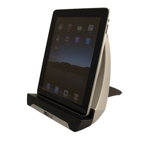
Read at Multiple Angles with the iPad Recliner
Here’s a dirty little secret about the iPad: it can be difficult to share. I’ve just gotten my own iPad, and I’m looking forward to being able to use it more than the one that Tonya took over when writing her free “Take Control of iPad Basics” book and editing our other iPad titles.
One immediate benefit is that I can more easily read on my iPad if I’m eating alone, a time when I often read paper magazines. But the ergonomics of reading at the table are poor at best; getting the magazine positioned properly for the light and in relation to my plate can be tricky. By itself, the iPad is, if anything, worse than a magazine, since its rounded back ensures that it never lies firmly on a flat surface.
Clearly, a stand of some sort is essential, and to that end I’ve been testing the iPad Recliner from LapWorks. It’s a two-piece plastic stand that adjusts anywhere from 25 degrees up to 65 degrees. You can position your iPad in either portrait or landscape mode, and either way, the iPad touches only a soft rubber cushion.
The least obvious part of the iPad Recliner is how to put it together. It ships in a configuration that reduces its overall size to fit in the box, so you must remove a threaded knob, turn the bottom piece around, thread the connecting screw through the single hole in the bottom piece, and reattach the knob. It’s hard to explain, and there are no instructions in the box, but LapWorks founder Jose Calero has a YouTube video that explains how to assemble the iPad Recliner properly, along with some tips on how you can put it together for even steeper angles.
At its 25 degree setting, the iPad’s screen is positioned well if you need to look nearly straight down at it, and you might be tempted to use that position for typing on the iPad’s virtual keyboard as well. Unfortunately, the deep lip on which the iPad sits gets in the way of tapping the Space bar and other keys at the bottom of the keyboard. If you could use a shim of some sort to raise the bottom of the iPad so it was flush with the lip, typing would be significantly easier. On the plus side, the deep lip means the iPad Recliner will hold an iPad in even a fairly thick case.
Increasing the angle to 65 degrees puts the iPad at a good angle for reading at arm’s length and for typing when using a Bluetooth keyboard. Remember, you can set it to any angle between 25 and 65 degrees, which is important for avoiding glare and finding just the right angle, something that’s not possible with many iPad stands.
Although the iPad Recliner doesn’t provide channels or slots for the iPad’s dock connector cable, they aren’t necessary, since the iPad works equally well in any of the four possible rotations. So, if you want to put your iPad into picture frame mode and leave it plugged in on the iPad Recliner, you’d either hang the dock connector cable off one of the sides (landscape orientation) or position it with the dock connector cable at the top (portrait orientation).
The iPad Recliner is fairly deep, ranging from 8.75 inches (22.2 cm) to 12.5 inches (31.8 cm) depending on angle, so it may not fit on a shallow shelf, although it will be fine on a desk, table, or counter. It has two rubber feet that prevent it from sliding around on a hard surface, which is good, but you won’t want to hold it on your lap in any way – the hard plastic is uncomfortable.
There’s nothing iPad-specific about the iPad Recliner; the name on the device itself is just “Recliner,” and you could easily put a Kindle, Nook, or other tablet-sized device in it as well. It even holds single sheets of paper well, though not paper magazines, which flop around too much.
Overall, I like the iPad Recliner, it works as advertised, and it’s cheaper than many other iPad stands (see Dan Frakes’s reviews at Macworld for others). But I’m not ecstatic about it – the iPad Recliner is perfectly functional, but it’s not the sort of thing I’d leave out as a decorative object without its iPad.
The iPad Recliner retails for $44.95, but is available directly from LapWorks for $10 off, dropping the price to $34.95.
Princeton Tests Kindle DX – Could the iPad Do Better?
Between 2008 and 2009, Princeton University students and faculty printed 50 million sheets of paper. Depending on how you want to look at it, that equals about 100,000 reams of paper, 5,000 trees, or $5 million. Worse, that shocking amount of paper is merely the latest in a nearly decade-long trend of paper usage that climbs 20 percent each year at Princeton.
The cause of this increase in printing? For the past decade Princeton has digitized ever more of its required course readings, with 62 percent of all required texts now available in PDF format. With no charge for printing – though each student account does have a printing quota – it’s no surprise that student print clusters account for more than 20 percent of all the printing. Also, since 38 percent of Princeton’s library holdings have yet to be digitized, it’s likely that the university’s printing problems haven’t even plateaued.
Like those at every other major business, non-profit, and government organization during this economic downturn, university budgets are stretched thin, thanks to falling endowments. The combination of a belt-tightening financial climate, a larger cultural shift towards sustainability, and the explosion of the e-reader market led researchers at Princeton University to launch an experiment testing whether e-readers present a viable alternative to traditional print media in academia.
Princeton’s Office of Information Technology was awarded $30,000 by the High Meadows Foundation to help with the costs of the pilot program, which entailed purchasing 54 Kindle DXs ($489 new) for 51 students and 3 faculty members. Researchers selected Amazon’s Kindle DX largely due to its 9.7-inch screen, which provided much greater legibility with regard to PDF files, charts, maps, and images, compared to its smaller brethren and pre-iPad competitors (the pilot program took place during the Fall 2009 semester).
The Pilot Program — Three classes at Princeton were chosen for participation in the pilot program: two graduate level courses – one in classics, the other in political science – and an undergraduate course in public policy. The classes all shared the characteristics of having a heavy reading load and of making extensive use of “reserve readings” in digital format, what Princeton calls “e-reserves.” Participating students (only one student opted out) committed to making a serious effort to refrain from printing for the pilot classes during the semester, and to do as many of their course readings as possible on the Kindle DX. For their effort and cooperation, they got to keep their Kindles when the semester
was over – not a bad deal for just doing your homework!
The study had three stated goals: to determine whether the use of e-readers could reduce the amount of printing on campus; to determine if e-readers could replace traditional reading materials at no scholastic cost to the student; and to provide feedback to e-reader manufacturers regarding the features students wished to see.
The pilot program’s first goal was easily achieved: on average, students using the Kindle DX for classroom readings printed just under 50 percent less material. However, before we attribute that number solely to students owning an e-reader, it’s worth looking at the other reasons students said they cut back on printing. Some students cited a newfound awareness of paper waste (77 percent of the students said merely participating in the program increased their awareness of their own paper consumption), some noted that they felt pressure to follow the study’s criteria, and many others said they were more apt to try the Kindle DX because their grasp of the readings which required the use of the device didn’t weigh heavily on their final
grade.
Additionally, in an end-of-term survey, 44 percent of students in the pilot said they would cut down on printing if they had to pay for it (though 31 percent said they would print whatever amount they needed to succeed in class). In other words, the reduction in printing comes from a combination of factors, though using the Kindle DX was key in triggering some of the behavioral changes.
All this could be good news for the university’s budget (especially if they could require students to purchase an e-reader, or roll it into tuition costs), since it could result in a $500,000 per-year savings (half of the student-driven 20 percent of the overall $5 million bill). With nearly 7,600 students, it would cost almost $2.9 million to outfit all students with Kindle DXs at current retail prices, though volume discounts would be likely.
Harder to determine is exactly what the overall environmental impact would be if all students switched from printouts to e-readers. While printing at the university would decrease, the larger environmental effect of the manufacturing and shipping of these devices for the entire student body – and how that would stack up against heavy paper usage – is exceedingly complicated. Yet, the complexity of these broad environmental issues – which surpass the scope of both the Princeton study and this article – needn’t keep us from asking how the adoption of the Kindle DX actually affected student learning, preparation, and class participation.
Regarding that goal, the Kindle DX proved to be a moderate success in engaging students with course readings. In responding to both mid-term and end-of-semester surveys, students said they were quite pleased by the Kindle DX’s battery life, text resolution, internal memory, screen size, and physical weight. In particular, the device’s E Ink technology impressed users across the board, with many students saying they found the Kindle much easier to read than their laptops or computer screens. Students also made frequent use of the text-to-speech feature which enabled them to get “reading” done when in transit or fatigued.
Beyond the Kindle DX’s specific attributes, most students said having an e-reader simplified their academic life – that packing for class was merely a matter of dropping the e-reader in their bag. Additionally, students appreciated the ease and lightness with which they could travel with all of their readings.
On the downside, there were plenty of issues and missing features that frustrated the study’s participants. The lowest ranking attributes of the Kindle DX included the Web browser, navigation between books and documents, highlighting capabilities, the keyboard, and text annotation capabilities.
One of the most-beloved features initially, highlighting to “the cloud,” soon became one of the most frustrating, as students realized that only 10 percent of any given book could be highlighted and exported. The realization came not by any obvious warning or indication, but by students eventually noticing that newly highlighted passages simply pushed out and replaced older selections! Thus, highlighting any serious quantity of text was tantamount to throwing away notes. Additionally, the actual method of highlighting on the Kindle DX was found to be frustratingly difficult.
While several students enjoyed the percentage-completed feature for gauging reading mileage, most bemoaned the vague methods of pagination in the Kindle DX. Students had a hard time adapting to the Kindle location numbers in lieu of traditional page numbers, both for citations and for quick navigation. In particular, students said location numbers became problematic in class seminars when many had trouble locating the sections being discussed. Overall, students wished for industry standard internal navigation controls, such as chapter divisions, and 69 percent of participants said they wanted pagination that was tied to the print edition of the book the e-book was based upon.
The problem of in-book navigation was further compounded by the variety of ways publishers of e-books handled it. Some books came without tables of contents, while others provided ones that weren’t interactive and failed to indicate the location numbers that corresponded to the page numbers where chapters began.
A final source of major complaints was the generally slow speed of the Kindle DX – in particular, the long load times when moving through the text. Students found they had a hard time maintaining focus through a dense text with such delays between pages. It also made flipping through the text, or skimming the text, nearly impossible – an action many of the students cited as being essential to successful academic reading.
While students were pleased with their Kindle DXs overall, they cited many areas that could stand improvement. Luckily for them, or future students toting e-readers, Apple’s iPad might just fit the bill.
The iPad in Academia — Where the Kindle DX failed students – navigation, internal organization, speed, and highlighting – the iPad is positioned to succeed. With its 9.7-inch color touchscreen, the iPad’s viewable area is the same size as the Kindle DX, though it is noticeably heavier (24 ounces/680 grams versus the Kindle DX’s 18.9 ounces/536 grams). In terms of price, Apple’s Wi-Fi-only base model is more expensive than the Kindle DX ($499 versus $379, following Amazon’s recent price cut on the Kindle), and the base model of the 3G iPad is $130 more expensive at $629 (plus an optional data plan). For those higher prices, iPad customers get quadruple the storage space (16 GB versus 4 GB), and vastly more
power and functionality that goes far beyond reading.
Although the Kindle DX has a Web browser, it suffers from glacial load times and clumsy navigation, such that it doesn’t even begin to compare with the iPad’s version of Safari. Given the necessity of Web access in academia, coupled with the iPad’s broad array of apps, it’s hard to see students preferring the single-purpose Kindle to the far more capable iPad.
And though the Kindle’s E Ink screen technology was one of the group’s favorite features, many students desired a touchscreen for easier navigation and highlighting. In particular students sought the capability to flip through a text easily and speedily, and as anyone who has picked up an iPad knows, Apple has nailed that kind of tactile interactivity.
Also, the iPad’s color screen, while not mentioned by these particular Princeton students as a must-have feature, is key for many fields. The courses testing the Kindle DX at Princeton were in classics, political science, and public policy, none of which rely heavily on graphics. Courses in the sciences and other fields frequently utilize graphs, charts, and maps whose legibility greatly improves with the inclusion of color, and it’s obvious that art history, architecture, and design classes rely on color materials as well.
Additionally, with its touchscreen technology, Apple makes highlighting and bookmarking sections in texts incredibly intuitive and easy. Between the slick navigation of iBooks, and the extensive PDF support and organizational capabilities in the popular app GoodReader many of the student wishes are met. (For more on reading on the iPad see “Reading Books on the iPad: iBooks, Kindle, and GoodReader,” 5 April 2010, and “iBooks 1.1 Adds PDF Support, Runs on All iOS Devices,” 23
June 2010.) Some colleges have already seized upon the iPad’s possibilities in academia. Reed College is planning a formal experiment to see how the iPad compares to its previous experiments with the Kindle DX, and the University of Maryland at College Park’s Digital Cultures and Creativity program is going one step further, providing every incoming student with an iPad (PDF link).
That’s not to say Apple has the academic market completely figured out. There remain ways in which the iPad does not currently meet student needs (other earlier problems have already been addressed by iBooks 1.1).
iBooks suffers from the same sort of page number correlation problems as the Kindle DX. The page count of a book changes substantially depending on whether you’re holding the iPad in landscape or portrait orientation, and the user-chosen font size and font face. Furthermore, there’s no connection between these page numbers and the original source, requiring either two sets of page references for every assignment or that everyone use the same electronic version.
The only thing that makes sense is to use paragraph numbers, a common approach in classics texts where students are often correlating a chunk of original text in Greek, for instance, with one or more translations of that chunk. It shouldn’t be too difficult for Apple to enhance iBooks to enable users to navigate by paragraph numbers.
Making texts available as PDFs works around the page numbering problem, but the PDF viewing features in iBooks are basic, lacking the capability to add annotations and highlighting, for example.
If Apple wants the iPad to succeed in the academic market, it needs to address these current oversights of page references and limited PDF support.
The Future of the Classroom? Academic reading is a unique genre in that a text is raw material – to be pulled apart, tossed around, chewed up, and reassembled in your brain. It’s quite distinct from pleasure reading, demanding a different kind of engagement that is actually very physical. In order to remap the information laid out in a linear text, a kind of non-linear movement is required to flatten out the data and better understand the connections through returning to sections and gaining a broad overview.
The Kindle DX’s greatest weaknesses, at least in the realm of academia, are its slow page-to-page load times, poor internal navigation, and lack of color. The iPad, with its mimicry of physical pagination, interactive bookmarks, and easy-to-use table of contents is a clear win in this department, though the current apps available for reading need enhancements to meet the needs of students and academics. That e-readers will replace traditional books and papers altogether in the near future is unlikely, but if I had to pick the device that was more likely to succeed in doing so, I’d pick the iPad hands down.
How Not to Buy a Digital Camera
Early this year, a peculiar confluence of events induced me to replace my cameras and lenses. Like any intelligent consumer, I studied camera-testing sites on the Web. Alas, those sites did not help me decide what to buy. I found myself unable to extract significant information from the reviews. In this article I am going to explain why I felt obliged to discount them, and how I chose what to buy.
Be It Resolved — A digital camera is an image sensor built into a box with a lens and a computer. The sensor is the limiting factor, so camera reviewers concentrate heavily on sensors.
Most tests of image sensors look at resolution before anything else, yet for 50 years lens designers have been trying to convince photographers that to the human brain, minute details matter less than the clarity of those details that are easily seen. See, for example, this article (PDF) that Zeiss first published in 1964.
You can see this in the figure below. The picture on the left contains finer detail – it resolves lines about one-half as thick – but the picture on the right looks better, especially if you back away a bit from the screen. This truth holds even for enormous enlargements. Indeed, what you are looking at is the centre of a blow-up that would be 40 inches by 60 inches (1 meter by 1.5 meters) at the resolution of a 100-dpi display.

The picture on the left came from a conventional Bayer sensor. Bayer sensors require the image to be softened optically, to avoid coloured artifacts. Since a digital camera requires processing by a computer, it ought to be possible to sharpen the digital image to compensate for that blurring. I did this in the comparison below, as well as I could. The sensor on the right had no blurring filter, but any lens always blurs an image slightly, so I sharpened it a hair as well. As you can see, the picture on the left is greatly improved but if you back up to a normal viewing distance for a 40 inch by 60 inch picture hanging on the wall, the extra detail disappears and the picture on the right still looks a little crisper.

Which of these images is preferable will depend on your taste but frankly, I think the differences between them aren’t worth worrying about. One wins on the curves, the other wins on the straightaways. The picture on the left came from a full-frame professional DSLR with a professional lens. Its image sensor has 22 million cells. The picture on the right came from a DSLR with a smaller Foveon sensor with 4.7 million cells. These approximate the extremes of resolution available nowadays. A picture from any modern camera using a smaller Bayer sensor would probably show detail somewhere between the two and be softer than either.
(Note that to maintain the sharpness of these images I enlarged them not in Photoshop but with PhotoZoom Pro. For a discussion of PhotoZoom Pro, scroll toward the bottom of “Digital Ain’t Film: Modern Photo Editing,” 29 April 2010.)
The Olden Days — Before the days of digital image processing, the quality of a lens used to limit the quality of an image, so photographers worried a lot about optics. Usually reviewers test lenses by plotting a piece of mathematical esoterica called a “modulation transfer function” or MTF. The MTF charts in a review show how clearly a lens images details of various size, photographed from a flat test chart. These charts ignore depth. MTF charts are a fundamental tool of lens designers, but lens designers do not use simple two-dimensional MTF charts, they plot MTFs in three dimensions. Also, when lenses bend light they can also modify its phase, so lens designers examine MTF tests in conjunction with a
similar chart of a phase transfer function. If this sounds like gibberish, think of it this way. Using a two-dimensional MTF to compare lenses is like deciding on a path through mountains by distance alone, ignoring steepness and whether a route traverses peaks or valleys.
I recently saw how misleading a simple MTF test can be. I just replaced a wide-angle zoom lens with a newer and costlier model. After I bought the new lens, I happened upon a comparison of MTF tests showing it to be less sharp than the older one. The centre was comparable but the corners were worse. Much worse. Now, the corner of a lens can never be so sharp as the centre, even in a theoretically perfect lens, because light travels farther to the corners than to the centre, so that the blurry disc representing a point of light becomes larger and pear-shaped in the corners. With this new lens, however, the discrepancy seemed extreme, and I saw this myself when I photographed a flat wall. However, when I photographed the whole room, the
corners were as sharp as I would expect for a lens of its angle of view. Apparently this lens does not project a flat field, it projects a curved field, so that across the image, objects at slightly different depths are in best focus. The lens is sharp enough, it just has a curved field of focus. I confirmed this by photographing the wall again, this time changing the focus slightly. This curvature of field stands out on a simple lens test but is not noticeable in normal use.
Moreover, digital images require processing by a computer, which permits the cleanup of optical aberrations. It is easy to remove most chromatic aberration, and Photoshop also allows a kind of optical sharpening with its Smart Sharpen command. After I correct the colour fringing and go to Smart Sharpen, I find that images from my new lens need 40 percent less sharpening than images from my old lens. Thus, my new lens looks worse in a simple MTF test but actually takes sharper pictures.
The design of a lens is an intricate set of compromises. With my new lens, the designer decided to compromise flatness of field and reduce more perceptible problems instead. Flatness of field is essential for lenses used to copy documents but it matters little otherwise, since few other photos are taken of entirely flat surfaces. Thus, the poor showing of this lens in a simple MTF test does not show that the lens is bad, it shows that the manufacturer decided to make improvements that hurt the product in simplistic reviews.
Living Colour — Colour tests are even more problematic than tests of lenses, because there is virtually nothing about colour that can be measured in the physical world. Colour is not a physical phenomenon, it is a perception formed by and within the brain. A colour is the response of the brain to various mixtures of wavelength at different intensities within a context, a context of other mixtures of wavelength at different intensities, and the further context of a history of what you have recently seen and what you have learned.
Look at the image below to see an example of this. The reds are identical physically but our perceptions of them are affected by the other colours nearby. This example is simplistic but it is not a trick. Effects of context on colour are ubiquitous. Every colour that we see is affected by its physical context.

A colour’s historical context is just as important – i.e., the context of what you have learned to expect. Thus, you see brown bark and green leaves on the tree in front of you largely because you have come to expect bark to be brown and leaves to be green, yet if you take some bark and a leaf into a lab, you are likely to find them matching paint chips labelled red and yellow.
The idea of comparing colours for accuracy is appealing but nonsensical, especially when it comes to subtle colours like skin tones. In any picture the “best” skin tone will depend upon the other colours in the picture, plus the lighting and surroundings of the room you are seeing the picture in, and the appearance of your family and friends.
No camera on the market is capable of capturing accurate colours, because the notion of accurate colours is a chimera. Engineers devised a set of definitions and tests to form a common standard for manufacturing products, but these are largely arbitrary. They are useful, but they bear little relationship to how the brain sees colours.
On the other hand, every camera on the market is able to capture the full range of visible wavelengths, so every camera on the market can capture the information needed to produce pleasing colours. Colours are controlled by digital processing, and with products like the Asiva plug-ins it is possible and practical to convert any colour to any other, within the physical limits of your computer’s display
and printer’s ink. (Again, see “Digital Ain’t Film: Modern Photo Editing,” 29 April 2010.) If your camera produces JPEGs, a computer in the camera will take a first pass at this and you may not always like the results, but you cannot possibly expect the camera’s computer to balance colours blindly as well as you can balance them with a computer on your desk using your eyes. If you are fussy about colours, there is no point in worrying about the camera’s capability to record them, you must expect to balance them yourself.
Dynamic Personalities — As a practical matter, what limits photographic quality today is the dynamic range that an image sensor can record, the range of tones from light to dark. Nobody will notice picayune detail like the stitching of a hem, but people will be upset if a bride’s gown washes out to shapeless white in the sun, or if the groom’s suit disappears in a shadow.
To a first approximation, the dynamic range of sensors is proportional to the surface area of the light-sensitive cells. Among today’s sensors, this varies 40-fold. Point-and-shoots have tiny sensors and, in consequence, minimal dynamic range.
Dynamic range is difficult to measure because noise differs qualitatively from one device to another. The most common objective test is to photograph an even tone, which ought to generate an even image, then measure how much the pixels vary. That variation is the noise. A certain proportion of noise is deemed to represent the weakest background that can be detected, and this defines a sensor’s dynamic range. To see how problematic this can be, consider two car radios. One is staticky, the other has a clear signal but the bass booms badly, making announcers difficult to understand. If you measure the noise as deviations from a constant background, the staticky radio is noisier, yet the resonant boom of the second radio is as much noise
as the static is, and unlike the static, the boom prevents you from hearing the news.
The only sensible way I know to compare the dynamic range of image sensors is to compare their images. Photograph a subject that runs from too bright to show detail to too dark to capture, then pull apart the detail in the highlights and shadows, to see what the sensor has recorded. I like to do this in my living room. I photograph a wall with a studio flash aimed in such a way that the exposure at the sensor ranges from too much on a light oil painting at one side to too little on a dark oil painting on the other. Next I convert the raw images to 16-bit TIFFs in Adobe Camera Raw, with all adjustments at zero save two: I set both Recover and Fill Light to 100. These expand the brightest highlights and darkest shadows about as much as
they can be expanded. Finally, if the sensors being compared are different sizes, I resample the smaller image to the size of the larger. In addition, for the example I am going to show later in this article, I also lightened the dark pictures overall by boosting Photoshop’s Exposure setting. I did this because the shadow detail in the upper image does not show up on the 6-bit LCD displays that many people use.
If the sensors being compared are different sizes… well, that brings up an interesting problem. It seems natural to compare ISO 100 of one sensor to ISO 100 of the other but for most photography, this is not appropriate. To see why, consider the diagram below. It shows an imaginary camera that can use either of two sensors, with a lens (the circle in the middle) that can focus the image on either. It is obvious that the images on both sensors will be scaled perfectly. The larger sensor is twice the size of the smaller one in each dimension, so every line will be twice as broad. Where the lens blurs lines, the blur will also be twice as broad, and if the shutter speeds are the same, any blur from a moving subject or camera will be
twice as broad as well. However, one factor will differ: the amount of light reaching each spot on the sensor. The larger sensor has four times the area, so the light hitting any one spot will have only one-fourth the intensity.
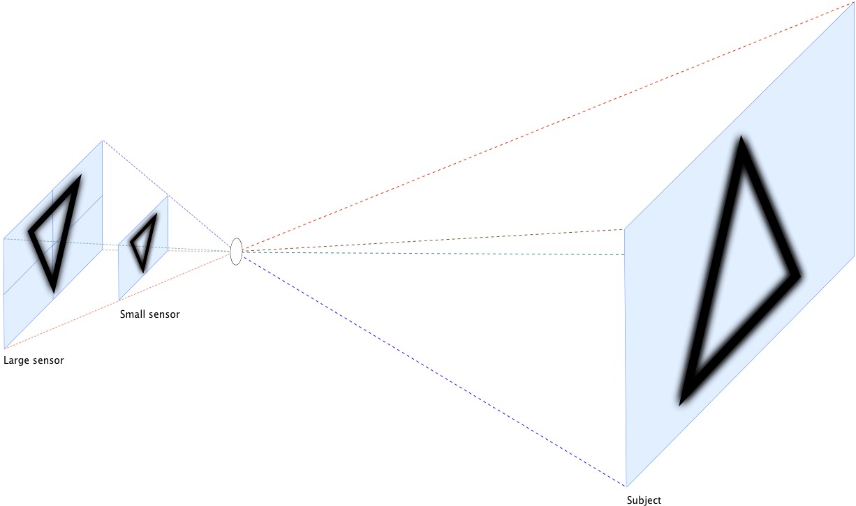
To compare these sensors we now have a choice. For the larger sensor we can enlarge the aperture of the lens by two stops to admit four times the light, or we can keep the shutter open four times as long to admit four times the light, or we can quadruple the sensor’s sensitivity (i.e., increase its ISO speed by two stops). Enlarging the aperture is fine for taking pictures of a test chart but it changes the image optically so that less of a three-dimensional subject is in focus from front to back (i.e., it reduces depth of field). If we slow the shutter speed, the subject is more likely to move while the shutter is open and we are more likely to move the camera. Thus, to create an image of the world that is comparable optically, we need
to increase the sensor’s ISO speed.
In short, to compare the dynamic range of sensors for ordinary picture-taking, if the sensors are of different sizes, then it is appropriate to compare them at the ISO speeds that give comparable depth of field at similar shutter speeds. Of course, for pictures taken when conditions are optimal – when the camera is on a tripod and the subject is stationary – it is also appropriate to compare the best ISO speeds of each.
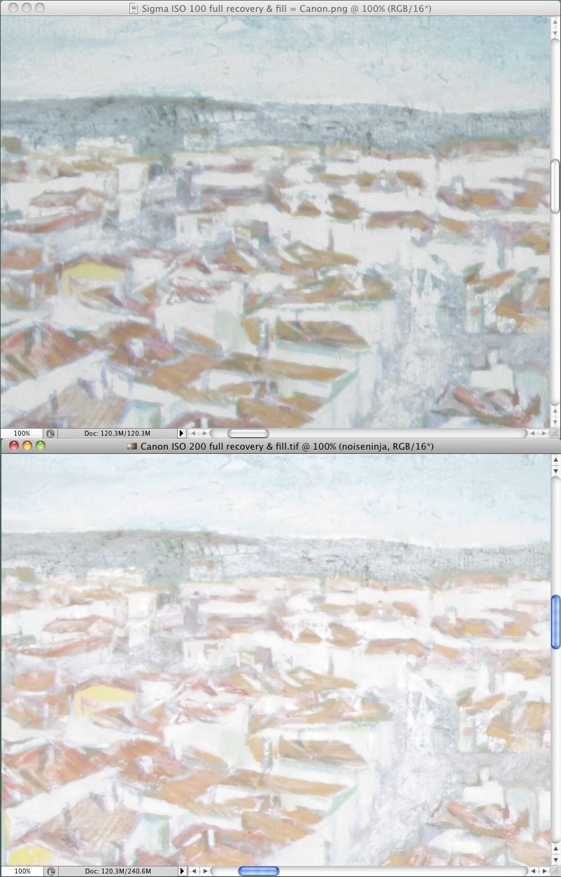
Comparing dynamic range as I do does not yield simple numbers, but unlike tests that do yield numbers, it is meaningful. For example, consider the two sensors I compared at the beginning of this article. They have just about the same difference in size as the sensors in my diagram. It happens that the best ISO speed on the smaller one is 100 and the best on the larger is 200, so let’s compare these. The image from the smaller sensor is on top, the image from the larger one is on the bottom. The lower image is brighter but it is also noisier. If you look at the dark details that you can just distinguish from black in the upper picture, or from the noise of the lower picture – look at the splotches of grey in the black hair – they are
just about the same, although the lower photo may show a hint more detail.
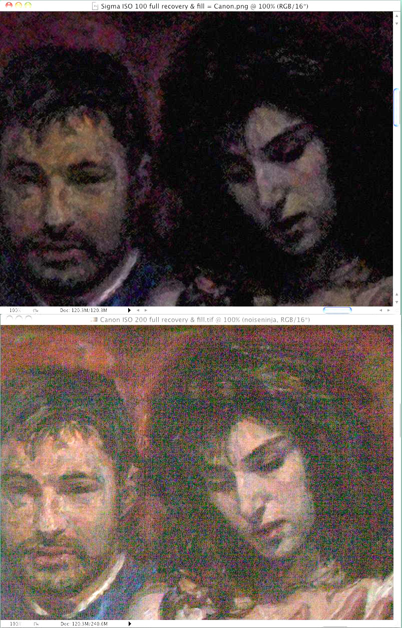
The light details in this next image are also almost the same, but in the light areas, the upper photo may show a hint more detail. In short, overall it’s a wash. At their best ISO speeds, the dynamic range of these sensors is the same.
(Incidentally, the larger of these sensors produces a 14-bit image, which is 2 bits more than the sensors in most DSLRs, including the smaller one here. This means that the voltages produced by the sensor are converted into digital numbers with greater precision. However the noise of the sensor is in its voltages, so the only effect those extra bits have on the noise is to digitize it more precisely.)
It turns out that the larger sensor’s ISO 200 and ISO 400 are indistinguishable in dynamic range, so the smaller sensor’s ISO 100 is also comparable to the larger’s ISO 400. Neither sensor is quite so good when stopped down to ISO 200 or 800, respectively, but the difference is slight and once again they are roughly comparable. At ISO 400/1600 the larger one is better, and above that point the difference is so great that the sensors cease to play in the same ballpark. The larger one seems almost able to take usable pictures in the dark.
Ignoring the Obvious — Although no conventional tests of image quality are meaningful, they still provide some information, and you might think that some information ought to be better than no information. Unfortunately, some information is not always better than no information. These conventional tests strike me as equivalent to blind men feeling parts of an elephant and describing it as like a wall, a tree, a snake, and a rope. If a reviewer measures something simple like the delay of a shutter, I am willing to believe it, but I see nothing credible about simple assessments of a phenomenon so complex as image quality. I am willing to delude myself about many things – my favourite delusion comes in the
shower, when I am convinced that I can sing – but I see no reason to delude myself that my Blink-o-Flex camera is better than my friend’s Wink-o-Flex because it gets better reviews.
Neither do I believe assessments of cameras’ mechanical quality. I do not know any way to examine a camera and tell how well built it is or how long it will last. It used to be that to use a camera you wound a spring to cock the shutter, twisted a ring to focus, pressed a button that released the shutter, heard various parts whirr and click and bang, and then twisted a knob or cranked a lever to advance the film. You could feel and hear that some cameras were better than others. Also, to withstand the pressures of your paws, parts were machined from brass and aluminum, so weight was also a clue. However, nowadays miniature motors replace fingers, so the parts need little strength and must have minimal mass. This means that quality no
longer comes from brass, it comes from being the right sort of plastic. A digital camera may need a metal case to dissipate heat from the electronics but any solid mass you feel is likely to be just a heat sink; it will not indicate mechanical quality.
Even play in lenses may not matter. It used to be that lenses were designed with the assumption that they would be manufactured perfectly, but today many engineers figure that it is more efficient to assume that there will inevitably be slop in manufacturing, especially with complex lenses, so they often design optics that will tolerate some misalignment. (Most people don’t appreciate how complex lenses have become. Professional lenses used to have 4 to 8 spherical elements that were ground from ordinary optical glasses, then cemented into 3 or 4 groups, which is what were mounted in the lens. Today, a lens sold in a modestly priced DSLR kit may contain 17 elements cemented into 13 groups, and 3 of the elements may be formed
aspherically from an exotic material.)
I don’t have any insider or specialist knowledge about makes and models of camera, so I scratched my head a lot last winter, deciding what to buy. I make big enlargements – my snapshot size is 11 inches by 17 inches (A3) – so I am after the best image quality I can get, yet I did not want a full-frame sensor, now matter how good it might be. That is because the ultimate limitation to image quality is failing to obtain an image in the first place because the camera is too heavy to bring along. Deciding not to lug the lens you need comes next. With my smaller Foveon-based cameras I am already beyond the limit of what I am able to haul on my back. I already need to leave at least one lens at home.
The next size down from full-frame is not standardized, but a number of sensors are similar enough to use the same lenses. I wanted one of those. Some of them do not have optical viewfinders and are temptingly light, but all of the lightweight models that have interchangeable lenses are based on Bayer sensors, and among sensors of this size, I prefer the devil I know to the devil I don’t. I know from experience that the Foveon has an excellent dynamic range, and I prefer the nature of the Foveon’s noises and artifacts to those of a Bayer sensor. The darkest Bayer tones are covered by coloured specks while the darkest Foveon tones lose their saturation. When we look at a natural scene with great dynamic range, usually we see little
saturation in the deep shadows, so the Foveon’s noise is more naturalistic.
Also, when the detail of a scene exceeds the sensor’s resolution, the Foveon records hints and suggestions of detail that are slightly larger, while the Bayer records moiré patterns. Since the finest detail the eye can make out usually adds nothing to a scene but hints and suggestions, the Foveon’s method of breaking up is more verisimilar. Finally, I dislike the blur that is intrinsic to a Bayer image. Although a Bayer image can be sharpened, sharpening tends to bring out artifacts, so I prefer to sharpen an image as little as possible.
I decided to buy Foveon-based cameras again but the architecture of the Bayer sensor offers one considerable advantage: it can be more sensitive to light. A Bayer sensor as sensitive as the one I tested above would be wonderful for taking candid pictures indoors, or to allow fast shutter speeds for sports and wildlife. If I photographed news or sports or a lot of wildlife, I would have been prepared to trade some image quality at low ISO speeds for better image quality at high ISO speeds. In this case I would have compared some cameras’ dynamic range inside a camera shop. At each ISO speed I would have taken a dozen pictures of the same scene one f-stop apart, then I would have compared the underexposed and overexposed pictures on a
computer.
Assessing Value — Among today’s cameras, dynamic range is far and away the most important factor limiting image quality. It is also the only optical factor that is practical to test yourself. However, a few features of a camera are also important. If you cannot see the image clearly in the viewfinder or LCD display, your pictures will be poorer. If your camera or lens does not stabilize the image optically, your pictures will be poorer. If the camera operates too slowly, you will miss pictures altogether.
You will also lose pictures if you do not have a lens with the appropriate focal length. In the days of film, sensible advice was to buy lenses with a fixed focal length rather than zoom lenses, and to buy fewer lenses rather than cheaper lenses, because you were stuck with optical imperfections. Nowadays I think the opposite is sensible. With a little time, most optical imperfections can be cleaned up. This makes cheap zoom lenses practical even for high quality work.
Of course, better lenses still make better images, which require less time to clean up, so it is still nice to have better lenses. Unfortunately, how to tell which lenses are better is a problem. The best you can “learn” from a manufacturer’s propaganda is that their Super line is perfect for everybody, this Duper line is doubly good, and their Extreme line is ideal. Price lists are usually the only intelligible guide. However, I do not know any sensible way to compare lenses from different manufacturers, and the correlation of price to quality is anything but perfect. Costs of production decrease exponentially with the quantity produced, so lower-priced lenses may be dramatically cheaper for little difference in quality, and the
highest-priced merchandise often sells not because it is better but because it more expensive. For example, as I write this you can buy a point-and-shoot made by and labelled as a Panasonic for $320, or you can buy the same Panasonic point-and-shoot labelled as a Leica for $700. Economists call such products Veblen goods, after the fellow who wrote a classic book on conspicuous consumption.
The only apparent indicator of value is the number of features a camera offers, but I don’t think this is a sensible indicator either. To my mind, every camera on the market is embellished with useless features that get in the way. I have missed any number of pictures by getting lost in a maze of menus or misinterpreting some hieroglyph and pushing the wrong button. On my cameras I would like to eliminate every menu option dealing with image size, image quality, exposure mode, aspect ratio, rotation, sharpening, colour balance, white balance, slide-show presentations, sound, and video. I would especially like to be rid of a button on one camera that I often push accidentally, the button that moves the location of the auto-focus sensor
away from the centre to some other part of the field, where I can figure out no reason for it to be. I never found any manual camera I ever owned to be so complicated to use and awkward to control as a digital camera, even my wife’s point-and-shoot, because digital cameras all try to do work more sensibly done by a desktop computer. This is daft. I want a simple camera that will save images in a raw format without any processing, then let me process the pictures in a desktop computer that is easier to control.
If my view of the photographic market seems jaundiced, well, it is. However, I really cannot be jaundiced about the cameras that are available today, once you get beyond the gadgetry. I get better enlargements from my DSLRs than I used to get from 2.25″ x 3.25″ film.
Among snapshot cameras, one model will have a larger LCD display than another, or a longer zoom, or a smaller size, but to me all of them look similar under the hood. All of them have tiny sensors that trade off dynamic range for superfluous megapixels, and all have a long list of useless features printed on the box. From what I can see, their prices are determined not by quality but by the stage in the product’s life cycle. To buy my wife’s last point-and-shoot I just visited a couple of local shops and bought the model with the fewest megapixels that had image stabilization, an LCD display that was easy to see, and a zoom lens.
If you want to buy a camera that is better than a point-and-shoot but smaller than an DSLR, then you need a sensor with a greater dynamic range. You will not get this with the “prosumer” models that look like small DSLRs but do not provide interchangeable lenses. These have the same tiny sensors as snapshot cameras, so they take no better pictures. You need a model with a four-thirds or an APC-sized sensor. Nowadays sensors of this size can be had in bodies that are hardly larger than a point-and-shoot. (I myself have one by Sigma that uses a Foveon sensor, the DP2s. It can take pictures every bit as good as my Foveon-based SLRs but I can recommend it only for skilled photographers because it lacks a zoom lens, it lacks image
stabilization, its LCD display is dim, and it has a remarkably awkward user interface.)
If you want to buy a DSLR, I think it’s more sensible to look for cheaper models than costlier ones. With a DSLR the sensor and viewfinder matter, as does image stabilization, but not much else. Like other computerized gadgets, digital cameras are constantly improving in quality and coming down in price. If you find yourself bumping into a modest camera’s limits, you will probably not be worse off selling it and buying something fancier tomorrow than you would have been buying something fancier today – and bumping into its limits is unlikely anyway.
And finally, do keep in mind that an inextricable part of any digital camera is a computer. Cameras come with built-in computers that work surprisingly well, but for top-notch pictures, no built-in computer can do enough. To get full value out of any digital camera, you need software that can optimize the digital image. Once you get beyond point-and-shoot cameras, better images do not come from better cameras, they come from better software and knowing how to use it, as I explained in “Digital Ain’t Film: Modern Photo Editing” (29 April 2010).
[If you found the information in this article valuable, Charles asks that you pay a little for it by making a donation to the aid organization Doctors Without Borders.]
TidBITS Watchlist: Notable Software Updates for 12 July 2010
BusyCal 1.3.2 — BusyMac has released a minor maintenance update to BusyCal, their iCal-replacement calendar program with sharing capabilities. Version 1.3.1 adds an Overwrite Sync Services button that addresses syncing errors in Snow Leopard, fixes an unspecified bug in Week View that’s triggered by dragging events, reinstates the appearance of recurring To Dos in the Alarms menu, and fixes an unspecified bug that could occur when syncing birthdays on a LAN. The update also addresses two crashing bugs, one of which occurred when deleting duplicate events and one that could occur on program launch if corrupt preferences were present. Finally, the latest version adds more
Help documentation, makes improvements in various localizations, and includes other minor enhancements and bug fixes. Version 1.3.2 fixes a crashing bug introduced in 1.3.1, along with a Calendar Group conversion bug when upgrading from 1.3. ($49 new, free update, 6.2 MB)
Read/post comments about BusyCal 1.3.2.
PDFpen and PDFpenPro 4.7 — SmileOnMyMac has released a minor feature update to their PDF editing utilities PDFpen and PDFpenPro. The latest versions make it possible to save PDFs directly to Evernote, the note-taking and snippet-collecting utility and service, via a new Save to Evernote item in the File menu. ($49.95/$99.95 new, free updates, 45.8 MB/46.0 MB)
Read/post comments about PDFpen and PDFpenPro 4.7.
ExtraBITS for 12 July 2010
It was a blessedly slow week for serious news, but a few items jumped out at us. Consumer Reports dinged the iPhone 4 on its antenna design, Apple finally acknowledged problems with certain Time Capsules, AT&T explained why iPhone 4 users in some cities were seeing slow upload speeds, Apple started a beta for a new version of MobileMe Calendar, Sony dropped prices on its ebook readers, and the New York Times warned that rising labor and currency costs may result in higher electronics prices.
Consumer Reports Confirms iPhone 4 Antenna Flaw — The redoubtable Consumer Reports says the iPhone 4 can drop connections in weak signal areas when you hold the phone with your skin covering the antenna gap on the lower left side. The non-profit organization tested three separately purchased iPhone 4s in a radio-frequency isolation chamber. The group says a little tape over the gap eliminates the problem (or you could, as Steve Jobs suggests, just not hold the phone like that). Consumer Reports does not recommend the purchase of an iPhone 4 at
this time as a result. Ouch.
Apple Replacing Defective Time Capsules — Apple has announced that it is now replacing or repairing, free of charge, Time Capsules purchased roughly between February 2008 and June 2008 that exhibit certain power failures. These failures include not powering on, or shutting down unexpectedly after startup. A recent Knowledge Base article has more information on how to identify whether your Time Capsule has a qualifying serial number, how to arrange for Apple to retrieve data from your device, and how to receive a refund for a previously paid repair or replacement.
iPhone Supply Chain Points to Rising Costs — The New York Times uses a discussion of the iPhone 4’s supply chain as a springboard to discuss how rising labor, currency, and housing costs in China may result in increased prices for consumer electronics. Though the actual assembly of a product like the iPhone makes up only a fraction of its total cost, prices of commodity parts such as circuit boards and batteries also reflect fluctuations in labor costs. And while Apple’s wide profit margins may provide some insulation from these pressures, other electronics companies that compete largely on price could be hit hard.
AT&T Denies Data Capping — Ars Technica has received confirmation from the horse’s mouth that AT&T is not capping data speeds for iPhone 4 users, as recent rumors have suggested. AT&T said that what some users are experiencing – a degradation in upload speeds to as low as 100 Kbps – is the result of a software defect in the Alcatel-Lucent equipment that AT&T uses in some of its cell towers. AT&T noted that the defect should affect only about 2 percent of users, and that Alcatel-Lucent is working on a fix.
Apple Unveils MobileMe Calendar Beta — Apple is now offering a beta preview of its revamped MobileMe Calendar. The latest version includes the capability to share and edit calendars with other MobileMe members, and to publish read-only calendars that can be viewed by anyone. Email event invitations can also be sent to any contact through the new Web application interface. The latest version of MobileMe Calendar is compatible with Mac OS X 10.6.4, iOS 4 (for iPhone and iPod touch), and iOS 3.2 (for iPad). To try out the new service, log in at www.me.com and click the Request an Invitation link; one will be
sent to you shortly in email.
Sony Cuts Digital Reader Prices — Barnes & Noble started it, by cutting the price of the Nook from $259 to $199, prompting Amazon to drop the Kindle 2’s price to $189 and the Kindle DX’s price to $379. Now Sony is following suit, cutting prices on its Reader Daily Edition to $299, the Reader Touch Edition to $169, and the Reader Pocket Edition to $149. Only the Reader Daily Edition has wireless capabilities, though, so Sony may have more work (or price cutting) to do before its products can compete with the Kindle and Nook, much less the
iPad.