TidBITS#1171/22-Apr-2013
You saw this week’s news coming, didn’t you? We’re talking about the 23rd anniversary of TidBITS! Adam Engst shares a few milestones related to the anniversary along with some thoughts about the role a 23-year-old publication can play in today’s modern Internet. Also this week, David Rabinowitz reviews the Divvy window management utility for Mac OS X, Agen Schmitz covers the initial open-source release of LiveCode 6.0 after its successful Kickstarter campaign, and Matt Neuburg waxes poetic about the iPod shuffle after searching through Apple’s iPod lineup for a suitable replacement for his second-generation iPod nano. Notable software releases this week include Mailplane 3.0, Things 2.2, CloudPull 2.4, Aperture 3.4.4, and iPhoto 9.4.3.
LiveCode 6.0 Released in Free and Commercial Editions
The spirit of HyperCard lives on with the release of LiveCode 6.0 from Runtime Revolution (RunRev for short) in two versions — a free open-source LiveCode Community edition and a LiveCode Commercial edition meant for developing professional applications. This follows the successful Kickstarter campaign to rejuvenate the cross-platform toolkit, which exceeded its funding goals in late February (see “LiveCode Crowdfunds Free, Open-Source Update,” 22 February
2013).
The 6.0 release of LiveCode is an “as-is” edition, promised as the first outcome of the crowdfunding effort. A few weeks ago, RunRev’s chief, Kevin Miller, explained in a blog entry that this version involved reviewing and updating the current code base to make sure it fully complied with the terms of the open-source license chosen by the company. The 6.0 release also required updating documentation, reworking licenses, and other cleanup tasks. The work starts next on the complete overhaul funded by the Kickstarter project.
LiveCode 6.0 can be used to develop apps that run on OS X, iOS, Android, Windows, and Linux platforms, and the free LiveCode Community edition can be used to create apps for yourself or for commercial purposes. However, the GPL license used by RunRev requires all apps created using the LiveCode Community edition be open source and the source code be made public, even if you’re selling your app.
If you want to keep your source code away from prying eyes, you can opt for the LiveCode Commercial edition, which is offered as a $500 annual license subscription or via other licensing options starting at $499 (for embedding a LiveCode component in a single iOS app; pricing can rise depending on the number of employees in your organization). Additionally, if you plan to make your app available through one of Apple’s App Stores, you’ll need the Commercial edition, as the GPL license is incompatible with Apple’s own licensing requirements.
To learn more about creating apps using LiveCode, RunRev is offering three tutorials (called “academies”) — an overview plus two others oriented toward creating games — that can be purchased separately for $50 or bundled together for $99 for a one-year subscription.
LiveCode 6.0 can be run on Mac OS X 10.4.11 Tiger on PowerPC-based Macs, 10.5.8 Leopard and later on both Intel and PowerPC systems, and 10.6 Snow Leopard and later on Intel-based Macs. The free LiveCode Community edition download weighs in at 54.1 MB, and you can view the full list of changes from version 5.5.4 in this downloadable PDF.
Divvy Eases Window Management
Although I love the Mac, window management in Mac OS X has bothered me since I switched from a PC four years ago. I was accustomed to windows filling the entire screen when I clicked the maximize button, and I was initially disappointed when Mac apps wouldn’t do the same. (Mac apps are supposed to zoom to the largest reasonable size when maximized — the width of a page in a word processor, for instance — but such attention to detail is unfortunately not universal.) Windows 7, the version I switched from, had also introduced Snap, a quick way to compare two windows side by side, complete with a keyboard shortcut to move and resize windows to fill only half the screen. I quite liked Snap because, as a student, I frequently need two
windows next to each other, one displaying questions for an assignment and another where I type my answers.
Although my approaching graduation means that I’m unlikely to need homework question-and-answer windows side-by-side any more, I’ve been able to wrangle my windows in even more ways than Snap provided using the Mac window manager Divvy, by Mizage. When invoked via a keyboard shortcut or by its icon in the menu and dock, Divvy displays a little grid that represents the screen. You then drag a rectangle over the area you want the current window to occupy. Want iTunes to live in a small area in the upper right of your screen? There’s no need to resize the iTunes window and move it into the corner manually — just bring up Divvy and drag a rectangle in the upper right of the grid.
Tweaking Divvy’s settings can make it even more powerful and efficient to use. You can configure the global keyboard shortcut that brings Divvy up while using any application. (I set mine to Control-D, because it’s easy to remember and I don’t happen to use any Unix programs in Terminal that rely on it.) Even better, you can set other keyboard shortcuts to resize and position windows around the screen in preset configurations, such as having a window resize and fill the right half of the screen. These shortcuts can be active only while
Divvy is open, or they can be global. Just for kicks, I decided to simulate the Windows 7 Snap keyboard shortcut that I miss. So I created two global shortcuts, substituting the Mac’s Command key for the Windows key. Now when I press Command-left arrow, the frontmost window instantly aligns itself to fill up the left half of my screen, and Command-right arrow does the same for the right side. This makes it easy to display two windows side-by-side.
Divvy’s main failing, though that may be overstating the case, is that dragging a rectangle in the grid can be done only with the mouse, which may trip up those who don’t like to take their hands off the keyboard. Of course, preset configurations and associated keyboard shortcuts should eliminate most of the need to use the mouse. But while Divvy meets my needs well, if it doesn’t quite fit your working style, a number of other window management tools are available for the Mac, including Breeze, Cinch, Mercury Mover, and the open-source ShiftIt. It’s also easy to create macros that move and resize windows using the popular Keyboard Maestro macro utility.
As a student, I haven’t had to purchase much software, since most of my needs are met by site-licensed packages, educational discounts, and free and open-source utilities. However, after giving Divvy’s 14-day trial version a test run — and I recommend you do the same — I was happy to purchase a copy for $14 (it’s also available in the Mac App Store for $13.99, though of course without a trial version). I had never used a window management app before and was impressed with Divvy. It sure beats fiddling with windows manually, and now there isn’t a single thing I miss about Windows (though anyone who has to use Windows at work might also be interested to know that
Mizage also makes a version of Divvy for Windows).
23 Years of TidBITS: Thoughts on Our Past, Present, and Future
Here at TidBITS, we pride ourselves on consistently publishing quality content on a weekly schedule. With this week marking our 23rd consecutive year of continuous publication — 23 years! — I wanted to share a few milestones and thoughts on where I see TidBITS meeting your needs in the future.
The Methuselah Matter — Back in 1990, when we started TidBITS, there were a variety of other Internet newsletters — we were early, but by no means the first. Most of those other early publications fell by the wayside over the years, succumbing to fatigue, irrelevance, or harsh economic realities. But one such publication — Liam and Pauline Ferrie’s The Irish Emigrant — started a few years before TidBITS and evolved in much the same way, switching from email-only delivery to an ad-supported Web site with daily updates. For years, I had to say that TidBITS was the oldest purely electronic technology publication on the
Internet, or the second-oldest Internet-born publication. Nonetheless, I always had a soft spot for the Irish Emigrant, since it was clearly a labor of love for the Ferries, just as TidBITS was for us, and Liam Ferrie was even kind enough to send congratulations on our 18th anniversary.
It turns out that we moved into first place for active publications in February 2012, when the Ferries retired and published the final issue of the Irish Emigrant, though it wasn’t until late 2012 when reader Rob Smyth alerted me to that fact. (Rob was also the first to tell me about the Irish Emigrant back in 1996, so it was especially nice of him to remember and loop back 16 years later.) So we can now say that TidBITS is the oldest active Internet-only publication. And we have a new goal, since the Irish Emigrant ceased publication on its 25th anniversary, having started in February 1987. If we can keep going for
another few years, we can claim the overall title for longest-running Internet publication.
Memberships and Managing Editors — One reason I’m confident that I’ll be looking for something to say in this spot in a few years is that the TidBITS membership program has been a huge help in keeping TidBITS on a sustainable financial track. With your support, we’ve been able to pay more writers to bring you quality articles — you’ve seen the results in pieces by Josh Centers, Steve McCabe, David Rabinowitz, Kirk McElhearn, Sharon Zardetto, Marshall Clow, Alicia Katz Pollock, and others, not to mention Joe Kissell’s new FlippedBITS column.
Even more important, I’m tremendously pleased to announce that the TidBITS membership revenues have enabled us to hire a managing editor to help with article assignments, coordination, editing, and writing, plus the myriad other tasks involved in keeping TidBITS coming to you. Much as I hate to tease, it’s premature to share precisely who will be assuming this role, but I can assure you that this person’s skill and enthusiasm will be a huge asset for TidBITS, and will result in even better content going forward.
If you aren’t already among our 2,000 members, now is a great time to join the TidBITS membership program and help us continue to refine and improve the kind of coverage you’ve come to expect from us.
Why Is TidBITS Important? — Back in 1990, when Tonya and I came up with the idea for TidBITS, our goal was to bring Mac news and information to people via the Internet, because there were relatively few Mac-specific magazines back then, and none were distributed in digital form. Clearly, that need has long since dropped away, with more Apple-centric content appearing every day than anyone would even have time to read. We’re well aware of that fact, and it has prompted soul-searching to figure out what the role of TidBITS should be in today’s Internet.
What I’ve realized is that TidBITS now serves a different need, which is to provide a view of the Apple world that is thoughtful, professionally written and edited, and above all, finite. You all have numerous demands on your time, and we want to respect that by focusing on those topics that are important and useful, rather than attempting to cover absolutely everything. We also feel a responsibility to give you complete stories, so you’re not left with more questions than when you started reading, even if that results in long-form articles in an age of 140-character tweets. And finally, we care deeply about including our readers’ voices alongside our articles in the form of comments that add interesting anecdotes, useful
advice, important questions, and more, without the drivel and vitriol that drags down so many other forums.
So while we can’t guarantee that everything we publish will interest you specifically, our goal is to give you a well-considered collection of accurate articles each week from which you can choose. Plus, while you may not find every piece relevant when it’s published, our hope is that by maintaining a complete archive, you can come back to previously skipped articles if and when their content becomes important to you.
In that context, I want to share the most recent accolade we’ve received, our top ranking among sources of Apple info in David Deutsch’s list at Examiner.com, because it speaks to the importance of including only the most important topics in our weekly newsletter.
My favorite Mac read of them all. Great “tidbits” of info as well as extremely informative Apple info and the most complete weekly newsletter, probably the most jam-packed source of Apple info on the Internet, run now for 22 years by husband and wife team: Adam and Tonya Engst, two of the most interesting Apple experts on the planet.
Thanks to David for his kind words, and while I know I’ve thanked those of you who have written in with similarly generous thoughts, allow me also to thank each and every one of you right now for making the time to read TidBITS regularly. I’m honored that you consider our work to be worth your valuable time, and that we’re a key part of your strategy for staying informed without wasting precious hours on Internet distractions.
How I Got an iPod shuffle — and Liked It!
Warning: The first part of this article mentions many iPod models, often distinguished both by a minuscule cognomen, such as “nano” or “shuffle,” and a generation number, such as “second-generation.” If you’re not an iPod expert, it might help to have at your elbow an encyclopedic historical list of models, such as this one from Apple.
This is the story of a dilemma and a solution. To avoid keeping you in suspense, I’ll outline the dilemma and the solution up front; then I’ll explain why the dilemma was a dilemma, and why the solution turned out to be a solution. The dilemma:
- I run (if you can call it running) every day.
- While running, I like to listen to various news and educational podcasts, or audio books. (I do sometimes listen to music while running, but much less often.)
-
I had this problem completely solved: I’ve been using a second-generation iPod nano for years, and loved it. But it finally gave up the ghost.
-
Apple no longer makes any iPods that I’m willing to take running with me — except, just maybe, the iPod shuffle.
The solution: Hey, this iPod shuffle isn’t so bad!
Now that I’ve spoiled the story by revealing the plot and the ending, let’s go back to the beginning.
A Man, A Plan, A Nano — Picture me, preparing for my daily run. I’m exquisitely outfitted with my second-generation iPod nano. It’s encased in a thick protective silicone-rubber sleeve, attached to a velcro armband. I’ve run this way every day for years, rain or shine. Unfortunately, something (I suspect the aforementioned rain) finally damaged its internal electronics, and I had to seek a substitute. Even more unfortunately, as I discovered when I began to research the current iPod situation, Apple barely makes any iPod that I would consider acceptable as a successor to the second-generation iPod nano.

To explain why, let me tell you what I loved about my iPod nano. It was wondrously simple, yet defiantly rugged, a slender aluminum rectangle with a tiny screen, a click wheel, and very little else. The screen was a crude, low-resolution LCD, capable of portraying no more than a few short lines of text. Yet this screen told me everything I needed to know: what’s playing, how long it is, how much time remains. And the screen was also an ingenious and powerful management interface, thanks to the click wheel, which not only provided the
basic play/pause, next/previous, fast-forward/rewind, and volume-adjustment functionality, but also, in conjunction with the screen, enabled me to dive down into various menus to navigate settings, playlists, and albums, as well as scrolling to a specific point in a track.
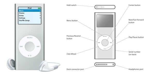
Crude as the screen was, I could see it even in the bright California sun. Even more important, the tactile quality of the click wheel meant that I could perform most functionality needed out on the trail (such as skipping a track, or adjusting the volume) without even looking at the device.
The iPod nano also had no moving parts. That might seem obvious, but you should have seen me in the days before flash memory, trying to run with a portable CD player! Also, the moving parts issue is one reason I would never run with, say, an iPod classic, which contains a spinning hard disk. I do know people who run carrying an iPod classic, but I think they’re nuts. Hard disks can crash. Equally significant, I can crash, and I often do: I do a lot of smashing through brush, and stumbling and falling over logs and rocks, so I could easily jar that hard disk into eternal silence. Besides, an iPod classic is expensive. I’m not heading out into the dust and the rain with $250 worth of fragile equipment strapped to my arm!
For the same reason, I wouldn’t usually consider running with my iPhone. To be sure, an iPhone is a wonderful device: besides being a phone, it contains a GPS, so it might stand in for my Garmin Forerunner 305, plus it’s a camera, something I frequently wish I had with me while running through the gorgeous Southern California scenery. I do walk with my iPhone, even into the back country; I carry it while dirt biking; but when I’m out there nearly naked, without pockets, facing the elements and pounding along, the expensive, delicate iPhone seems terribly out of place. And it’s too big!
Another reason I don’t want to carry an iPhone is the screen. It’s hard to read in bright light (and the Southern California sun is very bright, one of the reasons I love living here); and it’s a touchscreen. This means that in order to manipulate it, I’d need to stop running, take the iPhone off my arm or out of its pouch or whatever, clean and dry my finger, unlock the screen, deal with the Music app, lock the screen, put the iPhone back in its place, and start running again. The iPod nano, with its tactile click wheel, could usually (as I’ve already said) be manipulated without my breaking stride; and if I did have to stop and change playlists, the screen backlighting was very bright, and the click wheel was protected from
my sweaty hands by the rubber sleeve.
Open the iPod Bay Doors, Please, Hal — Imagine, then, my surprise and horror when, after my iPod nano stopped working, I turned to the Internet to research the state of current iPod models:
- The iPod classic, as I’ve already said, is expensive and has a hard drive; plus, it’s rather large. This is a pity, because its click-wheel-and-screen interface is extremely similar to that of my iPod nano.
-
The iPod touch is effectively an iPhone without the phone, and, for the same reasons as the iPhone, wouldn’t make a good running companion: it’s too big, it’s too easily damaged, and it has a touchscreen, with all the attendant complexity. That’s a pity, because I happen to own one already, a third-generation model that I don’t use much any more. I seriously considered using it for running when the iPod nano stopped working, but decided against it.
-
The current iPod nano had me momentarily tempted. After morphing its way through several generations, including the very strange small square of the sixth generation, it is once again, in its seventh generation, similar in size and shape to the second generation. But, darn it, it has a touchscreen! Plus, it’s relatively expensive at $149, not least because it’s loaded with electronics that I don’t need (Bluetooth, radio, accelerometer, and so forth). It’s a very clever device, but for running I want something simpler, sparer, tougher, and cheaper.
Having gotten this far, I was nearly in despair. What was Apple thinking, in doing away with everything that, to me, made my iPod nano worth having? Was there nothing acceptable in their iPod arsenal?
Such was the process of elimination that brought me, at last, to consider the iPod shuffle. I didn’t want to consider the shuffle. I had been brought this far very much against my will. I remember when the shuffle first appeared, and I thought at the time that it was just plain stupid. (Of course, that doesn’t prove much, since, as is well known, other things that I thought were stupid when they first appeared included Web browsers, iMacs, Mac OS X, and the iPhone.) But the shuffle had no display at all, and its name promoted its capability to randomize play order, which was just the opposite of how I listen: I like to set up playlists of podcasts and listen in order. Without a way to listen in order, without a way to
choose and navigate a playlist — which surely must require a screen — the shuffle seemed completely out of the running (pun intended).
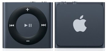
It turns out, however, that the iPod shuffle, too, has undergone various mutations during its generational evolution. It has had more form factors than Oprah, ranging from a tall rectangle like a package of Juicy Fruit gum to a tiny rectangle barely larger than its click wheel. It even went through a phase (the third generation) where it had no click wheel at all! The current fourth-generation iPod shuffle has inherited the best of the previous generations’ features, and after some further research I realized, to my surprise, that it might very well do, so I nipped out to Fry’s Electronics and bought one. I’ve had it only a few days, but it is already perfectly clear to me that, for my purposes, not only is it indeed the best
choice out of the range of current iPod models, but in fact it’s going to work more than satisfactorily as a replacement for my beloved iPod nano.
The Shuffle’s Mortal Coil — I’ll try to explain what I like about my iPod shuffle for my particular use case. Some aspects of the shuffle that might be thought weaknesses turn out to be strengths, or at least not significantly different from my old iPod nano; in one or two areas it definitely disappoints, but in ways I can live with. And some features of the shuffle turn out to be better than the nano!
What I got was a slate (black) iPod shuffle (there are seven other current colors); it cost about $40, because Fry’s has a low-price guarantee and that was the Amazon price at the time. It is astoundingly small: the click wheel is about the size of a U.S. 25-cent coin, and the body overall is about the size of a U.S. 50-cent coin. The case is aluminum and feels very solid indeed. It is ridiculously light. On the back is a spring clip. After some experimentation, I have settled on attaching the clip to the top of the waistband of my running shorts, where I do not feel it at all. In this respect, the iPod shuffle is better than the iPod nano was; the nano involved the complication and pressure of an armband, while the shuffle
just vanishes into my clothing.
By the same token, I have hopes that the iPod shuffle will prove more resistant to rain than the iPod nano was. I have not yet run in the rain, but I think that in most cases my shirt, worn outside my waistband, will be sufficient to protect it; in case of a serious downpour, I might put some plastic over it. (There does exist a truly waterproof iPod shuffle case, but my use case is running, not
swimming!) Moreover, the shuffle has less surface and orifice area for water to enter than the nano did. The nano had the old-style 30-pin dock connector port, which is how I think the water eventually got in to ruin it; the shuffle has no open ports, because its charging-and-syncing port is also its headphone port and is therefore occupied by the headphone jack. (The included charging-and-syncing cable has a USB connector at one end, suitable for plugging into a computer or an iPhone wall charger, and a headphone jack at the other end. It’s only about 1.5 inches [3.8 cm] long; I wish it were longer, but it’s no big deal.)

On the top of the device is a switch with three positions: Off, Normal, and Shuffle. I don’t expect I’ll ever use Shuffle mode, which randomizes play order within a playlist; I listen to podcasts in a set order, as I’ve said, and even a music playlist has a meaningful order to a classical music listener — it is not merely a grab-bag of independent “songs.” (A random movement from a concerto, or a random variation from a theme-and-variations, would be downright painful.) I don’t know whether I should be switching off
the iPod shuffle between runs; so far I’ve not done so, and it seems to be holding its charge very well. If that keeps up, I might never need to switch it off.
The click wheel, too, is actually better than the iPod nano’s click wheel. On the nano, the wheel’s four cardinal points and its center were buttons, but the wheel was also sometimes a wheel: to increase and decrease the volume, for example, or to navigate the tracks in a playlist, you had to treat the wheel like a touchscreen, moving your finger around the wheel in a circular gesture. On the trail, with a wet and dusty finger, I sometimes had difficulty with that gesture; the nano just couldn’t sense what I was doing. Also, the nano often got confused between my pressing the center button (select) and pressing the bottom of the wheel (play, pause, or — with a long hold — shut off). What the iPod shuffle has, despite the wheel
shape, is really five distinct buttons: louder/softer (the north and south cardinal points), previous/next or fast-forward/rewind (west and east), and play/pause (center). The springy, clicky tactile response of these buttons is superb, and the raised wheel shape is easy to sense. As a result, I’ve become adept at pressing the desired button without looking (and a good thing too, since the shuffle, you remember, is located at my waist!).
The center button on the iPod shuffle does a clever thing: if you hold it down for three seconds, it locks the click wheel (and produces, though the headphones, the lock sound now so familiar from the iPhone and iPad). The center button and the four cardinal point buttons are then unresponsive until either you hold down the center button for three seconds again or you shut off the device. This is useful to prevent accidental button clicks. I use this particularly when removing the shuffle’s spring clip from my waistband at the end of a run: it’s almost impossible to do that without accidentally pressing the click wheel somewhere, but such a press doesn’t do anything if the click wheel is locked.
Managing what’s on the iPod shuffle is exactly like managing what was on the iPod nano. The shuffle holds only 2 GB of music. So did the nano. To manage what music or podcasts is on the shuffle, you have to plug it into a computer and use iTunes. That was also true of the nano. With the shuffle, however, it’s more important than it was on the nano to arrange things into playlists when you’re setting it up with iTunes. That’s because, when you’re out in the field, the shuffle, unlike the nano, has no concept of albums or composers; the playlist is the only unit of internal categorization available to you.
And exactly how, you may ask, are playlists available to you when you’re out in the field with the shuffle? The nano, of course, had a screen, so you could dive into a list of your playlists or your albums or what have you. The shuffle solves the same problem by talking to you via VoiceOver. On the fourth-generation iPod shuffle, there’s a separate VoiceOver button, on top of the device. If you simply press and release it, it reads you the name of the current track, and if you use the click wheel previous/next buttons it will read you the name of each track you switch to; in this way, you can navigate within a playlist. To navigate to a playlist, you hold the VoiceOver button down for longer; the device starts
reading you the name of every playlist, and if you click the center button just after you hear a playlist’s name, you’re now in that playlist. You can also double-click the VoiceOver button to hear a report of your battery status.
This is ingenious, but it’s also the main area in which, for me, the iPod shuffle falls short: the VoiceOver recitation is insufficiently informative. I load up my device with enough podcast episodes to last me for about a week’s worth of running. When I’ve listened to all of them, I hook up to the computer, remove those podcast episodes, and load up more episodes, which the podcast creators have been kind enough to publish during the intervening week. Thus, when I’m using my shuffle, I need to know how many podcast episodes are in the current playlist, and which track of the playlist (by number) I’m listening to now. In particular, I need to know how close I am to reaching the last episode, because when I get to the last
episode, I’m going to need to return to home base to remove the existing podcasts and add new ones. With the iPod nano, I could obtain this information by looking at the screen (it would say, for example, “13 of 14”). With the iPod shuffle, it’s not so easy. My choices seem to be:
- Navigate the playlist via VoiceOver, listening to the titles of the podcast episodes, and counting. This seems clumsy, and is an invitation to lose my place.
-
Memorize the contents of the playlist, so that when I hear a certain episode I know that I’m reaching the end of the playlist. Due to certain personal limitations of my brain, that’s not going to happen!
-
Once back home, plug the device into the computer and examine the playlist with iTunes to see where I am. That’s the method I seem to be using so far.
I’ve now described all the buttons and functions of the iPod shuffle, but I should also mention that instead of controlling the device through the buttons on the device itself, you can control it through the remote three-button switch attached to some headphones and earbuds. This could prove desirable out in the field; some podcasts that are not run through The Levelator include both very loud and very soft talking, and I find I can adjust the volume more nimbly with the remote than with the shuffle’s built-in controls. Oddly, the earbuds that come with the shuffle lack a remote switch; but that scarcely matters to me, as I detest those earbuds (they are the old-style Apple
earbuds) and was certainly never going to run with them (the sound is lousy and they just fall right out of my ears). I would have liked to try Apple’s new-style EarPods but the shuffle, disappointingly, didn’t include them. Note that if your favorite listening hardware doesn’t include a remote, you can obtain a short inline adapter, such as the iLuv Remote.
The only downside to using the remote is that there’s a serious learning curve. There are only three buttons — Volume Up at one end, Volume Down at the other end, and a click switch in the middle — and the gestural language for obtaining particular functionality is far from intuitive. For example, wouldn’t you expect that to advance to the next track, or to fast-forward, you’d use the Volume Up button in some way? But no: it’s double-click the center button (and triple-click to go to the previous track). Apple has a useful support document listing the available gestures; I’m still studying it. My iPhone and iPod touch respond to the remote in much the same way, but I’ve
never bothered to study the list of gestures; the iPod shuffle, with its lack of a screen, makes a knowledge of the full range of remote gestures rather more necessary.
Not So Bad — So that’s the story of how I surprised the dickens out of myself by ending up with, and liking, an iPod shuffle. Whatever helps me get into my running togs and out the door is a good thing, and the iPod shuffle definitely does: with its impossibly tiny size and amazingly good sound, it’s like a secret personal trainer literally at my side.
Part of me still regrets that I couldn’t go from old iPod nano to new iPod nano: why doesn’t Apple still make a nano I can run with? That part of me thinks that Apple’s abandoning the click wheel and small text screen of the older nano is a mistake; there are situations where a touchscreen is just not the right thing. On the other hand, I was very happy to find that Apple still makes any device I can run with; and there are many things about the iPod shuffle that I actually like better than my old iPod nano. Its tiny size, and even its lack of a screen, work perfectly for my use case, loading it up with a week’s-worth of podcasts or some newly acquired audiobook and taking it out in the wind and weather and pounding the pavement
and trails for an hour every day. It’s simpler and more limited than the nano, but that simplicity and those limitations are perfectly appropriate; I wasn’t using the other features of the nano very much anyway. The only thing I really miss is being able to learn numerical statistics, such as what number track I’m listening to within its playlist or how much more of this track remains; but I can live without that, and I’ll have to.
On reflection, I think that part of the reason why the iPod shuffle makes sense within the repertoire of available Apple devices, and my old iPod nano no longer does, is that the iPhone and iPod touch now exist. It’s hard to believe, but in its day, my second-generation iPod nano was the last word in powerful, ingenious interface. I remember literally dancing in triumph around my friends with other MP3 players (as they were called) who could barely figure out how to skip the current track, let alone how many more tracks there were. And the nano could do a bunch of other tricks I haven’t even mentioned, such as holding and displaying your contacts, calendar, and text notes, and displaying photos! It had an alarm, a sleep timer, and
some built-in games!! It could even record your voice!!!
There was a time when I was travelling on airplanes to conventions with my iPod nano as my primary portable device. Now, however, the iPhone does exist; and we all know what that means. With its sophisticated touchscreen, amazing computing power, and astounding communication and sensory hardware, the iPhone will surely be your travelling companion of choice; so who, nowadays, needs a device with a crude tiny screen and a confusing click wheel interface? That interface was revolutionary in its own way, and for the sake of history and nostalgia I’m glad that the iPod classic preserves it; but I do understand why Apple might not want to make itself look ancient by continuing to provide it. All I ask is that Apple should remember
this: runners exist; the world is a bumpy, scratchy, dusty place, with blazing sun or drenching rain; and the touchscreen is not the be-all and the end-all. Now that I’m an iPod shuffle owner, I just hope Apple doesn’t abandon that as well.
TidBITS Watchlist: Notable Software Updates for 22 April 2013
Mailplane 3.0 — Uncomplex has released Mailplane 3.0, a major update to the Gmail-specific email client that now supports Gmail’s new compose mode and integrates Google Calendar. Mailplane 3.0 supports up to 10 accounts and enables you to switch instantly between tabbed accounts. It can also now preview attachments with Quick Look, as well as automatically compress directories dropped onto Mailplane as attachments. Other additions include support for Retina displays and for Notification Center (including the Do Not Disturb feature), plus inclusion of plug-ins and 30-percent discounts for the Gmail-enhancement services AwayFind (helps urgent messages find you) and RightInbox (for scheduling and tracking messages). ($24.95 new, 20-percent-off upgrade discount or free upgrades for purchases after 1 October 2012, 3.4 MB, release notes)
Read/post comments about Mailplane 3.0.
Things 2.2 — Cultured Code has released Things 2.2, improving overall performance to make the Mac task management app more responsive. The update also speeds up downloading of to-do items from Things Cloud and improves handling of dates when traveling between time zones, ensuring scheduled dates, due dates, repeating tasks, local notifications, and the Daily Review show up at the correct time for the time zone you are in. Other improvements include better handling of email messages that have been dropped onto the app’s dock icon (or notes field), behavior of contextual menus in text fields, formatting of dates in the
Logbook, and indicating when the app is offline. The release also fixes an issue where AppleScript-generated to-dos could appear out of order, an issue that randomized items in Schedule and the Daily Review, and a crash that occurred when creating tags with certain characters. ($49.99 new from Cultured Code and the Mac App Store, free update, 16.3 MB, release notes)
Read/post comments about Things 2.2.
CloudPull 2.4 — Golden Hill Software has released CloudPull 2.4 with a focus on backing up data from Google Reader, which will be shuttered as of 1 July 2013. (If you’re looking for a new RSS client, be sure to read “Explore Alternatives to Google Reader,” 18 March 2013.) The free and paid versions of CloudPull now provide the capability of backing up articles that you’ve tagged, as well as those that you’ve starred, shared, or liked. You’ll be able to export articles into an HTML bookmarks file that’s divided into folders (based on starring, sharing, liking, or
individual tagging), suitable for importing into the Safari and Chrome browsers as well as the Pinboard bookmarking Web site. The update also improves Quick Look previews, showing the article text from the RSS feed and not from the originating Web site, and it adds a Source column that contains the name of the originating Web site when displaying a full list of articles. CloudPull is available from the Golden Hill Web site and the Mac App Store (called CloudPull Premium) for $9.99, which supports up to 10 Google accounts. A free version of CloudPull is also available from the Mac App
Store, but it backs up only a single account. ($9.99 new with a 20-percent discount for TidBITS members, free update, 12 MB, release notes)
Read/post comments about CloudPull 2.4.
Aperture 3.4.4 — Apple has updated its professional photo management application Aperture to address a collection of annoying issues. Aperture 3.4.4 fixes an unnamed problem that could cause the application to quit during image import and when uploading images to Photo Stream; correctly displays raw images from Nikon P7700 cameras in the import window; properly displays thumbnails with names longer than 250 characters; resolves a problem that caused warning dialogs to appear when Web albums are synced after waking from sleep; and incorporates the important-yet-undefined “stability and performance improvements.” ($79.99 new
at the Mac App Store, free update, 523.15 MB, release notes)
Read/post comments about Aperture 3.4.4.
iPhoto 9.4.3 — With iPhoto 9.4.3, Apple has enhanced the consumer-level photo management app’s Photo Stream support and fixed a handful of bugs. Photos can now be deleted from My Photo Stream by dragging them to the Trash, you can use File > Export to export photos from Photo Stream, and raw images manually imported from My Photo Stream are now editable. On the bug-squashing side of the equation, one fix prevents manually rotated photos from appearing unrotated when shared to Photo Stream, another addresses a crash when syncing to Facebook, a third prevents calendar text from appearing at the wrong size and resulting in
order cancellation, and the final one fixes a problem that could cause books to have an incorrect number of pages after rearranging two-page spreads. ($14.99 new from the Mac App Store, free update through the Mac App Store or Software Update, 730.91 MB direct download via Apple’s support page)
Read/post comments about iPhoto 9.4.3.