TidBITS#1271/04-May-2015
It’s new technology week, as TidBITS examines several recently released initiatives to see if they’re right for you. Michael Cohen kicks things off with an investigation of Dropbox’s new commenting feature to find out if it’s useful for collaborative work. Glenn Fleishman runs through the details of Google’s new Project Fi wireless service, which won’t work with an iPhone but may help drive down cellular plan prices. Julio Ojeda-Zapata evaluates Apple’s new 12-inch MacBook with an eye toward figuring out for whom the tiny but underpowered laptop is best suited. Will the Apple Watch make driving safer? Josh Centers took his Apple Watch for a spin to discover if it will improve on or detract from the automotive experience. Finally, in FunBITS, Josh looks at the App Camp for Girls Quiz Compendium, which we’re shoehorning into the theme in the sense that it was created by middle-school girls who are new to technology. Notable software releases this week include Carbon Copy Cloner 4.1, Quicken 2015 for Mac 2.5, PDFpen and PDFpenPro 7.1.1, Default Folder X 4.7.1, Pixelmator 3.3.2, and BBEdit 11.1.
Dropbox Adds File Comments
On 28 April 2015, Dropbox announced a new commenting system for files stored in the Dropbox cloud so that you can “have conversations around Dropbox files, both on the files you own and the files people share with you.”
Since we at both TidBITS and Take Control Books use shared Dropbox folders to work collaboratively on a variety of projects, I asked my colleagues if this new feature might soon become part of our ever-evolving workflow. I was asked to look into it and report back. (Thanks, folks!)
So here goes…
To begin with, the commenting system is available only in your browser, either via Dropbox’s own Web interface or the Microsoft Office Online interface with which Dropbox is integrated. That’s not to say the Finder on your Mac can’t play a part: you can choose to create or look at comments with the Finder’s contextual menu when you have Dropbox installed. To do that, Control-click any file stored in Dropbox to see a Comment on this File menu item.
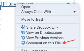
That’s as far as the Dropbox commenting system’s Finder integration goes: when you select that menu item, your default browser opens to the file within the Dropbox Web interface, and the rest of your commenting activities take place in the Comments sidebar there.
Also note that the Finder contextual menu item, and Dropbox’s commenting system itself, applies only to files, not to any folders that might house project files (and about which you might want to open a general conversation), nor to documents that are Mac packages, such as Pages or Numbers documents, and thus appear in the Dropbox Web interface as folders.

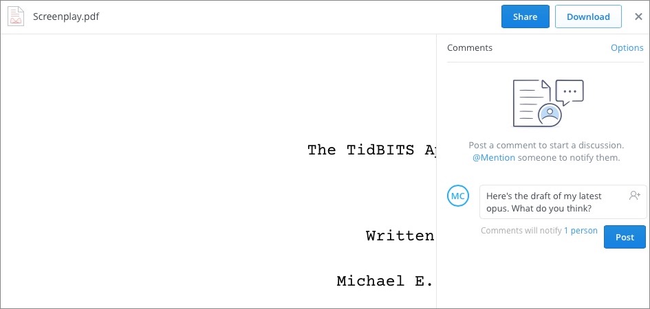
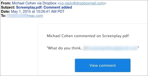
After you compose a comment, you click Post, and Dropbox sends your comment via email to everyone with whom the file is shared. The message includes both the comment and a link that opens the Dropbox Web interface so the recipient can respond.
If you already have the Dropbox Web interface open, you receive live notifications when comments are added, available from the Notifications icon above any folder list in Dropbox. A badge appears when you receive a notification.

Your discussions are not limited to those users with whom a file is shared; if you include an email address prefaced by @ (for example, “@[email protected]”), which Dropbox calls an “@mention,” a message is sent to that address as well. @mentions effectively share the file as a read-only document with the recipient of the email, who can then comment on and download it.
If you don’t want a shared file to be open for comments, you can disable comments on a file-by-file basis, using the Options menu in each file’s Comments sidebar.

After playing around with Dropbox’s commenting feature for a while, I have to say that while it may be valuable for some, I don’t think it’s a good fit for us at TidBITS and Take Control, due to its file-specific nature and lack of notification control.
Consider Take Control: each Take Control author has a shared Dropbox folder to which many other Take Control authors, as well as editors, have access. Comments on a book manuscript in the Dropbox Web interface would send an email message to everyone with access to the file, even though most of those people would not be involved with that particular project. Without a way to direct notifications to just a subset of those who share the file, the commenting system is useless for conversations about a book project. Furthermore, Dropbox comments might be useful to send a group email to everyone sharing a folder of commonly used assets (such as our Nisus Writer Pro macros), but, alas, comments can be attached only to specific files, not
folders.
In the case of TidBITS, our articles are not stored in Dropbox but in a Subversion repository, so Dropbox comments would be of no use for those. And, while we do share some more general materials via Dropbox, we would again be more likely to comment on a folder containing shared assets for a specific project than on individual files in that folder.
So, for us anyway, Dropbox’s new commenting feature is interesting, but not particularly useful. In fact, without a way to direct comments at just a subset of users, or to apply comments to shared folders, I’m hard-pressed to think of specific use cases where Dropbox comments would be better than alternative methods of having a conversation about a document.
That said, if you can think of good scenario for Dropbox comments, use our commenting system to let us know.
The Why Behind Google Fi
Both Apple and Google have been rumored for years to be planning to build or buy their own cellular networks. This would seem to put both companies at odds with their biggest purchasers of phones: the cellular carriers. Most phones in America are sold through subsidized or installment plans. Why rock that boat?
Google’s just-announced Project Fi seems to straddle a few different concepts, and it’s clearly an experiment. Like Google Fiber, it’s a way for Google to test something at relatively low cost, while also writing the business plans for other companies who might follow on Google’s heels. In the meantime, Google gets to collect data and shake some trees.
What is Project Fi and how might it affect your connectivity choices? Let’s start with the basics.
Fi Facts — At its heart, Project Fi is a cellular and Wi-Fi connectivity plan for mobile phones, albeit currently only for the Motorola Nexus 6 and only if you’re invited. It isn’t likely to affect iPhone users directly, but is another force exerting downward pricing pressure on cellular carriers.
The service will require a $30-per-month subscription with no commitment beyond the current month. A base $20-per-month fee includes unlimited worldwide texting and unlimited voice calls in the United States. Data is charged at $10 per 1 GB of cellular data in America and 120 other countries, and this includes Wi-Fi tethering. This is postpaid service, in which you’re billed for the current month in advance and any additional data usage in the next cycle. Google requires you sign up for at least a 1 GB usage plan, and suggests that you budget for expected usage ahead of time. However, it will refund on a prorated basis the cost of any unused data each month into the next bill. (All prices are before typical taxes charged by all
carriers.)
Data runs over 4G LTE in the United States. Carriers typically promise rates in the 5 to 12 Mbps downstream range with peaks as high as 40 Mbps; upstream, data typically flows at several Mbps and can peak at close to 20 Mbps. In other countries supported by the plan, throughput is throttled to 256 Kbps over 3G.
Voice calling costs are divided by Wi-Fi and cellular and whether the call takes place within the United States or elsewhere, a category that is further divided into a set of some 120 countries and the rest of the world. Here’s how it breaks down:
- All calls placed via Wi-Fi anywhere in the world to a U.S. number are included in the $20-per-month plan.
- All calls placed in the U.S. over a cellular network to a U.S. number are included.
-
All calls received while on Wi-Fi anywhere in the world are included.
-
All other calls incur a fee.
Using Wi-Fi anywhere in the world, including within America, to call a non-U.S. number is charged at Google Voice rates, which can be very low, such as 3¢ per minute to a mobile phone in France. In one of the 120 countries supported by roaming, inbound and outbound cellular calling to anywhere, including in the country you’re in, costs 20¢ per minute.
Google won’t allow devices with a Project Fi SIM to get on a cellular network in countries outside of those it supports for roaming, so as to avoid accidental charges. However, the Nexus 6 will work with other SIMs, including a SIM for a carrier in one of those countries. Plus, you can use Wi-Fi for calling, data, and texting in those countries, and be charged at Google Voice rates for outbound calls.
Project Fi manages all this in two parts. First, it’s an MVNO: a mobile virtual network operator. MVNOs buy access at wholesale prices from existing carriers, hence the virtual part. On the whole, MVNOs rose and fell years ago, because as carriers offered sweeter and less restrictive plans with fancier subsidized phones, the wholesalers couldn’t keep up. Many MVNOs disappeared or were purchased by carriers, such as Virgin Mobile, which Sprint acquired. About 10 percent of American cell phones subscriptions are via MVNO, but many of those are through subsidiaries of carriers based in the United States and elsewhere.
But Google’s trick is leverage, as the company is pairing cellular access with nearly ubiquitous free Wi-Fi. Google has partnered with both T-Mobile and Sprint on the cellular side, allowing 4G LTE access in America, leaning on the fact that those two networks have built out slightly different footprints. And Google has arranged access to what’s described as a million American Wi-Fi hotspots.
Google will offload calling and data to a Wi-Fi network whenever possible, and its FAQ describes these as open and free networks. As with other carriers that offer Wi-Fi calling, subscribers will also be able to call over private Wi-Fi networks to which they have access. (All data is sent via an automatically configured VPN, or virtual private network, which encrypts data between a device and a destination server elsewhere.)
Other carriers, like Republic Wireless, have inexpensive Wi-Fi-only plans or hybrid plans that lean heavily on Wi-Fi. And Cablevision recently launched a cheap Wi-Fi-only phone plan under the name Freewheel. We’ll see more of these over time.
At launch, Project Fi works only with the Nexus 6 from Motorola, which costs $649 (32 GB) or $699 (64 GB). The fee can be paid upfront or over two years of monthly payments without interest or fees; a credit check is required only for the payment plan. The same number associated with the phone can be used through Google Voice on other devices, too.
An invitation is currently required as well.
Why Fi? — Google’s service is competitively priced mostly for individual users who consume relatively small amounts of cellular data or with a high level of variation, and who routinely travel outside America.
T-Mobile’s Simple Choice Plan is the template on which the Project Fi service was built — including the same 120 countries for certain international features and low-speed but unlimited data outside America.
However, T-Mobile’s Simple Choice Plan starts at $50 for an individual line that includes 1 GB of data, and unlimited use at throttled speeds after 1 GB. For 3 GB and higher plans, T-Mobile rolls over unused data each month, expiring it after 12 months. Oddly, T-Mobile also has a somewhat hidden $30-per-month plan that includes 5 GB of data before throttling, unlimited texting, and 100 minutes of talk time, but it’s available only online or via Walmart (click Simple Choice). (Hat tip to Ars Technica on that one.)
For unlimited talk, text, and 5 GB of monthly usage, however, T-Mobile’s $70 plan matches Google’s ($20 plus 5 GB for $50), with the rollover and unlimited permanent calling being the primary difference. T-Mobile discounts additional lines significantly, and three lines with 5 GB each per month under the above plan is $150 per month ($70 + $50 + $30). Project Fi would be $210 for the same scenario, assuming nearly 5 GB consumed.
When you move into shared data plans, it gets murkier. The Ars article linked just above compares a lot of varying offers from different carriers, including prepaid and postpaid plans.
AT&T doesn’t have the competitive international roaming options, though it includes international texting in its shared plans. With three lines pooling 10 GB of data with smartphones that have already been paid in full, the monthly rate is $145 plus $15 for additional gigabytes above 10 GB.
The Downward Pressure — After T-Mobile announced its data rollover plan in December 2014, AT&T coincidentally offered a more limited version within a month. AT&T rolls over only a single month’s unused data, though for most people, that’s probably good enough. (Verizon’s apparent response to all this is, nyah, nyah, we don’t roll over for anything.)
Google’s Project Fi continues the pressure that T-Mobile started exerting, and that has been transforming the American cellular market for the better. Subsidies are now being broken out more clearly, so, for instance, we don’t pay a monthly fee forever for a phone that we really paid all the cost of months ago.
More importantly, shared data plans, data rollover, and refunds of unused data mean that customers with different needs will start migrating to carriers that have cheaper plans. The downward pressure is already happening, as many of us have seen on our bills. Project Fi may never have millions of customers, but it’s another step towards breaking the logjam of artificial scarcity that has kept cellular costs ludicrously high.
The 12-inch MacBook: A Different Mac for a Particular User
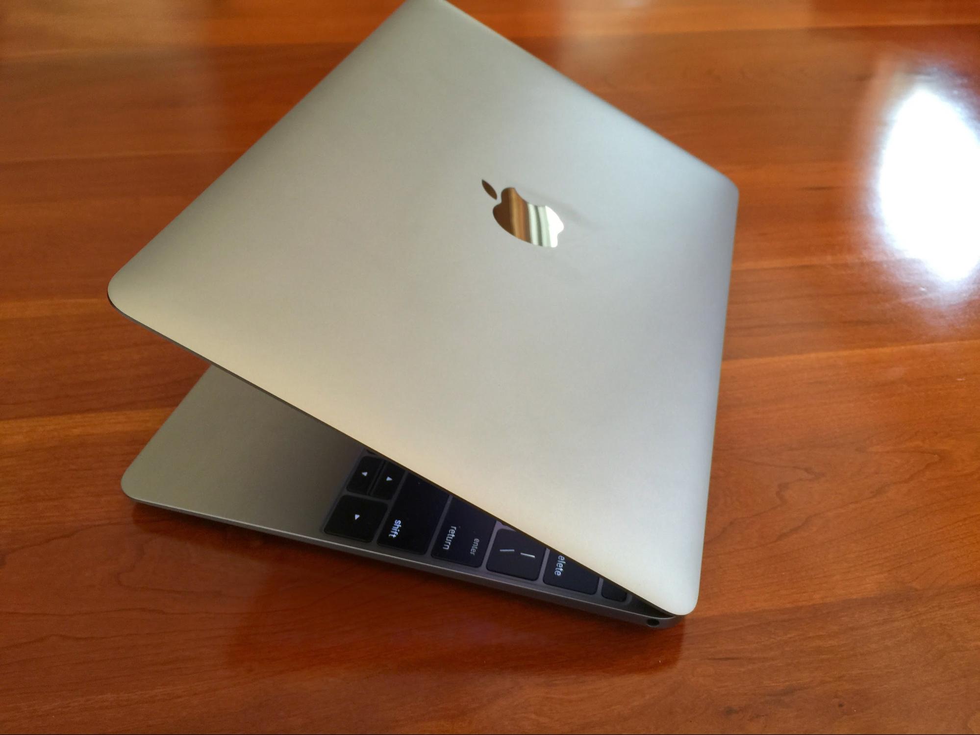
When I consider Apple’s new 12-inch MacBook, I can’t help but think of my retired parents. My dad is a fan of his iPad mini, while my mom is glued to her 13-inch MacBook Pro with Retina display. But if they had to do it over again, I’m convinced they would get his-and-hers MacBooks (see “New 12-inch MacBook Joins Updated MacBook Air and MacBook Pro,” 9 March 2015). (For the rest of this article, when I say “MacBook,” I mean the recently released 12-inch MacBook, not any of the previous models that share the same name.)
With the new MacBook, Apple is improving on its consumer notebook experience with features like a Retina display and Force Touch trackpad, while also radically simplifying the overall package (for more on the trackpad, see “Force Touch Trackpad Makes MacBooks More Compelling,” 20 March 2015).
Replacing most familiar ports with a single USB-C port has stirred controversy among Mac geeks, but my parents wouldn’t care, or even notice. They’d use the USB-C port to charge the machine, and wouldn’t have much interest in the port’s other purposes, such as data transfer or driving an external display.
The MacBook is underpowered compared to MacBook Pro models and even the MacBook Air. Those who have benchmarked the MacBook say it’s about on par with a 2011-era MacBook Air. But, again, my parents wouldn’t care. My mother’s 2014-vintage MacBook Pro packs more power than a MacBook, but she rarely needs it, given her relatively modest computer uses. A MacBook would suit her just fine.
For Dad, a MacBook would be an iPad-alternative fitted with a better keyboard.
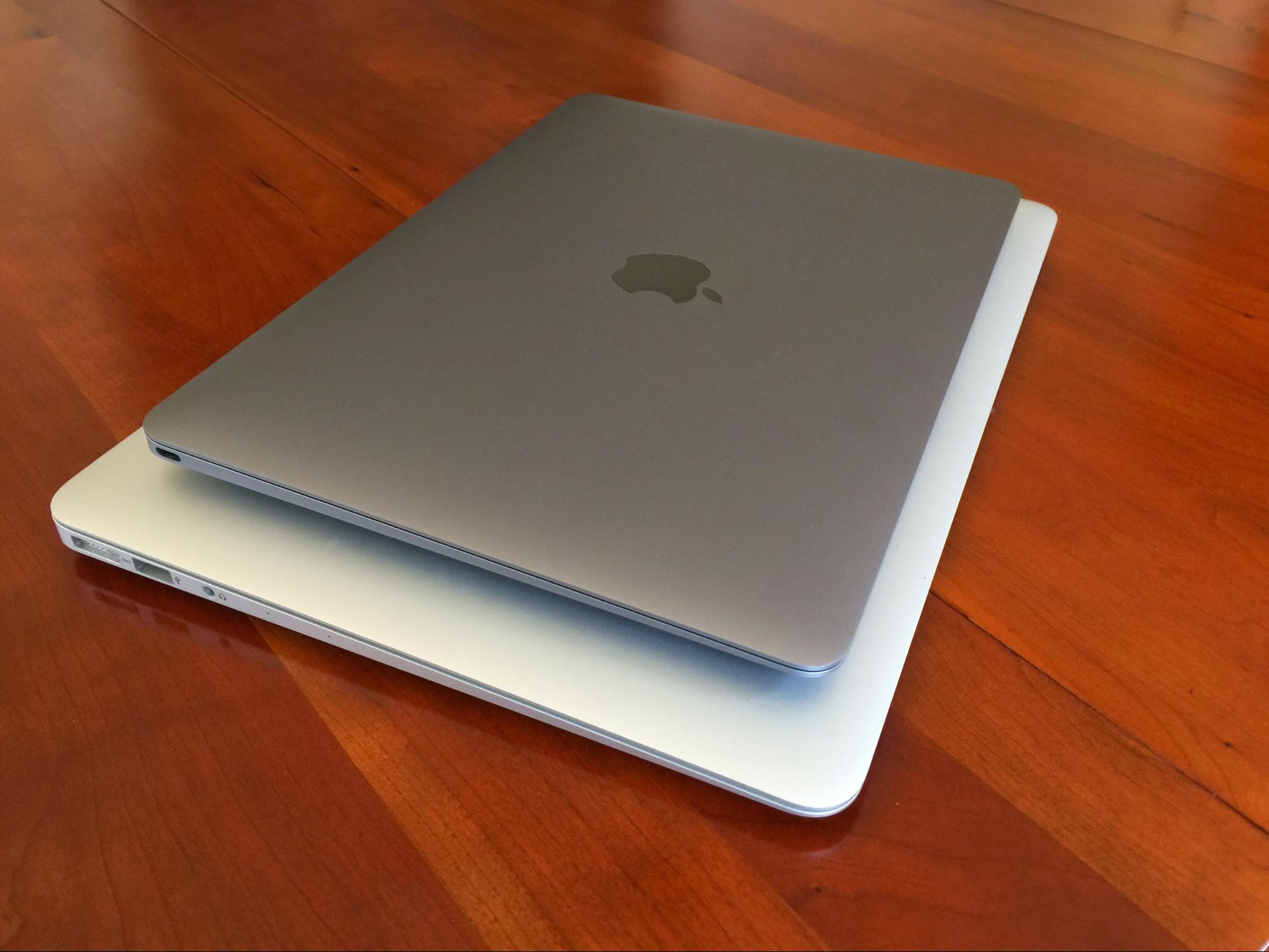
For Mom, the MacBook would be the simple notebook she wants for use at home and on vacations. It would also have a Retina display like her MacBook Pro, but in a more portable package. The MacBook delivers on that score at just over 11 inches, 2 pounds, and a maximum thickness of a half inch.
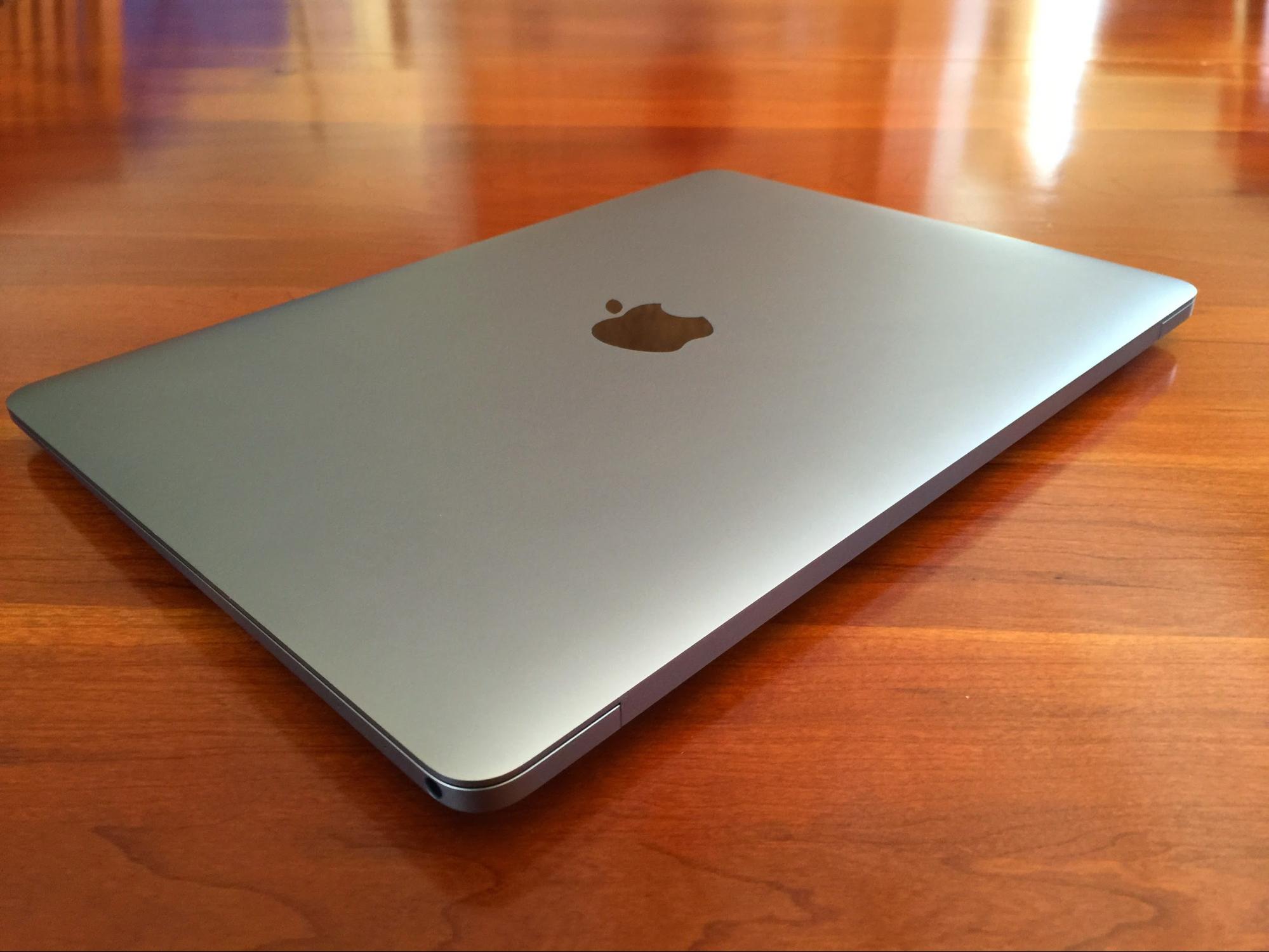
That’s crazy small even by MacBook Air standards, and perfect for Mom.
Cost? My mother paid $1,279 for her MacBook Pro with Retina display (a refurb purchase made last month), which puts her squarely in MacBook territory. The new notebook starts at $1,299. That’s steep for my father given that his iPad mini cost much less, but I’d wager he’d go for it given a laptop’s better functionality.
I’d bet my parents would also swoon over the MacBook’s good looks. Mom would get her MacBook in gold, I am all but certain. Dad? He’d definitely go space gray.
My point in bringing up my parents: the MacBook is a different kind of Apple notebook for a particular kind of owner who values minimalism and simplicity above all else.
If you’ve been gnashing your teeth at the MacBook’s relatively modest performance, and panicking about that USB-C port while scouring the Web for various kinds of USB-C cables and adapters to figure out how to integrate a MacBook into your Apple existence, you’re not that sort of user. Get a MacBook Pro, for Pete’s sake.
But the 12-inch MacBook looks to be a nice fit for other kinds of users. Here are profiles of a few such hypothetical MacBook buyers — see if you resemble one of these people.
The Cloud Navigator — I’m surprised at the degree to which I have forsaken native Mac apps for Web or “cloud” equivalents — notably Google services. I’m in a browser or browser-based app (like TweetDeck or MailPlane) almost all the time.
While you can fire up a browser on any Mac for hardcore Web-app use, doing so seems especially appropriate on this MacBook. The machine may not be able to keep pace with other portable Macs but it has more than enough power for mainstream computing tasks, with Web browsing being among the most common of those.
The MacBook may be, in some ways, Apple’s answer to the Chromebook (see “Google’s Chromebook Makes for a Fine Auxiliary Laptop,” 24 February 2014), the increasingly popular kind of notebook running Google’s Web-centric Chrome OS and intended for use almost exclusively with Web apps.
Chromebooks, like the MacBook, are being positioned as simple laptops for users who don’t need much power and don’t want any complications.
Most Chromebooks are much cheaper than the MacBook, but that tends to make them chintzier. Apple would argue that buying a MacBook is money well spent for top-flight hardware along with the option to run native apps alongside Web apps.
The only Chromebook roughly similar to the MacBook is Google’s Chromebook Pixel, with a just-as-nice screen and greater power under the hood at a lower cost than the MacBook, starting at $999. The Pixel is heavier and bulkier, but has two USB-C ports along with two standard USB ports.
The Entertainment Addict — The MacBook’s glorious 2304-by-1440-pixel screen makes it a terrific computer for watching streaming video, viewing and editing photographs, reading books, and other kinds of relatively passive entertainment.
What’s more, its petite size makes it less of a burden for such pleasurable pursuits than, say, a MacBook Pro. And while you can’t hold the MacBook in one hand while reading, the way you would with an iPad, it sits better in your lap or on a table.
The iPad has long been positioned as the perfect device for entertainment and information consumption. It still is, but I would argue that the MacBook is a tempting alternative — more so than, say, an 11-inch MacBook Air with a lower screen resolution and screen proportions that suddenly seem awfully cramped to me.
The Tablet-for-Work Recanter — The iPad, though primarily a device for information consumption, is also positioned as a tool for getting real work done. I’ve long pounded that drum, noting that the keyboard cases from a wide range of manufacturers turn iPads into pretty nifty mini-laptops (see “iPad Versus MacBook for the Mobile Writer,” 17 February 2014).
With the MacBook’s arrival, though, that argument may be wearing thin. The MacBook is only slightly longer and wider, and considerably thinner, than an iPad Air 2 in my favorite keyboard case, Belkin’s QODE Ultimate Pro Keyboard Case for iPad Air 2.
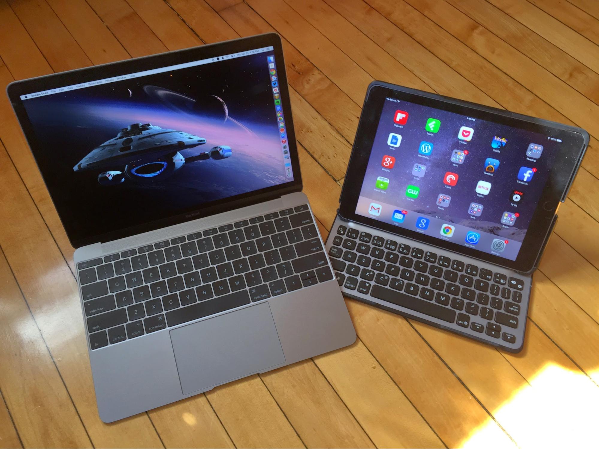
The MacBook has a larger, more comfortable keyboard than the cramped ones built into iPad cases. And the keyboard is fully integrated, not wirelessly linked via sometimes-unreliable Bluetooth. The display is bigger. The apps and operating system are more capable on the Mac than the iPad.
In short, an iPad Air 2 with a keyboard case now feels like a wannabe MacBook.
The Hardcore Keyboarder — Some will buy a MacBook for casual pursuits that do not involve heavy keyboard use. I am looking at you, Mom and Dad.
But others, like myself, put a lot of miles on our keyboards. That brings me to what may be the MacBook’s most controversial feature: its revamped keyboard, which feels markedly different from those on older Apple notebooks. The keys have a larger surface area but less vertical “throw,” due partly to the laptop’s thinness. They have a harder, harsher feel.
This bugged me at first and, as I write this, I have not completely adapted, but I am getting there. I’m seeing decent accuracy after an initial period of clumsiness. Interestingly, I’m most at home on the keyboard when taking notes during interviews, which involves super-fast typing in a hyper-concentrated state. In other words, when I forget about the hardware and just let my fingers fly, the keyboard performs splendidly.
I’m also starting to like the keyboard’s extra-firm clicking due to a redesigned key switch mechanism (“butterfly” instead of “scissor”).
Little is more personal than someone’s preferred keyboard, and the MacBook keyboard could be a deal breaker for some. I think I’m fine with it, though. And since the MacBook is a near ideal device for writers of all kinds, I suggest having an open mind about its keyboard. But I also strongly encourage you to try one in person before buying.
Modest Multimedia — I was surprised to see Apple’s advanced Final Cut Pro X installed on demo MacBooks in Apple retail stores. I shouldn’t have been. Though the underpowered MacBook is not a video editor’s dream, it does run Final Cut reasonably well.
I tossed a couple of my modest work-related video projects at it and felt little frustration. I got my projects done with minimal delay, and I have more Final Cut work queued up for the week remaining in my MacBook press-loan term.
I do chafe a bit at certain limitations. The MacBook does not have much on-board storage for media files, and my standard strategy of hooking up external solid-state storage via a Thunderbolt port doesn’t work here.
So, if video editing is your bread and butter, the MacBook shouldn’t be your primary Mac. But those with lighter video-editing needs (via iMovie or something fancier) shouldn’t have major issues apart from using USB-based external storage via an Apple adapter.
MacBook Gear — Speaking of which, some who buy MacBooks may want to spend a bit extra on accessories to make their use of the laptop a bit more practical and pleasurable. None of the following are must-haves for all MacBook users, but you will know if you need one or more of these.
Apple’s own audiovisual adapters, including the USB-C Digital AV Multiport Adapter and the USB-C VGA Multiport Adapter, are necessary if you want to use an external monitor or projector via HDMI or VGA. While you’re doing that, you can power the MacBook via a USB-C port in either adapter, and use the standard USB port also built into both for whatever you wish.
My test monitor has a DVI port, but I was able to get the MacBook working with it by adding a DVI-to-HDMI adapter to the mix.
Apple also offers a USB-C to USB Adapter for plugging in a wireless-mouse transmitter, external drive, or the like, but you can’t charge the MacBook while using the adapter.
If you need a standard USB port for charging some other device, Twelve South’s PlugBug attaches to an Apple laptop charger (including the new one for the MacBook) and supplies a USB port, as well as its own prongs for plugging into the wall.
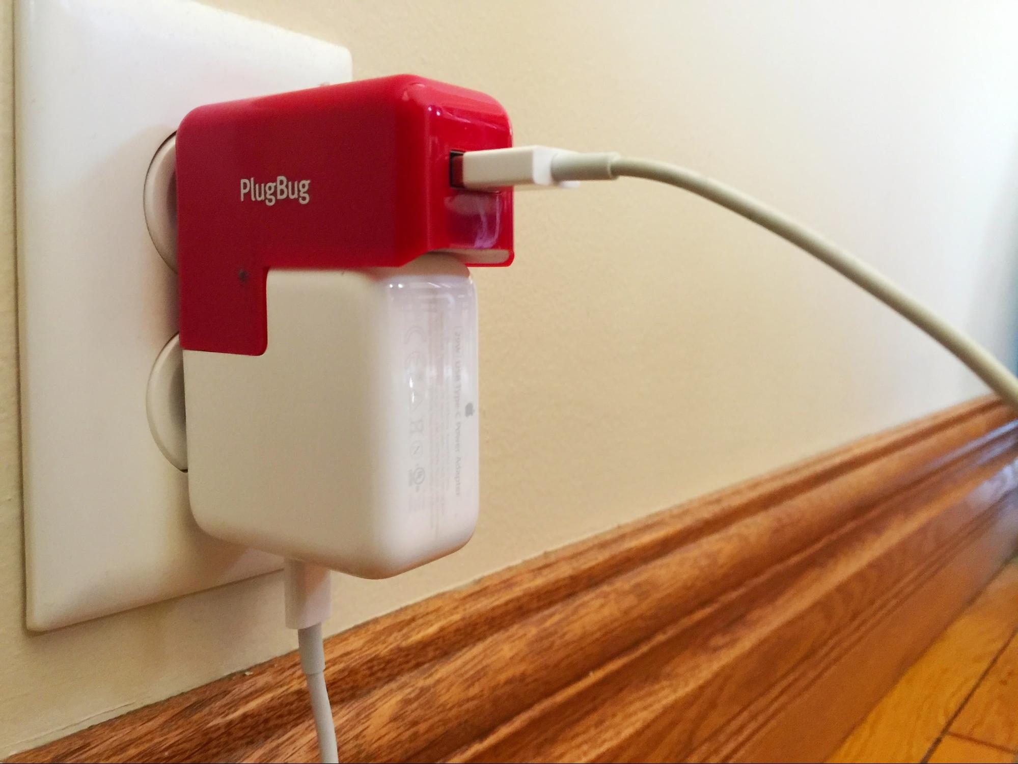
Alas, it’s only for charging; there’s no data-transfer link to the MacBook. Note, also, that the PlugBug is not an exact fit for the new USB-C charger, but it works just fine. A MacBook-customized version is surely coming.
Twelve South has two PlugBug models, including a $35 U.S. model and a $50 World version with an assortment of international plugs.
A spare charger can come in handy, and you don’t have to use Apple’s $49 charger because USB-C is an open standard, unlike Apple’s MagSafe. For instance, you can use the Chromebook Pixel’s $60 charger if the Apple one is out of stock, and there will be cheaper ones.
Apple, in a support document, says third-party USB-C power adapters will charge the MacBook “if they adhere to the USB Power Delivery specification.”
As an experiment, I attached an iPad charger to the PlugBug and tried to charge the MacBook that way. While this arrangement charges an iPad just fine, it doesn’t seem to supply enough power to charge the MacBook.
Finally, a bag, case or sleeve may be a good idea because I suspect that shiny, non-glowing Apple logo on the lid will scratch easily. I have always been partial to gear from WaterField Designs, and the company has a line of products designed for the MacBook.
Wrap-Up — The MacBook is a beautiful machine that I would never buy, partly because its USB-C port is too restrictive, and also because I can get far better performance for the money with other portable Macs.
These are hardly concerns for the people Apple wants to woo with its new laptop. They include folks like my parents who want a notebook that looks lovely, isn’t overly complicated, and is thin and light enough to take everywhere. It’s also great for Web-app users, video and ebook addicts, tablet-for-work recanters, hardcore keyboarders, and casual video editors.
The MacBook may feel exotic now, but its newfangled technology is undoubtedly headed for other Apple laptop models in the coming months and years. And, like the original MacBook Air, the MacBook will someday be seen as a bold trendsetter. For now, it’s a gorgeous and capable Mac with some practical limitations that restrict it to a specific audience.
Driving with the Apple Watch
The smartphone revolutionized driving. Thanks to apps like Google Maps and Apple Maps, getting lost is mostly a thing of the past. Apps like Waze can inform you of traffic jams and speed traps before you see them. And smartphone-enabled devices like those offered by Automatic Labs (a TidBITS sponsor; see “Automatic Labs Sponsoring TidBITS,” 27 April 2015) can make your driving safer and more efficient.
But those huge advantages come at a cost: an epidemic of distracted driving, which killed 3,154 people in 2013 alone. A University of Utah study (PDF) found that distracted driving is just as dangerous as drunk driving. This epidemic has led to a number of distracted driving laws throughout the United States, as well as regular public service announcements.
As someone who used to drive about 100 miles per day, I’ve experienced the effects of distracted driving first hand. In 2011, I was stopped at an exit ramp, waiting for traffic to clear, when a large pickup truck slammed into me at high speed, totaling my Jeep Grand Cherokee. Just two weeks later, after purchasing a new car, I was rear-ended again while sitting at a stoplight. I suspect that distracted driving was involved in both incidents, but such things are hard to prove.
What I know for certain is that I became incredibly paranoid after that. I was filled with terror at every stoplight, checking my rear-view mirror to see what drivers behind me were doing. Most of the time, unfortunately, they were checking their phones.
So when the Apple Watch was announced, one of my first questions was: how will this affect driving? Will it make things better or worse? After receiving my watch, I took a short road trip to find out.
Navigation — One of the Apple Watch’s built-in apps is Maps. It isn’t terribly easy to use, so I highly recommend watching Apple’s guided tour of Maps before proceeding.
I did not do that, being the intrepid tester that I am. Instead, I pulled up Siri and asked for directions to my destination, a route I know by heart (I may be intrepid, but I’m not stupid enough to drive somewhere unfamiliar with a device I’ve never used, especially when I had to stop periodically to take screenshots). I could have started on the iPhone too — if you begin navigating in Apple’s Maps app on your iPhone, turn-by-turn instructions will automatically be transmitted to your Apple Watch.
Things started well. It was nice being able to glance at my Apple Watch, on my left wrist at the 10-o’clock position on the steering wheel, to see the next turn. And the taps to indicate an upcoming turn, called Turn Alerts, were novel.
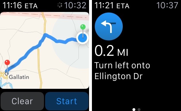
But first impressions quickly faded into harsh realities. The taps are supposed to indicate turn direction: a steady series of 12 taps means a right turn, while three pairs of two taps mean a left turn. In practice, I couldn’t tell the difference. While I’m driving, I need to focus on the road, not on what my Apple Watch is trying to tell me in a variant of Morse code. I certainly wouldn’t rely on turn alerts to guide me through the many lane changes that an interstate route through Nashville requires.
I asked the TidBITS crew for their impressions, and everyone who had tried it was in agreement that depending solely on the Apple Watch for turn directions is ill-advised. However, watch-based navigation may shine for walking directions, when taps and glances are a better option than staring at your iPhone.
Audio Control — Besides navigation, the main digital thing I like to do in my car is listen to music and podcasts. This too is a source of distraction, though one that’s not exclusive to the smartphone era, as even factory-standard radios can be a hazard.
Since my car’s stereo doesn’t have an auxiliary input, I rely on a Bluetooth-connected Motorola Roadster to broadcast audio from my iPhone to the FM radio. The Roadster offers limited controls for play, pause, and skipping to next track. But that’s not enough control for me, so I often find myself reaching for my iPhone in its windshield mount (a legal mounting spot in Tennessee). The audio controls on the iPhone’s lock screen make this less distracting than it could be, but it still pulls my attention away from the road.
This is an aspect of driving where the Apple Watch shines. Enable Apple’s Now Playing glance via the Apple Watch app, and pull it up before you start driving. Select some music to play on your iPhone, and then wake up the watch display by lifting your wrist, tapping the screen, or pressing the digital crown. Since your last-used glance or app appears on the screen (if you change the default to Apple Watch > General > Activate on Wrist Raise > Resume Previous Activity), as soon as the watch’s display comes on, you can play, pause, or skip a song from the watch. You can even control the volume with the digital crown. While it’s not as good as tactile, physical controls, it’s better than fumbling with the iPhone.
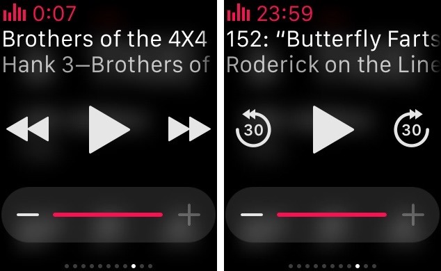
I also tried out Marco Arment’s Overcast app for the Apple Watch (for background, see (“Overcast Refines the iPhone Podcast Experience,” 16 July 2014). But don’t get too attached to the watch-sized version of the podcast player, as Arment has already all but vowed to overhaul it. Most developers didn’t have access to an actual Apple Watch during initial development.
What’s cool is that you can control Overcast with the Now Playing glance, and the rewind and fast-forward buttons automatically turn into 30-second skip buttons. Overcast includes its own glance, but I don’t find it worth a spot among the glances.
While the audio controls on the Apple Watch are handy while driving, trying to use them with turn alerts is a recipe for doubly distracted driving.
Apple Watch Interface Awkwardness — The Apple Watch’s interface has its quirks, but none more confusing than switching between the watch face, apps, and glances, something that should be done as little as possible while driving.
For those unfamiliar with the Apple Watch interface, here’s a quick rundown of how things are laid out.
- The default screen is the watch face. Swiping down from the top reveals notifications. Swiping up from the bottom reveals glances, and double-pressing the digital crown switches to your last-used app.
- However, double-pressing the crown from anywhere other than the watch face only takes you back to the watch face, not to your last-used app.
-
Glances can only be accessed via the watch face.
-
You swipe right or left to switch between glances.
Even when sitting quietly on the couch, it can take some effort to figure out where in the Apple Watch interface you are and how to get to where you want to go, but while driving it can be dangerously distracting. The saving grace is the Resume Previous Activity setting that ensures that the last-used app or glance comes up on the watch when you wake it up.
Unfortunately, turn alerts confuse this further. When one pops up, if you want to return to your last-used glance, you have to press the digital crown to return to the watch face, and then swipe up. Even worse, if you were playing audio with an app instead of a glance, double-pressing the crown after a turn alert takes you to the Maps app. So instead, you have to press the crown to return to the watch face, press it again to bring up the Home screen, and then find the desired app amongst the sea of icons. That’s awkward at the best of times, but downright dangerous while driving.
Texting While Driving — Of activities that can lead to distracted driving, it’s safe to say that texting is both the most common and the most dangerous, so much so that it’s illegal in many states, including Tennessee. So I was looking forward to seeing if the Apple Watch would let me receive and reply to text messages without touching my iPhone and in a manner that felt safe. Even so, I stuck to back roads at low speeds.
The good news is that if you receive a text message on the Apple Watch, it’s easy to glance at it quickly and satisfy your curiosity without significant distraction. Even better would be an option to have the watch read the message to you out loud. Given the position of your hand on the steering wheel, this is definitely safer than looking off to the side where an iPhone might be mounted.
However, replying to a text message requires some fumbling. When the notification appears, you may have to scroll down to read the entire thing, and scrolling down is almost always necessary to reveal the Reply button. Tap that, and you get a screen that lets you pick a canned reply from a scrollable list, send an emoji, or dictate a message. That’s a lot of controls to pack into the screen, and tapping accurately requires more attention than should be taken from the road. With dictated messages, you also have to tap a Send button.
Sending a text message is even harder. You have to press the side button to bring up your friends, select a friend with the digital crown or by tapping, choose which sort of text you want to send, and then either tap a canned message, send an emoji, or dictate a message, tapping a Send button at the end.
I did manage to send my wife a smiley face, and reply to her by voice dictation. They worked well, but took way too much of my attention away from the road. Don’t do this.
Siri is a better option, if it works. When you receive an incoming message notification, you can press and hold the digital crown, say “Reply” and the words you want dictated, wait for Siri to figure it out, and then press and hold the crown again and say “Send.”
For sending a new message, you can activate Siri either by waking the watch and saying, “Hey Siri,” or by pressing and holding the digital crown. Then you can say something like “Text Joe Schmoe I’m running 15 minutes late.” If Siri works correctly, the watch will present you with the message for verification and you can press and hold the digital crown again, and say “Send.” It would be nice to have an option for immediate sending, but that might result in sending embarrassing dictation errors.
Whether or not you use Siri, I recommend not sending messages while driving with the Apple Watch if at all possible.
Note that if you happen to have your iPhone awake, say, to show the map of where you’re going, it won’t send notifications to your Apple Watch, assuming that you want them on the iPhone instead. In terms of driver safety, this may be a welcome, if unexpected, side effect.
Pit Stop — No road trip would be complete without stopping for food, and nothing epitomizes America’s fossil fuel-powered food system like McDonald’s (as best explained by Michael Pollan in “The Omnivore’s Dilemma”). It also helps that McDonald’s accepts Apple Pay.
I wasn’t bold enough to attempt Apple Pay at the drive-through window, so I ordered inside. Apple Pay on the Apple Watch works fine, though it’s not quite as automatic as Apple Pay on the iPhone. With the iPhone, I hold it near the NFC reader, place my thumb over the Touch ID sensor, and iOS just figures it out. With the watch, I had to double-press the side button, then awkwardly position my wrist near the reader.
While my Apple Watch hasn’t drawn much attention so far, using it to pay for my hamburger was certainly noticed. The lady behind the counter exclaimed, “Is that the new Apple Watch? I haven’t seen anybody do that!” While waiting for my food, I saw her discreetly nudge a coworker and turn her wrist down, emulating my Apple Watch payment maneuver.
It was amusing, but I suddenly felt self-conscious. I wondered what wearing an Apple Watch this early, before it becomes commonplace, says about me? Do I come off as a rich snob, even though I ordered from the dollar menu? Does anyone mistakenly think that I’m wearing a $17,000 watch? And then I started wondering what would happen if I were pulled over by a cop? Would he be less sympathetic because I have an expensive toy on my wrist? Would he assume that my driving was impaired by the watch? How would I explain myself?
These questions are mere navel gazing for now, but it will be interesting to see how society responds to and changes in reaction to the Apple Watch. Jeff Porten has explored this area in both “Pondering the Social Future of Wearable Computing” (29 May 2013) and “After September, Still Apple Watching and Waiting” (25 September 2014).
Recommendations — In an ideal world, you would turn Do Not Disturb on and stow both your iPhone and your Apple Watch in the glove compartment before starting the car. Even in the best of situations, they’re distractions.
But I doubt anyone will do that. And if used sensibly, I believe these devices can improve safety. I feel much safer navigating the confusing interstates around Nashville when I have my iPhone guiding me through lane changes.
Here’s my recommended setup. For directions, it’s hard to beat an iPhone mounted in your car. There are numerous mounts to choose from, though The Wirecutter’s recommendations are probably safe choices. Check your local laws to see what’s allowed, but I find that with my iPhone mounted in the top-center of my windshield (which is legal in Tennessee, but likely not your state), directions are easy to glance at while keeping my eyes on the road. Plus, there’s the added benefit of not receiving distracting notifications on my watch.
Furthermore, I would disable Turn Alerts in the Apple Watch app under Notifications > Maps. They’re distracting, potentially confusing, and interfere with other functionality.
If you wish to control music with the Apple Watch, add Now Playing to your Glances in the Apple Watch app. That way you can bring the glance up quickly without having to wade through the icon sea. If you have other glances that you may wish to use while driving, such as Overcast, position them next to Now Playing to reduce swiping. Also, be sure to enable Last Used App on the watch under Settings > General > Activate on Wrist Raise.
In the end, while I believe that the Apple Watch has some features that could reduce distracted driving, I’m inclined to think that it will make things worse. Conscientious drivers will take steps to minimize their distractions, but most people aren’t that thoughtful. Having a device right there on your wrist is a huge potential distraction that takes discipline to ignore, especially while it’s new and novel. Apple could smooth interactions with user interface refinements, but there’s only so much that can be done to encourage safe behavior.
So, hey, if you choose to drive with an Apple Watch, don’t let it distract you from the important aspects of driving. Especially if I’m in front of you.
FunBITS: App Camp Quiz Compendium for iPhone
There’s a never-ending stream of tweets, blog posts, and think pieces talking about the state of women in tech. But Jean MacDonald (formerly of TidBITS sponsor Smile), decided to do something about it. In the summer of 2013, she and some friends launched App Camp for Girls, a summer camp that teaches 8th and 9th grade girls how to be developers. This summer, the program will be bigger than ever, with camps in Vancouver, Seattle, and Portland (Oregon).
I’m way too old and bearded to be an app camper, but at last year’s Macworld/iWorld I was lucky enough to attend an App Camp for Girls open house, a two-hour version of the week-long camp (see “App Camp for Girls Rocks Macworld/iWorld,” 11 April 2014). While there, the organizers passed around iPod touches loaded with the quiz apps previous campers had made. The hand-drawn art in the apps was adorable, and I was sad that TidBITS readers couldn’t try them out for themselves.
Well, now you can. For just $0.99, you can buy the App Camp Quiz Compendium in the App Store (iOS 8.2+, 148 MB).
The App Camp Quiz Compendium is composed of 15 short personality quizzes created by teams at previous App Camps. You can find out what kind of penguin you are (I am apparently a sporty penguin), what super power you have, which social media app you are, or which Hogwarts house you belong to.
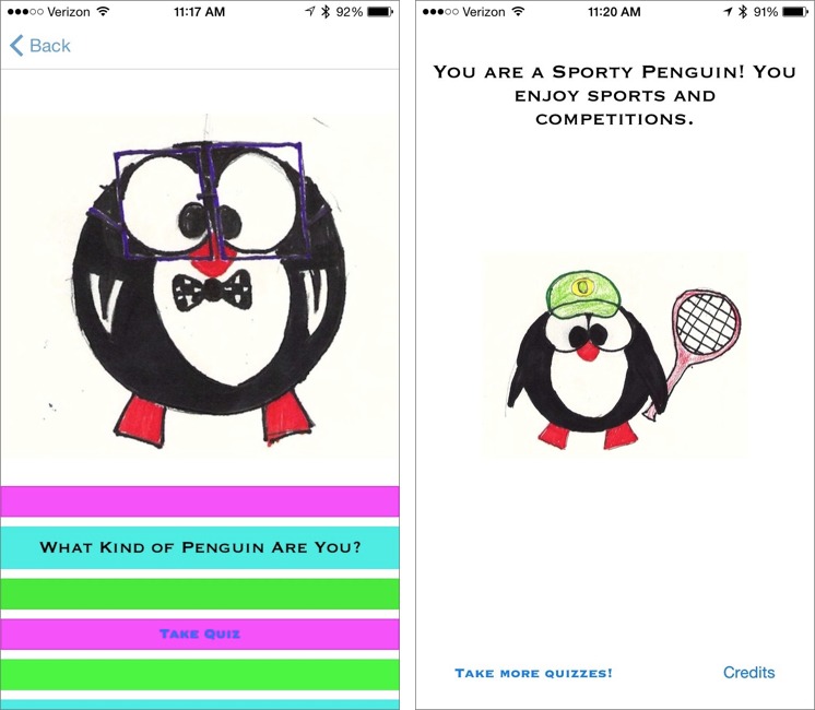
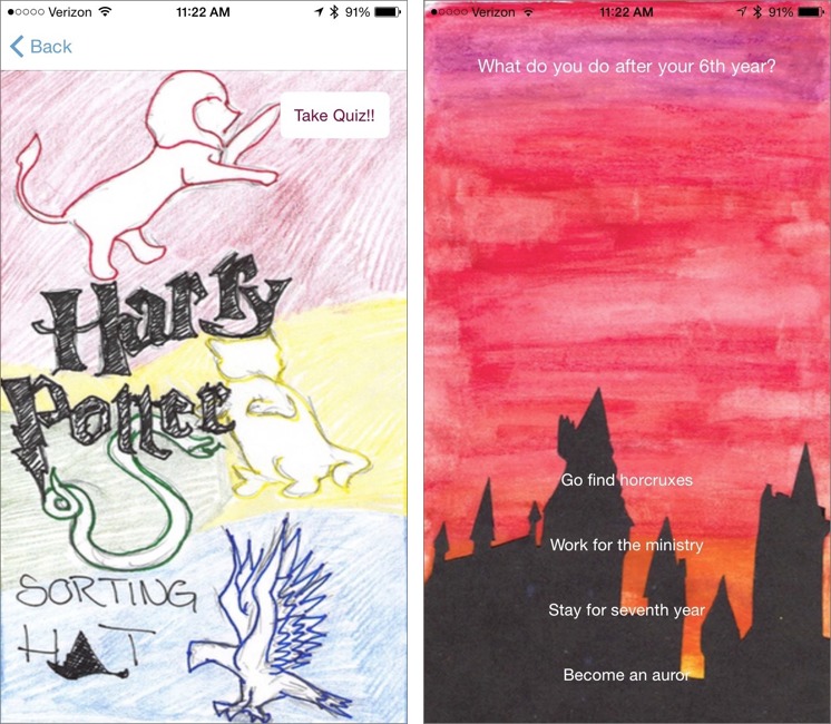
Unsurprisingly, there isn’t much to the quizzes themselves, but the artwork is charming. Hand-drawn art is rare in iOS, and it’s one of those things that either looks great or awful. Thankfully in the case of the App Camp Quiz Compendium, it’s the former.
The App Camp Quiz Compendium offers a few minutes of amusement for $0.99, but more importantly, its sales support a great educational endeavor. Over the course of a single week, App Camp for Girls provides a broad introduction to the process of app development, from brainstorming and designing ideas to building and pitching apps. I’ve seen what App Camp for Girls does first hand, and in my opinion, it could serve as a blueprint for how we educate children about technology and business more generally.
TidBITS Watchlist: Notable Software Updates for 4 May 2015
Carbon Copy Cloner 4.1 — Bombich Software has released Carbon Copy Cloner 4.1 (CCC) with a new task progress window added to the User Agent menu bar application, enabling you to see detailed progress for all tasks. The backup utility also adds a Simple Mode that displays only the source and destination selectors plus the Clone button, ensures all interface elements can be accessed via keyboard navigation and with VoiceOver, adds a contextual menu to the task list, enables you to disable tasks globally from the CCC menu bar icon, and improves the task configuration portion of the CCC window so it can be resized for easier file selection.
($39.99 new, 12.0 MB, release notes, 10.8+)
Read/post comments about Carbon Copy Cloner 4.1.
Quicken 2015 for Mac 2.5 — Intuit has released version 2.5 of Quicken 2015 for Mac with changes to investment reporting on the Calendar and improved Download/Financial Institution settings on the Account settings sheet. The Account settings sheet now has an option for showing the total percent day change (gain or loss) for the investing accounts included in a Calendar report. It also eliminates duplicate options, streamlines user flows, and simplifies the functionality of managing the connectivity status for either Direct Connect or Quicken Connect accounts, and enables you to set the date range of transactions to download for
Direct Connect accounts. Version 2.5 also addresses a number of bugs, fixing a hang when updating all accounts, resolving an issue where the sidebar would not remember the account expand/collapse state after restarting, fixing multiple issues related to QIF import from other personal finance applications, dealing with multiple display issues in the Calendar report, and fixing multiple Mobile Sync issues. Note that as of this writing, Quicken 2015 for Mac was still stuck at version 2.4.2 in the Mac App Store. ($74.99 new, free update, release notes,
10.7+)
Read/post comments about Quicken 2015 for Mac 2.5.
PDFpen and PDFpenPro 7.1.1 — Smile has released version 7.1 of PDFpen and PDFpenPro, a maintenance update focused on fixes. The PDF editing apps correct layout issues associated with the localized password prompt and save accessory panel, add free-form highlights to the annotations list, fix a bug where Find results wouldn’t permit selection of the result in Notes, resolve several encryption-related issues, remove duplicate entries in search results if there are highlights, prevent text boxes from extending right when in Wrap Text mode, and add language support for
PDF/A export. ($74.95/$124.95 new with a 20 percent discount for TidBITS members, free updates from version 7.0, 52.3/53 MB, release notes, 10.7+)
Read/post comments about PDFpen and PDFpenPro 7.1.1.
Default Folder X 4.7.1 — St. Clair Software has released Default Folder X 4.7.1, fixing a bug in OS X 10.10.3 Yosemite that caused Carbon applications (such as Microsoft Word and Excel) to always default to using the Documents folder. The Open and Save dialog enhancement utility now keeps better track of the Finder’s windows when the Finder is hidden automatically by other utility software (if this problem persists, Option-click on Default Folder X’s Settings button and turn on the ShowHiddenFinderWindows checkbox). The release also prevents a crash that could occur after encountering an alias file that
incorrectly refers to itself, ensures that folders within DEVONthink databases no longer appear in the Recent Folders menu, and enables resizing of the filename edit box in Save dialogs on 10.9 Mavericks (as well as Yosemite). ($34.95 new, $10 off for TidBITS members, free update, 11.0 MB, release notes, 10.6+)
Read/post comments about Default Folder X 4.7.1.
Pixelmator 3.3.2 — The Pixelmator Team has released version 3.3.2 of its eponymous image editing app with added support for the new Photos for Mac app (offering direct access to your Photos library), as well as for the Force Touch trackpad found on the new 12-inch MacBook and 13-inch MacBook Pro with Retina display (see “The 12-inch MacBook: A Different Mac for a Particular User,” 29 April 2015). With Force Touch support, Pixelmator will change the size of your brush according to how much pressure is detected by the force sensors. If this feature sounds familiar, it was predicted
(though not completely correctly) in our April Fools issue (see “TidBITS Watchlist for 1 April 2015,” 1 April 2015).
Pixelmator 3.3.2 also improves the speed of the Repair Tool (see this blog post to learn how Pixelmator improved the algorithm), enables you to repair images on a transparent layer placed in front (with the Sample All Layers option selected), ensures the New Layer from FaceTime feature works across all Macs, prevents the Layers palette from dimming after changing the image size, adds support for opening 16-bit Photoshop images exported from Aperture, and fixes an issue that slowed performance when working extensively with colors and styles of text and shape layers. ($29.99 new from the Mac App Store, free update, 42.9 MB, release notes, 10.9.5+)
Read/post comments about Pixelmator 3.3.2.
BBEdit 11.1 — Bare Bones Software has released BBEdit 11.1 with support for the version control system Git and the EditorConfig file format for maintaining a consistent coding style, along with a lengthy list of improvements and fixes. You can now access core Git features directly within BBEdit via the new Git menu, rather than switching to the command line or a dedicated Git client. The update also adds support for the EditorConfig settings file convention, which encompasses the majority of core universal and domain-specific properties plus
several properties that are specific to BBEdit (see this technical note for more details).
In addition, BBEdit 11.1 adds a Save All in Window dynamic command that’s enabled if any (or the only) document in the front window has unsaved changes; improves folding, keyword coloring, function navigation, and text completion in the new CSS/SCSS language module; removes the Subversion action bar item from disk browser and project windows; rearranges Editing preferences and adds the “Include system text replacements in completion list” setting; and updates the INI language module with improved navigation as well as folding. ($49.99, free update, 11.5 MB, release notes, 10.8.5+)
Read/post comments about BBEdit 11.1.
ExtraBITS for 4 May 2015
In ExtraBITS this week, Adam Engst discusses the Apple Watch on the Tech Night Owl Live, Apple confirms that tattoos can interfere with the Apple Watch’s heart rate sensors, and the company offers an unexpected recommendation for Apple Watch owners suffering from sticky digital crowns.
Cleaning a Sticky Digital Crown on the Apple Watch — Some users have reported that the Apple Watch’s digital crown has become “sticky.” If your digital crown isn’t operating smoothly, Apple recommends rinsing the Apple Watch under running water for 10 to 15 seconds, turning and pressing the digital crown to free it up. If you have a leather band, be sure to remove it first, and don’t use any cleaning products on the Apple Watch.
Apple Confirms that Tattoos Block Apple Watch Sensors — Apple has released a new support document about the heart rate sensors in the Apple Watch, confirming what many had suspected: that some tattoos can interfere with the watch’s light-based sensors. If this affects you, is a significant problem, and can’t be solved by moving the watch to your other wrist, Apple recommends connecting the Apple Watch to a Bluetooth-based chest strap monitor instead.
Adam Engst Runs Down the Apple Watch on the Tech Night Owl Live — You knew this was coming, didn’t you? With a week of experience under his wristband, Adam Engst joined Tech Night Owl host Gene Steinberg to talk about what works well and what doesn’t, with a focus on fitness. Put simply, Garmin and Fitbit don’t have much to worry about yet.