TidBITS#1293/12-Oct-2015
In this issue of TidBITS, we welcome Julio Ojeda-Zapata as our newest contributing editor, and he commemorates the occasion with a summary of Google’s latest hardware announcements, which are eerily similar to Apple’s. Moving on to a pair of musically themed articles, Josh Centers reviews the Beats Solo2 headphones and Adam Engst explains why he’s quitting Apple Music to return to Rdio. Notable software releases this week include Nisus Writer Pro 2.1.2, Lightroom CC 2015.2.1 and Lightroom 6.2.1, ChronoSync 4.6.4, Microsoft Office 2011 14.5.6, Tweetbot 2.1, Typinator 6.7, and iBooks Author 2.4.
Please Welcome Julio Ojeda-Zapata
You’ve undoubtedly noticed more and more TidBITS articles penned by Julio Ojeda-Zapata, and we’re pleased to announce that we’ve drawn him into our orbit as a contributing editor, joining Jeff Carlson, Joe Kissell, Michael Cohen, Rich Mogull, and Agen Schmitz. By day, Julio is a mild-mannered technology reporter for the St. Paul Pioneer Press newspaper and its TwinCities.com sibling site, where he writes the Your Tech Weblog.
But in his off hours of late, he’s been doing a heroic job of covering a wide variety of technology topics for TidBITS. In particular, I’ve been grateful for his coverage of non-Apple products, since although we direct most of our focus on Apple, I think it’s essential to remain aware of the broader industry, and of what competitors like Amazon, Google, and Microsoft are doing. Equally important for us is that Julio has been enthusiastic, amiable, and responsive — qualities that are all too rare in the Twitter age of typing
without thinking.
Born in Quito, Ecuador, and raised in San Juan, Puerto Rico, Julio is now in the wintry climes of Saint Paul, Minnesota, where he lives with his wife and son. We’ve had the pleasure of meeting Julio in person at one of the late, lamented Macworld Expos, and now we have one more reason to visit the Twin Cities of St. Paul and Minneapolis.
So the next time you see Julio’s byline under an article you find useful, let him know that you appreciate his efforts in a comment.
The Beats Solo2 Headphones Don’t Deserve Their Bad Rap
When Apple announced that it was dropping $3 billion to buy Beats (see “Apple Buys Beats for $3 Billion,” 28 May 2014), there was much consternation in Apple fandom. Much of the criticism was directed at the poor reputation of the Beats headphones. While Beats headphones have been an enormous commercial success, they’ve often been written off as overpriced and overly bassy fashion accessories.
But the Beats Solo2 are a bit different than prior Beats products. They’re the first pair of headphones released by Beats after the acquisition, technically making them an Apple product. And with the Solo2, Beats promised a “more dynamic, wider range of sound, with a clarity that will bring you closer to what the artist intended, whether you’re into hip-hop, heavy metal, jazz, electronic, or country.” Sorry, classical music fans, you’re apparently not the target
market.
The Solo2 lists for $199.95, but Amazon has them for as little as $140 for a gray model. There’s also a Bluetooth wireless model available for $100 more, although it reportedly has completely different electronics, and should be evaluated independently.
I’ve spent a few weeks with the wired Beats Solo2 now, and I’m ready to share my impressions. I’ll review them in three categories: design, comfort, and sound quality.
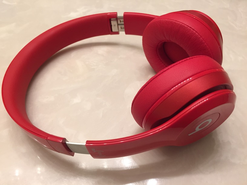
Design — Say what you will about the merits of Beats headphones, but you can’t deny that they’re noticeable. For those who wear headphones for hours per day in public, looks are important, and while it’s impossible for us to say whether you will personally find these headphones attractive, they’re sleek and smoothly designed. They come in over 10 colors; you can probably find one that appeals to you.
The Beats Solo2 are supra-aural headphones, which means that their pads rest against your ears, instead of around them, like circumaural headphones. They’re also closed, which means that they help block ambient noise and don’t leak as much sound as open headphones, which are more like wearing speakers on your skull.
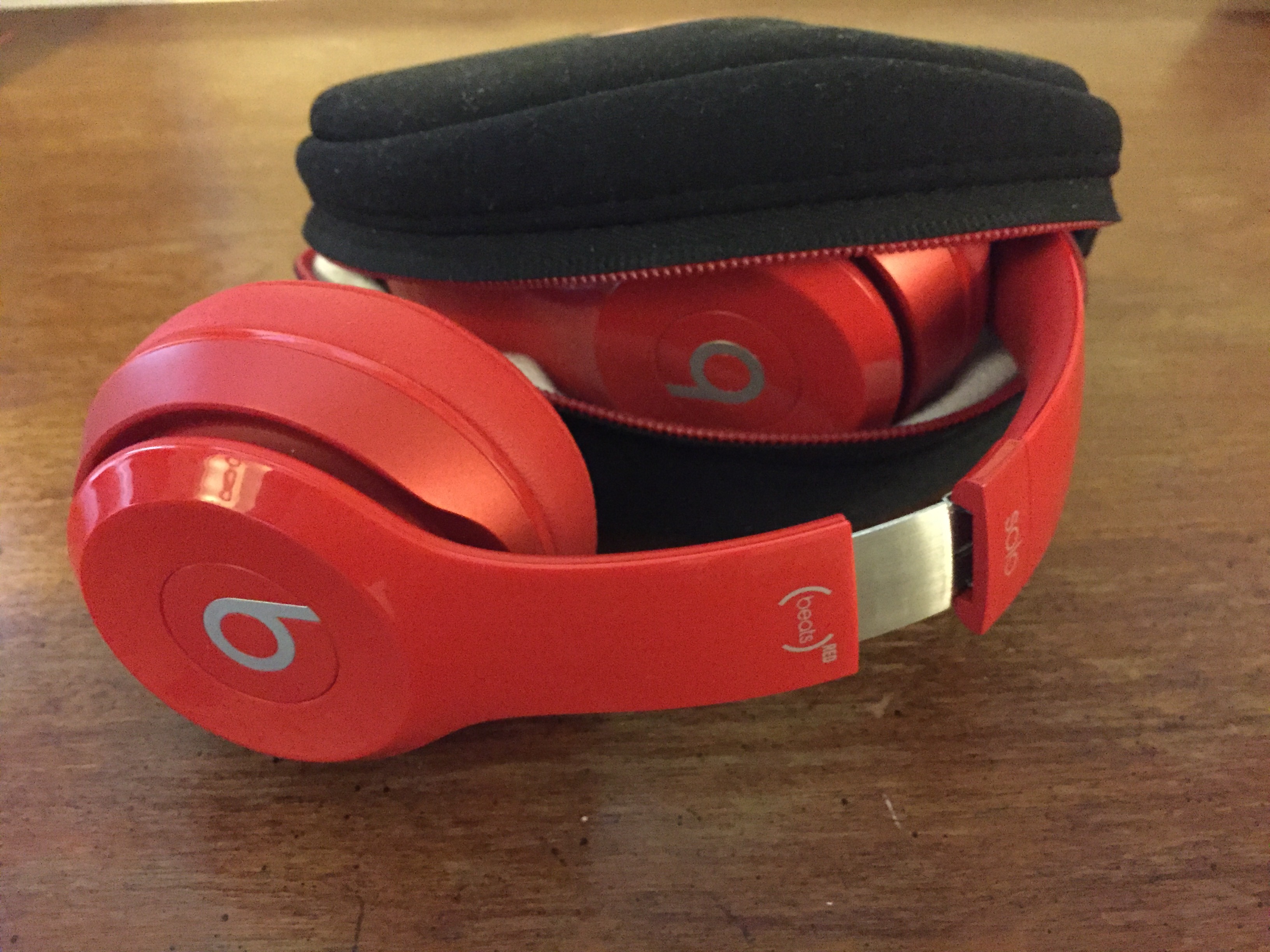
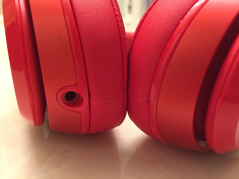
In terms of industrial design, the Beats Solo2 have a couple of Apple-worthy details. They can be folded up and stored in the included carrying case for easy transport. Also, you can unplug the audio cable from the headphones — something that I think should be standard in every pair of headphones in this price range, as it makes them easier to transport and makes cable damage easy to resolve (you can replace it with a generic 3.5mm stereo cable or any number of reasonably priced Beats-specific cables on the market).
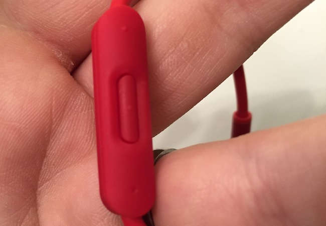
Speaking of the headphone cable, it also features an iOS remote with a built-in microphone, so you can control your music, change the volume, make calls, and summon Siri on the go. In another bit of thoughtful design, the end that plugs into your audio player is at a right angle, so it protrudes less.
Design-wise, the Solo2 headphones live up to Apple’s standards. They have an attractive, thoughtful design, and it’s obvious why they have such mass appeal.
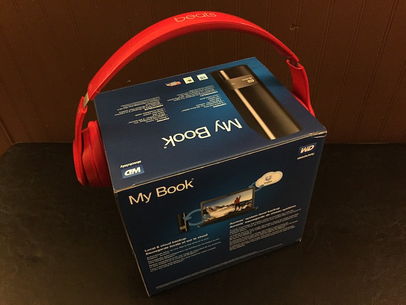
Comfort — Design is an important factor in headphones, but it’s not as important as comfort. Unfortunately, this is where I have difficulties with the Beats Solo2. Out of the box, the Solo2 painfully clamped my skull, like a torture device left over from the Spanish Inquisition (and no one expects the Spanish Inquisition!). This isn’t unusual for me, since my head rivals The Great Pumpkin’s in size, but I have a trick to stretch out headphones: put them on a box that’s a bit wider than my head and let them sit there for a while.
After a few sessions, they no longer felt like they were crushing my head, but they’re still uncomfortable for extended wear. I think my glasses are part of the problem, since the Solo2 presses the earpieces into my head. I hope I’ll eventually get them broken in. I had a similar struggle with a pair of Sony MDR-V6 cans, and after several years, putting them on is like slipping into an old pair of shoes.
My wife, whose head is normally sized, hasn’t had any issues with the comfort of the Beats Solo2 — she loves them. And our own Michael Cohen also owns a pair, and doesn’t have any comfort issues. But I’ve found many reports on the Internet of others having the same problems that I do. In any case, I’d recommend trying on a pair (your closest Apple Store should have plenty) for an extended period before plunking down your hard-earned cash.
One place where I’ll give the Solo2 a thumbs-up in the comfort category is the ear pads. They’re never scratchy or sweaty, unlike most of the headphones I’ve owned.
Sound Quality — Here’s the most crucial, yet perhaps trickiest metric by which to judge headphones: how do they sound?
Beats headphones have a reputation for being “boomy,” meaning that they emphasize bass at the expense of other frequencies. In my testing, this is somewhat true. Naturally, hip-hop sounds amazing on the Solo2, particularly Dr. Dre’s latest album, “Compton” (these are Beats by Dre, after all). Sometimes older, less bass-intensive tracks can sound a bit muddled. However, the Solo2s deliver much more balanced sound than I had expected from a pair of Beats headphones, and just about any genre I threw at them sounded pretty good.
A funny thing happened when I went back to my beloved Sony MDR-V6 headphones after a few days of listening to the Solo2: they sounded flat and lifeless. The Sony MDR-V6 are known for being neutral, which is good for production work, but I realized just what they were missing on the musical front. On the other hand, I wouldn’t recommend the Beats Solo2 for any sort of podcasting work — they made my voice sound like Darth Vader.
But sound quality is a subjective metric. Let’s look at some other opinions.
Developer Marco Arment has made a hobby out of comparing headphones, and while the Beats Solo2 only ranked 16 out of 30 in sound quality in his testing, there are only three models in the same price range that beat it: the Audio-Technica ATH-M50x, the AKG K551, and the B&O H2. However, the ATH-M50x and the K551 aren’t nearly as portable as the Beats Solo2, and Arment said the H2 headphones have similar sound quality to the Solo2, but are less comfortable.
For yet another opinion, we can turn to The Wirecutter’s guide to “The Best On-Ear Headphones (At Any Price).” While the Solo2 didn’t win that contest either, it held its own, with one panelist preferring the Solo2 over the final picks. The Wirecutter’s Lauren Dragan wrote, “Here’s something really exciting for the future of Beats: the Beats Solo 2s are the best sounding Beats we’ve heard. Everyone found the Solo 2s to be very comfortable, and our entire panel agreed that the Solo 2 were hands down our favorite Beats headphones so far.”
However, Dragan also criticized the Solo2’s sloppy bass: “To put it into a visual, if the mids and highs were a gourmet meal, the bass is a pudding cup some toddler just emptied onto your plate. I mean, the food that was there is technically still good, but man, it sure would have been better without that pudding all over it. That said, if the Beats didn’t cost $200, we might be having a different conversation.”
Which brings us to the ultimate question…
Are the Beats Solo2 Headphones Worth the Money? — The core of all Beats criticism is that, while they’re not the worst headphones, they cost too much for what you get. At $200, I’d agree that the Beats Solo2 are overpriced, though not as much as other Beats models. But now that they can be had for under $150 new, or even around $100 refurbished, they’re not a terrible value, considering their blend of clean design, iOS integration, and decent sound quality.
You can probably find “better” headphones for the same price or less, but that depends on your definition of “better.” The Beats Solo2 are ideal for a college student: someone often on the go, who needs excellent sound isolation, and who prefers the newer, compressed music that the Beats sound is designed around.
However, they’re not appropriate for those who exercise outside, thanks to their weight and isolation from important ambient sounds (like approaching cars that are oblivious to your presence). Likewise, someone who spends most of the day at a desk might find a less portable pair of cans that offer better comfort and sound quality at a lower price. The Solo2 headphones are a solid jack of all trades, but master of none.
I’m not comfortable telling you to buy a specific pair of headphones, because it’s such an individual decision, influenced by your own musical taste, fashion sense, and personal comfort. But I will say this: if you’re considering the Beats Solo2 headphones, they’re perfectly nice headphones for the money.
Google’s Fall Event Echoes Apple’s
iPhone, meet Nexus. iPad, meet Pixel C. Apple TV, meet Chromecast. Apple Pay, meet Android Pay. iOS 9, meet Marshmallow. Apple Music, meet Google Play Music. Apple Photos, meet Google Photos.
Google and Apple, once nothing alike as companies focused on Web search and consumer hardware, respectively, have more recently engaged in a tit-for-tat tech battle with hardware, software, and services that practically mirror each other.
This was all too clear in the two companies’ recent product announcements. Apple made the first move in September by unveiling two new iPhone models and the productivity-focused iPad Pro, along with a revamped Apple TV.
As expected, Google responded with a set of announcements that show how the search-engine giant increasingly competes directly with Apple.
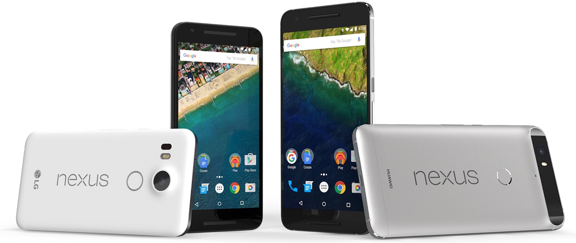
Google unveiled two Android-based additions to its Nexus smartphone line, and a Pixel-branded tablet focused on productivity, along with two new Chromecast streaming-media devices for use with televisions and home speakers. There were even some updates to Google Play Music and Google Photos.
New Nexus Phones — Amid a spate of independent smartphones running Android, which has become the largest mobile platform, Google periodically works with a manufacturer to create cutting-edge Nexus devices in an attempt to set the market’s direction.
This year, for the first time since the Nexus brand was created, Android fans have a choice of two smartphones.
The new phones, the Nexus 6P and Nexus 5X, have a few things in common: the new Android 6.0 “Marshmallow,” USB Type-C charging connectors like the one on Apple’s 12-inch MacBook, a 12.3-megapixel rear-facing camera with larger pixels for better low-light performance, 4K and slow-motion video shooting, and a Nexus Imprint fingerprint sensor.
That sensor is intended to be used with Google’s new Android Pay system in brick-and-mortar stores with NFC terminals, just as Apple’s Touch ID sensor is used with Apple Pay for similar tap-to-pay transactions in stores. And, like Touch ID, the Imprint sensor provides access to locked phones in place of a passcode.
The only major difference: Google’s sensor is on the back of the phone.
Both Nexus phones also work with Google’s new Project Fi wireless service, which blends Wi-Fi with cellular signals from multiple sources (including T-Mobile and Sprint) to ensure a dependable data connection. Project Fi previously worked with only one phone, the Nexus 6.
Marshmallow brings with it a number of useful features, such as a Doze mode that puts certain phone functions into standby mode if the handset is left unattended. Sound familiar? Yeah, it’s a lot like iOS 9’s Low Power Mode.
The new Nexus phones are otherwise quite different from each other.
The 5.7-inch Nexus 6P is the first Nexus with a body made entirely of metal – aeronautical-grade aluminum, specifically – which brings it in line with all-metal designs from Apple and other makers.
The Huawei-manufactured smartphone has a 64-bit processor, an 8-megapixel front-facing camera, forward-facing stereo speakers, and a 2560-by-1440-pixel screen with Gorilla Glass 4. It starts at $499 for a 32 GB version, and goes up to $549 for a 64 GB model and $649 for a 128 GB model. It is sold in black, white, and silver.
The phone, along with its smaller sibling, has a potential leg up on the new iPhones with 1.55-micron pixels in its camera sensor, compared to 1.22 microns with the Apple iSight equivalent. This, at least on paper, translates into better low-light performance. Google made much of this (and other low-light features such as enhanced autofocus and HDR) in its press event.
But Nexus 6P has one big, recently publicized hardware downer: it lacks optical image stabilization for photo and video shooting, a marquee feature in its Apple counterpart, the iPhone 6s Plus. Google, after first insisting optical image stabilization is not needed because of the improved sensor, later said it would try to remedy the problem (at least up to a point) with a software update.
The smaller 5.2-inch Nexus 5X, manufactured by LG, is a direct successor to the popular, now-discontinued Nexus 5. The 5X, made of soft-touch plastic instead of metal, has a single front-facing speaker, a 5-megapixel front-facing camera, and a 1920-by-1080-pixel screen with Gorilla Glass 3. It costs $379 for a 16 GB version and $429 for a 32 GB version. It’s offered in black, white, and light blue.
Both handsets are available for preorder in a handful of countries, including the United States, with U.S. shipping estimates of 2–5 weeks depending on the model and configuration. Google is sweetening the deal with a 90-day Google Play Music subscription, and a $50 Google Play store credit for purchasing apps, games, music or video content.
For the first time, Google is also offering a Nexus Protect plan that bumps the 1-year manufacturer warranty up to 2 years, and throws in 2 years of accidental-damage protection (which allows for two accident claims, each with a $79 deductible). Such a plan costs $69 for the Nexus 5X, and $89 for the Nexus 6P. The plans bring Google roughly in line with Apple, which also offers AppleCare+ accident coverage for its iPhones.
Pixel C — On the tablet front, Google is rolling out its first model developed entirely internally. Earlier Google tablets were developed in partnerships with third-party makers, which yielded mixed results.
What’s more, the 10.2-inch tablet eschews the Nexus brand in favor of the Pixel name shared with the high-end Chromebook Pixel notebook (also developed internally at Google). The tablet has the same all-aluminum, angular styling as the Chromebook Pixel, and a similar high-resolution display, along with the same USB Type-C charging technology.
But, to confuse things a bit, the Pixel C does not run the Web-focused Chrome OS operating system, as the Chromebook Pixel does, but Android Marshmallow.
The Pixel C, like Apple’s iPad Pro, is largely intended for productivity. That’s why Google is offering a $149 add-on keyboard that interacts with the Pixel C via Bluetooth. The keyboard attaches magnetically to the Pixel C via a flip-up slab that sticks to the tablet’s back and functions as a sort of docking station.
The magnetic connection is so strong that the tablet can be suspended upside down from the keyboard, as a Google employee demonstrated during the press event.
The metal keyboard has keys similar to those on the Chromebook Pixel (with the transfer of some lesser-used keys onto the tablet screen to make room). It also permits the Pixel C to be angle-adjusted, via that flip-up slab, much like a notebook screen. The keyboard gets power from the tablet, meaning it doesn’t need to be charged separately, and holds two months of juice.
The Pixel C starts at $499 for a 32 GB model and goes up to $599 for a 64 GB version. It is slated to ship in time for the holidays.
Chromecast — Google, instead of offering a remote-driven streaming-video box like the Apple TV, makes a more compact dongle that connects directly to a television’s HDMI port and is controlled with a smartphone, tablet, or computer instead of a remote.
With it, Chromecast-friendly apps on a laptop or handheld can use a television as an alternative display (but communicate with the TV via the Internet instead of home Wi-Fi, a la Apple TV). Chromecast-ready apps now number in the thousands, and include many of big names in news, entertainment, sports and gaming.
This is all fully cross-platform, with support for iOS devices, Android variations, and any computer running the Google Chrome Web browser.
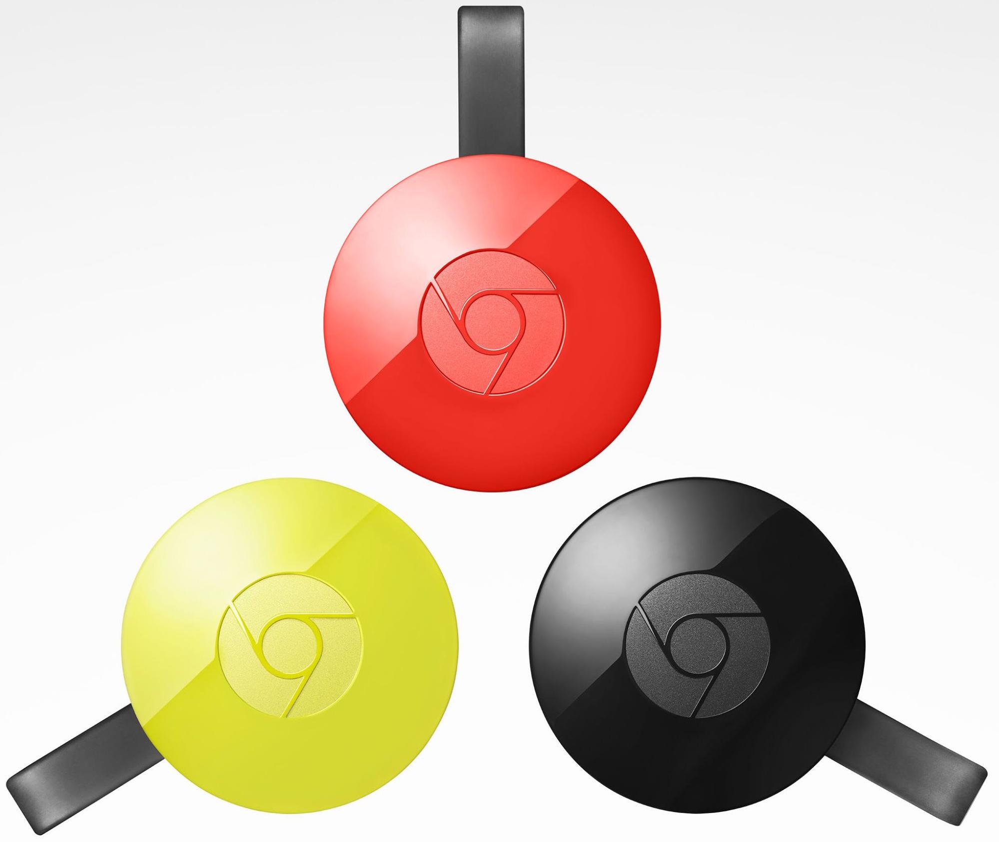
Now Google has revamped its Chromecast dongle. It has a new design, which vaguely resembles a round piece of candy, and is available in black, red, and yellow. The HDMI connector is now in the form of a short cable that better fits into a TV’s HDMI port in cramped quarters.
The new Chromecast supports the latest Wi-Fi standards and, according to Google, has antennas that adapt more capably to changing Wi-Fi conditions in a home to ensure optimal video streaming with less buffering.
Chromecast now turns a smartphone into a gaming controller while the main action is shown on your TV, and two or more phones can be used for multi-person gaming. A TV wallpaper feature called Backdrop has been updated with support for the 500px and Getty Images services.
It’s only $35, and is available now.
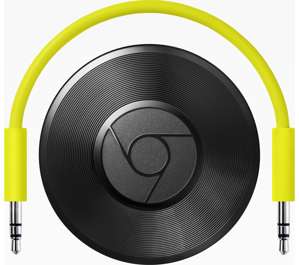
A separate Chromecast Audio device, also announced last week, is designed to plug into home speakers instead of a TV, and to stream a wide range of audio programming once connected to Wi-Fi. This includes the likes of Spotify, Rdio, Pandora, and Google Play Music, Google’s Apple Music counterpart. The rounded device can be controlled using Android and iOS apps as well as desktop computers.
The Chromecast Audio also costs $35, and is available now.
Google is updating its Chromecast mobile app for Android and iOS to make sifting through the thicket of Chromecast-compatible apps more convenient. It will even provide app recommendations. The updated apps are due to be available in the next few weeks.
Google Photos — Almost lost in the flurry of hardware announcement were a couple of updates to Google Photos, a direct competitor to Apple’s iCloud-based photo service.
Google Photos is a compelling service, even for many Apple users, since it allows for unlimited uploading of photos up to 16 megapixels, or 15 GB of full-resolution uploads (after which charges apply). Apple’s iCloud Photo Library offers only 5 GB of free storage.
Last week Google announced augmented facial-recognition searching, a shared albums feature roughly comparable to one available via iCloud, and Chromecast-based photo viewing that’s similar to how photos can be seen on an Apple TV. Google Photos even turns a burst sequence of shots into an animated GIF as a rough approximation of Apple’s Live Photos feature, which is new on the iPhone 6s and 6s Plus.
There was no mention of the photo editing features that were rich and powerful in the old Google+ Photos version of the pictures service, but were eviscerated in the transition to Google Photos. For Mac users, this makes the addition of support third-party editing extensions in Apple’s Photos app all the more compelling.
Google’s Hardware Play — Apple fans will have varying degrees of interest in – or indifference about – the new Google products, depending on which we’re talking about.
Mac users have little incentive to buy the Nexus phones in place of iPhones, for instance, since they’ll miss out on Apple’s ecosystem integration.
The same goes for the Pixel C, given a wide variety of iPad models for every budget and use case, with those tablets also part of a tight-knit Apple ecosystem.
Besides, Google does a good job of providing iOS apps for Apple users who use Google cloud services.
The Chromecast devices are more interesting from an Apple vantage point since they can be controlled from iOS as well as Android. All but the most budget-constrained Apple users will probably just get the upcoming fourth-generation Apple TV, though.
Regardless, even the most diehard Apple users should be appreciative of Google’s products since they will spur Apple to continue to innovate, and the end result should be ever-better products at a rapid clip. Apple and Google have been one-upping each other for a while now, and that trend does not look to wane any time soon.
Retuning Rdio: Why I Dropped Apple Music
Music used to be simple. Turn on the radio, and tune to a reliable station. Pop a CD in and press Play, or, if you were like me, leave six favorite albums in the multi-disc changer and just press Shuffle. Even cassettes and records were easy enough, if a little more effort. In the early days of digital music, SoundJam and its eventual successor, iTunes, made playing your music collection easier — it was simple to play a single album or shuffle through your entire library.
But that trend has reversed itself, and playing music in iTunes can now be actively difficult, requiring frequent management and constant decisions. (There’s a reason Kirk McElhearn’s “Take Control of iTunes 12: The FAQ” has grown to over 250 pages!) Apple’s constant revamping of the iTunes interface, which has driven many a loyal Mac user to profanity, is largely responsible for this, and is one of the main reasons I subscribed to Rdio two years ago.
Rdio also scratched a major itch. I grew up in an era of music scarcity, and could afford only albums that I was certain I’d like. I didn’t have my own turntable, so I recorded my favorite songs to cassettes and listened to them ad infinitum. In high school, my musical tastes didn’t mesh with those of my friends, so it wasn’t until college that I met people with whom I could share recordings of my favorites. But even then, my music collection was minuscule compared to many. I never got into digital file sharing, and it was clear that I could spend far too much in the iTunes Store, so I restricted myself to adding singles I loved (on albums I’d never buy) to my iTunes library.
So you can imagine my reaction when streaming services like Spotify and Rdio appeared. It was an embarrassment of riches — all the music I’d never been able to explore. After determining that I preferred Rdio’s clean white interface to Spotify’s dark look on the Mac and signing up for a monthly plan to eliminate the ads, I started building a collection of artists and albums I’d always wanted to try, but wasn’t willing to buy unheard.
Fast forward two years, and Apple Music has just appeared. Pricing is similar to Rdio, the selection is likely better, integration with all my Apple devices should be top-notch, and the three-month trial is a great chance to give it a try. My time is just about up, and the question is, given all of Apple Music’s advantages, will I be dropping Rdio and paying Apple instead?
Just the opposite. Apple Music, enmeshed as it is within iTunes’ convoluted interface, is just too hard to use. It’s not that I can’t use it — I know perfectly well how to do so, just like I know how to compose complex pattern-matching searches with grep in BBEdit. But I expend the extra effort in BBEdit because the results are worth it; in contrast, clawing my way through obscure and ever-changing controls in iTunes doesn’t get me any further than a couple of clicks in Rdio, particularly when it comes to building my music library.
Before I get into details, note that I’m fully willing to acknowledge that how I prefer to discover and listen to music is likely different from how you do it, and it may even be really odd — I don’t know. Regardless, iTunes is obstructionist in ways Rdio isn’t.
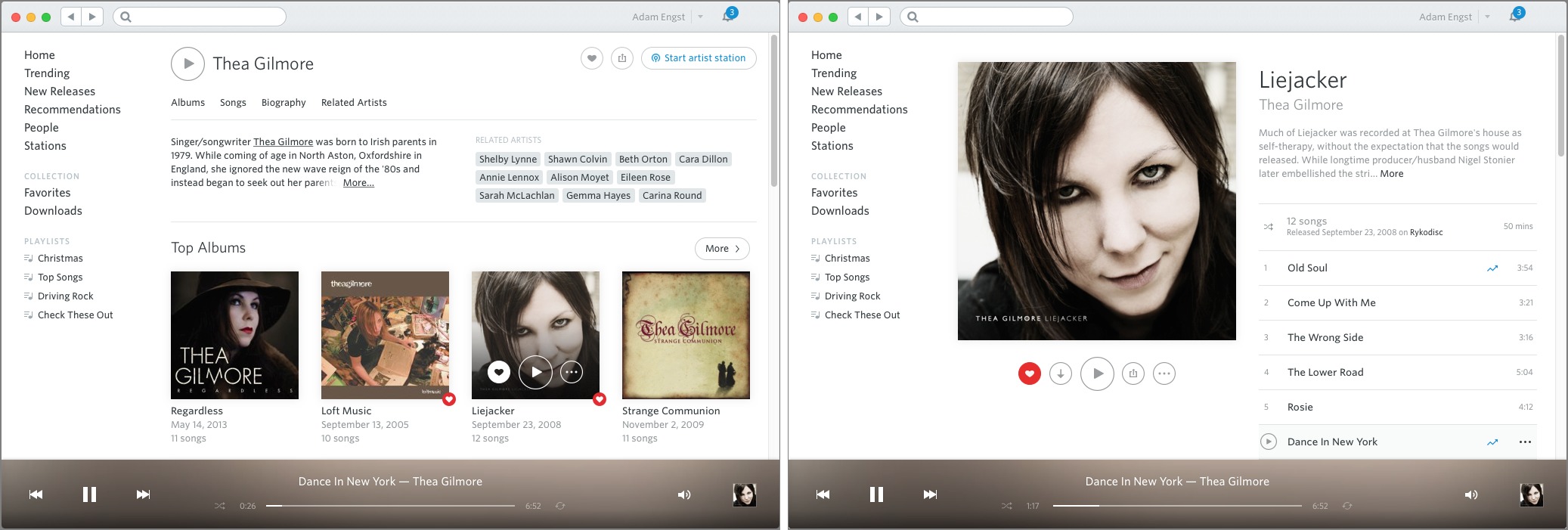
Turning on the Rdio — Here’s my standard approach when I’m seeking out new music. I start at a song I like, generally because it’s already playing in Rdio. With a single click on the artist’s name, Rdio displays an artist page with a brief bio, that artist’s top albums and top songs, and a collection of related artists. I’ll pick a related artist largely at random, and a click displays their page. Another click plays that artist’s most popular song or album, and if I like what I hear, yet another click on an album cover shows its contents, often along with a review and similar albums. After I’ve listened to the entire album, a click on the heart button
adds it to my favorites, or, if only a few songs are worthy, a contextual menu item lets me add just them. In short, exploring through Rdio’s library of 30 million songs is fast, fluid, and flexible.
Playing a selection of music beyond a single song or album is equally easy. There are three main station-based options: the collection of my favorites on what Rdio calls “Adam FM,” an artist-based station, or a song-based station. For each station, there’s a three-position slider that lets you specify how adventurous Rdio should be. The first position plays just items from your favorites or from the specified artist, the second position plays music that’s tightly related, and the third position tells Rdio to go further
afield in its selections.
Personally, I never let Rdio leave my favorites list when playing Adam FM, and only occasionally will I loosen the slider to the second position when playing an artist station. I find hearing bad songs extremely jarring, and I’d prefer that Rdio just didn’t play any rather than make me constantly interact with the player (skipping a track just moves on, whereas clicking the thumbs down button tells the current station you never want to hear that track again). Helpfully, Rdio always displays what’s playing in
context, either with its album cover or, if you’re within the album, within the set list.
And yes, you can make playlists all you want. I seldom do, since I don’t have time to think that hard about slicing and dicing my collection, and the combination of Adam FM and artist stations gives me sufficient variety within constraints.
That’s pretty much it. Rdio has lots of other ways of finding music — entire collections for albums that are trending, new releases, personalized recommendations based on your favorites, music listened to by other Rdio users you follow, and a ton of genre-based stations. Whatever — I haven’t met the algorithm that can reliably recommend music I like, and people are seldom any better. I’m a collector — I enjoy finding music on my own. (If necessary, Rdio also has an entirely capable search, should I read a review of an artist or album that I’d like to listen to.)
Fumbling Toward iTunes — Ignoring the fact that I’ve been able to do all this in Rdio for years now, I must say that it’s possible to recreate my system with Apple Music in iTunes. But it’s difficult enough that as much as I tried to make myself do it, I just couldn’t.
To start, when you launch iTunes, it returns you to wherever you were last. That means that if you were viewing an iPhone app’s page in the App Store but now want to play music, you have to orient yourself and then click the tiny musical note button in the left side of the iTunes navigation bar to switch to Music. Next, depending again on what you were doing the last time you were in My Music, you may have to click My Music or Playlists in the middle portion of the navigation bar to see your collection.
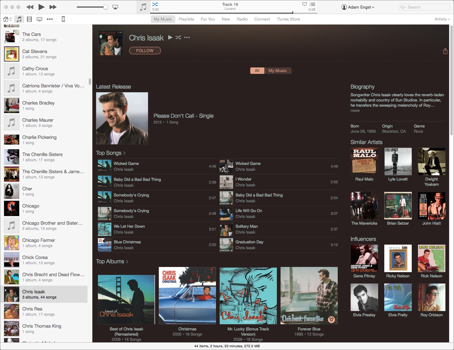
Starting the equivalent of Rdio’s Adam FM is easy enough — a double-click on All Artists in the sidebar, although which sidebar it’s in depends on whether you’re in My Music or Playlists, and the necessary sidebar appears only if you’re in Artists view at the far left of the iTunes navigation bar. And while iTunes starts playing the first song from the first artist, alphabetically, once it moves on in shuffle mode, you can tell what’s playing only by looking at the tiny LCD display at the top of the window. (One trick — choose Controls > Go To Current Song, or press Command-L, to jump to that song’s artist page.) The MiniPlayer window is more obvious about what’s playing, but requires juggling another window (and it
lacks the shuffle button in the LCD).
Let’s branch out and try to find new music in the way I do in Rdio. If you’re in the main window, in My Music or Playlists, trying to view an artist’s page in Apple Music can be a baffling exercise. Sure, if you’re in Artists view, you can just click an artist name in the sidebar. Fine.
But it gets harder. If you’re in Songs or Albums view, clicking the tiny … button that appears only when you mouse over a song title presents (eventually — I always experience a delay) a pop-up menu with a Go To Artist command. But if you’re instead in Artists, Composers, or Genres view, that very same pop-up menu lacks a Go To Artist command.
The … button’s menu always seems to include Go To Artist when clicked from the iTunes LCD or the MiniPlayer window for the current song, and for everything in Up Next in both, which is great. Wait, I take that back! Go To Artist doesn’t appear in either the LCD or the MiniPlayer when you’re playing a station — when you’re most likely to want it — although it does when you’re playing a For You playlist. Trying to predict iTunes is like playing a shell game.
Maddeningly, it seems that there’s always a Show In iTunes Store command in that pop-up menu, but choosing that takes you to the iTunes Store, not to the artist page in Apple Music. Once you’re in the iTunes Store, there’s no way to get back to Apple Music’s artist page. Even the Controls > Back command navigates only within the iTunes Store itself.
Once you do eventually make your way to an artist’s page in Apple Music, it offers the same basic features as Rdio: top songs, top albums, a bio, and related artists. But Apple Music swaps the order, putting songs first. That makes it easy to listen to an artist’s hits, which is great, but then it’s harder to explore entire albums. Happily, within an artist page, you can click the names of related artists to jump to their pages, rather than having to use the little … button. Sadly, Apple Music doesn’t extend the artist name linking to bios, as Rdio does, eliminating a nice way to bop around the catalog.
Actually, I need to step back a moment, because there are essentially two pages for any artist, one that appears when you’re in My Music or Playlists, and another that’s in New (another of those labels in the middle of the iTunes navigation bar). To clarify, say that you’re in My Music and you view an artist page. You can play any song or album you see from My Music, but if you click an album or other artist name, you’re shown that album or artist in the New view. Since iTunes seems to think of each of these
views as a separate tab in a Web browser, using Controls > Back like you would in a Web browser only moves you within the New view. So if you click an album on a My Music artist page, you’re switched to New, and using Back takes you to the last artist or album page you viewed in New, not back to the artist page in My Music.
I’m sure there are logical reasons why iTunes has to have completely different interfaces for navigating to an artist page, depending on where you are in the app, and for making the Back command specific to each view, but honestly, I don’t care. Just because there’s a logical reason for something doesn’t make it a good interface, or an enjoyable interface, and I expect even more from Apple than from Rdio. It’s one thing when iTunes is free, and inescapable for certain things, but I’m not going to pay monthly for the privilege of increasing my blood pressure every time I want to listen to music.
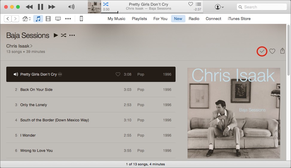
Regardless of how you get to an artist’s page, once you’re there, there’s a key control that switches the view between All and My Music. The former shows all of the artist’s music; the latter just those albums that you’ve added to My Music. To add a particular album to My Music, you click a tiny + button in the upper right corner of the album page; once clicked, it turns into a checkmark. That’s the only way to know if you’ve added an album, so if you come back to an artist later, you have to navigate into each album independently, look for the checkmark, and navigate back out to the artist page. In contrast, Rdio shows a heart icon on every favorited album, wherever it appears.
As with Rdio, Apple Music lets you create stations based on artists or songs, but as I noted before, there’s no way to jump to an artist page if you hear a song from an unfamiliar artist that you like. Worse, unlike Rdio, you have almost no control over what a station plays — you can’t limit it to one artist, nor can you tell it to be more or less adventurous in what it selects. You can at least tell Apple Music to Play More Like This, and if you really don’t like something, to Never Play This Song.
Much has been said about Apple Music’s For You screen in iTunes. It offers numerous human-curated playlists as well as recommended albums based on your music collection. Unfortunately, the fact that I like The Doors means I like The Doors, not that I will like anything in a playlist called “Hollywood Freaks on Runyon Canyon” and described as “L.A.-inspired indie-folk and rock tracks — but no movie stars in sight.” There might even be a song or two I’d like in there, but every For You playlist that ventures beyond a single artist has also been saddled with numerous songs I seriously dislike, and listening to music shouldn’t require constant decision-making. For You might be good for you, but it’s not for me.
It’s ironic — by forcing myself to document just these inconsistencies and annoyances in the iTunes interface (and there are many more) for this article, I see how I could, over time, train myself to work around them. But the benefit simply isn’t great enough to bother, and worse, I suspect Apple will keep rearranging the deck chairs on the unhappy ship that is iTunes, wasting any effort that I were to put in now. So it’s back to Rdio I go.
Be aware that the free trial of Apple Music is set to renew to a paying plan automatically, so if you don’t want to get charged, click your name at the top of the iTunes window, choose Account Info, and enter your Apple ID password. On the Account Information screen that appears, scroll way down to Settings, and click the Manage link to the right of Subscriptions. Once there, you can turn off automatic renewal.
One final note. Although it’s financially trivial to switch between Apple Music, Rdio, and Spotify, the hard part is recreating your collection of artists, albums, and playlists. Luckily, numerous tools have popped up to facilitate moving between the services. Although I can’t recommend any particular one because they’re all slightly different, it’s worth checking out Mooval, Soundiiz, Playlist Converter,
Playlist Exchange, Ivy, re/spin, Exportify, Stamp, and Move to Apple Music.
TidBITS Watchlist: Notable Software Updates for 12 October 2015
Nisus Writer Pro 2.1.2 — Nisus Software has released Nisus Writer Pro 2.1.2 with a variety of improvements and fixes for the venerable word processor. The update restores a preference that controls how often autosave is triggered, improves import and export of DOCX and DOC documents, adds the capability to import documents from Apple Pages (but only from iWork ’09), resolves a scrolling problem that occurred on Macs with certain kinds of trackpads, fixes several issues related to editing with tracked changes, closes some memory leaks, and fixes several instances of crashes. ($79 new, free update, 221 MB, release notes, 10.8.5+)
Read/post comments about Nisus Writer Pro 2.1.2.
Lightroom CC 2015.2.1 and Lightroom 6.2.1 — At the beginning of last week, Adobe issued updates to the two editions of its professional photo cataloging and editing application: the standalone Lightroom 6.2 and Lightroom CC 2015.2 (available as part of Adobe’s Creative Cloud Photography plan; for more details, see “Photos Everywhere with Lightroom CC and Photos for OS X,” 11 May 2015). The update brought the new Dehaze adjustment to Lightroom CC, and revamped the Import function for both editions of Lightroom in an effort to make the workflow more
explicit and potentially easier.
However, many users found these releases to be riddled with slowdowns and crashes (which Adobe acknowledged), while other users found the changes to the Import function frustrating due to loss of features (see this Fstoppers article for details on the changes). At the end of last week, Adobe released Lightroom CC 2015.2.1 and Lightroom 6.2.1 to address the stability issues, and issued an apology regarding both the introduction of the buggy behavior and how the “simplification of the import experience” was handled and communicated.
Other changes to Lightroom CC 2015.2 and Lightroom 6.2 that carry over to versions 2015.2.1 and 6.2.1 include added support for new cameras (including DxO ONE, Leica S (Typ 007), Olympus E-M10 Mark II, and Sony A7SM2) and a wide range of new lenses, a fix for a bug that migrated previously rejected face regions from Photoshop Elements, and resolution for a bug that caused Lightroom CC to export JPEG files that were incompatible with some other applications due to a non-standard header. Both Lightroom CC 2015.2.1 and Lightroom 6.2.1 can be downloaded via Help > Check for Updates. ($9.99 monthly subscription or $149 for the standalone app, release notes, 10.8+)
Read/post comments about Lightroom CC 2015.2.1 and Lightroom 6.2.1.
ChronoSync 4.6.4 — Econ Technologies has released ChronoSync 4.6.4, providing full compatibility with OS X 10.11 El Capitan plus fixes for various user interface glitches and visual artifacts related to El Capitan. The synchronization and backup app also fixes some problems with establishing IPv6 network connections, resolves a problem setting the new El Capitan “restricted” flag on symbolic links, and fixes an issue with the core copy engine that sometimes reported an incorrect target as the source for certain types of errors. (Free update, $49.99 new for ChronoSync with a 20 percent
discount for TidBITS members, 28.7 MB, release notes, 10.8+)
Read/post comments about ChronoSync 4.6.4.
Microsoft Office 2011 14.5.6 — Microsoft has issued version 14.5.6 of its Office 2011 suite to correct an Exchange syncing issue that bedeviled users who had migrated to OS X 10.11 El Capitan. In particular, a bug with Outlook caused unending hangs, making it impossible to download new email when running El Capitan. While Office 2011 has received a fix, Office 2016 users are still awaiting relief (and are being vocal about it in this Microsoft Community thread) from repeated crashes suffered not just by Outlook but also by Word, Excel, and PowerPoint (as noted by this Computerworld article). (Free update from the Microsoft Download Center or through Microsoft AutoUpdate, 113 MB, release notes, 10.5.8+)
Read/post comments about Microsoft Office 2011 14.5.6.
Tweetbot 2.1 — Tapbots has released Tweetbot 2.1 for the Mac (see “How to Mute Unwanted Tweets in Tweetbot,” 4 September 2015) with the addition of the Activity View (ported over from Tweetbot for iOS), which displays recent favorites, retweets, and other interactions. The Twitter client also now displays quoted tweets in mentions; plays Twitter, Instagram, and Vine video within the app; adds support for uploading video to Twitter; displays images in direct messages; fixes an
issue that prevented a selected tweet from being fully visible when using the keyboard to navigate; and improves memory management. ($9.99 new from the Mac App Store, free update, 11.8 MB, 10.10+)
Read/post comments about Tweetbot 2.1.
Typinator 6.7 — Now scriptable, the new Typinator 6.7 from Ergonis enables you to perform a variety of actions using AppleScript or JavaScript (as well as other scripting languages, such as Bash, Perl, PHP, Python, and Ruby). Additionally, the text expansion tool enables scripts to be stored in compiled form (within the Included folder) for faster execution. The update also adds new built-in functions for inserting arbitrary Unicode characters in expansions and pasting the contents of the clipboard, adds support for Baidu Pinyin input methods for Chinese, works around a bug with Microsoft Word 2016 that caused
bookmarks to be created around copied text fragments, adds new diagnostics for analyzing issues with expansions, resolves a bug related to expansions in Messenger for Facebook, and fixes an issue that caused checks for new versions to fail on OS X 10.11 El Capitan. (€24.99 new with a 25 percent discount for TidBITS members, free update, 7.1 MB, release notes, 10.6.8+)
Read/post comments about Typinator 6.7.
iBooks Author 2.4 — Apple’s iBooks Author has been updated to version 2.4 with improvements to its EPUB templates, plus the added capability to add Pop-Over widgets with text or images to an EPUB template. The free authoring software also improves the import function for Pages and Microsoft Word documents, and in an email message sent to users of iTunes Connect, Apple notes that it’s best to use section breaks between chapters when writing in either Pages or Word. (Free from the Mac App Store, 446 MB, 10.10+)
Read/post comments about iBooks Author 2.4.
ExtraBITS for 12 October 2015
In ExtraBITS this week, Adam Engst talks about electric cars and iTunes on the Tech Night Owl, Verizon plans to share your personal information with AOL, and Apple claims that different iPhone A9 chips have only a minimal impact on battery life.
Adam Ponders the Apple Car and iTunes on The Tech Night Owl Live — Cars are once again the topic of this Tech Night Owl Live podcast discussion between Adam Engst and host Gene Steinberg, with this one focusing on why electric cars are better, infotainment system interfaces, and the challenges Apple would face in the car market. The conversation wrapped up with why the iTunes interface caused Adam to drop Apple Music.
Verizon to Share Supercookie Data with AOL — You may recall our prior coverage of Verizon’s “supercookie,” which tracks all your Internet activity on the company’s cellular data network (see “How to Say “No Thanks” to Verizon’s Supercookie,” 2 April 2015). Now Verizon has announced that it will be sharing that collected data with AOL, now owned by Verizon, for its ad network, and AOL will be able to see your gender, age range, interests, apps used, and sites visited. Thankfully, you can disable this tracking in Verizon’s
privacy settings, under Relevant Mobile Advertising.
Apple Says iPhone 6s Battery Life Varies Minimally by A9 Chipmaker — It turns out that Apple has two suppliers for the A9 chip that powers the new iPhone 6s and 6s Plus — Samsung and TSMC — and the chipmakers rely on different process technologies. Some benchmarks have shown that iPhones using the TSMC A9 chip are more efficient than Samsung’s A9 chip, resulting in longer battery life. Apple has now weighed in on the controversy, telling TechCrunch that the difference in real-world use is just 2–3 percent, nothing that anyone would notice in actual
usage and well within the tolerances that Apple would accept for any device.

