TidBITS#908/17-Dec-07
Have you gotten chummy with a Chumby? (Are you thinking we’ve gone out of our minds?) Kevin van Haaren looks at the plush computing device and explains what you can do with it. Matt Neuburg writes about how Default Folder X 4 is an essential update for your Mac, and how Quay makes Leopard’s stacks usable again. Joe Kissell makes his Windows and Mac partitions talk to one another via NTFS for Mac, and Adam raises concerns about Google’s Knol, which seems to be taking aim at Wikipedia. In security news, Apple released QuickTime 7.3.1 to fix the serious RTSP vulnerability. Lastly, we’ve published new and updated Take Control ebooks about the iPhone, digital TV, running Windows on a Mac, and Mac OS X terminology (all of which are 20% off via the MacSanta promotion on 18-Dec-07). Have a safe and happy holiday – our next issue will be 07-Jan-08!
TidBITS 2007 Holiday Hiatus
It seems that every year ends with a mad rush to finish as much as possible before the holidays kick in, but this year was truly extreme for Tonya and me. Along with redesigning the TidBITS Web site in August, we published 23 new and updated ebooks since the beginning of September, and I somehow managed to find the time to write “iPhoto ’08: Visual QuickStart Guide” in November as well. I can’t remember anything that happened before August.
We could never have accomplished even a fraction of this without the immensely capable assistance of Jeff, Glenn, Joe, Matt, and Mark; the many Take Control authors and editors; the savvy techs at digital.forest, our Internet host. We’re also indebted to the knowledgeable authors who contributed articles throughout the year, our selfless volunteer translators, our corporate sponsors, all the people who make TidBITS Talk vibrant, and everyone who makes time to read what we write. Thank you, one and all, and may all your holiday wishes come true.
Although the pace of both will undoubtedly slow, we’ll continue posting articles to the TidBITS Web site, and we’ll keep moderating messages through to TidBITS Talk as well. The next email issue of TidBITS will appear 07-Jan-08, and the week after that, we’ll be in San Francisco for the annual Macworld Expo excitement.
QuickTime 7.3.1 Fixes RTSP Vulnerability
Apple has released QuickTime 7.3.1, a security update that patches a potentially serious exploit (see “Protect Yourself from the QuickTime RTSP Vulnerability,” 2007-09-07). Unlike many recent security issues on the Mac, malicious code that took advantage of the QuickTime RTSP (Real Time Streaming Protocol) vulnerability was active in the wild: a specially crafted Web page could install malicious software on your computer. According to Apple’s security release notes, QuickTime 7.3.1 fixes the flaw in RTSP as well as holes in QuickTime’s Flash media handler.
Apple recommends the update for all users: it’s available via Software Update and in standalone form for Leopard (52.6 MB), Tiger (48.7 MB), Panther (50.9 MB), and Microsoft Windows XP and Vista (20.3 MB).
Get DivX Pro for Free for a Limited Time
[19-Dec-07: The offer has apparently now expired, sorry! -Adam]
For an unspecified limited time, DivX is giving away free serial numbers to their DivX Pro software, which makes it possible to create DivX-encoded videos on the Mac (a Windows version is also available). DivX is a compressed digital media format for video, much as MP3 and AAC are compressed digital media formats for audio. Read all about it on Wikipedia if you’re interested in the gory details.
Normally $19.99, DivX Pro for Mac is a bundle of four applications, DivX Player (for playing DivX videos on the Mac), DivX Web Player (for extending playback functionality to the Web), DivX Pro Codec (necessary for encoding video in DivX format), and DivX Converter (the application that works with the codec to create DivX videos).
If you don’t create video at all, there’s nothing wrong with downloading the free version of DivX Pro, but you can get just the parts you need to play DivX-encoded videos for free any time. The DivX for Mac bundle includes the DivX Player, DivX Web Player, and the DivX Community Codec, which I gather can only decode DivX video, with encoding being restricted to the DivX Pro Codec.
Take Control News: Save with MacSanta Discounts
On Tuesday, 18-Dec-07, you can save 20 percent on all Take Control ebooks as part of the month-long MacSanta promotion. Just enter the coupon code MACSANTA07 in our cart when ordering on that day to receive your discount. If you miss ordering on the 20-percent-off day, you can still save 10 percent with coupon code MACSANTA07TEN for all orders through 31-Dec-07. (While you’re there, be sure to check out all the other products available at discount!)
Note that we usually embed coupon codes in our URLs to make things easier for you, but that wasn’t possible in this case, so you’ll need to copy a coupon code above, paste it into the Coupon Code field in the upper-right corner of our eSellerate-based shopping cart, and click the Enter Coupon button to apply it to your subtotal.
And remember, you can give one of our ebooks as a last-minute gift easily. Just place your order, download the PDF, and then send it to the recipient as a normal email attachment. Make sure to explain how to click the Check for Updates link to look for information about updates.
Take Control News: Master Your iPhone with Ted Landau’s Advice
The iPhone was recently named Time Magazine’s Invention of the Year, and there’s certainly a lot to like about all the snazzy features it shoehorns into a shiny package. However, if you want to feel more in control of core features like syncing to your computer, setting up Mail accounts, and connecting to wireless networks, the new “Take Control of Your iPhone,” by computer troubleshooting guru Ted Landau, explains what’s happening under the hood so you can use your iPhone more effectively and with less hassle.
If you have questions about activating your iPhone, the nuances of the touchscreen and virtual keyboard, or customizing the settings for applications, this book has the answers. Where it truly shines, though, especially in comparison with other iPhone titles, is in its coverage of how to solve problems. Whether you’re suffering a syncing feeling, can’t get your email delivered, having trouble getting a charge out of your battery, or need to resuscitate a dead iPhone, you’ll benefit from Ted’s many years of experience with authoring best-selling troubleshooting books. This completely up-to-date ebook walks you through dozens of step-by-step problem-solving procedures, while offering tips for smart ways to use the iPhone along the way.
For the adventurous, Ted also covers iPhone hacking and how to deal with updating (or not updating) a hacked iPhone.
Through the end of December, an introductory offer drops the 195-page ebook’s $15 price to only $10. Get your copy today!
(Owners of the preview version of the ebook – titled “Take Control of Troubleshooting Your iPhone” – can get the full “Take Control of Your iPhone” by clicking the Check for Updates link in the preview PDF.)
Take Control News: Three Ebook Updates for Holiday Reading
Whether your holiday reading over the next few weeks trends more toward figuring out how to buy or set up a new digital TV, learning a few new technology terms, or playing the latest hot Windows game on your Mac via Boot Camp, we have a freshly updated ebook for you. Even better, all of these updates are free to existing owners of the most recent version. Happy holidays!
- “Take Control of Running Windows on a Mac“: Hot off the virtual press, this ebook – now at version 2.6 – is once again updated to cover the latest technology and advice for making Windows run smoothly on your Intel-based Macintosh. This version looks at running Boot Camp under Leopard, what to do if you were previously running Boot Camp under Tiger (or still are), and the latest versions of the frequently updated Parallels Desktop and VMware Fusion. Kudos to author Joe Kissell for keeping this title fresh! $10, 151 pages.
- “Take Control: The Mac OS X Lexicon“: Although this title doesn’t include “w00t,” Merriam-Webster’s word of the year for 2007, it does include over 500 terms that we at TidBITS Publishing think you should know in order to get the most out of your Mac. Written by Andy Baird and by Sharon Zardetto of Mac Bible fame, the revised title (now at version 1.5) has 30 new entries for Leopard, along with lots of helpful tips for Leopard as well as for older versions of Mac OS X. This unusual book stands out from the pack with its enjoyable and helpful prose, and it makes a great holiday gift. $15, 209 pages.
- “Take Control of Digital TV“: If you’re shopping for a new HD television, you definitely want this ebook, now at version 2.1. It walks you through the entire purchasing process, starting by explaining what features are available in an HD set, explaining the jargon, and helping you figure out which options make sense for your budget and the way you’ll use the TV. You’ll get a printable shopping checklist, ideas for where to shop, suggestions for how to find HD content once you have your TV, and coverage of some popular options for peripherals to attach to the TV. The ebook also helps you with common installation questions. $10, 98 pages.
If you own an earlier version of any of the above ebooks, open your PDF and click Check for Updates on the first page to access your update. Updates from the previous version of each book are free; readers with the first editions of “Take Control of Digital TV” and “Take Control of Running Windows on a Mac” receive update discounts.
Quay Sticks It to Stacks
This is certainly an exciting time for those of us who have found ourselves hampered by Leopard’s superficial silliness. Of the Leopard features I complained about in “Six Things I Hate about Leopard” (2007-10-26), three have already been skewered by good old user ingenuity.
- The reflective Dock was killed, early on, by the discovery of a secret preference setting, available through the Terminal.
- The transparent menu bar (see “Menu Bars So Clean, They Seem To Disappear,” 2007-10-30) was recently rendered opaque (and gorgeous!) by a rather scary Terminal incantation that hasn’t done my computer any apparent harm (see “Transparent Menu Bar, Die Die Die!,” 2007-11-16).
- And now, Stacks in the Dock have been replaced by well-behaved folders thanks to Quay, a clever little utility from Rainer Brockerhoff (well known as the author of three other classic utilities on which many of us have long depended: XRay, Nudge, and Zingg!).
Here’s how you use Quay (the name, by the way, is evidently a pun on “Dock”). First, drag any folders out of the Dock so that they vanish in a puff of smoke. Those old folders are Stacks, and are just what we’re trying to avoid. Next, start up Quay. For each folder you’d like to see in the Dock, instead of dragging it directly into the Dock, drag it onto Quay’s window; Quay then produces an icon (which you can customize quite extensively), and you drag that icon from Quay’s window into the Dock. When you’ve populated the Dock with folders, you can quit Quay.
Now, with any of those Dock folders that you created with Quay, if you simply and quickly click the folder’s Dock icon, a hierarchical menu of its contents appears. This menu is actually better than the old Dock hierarchical menus were: the menu for each folder can be sorted by name, date, or kind, and the menu’s items can have small, large, or no icons – plus the menu can optionally display invisibles and/or package contents. To determine these menu display options, Option-click the folder icon. To open the folder, double-click it. What you should not do is Control-click the folder icon, or hold the mouse down on it for any length of time, because that will display the Dock’s own menu for the item instead of Quay’s.
That brings me to how Quay works its magic. This is largely guesswork, but I take it that what’s going on here is that the things you’re putting into the Dock with Quay are actually documents, not folders at all. (That’s why they live in the correct location, the right side of the Dock, where both folders and documents go.) The originals of these documents are created behind the scenes by Quay, and are stored in your Application Support folder; they are concealed inside a package so you can’t accidentally mess with them. When you single-click on a “folder” icon, since this is really a document, what happens is what always happens when you single-click a document in the Dock – the document is opened by the application that owns
it. That application is not Quay itself, but an invisible background process that lives inside Quay’s package. The invisible application’s response to one of its documents being opened is to produce the hierarchical menu representing the contents of the folder to which that document is tied. (That’s why Quay itself does not need to be running in order for you to use the Dock “folders” it produces.) Double-clicking a “folder” is seen as an attempt to open the same document twice in quick succession; the invisible process interprets this as a request to open the associated folder.
Quay is not perfect: For example, you can’t Command-click on a “folder” in the Dock to reveal it in the Finder, and sometimes you can’t double-click a “folder” in the Dock to open it either, because after the first click the hierarchical menu appears and, if it’s large enough, it blocks the Dock so your second click can’t get through. And the double-click feature is unreliable in other ways: Sometimes I find that it reveals the folder without opening it, and other times it opens the folder. In general, the double-click feature is unreliable, and it would be better if the hierarchical menu itself included options either to open or to reveal the original folder. Plus, of course, you can’t drag an item onto a “folder” in the Dock to copy
or move that item into the actual folder, because the thing in the Dock is just a document and no application is even aware of your drag. Finally, the Quay documentation warns that “Quay may get confused if you have several copies of it scattered around;” that’s a little worrisome, since, with Time Machine making backups of everything, there certainly will be multiple copies of Quay (the documentation goes on to warn you to prevent this).
Nevertheless, the Quay approach is elegant, simple, and fun and easy to use, and of course this version is just 1.0; so I recommend that you give it a try. Quay costs 7 euros (about $10 at the moment); you can download it as a demo, but until you register, the hierarchical pop-up menu will work only on one of your Dock “folders.”
Now if only someone would do something about the darned tiny type and icons in the sidebar of Finder windows!
Default Folder X Tames Leopard’s Open/Save Dialogs
Jon Gotow’s St. Clair Software has just released version 4 of Default Folder X, and in order to explain what that means to me, permit me to remind you of a couple of themes I’ve been harping on going back many years.
First, why aren’t Open and Save dialogs more like the Finder? The Finder is for browsing and navigating your file hierarchy; so are Open and Save dialogs. The Finder is good for opening files; so are Open dialogs. So why are they such totally different worlds? Why are they so disconnected? Why is it still all too easy to save a file, have the Save dialog close, and then go, “Oh, darn, what folder did I just put that into?” In fact, not to put too fine a point on it, when you want to open or save a document from within an application, why are you not, in some sense, in the Finder?
This was a riddle I posed way back in the day (see “Apple’s Dirty Little Secret,” 2001-10-15), when Finder windows and Open and Save dialogs looked nothing like one another. Nowadays, Apple has gone to some lengths to obscure the differences between the two: Open and Save dialogs have acquired the power of Spotlight (see “Spotlight Strikes Back: In Leopard, It Works Great,” 2007-11-01), the Finder sidebar (and, in Leopard, the ability to customize it), views that are sort of like the Finder’s views (including, in Leopard, icon view), the capability to summon the Get Info dialog (by, uh, switching to the Finder), and so on. But Open and Save
dialogs lack many Finder features, and the fact remains that these are two distinct worlds. They operate differently, and they aren’t directly connected, even though you can use both simultaneously. How many times have you screamed at your computer, as it presented you with an Open dialog, “It’s right there, dummy – the thing I want to open is sitting right there in a Finder window, behind you! Can’t you see it?” No, alas, it can’t. True, these days, you can drag from the Finder into an Open or Save dialog to help tell it what folder it should be in; but with all the windows you usually have open, arranging to make that little move can be like solving a Sokoban puzzle.
Second, whatever happened to Boomerang, which was first mentioned in TidBITS in “Boomerang Makes Good” (1990-10-01)? For readers born since those days (and I worry that, by now, we might really have some), Boomerang was a brilliant hack that helped Open and Save dialogs remember where you’d opened and saved things from, so you could get back there again. It was bought and mutated and re-mutated (for some great ancient history on this topic, see Jerry Kindall’s “Get a Piece of the ACTION Files,” 1998-06-15), but it was essential to my Mac usage since, gosh, System 6. Slowly, over the years, Apple has realized that Boomerang’s functionality
might be a Good Thing and has incorporated some of it into the system; but it doesn’t really work very well (that’s putting it kindly). Sure, an Open or Save dialog contains a Recent Folders section in the pop-up menu, but you know something? I never know where the heck it’s getting that list from – most of the time, it doesn’t remind me of the places I’ve recently opened or saved in this application – and it’s usually a paltry two to five items in length. Does Apple think we’re a bunch of weenies who only open documents from two to five places?
All of which brings me to Default Folder X. I see we’ve been writing about this utility since 1991 (back when it was called DFaultD – wow, I’d actually forgotten that: see “DFaultD 2.22,” 1991-11-18), and you can follow its history right up through 2005 (“Default Folder X 2.0.2 Now Available,” 2005-09-05), which takes you up to Tiger; now, it’s Leopard time.
Default Folder X (it’s a System Preferences pane with an application wrapped up inside it) can do a whole lot of things and has a whole lot of options; so any description threatens to be inadequate or confusing. Suffice it to say that it tries very hard to bridge the gap between Open and Save dialogs and the Finder, as well as adding some delightful extra navigational features. When an Open or Save dialog appears, Default Folder X notices this, and places a bar with five icons next to it. Each icon summons a menu:
- The first lets you perform Finder actions, as if you were in the Finder: you can open folders, rename items, make a new folder, zip an item (wonderful when you’ve reached for the Open dialog in an email program only to realize that your attachment target is a bundle and must be compressed first), trash an item, and summon a secondary window where you can view a large Quick Look preview, see size and date information, learn and set permissions, and even view and add a Finder (Spotlight) comment.
- The second is a hierarchical menu for navigating your entire computer. You can also access this menu in the menu bar and the Dock.
- The third accesses “favorites” (folders you’ve marked as frequently used), including the single default folder assigned to this application (the original purpose of DFaultD, way back when). Favorites are global; there are no application-specific favorites, which I personally think would be better, as I typically have a range of base folders I return to again and again for particular applications. However, you can switch among entire sets of favorites.
- The fourth is your list of recent folders (each of which has a hierarchical navigation menu attached to it). Lots of recent folders. Lots and lots of recent folders. As many as 100, if you like. I like!
- The fifth lets you pick an open Finder window to be displayed in the current dialog. You can also switch, in the dialog, to any Finder window you can see, merely by clicking on that window, usually with a modifier key (I have mine set for Control-click).
I should also emphasize Default Folder X’s “Boomerang” feature, since this, for me, is worth the whole price of admission. When an Open dialog opens, not only does it open to the folder you were last viewing, it selects the file you last opened. This is hugely important, not just because this is the file you are most likely to want to open again, but also because if you are processing a series of files, you now know instantly which file is next in the series. I’ve been using Open dialogs this way, as I said before, since System 6, and I find it hard to live without this feature.
Some people might not like Default Folder X’s new black-and-white semi-transparent windows, modeled after Leopard’s “heads-up display” window style; but I think that they, and the new Leopard animations as you summon a menu, are the bee’s knees. (That’s a term of strong approbation.) Despite the mind-boggling array of options in the preference pane, the Leopard version of Default Folder X feels clean and useful, simple and powerful. Nonetheless, I’m sure I’ve described Default Folder X and its value inadequately, so please check the St. Clair Web site for yourself (it is best simply to read the entire manual), and download and try this indispensable utility. To find it
working so beautifully on Leopard is a joy; I think you’ll agree. Default Folder X is $34.95, with a 30-day free trial download available.
NTFS Options for Mac Expand
One of the irritating things about using Boot Camp, especially if you’ve formatted your Windows volume using NTFS (which is mandatory for Vista), is the awkwardness of transferring files between your Mac partition and your Windows partition. While running Windows, you can’t see your Mac partition at all. While running Mac OS X, you can see your Windows partition, but you can make changes to files on it only if it uses the FAT32 format. If it uses NTFS, you have read-only access.
As a result, accessing files from one operating system while using the other requires you to jump through some hoops. One way is to use an intermediate volume that’s visible to both Mac OS X and Windows, such as an external hard drive, an optical disc, or a server. If you have Parallels Desktop or VMware Fusion installed, you can use either of them from within Mac OS X to access your Boot Camp partition (or any other NTFS volume), though this is a rather roundabout approach. Another option is to install MacDrive under Windows, which gives you seamless access to your Mac partitions but doesn’t enable you to see your Windows volume when running Mac OS X.
Almost a year ago (see Chris Pepper’s article “MacFUSE Explodes Options for Mac File Systems,” 2007-01-29), Google released MacFuse, a system that lets developers create plug-ins supporting access to other file systems under Mac OS X. One of those plug-ins, NTFS-3G, provides read-write access to NTFS volumes, including those used by Boot Camp. As both of the required components are free, many people have been using them to get easier access to their NTFS volumes. Although the MacFUSE+NTFS-3G combo works reasonably well if your needs are modest, it has been criticized for problems such as
inadequate transfer speeds, a lack of documentation, and difficulty getting support.
But now, an interesting new option has emerged that promises to solve these problems and more. Install Paragon Software’s NTFS for Mac OS X, and your Mac acquires the capability of writing to any NTFS volume, including your Boot Camp partition, at respectable speeds and with complete transparency. In fact – and I never thought I’d say this – it may be too transparent for its own good.
Out of Sight — NTFS for Mac OS X 6.0 (the first release for the Mac, despite the version number) is a low-level driver that does its thing invisibly in the background. When it’s installed, your NTFS partitions switch from read-only to read-write – and that’s pretty much that. There’s nothing to configure. It works silently, and in normal circumstances you’ll never notice it at all – you’ll just notice that you can write to your NTFS volumes.
Well, you may notice a couple of other things too. Under Leopard, Disk Utility gains the capability to repair NTFS volumes as well as format new or existing volumes as NTFS (NTFS-3G can also do the latter). Or, if you prefer, you can use supplied command-line utilities for these tasks (under Tiger, only the command-line utilities are available). In any case, this integration, too, is as seamless as can be.
One of the interesting implications of being able to write to an NTFS volume is that you can, if you want, back up your Boot Camp volume using the Mac backup program of your choice (rather than backing up within Windows). Strictly speaking, you could always do that, but now you can easily restore backed-up files, too, which obviously makes those backups a little more useful!
Just One Problem — Ordinarily, I’d say that the more transparent a piece of software is, the better. After all, Apple ought to have built full NTFS support directly into Mac OS X, as they did for FAT32; one could argue that with NTFS for Mac OS X installed, your Mac behaves the way it should have all along. And yet, in the weeks that I’ve been using NTFS for Mac OS X, I’ve found myself strangely uneasy. When random problems have occurred, one of my first thoughts has been, “Could this new driver possibly be the culprit?” Sure, I have all sorts of other third-party software on my computer with no explicit user interface, but for some reason, I’ve found myself unusually bothered by the fact that NTFS for Mac
OS X has no on/off switch, no convenient way to check the version number, and no auto-update mechanism to tell me if a new version is available. The only way to know if it is in fact causing a problem is to uninstall it and see if the problem goes away.
As it turns out, when I did exactly that on one occasion, I learned that NTFS for Mac OS X had indeed been causing one of my problems. Last week I downloaded the FileMaker Pro 9.0v3 update, and when I ran the updater, it scanned all my mounted volumes looking for previous copies of FileMaker Pro. When it got to my Boot Camp volume, the updater hung – for several hours, until I force-quit it. I tried again a few more times, and each time, it hung in the same place. I then uninstalled NTFS for Mac OS X and the problem went away – the updater zipped right through the entire scanning process. (Paragon says they’re looking into this problem.) In the absence of any user interface, a user might easily forget or overlook the existence of NTFS
for Mac OS X, and thus have a harder time tracking down conflicts like this. Something along those lines of a simple preference pane would make me a happier user of NTFS for Mac OS X, especially if it included a way of disabling its functionality without having to completely uninstall it and restart.
Other than that single (and not-terribly-serious) issue, I haven’t encountered any problems with the software; everything else has, so far, worked as advertised. Which is simply to say: I can add, delete, and modify files on my Boot Camp volume while I’m in Mac OS X, and thereby avoid some complicated workarounds for moving between my Mac and Windows environments. I’ve found read and write speeds to be entirely adequate, and the company has been responsive to my support inquiries. NTFS for Mac OS X has an introductory price of $29.95 (regularly $39.95). It runs for a 10-day trial period without a license, and is a 2.3 MB download.
Chumby: The Beanbag Computer
I seem to be on some secret marketing list of people who paid off their cars recently. Chumby Industries claims they offered me the opportunity to buy a Chumby because I signed up to be notified when the Chumby would be available to purchase before the general release, but I know better. With car money burning holes in my bank account I purchased a Chumby (in stylish Steve Jobs black) for $179.95.

Chumby 101 — So what the heck is a Chumby, anyway? Take a beanbag about the size of a grapefruit and stuff it with a 3.5″ color LCD touch screen, a 350 MHz CPU, 128 MB of memory, Wi-Fi, a motion sensor, a squeeze sensor, two USB ports, a pair of speakers (and headphone jack) and you have a Chumby.
Sure, sure, but what does it do? The Chumby is a dedicated widget machine. It loops through widgets you’ve selected from the Chumby Web site. Each widget plays for a configurable amount of time, and, just like Dashboard widgets in Mac OS X, they can do many things. Widgets for weather, RSS feeds, webcams, Twitter, clocks, calendars, and Magic 8 balls are already available, and more are being developed all the time.
Access to the Chumby’s widget library and future software updates are free. They’re paid for via the occasional advertising widget that shows up randomly on the Chumby. To date, I think I’ve had only a handful of ads show up each day. All have been Flash-based movies, but the movies do not play automatically. You have to hit the play button to start them.
But widget playing is just part of what the Chumby can do. It can also act as a passable iPod dock, charging your iPod and playing music from playlists through its built-in speakers or headphone jack. It’s even a dual-alarm clock, making it appropriate for the bedroom.
Chumby Usage — When your Chumby arrives, the first thing to do after removing it from its burlap bag packaging (perfect for carrying the Chumby around, and environmentally appealing as well) is select the appropriate charm to attach to it. Why? Don’t ask me. It comes with several, and for my black Chumby I went with the flame charm.

Next you turn the Chumby on and join it to a Wi-Fi network. Thankfully, it supports both WEP and WPA. At work I joined it to a 40-bit WEP access point (not our official company one, which requires more extensive authentication than the Chumby supports.) I did have a problem initially connecting to the WEP access point as it wanted the password in hex instead of ASCII. Luckily, I found a Web page that could convert the password. At home I joined it to my WPA-protected network, which was significantly easier, since the Chumby accepted ASCII input for that password.
Once you have network access, you have to activate your Chumby. This involves creating a free account on the Chumby Web site and linking your Chumby – identified by duplicating a graphical onscreen pattern – to the account.
After activating the Chumby you can add widgets. The Chumby uses “channels” to decide which widgets to play. You can have several channels, each with different widgets. I currently have three channels, through which I randomly cycle throughout the day. I only need to know the San Diego pandas are OK via their PandaCam so many times before I change channels and check in on PolarBearCam. In addition to webcams, I use the Chumby at work to keep track of Twitter, the TidBITS RSS feed, stock quotes, and the latest pictures from I
Can Haz Cheezburger and Cute Overload.
To use a Chumby with an iPod, just connect the iPod via a USB cable. Your playlists from the iPod appear on the Chumby’s screen, and you can play one or more playlists in random or sequential order while the widgets display. Unfortunately, the Chumby’s iPod integration needs a few improvements. If a widget plays a Flash-based video with sound, the Chumby isn’t smart enough to pause the iPod, instead merging the sound from the two. Also, pausing the iPod, as I need to do at work when I receive a phone call, is a three-step process: hit the squeeze sensor, tap the Music control, then tap Pause. The Chumby should pause the iPod as soon as the squeeze sensor is activated. I’d also like an option for song titles to be overlaid on the current
widget for a few seconds every time the song changes, and it would be nice to be able to enter star ratings for songs.
Hack the Chumby — But the real reason I wanted a Chumby was for hacking, and enjoying the results of everyone else’s hacks. Everything about the Chumby is open. In a flashback to the days when Steve Wozniak gave away the schematics of his early Apple hardware designs, the schematics of the Chumby are available online. The software is all covered by the GNU Public License (GPL). Chumby Industries even encourages modifying your bean bag (you can see some of the things people have done on Flickr). Of course there are plenty of warnings about ripping open
the bean bag violating the warranty, but that does not stop them from providing instructions on how to do it!
The biggest disappointment I have in the Chumby is the choice of Flash as the development environment for widgets. Most widget systems use JavaScript instead, as does Apple’s Dashboard. I’d like to take a stab at writing a Chumby widget since widgets can be submitted to Chumby for everyone to use or played from a USB flash drive for personal enjoyment. But Flash seems expensive for a hobbyist developer – Adobe’s Flash development package lists for $699. There are some open source development systems like haXe, but my brief overview didn’t reveal if they could work with the sample
code that Chumby provides.
With all the Chumby’s openness, I’m hoping the annoyances I mentioned, including support for widgets written in JavaScript, will eventually be fixed. Perhaps Chumby Industries will do it, but if not, maybe we’ll see the solution from some hacker with an itch to scratch.
Horsepower & Image Sensors
When people shop for a digital camera, the first thing they ask is how many megapixels it has. Megapixels are to digital cameras what horsepower is to cars, fundamentally important – to marketing, but not to performance on the street. Moreover, manufacturers’ specs for resolution are flagrantly misleading. Manufacturers multiply the real number of pixels by four. (For an introduction to image sensors see “Sense & Sensors in Digital Photography,” 2004-10-18 and “Digital Photography: Correction & Follow-up,” 2004-12-06.)
In fact, megapixels make for a meaningless specification because the eye does not see pixels or dots, it sees lines. As far as the eye is concerned, resolution is not millions of pixels, it is hundreds of line-pairs – and even line-pairs don’t mean much because the eye’s sensitivity to the thickness of lines follows a curve where equal increments are doublings. Because of this even a quadrupling of pixels is not a big deal. (For examples showing better enlargements with one-fourth the pixels, see “A Feast for the Fridge: Printing Digital Pictures,” 2005-12-19.)
Every camera on the market today has enough pixels to make big enlargements, but dynamic range is another matter. Dynamic range varies greatly among cameras and is more important than resolution. Dynamic range is the range of brightness from light to dark that a camera can record before the image turns blank white or dead black. This matters for enlargements because spots of pure white or black in a snapshot enlarge to broader areas noticeably lacking in detail. Also, the bottom of a camera’s dynamic range is noisy, so that if the camera has a poor dynamic range, enlarging dark tones will enlarge noise.
Dynamic range is difficult to market because, like the handling of a car, it cannot be measured objectively. Dynamic range is limited by visual noise and the noise generated by two sensors may differ qualitatively. If two noises differ qualitatively, comparing them is like comparing two baskets of fruit. You can take measurements under standardized conditions to a thousand decimal places, but if you are comparing apples to bananas, or red noise to grey, the measurements do not mean a lot. (Some kinds of noise under some circumstances can even create an illusion of increased dynamic range. For an example of this, search for “One final consideration” in “Reality and Digital Pictures,”
2005-12-12.)
A New Sensor — Foveon makes uniquely sharp and efficient image sensors with a remarkable dynamic range, but they have had a hard time selling them, largely because the sensors do not sound competitive in resolution. Last spring, however, Foveon announced a new model that they advertise as though it has a V8 under the hood, claiming 14.1 megapixels for it, 40 percent more than its predecessor (and only three times what it actually has). Among Foveon fanciers this generated great excitement but – well, 40 percent more pixels means that the camera can record lines that are 15 percent thinner. The previous sensor already approximated the resolution of the human eye for the
kind of information contained in photos. The improvement amounts to being able to read the 20/20 (6/6) line on the doctor’s eye chart clearly instead of with difficulty. Under normal circumstances this will not matter because 20/20 lines are so fine that we virtually never notice them. I don’t know any ophthalmologist who would recommend replacing a pair of glasses to effect so subtle an improvement.
Foveon announced their new sensor at the same time that Sigma announced a camera employing it, the SD14. I was not impressed by those announcements. After I read them, my reaction was to purchase a second Sigma SD10, the model using the previous sensor. I did that because to fit 40 percent more pixels in the same area, Foveon needed to shrink each light-sensitive cell. If nothing else in a sensor’s structure is changed, then shrinking cells will add noise and thus limit the detail that can be seen in shadows. Foveon’s propaganda trumpets the increased resolution but provides no useful information about dynamic range.
Well, my cynicism was wrong. When I finally got my hands on an SD14 to test, I discovered that Foveon’s marketing obscures a substantial improvement in the structure of the sensor. Despite its higher resolution, the new sensor captures more shadow detail than the old.
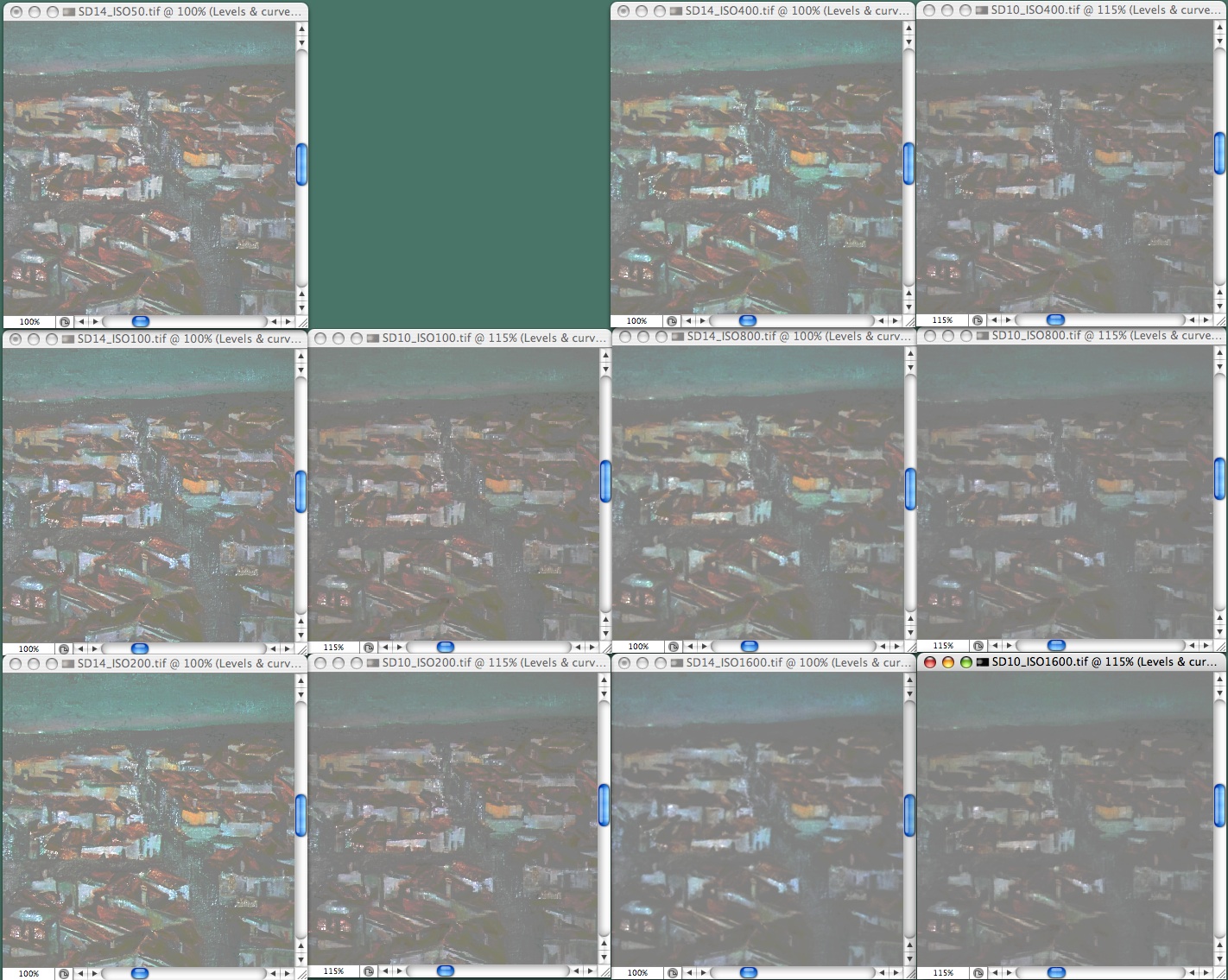
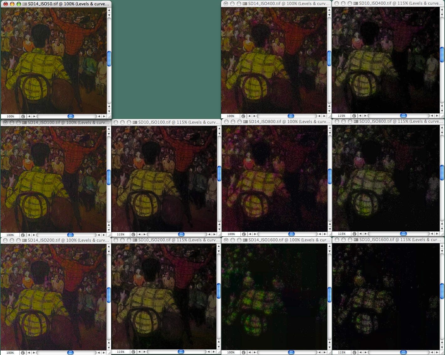
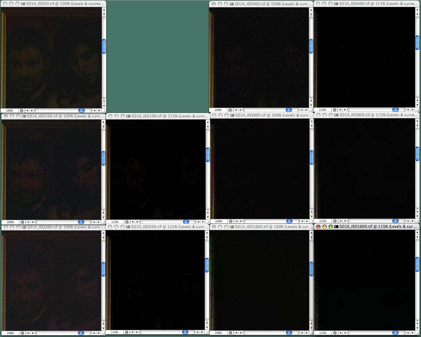
Testing Dynamic Range — To test dynamic range, I photograph a scene with a tonal range exceeding the capacity of any sensor, then I pull apart the tones in the highlights and shadows at the expense of the middle tones, to see what hidden detail becomes visible. I convert raw 12-bit files to 16-bit TIFFs without any manipulation, then I run a Photoshop action on each of them, an action that first spreads the image across 16 bits and then uses Photoshop’s Curves tool to stretch the highlights and shadows. The photos below show the overall scene without any manipulations plus samples of three regions with the tones pulled apart. I enlarged the SD10’s images to the size of the SD14’s using simple bicubic
interpolations without sharpening. There is no image from the SD10 for ISO 50 because the camera does not offer that speed.
Overall: This is the original image from each camera. The spotlight on the light painting fades rapidly off toward the side, leaving the painting on the right too dark to for any sensor to capture.

Bright Area: This compares the bright area of images taken at each ISO speed offered by each camera. For every pair of images you can see that the SD14’s image shows just a bit more detail than the SD10’s image.
Dark Area: The images from the SD14 are noticeably better than those from the SD10.
Very Dark Area: Here there’s no real question of quality but the SD14 can extract at least some detail at ISO 200 and below, whereas the SD10 cannot.
Comparing the SD10 and SD14 — As cameras go, the SD14 and SD10 are very different. The SD14 has a clearer viewfinder than the SD10 and several more features. At first blush it looks more desirable but most of those features strike me as more important for marketing than photography, and they complicate the camera’s controls. Also, although the SD14’s viewfinder is larger and clearer, the SD10’s viewfinder functions like a sportsfinder to facilitate framing moving subjects, and – a clear disadvantage – the SD14 lacks the SD10’s protective cover for the LCD, which leaves the SD14 more fragile. All in all, ignoring the sensor, I don’t see either camera as preferable to the other.
I cannot ignore the sensor, however. It is the sensor that captures images, not gadgetry on the camera, and the SD14’s sensor shows less noise than the SD10’s and does a better job capturing tonal extremes. I suspect that most people would not notice the difference but I frequently push the limits of the SD10, so I could not resist the improvement. Anybody care to buy a second-hand SD10?
[If you found Charles Maurer’s discussion of megapixels, dynamic range, and image sensors helpful, he asks that you make a donation to Doctors Without Borders.]
Google Goes After Wikipedia
A blog posting from Google’s Udi Manber, vice president of engineering, fires the first shot in a competition that will at least prove interesting, if not world-changing. In the post, Manber announces Google Knol – a “knol” is a Google-invented word standing for “a unit of knowledge. The basic concept behind Google Knol is that anyone (eventually; it’s in private testing for now) will be able to create a well-designed, automatically organized Web page on any topic – Google’s goal is that knols will be the first hits people looking for information will find.
This sounds a lot like Wikipedia, and that’s intentional. Anyone can already create an article in Wikipedia on any topic, and Wikipedia articles already sit atop the search results for a vast number of terms – try a Google search for “Hurricane Katrina,” for instance, and the first hit is the comprehensive Wikipedia article on the topic. So why would Google be attempting to replicate Wikipedia?
Put yourself in Google’s business shoes for a moment. Google is happy to provide the search that reveals the Web pages that people want to find because of the ads that appear on the search results page. But wouldn’t you be even happier if you owned the results of that next click too? Google has long been adding services that keep you within the Google orbit longer, so, for instance, if you search for “New York weather,” Google presents you with a mini report and forecast rather than send you off to another site right away. Similarly, if you search for “recipe spaghetti,” Google dumps you into a recipe-specific
search interface (this doesn’t yet happen with all recipe searches, or even for all people).
So if a Google knol becomes the top result for related searches, Google has the opportunity to display ads on that page. Here’s where Google Knol departs from the Wikipedia approach. Google knols will have a single author, who will be credited and will decide if ads are to be displayed, sharing in the revenue if so. Manber makes a big deal about how authors have faded into the background on the Web, saying “…somehow the Web evolved without a strong standard to keep authors’ names highlighted.” That’s hooey – there is no systematic lack of credit to authors on the Web in general, with nearly every article, blog post, comment, and home page providing a clear mark of authorship. Heck, the basic idea of having authors create
topic-specific pages isn’t even new – About.com (now owned by The New York Times Company), has been doing this since 1996.
That’s a huge split from the community-based approach that Wikipedia uses, where every article is the result of a collaborative writing and editing effort from many different people. And, of course, where ads have no place.
According to Manber, Google Knol will include community-based features as well, with people being able to “submit comments, questions, edits, additional content, and so on.” But the key word there is “submit” – the implication is that the primary author remains in control of the content and can choose to address or ignore comments and edits as desired. Google even says, “All editorial responsibilities and control will rest with the authors.”
Speaking as an author, and as a publisher who has worked with hundreds of authors over the last 18 years, I think this is a huge mistake. Maintaining content is hugely difficult and time-consuming, and not something that most authors do well (if at all). The beauty of the Wikipedia approach is that anyone who wants can contribute as much or as little as they want, as frequently as they want. If one person loses interest, there’s always room for another to take over.
There’s also an implication in Manber’s post that knols will be of high quality because of this authorial ownership. That will be true of some, but the reality of the situation is that most people, even if they are expert in some topic, can’t write their way out of the proverbial paper bag. Many won’t even have the necessary skills to organize the source material – this stuff isn’t nearly as easy as it sounds.
Google’s answer to this is that they don’t care, claiming that their search rankings will separate the wheat from the chaff, and will in essence arbitrate between good and bad knols on the same topic. Since Google is providing no editorial or organizational oversight, duplication is nearly guaranteed, which results in dilution of interest from the community. Editors who might donate some time to fixing up Wikipedia pages won’t have the same interest in working on multiple similar knols, especially those that stand to benefit the author.
Worms abound in the Google Knol can. What happens when there are copyright infringement claims against knols that plagiarize content from elsewhere? Will knol authors start by just stealing Wikipedia articles, and will Google act to prevent that? Will Google’s policies disallowing specific content for services like Google Groups apply to Google Knol? What happens when a knol author gets busy, becomes bored with a knol, or dies? Will Google be able to argue in international court that it has no oversight over illegal content created using its own service? There’s nothing new here, but the bigger the company, the bigger the target.
Don’t get me wrong. Google will undoubtedly do a much better job than Wikipedia in terms of user interface and hosting technology, and the Google Knol pages will undoubtedly be better designed and more attractive. Generalized wiki technology simply can’t compete with a purpose-built tool designed and run by the dominant company on the Web.
But with this project, Google looks more like Microsoft than ever before: coming late to the game with a solution that’s only a marginal improvement over the competition, all while talking as though it’s a revolutionary change. Just as the open-source Linux has proven impossible for Microsoft to squash, Wikipedia’s community-based approach, flawed and argumentative as it can be, will prove more compelling, accurate, and resilient than Google Knol in the long run.
Bonus Stories for 17-Dec-07
Amazon Delivers Like It’s 1999 — A new grocery delivery service from Amazon being tested in Seattle reminds this author of the heyday of the early dot-com era. This time, however, there’s a chance for a company to make money. (Glenn Fleishman, 2007-12-11)
Leopard Compatibility List Updated — Curious about what programs have been updated for Leopard? Look inside for a list of the important or interesting programs that specifically claim Leopard compatibility. (TidBITS Staff, 2007-12-11)
Hot Topics in TidBITS Talk/17-Dec-07
Airport Express — Learn how to play streaming audio, such as radio stations, through an AirPort Express. (3 messages)
Crucial bug in Safari for Leopard — A reader encounters a problem related to loading PDFs and sound files in Safari; anyone else seeing it? (1 message)
Licensing NTFS – Or Why Doesn’t Mac OS X Natively Support NTFS — Joe’s article about NTFS for Mac OS X wonders why Apple didn’t build that functionality into Leopard. One reader speculates on the answer. (1 message)
New Apple Store in New York/Scrolling in iPod Touch and iPhone — After a visit to Apple’s new retail space in New York City, a reader has questions about displaying maps and accessing private data on an iPod touch or iPhone. (7 messages)
10.4.11 Issue with Quickverse — A bug in this Mac Bible software has yet to be fixed, leading to questions of faith: which applications can one turn to instead? (6 messages)
Storing passwords on an iPod — What’s the best way to store sensitive material on an iPod, versus carrying a Palm handheld? (3 messages)
Amazon Grocery Delivery Service — Glenn’s experiences using Amazon Fresh invites comparisons to other services, many of which are small and local, compared to the failed promise of Webvan. (4 messages)
Leopard 10.5.1 on a G5? — After installing Leopard and getting the latest system update, the fans in a reader’s Power Mac G5 have gone into jet-plane mode. (5 messages)
Networking Problem — A reader bought a new modem to take advantage of faster ADSL network speeds – but the devices aren’t talking. What can get these peripherals to come back to the table? (7 messages)
Google Goes After Wikipedia — Readers discuss Google Knol, a Wikipedia competitor that will potentially have issues with copyright and author bias. (4 messages)
Death by mdimport — Preventing Spotlight searches of several directories made a big difference in system slowdowns for one reader using a Power Mac G5. (1 message)