TidBITS#1163/04-Mar-2013
Frustrated by passwords? We have the solution in our latest ebook, Joe Kissell’s “Take Control of Your Passwords” (complete with a “Joe of Tech” comic and a funny intro video). In other TidBITS news, listen to the staff roundtable discussion about our email strategies and be sure to check out the New Republic article that keys off a previous staff roundtable, along with Adam Engst’s interview on KCRW radio. But enough about us! Jeff Carlson covers the flap over the buggy Kindle app, Adam examines the re-approved DataMan Pro, and Glenn Fleishman explains how you can join App.net for free. Feature articles include Josh Centers’s review of the visual communication app Napkin and Matt Neuburg’s look at what’s new in our TidBITS News app, complete with a trip back through iOS history. Notable software releases this week include Scrivener 2.4, CrashPlan 3.5.2, DEVONthink and DEVONnote 2.5, and PDFpen and PDFpenPro 5.9.5 — all apps that, coincidentally, we’ve covered in Take Control books.
Overcome Password Frustrations with “Take Control of Your Passwords”
Do you find juggling Web site usernames and passwords frustrating? I know I do, thanks to having over 300 Web accounts, accumulated over a decade or more. During that time, the recommendations for secure passwords have changed significantly, and both the likelihood of problems and the liability of having accounts compromised have increased radically. It’s maddening, and, honestly, a bit scary, especially after the high-profile hacking of Wired writer Mat Honan last year (“Watch TidBITS Presents “Protecting Your Digital Life”,” 22 August 2012), coupled with password thefts from the likes of Yahoo, Twitter, and Facebook.
Luckily, Joe Kissell is on the case, and his latest ebook, the 88-page “Take Control of Your Passwords,” calmly offers a secure, reliable strategy that you can apply with a minimum of fuss. But rather than write more about it here, we wanted to have some fun, so we commissioned our friends Snaggy and Nitrozac of the Joy of Tech to create a special “Joe of Tech” comic (click it to expand).
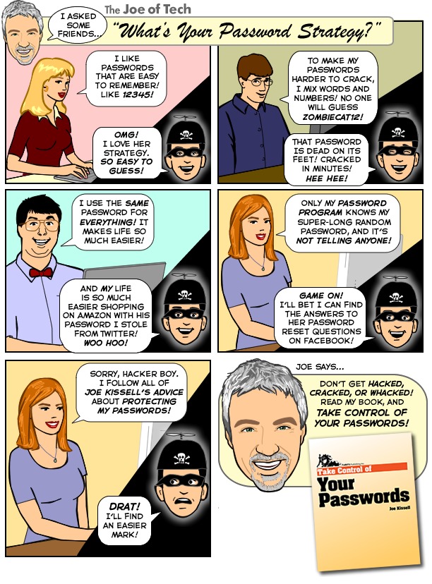
Even better (if anything could be better than a Joe of Tech comic!), Joe put together this short intro video — it provides a humorous look at the problems Joe helps you solve in “Take Control of Your Passwords.” Well, unless you’re using a Commodore 64.
Lastly, in a reprise of something we did with the 2003 release of our first title, Joe’s “Take Control of Upgrading to Panther,” if you find this ebook helpful, write to us about your experiences — for example, how you overcame bad password habits or solved a challenging password problem. (If you want to include a photo of yourself, perhaps with a cranky “uncle” you’ve helped out with advice from the book, feel free!) We’ll post the most interesting and creative responses on the Take Control Web site, and once a month (for the first 3 months after publication) Joe will pick his favorite story and send the lucky reader a batch of his famous homemade chocolate chip cookies. Photos and testimonials about the cookies are
also welcome, of course!
VidBITS: Email Strategies of the TidBITS Staff
While we were having the internal discussions that led to two articles in last week’s issue of TidBITS — “Mailbox for iPhone Eases Email Triage but Lacks Key Features” (22 February 2013) by Josh Centers and “It’s Not Email That’s Broken, It’s You” (23 February 2013) by Joe Kissell — I started wondering about how my TidBITS colleagues actually deal with their email. It was an odd thought, since I exchange email with these people daily, sometimes hourly, but I see only their replies, not how they handle my incoming messages, much less the vast quantity of other messages that arrive every day.
So in this week’s staff roundtable, I asked Joe Kissell, Jeff Carlson, Michael Cohen, and Tonya Engst if they found email stressful, what their basic email strategy was, and how they integrated iOS devices into that strategy (and I shared my approach as well). Some interesting takeaways:
- No one, with the possible exception of Tonya, is particularly stressed out by email, and Tonya was careful to qualify her answer by noting that it wasn’t email in particular that caused her stress, but there simply being too much to read, watch, and do in general. As the bearer of ever more information, email sometimes becomes the focus of that stress.
- We spanned the gamut of how many email messages remain in our inboxes. Though he doesn’t subscribe to the approach of Inbox Zero, Joe had only a single message in his inbox, whereas Jeff had nearly 200, Michael’s inbox held over 900, Tonya bested him slightly with about 1,100, and I “won” by having tens of thousands of messages in my inbox (but that’s because I see no reason to remove Gmail’s Inbox label from messages and instead mark messages as unread when they still need to be dealt with).
-
I was intrigued to see just how differently we all approached email, with some people doing a lot of filtering and attempting to keep a clean inbox, and others of us dealing with email more as a stream of information that doesn’t need to be filed away to be found later.
-
Several of us read email on an iPhone or iPad first thing in the morning, sometimes while even still in bed or while eating breakfast. Although it’s not possible to deal with everything while not at the Mac, it can be a nice way to cruise through the easy stuff quickly.
In the end, I came away with the realization that no app or technique that promises to solve email overload can possibly help everyone, since we all have different needs and proclivities. Nevertheless, tune in, and perhaps you can pick up some tips that will help you take control of your email! And if you have an email strategy that works well for you, please share it in the comments.
(Remember, you don’t have to watch the video; you can click the Listen link at the top of the article’s Web page to listen to the audio, or subscribe to the TidBITS podcast to have it downloaded to iTunes or your favorite podcast app automatically.)
Kindle App Updates Demonstrate iOS App Store Flaw
Why would a company tell its customers to not download its latest offering? Because that version includes a nasty bug that can’t be quickly fixed.
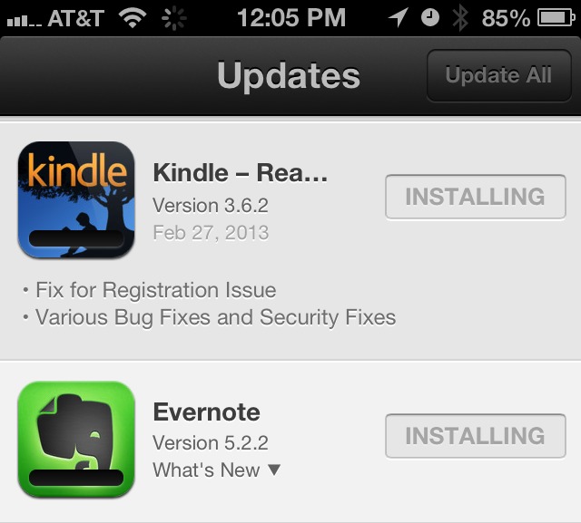
On 27 February 2013, Amazon released version 3.6.1 of its Kindle iOS app and then quickly recommended that users not apply the update due to a “known issue with this update.”

Updating forced you to log back in to your Amazon account, removed all titles from the device, and marked them as New when you downloaded them. However, it still retained your last-read location in the books.
By the next morning, a 3.6.2 update appeared that worked around the problem. If you updated to 3.6.1 but didn’t open the app, jump to 3.6.2 and you won’t see any of the problems.
How is a situation like this possible? When a company submits an update to Apple for release in the App Store, it must wait for the update to be approved. In this case, an installation bug slipped through that Amazon probably couldn’t fully test against.
But once an update is submitted to Apple, the developer can’t do anything to fix such bugs other than re-submit another update that corrects the problems — which must again go through Apple’s review process.
The only other action Amazon could take was to change the release notes, which developers can do easily. And then wait for Apple to approve the new version. Unfortunately, users often don’t read the release notes, although at least the iOS App Store app has made it easier to do so on the iPhone. In an earlier version, you had to tap exactly on the tiny What’s New triangle, which was nearly impossible; now you can tap anywhere on the app’s name to show the release notes.
To reduce the impact of similar bugs in the future, Apple could make it easier for users to revert back to a previous version. As Matt Neuburg pointed out, reverting manually is possible, provided a couple of conditions apply: that you update apps only via iTunes syncing and that you don’t empty the Trash after updating. If so, you can pull the previous version out of the Trash and swap it with the one in your Mobile Applications folder.
But if you’re like me and hate to have badges appear on the App Store app icon, don’t be so quick to update everything. This isn’t the first time unexpected bugs have appeared in updates, and won’t be the last.
DataMan Pro Returns, Again, with Fewer Features
In the ongoing saga of excessive cellular data usage, the furor seems largely to have died down over the past few months, presumably as Apple has silently fixed bugs in iOS 6 — I personally haven’t had any runaway data days since upgrading to iOS 6.1 (see “Mysterious iOS 6 Cellular Data Usage: A Deeper Look,” 24 October 2012). But I’m willing to bet that there are people still experiencing problems who are either suffering quietly or who have adjusted their habits (such as by toggling cellular data manually) to compensate. For anyone who remains concerned, the good news is that the DataMan Pro iPhone app that tracks
cellular data usage has once again reappeared in the App Store (see “Track Per-App Data Usage in iOS with DataMan Pro,” 20 November 2012). For a limited time, the $9.99 app is available for half-price, at $4.99.
DataMan Pro has a checkered history in the App Store, having been pulled by Apple — after initial approval and significant sales — not once, but twice. The problem is that DataMan Pro needs to do things that Apple doesn’t approve of — notably run in the background and read various internal log files. Apple removed version 6.1 of DataMan Pro from the App Store because it implemented a voice-over-IP client (which can run in the background) but was not primarily a VoIP client. Yes, it was an attempt to work around Apple’s restrictions, but any system that restricts developers from providing the useful features that users want invites such workarounds.
The new DataMan Pro 6.3 switches to a different approach, and the bad news is that not being able to use the VoIP trick means that some of DataMan Pro’s most compelling features have been removed. Notably, there’s no more hourly, daily, or weekly tracking — both overall and per-app usage stats exist only at the monthly level. Regarding the more-granular tracking, Johnny Ixe of XVision, DataMan’s developer, told me:
“We needed to leave it out so that we could overcome the technical constraints that Apple imposed on us. Since we can’t use the VoIP mode, we can’t reliably display hourly stats. Daily tracking has also become more challenging, and so we left it out to negate any objections from Apple and to get DataMan Pro back quickly. We were hoping that Apple is more receptive of this “less detailed” app watch. And we were right — they approved DataMan Pro again. We hope to bring daily stats back in the future.”
The other hassle required by the new version is that you must open DataMan Pro before any restart to maintain accurate data. Opening it after restart is not necessary.
On the plus side, DataMan Pro is far more attractive than in the past, featuring a color-coded main screen that provides an at-a-glance sense of how in danger you are of exceeding your monthly data cap. More than just a simple green-yellow-red color coding, DataMan Pro’s Smart Forecast feature predicts how likely you are to remain within your allotted data limits at all times, taking into account both how much data has been used in the month, and how close you are to the end of your billing cycle. So if you’re at 90 percent of your limit but have only 1 day remaining in the month, it will be green to indicate that you have nothing to worry about. However, if you hit 90 percent with 21 days remaining, it turns red to warn you that
you’re extremely likely to go over your limit.
Swiping up from the main screen reveals a list of per-app usage details (cellular only), along with location pins. Settings are available by swiping left in the main screen.

Even though DataMan Pro 6.3 is far more attractive than in the past, and is one of the best options for tracking cellular data use on the iPhone, the loss of the more-granular tracking features is disappointing. If you have DataMan Pro 6.1 and rely on those features, I recommend avoiding this update. If you don’t yet own DataMan Pro for the iPhone, version 6.3 will provide more guidance than iOS’s built-in reporting, and we can hope that XVision is able to get those features past Apple’s restrictions in a future update.
App.net Adds Freemium Option
App.net has gone freemium. The social-networking platform designed to be leveraged by third-party developers has a focus towards paying customers that might make adding a free tier seem like a bad fit. But the limits on free use make sense, much like Dropbox’s free and paid divisions. Free users must be invited by existing paid account holders.
App.net may at first be mistaken for a microblogging service like Twitter, with ambitions to become a full-blown social network like Facebook. But the business is built the other way around. It promises never to switch to an ad-supported model, allows developers to charge any amount or use any business model for their software (and doesn’t collect a fee beyond a $100-per-year developer subscription), and says it will restrict only malicious activities or those that threaten the network’s stability.
I first wrote about App.net on 28 August 2012 in “New App.net Social Network Aspires Beyond Chat and Ads,” explaining that while it looks like Twitter to begin with, App.net’s ambitions were to provide all the plumbing for developers who want to build on top of a platform without creating all the messy bits underneath. Think of App.net as a city that installs gas, electric, sewer, water, and Internet feeds, and lets developers build as many houses, hotels, and office towers as they want, on an essentially infinite amount of land. App.net makes money from providing utilities, not establishing any rules beyond a loose building code.
App.net launched in mid-2012 through a crowdfunding project (both to raise funds and see if anyone cared) that set the annual regular user fee at $50. In October 2012, it dropped its rate to $36 per year and added a $5 month-at-a-time subscription to let people test the waters (see “App.net Reduces Fees, Software Options Grow,” 3 October 2012). It later quietly gave paying subscribers three invitations to give a month’s free service to friends.
A few weeks ago, App.net rolled out its “File API,” which allots 10 GB of storage to every paid user, and enables developers to use that as a pool of cloud data available everywhere. Tapbots updated its Netbot iOS app, which is now free, to use App.net storage for uploading photos to share over the microblogging component of the network.
The free level has a number of limits. Free users may follow only up to 40 other people and store up to 500 MB of data (with file sizes up to 10 MB each). Paid users have been given invitations in their accounts to extend to others; anyone previously invited to a one-month trial has had their account converted to the free tier, too.
This isn’t an untested model. App.net cites Dropbox and github as notable examples, and there are many smaller ones as well. Dropbox has a valuation of billions of dollars, but has retained its free/paid split as a tool to entice people into relying on hosted and synced cloud storage. Dropbox’s free level includes a decent 2 GB of storage (which can be expanded through referrals and uploading photos), but when you approach that threshold, it’s a small step to start paying a monthly fee for more storage: you’ve already realized Dropbox’s utility.
The invitation approach is designed to continue the stately scaling of App.net’s user base. The company simply doesn’t want a million users overnight as that doesn’t benefit it, its users, or third-party developers. Rather, the goal is slow but steady growth, which the company now wants to goose a bit by making it easier for people to understand whether there is any “there” there — it lets those curious participate, listen, and discuss, and pay only if they find that their interests exceed following 40 other people.
As I wrote at the top, App.net isn’t just a microblogging service. That is its most obvious feature and helps explain what the service does. You can summarize that side as, “It’s like Twitter but without the Twitter business model that has squeezed developers out of the market.”
More interesting is what’s to come. Expect more and varied applications that rely on the many pieces of App.net’s infrastructure (with more pieces obviously to come that aren’t yet announced) in more exotic ways. For instance, App.net added multi-party private messaging months ago, which has hardly been exploited. A photo-sharing service could launch on top of App.net (which will ostensibly eventually let us buy more storage if that’s the case). And existing programs could add App.net as an alternative to Twitter, Dropbox, and other integration for storage, comment authentication, and other functions.
I hate to predict the future, but I believe we’ve seen just the tip of the iceberg so far as to what developers will do with App.net’s services. Adding free users lets us see what more of that iceberg looks like.
Napkin Offers a Fresh Take on Visual Communication
One of the most talked-about releases of late has been Napkin, a new image annotation and diagramming app from Aged and Distilled. Napkin sets out to make visual communication as fast and simple as scribbling on its namesake. To drive the analogy home, its default background is a napkin texture.

Napkin focuses on making visual communication as simple as possible. Unlike most applications in its class — and most Mac applications in general — Napkin emphasizes gestures, and feels as though it would be as at home on the iPad as it is on the Mac. It’s hard to imagine that an iOS version isn’t in the works, but Napkin is otherwise so aligned with current Apple thinking that it’s limited to OS X 10.8 Mountain Lion and saves to iCloud by default (and is thus limited to the Mac App Store).
There are three ways to place an image on your napkin: open an existing file, take a screenshot, or snap a picture from a webcam. Screenshots can be taken of an entire window, or you can click and drag to select only part of a window. You can add as many images to a particular napkin as you need.
Once you have the image(s) you want, annotations are intuitive, and can be added via menus or the toolbar, or by gestures. If you want to add some text, just start typing. If you’d like to point out something with an arrow, just click, drag, and draw a straight line. To draw a shape, press the Command key, and click and drag to draw it out. You can lock an object, and if you drag an arrow out from that object, the arrow remains linked to the object, so if you unlock it and move it around, the arrow stays connected. If you draw a line inside a locked object, Napkin instead creates a measurement line, with a text label of how many pixels long the line is.
You can use all of these Napkin features together to create diagrams and even mind maps. You can add text directly inside a shape, so you can draw a bubble, add a thought, then lock the bubble. Then, you can draw an arrow out from that thought bubble to your next idea.
Image captures can be decorated with frames, which act somewhat like borders, and with backgrounds, but the selection is limited. Napkin gives you six frames from which to choose, but you have no way to adjust them. I have yet to find one that I actually like. The two I find acceptable are Simple and Photo, which are tasteful, if wide, white borders. There is also the Capsule frame, which rounds the corners of the selected image. Three of the rest are skeuomorphic and just feel silly: Thumbtack, Tape, and Paperclip, each of which adds a cartoon version of its namesake to the top of a captured image. Backgrounds are even more limited, with three options: Transparent, White, and the aforementioned Napkin, which resembles the texture of a
paper napkin.
If a captured image contains sensitive information, you can double-click on it to redact. Napkin zooms in on where you clicked and gives you two tools: a marker and an eraser, each of which can be set to a variety of sizes. While this is a neat feature, I would rather just draw black rectangles over sensitive information, as drawing redactions out by hand usually looks messy.
Napkin’s marquee feature is the Call-Out, which acts like a fixed magnifying glass, pointing out details you would like to draw attention to. You can create one either by clicking the Call-Out button or by drawing a circle. Then, simply drag the Call-Out over whatever you would like to magnify and click it again to lock it in place. Between Call-Outs and arrows, Napkin makes calling attention to interface elements easy.
Napkin is inherently social. A built-in Share button lets you send images to Twitter, iCloud, Facebook, email, and more. One of Napkin’s cleverest features is the File Pip, a button in the upper right labeled “.png”. Drag that button anywhere to add a PNG image of the current napkin. Unfortunately, the File Pip hasn’t been perfected yet, as you can’t drag it to every application. Here at TidBITS, we use a custom app called ShotBOT to upload images to our content management system, but dragging the File Pip to ShotBOT doesn’t work, nor does it work with many other applications. However, if you own a copy of DragonDrop, a neat utility that acts as a holding cell for files
and content, you can drag a PNG from Napkin to DragonDrop, then to any other application you choose. Unfortunately, you can’t directly choose what the resulting PNG is named; it’s a combination of the napkin’s filename and a timestamp.
Despite its professional price tag, Napkin 1.0.2 lacks many professional features and even some basic ones. There is no way to zoom in or out, an essential feature of any image editor. There isn’t yet a system-wide hotkey to take screenshots, though the screenshot feature works well enough with Mission Control, as long as your Napkin window shares a Desktop with the window you would like to take a screenshot of. Although you can align images to each other, Napkin lacks guides, making it difficult to fine-tune alignments. Napkin also lacks image cropping. While you can select only part of a window for a screenshot, once you’ve taken an image, Napkin can’t trim it down further. Nor is there any easy way to limit screenshots to
specific interface elements like menus and dialogs.
Although it’s innovative for a Mac application, Napkin’s gesture-based interface can be annoying. I often found myself drawing an arrow when I wanted to drag an existing element. It can also be difficult to remember how to trigger an arrow instead of taking a measurement. Napkin tries to guess what you want to do, but doesn’t always guess correctly. I hope Napkin’s developers are paying attention to user feedback and will be smoothing out these rough edges.
I want to like Napkin. It’s innovative and clever, and I’m sure it will get better with time. But at the moment, it’s difficult for me to recommend the app, particularly at its current price of $39.99. While its simplicity makes quick diagrams and annotations fun, it lacks the fine control required for production work. I could see using it for quick notes and remote project collaboration, but it grants the user little control over the final output, so if you’re trying to prepare images for a publisher with specific needs, Napkin will likely fail you. I used Napkin for the first image in “Squarespace 6 Web Hosting: Ease of Use and Design Outweigh Flaws” (8 February 2013) and
found myself frustrated at the limitations in image alignment and border options.
Napkin could be an indispensable tool for a development team. The Call-Out feature is a great way to point out small details, and alone could justify the cost of admission for some. But for now, it probably can’t handle all of your visual communication needs, so is instead merely an adjunct to existing tools.
TidBITS News 1.5: A Revolution in a Nutshell
The freeware TidBITS News app, which lets you read and listen to the most recent TidBITS articles, is a tiny microcosm of almost the entire history of iOS. And it’s been one heck of a history. If dog years are 7 years, then developer years, trying to keep up with a rapidly changing target like iOS, feel more like 20 years. This app has been public for just over 3 solar years, but it seems I’ve already spent a lifetime trying to keep it running and up-to-date.
A Brief History of the World — Perhaps I should stretch my metaphor even further, and say that developer years are more like 200 million years. Then I could compare the six released versions of TidBITS News to geologic strata, tracing a history of cataclysmic changes. Here’s some of what we’ve lived through (and somehow survived) with TidBITS News:
- When TidBITS News version 1.0 was released, in December 2009, the latest devices were the iPhone 3GS and the third-generation iPod touch. I had acquired one of the latter a couple of months before, sporting Apple’s shiny new iOS 3.1, and I was intrigued by its capability to make do with little in the way of speed, memory, and screen real estate. I wrote TidBITS News in part to teach myself how to program in this strange new world of tiny single windows with touchable interfaces.
Architecturally, TidBITS News was a simple pair of Master-Detail screens: in the Master view, you see a list of TidBITS stories with their titles and summaries; if you tap one, you see the Detail view, containing the entire story. Still, behind the scenes, it was doing some pretty slick networking: the stories were downloaded from an RSS feed and parsed using an open source library, and the Detail view let you listen to the online podcast of that story if it existed. The Master view contained one highly innovative feature: the titles and summaries, and the table rows containing them, could vary their heights from row to row. I knew of no other app at the time that did that, and I was
proud of having worked out how to do something so tricky. Since then, I’ve published instructions, and it’s become a fairly widespread form of interface. - In April 2010, Apple released the iPad. Fortunately, iPhone-sized apps continued to run on the iPad, in a kind of emulation mode, displayed at the iPhone screen’s size (or at a rather ugly double size). So the TidBITS News app didn’t need a separate iPad version, I felt, and I hoped to get by with doing nothing. Unfortunately, the emulation wasn’t exact. The iPad ran iOS 3.2, while the iPhone remained at iOS 3.1, a cross-device discrepancy that took Apple an unconscionably long time to resolve. There were differences in how the two systems implemented identical features, and in how they responded to identical code. (Most egregiously, if you drew a shadow in iOS 3.1, the same code caused the shadow to come out backward in iOS
3.2. Oh, Apple.)This difference in system behavior had consequences for TidBITS News: iOS 3.2 broke my prized methodology for dynamically sizing the titles, summaries, and table rows in the Master view. I had to scramble to fix the problem. I still remember solving it, sitting at my parents’ kitchen table in Princeton, New Jersey, banging away with a virtual hammer, and eventually somehow coming up with code that worked on both systems and both kinds of device. Version 1.1 of TidBITS News, incorporating the fix, was posted in June 2010.
-
By that time, Apple was ready with another revolution: the iPhone 4. This brought two huge changes. First, it had a double-resolution screen; this made the text in TidBITS News look fabulous, but unfortunately it made the graphics look lousy. Second, and more far-reaching, it introduced iOS 4 and multitasking. This, as I explained at the time (“What is Fast App Switching?,” 23 June 2010), meant that an app was suspended rather than terminated when the user switched to the Home screen or to another app, but the suspended app might be terminated without notice thereafter. In August 2010, we released version 1.2 of TidBITS News, incorporating multitasking and with
double-resolution graphics (along with some nasty kerfuffle involving the App Store; see “Explaining the TidBITS News App Version Confusion,” 21 August 2010). -
iOS 4.0 ran on the new iPhone 4, as well as on some older iPhone and iPod touch models, but not on the iPad, which was still back at iOS 3.2 and therefore didn’t have multitasking or any other iOS 4 innovations. TidBITS News, which was designed to run on either the iPhone or the iPad even though the App Store refused to let us distribute it that way, contained a lot of extremely messy code, jumping through various hoops to detect and respond to what system it was running on. I found this situation disgusting (there is no nicer way of putting it), and was resolved, as long as Apple persisted in giving its developers the virtual finger, to give Apple the same virtual finger right back again. Like Achilles in his tent, I would refuse
to come out and fight until my conditions were met: Apple must first unify the system across devices. Finally, in November 2010, after a dramatic false start, Apple released iOS 4.2.1, which ran on the iPad as well as all devices that previously ran iOS 4.0, and now Achilles had to come out and fight. I proceeded to turn TidBITS into a “universal” app, meaning that it had two interfaces, one which loaded on an iPhone-sized screen and another which loaded on the iPad.Version 1.3 of TidBITS News was released in December 2010; it still had quite a bit of hoop-jumping code, but this was different hoop-jumping code: instead of behaving differently for different systems, it behaved differently for different devices, and not because the systems had different capabilities, but because the interface architectures were different. On the iPhone, the Master view was the first view of a navigation interface, and the Detail view was the second view of the navigation interface, replacing it; on the iPad, they were both visible simultaneously, as the left and right views of a split view (in landscape orientation; in portrait orientation, the Master view was an annoying “popover,” because
that’s how iOS 4 implemented split views). The iPad, being taller, could accommodate taller table rows, and screen real estate wasn’t tight, so a story could be displayed with bigger images and wider margins. -
Shortly after the release of version 1.3, a rare memory bug arose. After some experimentation, I decided that it wasn’t ultimately my bug — it had something to do with that extremely annoying popover — and that I’d done all I could to ward it off. Also, acting on a suggestion from a reader, I incorporated a new audio management policy: if the user was playing background music at the time TidBITS News came to the front, we’d permit the user to continue enjoying that music while reading, but if the user then asked to listen to one of our podcasts, we’d pause the background music. Version 1.4 of TidBITS News was released in February 2011 (“TidBITS News App 1.4 Allows Background
Audio,” 18 February 2011).
And there things remained for nearly two years, as far as TidBITS News was concerned. Things in the Apple world, however, continued to move at their usual pace. iOS 5 (October 2011), and especially iOS 5.1 (March 2012), brought innovations that I wanted to incorporate into TidBITS News (see “How iOS 5 Will Affect Developers — and You,” 17 October 2011), but they didn’t actually break anything, so I had no real excuse to write a new version. The third-generation iPad (March 2012), with its Retina display, made our text look even better; we already had double-resolution graphics (except for the app’s icon itself), so there was no need to panic. Then, iOS 6 (September 2012) brought
still further inviting innovations (see “How iOS 6 Will Affect Developers — and You,” 25 September 2012), plus it gave me the excuse I’d been waiting for: it broke, ever so slightly, the technique I’d been using to draw the text in those variable-height table rows — and, of course, the app was letterboxed on the taller screen of the new iPhone 5. I was darned if I was ever going to jump through those runs-on-two-systems hoops ever again, so I resolved to rewrite TidBITS News completely from scratch as a pure iOS 6 app. After providing due warning in “Get the TidBITS News App for iOS 4.2 and iOS 5 Now” (10 December 2012), we
released TidBITS News 1.5 in January 2013.
What You See — What’s new in TidBITS News 1.5, then, is a highly representative cross-section of what’s new in iOS 5, iOS 5.1, and iOS 6. Some of it appears quite obviously on the surface. Compare side by side, for example, the Master view (the list of story titles and summaries) as it appears in TidBITS News 1.4, on my iPod touch running iOS 5.1 (left), with the same interface as it appears in TidBITS News 1.5, on my iPhone running iOS 6 (right).
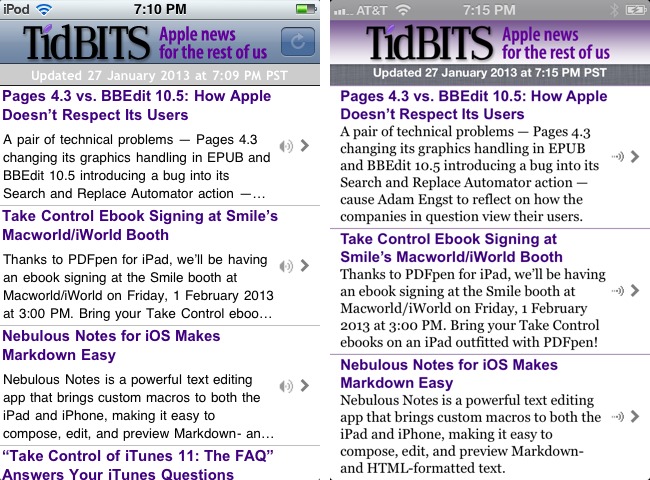
Start by looking at the very top of the screen, above the TidBITS logo, where it reports things like the current time and the state of the battery. That’s not really my app; it’s the system status bar. But there’s a change here nevertheless. iOS 6, on the iPhone (but not on the iPad), insists on tinting the status bar in a mysterious, automatic way. Developers don’t like this, because the tinting algorithm is undocumented (though of course we’ve figured out what it is, and how to fool the status bar into tinting itself some other
color) and you can’t turn it off — unless you want the status bar to be black. What you absolutely can’t have, alas, is the good old gray gradient status bar from iOS 5 and before. It’s just a nostalgic memory.
Cast your eye a little lower, now, to the TidBITS logo. What’s changed here isn’t the logo, but what’s behind it. Back in iOS 4, when TidBITS 1.4 was written, standard interface elements like this one — it’s a navigation bar — were pretty much the same in every app. It was like the status bar: you could have a gray gradient or a black gradient. Starting in iOS 5, Apple began providing official ways to customize many interface elements, and they went even further in iOS 6. So this navigation bar now has a background image that was previously impossible; the artwork for that gradient comes from the TidBITS home page. Oh, and just below the navigation bar — just below it, and barely visible against the “linen”
background in the second screenshot — is another new iOS 6 feature: a navigation bar now optionally casts a tiny shadow against whatever’s below it.
At the right of the navigation bar, version 1.4 has a Refresh button; version 1.5 doesn’t. That’s because iOS 6 provides a new built-in Refresh control for tables. The idea, which originated with the Twitter app, is that you pull to refresh: you scroll the table down until the Refresh symbol appears, and keep holding it down until the Refresh symbol starts animating. By taking advantage of this, I use a bit of interface that’s become common coin in standard apps like the iOS 6 version of Apple’s Mail app, and I keep the Refresh button from cluttering up the visible interface.
The iOS 6 Refresh control has both an activity indicator and a label where I can display some text. I’ve taken advantage of this to change the way I display the date and time when we last updated our data from the feed. In TidBITS News 1.4, that information is displayed in a label that’s always present, distracting the eye and occupying screen real estate. In version 1.5, it’s part of the Refresh control and is usually hidden up under the logo at the top of the table; you can see it in the screenshot only because I expose it just after the feed data is refreshed. Thus the 1.5 interface is much cleaner: no refresh button, no Updated label, just the TidBITS logo on a nice background and the list of stories.
The list of stories itself is obviously formatted slightly differently in version 1.5 — I’ve chosen a different font for the summary, and I’m allowing slightly taller cell rows, so there’s a better chance of displaying the entire summary (and on the iPad I always display the entire summary) — but the really significant change is behind the scenes. In version 1.4 and before, the title and summary are two separate labels, each in a single font and style; as I mentioned earlier, a great deal of ingenuity then goes into juggling their heights and positioning them dynamically. But iOS 6 changes all that, introducing genuine styled text as a first-class citizen. So the headline and summary together are a single
two-paragraph formatted string, drawn directly and laid out far more easily and accurately.
The Detail view (an individual story) isn’t so dramatically interesting in a side-by-side comparison. Once again, TidBITS News 1.5 benefits from a capability to customize standard interface elements that wasn’t available before; here, the buttons in the navigation bar get a nice tinting to complement the new background gradient. (The shadow cast by the navigation bar is also more obvious in this screenshot.)
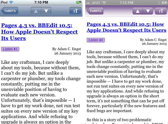
Next, let’s consider how the user listens to a podcast. The side-by-side comparison shows that the view here has completely changed in version 1.5. This is not, however, because of some iOS 6 innovation; it’s because I completely recast the interface. The view on the left, in version 1.4 and before, is a single built-in view that plays an Internet resource (a movie or a sound); I used this originally, in version 1.0, because I was relieved to discover, when I was first writing TidBITS News, that I could play an online podcast and display an
interface with just a couple of lines of code. Later, though, when I was writing version 1.3 and 1.4, I discovered that some secondary aspects of this interface were limiting what I could do with the sound. So, in version 1.5, I changed the interface. This change lets me display the title of the currently playing podcast, but that’s not the real reason for the change. The real reason has to do with what happens when the user switches away from the app while a podcast is playing.

Formerly, I was able to keep the sound playing in the background only if the user stayed in TidBITS News but locked the screen. Now, thanks to this change in interface, I have much more control over the app’s sound policy, so I can keep the sound playing even if the user quits TidBITS News altogether. What’s more, the user can pause and resume playback from within the lock screen itself, or from the app switcher interface (where you swipe rightwards to see the sound controls). The user can also see, in those two places, the title of the
currently playing podcast, thanks to a feature introduced in iOS 5.
The other obvious surface change in TidBITS News 1.5 is how the list of stories is displayed on the iPad. Formerly, as I mentioned before, the list had to be summoned in a popover when the device was held in portrait orientation. But in iOS 5.0, Apple introduced a new interface, evident particularly
in the Mail app, where the message list would slide in from the left. I immediately spent three days reverse-engineering that interface, and even published an explanation of how to achieve it, but I needn’t have bothered: in iOS 5.1, Apple made that same interface directly available to developers, with no code required; basically, the old popover-based interface just magically turns into the new sliding interface. TidBITS News 1.5, being compiled against a system version later than iOS 5.1, automatically acquires that interface.
Under the Hood — Two more significant changes in TidBITS News 1.5 are buried under the hood. They have no manifestation in the interface; rather, they have to do with changes in the building blocks that Apple provides to its developers. One of them, though, does change the app’s behavior slightly, as I’ll explain.
TidBITS News now uses storyboards, introduced in iOS 5. A storyboard is a single file containing drawings of most or all of an app’s interface. Formerly, an app with many “screens” had either to construct each screen’s interface in code or else load the interface from a “nib” file; a typical app could have many, many nib files. A storyboard is effectively a way of combining all those nib files into a single file. I found the iOS 5 implementation of storyboards rather crude, but iOS 6 added some improvements that made storyboards truly useful, and I adopted them for TidBITS News 1.5.
TidBITS News contains two storyboards, each representing the entire interface for one device version — iPhone or iPod touch on the one hand, or iPad on the other. The correct storyboard for the current device loads automatically as the app launches. Moreover, the storyboard itself implements standard transitions between screens, such as navigating from the Master view to the Detail view on the iPhone, or summoning and dismissing the podcast player view. The result is that I was able to remove huge amounts of code. I no longer have to draw my interface in code; more important, I no longer have to fill the app with ugly conditional code that does one thing if we’re running on iPhone and another thing if we’re running on
iPad. There is still some conditional code, having to do mostly with tiny differences in configuration of interfaces that both devices share; for example, as I mentioned before, there’s a height limit on a Master table row on the iPhone, but none on the iPad (we now display the entire article summary, no matter how long it may be). But the code is now far neater, simpler, and easier to understand and maintain.
The other major under-the-hood change has to do with how state is maintained between launches. This has been a vexing problem ever since multitasking came roaring onto the scene in iOS 4, and many apps (including Apple’s own iBooks) still haven’t solved it. The issue stems from the fact that an app can come to life in two very different ways. If the app was suspended (the user switched to the home screen or to another app), then it is instantly freeze-dried in its current state; when the user returns to the app, the app is thawed out, and there it is, doing exactly what it was doing previously. But if the app was terminated while it was suspended (the device needed to free up some resources), then the app launches from
scratch. This difference is annoying and mystifying for the user, especially since, from the user’s point of view, there’s no distinction between the two situations; you never explicitly quit an app, and you’ve no simple way of knowing what’s running and what’s not — even the app switcher interface doesn’t distinguish between running and terminated apps.
To solve this problem is not at all easy for developers. TidBITS News, even before the days of multitasking, had made some effort to grapple with the question of what should happen on a cold start: if you (the user) were reading an individual story, TidBITS News remembered that fact, and navigated to that story when you relaunched it. Multitasking actually made the problem harder, because now there were two ways in which the app could come to the front, and we had to distinguish between them: if the app is merely coming back from suspension, do nothing, but if the app is launching from scratch, try to navigate to the story that was being viewed previously if there was one. I found this extraordinarily difficult to implement in a
sensible, maintainable way — even though we’re talking about an app with just two main views!
In iOS 6, Apple introduced a new, built-in mechanism for state saving and restoration, and I eagerly adopted it when I was rewriting TidBITS News 1.5 from scratch. The result is that you should barely be able to tell the difference between resuming TidBITS News when it has been suspended and launching TidBITS News when it has been terminated in the background! Either way, there it is where you left off, displaying the Master list of stories scrolled to the same position as before, with the same selection, or the Detail view of an individual story, likewise scrolled to the same position as before.
Unfortunately, it turns out that there’s a huge bug in Apple’s built-in state saving and restoration mechanism, a bug so huge that you could drive a luxury Winnebago straight through it with your eyes closed at 70 miles an hour and never harm a hair on the head of any of the top Apple executives drinking martinis inside. The saved state doesn’t survive a restart of the device.
The discovery of this bug put me in a serious quandary. Here I’d rewritten TidBITS News to use this supposedly wonderful new feature, and now it was behaving less well than formerly! TidBITS News 1.4 and before performed a clunky, simple-minded form of state restoration; if the user was reading a story when we are suspended, we save that fact, along with the story identifier and the scroll position, and try to restore it if we are subsequently launched from scratch. Clunky and simple-minded, yes; but it always worked. Now, I found I had hitched my wagon to the wrong star; the new built-in state saving and restoration only worked sometimes. What was I to do?
My decision was influenced by the evident awareness of folks at Apple that this bug existed, and my consequent expectation that it would eventually be fixed. Consider my options:
- I could back out the entire use of the built-in save-and-restore mechanism, and return completely to the clunky methodology I was using before. I really didn’t want to do that, as my code was ugly and nearly incomprehensible.
-
I could implement a two-pronged approach: I could use the built-in save-and-restore mechanism if it was working, but if the app launched from scratch and it was clear that the save-and-restore mechanism was not operating, I could then fall back on my original clunky approach. But there were two problems with that. First, it meant that my ugly old code was going to live on, which I didn’t want. Even more important, what if Apple suddenly fixed the bug? I could imagine a situation where the built-in save-and-restore mechanism started working properly even after a device restart, and my ugly old code might somehow conflict with it.
-
I could use only the built-in save-and-restore mechanism, and hope that some day Apple fixes the bug.
I chose the third option. And, of course — of course! — Apple still hasn’t fixed the bug in iOS 6.1.
So right now, if you restart the device (or if you are so foolish as to kill TidBITS News manually in some other nonstandard way, such as using “jiggly mode” in the app switcher interface), all state is lost. The app launches from scratch, as if it had never launched before. Thus there is no saved feed, and if you don’t have an Internet connection at that moment, you’ll get a blank interface and an error alert. Of course, if you do have an Internet connection, which I assume most people will most of the time, then there’s no serious problem: TidBITS News will download a new copy of the feed, just as if you had asked it to refresh the list of stories.
The result is imperfect, but the circumstances involved are sufficiently rare that most people shouldn’t be adversely affected. I don’t think users restart their devices all that often, and if they do, they are not surprised to find that all bets are off and that apps that they launch are starting from scratch; that, indeed, would be one of the purposes of restarting the device. Similarly, people don’t generally manually kill an app in the app switcher, and if you do, you’ve only yourself to blame for the consequences; you can hardly complain if the app launches from scratch next time (though, to be honest, I’ve already received email from one reader who thinks he can complain). And remember, the consequences are not
dire, provided you’ve got an Internet connection when you relaunch.
If, on the other hand, the system itself kills the app while it is suspended, then the save-and-restore mechanism works brilliantly. When you relaunch TidBITS News, you should be virtually unable to tell whether it was killed in the background or merely suspended: the saved feed and the interface as you were viewing it will be preserved.
TidBITS Watchlist: Notable Software Updates for 4 March 2013
Scrivener 2.4 — Literature & Latte has released Scrivener 2.4 with an abundance of refinements and fixes for the word processor that’s focused on long-form writing projects. (To learn how to use Scrivener to write scripts, novels, academic works, and more, check out Kirk McElhearn’s “Take Control of Scrivener 2.”) The update adds support for Retina displays, separate global and project-based compile presets, an option to include a standard Adobe Digital Editions page template when compiling (this can be unchecked to avoid errors
with its inclusion in files destined for iTunes Producer), an option to start Kindle books after the front matter (or at the very first page if left unchecked), support for the Fountain screenplay syntax, support for dragging Scapple notes into Scrivener’s freeform corkboard mode, and larger text fields for the Find and Project Replace panels that also display invisible characters. The list of fixed bugs include a critical data-loss issue where edits made in scrivenings mode could fail to save if the project had been open for more than two days, a crash that occurred after creating a new project and immediately applying a layout, and a problem with the sandboxed Mac App Store version where projects couldn’t be saved as templates.
Scrivener 2.4 is available in two versions from the Literature & Latte Web site’s downloads page — one for Mac OS X 10.6 Snow Leopard and later (also available from the Mac App Store) and one for 10.5 Leopard and 10.4 Tiger. As of this writing, Scrivener is still stuck at version 2.3.1 at the Mac App Store. However, you can download the demo from the Literature & Latte site and replace the Mac App Store version on your system, where the demo will run as though it were registered normally. ($45 new from Literature & Latte and the Mac App Store, free update, 35.7 MB (31.4 MB for the
10.4/10.5 version), release notes)
Read/post comments about Scrivener 2.4.
CrashPlan 3.5.2 — Code 42 Software has released CrashPlan 3.5.2, a small maintenance release for the popular Internet backup software that does make one major change — dropping support for Mac OS X 10.4 Tiger. (To learn more about CrashPlan, check out Joe Kissell’s “Take Control of CrashPlan Backups.”) A CrashPlan support page notes that current backups and restores will continue uninterrupted, but it does recommend upgrading to a later edition of Mac OS X in order to take
advantage of features in future versions. CrashPlan 3.5.2 adds support for Retina displays, support for Java 7, and localizations for Japanese, Portuguese, Chinese (Simplified) and Chinese (Traditional). It also fixes an issue with Web restore that affected some users, improves cross-platform computer adoptions, and ensures the menu bar no longer disappears after the system wakes from sleep. There’s no need to download CrashPlan 3.5.2 manually, as the app will automatically upgrade on its own on Macs running 10.5 Leopard and later (though it might take a few days). (Free with a 30-day trial of the CrashPlan+ online backup service, 21.2 MB, release notes)
Read/post comments about CrashPlan 3.5.2.
DEVONthink and DEVONnote 2.5 — Adding a significant synchronization boost to its stable of information management apps, DEVONtechnologies has updated all three editions of DEVONthink (Pro Office, Pro, and Personal) plus DEVONnote to version 2.5. The new release enables you to synchronize databases between multiple computers and locations using Dropbox, a WebDAV server, or your own mountable drive, as well as with other copies of DEVONthink on the same local network or VPN. Colleagues can access the same “sync store,” download
databases, work offline, and then synchronize all changes (local and remote) either manually or automatically. (For more details, see Joe Kissell’s “Take Control of Getting Started with DEVONthink 2, Second Edition.”)
All three editions of DEVONthink plus DEVONnote have also received improved tagging capabilities, including a Tags column in document lists to make it easier to tag multiple items. DEVONthink Pro Office improves its Web sharing capabilities, providing support for uploading, creating, renaming, moving, and trashing documents, and editing text plus adding the capability to convert images and scanned PDFs to searchable PDFs. In addition to Mac-based Web browsers, the full Web interface also runs on Safari on the iPad.
If you have been using any of the previously available public betas of DEVONthink 2.5, you’ll need to delete your existing sync store folder (on your file server, WebDAV drive, or on Dropbox) before using the final version. (All updates are free. DEVONthink Pro Office, $149.95 new, release notes; DEVONthink Professional, $79.95 new, release notes; DEVONthink Personal, $49.95 new, release notes; DEVONnote, $24.95 new, release notes; 25-percent discount for TidBITS members on DEVONnote and all editions of DEVONthink)
Read/post comments about DEVONthink and DEVONnote 2.5.
PDFpen and PDFpenPro 5.9.5 — Smile has updated PDFpen and PDFpenPro to version 5.9.5, a small maintenance release for the PDF-manipulation programs that should provide relief from a few glitches. The release improves its handling of the current zoom level when entering Full Screen mode, avoids a potential crash during internal notification, fixes a rare problem of following page links, and fixes sidebar initialization on window restoration at launch. For full documentation, see Michael Cohen’s “Take
Control of PDFpen 5.” ($59.95/$99.95 new with a 20-percent discount for TidBITS members, free update, 47.5/48.5 MB)
Read/post comments about PDFpen and PDFpenPro 5.9.5.
ExtraBITS for 4 March 2013
We have lots of great outside articles for you to read this week, starting with a 4-minute interview with Adam Engst on Southern California’s KCRW radio station and a New Republic article that keys off a recent TidBITS staff roundtable. In other pieces, Rob Griffiths compares Siri and Google’s voice input technology, Dan Moren and Lex Friedman look into how iCloud silently drops some email on the floor, and the folks at Panic discover (with the help of a hacksaw) that a tiny computer resides inside Apple’s Lightning Digital AV Adapter. Apple also announced one billion downloads at iTunes U, and former Mac evangelist Guy Kawasaki joins Google’s Motorola group to advise on the future of smartphones.
Analyzing Apple on KCRW Radio — Adam Engst’s short interview with Steve Chiotakis of KCRW (Southern California’s leading NPR affiliate) did a nice job of explaining some of Apple’s initial attraction, what was astonishing about the iPhone and iPad, why Apple is being confronted with more competition now, and what challenges the company faces going forward.
Bummed Out by the Brand in the New Republic — Our staff roundtable looking at why people still support Apple after all these years got some attention from the New Republic, where Lydia DePillis used it to bookend her article “Apple Agonistes: What happens to Mac fanatics when the brand bums them out?” She talked to a lot of the right people, and the article catches some of the tensions currently being felt in the Apple community.
Macworld Tracks Down iCloud’s Silent Email Filtering — There’s nothing all that new here — Apple has long deleted some email messages silently, even including TidBITS at various times — but Dan Moren and Lex Friedman show how iCloud can delete messages containing certain phrases with no warning to the user, even if the phrase occurs only in a zipped PDF attachment. So if something you’re expecting doesn’t show up (assuming you notice), consider asking your correspondent to send it to another email address.
Rob Griffiths Pits Siri against Google Search — We love Siri, but is Apple’s voice recognition technology the best out there? At Macworld, Rob Griffiths pits Siri against the voice-input capabilities of the Google Search app for iOS and finds that Google’s system “works better, faster, and more intuitively.” Apple won’t ever allow Google’s voice input to escape out of Google’s own apps in iOS, but Apple still needs to keep Siri competitive with voice input in Android and Chrome OS.
Panic Discovers a Tiny Computer in Lightning AV Adapter — Stymied by oddities when outputting video from an iPad to an HDTV, the folks at Panic took a hacksaw to Apple’s Lightning Digital AV Adapter to investigate. To their surprise, they found what appears to be a miniature computer, complete with a processor and 2 gigabits of RAM (for reference, that equals 256 MB of RAM, the same amount shipped in the original iPad). Panic’s initial speculation was that the processor was outputting an AirPlay signal (which would partially explain some compression artifacts that appear on
screen). However, an anonymous but apparently knowledgeable commenter, who sounds like he or she works at Apple, explained that the adapter’s approach “essentially allows us to output to any device on the planet, irregardless of the endpoint bus (HDMI, DisplayPort, and any future inventions) by simply producing the relevant adapter that plugs into the Lightning port.” See for yourself!
One Billion Downloads at iTunes U — Apple has announced that downloads of iTunes U content have topped one billion. iTunes U doesn’t get much mainstream press, but it could be one of Apple’s most important projects, hosting over 2,500 courses (and thousands more private courses) from over 1,200 colleges and universities, plus another 1,200 K-12 schools and districts. Some iTunes U courses have as many as 250,000 students enrolled in them, and over 60 percent of the iTunes U app downloads originate from outside the United States. Put simply, iTunes U is an
astonishing educational resource.
Guy Kawasaki Joins Google’s Motorola Group — Ex-Apple evangelist Guy Kawasaki has taken a job advising cellphone manufacturer Motorola, now owned by Google. He’ll be focusing on product design, user interface, marketing, and social media, and it will be interesting to see what difference his experience at Apple and in the Macintosh world in general will make in future Google phones.