TidBITS#1196/21-Oct-2013
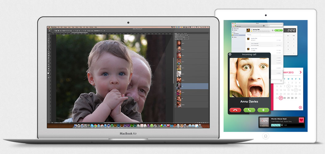
MacBook Air owners take note — Apple has announced a replacement program for defective flash storage drives. Read on to learn if yours is affected. Much has been written about inaccurate positioning sensors in the iPhone 5s, but it’s little more than a tempest in a teapot. More worryingly, Google wants to embed your endorsements in ads shown to your friends; luckily, unlike Facebook, you can opt out. Glenn Fleishman chimes in on why Newsstand in iOS 7 is a bad deal for publishers, Josh Centers reviews the Level Money budgeting app, and Adam Engst examines the Infinite PDF iPad app that enables you to create interactive PDFs. We’re also pleased to welcome our latest sponsor, Avatron Software, makers of Air Display 2, and share the latest installment of FunBITS about the spooktacular Limbo for iOS. Notable software releases this week include LaunchBar 5.6, ReadKit 2.3.2, DEVONthink and DEVONnote 2.7, 1Password 4.0.3, Instacast 1.0.3, Downcast 1.0.3, Java for OS X 2013-005 and Java for Mac OS X 10.6 Update 17, Little Snitch 3.3, and Fission 2.1.4.
Apple Replacing Faulty MacBook Air Storage Drives
If you purchased a 64 GB or 128 GB MacBook Air (mid-2012) between June 2012 and June 2013, your flash storage drive might be defective, in which case Apple will replace it for free.

To determine if your MacBook Air has a faulty flash drive, open the App Store app on your MacBook Air, click Updates, and download the MacBook Air Flash Storage Firmware Update 1.1. Presumably, if the update doesn’t appear, your MacBook Air is not among those that might suffer from this problem. (TidBITS publisher Adam Engst has a mid-2012 MacBook Air, didn’t see the update in the App Store app, and when he downloaded it and ran
it manually, the installer reported “This computer does not need this update.”)
Once downloaded, the update will test your drive and install new firmware to resolve the problem in most cases. If the drive is faulty, the update directs you to the relevant Apple support document for further instructions about how to get a free replacement. If the update completes without any additional comments about the drive’s health, we believe that means the firmware update has fixed the problem, based on Apple’s statement:
Apple has discovered that a small percentage of flash storage drives in these MacBook Air models have an issue that may result in data loss. This update tests your drive and, in the majority of cases, installs new firmware to resolve the issue.
If your drive is bad, Apple strongly recommends that you don’t install new applications or operating system updates until the drive has been replaced. You should also be sure to perform a backup as soon as possible. In fact, you should do that even if your drive is good! If you’re not backing up regularly, be sure to check out Joe Kissell’s “Take Control of Backing Up Your Mac, Second Edition,” which tells you everything you need to get started.
The iPhone’s Positioning Sensors Were Never Good
Much is being made of Gizmodo’s tests showing that the positioning sensors in the iPhone 5s are off. Not just a little off, but off in a non-trivial way. The gyroscope read 3 degrees off, the compass 8 to 10 degrees off, and even the accelerometer seemed to be inaccurate.
There was only one problem with Gizmodo’s experiment: they only compared the iPhone 5s against the previous iPhone 5. That may have seemed reasonable at the time, but it assumes that the iPhone 5’s positioning sensors were accurate. Testing by TechHive in a variety of locations with an iPhone 4S, 5, 5c, and 5s now shows that the iPhone’s positioning sensors have never been any good.
While TechHive didn’t find anything wrong with the iPhone’s leveling capabilities, none of the iPhone compasses matched up — to themselves, to each other, or to an inexpensive Suunto A-10 recreation compass. Some were off as much as 20 degrees, and the worst deviation came in three different iPhone 5 units. TechHive also tested the compass of the Android-powered LG G2 smartphone and found that it was the closest to the Suunto, off by only 3 to 4 degrees. (The question this result raises is if the Suunto was itself accurate; a single cheap magnetic compass might not have been the best control.)
While Apple could, and should, make the iPhone positioning sensors more accurate and consistent, the moral of the story is to not rely on smartphone sensors for critical tasks. As our own Rich Mogull said during our staff discussion, “As a mountain rescue guy, digital compasses make me nervous. I have enough trouble keeping a physical compass calibrated and accurate. You walk out of an office building in a city near power lines, and no compass will be accurate. It’s just physics. Indoors? Not a chance.”
It’s also worth noting that despite the fuss surrounding this story, we’re not hearing from users about losing an orienteering race due to incorrect compass readings (iPhones wouldn’t be allowed anyway), having a woodworking project be tippy because of issues with the iPhone’s level, or even having trouble playing accelerometer-based games. In short, despite the proven problems, the iPhone’s positioning sensors still work sufficiently well for the uses that most people demand of them.
How to Prevent Google from Monetizing Your Face
Google caused a commotion when it announced updates to its Terms of Service to allow the search giant to begin using user reviews in ads. (Users are alerted to the changes by a bar that appears at the top of at least some Google sites.) “Shared endorsements,” as Google calls them, will place your name, photo, comments, and ratings in Web ads seen by your friends. This can include businesses reviewed in Google Maps, reviews from the Google Play store, and anything on the Web for which you’ve clicked a +1 button.

This isn’t quite as troubling as it first appears. After all, the entire point of reviewing products is to inform the public. That said, I have two problems with Google’s approach.
First, if Google is going to monetize the work of its users, then it should share the profits. Companies pay celebrities big bucks for endorsements — we common folk should be compensated as well. Such an approach would encourage even more users to review products, although it might lead to an epidemic of sock puppetry.
Second, whether or not Google were to share revenues with users, the addition of user reviews to Web ads could give Google an uncomfortable incentive to encourage positive reviews and possibly hide or sanitize negative ones.
The good news is that it’s easy to opt out of shared endorsements, and you may already have opted out in the distant past by answering a similar question while signing up for Google+. Just visit the Shared Endorsements settings page and deselect the checkbox reading “Based upon my activity, Google may show my name and profile photo in shared endorsements that appear in ads.” (Parsing the meaning of the checkbox with such wording is on par with having to select the Limit Ad Tracking option in Apple’s iOS privacy settings to opt out of ad tracking; fortunately, Apple moved that control from iOS 6’s hidden Settings > General > About > Advertising location
to the sensible Settings > Privacy > Advertising spot in iOS 7.)

While we certainly don’t recommend allowing Google to use your work in shared endorsements, at least Google lets you opt out. Facebook’s “sponsored stories” do very much the same thing, and Facebook doesn’t let you to opt out, only control who can see your activity. (Facebook introduced sponsored stories in January 2011 without changing its terms of service and ended up paying $20 million to settle the resulting class-action suit.) It’s hard to imagine that Twitter isn’t planning a similar feature.
And yes, it is legal for these companies to do this — apart from Google’s opt-out option, your only real defense is to stop recommending things via social media services.
Avatron Sponsoring TidBITS
We’re pleased to welcome as our latest long-term TidBITS sponsor Avatron Software, a Portland, Oregon-based developer of a variety of clever utility apps, including:
- Air Sharing, which enables you to work with files on your iOS device, mounting remote file servers, viewing a wide range of documents, sharing with others, and printing.
- Air Login, which makes it possible for you to control your Mac over the Internet from your iPad or iPhone.
-
Air Display 2, which lets you turn a Wi-Fi-connected iPad, iPhone, Mac, or Windows PC into a second monitor for your computer. Air Display 2 is reportedly up to 50 percent faster than the previous version, and the iOS version is on sale for 50 percent off today, 21 Oct 2013 (but don’t stress if you miss it — the app only costs $9.99 normally).
While Air Sharing and Air Login are indisputably cool, Air Display 2 is the one that really rocks my world. I’ve evangelized using multiple monitors on Macs since before some of our younger readers were born, and while adding a second monitor has become easier over the years, Air Display requires no hardware beyond what iOS devices and computers you already have lying around. You just need Air Display’s free host software on your Mac and a copy of the Air Display client software for the device you want to turn into a second screen.
I see two primary uses for Air Display. First is when you’re travelling and are limited to the small display of, say, a MacBook Air. Air Display lets you expand that by turning your iPad into a second display for the MacBook Air. It’s great for storing Photoshop or InDesign palettes, a Web browser window for reference while you’re writing in BBEdit or Pages on the Mac screen, or just keeping Messages visible while getting the app out of your way (and still being able to use a real keyboard). Even better, the iPad actually becomes a touch-screen display, so if you tap it, it’s just like clicking in that location with your Mac’s mouse. You can also mirror your display to the iPad, so you could, if there’s no projector for a
small presentation, let multiple people watch on iPads rather than looking over your shoulder — Air Display 2 can now extend or mirror your screen to up to four devices.
You’re not limited to using an iPad as a second screen, which leads to Air Display’s other primary use, which is expanding your screen real estate while at your desk, taking advantage of other computers you may have around. For instance, you could slave your MacBook Air to your iMac as a second screen or, better yet, put that PC you’re required to have to work as a second monitor. Air Display does work on an iPhone, which is perhaps more amusing than useful. It’s hilarious to see a tiny — but fully functional! — Dock
running down the edge of an iPhone screen.

Of course, using even the speed-enhanced Air Display 2 over Wi-Fi won’t be as responsive as using a directly connected display, but as long as you’re not trying to play a video or use it for gaming, you probably won’t care. The productivity win from having more screen space far outweighs any annoyance of slightly slower screen drawing.
Thanks to Avatron for their support of TidBITS and the Apple community!
How iOS 7’s Newsstand Hurts Publishers
Marko Karppinen, one of the folks behind the Maggio publishing platform, says that it no longer makes sense for publishers to use Apple’s Newsstand to feature their magazines, newspapers, and other periodicals. The advantages, he writes, have disappeared slowly and, in iOS 7, no longer outweigh the downsides that bury a publication app within Newsstand.
This ultimately affects all iOS users, because publications have to remain financially viable, and anything that jeopardizes their ability to attract and keep subscribers makes it harder for apps to be kept up to date and stay in operation.
As the owner and editor of The Magazine, I took notice when Karppinen’s essay appeared. Marco Arment founded The Magazine in October 2012. I came on as executive editor later that month, and purchased it from him in June 2013. We celebrated its first anniversary of fortnightly publication with our 27th issue last week.
Newsstand is both a periodical-only portion of the App Store and its own freestanding, unremovable folder in iOS. It includes apps that produce an issue-format publication at least quarterly. In his post, Karppinen delineates eight behaviors that Apple confers on Newsstand apps.
Of these, some are positive, such as being included in the Newsstand section of the App Store, updating screenshots at will (instead of only with new releases), providing an Atom feed to update Newsstand information automatically, and providing free trials (which aren’t available for other iOS apps).
The additional chances for discovery from appearing in both the Newsstand section of the App Store and in another category (The Magazine app also appears in the Lifestyle section) are indeed important, especially as the number of publications has ballooned. When Marco launched The Magazine as one of the first digital-only and independent Newsstand periodicals, we received disproportionate attention and thus a higher rate of subscriptions. We continue to get featured regularly by gross sales, which surely helps with people discovering us. Newcomers will have an increasing trouble being found, and that double listing helps.
But other Newsstand features are less clearly useful, such as using a cover as the app’s icon. Shrinking a traditional magazine cover to icon size works poorly, but isn’t necessary. For The Magazine, Marco and the designers he worked with at Pacific Helm — notably Louie Mantia, who has designed every cover — avoided that trap. Our covers rely on images that play well at every size, including our first-anniversary cover.
Newsstand apps can also include automatically renewing in-app subscriptions, but that feature isn’t exclusive to Newsstand apps. Plus, although Newsstand apps offer automatic background content downloading once a day, that feature has now become available to any app in iOS 7, removing one of the key advantages of Newsstand.
On the downside, publications are hidden away inside the Newsstand app, and it has gotten worse in iOS 7. It’s largely because of this beef that Karppinen says that his company will no longer recommend publishers use Newsstand, and will instead suggest building standalone apps.
In iOS 5 and 6, there were at least microscopic previews; in iOS 7, the generic Newsstand icon eliminates the previews and the “shelves” inside are neither skeuomorphic nor well-designed. When I saw this new look during the iOS 7 beta period, I assumed it was a placeholder that would be fixed before release.
![]()

And, Karppinen points out, an app that starts as a Newsstand app cannot become a regular one, but the opposite is true, should publishers find that a standalone app doesn’t give them what they need.
Apple designed Newsstand to prevent users’ home screens from filling with publications, and to make sure there was a distinction between a periodical app and a regular one to reinforce the expectation of updated content. Those seem like laudable goals, but users can just as easily create and check their own folders, which do a better job of displaying shrunken icons of the apps inside than Newsstand in iOS 7.
Put bluntly, Newsstand is a ghetto. Readers complain to me regularly about forgetting to read The Magazine, even though we use iOS notifications for each issue. If readers don’t read immediately and don’t remember to tap the Newsstand icon later, they forget about us entirely.
There’s another element that Karppinen didn’t mention. Monthly auto-renewals result in an email reminder before every renewal period — every month! — telling subscribers that they have time to cancel. While I don’t want to fool anyone into renewing automatically, we have also heard from readers who canceled because they simply hate receiving the reminder month after month. We added a yearly subscription option a few months ago partly for that reason — and to reward people who want to stick with us; it’s $20 a year versus $2 a month. A quarterly or semi-annual reminder might be enough. (For subscriptions that originate through our Web site, we use Stripe for credit-card processing and have configured our account to send out a receipt for each charge, rather than a reminder beforehand.)
Strangely, Apple makes it difficult to find where in the App Store app and in iTunes to turn off auto-renewals; Marco put a big button in our app’s Settings screen that jumps users right to it to avoid the perception that we were trying to hide cancellation controls. (Cancellation itself is also confusing: you disable auto-renewal by flipping an On switch to Off, and the subscription lasts to the end of the current billing period.)
Apple made Newsstand the preferred and sensible destination for periodicals when it was launched. It is much less so in iOS 7, and the current experience is worse both for readers trying to find the publications to which they subscribe and for publishers trying to keep and serve their subscribers. I hope Apple turns its attention once again to trying to make iOS the leading edge for digital periodicals, one of the company’s great promises years ago, and one that has yet to be fulfilled.
Level Money Simplifies Budgeting
I’ve always tried to maintain good financial discipline. Life is a lot easier when you spend less than you make, so budgeting is the cornerstone of that commonsense strategy.
But I’ve never cared for most ready-made budgeting systems. My usual complaint is that they split my spending up into too many pointless categories. Yes, I’d like to set aside some money for groceries, but I don’t care to calculate how much I spend on croutons every month. For that reason, I set up my own budget spreadsheet to track the few categories that made sense for me, and kept up with how much money was available for each.
That worked well for years, but required me to keep track of receipts and manually input how much I spent on things, which was time-consuming. It became more difficult to keep up once I started freelancing on the side, and after I got married, it became untenable. There was no way I was going to ask my wife to keep every single receipt and enter it into a spreadsheet. Now that our first child is here, the idea is even more laughable. I’m lucky to eat dinner and stick to my deadlines most nights — never mind punching all my receipts into a spreadsheet.
To get at least some kind of a grip on my financial life, I turned to Intuit’s Mint service, which ties into your various bank accounts and promises to budget automatically. But like most budgeting systems, Mint splits things up into too many categories. I don’t care about my clothing or entertainment budgets, because those are things I worry about only after monthly bills, gas, and food. And Mint is particularly bad with automatically categorizing my purchases. Anything you buy from a gas station is counted against your gas budget. Bought a Mountain Dew and a Snickers at the corner Speedway? Mint doesn’t see those as groceries, because it thinks they’re gas. A bag of ice, a hot dog, and five
gallons of gas? That’s all gas. Emergency aspirin? That’s also gas. You get the idea.
Sure, Mint would probably be a lot smarter if I took the time to train it, but if I had time for that, why would I use Mint? Ultimately, I wanted something simple that would let me know how much I have to spend after the essentials are paid for.
Level Money for iOS, which is free in the App Store (the company is funded by venture capital), promises to be that app. It tosses out categories entirely. You enter your income and the bills you pay every month, set a percentage of income you want to save, and Level Money does the rest. Like Mint, it manages access to your online bank accounts through Intuit’s backend so everything is automatic.
Level Money presents your budget in a set of three bubbles. One tells you how much you can spend today, another how much you can spend this week, and the last one how much you can spend this month. You can also access charts to view how well you’re staying within budget and how much you’re saving. It’s really that simple.
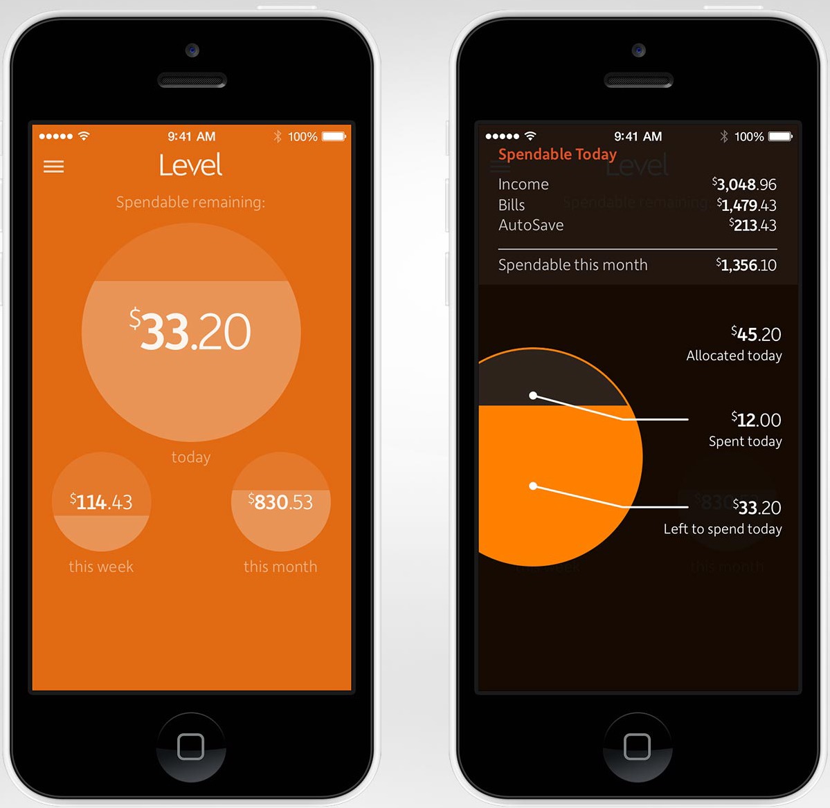
If there’s one thing that annoys me about Level Money’s interface, it’s that when I view a list of transactions, it often doesn’t mention where the transaction occurred. “You spent $136.02.” OK, on what, where? It’s usually not a big deal, unless I’m trying to analyze our monthly bills to see if they’ve fluctuated.
With a bit more intelligence, I think Level Money could easily solve this problem. For instance, if I could select a transaction called TRICOUNTYUTILITY, and label that as my utility bill, then the process would be far more automatic. Level Money already sort of lets you do that, but with the payee being unlisted much of the time, it falls short of being helpful.
That’s pretty much all to say about the interface. Level Money keeps it simple, and for me, that’s a huge step in the right direction. But, as with Mint, the Intuit back end — where Level Money gets its data — has some details you should be aware of.
First, Level Money’s support for specific banks is pretty limited, confined mostly to about 100 big national banks like Ally, Bank of America, and Chase. You can suggest a bank to the developers, but who knows how long it will take them to add it. Frustratingly, Intuit has access to almost every bank in the nation. Mint was useless to me before Intuit purchased it, because it didn’t support any of the banks I used. But once Intuit purchased Mint, that changed nearly overnight. It’s one of the few big acquisitions that worked out well for the end user.
Since Level Money works through Intuit, there’s almost no reason to have such a small list of banks. The developers claim it takes time to test each bank, and I can respect that, but somehow the Mint team was able to pull it off in short order.
But right now, I’m guessing you’re probably pounding your fists on the desk and shouting, “BUT WHAT ABOUT SECURITY? DO YOU EXPECT ME TO JUST HAND OVER MY BANK PASSWORDS TO SOME SKETCHY APP DEVELOPERS WITH NO APPARENT BUSINESS MODEL?”
Well, to be frank, that’s a definite concern. If you’re uncomfortable with the idea, I say to trust your gut and walk away — which is decent advice in general.
Level Money’s Web site has a standard security spiel about using 128-bit encryption, etc. But Dave Fayram, vice-president of engineering for Level Money, has been open about how their systems work. “If there is a security compromise, the attacker will never get your bank credentials. We don’t store them on your phone and we don’t store them on our servers,” said Fayram in a comment at Wired. Again, Level Money uses the same back end that Intuit uses for Mint, and Mint hasn’t had any major security failures so far (the New York Times explored Mint’s security policies in 2010).
Plus, Intuit’s, and therefore Level Money’s, connection to the banks is read-only, so it would take a full-fledged breach of Intuit’s databases before your accounts could be at significant risk. Even then, many financial institutions (including Ally, Bank of America, and Fidelity) offer guarantees that will reimburse any losses due to unauthorized account access if you report the problem promptly. Check your bank’s service agreement or search for the bank’s name and “online banking security guarantee.”
Like anything on the Internet, Level Money is a balance between security and convenience. But for me, the partnership with Intuit eases my concerns. Granted, many in the Mac community hold no love for the company, which has been jerking Mac Quicken users around for years. But Intuit has a good record when it comes to security, and I’ve never had issues with Mint.
Frankly, I’m more worried about individual bank security than I am about services like Mint or Level Money. I’ve used far too many online banks that limit my password to eight measly characters, which is frightening. Safer is a bank like Capital One 360, formerly ING Direct. It uses special read-only passcodes for services like Mint and Level Money, so even if your credentials were stolen, the attacker could only view your information, not transfer money or take any other action.
The Level Money app handles security in a similarly smart way. You don’t need a password to view how much you can safely spend, but you have to log in if you want to change settings or view more in-depth information. It’s a good balance between security and convenience.
One final comment. Since Level Money is geared toward Millennials (people born sometime between 1980 and 2000) it seems that every time this app is discussed online, the Millennial bashers come out in full force, with comments in the vein of, “These Millennials need a dumbed-down finance app because they don’t have their helicopter parents around to balance their artisanal checkbooks!” Speaking as a Millennial, I can’t resist sharing a few thoughts.
A 2012 survey showed that half of all Americans spend more than they make – a group that extends far beyond Millennials. Granted, the economy stinks and about 15 percent of America lives in poverty, but half of the survey respondents said they didn’t even set monthly savings goals. And another more recent survey suggested that 27 percent of Americans have no savings at all.
Put simply, we have a serious lack of financial awareness in this country, regardless of generation. Anything that helps make the complex world of finance more accessible and encourages people to save money is a good thing, and Level Money fits the bill. It offers a simplified way to budget your money and track savings, and although there are certainly security concerns, you have to ask if they’re more worrying than inadvertent overspending. For me, they aren’t.
Infinite PDF Brings Interactivity to PDFs on the iPad
The beauty of HyperCard, back in the day, was that it enabled non-programmers to distill their knowledge into interactive collections of information. Of course, other technologies, most notably the Web, have stepped up to take HyperCard’s place, and while many have been successful in their own right, the level of difficulty always keeps some people from sharing their expertise. A new entrant in this field, the iPad-only app Infinite PDF from ReOrient Media, promises to make generating non-linear, interactive documents — adaptive presentations, ebooks, comics, and graphic novels — as easy as can be, though distributing them in their full glory
remains a challenge for a while.
As you’d expect from the name, Infinite PDF works with PDF files, is compatible with PDFs generated from any source, and layers its metadata onto the end result such that the file can still be read (without the interactivity) in any PDF reader. That eliminates one common roadblock to these sorts of programs right off the bat, since you probably either already have your information in PDF, or can print to PDF in a matter of moments. (In fact, the company’s first app, Infinite Canvas, ran smack into this problem — it was just too hard to get data into it for most people to invest the time into learning and using it.)
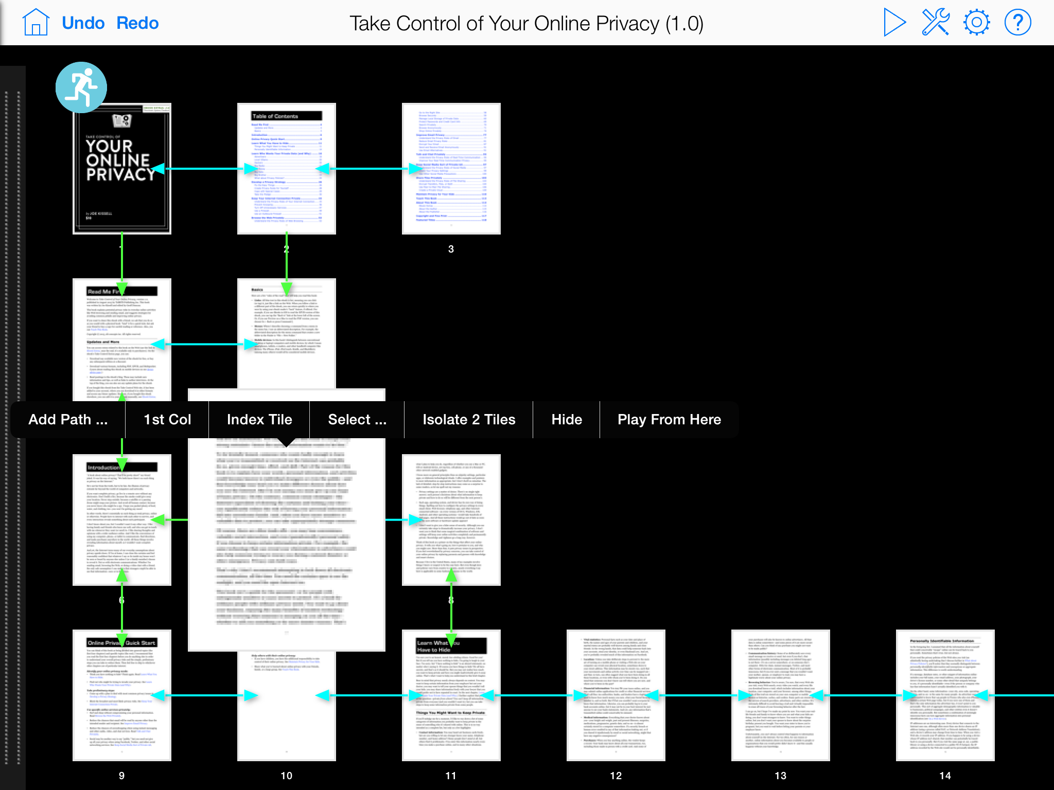
When you bring a PDF into Infinite PDF, which you can do by opening it from your Dropbox account or downloading it from a Web link, it appears in Infinite PDF’s editor as a series of thumbnails. They’re lined up in a single row at the top of the screen, each page connected to the next with bidirectional left/right paths. If you think about it, this is what a normal PDF would look like if you could fly over it in a reader like iBooks, looking down on the thumbnails of the pages. It would work like this in iBooks too — swipe left to move to the next page, and swipe right to move to the previous page.
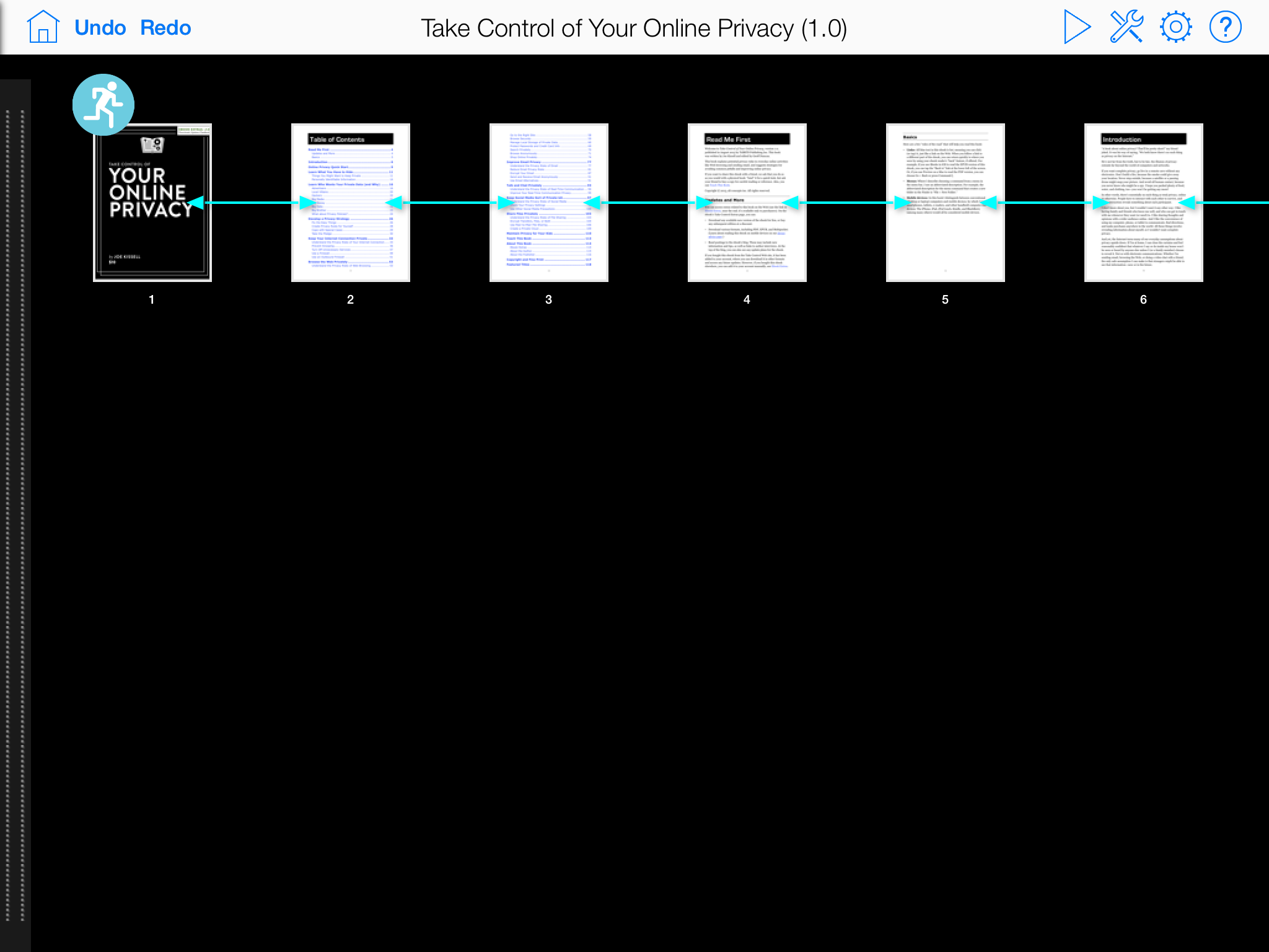
But what if you weren’t constrained to a single row of pages, and what if you could specify what happened when the user swipes up or down as well? That’s the magic of Infinite PDF. In its editor, just tap and drag on a page — perhaps the first chapter start after the front matter in an ebook — to move it, and all the pages after it in the row, to a second row, breaking the linearity. Then do it again, and again — it’s addictive.
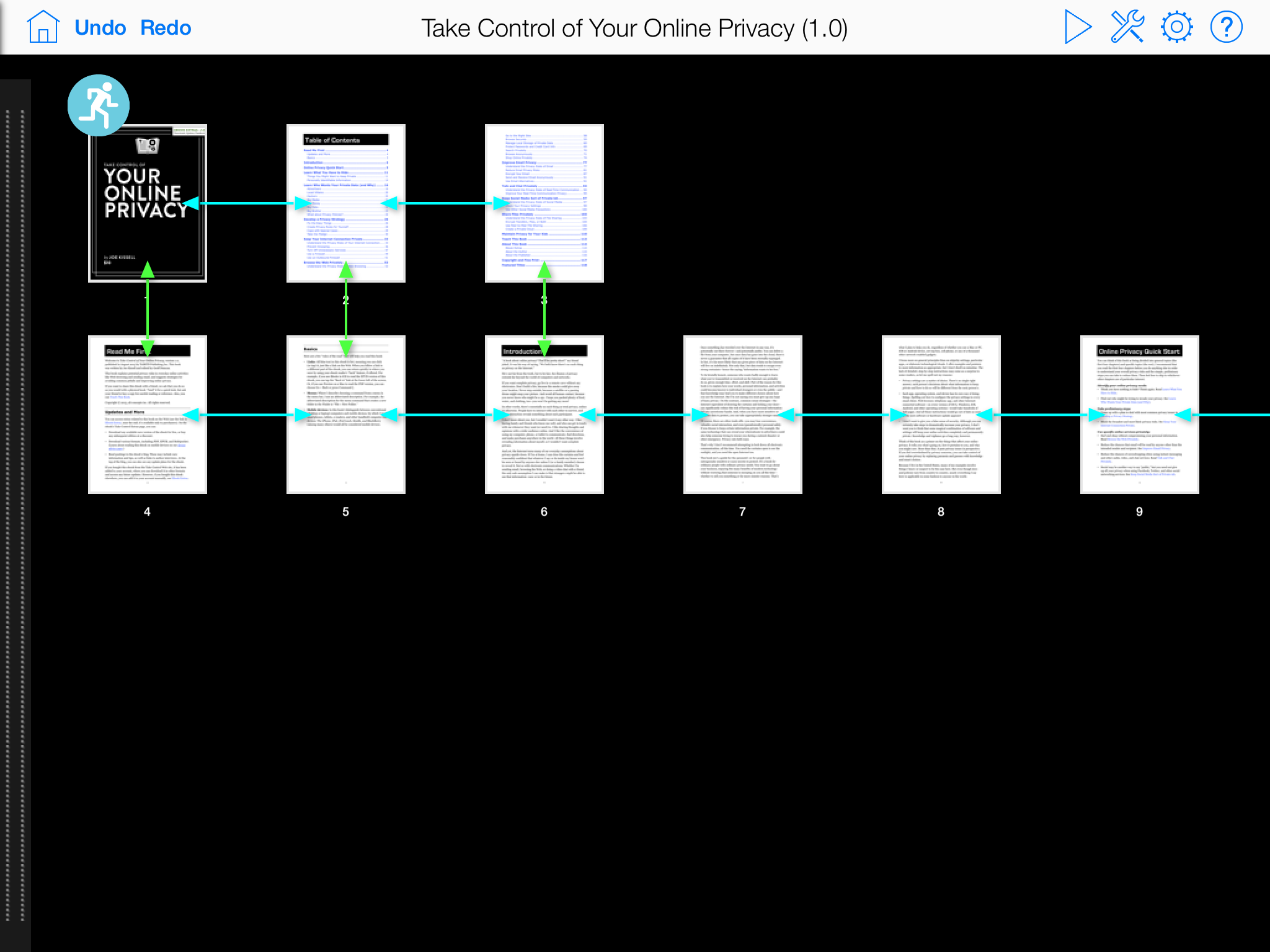
As you do this, you’ll notice that the double-headed blue arrows still connect all the pages in each row with left/right paths, but they’ve been joined by double-headed green arrows that connect each page with the one below it, if one exists. These are special paths that Infinite PDF automatically creates so the user can swipe up or down to move between those pages as well. This may not be what you want, and it’s easy to get rid of them — tap and hold on the second page in a row and in the toolbar that appears, tap
Isolate X Tiles. (Why the second page? For this example, I’m making each chapter into its own row, and I want the user to be able to swipe up and down on the first page of each chapter to move to the next or previous chapter. This is in fact best done right after you move each chapter to a new row.)
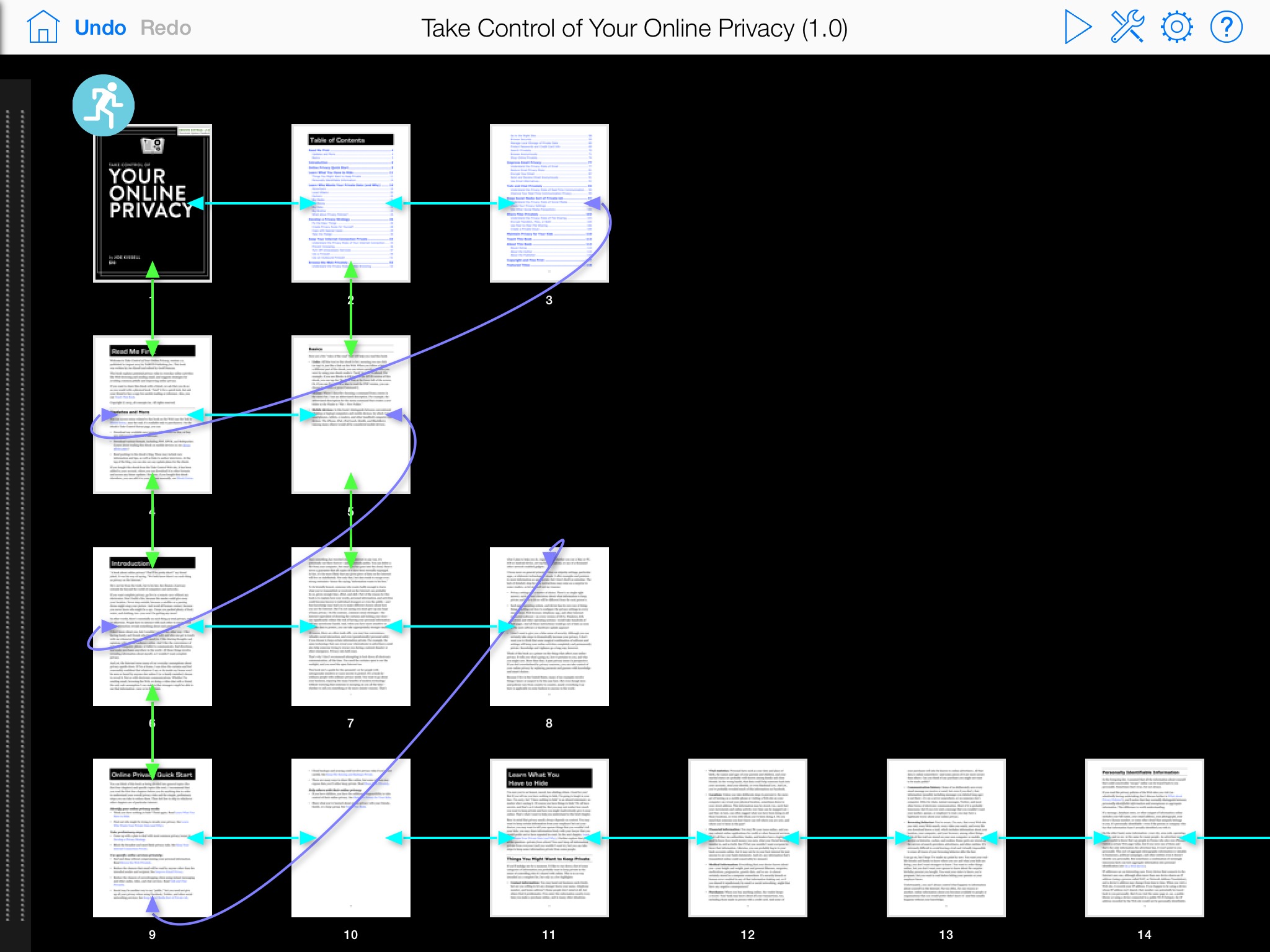
While you’re editing, you can at any time “play” your PDF by tapping the triangular play button at the top of the screen. If you did that, you’d discover that swiping left and right moves between pages, and swiping up and down on the first page of any chapter moves between chapters. But what doesn’t work is moving from the last page of one chapter to the first page of the next — there’s no path to enable that.
You can add one easily. Back in edit mode, tap and hold on the last page in a chapter until the toolbar appears, tap Add Path, drag the arrow on the path to the destination page, choose whether you want it to be a one-way path or a two-way path, and select the swipe direction that will activate the path and the transition to use while moving to the destination page. To see an example similar to what I’ve shown here, check out the Infinite PDF version of our free “Take Control of Calendar Syncing and Sharing with BusyCal” in Infinite PDF’s showcase.
A few additional commands help you organize pages more quickly, and you can spend some time playing with path transitions, but that’s just about all there is to creating an interactive PDF with Infinite PDF. When you’re done, you can save your work back to Dropbox for sharing. And again, what you’re creating remains a PDF, so anyone can open it with any PDF reader, but if they view it in Infinite PDF, they can navigate through it in all the ways you set up.
Now that you see how easy it to create such an interactive PDF, what might you want to make? ReOrient Media is targeting Infinite PDF at presentations right now, and that is indeed a compelling use case. Imagine you’re giving a high-level presentation and someone in the audience asks a pertinent question. In normal presentation programs like Keynote and PowerPoint, it’s quite difficult to jump to a different set of slides that offer more detail into the question, but with Infinite PDF, you could have a horizontal “spine” of the high-level slides, with a column of additional slides dropping down from each high-level slide to provide supporting information. If you don’t
get a question, you continue along the horizontal spine, but should you need to delve into a topic in more depth, you navigate down the column. You could even set up additional paths that let you return to the high-level spine by swiping left on any supporting slide.
As a publisher, I’m more intrigued by the possibilities Infinite PDF brings to books, and there are a number of examples in Infinite PDF’s showcase to show you what’s possible. The problem is that Infinite PDF’s interactivity is available only within Infinite PDF, which costs $9.99, and as yet there is no free viewer app for iOS or the Mac. So you can easily distribute your textbook or graphic novel, but your readers won’t see anything more than a linear PDF unless they too own Infinite PDF. ReOrient Media is of course working on such a free viewer app for the iPad, with the hope of getting it out in November 2013. A Mac version of the viewer app is slated for several months further out.
Since our Take Control ebooks already have a great many internal navigation links (all of which continue to function in Infinite PDF), giving them interactivity in Infinite PDF isn’t a huge win for us. But I could easily imagine making a “choose your own adventure” type of book in Infinite PDF that offers multiple narratives depending on the paths you choose (this is roughly what I studied at Cornell University — my degree is in Hypertextual Fiction). Or what about a Scott McCloud-inspired comic that meanders along in multiple directions? Or even a map of sorts where you simply explore by swiping around?
My initial thought there was to map out Colossal Cave, but since Infinite PDF has only four actions per page — a swipe in each direction — it would be difficult to mimic even the navigational commands. In the future, ReOrient Media plans to add the capability to add new links and interactive buttons — which can even include JavaScript scripts — to PDFs to increase interactivity further. Plus, in the future, they’re hoping to be able to add sounds to buttons. With those additions, Infinite PDF gets just a little closer to HyperCard.
As it stands now, Infinite PDF is great fun to play with, and if you’ve long wanted to create presentations that could allow branching, I recommend giving it a try. For the moment, it’s not possible to distribute works created in Infinite PDF to a significant audience (without losing the interactivity, anyway), but I hope to see a free viewer app appear very soon. Infinite PDF is available in the App Store for $9.99 and works in both iOS 6 and iOS 7 on the iPad.
FunBITS: Limbo Is Spooky Fun for iPhone and iPad
Halloween is fast approaching, so it’s time to try to scare ourselves silly with horror movies, haunted houses, children dressed as Miley Cyrus, and spooky video games. On iOS, I can’t think of a better Halloween game than Limbo, an independent platform game that originally debuted on the Xbox 360 in 2010. Limbo has since come to Playstation 3, Windows, Mac, and a few months ago, iOS. It costs $4.99 in the App Store and is universal for iPhone and iPad.
In Limbo, you play an unnamed boy who travels to the edge of Hell to find his sister. It’s a side-scrolling platform game, but you won’t be jumping on enemy mushrooms or battling flying turtles here. Instead, Limbo is more focused on solving puzzles than combat. Even when you fight a giant spider, it’s more of a series of interconnected puzzles than a traditional video game duel.
Limbo is a dark game, both literally and metaphorically. The game is entirely grayscale, covered by film grain, with heavy emphasis on black — the protagonist is solid black, with only white dots for eyes. But the style works, and it’s one of the most beautiful games I’ve seen. The Mac version won an Apple Design Award in 2012.
The darkness sets Limbo’s creepy tone, and helps tone down the gory deaths. Usually when you die in the game, it’s by some sort of dismemberment. One second, you’re asking yourself if that tree has claws, the next you’re watching helplessly as your character is being torn limb from limb. If anything, the black-and-white color palette makes such deaths all the more surreal.

Perhaps even more impressive than the visuals is how well the controls have been translated for touch. You won’t see any lousy onscreen directional buttons here. Instead, you control everything through swipes. Swipe your left thumb to the right and hold it to move forward, and swipe with your right thumb to jump and climb. It’s simple, elegant, and responsive.
So if you’re looking for a good scare for Halloween, Limbo might just be the nightmare you desire, in addition to being a game that makes you think about every move. It’s a fantastic port of the original, and the developers have raised the bar for touchscreen platform gaming controls.
TidBITS Watchlist: Notable Software Updates for 21 October 2013
LaunchBar 5.6 — In addition to compatibility with OS X 10.9 Mavericks, LaunchBar 5.6 boasts support for the recently released 1Password 4 (see “1Password 4 for Mac Better Than Ever,” 3 October 2013). With this latest update to the keyboard-based launcher from Objective Development, you can use Shift-Space in 1Password 4 to trigger a full search and Command-Return to edit a 1Password item. The update also improves how the LaunchBar Dock icon hides, fixes the Show in Contacts action for contact groups, improves support for plain text snippets with HTML content, fixes
Growl notifications for those running 10.7 Lion and earlier, and fixes the Search in Evernote action. For a limited time, get a free copy of “Take Control of LaunchBar” with new LaunchBar purchases! ($35 new with a 20 percent discount for TidBITS members, free update, 5.4 MB, release notes)
Read/post comments about LaunchBar 5.6.
ReadKit 2.3.2 — Webin has released ReadKit 2.3.2, a small maintenance update to the RSS client and read-later app that nonetheless eases a few specific frustrations. The new version fixes sync problems with Feedly, an issue with the built-in browser collapsing when items were marked as read, the storing state of the “Is shared” checkbox on the Pinboard sharing panel, and minor issues with OPML importing. ($6.99 new from the Mac App Store, free update, 3.9 MB)
Read/post comments about ReadKit 2.3.2.
DEVONthink and DEVONnote 2.7 — Improving support for OS X 10.9 Mavericks and Markdown, DEVONtechnologies has updated all three versions of DEVONthink (Personal, Pro, and Pro Office) and DEVONnote to version 2.7. On the Mavericks front, all three editions of DEVONthink adjust the appearance of labels to hew more closely to the look and feel of Mavericks, add compatible tags when exporting, support tags created by the Mavericks Finder, and ensure more reliable importing and indexing of images and PDF documents. (DEVONnote picks up the label
appearance and tagging changes.) All three DEVONthink titles also add Markdown support to the Take Note panel, bring support for formatted notes and Markdown text formatting language in the Sorter, and enable all text documents to be displayed as Markdown. The updates to DEVONthink also make several synchronization improvements, including deletion of transactions older than 24 hours and encryption of metadata and content at the record level.
The Mac App Store version of DEVONnote fixes a problem with importing notes from Evernote, and it now requires 10.8.3 Mountain Lion (the version available from DEVONtechnologies requires 10.6.8 Snow Leopard or later). However, as of this writing, DEVONnote 2.7 isn’t available in the Mac App Store. (All updates are free. DEVONthink Pro Office, $149.95 new, release notes; DEVONthink Professional, $79.95 new, release notes; DEVONthink Personal,
$49.95 new, release notes; DEVONnote, $24.95 new, release notes; 25 percent discount for TidBITS members on DEVONnote and all editions of DEVONthink)
Read/post comments about DEVONthink and DEVONnote 2.7.
1Password 4.0.3 — AgileBits has released 1Password 4.0.3 in response to sync problems related to Dropbox that had bedeviled many users. Now available in the Mac App Store, version 4.0.3 resolves a problem that could cause syncing with Dropbox to stop after 1Password mini was restarted. (If you’re not familiar with 1Password mini, which was recently introduced with the release of 1Password 4.0, check out “1Password 4 for Mac Better Than Ever,” 3 October 2013, for an overview of
the new features, and “Take Control of 1Password” for complete documentation.) Unfortunately, 1Password 4.0.3 doesn’t seem to solve a second bug that prevented instant syncing of new changes. Until that’s addressed by a soon-to-be-released update, you can force a sync by locking or unlocking 1Password or switching vaults. AgileBits is still running a temporary launch sale on its site and in the Mac App Store where you can purchase a new license for $39.99 or upgrade for $24.99. ($49.99 new, free update for those with a 1Password 4 license, 32 MB)
Read/post comments about 1Password 4.0.3.
Instacast 1.0.3 — Vemedio has released version 1.0.3 of Instacast for Mac, upgrading the podcast app’s syncing engine to Instacast 4 and improving syncing with Instacast Cloud to keep subscriptions, played/unplayed states, and deleted episodes in harmony across the company’s Mac and iOS apps. The update also improves Auto-Flattr donations to content providers, fixes the Copy Podcast URL function, and improves local file sharing with Instacast for iOS 4.1.1. ($19.99 new, free update, 5.9 MB, release notes)
Read/post comments about Instacast 1.0.3.
Downcast 1.0.3 — Boosting the Mac version of its podcatcher app with AirPlay support, Jamawkinaw Enterprises has released Downcast 1.0.3 with a number of new features and improvements. The update adds a preference to prevent screen dimming while playing videos, hides the cursor during video playback, makes significant improvements in iCloud syncing and stability, ensures the progress indicator is displayed when importing files, and makes several improvements to VoiceOver. It also fixes a bug that caused episodes to be marked for streaming instead of being downloaded and an issue that prevented the played/unplayed status from
syncing correctly. ($9.99 new from the Mac App Store, free update, 6.1 MB, release notes)
Read/post comments about Downcast 1.0.3.
Java for OS X 2013-005 and Java for Mac OS X 10.6 Update 17 — Apple has released Java for OS X 2013-005 for OS X 10.8 Mountain Lion and 10.7 Lion and Java for Mac OS X 10.6 Update 17 with just the barest of information about the updates. Updating Java SE 6 to 1.6.0_65, both releases make the standard promise of “improved security, reliability, and compatibility.” However, Apple’s security page provides a long list of Common Vulnerabilities and Exposures (CVEs) identified in the previous Java release (version 1.6.0_51)
that are addressed by version 1.6.0_65. Additionally, Apple notes that this latest release of Apple’s version of Java SE 6 will also uninstall Apple’s Java applet plug-in from all Web browsers, forcing you to go to Oracle’s Web site to download the latest version of the Java applet. The updates are available via the App Store app or Software Update and direct download, and Apple reminds you to quit any Web browsers and Java applications before installing either one. (Free, 64 MB for 2013-005 and 69.5 MB for Update 17)
Read/post comments about Java for OS X 2013-005 and Java for Mac OS X 10.6 Update 17.
Little Snitch 3.3 — Objective Development has released Little Snitch 3.3, a maintenance release to the company’s networking monitoring utility that provides compatibility with OS X 10.9 Mavericks, rejiggers the welcome window, and moves some alerts to Notification Center. The update also improves the behavior of Profile Switching Alerts and when filtering during a system startup, fixes an issue that displayed IP addresses instead of the actual hostnames, improves positioning of the Network Monitor window on multiple display setups, and fixes a bug that prevented a Network Monitor document from being saved from
the closing dialog. ($34.95 new, free update, 20.8 MB, release notes)
Read/post comments about Little Snitch 3.3.
Fission 2.1.4 — Rogue Amoeba has released version 2.1.4 of its Fission audio editor, adding full support for OS X 10.9 Mavericks and moving to the 64-bit frontier for future performance gains. The update replaces the QuickTime engine for opening files with Rogue’s own internal libav for handling multimedia, which may not support some “extremely rare” file formats. The saving pipeline has been revamped, which improves how the Mac App Store version saves ringtones. The new version also improves its handling of extra-large AAC and
Apple Lossless files, slims down the debugging window, and makes it possible to drag an iTunes song into the Mac App Store version with a single attempt. ($32 new with a 20-percent discount for TidBITS members, free update, 14.2 MB, release notes)
Read/post comments about Fission 2.1.4.
ExtraBITS for 21 October 2013
This week, celebrated Burberry CEO Angela Ahrendts announced that she’s joining Apple, David Pogue is moving from the New York Times to Yahoo, and the Nielsen Norman Group has published a damning critique of iOS 7’s interface.
David Pogue Leaves the New York Times for Yahoo — After 13 years of writing about technology for the New York Times, David Pogue is moving on to Yahoo, where he’ll be building and writing for a new consumer-technology site. He’s keeping his Missing Manual books, his NOVA specials on PBS, his stories on CBS Sunday Morning, and his column with Scientific American. Sleep is clearly not involved, but we’re actually not surprised — in recent years, a number of our generation of technology writers have moved into higher level publishing work, as we did with Take Control.
Why Angela Ahrendts Is a Perfect Fit for Apple — Apple has snagged Angela Ahrendts, the lauded CEO of luxury retailer Burberry, to be its Senior Vice President of Retail and Online Stores — a new position created to replace the vacant SVP of Retail position, last occupied by John Browett in October 2012. At Burberry, Ahrendts became the highest-paid CEO in the UK, increasing annual revenue by 250 percent and driving up the stock price by 300 percent. Ahrendts also spearheaded new technology at Burberry, lining stores with video screens broadcasting runway shows and installing RFID
tags in clothing that customers can scan for information. Ahrendts is the second fashion CEO to join Apple’s current executive team, following Yves St Laurent CEO Paul Deneve’s hire in July 2013.
Nielsen Norman Group Slams iOS 7 — The Nielsen Norman Group (NN/g), a user experience firm founded by usability gurus Jakob Nielsen and Don Norman, has appraised iOS 7, and the verdict isn’t great. “Early experience with applications redesigned for iOS 7 is fairly negative: several have worse usability than their iOS 6 versions.” In particular, NN/g cites action labels that are indistinguishable from content, the confusing date picker, confusing swipe actions (for example, activating Notification Center when you wanted Spotlight), and the redesign of many icons, of which NN/g said, “Apple has demolished
millions of hours of user learning by changing the icons.” However, NN/g said that iOS 7’s design isn’t fatally flawed, and praised how controls are hidden in Safari, global font size controls, and the streamlined Settings app.