TidBITS#1203/16-Dec-2013
Happy holidays from TidBITS as we enter our annual hiatus; we’ll be back with our next email issue on 6 January 2014. We’re leaving you with plenty to read, between this solid issue, the second edition of Joe Kissell’s best-selling “Take Control of iCloud,” and the latest streamed chapter of Josh Centers’s “Take Control of Apple TV” (containing everything you need to know about audio on the Apple TV). In the news, Josh rounds up the latest updates in the NSA spying saga and looks at the newest channel additions to the Apple TV, and he and Adam Engst pass on the details about improvements in the just-released OS X Mavericks 10.9.1 Update. Matt Neuburg returns with his annual look at what the changes in iOS 7 mean for developers (and thus users), Michael Cohen reviews Belkin’s QODE Ultimate Keyboard Case for iPad Air, Chris Armstrong investigates Receiptmate for iPhone, and Geoff Duncan takes over FunBITS for a jam session with the ear-training app Capo 3 for Mac. Notable software releases this week include iFlicks 2.0.1, Firefox 26, VLC Media Player 2.1.2, PopChar X 6.4, and TextExpander 4.2.
TidBITS 2013 Holiday Hiatus
It’s interesting how, even in these modern times when many people barely venture outside on a daily basis, much less concern themselves with the passing seasons, we still live our lives largely on cycles drawn from planetary interactions with the sun and moon. The Internet knows no winter, spring, summer, or fall, and yet, it always feels like we’re racing to finish before some indefinable end this time of year. Of course, there is no end in sight, and nothing to finish that won’t spring back to life soon enough — merely a brief holiday pause in the everyday frenzy of technology. But pause we will, as holiday celebrations approach, and that makes this the final issue of TidBITS for 2013.
Overall, 2013 was a good year for us, bolstered by the generous support of over 2,500 TidBITS members, who stood behind our belief that community-supported content really can work for smaller publications (for full details about what we accomplished in that regard, see “Support TidBITS in 2014 via the TidBITS Membership Program,” 9 December 2013). And, of course, we’re eternally grateful to the corporate sponsors who have long provided our core funding, especially current long-term sponsors CrashPlan, Smile, ScanSnap, Avatron Software, and Aspyr Media.
Tonya and I are equally thankful for the highly capable and amiable assistance of Josh Centers, Michael Cohen, Joe Kissell, Agen Schmitz, Jeff Carlson, Glenn Fleishman, Matt Neuburg, Rich Mogull, Mark Anbinder, and Bruce Dumes, along with the many Take Control authors and editors. This year saw some major changes in our staff, with newcomer Josh taking up the managing editor reins and becoming a daily fixture in our email and chat streams. In another changing of the guard, Glenn passed most of his technical responsibilities on to Bruce, who we found via happy coincidence when Michael heard we were looking for a Perl expert to wrangle our homegrown TidBITS Publishing System.
The funding from the TidBITS membership program enabled us to commission a number of articles this year, and our thanks to those who broadened and strengthened the voice of TidBITS, including Geoff Duncan, Jeff Porten, Chris Armstrong, Alicia Katz-Pollock, Steven Aquino, David Rabinowitz, Marshall Clow, and Steve McCabe. Our appreciation also goes out to the indefatigable volunteers who translate TidBITS into Dutch and Japanese each week, to those who leave comments on articles and participate in TidBITS Talk, and to everyone who carves out precious time to read what we write.
Thank you, one and all, and may all your holiday wishes come true.
As is our custom, we’re taking the final two weeks of the year off from publishing the email issue of TidBITS so we can all spend more time with family and friends, reflect on the past year, rest up a bit, and look forward to whatever excitement Apple and the rest of the technology industry have in store for us in 2014.
Although many of us will be offline for large portions of the next few weeks, be sure to stop by the TidBITS Web site, read along in the free TidBITS News app on your iOS device, or subscribe to our RSS, Twitter, or Facebook feeds for news, ExtraBITS links, Watchlist items, and other articles we can’t resist posting over the holiday break. TidBITS Talk discussions will continue as well,
though undoubtedly at a more relaxed pace. The next email issue of TidBITS will come out on 6 January 2014. See you then!
Apple Releases OS X Mavericks 10.9.1 and Safari 7.0.1
Apple has released OS X Mavericks 10.9.1 Update, advertising a few fixes for the Mail issues outlined by Joe Kissell in “Mail in Mavericks Changes the Gmail Equation,” (22 October 2013) and “Mail in Mavericks: Is It Safe Yet?,” (11 November 2013). The free update weighs in at 243.4 MB and can be downloaded from Apple’s Support Downloads site or Software Update.
![]()
Most notably, 10.9.1 promises improved support for Gmail in Mail, with fixes for users with custom Gmail settings. Other Mail improvements include better reliability of Smart Mailboxes and search and a fix for an issue that prevented contact groups from working correctly in Mail.
A month ago, Apple released an update for Mail in Mavericks that also promised to fix Gmail problems (see “Apple Updates Mail to Address Mavericks Bugs,” 7 November 2013), and while it helped many people, it wasn’t a panacea. While we’re happy to see Apple focusing more attention on these problems, if you’ve been holding off on upgrading to Mavericks because of Mail playing badly with Gmail, we recommend waiting a bit longer until the user community reports in on how well 10.9.1 resolves the problems.
Other fixes in 10.9.1 include an issue that prevented VoiceOver from speaking sentences featuring emoji, a bug that prevented iLife and iWork apps from updating on non-English systems, multiple prompts to unlock the “Local items” keychain, an issue that caused Japanese keyboards to retain previous languages, and an issue that prevented a Contact group name from populating the address field.
For those with a recently purchased MacBook Pro, a separate “OS X Mavericks 10.9.1 Update for MacBook Pro with Retina Display (Late 2013)” includes all the fixes in OS X Mavericks 10.9.1 Update, plus “system specific enhancements to improve the stability and compatibility of your Mac.” It too is available via Apple’s Support Downloads site (364.1 MB) or Software Update.
Safari 7.0.1 — Included in the 10.9.1 update is Safari 7.0.1, which fixes hangs when filling out forms on fedex.com, stubhub.com, and other Web sites, and improves Credit Card Autofill compatibility (just in time for the last few days of the holiday shopping season). It also improves how VoiceOver works with facebook.com, and now updates shared links automatically when they’re displayed in the Safari sidebar.
Safari 7.0.1 bundles in a few security fixes, one for an issue that caused the autofill feature to disclose login credentials to unintended domains and eight for vulnerabilities that could result in crashes or arbitrary code execution.
If you’re not yet running Mavericks, Apple also released Safari 6.1.1 for 10.7 Lion and 10.8 Mountain Lion with the same bug and security fixes. It doesn’t (yet?) appear on Apple’s Support Downloads site, but is available via Software Update.
“Take Control of iCloud, Second Edition” Solves iCloud Confusions
Given how pervasive iCloud has become for Apple users, we’re particularly happy to bring you the second edition of Joe Kissell’s “Take Control of iCloud.” One of our best-selling titles over the past two years (during which we gave readers four free updates!), this title has helped over 10,000 Mac and iOS users since iCloud debuted in 2011. In it, Joe offers insight into what iCloud is trying to do, while providing steps for key procedures and advising you on the best real-world techniques for integrating iCloud’s many services into your computer life. The 142-page book is available now for $15, and it covers OS X 10.9 Mavericks, iOS 7, Apple TV, Windows, and the latest
versions of the iCloud Web apps.
“Take Control of iCloud, Second Edition” is overflowing with up-to-date iCloud advice, whether you are flat-out confused by iCloud, need help integrating iCloud Keychain into your password-management strategy, are running into confusing limitations with iCloud Photos, or want to understand how iCloud syncs files like those from Pages or Keynote between your Mac and iPad. One early reader wrote:
“As someone who hadn’t invested a lot of time in setting up iCloud before, I found this book very informative — particularly the information about managing multiple iCloud accounts and the Photos section. Thanks!” —Kelly
Joe walks you through getting started with iCloud, and then explains the key aspects — and hidden gotchas — of iCloud’s core features, all while helping you understand why it might not match your expectations. Among the many features Joe covers are working with Apple’s media stores, iTunes Match, My Photo Stream, iCloud Photo Sharing, Documents in the Cloud, Mail, Contacts, Calendars, iCloud Keychain, Find My iPhone/iPad/Mac, Find My Friends, and iOS backups.
You’ll also find the answers to questions such as:
- What if I have more than one Apple ID?
- How can I use multiple iCloud accounts without messing things up?
- What if I want to use both a third-party password manager and iCloud Keychain?
- How do I share calendars with people who are not using iCloud?
- What if I want to make my contacts available on my spouse’s iPhone?
- How quickly should I expect iCloud to sync my data?
- How do I configure my email software to use my iCloud email address?
- How do I add photos to My Photo Stream from Windows?
- How does Dropbox’s Camera Uploads feature compare to My Photo Stream?
- Where does my Mac store documents that I save in iCloud?
- How can I configure my AirPort Extreme to work with Back to My Mac?
So if you’re looking for help with iCloud, let “Take Control of iCloud, Second Edition” be your guide to Apple’s cloud service.
Apple TV Gains ABC, Bloomberg, Crackle, KORTV
The Apple TV has gained an eclectic round of new channels to join this year’s additions of ESPN, Disney, HBO, PBS, and others — for a total of 14 new apps since June (for more about what’s been added to the Apple TV this year, see “Apple TV Update Adds HBO GO, ESPN, and More,” 19 June 2013; “Apple TV Updated with New Channels, Netflix Profiles,” 27 August 2013; and “PBS and Yahoo Come to Apple TV,” 19 November 2013). All the new apps should appear automatically in your Apple TV’s main menu.

The Watch ABC app, like its Web and iOS counterparts, lets you watch the latest episodes of ABC’s shows, including “Agents of S.H.I.E.L.D,” “Scandal,” and “Once Upon a Time.” Unlike the Web and iOS versions, however, the Apple TV app requires activation with a participating cable or satellite provider, which is disappointing. To add insult to injury, it has a number of
unskippable commercials. Also, the app won’t work outside of the United States. For some reason, the app doesn’t think my home in Tennessee qualifies, so I can’t access it as of this writing. (I can assure ABC that my state was admitted back to the Union on 24 July 1866 and is on amicable terms with the federal government.)

The Bloomberg app brings the business news channel to the Apple TV, with clips, full shows — such as “Charlie Rose” — and even live content. It’s the Apple TV’s best American news channel yet, joining the anemic Wall Street Journal app and the British Sky News. Bloomberg doesn’t require a cable subscription and is free with ads.

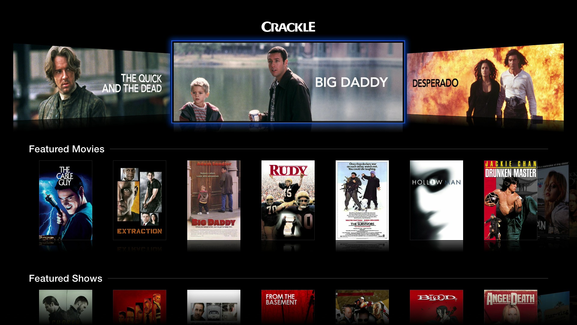
Crackle is an exciting addition to the Apple TV (I previously recommended the iOS version for use with AirPlay in “Take Control of Apple TV, Chapter 6: Apple TV at the Movies,” 9 December 2013). It’s a free, ad-supported app with an odd mix of movies and TV shows. The currently featured movies include “Big Daddy,” “Step Brothers,” “Ghostbusters,” “American Psycho,” and “The Spirit.” Available shows include “Seinfeld,” “I Dream of Jeannie,” “Sanford
and Son,” “Barney Miller,” “Damages,” and “The Shield,” as well as original shows like “Chosen” and Jerry Seinfeld’s “Comedians in Cars Getting Coffee.” While you aren’t likely to find anything you’re actively searching for on Crackle, you can probably find something you’ll enjoy watching.
Of all the new additions, KORTV is the most interesting, at least for a subset of Apple TV users, as it offers Korean movies and TV shows. I found only one (free) English program in the entire app. Interestingly, the descriptions for Korean-language content are in English.

Some of KORTV’s content is free, but much of it requires a subscription, with fees between $1.99 and $4.99 per month. For instance, MBN business news is $1.99 per month, ETN K-pop (featuring Korean pop music) costs $2.99 per month, and you can access all available movies for $4.99 per month. If you’re a fan of the ancient strategy game Go, there’s an entire free section dedicated to it, provided you understand Korean.
New content is always welcome on the Apple TV, though Apple is both filling in obvious gaps (such as with ABC and the previous addition of PBS) and adding quirky choices that feel like obscure cable channels. The more content Apple adds to its streaming box, the more apparent it is that the company needs to provide better organizational controls or even open an Apple TV App Store in order to preserve the sanity of users faced with a plethora of choices every night (not to mention us poor book authors). Easier app hiding is rumored to be on the way, but until then, I explain how to hide unwanted apps in “Take Control of Apple TV, Chapter 2: Set Up Your Apple TV,” (4 November 2013).
Chapter 7 of “Take Control of Apple TV” Available
It’s easy to assume that the Apple TV is all about video, but thanks to AirPlay and a number of built-in apps, Apple’s little black box makes a surprisingly good hub for all your audio as well, as Josh Centers outlines in his streamed ebook, “Take Control of Apple TV.” In Chapter 7, “Rock Out with Apple TV,” Josh offers some pointers for hardware that can improve the Apple TV’s audio quality, and then dives into the five apps that (insert required “This Is Spinal Tap” joke here) take the Apple TV to eleven.
As you may expect, the Apple TV’s Music app offers access to your music, but only if you’ve purchased it from iTunes. For music you’ve acquired from other sources and stored in your Mac’s iTunes library, the combination of the Computers app and Home Sharing gives you what you need (and Josh provides advice for the best way to rip your existing CD collection, if necessary). And if you want to go beyond your personal collection, the iTunes Radio app ties into Apple’s excellent streaming service and the Radio app serves up numerous Internet radio stations. Lastly, the Podcasts app syncs up (theoretically, at least) with your podcast subscriptions from iTunes and the iOS Podcasts app (see “Explaining Podcasts in iTunes 11.1,” 14 October 2013).
As with Chapter 6, “Apple TV at the Movies,” Chapter 5, “Master AirPlay,” Chapter 4, “Discover What’s on Offer,” Chapter 3, “Control Your Apple TV” and Chapter 2, “Set Up Your Apple TV,” this chapter is available for free, but only to TidBITS members; everyone is welcome to read Chapter 1, “Introducing Apple TV,” to see what’s still coming. Please keep those comments coming —
they’ve been very helpful so far! When we’re done, everyone will be able to buy the full ebook in PDF, EPUB, and Mobipocket (Kindle) formats, and TidBITS members can save 30 percent on this and all other Take Control titles.
Publishing this book in its entirety for TidBITS members as it’s being written is one of the ways we thank TidBITS members for their support. We also hope it encourages those of you who have been reading TidBITS for free for years to help us continue to bring you carefully considered, professionally written and edited articles each week (for more details on what the membership program means to us, see “Support TidBITS in 2014 via the TidBITS Membership Program,” 9 December 2013).
Keeping Up with the Snoops
Even months after Edward Snowden’s initial revelations about the U.S. National Security Agency’s data collection programs, it seems like we learn something new every day. The details can be overwhelming, but it’s an issue about which we feel everyone should be well informed. With that in mind, here’s a collection of the latest developments.
First, if you need to catch up on the story so far, the New Yorker’s Ryan Lizza has done a heroic job of telling the story of the NSA’s data collection programs since the 9/11 attacks. It’s a long, long article, so I recommend saving it to a read-later service like Instapaper or Pocket, or even printing the whole thing out. Lizza tells the story of how former Vice President Dick Cheney helped create the current situation, how President Obama helped codify it, even after campaigning against President Bush’s warrantless wiretapping programs, and how intelligence officials lied to Congress and the secret FISA courts to protect the
programs. Everyone should read and share this article.
What Lizza’s article doesn’t mention is the just-revealed intelligence operations occurring in online game services like World of Warcraft, Second Life, and Xbox Live. Agents with the NSA and its British counterpart, the GCHQ, have used online games since at least 2007 to monitor communications, friend networks, behaviors, biometric data, and to recruit potential informants. Blizzard Entertainment, maker of World of Warcraft, said that if any surveillance was taking place, it was without its knowledge or consent. Microsoft, maker of Xbox Live, and Linden Labs, producer of Second Life, refused to comment.
It’s disturbing enough that the NSA is monitoring games played (at least in part) by children, but the agency is also seeking to recruit, or “convert” them, as the NSA is fond of saying. NSA college internship programs target journalism students with a 3.0 or above GPA, which is a tempting prospect in an increasingly difficult field. It’s not just college — the NSA’s High School Work Study Program seeks kids as young as 15 years old for entry-level positions. It sounds like a pretty good first job, with 20–32 hours of work per week, paid federal holidays, and sick leave. And, over the last three years,
100 percent of high school participants who wished to “convert” were hired.
Even more disturbing is the recent revelation from a former FBI assistant director that the FBI is able to activate your webcam without your knowledge in order to spy on you. Covering your webcam with a piece of tape, once largely limited to paranoid tinfoil hatters, now seems like a sensible precaution. Christopher Poole, the founder of the infamous 4chan image board, has teamed up with General Electric to create a 3D-printed bit of plastic to block webcams. Politics makes
strange bedfellows.
Meanwhile, the outcry over pervasive NSA surveillance is growing. A group of well-known authors, including several Nobel laureates, has signed a statement protesting mass surveillance and calling for an international bill of digital rights. If you wish, you can join them in signing the pledge at Change.org. And it’s not just writers. Former President Bill Clinton has condemned the collection of economic data under the
guise of security.
But perhaps most importantly, Apple, Google, Facebook, Microsoft, Twitter, Yahoo, LinkedIn, and AOL have signed a joint statement asking for the following surveillance reforms:
- Limits on governmental authority to collect user information
- Increased oversight and accountability
-
The ability to publish government demands promptly
-
The free flow of information between borders and for countries to not require service providers to operate locally
-
A treaty to unify these processes between governments
The potential economic consequences are dire for the tech industry (particularly with regard to item 4 above), as our own Geoff Duncan pointed out in “Are We Ready for the Post-Snowden Internet?” (6 December 2013). The tech sector in the United States has been built in large part on a worldwide trust in the American Internet, and now with that trust vanishing, the future of our healthy tech sector is in jeopardy.
But even with potentially devastating consequences for the U.S. economy, Senator Ron Wyden, an outspoken critic of NSA surveillance who was featured in Lizza’s article, doesn’t have much hope for true reform, since Congress is largely in favor of surveillance. And Wyden’s friend-turned-rival, Senator Diane Feinstein, is pushing for “reform” that in fact would legitimize NSA data collection with only a minimum of additional oversight.
That’s it for this week’s depressing headlines — apart from the sensible precautions suggested in Joe Kissell’s “Take Control of Your Online Privacy,” the best thing you can do if you’re concerned about the NSA’s spying on U.S. citizens (and you’re a U.S. voter) is express that concern to your elected representatives in Congress. You can also support the nonprofit Electronic Frontier Foundation, which is actively fighting the NSA in court. Change won’t be easy or come quickly, but it’s clear that transparency and accountability must be codified in law if they are to happen.
Belkin Ultimate Keyboard Case Makes iPad Air a Fair Travel Computer
I had promised Glenn Fleishman a piece for his latest venture, The Magazine, and I thought that my annual Thanksgiving trip to visit my brother and sister-in-law would be the perfect time to write it. But, rather than haul my aging MacBook along on the trip, I decided to compose the article on my sleek new iPad Air. As luck would have it, a review unit of Belkin’s QODE Ultimate Keyboard Case for iPad Air arrived at my door five minutes before the airport shuttle arrived, giving me just enough time to shove the unopened package into my carry-on bag before embarking on my journey.
When I arrived at my brother’s home, I unpacked the case and, using the included meter-long USB-to-micro-USB cable, plugged it into my iPad’s charger. The case must have been pre-charged at the factory, because less than ten minutes later, the charging light on the right side of the case indicated that the battery was full.
Meanwhile, I examined the packaging for a manual. All I could find was a single card-stock sheet with minimalist instructional diagrams labeled in English, French, and Spanish. Even those instructions were unnecessary, as it was obvious how to snap the iPad into the case, and I had already figured out how to charge the device. What I didn’t know was how to turn the case on or how to pair its Bluetooth radio with my iPad Air.
The answer to the first question is simple: once the iPad is in place, awake, and positioned for use, the case comes to life automatically. As for the second question, that, too, almost answers itself: you hold down the Fn key at the lower-left of the keyboard while tapping the Pair key at the upper-right. Pairing happens almost instantly, and doesn’t require typing a pairing code (though you do, of course, have to remember to turn on Bluetooth in the iPad’s Settings app). A blue light illuminates briefly to let you know that pairing has taken place.
Snapping the iPad into the case is easy: cut-outs around the edge of the case line up with the iPad’s ports and buttons so you can do it even in the dark. The iPad snaps in so securely that it’s harder to get the iPad out than to put it in! That’s a good thing, of course, since you don’t want the iPad to pop out accidentally. However, it took me a few tries to work out the easiest way to convince the case to give me my iPad back — I recommend you place the case on a flat surface first before you try popping the iPad out so you don’t send your precious tablet flying through space.
![]()
Although you have complete access to the iPad’s ports and buttons when the iPad is in place, the only ones you are likely to need are the Sleep/Wake button, headphone jack, and Lightning cable socket. The keyboard itself has a dedicated key for the iPad’s Home button, along with function keys (invoked when you hold down the Fn key) for controlling audio volume, muting, playing and pausing media, showing and hiding the on-screen keyboard, and even one for displaying the multi-tasking screen. When the iPad is sleeping, a quick
tap of the Home key on the keyboard wakes it.
There are also function keys for cut, copy, and paste, though you may not have to use them: the keyboard includes both standard Command and Option keys that worked with every text editing app I tried, so I didn’t have to retrain my fingers for common editing maneuvers. The same, unfortunately, cannot be said about touch-typing; the semicolon key is placed just to the right of the space bar instead of at its usual location to the right of the L key, so I found myself hitting the apostrophe key whenever I wanted a colon or semicolon. Also, the apostrophe key is narrower than the other keys, so even when I remembered its non-standard location, I often overshot it and pressed Return instead.
However, these are relatively minor quibbles. Aside from the half-size apostrophe key, I found the keyboard large enough to fit my hands, and the keys themselves provided a similar tactile response to those built into my MacBook. You won’t mistake the keyboard for a classic IBM Selectric typewriter, but it more than serves the purpose.
Physically, the case is rather sturdy. The bottom is aluminum, protecting both the keyboard and the iPad screen when the case is closed. The top frame, where the iPad snaps in, is rigid plastic with an imitation leather panel and a micro-fiber lining that protects the back of the iPad. The top frame attaches to the keyboard by that panel, which unfolds to act as a stand so you can angle the iPad when it is in use. You can flip the top frame around to hold the iPad one-handed, though that leaves the keys exposed on the back.

When open, the top frame holds the iPad in place with magnets; thin lines printed above the keyboard show where to align the top frame with the bottom, and there are three sets of them so you can adjust the viewing angle to your liking. The magnets also hold the case closed securely — I found that opening the case required more than a casual amount of force. Again, this is a good thing, since it keeps the case from opening accidentally.
The case by itself is somewhat heavier than the iPad Air — Belkin does not provide specs but, according to Amazon, the case weighs 1.3 pounds (590 grams), making the combined case and iPad Air just slightly heavier than, say, a third-generation iPad with a Smart Cover. That’s certainly not unbearable, but it’s not an arrangement you would use for extended periods of pleasure reading. You’ll probably want to free the iPad Air from its case when you curl up with a good ebook.
During my week of writing, I experienced a few glitches. Several times I had key presses go mad and repeat themselves until I tapped another key. Twice the keyboard suddenly became completely unresponsive; to cure that I put the iPad to sleep and then woke it up again, which re-established the Bluetooth connection. But those glitches were rare and hardly interfered with my work.
Battery life is exceptional: I haven’t recharged it since I gave it its initial charge. Belkin states that the case can operate for 264 hours (about a month of 8-hour days) on a charge, and it can hold a charge on standby for about six months. I have come nowhere near either of those limits. Even heavy users of the case should not have to charge it more than once every couple of months.
At $129, Belkin’s QODE Ultimate Keyboard Case for iPad Air is pricey, but not overpriced: it’s lightweight, sturdy, and very easy to set up and use. It may not turn your iPad Air into a MacBook Air, but it does make your lightweight tablet a practical alternative to a MacBook for many tasks.
Organize Receipts on Your iPhone with Receiptmate
Keeping track of receipts is an infuriating task in the digital age. Whether you track them for reimbursement by your employer or to better watch your personal finances, managing a flurry of small receipts is a headache. Nobody wants to sort through a filing cabinet filled with little bits of paper or trudge through the data entry necessary to generate an expense report.
Fortunately, I’m not the only person with a vendetta against physical receipts. Gareth du Plooy, the man behind Brilliant-ish Software, has created Receiptmate for iPhone, a $2.99 app to scan your receipts, tally up their totals, and store them digitally in the snippet-keeping service Evernote. Using Evernote for storage rather than a custom service is sensible — having all my receipts accessible from any device with the Evernote app is an appealing proposition — plus Evernote is tried and tested for PDF storage. You will need an Evernote account
to use Receiptmate.

Receiptmate is flexible, allowing you to add receipts at any time. Prefer to snap pictures of your receipts throughout the day and add them to the app in the evening? No problem, as it can import images from your iPhone’s Camera Roll. Would you rather add each receipt as you receive it? Receiptmate works well in that case too, since the interface allows quick entry. Here’s the basic process.
Entering Receipts and Amounts — Receiptmate uses your iPhone’s camera to scan receipts: it’s just one tap away from the app’s main screen, letting you quickly snap a picture of a receipt or import an existing image. Next, crop the receipt’s image, removing cruft around the edges. Receiptmate automatically adjusts brightness and contrast, preparing the image for you to highlight the total.

The main reason to keep receipts is to track spending amounts, so the next step is enter the amount of your scanned receipt. Receiptmate prompts you to highlight the total with a finger, after which the built-in text-recognition engine takes its best guess at the amount. I’ve had mixed results with this feature, but corrections are easy: just tap out the amount — no need to delete the bad guess.

Finally, you can add additional pages to the receipt — a feature I have yet to need. Each page you add follows the same process described above. Once you’re satisfied with the end result, enter a title and any notes you may have, and you’re done.

The finished receipt uploads to Evernote in the background. I made a new notebook in Evernote called Receipts and directed all my Receiptmate uploads there to keep them separate from the rest of my notes.

Once you have sufficient data within Receiptmate, it’s easy to generate a spending report right within the app, which you can then export as either a PDF or an Excel spreadsheet.

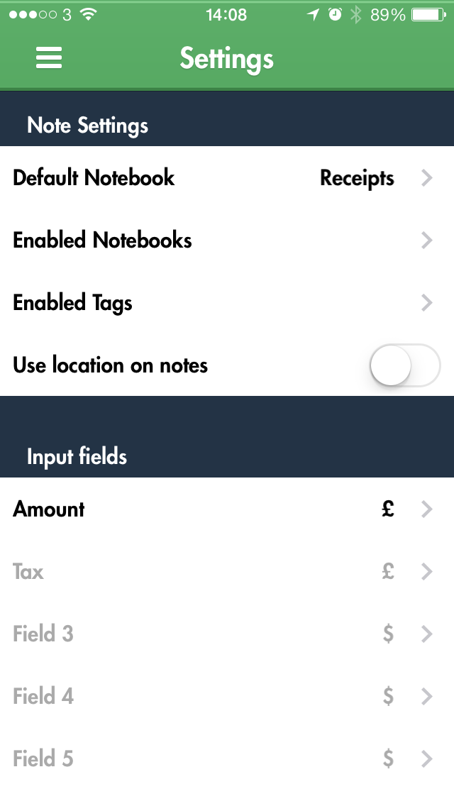
Receiptmate’s settings menu contains options to change the active Evernote account, choose the default Evernote notebook to save receipts to, enable or disable tags, turn on the saving of location information to your receipts and — one of my favourite features — support for custom input fields. These fields use the same text recognition as the amount calculator described earlier, but they can be named anything you wish and be given units varying from currencies to distances.
The Future, for Receiptmate and You — The main place where Receiptmate could improve is with its text recognition. The success-to-failure ratio just isn’t good enough, to the point where I simply don’t trust it. Worse, recognition problems occasionally arise from the automatic contrast and brightness adjustments Receiptmate itself makes. The smart design decision to allow manual entry if recognition fails lessens the annoyance, but I’d rather see the text recognition removed entirely. Plus, it can be frustrating when the automatic brightness and contrast adjustments render the receipt difficult to read, so I hope to see either some improvements to these adjustments
or more manual contrast control in a future update.
What if you want to stop using Receiptmate or Evernote in the future? Exporting all your receipts from Evernote is easy: all you would lose are the amounts entered manually or by text recognition, and since the amounts stored within Receiptmate are used to generate reports, you can create one final Excel spreadsheet with all your receipt data. This should make moving relatively painless. The scanned receipts are easy to work with as well, since they’re all named and dated in Evernote.
Making the leap to paperless can be psychologically wearing, due to worries about potential problems that might offset promised benefits. But if physical receipts are a pain point and you already use Evernote for online storage of documents, Receiptmate is worth investigating.
The ideal Receiptmate user would be an individual just starting out in the paperless world and looking to track expenditures for personal reasons — if your employer requires you to submit expense reports in specific formats or enter receipts into an invoice management system, Receiptmate may not meet your needs. However, for those of us who are just looking to do something with our receipts rather than throwing them out or letting them pile up, Receiptmate’s simplicity and focus are compelling.
How iOS 7 Will Affect Developers — and You
Now that I’ve finished rewriting my technical book on how to write iOS apps (this time around, it got divided into two books, called “iOS 7 Programming Fundamentals” and “Programming iOS 7”), here are some of the major changes wrought by iOS 7, and how they are likely to influence developers — and hence, the interface and behaviors of the apps that those developers create.
(For my earlier surveys in this vein, see “How iOS 6 Will Affect Developers — and You,” 25 September 2012, and “How iOS 5 Will Affect Developers — and You,” 17 October 2011.)
Bars, Buttons, and Breakage — The most obvious effect of iOS 7 on any developer who rebuilds an app using the current version of Xcode is that it totally alters the look of the app. In part, this is because every built-in widget is drawn in a new way. I don’t need to belabor the details, as by now they are notoriously familiar to all users of iOS 7: switches are smaller, thermometers are thinner, buttons are borderless, and so on.
In addition, all apps are now full-screen apps. The status bar is transparent, and an app’s interface extends underneath it and is partly obscured by it — so there mustn’t be anything at the top of the interface that the user needs to read or tap, as both are impossible. Even more surprising, navigation bars and toolbars are translucent by default, and the system tries to extend the interface behind them as well. Thus it is quite probable that a developer who rebuilds an iOS 6 app under iOS 7 will find that parts of the interface have been shifted and hidden behind something else.
Here’s a screenshot showing what iOS 7 did to my Zotz app. On the left, how the app’s game screen looked under iOS 6; on the right, the very same project running under iOS 7. Note the thinner thermometer (at the top), the pale translucent tab bar (at the bottom), and the way the card layout has been stretched to extend behind the status bar and the tab bar.
Trying to untangle the resulting interface mess is so troublesome that many developers will probably find it not worth their time and effort to maintain compatibility with iOS 6 and before. It’s far simpler to drop iOS 6 support, or to publish two different apps (one for iOS 7 and one for pre–iOS 7), than to rejigger one app to look right on multiple systems. It took me several days to fix the way Zotz looked; by the time I was done, I had a decent iOS 7 interface, but there was no going back. On the left, what iOS 7 initially gave me (the
same as the right image from the previous pair of screenshots); on the right, what I ended up with.
The settings screen of my Zotz app shows some of the adjustments I had to make in order to deal with changes in how widgets draw themselves. The problem with buttons was particularly acute; the system was no longer showing users that these were buttons — they looked like mere text. To clarify the interface, I ended up drawing my own rather unsatisfactory custom button-like borders. On the left, how it looked in iOS 6; on the right, how I managed to get it to look, eventually, in iOS 7.
Wild Animations and Fake Blurs — iOS 7 hands developers many new animation tools; for example, UIKit Dynamics provides an easy cartoony imitation of real-world physics. Even more important, iOS 7 lets developers use their own animations in new places — in particular, during the transitions between screens. You can see this in Apple’s Calendar app on the iPhone.
Those two screens are part of a standard navigation interface. Formerly, the passage between them would be animated by the new interface sliding in from one side; there was no other choice. Developers are now free to do whatever they like during that transition; the Calendar app performs a sort of vertical zoom. You can expect to see lots of other new and original navigation animations. In my Zotz app, I now animate the transition between the game screen and the settings screen; formerly, such animation in a tab bar interface was impossible.
For certain kinds of transition, iOS 7 also grants developers new freedom as to where the incoming view ends up. A presented (“modal”) view on the iPhone could formerly be only fullscreen; now, it is perfectly legal for such a view to cover only part of the screen. This means, for example, that developers can escape the tyranny of the alert view that pops up in the middle of the screen. Apple’s built-in alert view can contain only a title, a message, an optional text field, and a couple of buttons; now, however, any view can pop up in the middle of the screen, giving developers complete freedom to design their own alerts.
Apple also urges developers to use blurring to suggest that one view is covering another. I do this in my Zotz app, where the user taps a color in the settings screen to bring up a secondary color customization screen. The color customization screen seems to be covering and blurring the settings screen, thus emphasizing its temporary (“modal”) nature; that’s not really what’s happening, but iOS 7 provides tools that let me easily create the illusion.
Secret Sharing — An iOS 7 app that downloads updates to its content can now arrange with the system to be woken or launched periodically to perform such an update, without the app coming to the front, even when the screen is locked. The idea is that the user may no longer have to ask the app to refresh its content; by the time the user summons the app to the front, the app will already have refreshed its content. The user can prevent such background downloads in general or for individual apps, in Settings > General > Background App Refresh. The TidBITS News app (see “TidBITS News 1.5: A Revolution in a
Nutshell,” 12 February 2013) is an excellent candidate for this feature.
iOS 7 brings other changes to the sorts of thing apps can do in the background, including new ways of uploading and downloading data over the network, and new ways of tracking the device’s location. Apple claims that these new forms of multitasking are intelligently applied by the system in such a way as to avoid straining the user’s hardware, but I suspect that they may cause reduced battery life. There are many lists of tips for mitigating iOS 7 battery issues, largely uninformed by experimental evidence or knowledge of the facts; it may be that iOS 7 is just a lot busier in the background than any previous system, and that the
user can’t do much about it.
Tricky Text — iOS 7 introduces some new text tricks. Dynamic Text is Apple’s name for the user’s new ability to set overall interface text size. The name is misleading; there’s nothing “dynamic” here. Developers are urged to make their apps listen for changes to the user’s preferences in Settings > General > Text Size, and to respond by adjusting the interface. A standard set of fonts for various text “roles” is provided, but these thin, sans-serif fonts are not particularly legible (despite Apple’s claims to the contrary) and are unsuitable for anything beyond labels. The TidBITS News app, for example, will probably be Dynamic Text–savvy with regard
to article headlines and blurbs, but for the actual content of an article, I intend to go right on using good old Georgia and letting the user adjust the size directly within the app.
iOS 7 also provides developers with full access to the Mac OS X text layout engine, Text Kit. How developers will use this new-found power is anybody’s guess, but drawing styled text in sophisticated ways will be vastly easier. Expect to see inline images, tab stops, text “decorations” of various sorts (such as special colored underlines or word backgrounds), and text arranged in interesting shapes. For example, I’m not sure whether or how I could have laid out an illustrated price list in columns in previous versions of iOS, but in iOS 7 it’s easy. (The missing “0” isn’t a mistake; it’s to prove that my tab stop aligns the prices on the decimal point.)

Similarly, text that flows from column to column is downright trivial to implement in iOS 7.
Swings and Roundabouts — We hope for bug fixes in any system update. Unfortunately, these are often balanced by new issues. A system-level problem that I ranted about in my article about the TidBITS News app is fixed in iOS 7: state saving and restoration now survives a restart of the device. But iOS 7 has blithely broken another TidBITS News app feature: you can no longer control playback of one of our podcasts from the Control Center or the lock screen, even though this worked fine under iOS 6, and even though TidBITS News is currently still an iOS 6 app (see “Four Problems with iOS 7: Crashing, Messages, Siri, and
Audio,” 2 October 2013). Apple’s cavalier attitude toward backwards breakage is particularly evident in iOS 7, and many of my favorite apps have faltered because of this.
iOS 7 is also itself, by a long chalk, the buggiest major iOS system release ever. I filed more bugs on iOS 6 than on all previous systems combined; I filed twice as many bugs on iOS 7 as on all previous systems combined, including iOS 6. Many of those bugs are still sitting open. Many apps are likely to be peppered with workarounds, and some developers are even finding that they can’t upgrade their apps to iOS 7 at all, because fundamental functionality no longer operates correctly.
iOS 7.1 is currently in beta; we’ve had two releases of it to date. I don’t think I’m breaking NDA by saying that so far it’s still swings and roundabouts: some small bugs are fixed, but new ones are introduced. For example, in one of my apps I have an interface element that works fine on iOS 6 and iOS 7.0.3, but iOS 7.1 currently breaks it.
But small bugs are to be expected; larger trends are more disturbing. I pointed out on Apple’s developer forums that a key interface widget, CATiledLayer, worked fine in iOS 4, iOS 5, and iOS 6, but was broken in the very first iOS 7 alpha release back in July — and remains broken, along with a strong suggestion that this was unacceptable — and my message was deleted instantly by the forum monitors. (Luckily they can’t delete the same statement from my book.)
Also, iOS 7 does nothing to address a growing body of large architectural incoherencies in Cocoa Touch, which badly need resolution. I don’t want to bore you with the technicalities, but the mutual enmity between Auto Layout and animation is a prominent case in point.
Back in the iOS 3 and iOS 4 days, I loved the simplicity and elegance of Cocoa Touch. Nowadays, it seems to me to be growing like a clay sculpture created by a classroom of toddlers: people keep slapping bits onto it, and no adults are supervising the overall shape. The chief implication for you, the user, is that if some of your apps seem to be receiving a lot of updates, it may be because developers keep having to dance around Apple’s unpredictable inconsistencies.
FunBITS: Master Your Fretboard with Capo 3 for Mac
Almost anyone who plays an instrument knows there are two main ways musicians learn songs: studying written music and picking stuff up by ear. Most players eventually wind up in both camps, but generally, folks with formal training playing composed music (classical, choral, show tunes, etc.) lean toward printed music, and those who play popular music (jazz, blues, rock, pop, country, etc.) tend to play by ear.
Learning by ear is arguably the more difficult path. Not only are beginners trying to grasp the basics of their instruments (often without a teacher or lessons), but they’re also trying to train their ear to identify notes, harmony, and musical forms — stuff that’s mostly spelled out for those studying printed music. It’s no wonder most starter instruments received enthusiastically as gifts over the holidays are gathering dust by summer.
Fortunately, technology can help. SuperMegaUltraGroovy has recently updated its well-regarded Capo for Mac to version 3.0, featuring automatic chord detection and the powerful claim that it can help aspiring musicians “reverse-engineer rock and roll.” Capo’s not just for guitarists: people playing bass guitars, five-string banjo, mandolin, or ukulele can use all of Capo’s features. (Capo is also available for iOS devices running iOS 5 or later, though without the Mac version’s chord detection or tablature.)
Can Capo 3 help aspiring players overcome the hurdles of learning to play by ear? No… and yes.
Capo Figures Out Chords?! — To get started with Capo for Mac, you load in a music file from iTunes or the local drive. Capo doesn’t access iTunes playlists directly (that would be handy), but you can drag tracks straight from iTunes to the Capo window, or go old school and drag tracks into Capo from the Finder. Sometimes Capo picks up iTunes artwork, sometimes not: I haven’t figured out any pattern. Capo supports MP3, M4A, WAV, and AIFF files; however, it doesn’t handle older copy-protected songs from the iTunes Store. You can upgrade most protected tracks to DRM-free versions via iTunes Match; other ways of getting around Apple’s FairPlay DRM are left as an
exercise to the reader.
When Capo loads a file, Capo’s main window shows five primary regions. Top to bottom, they are:
- A numbered timeline displaying Capo’s best guess of a track’s measures
-
A small area showing the waveform of the track itself
-
A large area with a note-by-note spectrum analysis
-
Chords Capo detected in the track, with fingering diagrams for the current instrument
-
Lines to display tablature for the current instrument
If you’ve ever been frustrated figuring out chords to your favorite songs, take a moment and pry your eyebrows off the ceiling right now. Drop a song into Capo and you get an interactive chord chart? Amazing.
And it is amazing. Capo’s chord identification works using sophisticated frequency analysis. At any particular instant in an audio recording, certain frequencies are more prominent than others, and those probably represent notes being played. For instance, a perfectly tuned middle C is at about 261.6 Hertz (vibrations per second). Capo zips through the entire audio track, picking out which frequencies are most prominent at which times. The app compares those frequencies to named notes (like middle C being 261.6 Hz), then considers which notes are sounding at the same time to guess at what chords are being played. Capo also uses beat detection to assess which chords are more important than others: it’s more likely to show a
chord diagram on a strong beat than a weak one.
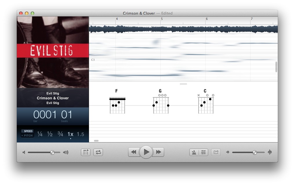
Strong frequencies appear as blotches or lines in Capo’s spectrograph — the darker, the stronger — with high notes on top and bass notes on the bottom. The screenshot above shows a few early bars in a heavy version of “Crimson and Clover,” recorded by Evil Stig (with Joan Jett) in 1995. Those three heavy lines at the beginning of measure four are a quintessential rock power chord — F major in this case. Capo identifies the individual notes when hovering the mouse pointer over them; the screenshot also shows how the song moves to a G power chord, then slides up to a C. This is Rock ’n’ Roll 101.
Are Those The Right Chords? — Capo 3’s chord identification is astonishing — but there are gotchas. For one thing, not everything happening in music is a pitch. Drums, cymbals, and percussion are mostly atonal, and that cacophony can make it tough for Capo to pick out notes. Things like sound effects, speaking voices, and swishing synthesizers can also interfere.
Plus, not all music is loud power chords. Structurally, Dwight Yoakum’s “Guitars, Cadillacs” is a simple tune — simpler than “Crimson and Clover,” in fact! However, thanks to walking bass, passing tones, and fills, Capo 3 detects no fewer than ten chord changes in just the first eight bars, including some prominent diminished chords. Don’t panic! The passage is just two chords. But Capo can’t distinguish true chord changes from musical conventions and players’ embellishments. At each instant, Capo’s chord choices make harmonic sense — they’re just not how musicians would think about the music.

Other things can impair chord detection. Phrasing and effects (like a wah pedal) change a frequency profile so that a note seems different from what’s being played. Some instruments have overtones that make them seem like they’re playing higher: the classic example is an oboe (which has high overtones stronger than its primary note), but even a simple, sustained note on a bass guitar sometimes displays as multiple notes in Capo 3. The bass probably isn’t playing a chord, but all those extra
notes can be confusing.
There’s a more subtle problem. It’s tempting to think we hear the same way Capo’s frequency analysis works, but human perception is more complex. Just as we can pick out our names spoken softly from across a crowded room, we’ve learned to identify and follow both melodies and tones even when they aren’t prominent — at least in terms of the concentration or power of their raw frequencies. I recently played on a recording of The Strangelove’s “I Want Candy” with a strong melody played in unison by an electric guitar and a sitar. Between pounding drums, a snorting bass guitar, and the lead instruments spreading the melody across a broad range or frequencies, most of
the lead notes are essentially invisible in Capo’s frequency spectrum: the whole thing falls between C4 and C5, but Capo 3 picks out just two sustained notes. The part is easy to hear in the recording, but using Capo’s frequency spectrograph to figure out that line would be nearly impossible.
If Capo’s chords don’t seem right, then change or delete them. Clicking a chord in Capo 3 selects it; from there, you can correct the chord. By default Capo prefers open-position chords down the neck (these tend to be easier for beginning players), but you can choose alternative fingerings. If your ear tells you a G chord is being played up at the 10th fret, you can choose that chord diagram. Capo 3 uses Mac OS X’s built-in MIDI support to let you try out chords: clicking a chord lets you hear
whether it’s “right” or not, developing your ear. Chords can also be deleted entirely.
What About Tablature? — The utility of Capo 3’s spectrograph doesn’t end with chords. Capo doesn’t generate tablature automatically, but you can drag the mouse pointer over notes in the spectrum diagram not only to hear that note played back using MIDI, but also to generate tablature. Tablature is a common way to notate music on a fretted instruments: each horizontal line represents a string, and numbers indicate a fret position on a string. Tab is popular because it doesn’t require the ability to read music, but (if the tab is accurate!) provides exact fingerings for an instrument. As with chords, Capo 3 initially suggests open strings and notes at the bottom of
the neck when dragging out notes in the spectrograph, but you can choose an alternative string and fret using a contextual menu on any note. Here’s the famous opening lick from Jimi Hendrix’s “Voodoo Chile” in Capo’s tablature: I’ve changed each note to the correct fingering.
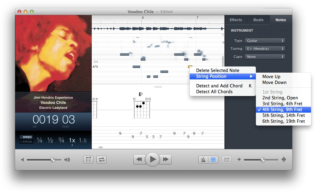
That screenshot also shows other useful Capo features. On the right side of the window I’ve selected “guitar” as the instrument, but the “E♭ (Hendrix)” tuning. Jimi Hendrix famously tuned his guitar down a half step, so with that tuning, the tablature accurately reflects the recording. Capo 3 supports a whopping 56 guitar tunings, along with bass guitars (four to six strings), mandolin, ukulele, and five-string banjo (with common alternate tunings for each). If the MIDI notes get annoying (they did quickly
for me), you can turn them off at Sound > Mute Notes without impacting tablature.
The tablature option is a useful learning tool, but there are some shortcomings. Capo 3 doesn’t support printing, and you can’t annotate the tab with bends, vibrato, or effects. That last tabbed note in “Voodoo Child” is a pull-off: it’s not picked separately, but there’s no way to indicate that in Capo 3. Folks who need a full-featured tab program will need to look elsewhere. Also, those with third-party audio/MIDI hardware might see Audio Units security warnings: this is an unfortunate side effect of Apple’s sandbox security model (for more details, see “Answering Questions about Sandboxing, Gatekeeper, and the Mac App Store,” 25 June 2012). Agreeing to lower security
for Capo should be fine.
Powerful Learning Tools — I’ve focused on Capo 3’s new features, but the app retains all the nifty tools from previous versions. Chief among these are the capability to speed up and slow down the original recording so you can more easily hear what’s happening and play along. Unlike the bad old days of slowing down record players or cassettes, Capo reduces speed without changing the original pitch, making it far easier to pick out what’s going on. Capo can slow recordings down to as little as one quarter their original speed. However, there are times you do want to change a recording’s pitch to match your instrument — say you don’t want to de-tune your
guitar to play “Voodoo Child,” as mentioned above. In that case, you can tell Capo to play the recording a half step higher. Ta-da: Hendrix in standard tuning!
I’ve used many pro-level pitch-shifting and time-stretching tools over the years; to my ears, the features in Capo are basically on par with professional audio software, although they may reveal shortcomings in that 128 Kbps MP3 file or a crappy audio track you copied off YouTube (not that anyone would do that!). Capo also enables you to apply EQ and vocal reduction to songs to better hear what the instruments are doing. Personally, I don’t find those tools particularly useful (learning to play by ear includes learning to listen around clutter) but they worked well in my tests.
Capo also does beat detection to figure out the basic tempo of a recording: again, it seems about as good as anything else in the business, which is to say “your mileage may vary.” Depending on the music or recording, Capo may be spot on or hysterically wrong. There’s no way to correct Capo’s guess, but if Capo’s assessment is usable, there are options for a metronome, setting time signatures, and count-ins that some musicians and students will appreciate.
If you want to work on a particularly tough phrase or solo, Capo 3 supports looping regions in the recording, which cycle over and over again at whatever speed you like. The looping regions are a replacement for markers in previous versions of Capo: some folks accustomed to markers prefer them, but I think looping regions are a welcome improvement: they’re more akin to the way programs like GarageBand, Logic, and ProTools work, so the concepts translate better if people get interested in multi-track recording. You can set up as many regions in a song as you like, and move easily between them.
Worth The Money? — Anyone expecting instant, completely accurate chord charts and tablature from Capo 3 is likely to be disappointed. However, that doesn’t mean Capo’s chord detection and tablature features aren’t useful. I’d argue Capo 3 is like every other music learning tool: you get out of it what you put into it.
Capo 3 doesn’t eliminate the need for motivation, hard work, and lots (and lots) of practice. However, it does provide unique and worthwhile tools for understanding harmony, transcribing music, and figuring out those signature licks to show off to friends — which might make all the difference between staying motivated to become a rock star or an instrument getting lost in the back of a closet.
Capo 3 costs $29.99 and is available from SuperMegaUltraGroovy’s Web site and the Mac App Store; the trial version is fully featured but overlays audio with noise after five minutes of playback. Capo 3 requires OS X 10.8 Mountain Lion or newer; older versions (without automatic chord detection) run on 10.7 Lion and 10.6 Snow Leopard.
TidBITS Watchlist: Notable Software Updates for 16 December 2013
iFlicks 2.0.1 — After several months of beta testing, Jendrik Bertram released version 2.0 of his iFlicks video encoding and metadata management app a few weeks ago with a redesigned interface and a number of metadata search improvements (including localized content ratings). If you’re not familiar with iFlicks, be sure to read Josh Centers’s overview in “iFlicks Improves iTunes Imports” (10 January 2013). Bertram recently updated iFlicks to version 2.0.1, which now makes sure to wait for new items in a watch folder to finish copying before processing, fixes an issue with
setting the current location in Preferences, fixes problems with audio encoding and muxing, and updates several unspecified translations. ($24.99 new from the Mac App Store, free update, 10.6 MB)
Read/post comments about iFlicks 2.0.1.
Firefox 26 — With the release of version 26 of the Firefox browser, Mozilla has implemented a plug-in activation scheme that had been hinted at back in September 2013. The new version of the Web browser makes Click to Play functionality for Java plug-ins the default behavior, requiring you to click an applet on a Web page to authorize Java to run. Previously, Mozilla had promised to make this the default for all plug-ins, save for the most recent version of Flash, but only Java gets the treatment in Firefox 26. The update also
adds support for script-generated password fields, improves page load times by not decoding images that aren’t visible, and fixes the AudioToolbox MP3 backend for Mac OS X. (Free, 45.5 MB, release notes)
Read/post comments about Firefox 26.
VLC Media Player 2.1.2 — VideoLAN has released VLC 2.1.2 with fixes for numerous bugs that were introduced in the version 2.1 release (nicknamed RinceWind after a character from Terry Pratchett’s “Discworld” series of novels). The update also features a rewritten audio core that should improve volume and device management, adds hardware decoding for Mac OS X using VDADecoder, offers support for fragmented MP4 files (as well as Wave and RF64 files), adds support for screen input on Mac OS X 10.7 Lion and later, and is now ready for 4K displays. (Free, 30.1 MB, release notes)
Read/post comments about VLC Media Player 2.1.2.
PopChar X 6.4 — Improving support for OS X 10.9 Mavericks, Ergonis Software has released PopChar X 6.4 with an improved “corner P” that appears on the active screen on all monitors in a multi-monitor configuration and fixes several other display issues with Mavericks. The font discovery utility also improves its responsiveness in several areas, with the update quickening the pace of displaying the character table, improving the speed of detecting the font in the current application, reducing background activity by reloading available fonts only when necessary, and remembering the previously selected font
separately for each application. (€29.99 new with a 25 percent discount for TidBITS members, free update, 3.7 MB, release notes)
Read/post comments about PopChar X 6.4.
TextExpander 4.2 — Smile has released TextExpander 4.2 with a number of fixes and improvements for the typing shortcut utility. The update works around an issue in OS X 10.9 Mavericks that introduced smart quotes when TextExpander was set for straight quotes, allows embedding snippets within embedded script snippets, repairs snippets with mismatched plain/formatted content, addresses an issue with some Web browser “unibars” that wouldn’t remove the snippet abbreviation, improves expansion capabilities in Google Documents within Safari, and initially displays apps that are currently running when choosing an
application-specific expansion. ($34.95 new with a 20 percent discount for TidBITS members, free update, 9.1 MB, release notes)
Read/post comments about TextExpander 4.2.
ExtraBITS for 16 December 2013
We close out our final email issue of 2013 with Macworld’s tips for troubleshooting Touch ID, a Kickstarter project for The Magazine’s print collection, and Apple bringing its 12 days of Gifts app to the United States.
Troubleshooting Touch ID — A number of users have reported problems using the Touch ID fingerprint scanner in the iPhone 5s, and Macworld’s Serenity Caldwell offers some tips on reducing frustration. In particular, she advises scanning your fingerprint at the same angle that you’d most likely use to unlock the iPhone, and if that’s not enough, adding multiple scans at different angles. She also explains some situations where Touch ID might not work well, if at all.
The Magazine Aims to Fund a Print Collection via Kickstarter — Glenn Fleishman may not be doing as much with TidBITS since he acquired The Magazine from Marco Arment earlier this year, but he certainly isn’t lounging around. His latest effort is a Kickstarter project that’s trying to raise $48,000 so he can create a hardcover and ebook collection featuring more than 25 of the most popular stories from the Newsstand-based periodical. Our favorite reason to help crowdfund this book? Glenn will pay contributors whose work is used an additional reprint fee, which is sadly unusual in
the industry.
Apple Brings 12 Days of Gifts Stateside — From 26 December 2013 to 6 January 2014, Apple will be offering free songs, apps, books, movies, and more in its 12 Days of Gifts iOS app. Each day, the app will offer a new downloadable gift. This promotion has been around for a few years, but this is the first year that it has been offered in the United States.