#1468: tvOS 13 sneak peek, Dark Mode dissected, VMs not being backed up, Qi wireless charging, Apple bullies small repair shop
Our WWDC coverage wraps up this week with a sneak peek at tvOS 13, which may be the most notable update to tvOS in years. Apple continues to harass a small Norwegian business in its nonsensical quest to crush independent repair shops. If you’ve been unenthused about Qi wireless charging, Josh Centers would have agreed with you until it saved his vacation. Speaking of saving things, did you know that cloud backup services may not be backing up all your files, particularly virtual machine images? Adam Engst explains that before delving into the scientific research that reveals the dark side of Dark Mode—for most people, most of the time, it will make text harder to read, understand, and edit. Unsurprisingly, given that most Mac developers were paying attention to WWDC last week, the only notable Mac app release was Cyberduck 7.0.
Apple Continues to Harass Tiny Norwegian Repair Shop
Last year, Henrik Huseby, owner of a small Norwegian smartphone repair shop, took on Apple in court and won—see Jason Koebler’s full story at Motherboard. In short, after Norwegian customs seized a shipment of 63 refurbished screens for the iPhone 6 and 6s, Apple accused Huseby of importing counterfeit parts and tried to get him to pay $3566 and admit wrongdoing. Huseby and his lawyer countered that refurbished screens were never advertised as coming from Apple, even though they were often made with authentic Apple parts, with the Apple logo covered with paint.
If the logo wasn’t covered, it would be a violation of European Union regulations. In fact, one of Apple’s tricks to keeping parts from independent repair shops is to slap its logo on everything, even internal parts. The Norwegian court saw through that trick, saying:
It is not obvious to the court what trademark function justifies Apple’s choice of imprinting the Apple logo on so many internal components… Huseby is largely dependent on being able to import screens with covered up Apple logos to be able to operate in the market as a non-authorized iPhone repair technician.
One of the thorny issues for independent repair shops is that Apple won’t sell them necessary parts, so they often have to go through gray market channels to get them. There’s a blurry line between what’s counterfeit and what’s simply recycled. It’s not as simple as a Chinese factory making a knockoff Rolex—in many cases, the same factory that produces the actual part for Apple also makes the “knockoff.” Plus, refurbishers often make replacement parts from recycled Apple parts (Apple claims to support recycling) and other components. For more on this topic, see “Where Do iPhone Repair Parts Come From?” (17 August 2018).
Despite losing its lawsuit against Huseby, Apple is appealing the decision to a higher Norwegian court. But whether or not it manages to beat up on a lone Norwegian trying to help iPhone users with broken screens, Apple has a serious issue on its hands with repair:
- At the same time as Apple strives to maintain a monopoly on device repair, it cannot keep up with demand, as many people who have tried to get service lately know.
- Lots of people live far from an Apple Store, and even many Apple Authorized Service Providers cannot repair certain iPhone problems, forcing users to go without their iPhones for days after sending a broken unit in for repair.
- Despite Apple’s other efforts to protect the environment, many of its repairs involve throwing away (or hopefully recycling) substantial parts while at least some independent shops reduce waste by repairing broken solder joints or replacing specific failed components.
It just doesn’t make sense—Apple’s policies can’t be making the company significant amounts of money and are resulting in significantly worse customer experiences for both those who want to work with Apple for repair and those who don’t.
An Early Look at tvOS 13
I’ve spent the past five years documenting everything there is to know about the Apple TV, so I was pleased to see that tvOS, wholly neglected at the last WWDC keynote, took the top slot at this year’s keynote. Apple announced a lot of neat features for tvOS 13, and here’s a quick peek at what you can look forward to when tvOS 13 ships, likely in September 2019.
The New Home Screen
Apple is making quite a big deal out of the “new Home screen,” but it’s not that different than what you’re used to. The two most immediately noticeable changes are a shadow box around the first row of icons and the addition of video previews to the Home screen apps in that top row.

I know what you’re thinking, but these auto-play previews aren’t that bad! It seems like someone at Apple read Adam Engst’s “#DeathToAutoPlay—No More Audio and Video That Plays Automatically!” (6 February 2019) because the company did some things to keep tvOS 13’s previews from being as obnoxious as those that Netflix assaults us with:
- Video previews appear only for apps in the top row.
- You must have an app highlighted for a few seconds before the preview video plays.
- The preview video plays silently.
- Most importantly, you can disable previews entirely by turning off Auto-Play Video Previews in Settings > General > Accessibility > Motion.
If you want to hear audio, you can swipe up on the preview video to take it full screen and press Play to play the video with sound. There may also be multiple preview videos that you can switch between by swiping left or right. (At the moment, previews work only in the Music app.)

Unlike Netflix’s aggressive video previews, Apple’s are easily avoided.
Control Center and Multi-User Support
I’ve long wanted a Control Center in tvOS—if for no other reason to make audio output switching easier—and we finally have one! Press and hold the Apple TV button to bring it up.
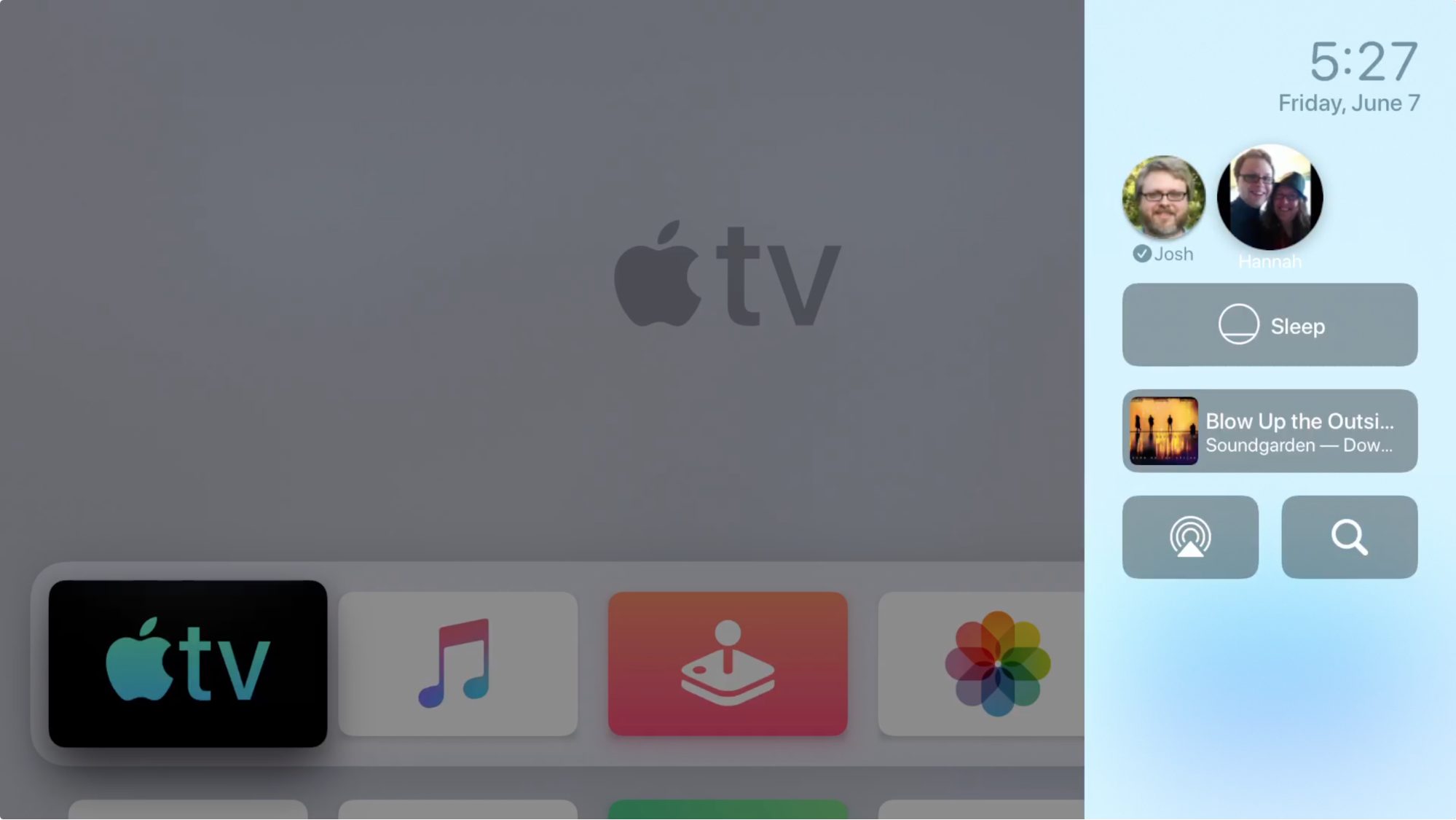
In Control Center, you can see the date and time, put the Apple TV to sleep, control background audio playback, choose audio output, and search. I hope Apple adds some other quick settings, like switching between light and dark modes, or even provides customization options like in iOS, but for now, I’m happy that I can switch to AirPods without fumbling through Settings.
The other big thing you do in Control Center is switch between users. That’s right, tvOS has gained multi-user support before iOS. You can add multiple Apple IDs to tvOS 13 (Settings > Users and Accounts > Add New User). Note that this doesn’t change which apps appear on the Home screen, but rather the content of apps like Apple TV, App Store, and Music. It’s not yet clear what third-party apps will take advantage of multi-user support.
As you can see below, switching users changes what you see in the Apple TV app.

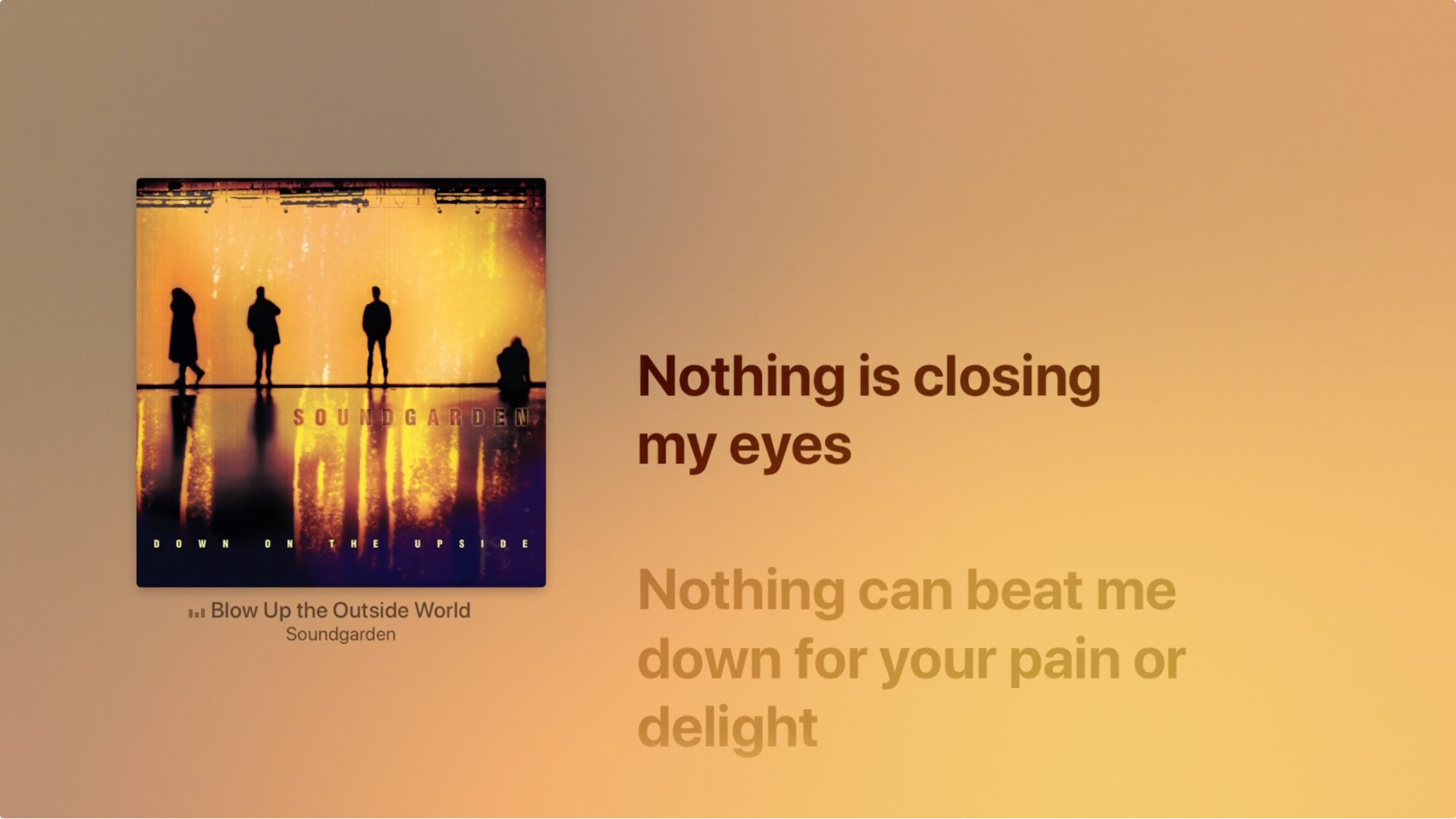
Apple Music Lyrics
Here’s a fun little enhancement: the Music app now displays lyrics, synced to match up to the music as it plays. Can Apple TV karaoke be far away?
Gaming
Apple Arcade, Apple’s upcoming subscription gaming service, is in the tvOS 13 beta, both as an independent app and as a tab in the App Store. Unfortunately, there isn’t much to see yet.

What’s more interesting is that tvOS 13—as well as iOS 13, iPadOS 13, and macOS 10.15 Catalina—supports Xbox One and PlayStation 4 wireless controllers. Pair them in Settings > Remotes and Devices > Bluetooth. (To put the PlayStation 4 controller into pairing mode, press and hold the PlayStation button and the Share button until the controller light starts flashing. To pair an Xbox One controller, press and hold the Connect button for a few seconds.)

Of everything announced at WWDC, game controller support might be the single most unexpected news item. If anything, gaming commentators always assumed Apple would develop its own controller. Ultimately, Apple probably realized it could never outdo Sony’s and Microsoft’s decades of experience in designing game controllers, nor could it contend with their extensive and well-defended patent portfolios.
This is great news for Apple TV owners who also own one of these consoles because it means they already have a fantastic game controller at hand and can get a lot more out of Apple TV gaming than they could with a Siri Remote or an iPhone. Even if you don’t already own one of these consoles, either controller will be much better than any of the existing MFi game controllers on the market, and cheaper too. The MFi SteelSeries Nimbus costs about $50 while the PlayStation 4 and Xbox controllers sell for around $40. If you want to improve your gaming experience after installing tvOS 13 (or any of its siblings), you can’t go wrong with either one, though the Xbox controller has native Windows 10 support as well.
Screen Savers
Finally, Apple is touting a new collection of 4K HDR screen savers from the BBC Natural History Unit, the same team behind Blue Planet. They’re not yet in tvOS 13, though they’ll undoubtedly be incredible. We’d still like to see the Apple TV screensaver do a better job of turning a huge TV into a digital picture frame.

So there you have it: a refined Home screen, Control Center, multi-user support, game controller support, and gorgeous new screen savers all combine to make tvOS 13 the most exciting update to the Apple TV in years.
How I Learned to Stop Worrying and Love Wireless Charging
When inductive Qi charging arrived on the iPhone with the iPhone 8 and iPhone X, I wasn’t enthused. “Wireless” charging isn’t even new—the Palm Pre had it as an option back in 2009. Plus, the concept always seemed overhyped to me:
- Despite being called “wireless,” inductive charging still requires a wire to connect to the charging mat or stand.
- Inductive charging isn’t efficient. Even so-called “quick charging” is slower than wired charging and can generate a good deal of heat, as the engineers of the ill-fated AirPower charging mat learned the hard way (see “Apple’s AirPower Wireless Charger: What Happened?,” 17 September 2018).
- The quality of Qi chargers varies greatly. Adam Engst and I have both had problems with putting an iPhone on an inductive charger at night and waking up to a barely charged iPhone.
- Even when they do work reliably, Qi chargers are finicky about placement. Nudge the phone a millimeter in the wrong direction and it will stop charging.
But what I’d ignored is that wired charging has drawbacks of its own. Having the Lightning port on my iPhone X suddenly stop working while I was on vacation recently brought that into sharp focus. I tried all the usual tricks: cleaning pocket lint out of the port with a toothpick, using compressed air to ensure nothing remained in there, and even spraying a little electrical contact cleaner into it. Nothing helped.
Had I still been using an iPhone 7 Plus, which lacks Qi charging, this Lightning port failure would have put a severe crimp in our vacation, since the closest Apple Stores were hundreds of miles away. Even if one had been closer, getting service quickly in an Apple Store isn’t the easiest thing, even with AppleCare+.
Thankfully, I happened to have a wireless charger with me: a Scosche StuckUp Qi-enabled car mount, Despite my lack of enthusiasm for Qi charging in general, I’ve always appreciated how Qi car mounts make it easy to drop your iPhone in and go without worrying about GPS navigation sucking battery life.

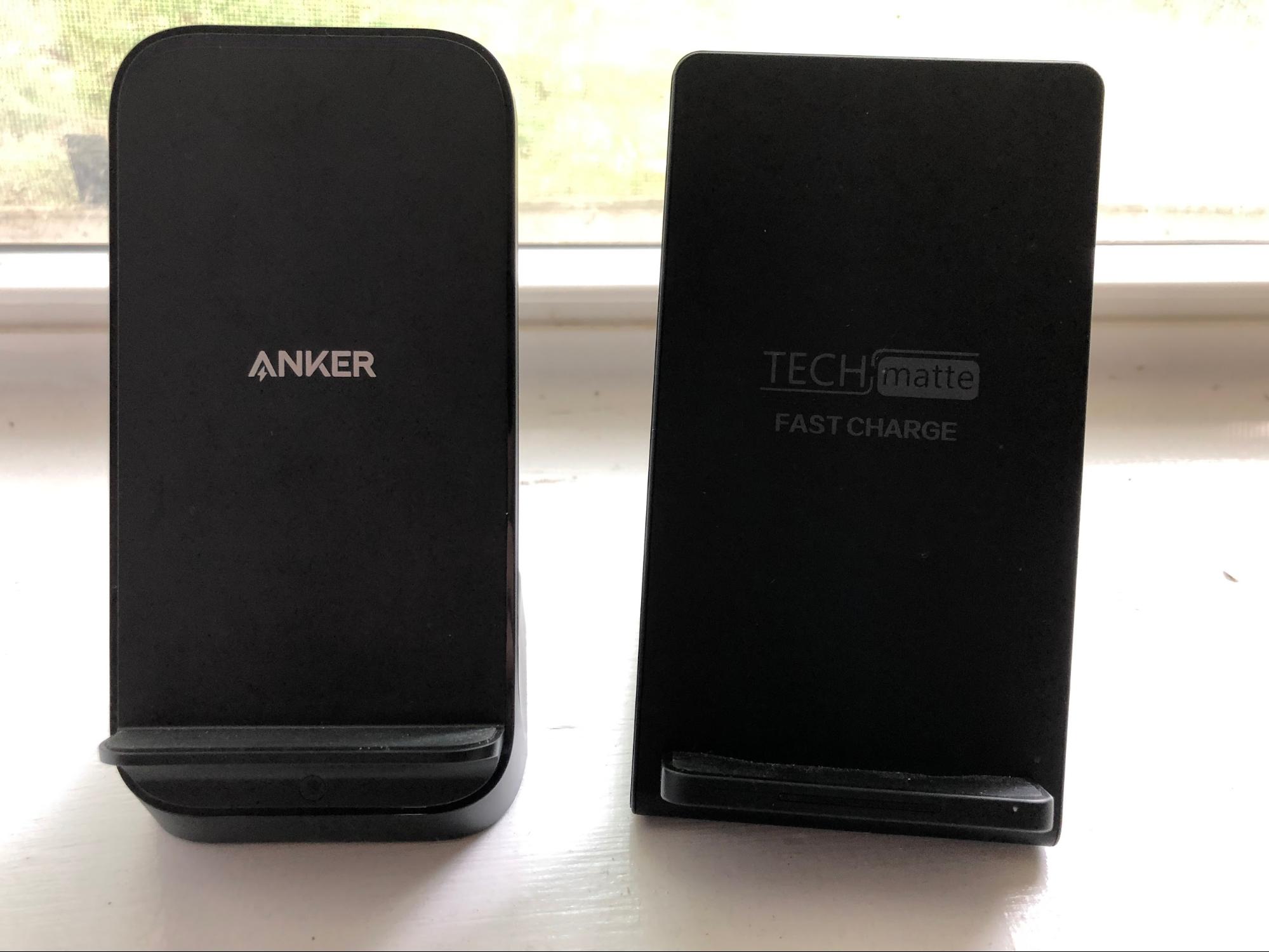
However, this Scosche mount charges extremely slowly, so I stopped in a nearby Walmart (the closest electronics store at the time) and picked up the best Qi charger available, which in this case was the Anker PowerWave+ Stand, which set me back about $50. I would link to it, but I can’t find the exact model anywhere online (the closest I see is the Anker PowerWave 7.5 Stand). But here are the criteria I used to pick it:
- It’s distributed by Anker, a brand I trust.
- The box clearly stated that it supports iPhone fast charging.
- It included a (rather large and hefty) wall adapter that provides more power than standard USB ports or Apple’s little iPhone wall plugs.
- It’s a charging stand, which I prefer, but there was also the PowerWave+ Pad with Watch Holder.
The PowerWave+ Stand worked better than I had expected, quickly and reliably charging my iPhone X. And it’s not nearly as particular about placement as a TechMatte charging stand I had tried at home. (As an aside, when it’s plugged in, the TechMatte stand seemingly prevents my iMac from booting.)
Here’s what I took away from this experience:
- Even if wireless charging isn’t as fast or reliable as wired charging, redundancy is always good.
- You get what you pay for. Sure, you can spend $16 for something like the TechMatte, but the $50 PowerWave+ Stand was worth the extra money.
- Wired charging has its own drawbacks. Open ports can fill with crud and provide an opening for liquids. Lightning cables are notoriously fragile. Connected devices are always at risk of being snagged and pulled off surfaces. And even if Qi charging isn’t entirely “wireless,” it makes cable management easier than wired charging.
- Your family will appreciate it if you minimize the amount of time you spend on tech problems while on vacation.
I wouldn’t be entirely shocked if Apple were to drop the Lightning port in a future iPhone. The Apple Watch has shown that it’s possible to have a device with no ports, the AirPods are wildly popular (and now have an optional wireless charging case), and Apple continues to encourage users to back up and restore via iCloud. I’m not saying the Lightning port will disappear with this year’s new iPhones, but it doesn’t seem impossible at some point.
Backing Up VM Image Files to Internet Backup Services
Code 42, makers of the CrashPlan backup service for small businesses (but not individuals, see “CrashPlan Discontinues Consumer Backups,” 22 August 2017), has announced that, starting in May 2019, the service would no longer allow users to back up applications, virtual machine image files from apps like Parallels Desktop and VMware Fusion, and some backup files.

Code42 explains the change by saying that excluding these files will likely result in smaller backup archives and faster restores, syncs, and backups. That’s obvious, no? If you eliminate large files from a backup, everything will run faster (and Code42 won’t need to add storage as quickly). More troubling is the comment earlier on in the note, which says:
We have always recommended you not include applications or large files in your selection as they may not backup correctly.
Seriously? Code42 is actually admitting that CrashPlan may not back up large files correctly? Isn’t that Job #1 for any backup app?
Needless to say, Code42’s announcement perturbed some users, who notified us of the change. TidBITS member Peter Erbland said, “It seems like it is defeating the purpose of an offsite cloud backup in case of a catastrophic loss of data.”
I was curious about Code42’s performance claims, however, so I checked with CrashPlan competitor Backblaze (which has sponsored TidBITS in the recent past). Yev Pusin, Backblaze’s Director of Marketing, explained that Code42 wasn’t just making an obvious statement about smaller archive sizes improving performance for a few reasons:
- On initial backup or when a lot of data changes, large files take a long time to upload. That’s to be expected, of course, but what people may not realize is that smaller files can be blocked from uploading during that time, leaving them unprotected.
- After the initial upload, apps like Backblaze and CrashPlan do block-level data deduplication, which means that they analyze small blocks of each file, compare them to what’s already backed up, and copy only those blocks that are new or changed. It might seem as though large files wouldn’t present a problem after initial backup as long as they didn’t change all that much. However, as Yev pointed out, the resources necessary to analyze all the blocks in a multi-gigabyte file are significant—you need enough drive space to store a copy of the file, and then the backup app has to spend a lot more time and CPU power analyzing all those blocks.
- On the restore side of the equation, if you’ve been backing up a large VM image for months, with changes happening regularly, and then you need to restore it, you’ll hit another performance problem. That’s because the backup app needs to reassemble all those individually backed-up blocks into the current representation of the file, and the more of those there are, the longer it will take the backup servers to provide your file.
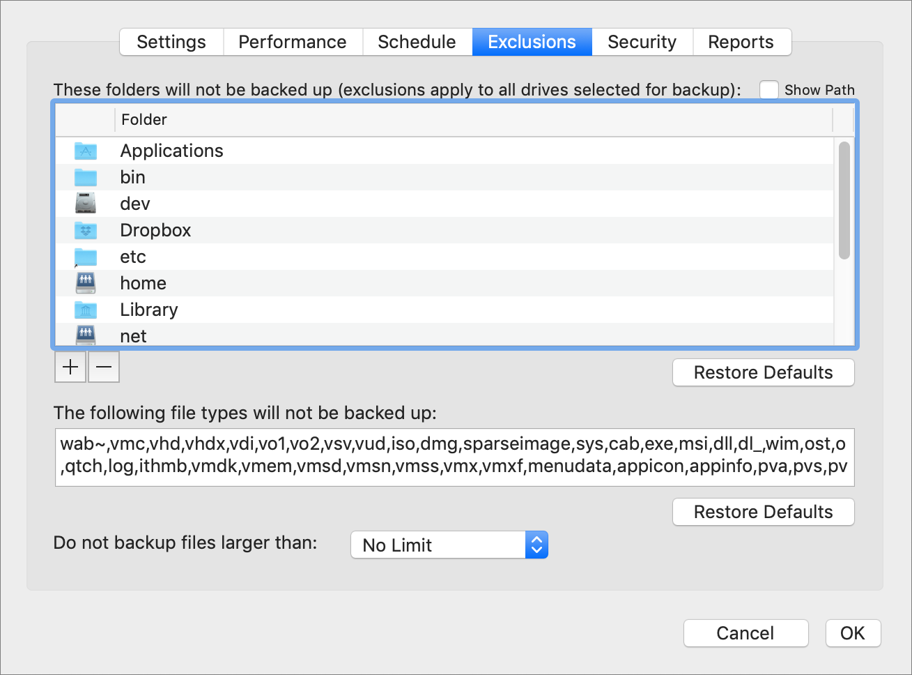
For these reasons, Backblaze also excludes VM image files and other large file types (it also doesn’t back up system files or applications), as you can see in the app’s Exclusions screen.
So what should you do if you have a large VM image file that you want backed up? In fact, I’m in precisely this situation, since I have Parallels Desktop set up to run a Windows app called HyTek Meet Manager for managing Finger Lakes Runners Club track meets. I use Meet Manager infrequently—just six times per year for a day or two—but it’s vital that its data be backed up when I am using it so I wouldn’t have to recreate a meet file if something bad happened.
With Backblaze at least, there are three solutions:
- Share a Mac folder with Windows in the virtual machine, and store all the essential data in that folder. This solution, which is what I do, is by far the easiest and best since it ensures that all the Windows app data is backed up just like Mac app data.
- Back up the VM image file as it exists on the drive. Although Backblaze excludes VM image file types by default, nothing prevents you from editing that exclusion list and removing the file type corresponding with your image file. However, it will impact performance in the ways discussed above.
- Install the Windows version of Backblaze within the virtual machine and set it to back up the important Windows app data. Unfortunately, this approach requires buying another license for Backblaze since it thinks it’s running on another computer. It’s not a very satisfying solution unless you work in the virtual machine all the time and have a lot of data that can’t easily be stored in a shared Mac folder.
As much as it’s easy to think of Internet backup services as being complete backups, they just aren’t. There’s no point in backing up system files in particular because no Internet backup service I’m aware of can perform a “bare-metal” restore after reformatting a Mac’s drive.
(Interestingly, the company in the best position to provide a complete backup service is Apple, since Macs already have Internet Recovery for reinstalling macOS, and iOS devices can back up to and restore from iCloud without needing a computer with iTunes involved. If Apple ever decides it needs more Services revenue, all it needs to do is let Macs back up to iCloud as well and sell a lot more iCloud storage. That would be a significant hit to existing Internet backup services.)
While applications can usually be backed up and restored, that’s an awful lot of data to analyze, transfer, and store in a situation where you can generally redownload with just a few clicks. The Microsoft Office suite is 8.6 GB on its own, and the big four of Adobe’s Acrobat, Illustrator, InDesign, and Photoshop weigh in at 5.6 GB. Apple’s iWork suite of Pages, Numbers, and Keynote is svelte in comparison at 1.8 GB.
But remember, an Internet backup service is only one part of a solid backup strategy, and it should always be seen as the backup of last resort, the one you turn to if everything else is lost. Spending a little time reinstalling macOS and downloading apps isn’t the end of the world—losing your actual data is.
So whether you’re using Backblaze or CrashPlan or some other Internet backup service, always make sure that you also have a local versioned backup made by something like Time Machine and a bootable duplicate created by something like SuperDuper, Carbon Copy Cloner, or Chronosync. The versioned backup lets you recover an older version of a file that became corrupted or was damaged by human error and then saved, and the bootable duplicate enables you to get up and running as quickly as possible if your entire drive dies. For the best and most complete backup advice, see Joe Kissell’s Take Control of Backing Up Your Mac, Third Edition.
The Dark Side of Dark Mode
Dark Mode is the marquee feature of macOS 10.14 Mojave. Apple even gives it the top spot on the macOS product page, saying:
Dark Mode is a dramatic new look that helps you focus on your work. The subtle colors and fine points of your content take center screen as toolbars and menus recede into the background. Switch it on in the General pane in System Preferences to create a beautiful, distraction-free working environment that’s easy on the eyes—in every way. Dark Mode works with built-in apps that come with your Mac, and third-party apps can adopt it, too.
And third-party apps have adopted it in droves. For months after Mojave shipped, our Watchlist items dutifully reported that this app and that app now supported Dark Mode or had tweaked their support for it in some important way.
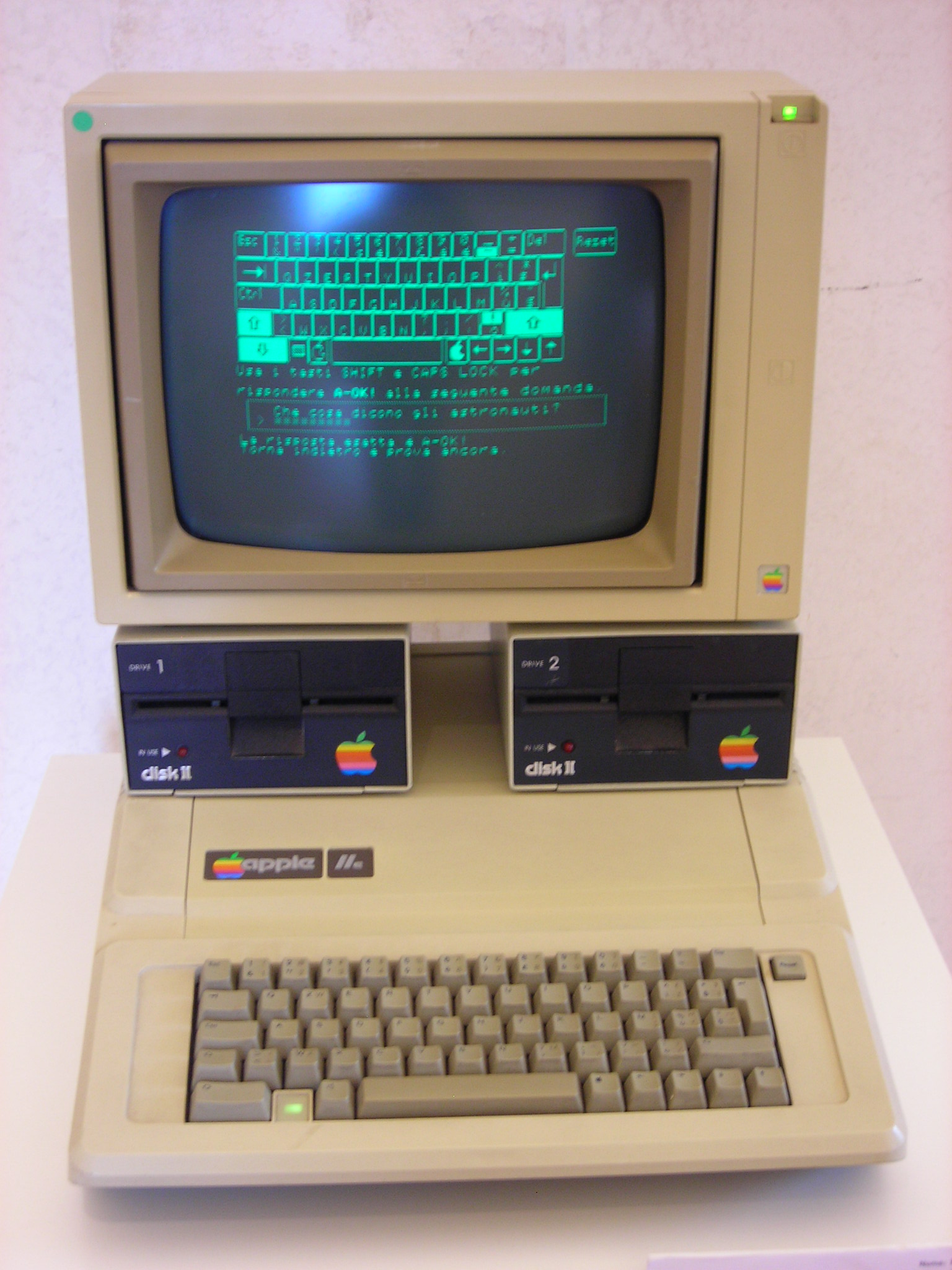
Have you ever wondered why, if Dark Mode is such a revelation, it took Apple 35 years after the first Macintosh to revert to the look of the light-on-dark CRT-based monitors of the Apple ][ and IBM PC era? Were those green-on-black and amber-on-black screens really so wonderful?
No, they weren’t, and one of the Mac’s most significant design decisions back in 1984 was an interface that put black text and graphics on a white screen, just as had been done in print for hundreds of years. This wasn’t exactly an innovation since the designers of the experimental Xerox Alto (which Apple’s engineers copied liberally) also chose to display text as black on a white background. Going even farther back, Douglas Engelbart’s “Mother of All Demos” of the NLS also used a black-on-white display. But the Macintosh was the first mainstream personal computer whose screen tried to mimic paper.
Unfortunately, Apple’s marketing claims about Dark Mode’s benefits fly in the face of the science of human visual perception. Except in extraordinary situations, Dark Mode is not easy on the eyes, in any way. The human eyes and brain prefer dark-on-light, and reversing that forces them to work harder to read text, parse controls, and comprehend what you’re seeing.
It may be hip and trendy, but put bluntly, Dark Mode likely makes those who turn it on slower and less productive. Here’s why, if you adopted Dark Mode purely because Apple promoted it as the new hotness, you should think hard about switching back to the Light Mode that your eyes and brain prefer in System Preferences > General.
Dark-on-Light: The Background
Vision research has shown that humans prefer dark-on-light. That’s because, in the real world, the background of any scene around you is usually bright. Humans evolved outside, and we are generally active during the daytime and asleep when it’s dark. What we care about are the objects in front of the background, whether food, tools, predators, or whatever. Those objects are by definition darker than the background because they’re illuminated by the sun, or indoors, by whatever lights may be on. Even light-colored objects stand out from a bright background because they’re illuminated from some direction other than precisely behind you. That makes for indirect illumination, putting much of the object in shadow and thus darker than the background.
This is, of course, an oversimplification. Backgrounds are not always brighter than objects in front of them (think of a campfire at dusk), and indoor lighting can be much more variable. But the general rule holds—the background is generally brighter than the objects in a scene, and so the human brain becomes much more used to dark objects against light backgrounds and thus prefers them. This preference may even be hard-wired into our brains. Three-month-old babies shown images with both light-on-dark and dark-on-light components look toward the latter first.
For an example, let me reach into our archives. In “Better than the Printed Page: Reading on an iPad” (15 March 2018), Charles Maurer illustrated this preference with a couple of overly colorized pictures of Abraham Lincoln. Both use bizarre colors to eliminate any sense of familiarity with one or the other, but you’ll find that the right-hand image is intrinsically easier to identify. (And yes, since faces are easier to recognize than most other objects, this image is meant to illustrate, not prove the point.)

(I’m referencing Charles’s articles for TidBITS here because his wife Daphne Maurer is an experimental psychologist at McMaster University and a prominent visual scientist who was recently named a Fellow of the American Association for the Advancement of Science (AAAS) for her ground-breaking research on the development of vision in human infants. Charles has worked extensively with Daphne over the years, and they are in the midst of preparing a book about perception, which is why I couldn’t persuade Charles to write this article himself.)
Applying Dark-on-Light to Screens

Images like Technicolor Abe above aren’t really in question here—we’re mainly talking about text, which is made up of thin lines. When text is white on a black background as it would be in Dark Mode, the whiteness of the lines lightens the edges of each line broadly on both sides, blurring the edge. If the thin lines of the text are black and the background is white, however, white from both sides washes over the entire line, lightening it evenly, so the edges aren’t blurred. Charles illustrated this for me with a photo of a cactus backlit by the sun, in which you can see the bright optical flare making the cactus lighter in front of it.
Blur is a bad thing because of how the human eye relies primarily on contrast when extracting detail from an image. In “Reality and Digital Pictures” (12 December 2005), Charles wrote:
The eye does not see light per se, it sees changes in light – contrast. If two objects do not contrast with one another, to the eye they meld into one. This fact makes controlling the contrast of adjacent details to be paramount in importance.
He was focused on issues revolving around photographs, but contrast has been shown to be paramount in numerous studies of textual legibility as well. Of course, contrast goes in both directions—black on white and white on black both have high contrast. In the scientific literature, black on white is called “positive polarity,” whereas white on black is called “negative polarity.” Numerous studies over decades of research have found that positive polarity displays provide improved performance in a variety of areas. (While early studies used CRTs, all recent studies rely on LCD-based displays.) To quote from the introduction of a 2013 paper by Piepenbrock, Mayr, Mund, and Buchner in the journal Ergonomics:
For instance, a positive polarity advantage has been found in error rates and reading speed in a letter identification task (Bauer and Cavonius 1980), the number of transcribed letters onto paper (Radl 1980), subjective ratings on visual comfort (Saito, Taptagaporn, and Salvendy 1993; Taptagaporn and Saito 1990, 1993), text comprehension (A. H. Wang, Fang, and Chen 2003), reading speed (Chan and Lee 2005) and proofreading performance (Buchner and Baumgartner 2007). Taptagaporn and Saito (1990, 1993) tracked changes in pupil size for different illumination levels as well as for the viewing of different visual targets, such as a cathode ray tube (CRT) display, script and keyboard. They found less visual fatigue as measured by the frequency of changes in pupil size when working was accomplished with a positive than with a negative polarity display. Likewise, Saito, Taptagaporn, and Salvendy (1993) found faster lens accommodation and thus faster focusing of the eye with positive than with negative polarity displays.
To summarize, a dark-on-light (positive polarity) display like a Mac in Light Mode provides better performance in focusing of the eye, identifying letters, transcribing letters, text comprehension, reading speed, and proofreading performance, and at least some older studies suggest that using a positive polarity display results in less visual fatigue and increased visual comfort. The benefits apply to both the young and the old, as that paper concludes:
In an ageing society, age-related vision changes need to be considered when designing digital displays. Visual acuity testing and a proofreading task revealed a positive polarity advantage for younger and older adults. Dark characters on light background lead to better legibility and are strongly recommended independent of observer’s age.
In another study published in the Journal of the Human Factors and Ergonomics Society that focused on how positive display polarity helps when reading small text in small font sizes, Piepenbrock, Mayr, and Buchner concluded:
The implications seem important for the design of text on such displays as those of computers, automotive control and entertainment systems, and smartphones that are increasingly used for the consumption of text-based media and communication. The sizes of these displays are limited, and it is tempting to use small font sizes to convey as much information as possible. Especially with small font sizes, negative polarity displays should be avoided.
Since Apple has now announced that iOS 13 will introduce a Dark Mode similar to Mojave’s, you’ll want to avoid it there too or take a performance and productivity hit.
Screen Brightness and Ambient Brightness
There’s an obvious caveat to the comment about the human eye preferring dark objects against a light background. Apart from a few exceptions like fire, lightning, and bioluminescent fireflies, almost nothing in the natural world emits light.
In our modern world, however, screens do emit light, and quite a lot of it. (There’s truth in advertising here—many, if not most modern-day screens are lit from behind by LEDs, or light-emitting diodes. Those that aren’t use fluorescent lamps instead.)
So what, then, is the role of both screen and ambient brightness in the question? From a comfort standpoint, there’s no question that a bright white screen can be glaring and hard to view. Paper reflects about 90 percent of whatever light strikes it and is thus always slightly dimmer than the surrounding light, but an iPhone or iPad screen, for instance, is often brighter than the surrounding light sources.
When there’s a mismatch between the two—the screen is too dim outside or too bright inside—it’s hard to look at. That’s why Apple implemented automatic brightness control in iOS (find it in Settings > General > Accessibility > Display Accommodations) to reduce the screen brightness when you’re reading in a dark bedroom and increase it when you’re trying to take a picture on a sunny day. Apple’s algorithms might not fit what your eyes prefer, but it’s easy to adjust the brightness manually in Control Center if necessary.
Similarly, Apple’s True Tone technology on many devices tries to adapt the display to the colors in the surrounding environment to reduce the harshness of glancing from a warmly lit room to a cold white iPad screen. Keep True Tone enabled in Settings > Display & Brightness (iOS) and System Preferences > Displays (macOS, when supported by hardware) for most situations.
Notice that I haven’t said anything about all the cognitive benefits of a dark-on-light positive polarity display with respect to light in the surrounding environment. That’s because the research suggests that ambient light is irrelevant. In another paper in Ergonomics, Buchner and Baumgartner showed that the benefits of positive polarity displays were independent of ambient light when they compared results of the same experiment run in a darkened room versus one with typical office lighting. (Nor did chromaticity—blue and yellow as opposed to black and white—make a difference. It’s all about positive polarity, baby.)
So while night-owl programmers can say that they find Dark Mode more comfortable during stints of nocturnal coding in unlit rooms, they might finish sooner if they stick with traditional dark text on a light background (while keeping the brightness of the light background appropriate for the room lighting, of course).
Go Toward the Light
All that said, there are always people who are outliers. For instance, sleep research suggests that nearly all adults need 7–9 hours of sleep per night, but about 1% of people naturally sleep less. (Most of those who say they need less sleep are actually operating as though they were 8 years older than they actually are.) In much the same vein, I’m sure there are some people for whom Dark Mode is legitimately better, perhaps due to vision problems like floaters or light-triggered migraines. But for the vast majority of people, the science is pretty clear—Dark Mode can hurt your productivity.
There are also excellent niche uses for Dark Mode. Let’s say you’re a musician who uses a MacBook Pro as part of your performance on a darkened stage. Even though the MacBook Pro will likely be harder and slower to use in Dark Mode, those downsides are probably worthwhile to avoid a glowing white light illuminating your face. Similarly, if you read at night on your iPhone while someone else is sleeping next to you, it’s only kind to switch to light-on-dark—whether in an ebook app or in iOS 13 if it does gain Dark Mode—to reduce the chance your insomnia will wake up your bed partner.
Finally, everyone is, of course, welcome to make their own choices concerning Dark Mode. We all make decisions about what we prefer even when research suggests those decisions may not be optimal.
But whatever you choose, it’s important to understand that Apple’s marketers don’t have any science backing up their promotion of Dark Mode. The fact that macOS has long had an Invert Colors option in System Preferences > Accessibility > Display for those whose vision requires it suggests that Dark Mode exists largely because it has somehow become trendy.
Use it if you wish, but know that it’s a productivity hit for most people most of the time.