1672: The hidden power of Google Sheets, Launchpad usage levels, Emergency SOS via satellite in the Maui fires, do you use proxy icons?
It’s easy to take spreadsheets for granted, but as Adam Engst writes, modern spreadsheets can do far more than perform calculations. By way of illustration, he explains how he built a budgeting tool in Google Sheets that extracts data from dense accounting reports to make it more readable and understandable. Apple’s Emergency SOS via satellite feature of the iPhone 14 is in the news after playing a pivotal role in saving lives during the Maui fires. In our Do You Use It? polls this week, Adam reports on the usage levels of Launchpad by longtime Mac users before asking how often you use proxy icons. We also look briefly at SanDisk portable SSD failures and CNET deleting articles for SEO reasons. Notable Mac app releases this week include Mactracker 7.12.7 and Cyberduck 8.6.3.
Emergency SOS via Satellite Saves Lives in Maui Fires
On the Service Formerly Known as Twitter, Michael J. Miraflor posted:
My brother’s girlfriend’s cousin and his family were caught in their vehicle in Maui while the wildfires suddenly erupted around them.
No cell service, so Apple Emergency SOS was the only way they could get in contact with first responders. Literally saved their lives.
I can’t even imagine what these 34 minutes of hell must have been like. Emergency SOS is magic (see “Testing Emergency SOS and Find My via Satellite,” 21 November 2022), but while the iPhone walks you through using it, doing so successfully while trapped in a van with fire all around would have been nerve-wracking. Two additional thoughts:
- The iPhone user’s emergency contact must have been simultaneously horrified and relieved to receive this chat, presumably after it ended.
- Particularly for younger people, the emergency services dispatcher typing in all caps might have been additionally stressful.
Regardless, kudos to Apple for developing Emergency SOS via satellite, to the iPhone 14 user for keeping a cool head under pressure, to the emergency services dispatchers, and to the actual fire department for making the rescue.
I hope stories like this encourage Apple to make the Emergency SOS via satellite feature usage-based in some way after its initial 2-year free period. No one would subscribe in advance because they expected to be caught in a wildfire in a historic Hawaiian beach town.

Do You Use It? Launchpad Doesn’t Compete for Longtime Mac Users
Our initial “Introducing “Do You Use It?” Polls” (28 July 2023) article asked how often you use Launchpad, a grid-based launcher that brings to the Mac the Home screen experience from iOS (which in turn may have been influenced by Apple’s At Ease from the early 1990s). Apple ships the Launchpad app with macOS, placing it in the second position on a default Dock and making it easy to invoke with a keyboard shortcut or trackpad gesture.
Launchpad isn’t new to the Mac, having been introduced in OS X 10.7 Lion in 2011. Apple’s intent was likely to provide a familiar user experience for users who come to the Mac from the iPhone or iPad. Our poll results suggest that most TidBITS readers—mostly longtime Mac users—largely ignore Launchpad, with 70% of the 800-plus respondents to our poll saying they never use it. However, with Apple regularly suggesting that roughly half of Mac purchases are by people new to the platform, TidBITS readers probably aren’t representative.
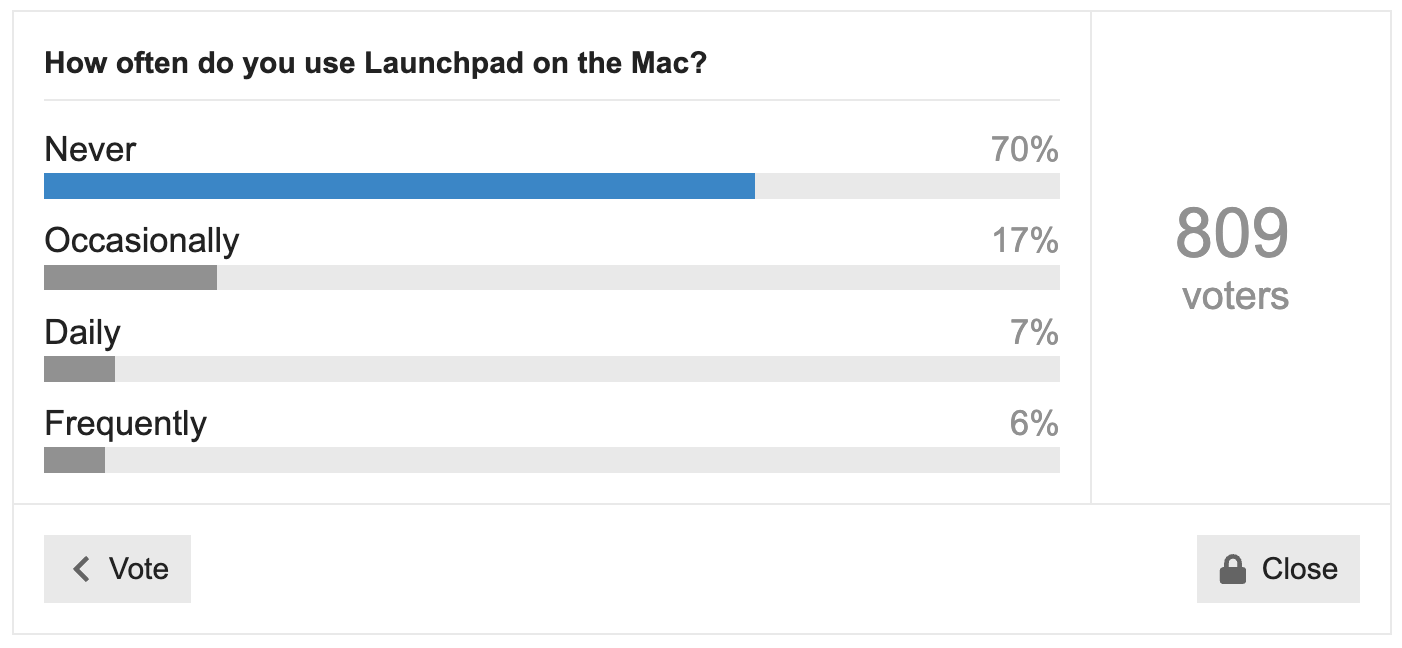
Of the remaining 30%, only 7% said they used it Daily, with the remaining 23% falling into Frequently or Occasionally. I was intentionally vague when labeling those frequencies, but my general thinking was:
- Daily: If you use a feature every day, it’s something that’s built into your working habits. That might mean you use it hundreds of times per day, or only a handful of times, but regardless, it’s a mainstay of your tech life.
- Frequently: I didn’t want to ask people to categorize their use more specifically because few people probably know if they invoke something like Launchpad once, twice, or thrice each week. “Frequently” accommodates the sense of “I don’t use Launchpad every day, but it’s not unusual for me to open it.”
- Occasionally: I included this option for those who might use Launchpad every so often in ways that aren’t obvious—a few people use it like this for uninstalling apps from the Mac App Store (described below).
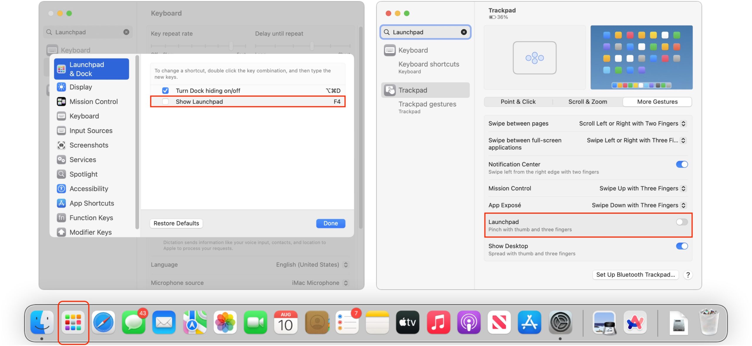
If you want to give Launchpad a try, or if its default keyboard shortcut or trackpad gesture gets in your way, you can control it in macOS 13 Ventura in System Settings > Keyboard > Keyboard Shortcuts > Launchpad & Dock and System Settings > Trackpad > More Gestures. (The nested locations in System Preferences in macOS 12 Monterey and earlier are similar.)
Usage is simple once Launchpad is active. Click an icon to launch its app. Type a few characters—no need to click in the Search field first—to filter the icons shown. Drag an icon to rearrange it. Drag one icon onto another to create a folder containing both, and subsequently drag other icons in or out. Click a folder to open it. Press the Option key or click and hold an icon to enter jiggle mode to rearrange multiple icons or uninstall a Mac App Store app by clicking its X badge. If necessary, click the background to leave jiggle mode.

Because Launchpad’s raison d’etre is launching apps, most of those who explained why they didn’t use it credited another method of quickly launching apps, including:
- The Dock, often holding the Applications folder or a folder of app aliases
- Spotlight (and be sure to vote in Do You Use It? Spotlight on the Mac)
- Alfred
- Butler
- iCollections
- LaunchBar
- Quicksilver
- Raycast
- SwitchGlass
One of the issues with Launchpad, like the iOS Home screen, is that it shows only 35 items by default, in 5 rows by 7 columns. If you have more than 35 apps in your Applications folder, Launchpad creates additional screens. Apple may have chosen that grid size to ensure that the icons and names are readable even on smaller MacBook screens, though it would be nice to think that the engineers based the grid size on human factors research about the cognitive load of parsing a grid of items.
Regardless, opinions vary as to whether Launchpad would be more or less useful depending on the number of apps in your Applications folder (all of which appear). There are two ways of reducing the number of screens since Launchpad lacks the App Library feature of iOS and iPadOS (see “iOS 14’s App Library: The FAQ,” 9 September 2020):
- Create folders: As noted above, you can create folders containing multiple apps, though organization can be tedious, just as in iOS and iPadOS. If you do go to the effort, check out Laine Lee’s script for backing up your configuration.
- Adjust the grid: Enter the commands below in Terminal to change the grid size to 10 by 7, for instance. To revert to the default size, repeat the command without the
-int #at the end to revert to the default size. Thanks to David C. for the tip!
defaults write com.apple.dock springboard-columns -int 10
defaults write com.apple.dock springboard-rows -int 7
killall Dock
I’d love to know what percentage of users who come to the Mac from the iPhone see Launchpad as the default way of launching apps, but I can’t see any way of determining that number.
Discovering the Hidden Power of Google Sheets
I’ve never been a big spreadsheet guy. As a writer, my life has been spent in word processors and text editors. Sure, I know how to use spreadsheets, and I’m a great believer in setting up a simple spreadsheet for calculations that might need to be tweaked or updated. Until recently, I could go months without opening a spreadsheet. Part of my disregard has been due to people in my life using spreadsheets as layout programs because they lacked the tools or skill to produce the same document in a page layout app. That’s seductive—you can put text anywhere on the “page” by filling in the right cells—but for anything except one-offs, hammering a nail into the page layout wall with Excel as your screwdriver will eventually result in tears.
In the last year or two, though, I’ve changed my spots. It turns out that I just needed the right project to unleash my inner spreadsheet maven. I hope the highly specific story of my evolution from a guy who seldom strayed beyond SUM and AVERAGE to someone who has discovered the wonders of multi-sheet lookups will give you ideas about how you too can make better use of the astonishing tool that the modern spreadsheet has become.
Speaking of tools, although I suspect that what I’ve done is possible in Apple’s Numbers and Microsoft Excel, I chose to work in Google Sheets. Not because it’s necessarily the most powerful of spreadsheets—I have no idea how it stacks up—but because having my spreadsheets always accessible to multiple people with minimal fuss is the killer feature. It’s the same reason I do most of my writing in Google Docs these days. It’s also helpful to be able to pull up any of my online documents on any of my other devices.
Architecting the Budget Tool
In 2020, I became president of the Finger Lakes Runners Club (FLRC), only to have the pandemic force us to cancel all our races after February, which thoroughly confused the club’s financial workings. At the end of 2020, our then-treasurer had to create a 2021 budget based on pure guesswork and update it throughout the year, as some races came back and others didn’t. That treasurer stepped down during the year, and I convinced my friend Charlie to take the role. Our first task was to build a budget for 2022. Research revealed that the previous treasurer’s approach had been a simple spreadsheet that did little more than add manually entered numbers. I hate retyping numbers—that’s what computers are for!—so I started to brainstorm better approaches.
My first question revolved around the purpose of the budget. FLRC puts on about 20 races per year, and we expect most of them to make a small profit or at least break even, with two large races providing the bulk of the club’s income for operations, philanthropy, and savings. I realized we didn’t care exactly how much race directors spent as long as they stayed within ranges that would lead to a workable outcome for the club as a whole. Problems had occasionally cropped up in the past when a race director came up with an ill-considered plan that resulted in considerable losses. I wanted our budget to provide guardrails that race directors could stay between when contemplating an unusual expense.
My initial thinking was that QuickBooks Online, which is what the club uses for accounting, might provide budgeting capabilities. It does, but it was a non-starter for two reasons. First, its interface doesn’t provide significant historical information we could use to inform our budget estimates for the next year. Second, although we could export the budget in various ways, we would have to do that regularly so race directors could check how their race was doing as we recorded income and expenses. That’s when I focused on Google Sheets—I wanted any race director to be able to see the budget for their race and its up-to-date numbers with a click of a link.
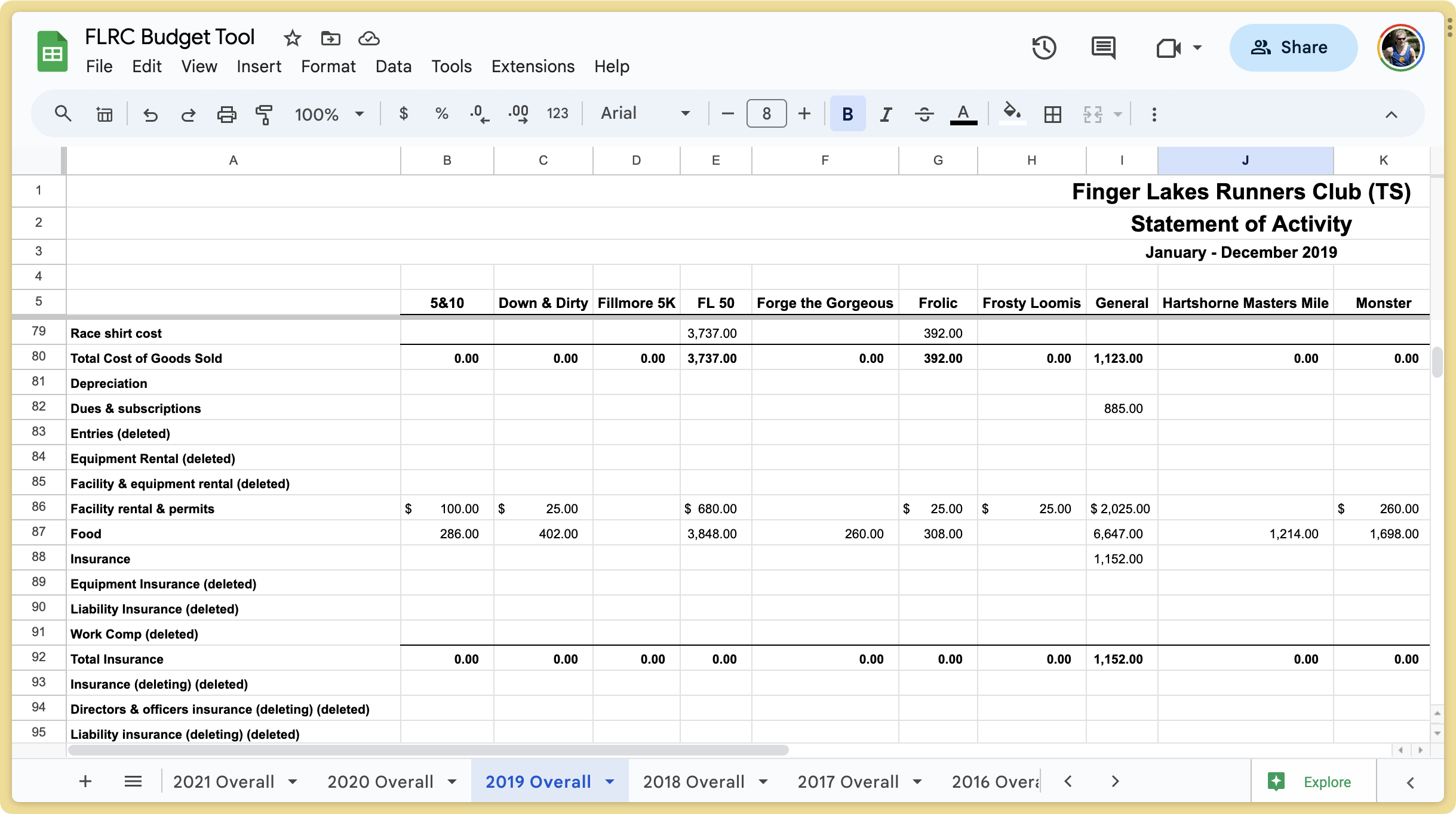
The key report to see a race’s current numbers is the statement of activity in QuickBooks Online. Each race is a class that turns into a column when exported, and each row is an account (registrations, awards, timing, etc.) from our chart of accounts. It’s nice, tabular data, but it’s difficult to read in any format because the number of races and accounts force scrolling vertically and horizontally. Also, I wanted each race to appear in isolation—asking race directors to parse their race data from a massive PDF or spreadsheet wouldn’t fly.
That’s when I had my next epiphany. I may not be a spreadsheet guy or a programmer, but I understand abstraction. When programming, you use variables to avoid hard-coding data—myVariable changes based on whatever you put into it. In spreadsheets, you use cell references to operate on whatever the contents of cell C32 or column M happen to be. Even better, a single spreadsheet can have multiple internal sheets, and you can reference cell ranges in one sheet from another.
Suddenly, I could visualize the architecture of the spreadsheet I needed to build. I would have a statement of activity in one sheet—exported directly from QuickBooks Online—and then I’d have a separate sheet for each race that would extract its data from the statement of activity. Even better, I’d import a statement of activity for every year back to 2016 so each race could display columns of historical data for those years as well. That historical data would inform the actual budgeting process, enabling Charlie and me to look at previous years (and an overall average) as we attempted to predict the next year’s revenues and expenses.
Building the Magic Formula
The tricky part was implementing my vision. I knew it was possible to look up data from one sheet and display it in another, but I didn’t know how. I quickly came up with a hard-coded proof-of-concept, which was good, because it took me a lot longer to figure out how to abstract it. Eventually, with many Web searches and poring over examples, plus trips to Help > Function List to see what Google Sheets is capable of, I ended up with this formula.
=IFERROR(HLOOKUP($A$2,INDIRECT("'"&E$4&" Overall'!$A$5:$X$250"), Utility!$A5, FALSE))
Explaining it will take some time, but it’s where the magic happens:
IFERROR: Wrapping the entire formula in anIFERRORfunction like this shows a blank instead of an error like#N/Awhen the rest of the formula fails, usually because there’s no data in one of the long-ago years.HLOOKUP: TheHLOOKUPfunction does the bulk of the work, searching across a range for a key and returning the value of the cell in the column that it finds. Configuring it properly took the most time.$A$2: The first task was to specify the search key forHLOOKUP. Since my goal was to look up the information for a particular race, I initially hard-coded the race name in this spot soHLOOKUPcould find it in the annual statements of activity. That worked but would have forced me to customize the formula on each race sheet. Doable, but fussy and brittle. Instead, I created a variable of sorts by putting the race name in cellA2and using the absolute reference$A$2to look it up. ($characters ensure that the specified column and row don’t change when the formula is copied into other cells.) When I wanted to create a new sheet for a race, all I had to do was put the new race name in that cell to enable the formula to look up the correct data.INDIRECT: The next information thatHLOOKUPneeded was the range to search. I could hard-code something like2023 Overall!A5:X250to reference the necessary data in this year’s statement of activity, but abstracting that to any given year was tough. (I had to start atA5rather thanA1because the first four rows come in as merged cells from the QuickBooks Online export, and starting atA1fails.) TheINDIRECTfunction turned out to be the key because it returns a cell reference specified by a string. Building its string took me a long time due to the exactitude required."'"&E$4&" Overall'!$A$5:$X$250": Each historical column needed to look up data from the associated year’s sheet, but I wanted to avoid hard-coding the years. My solution was to use'"&E$4&" Overall'to pull the year from cellE4and mash it onto the wordOverallto specify the title of the correct sheet. BecauseEwas relative (not prefixed with$), copying the formula to other columns continued to look up the year from row4(absolute, because it was prefixed with$). Specifying the absolute range of!$A$5:$X$250was easy. The hardest part was figuring out the combination of double and single hash marks and putting the&(string concatenation operator) in the right place. It probably took me an hour of trial and error; I understand why it works now, but I didn’t until it worked. I’m a shameless stealer of examples, and one of them must have convinced me it was the right approach.Utility!$A5: What’s this Utility sheet? It contains a single column of numbers, with 1 inA1, 2 inA2, and so on, down to 250 inA250. It exists because I needed some way to giveHLOOKUPthe index, the row number of the value to be returned, and I couldn’t figure out any other way to increment a number without referring to the contents of a cell. Confusingly, the index has to start from row5because my range to search isA5:X250. So the index for row5needs to be 1,6has to be 2, and so on. This was mind-bending, and, honestly, I only figured it out through trial and error by slotting in specific index numbers until the correct results came back. The$before theAensures that it’s absolute to stay focused on that column, whereas the lack of the dollar sign before5makes it relative so it can increment as need be.FALSE: Finally, theFALSEoption forHLOOKUPspecifies that the row to be searched isn’t sorted. I’m unsure what that would entail, but since my data isn’t sorted, I just went with it.
The beauty of this formula is that it pulls in all the data I need in one fell swoop. I first create a sheet with the race name in A2 and columns for 2016 through 2023. Then I put the formula in the first cell under 2023, copy it to the right to fill the first row for each year, and finally copy it down to fill the rest of the rows.
(For those who don’t do much with spreadsheets, there’s always a trick for copying a formula—in Google Sheets and Excel, you drag the handle in the lower-right corner of the cell; in Numbers, you drag a yellow handle on the desired side of the cell. That copies the formula to the destination cells, appropriately incrementing relative row and column references. If you want to put a formula from one cell into another without incrementing cell references, you must either prefix both the row and column references with $ or copy and paste the text of the formula rather than the cell that contains it.)
Filtering and Formatting the Data
If you looked closely at the statement of activity screenshot earlier in the article, you might have noticed that many of the accounts are suffixed with (deleted) or even (deleting)(deleted). Those are an artifact of a quirk of QuickBooks Online that required a lot of fuss. Here’s why.
Our chart of accounts hasn’t remained static over time, with various treasurers and bookkeepers adding and removing accounts, some of which haven’t been used since 2016, the first year I pull in for the Budget Tool. But if you think about my magic formula, it works by looking up cell references. I need the Food account to be in row 87 in the Overall sheets for each year. A standard QuickBooks Online statement of activity shows only rows with activity, but if I create such a report, there’s no predicting which row Food will end up in for any given year.
Luckily, there is an option in QuickBooks Online to show all accounts in reports, and when I use that, the statement of activity report puts each category in the same row every time. That’s possible because QuickBooks Online never deletes any account; it only marks it as deleted and hides it from view.
However, having all these unnecessary rows littering up my raw data presents other problems. Most of our races have activity in 10–20 accounts at most, but the statements of activity have a whopping 204 rows. That’s a serious presentation problem.
Why so many accounts? Earlier this year, we realized we could save over $800 per year by switching from a regular QuickBooks Online account to one through TechSoup, which provides discounted technology for nonprofits. I vaguely knew about TechSoup because Jeff Porten wrote about it for TidBITS years ago (see “TechSoup: Get Deep Discounts on Technology for Your Nonprofit,” 18 October 2018), but I didn’t realize it had a $75-per-year QuickBooks Online subscription on offer. Converting our existing QuickBooks Online subscription to the TechSoup account required setting up a new “company,” transferring our data, and then canceling the previous subscription. It was complicated, stressful, and required help from Intuit support to get the promised refunds, but it worked in the end.
Unfortunately, setting up a new QuickBooks Online company gives you a boilerplate chart of accounts even when you’re immediately importing data from a backup. All those boilerplate accounts were then marked as deleted, radically increasing the number of deleted accounts cluttering my statement of activity reports. I wanted those accounts to disappear entirely since they never had any activity at all, but the closest I could get to removing them for good was merging them. In theory, I could have merged all of them into a single account that would be marked as deleted. In reality, it was a clumsy, error-prone process that worked only sporadically, so I gave up and decided to suffer with ugly statements of activity.
In an earlier iteration of the Budget Tool, I had manually gone through each race and hidden the rows that didn’t contain relevant data, but that was tedious and caused confusion once when a race generated activity in a previously unused account that I’d hidden. When I was refactoring the Budget Tool to handle all those extra deleted rows from the QuickBooks Online boilerplate chart of accounts, I thought of a better approach.
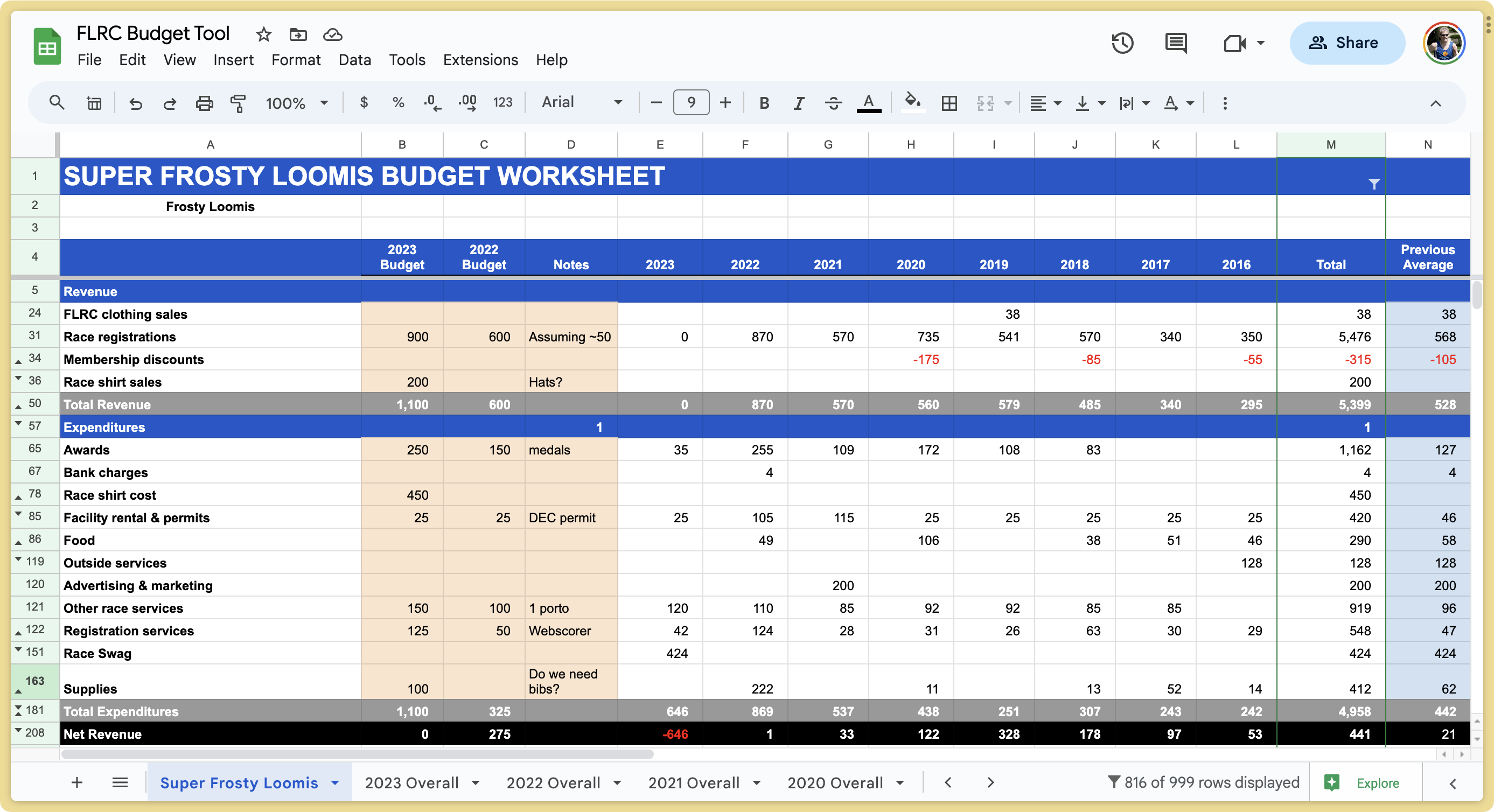
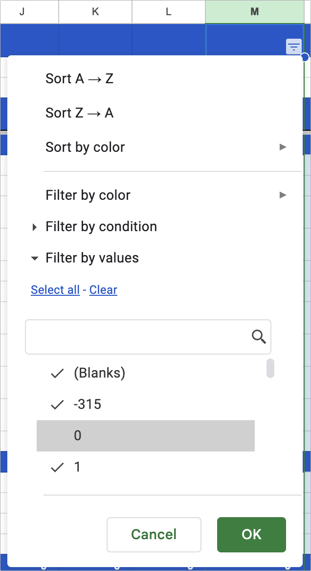
Google Sheets has filtering capabilities that can hide or show rows. So I created a Total column that added up the numbers from each of the years from 2016 through 2023. I don’t care about the total itself, but then I created a filter (choose Data > Create Filter) on that column that showed only those rows that weren’t zero. Poof! All the unnecessary data immediately disappeared.
I did end up with one wart. My sheets all have header rows for Revenues and Expenditures. The Revenues header appears above all the data and is thus safe from the filter, but since Expenditures is in the middle of the sheet and has no associated data, the filter hides it. To keep it around, I put a 1 in one of its columns to keep it visible. Perhaps there’s a better solution.
You’ll also notice that, along with the blue Revenues and Expenditures header rows, I have gray Total Revenues and Total Expenditures rows, and a black Net Revenue row. For ease of reading the sheet, I want those formatted differently. Initially, I had formatted those manually for each sheet, which is fussy but not as complicated as it might seem, given that Google Sheets has an Edit > Paste Special > Format Only command. I could copy any cell that was formatted the way I wanted and then go through selecting entire rows and pressing Command-Option-V to paste just the formatting of my copied cell.
Nevertheless, in my quest for abstraction, I realized there was a better way. Google Sheets also has a conditional formatting capability, which lets you format a range of cells based on a formula. I’ve long used it to make negative numbers red, but I realized I could also make rules to format my special rows. One tip: choosing Format > Conditional Formatting displays only the rules that apply to the currently selected cells. So if you choose that command and nothing appears, select a cell that should be in the affected range.
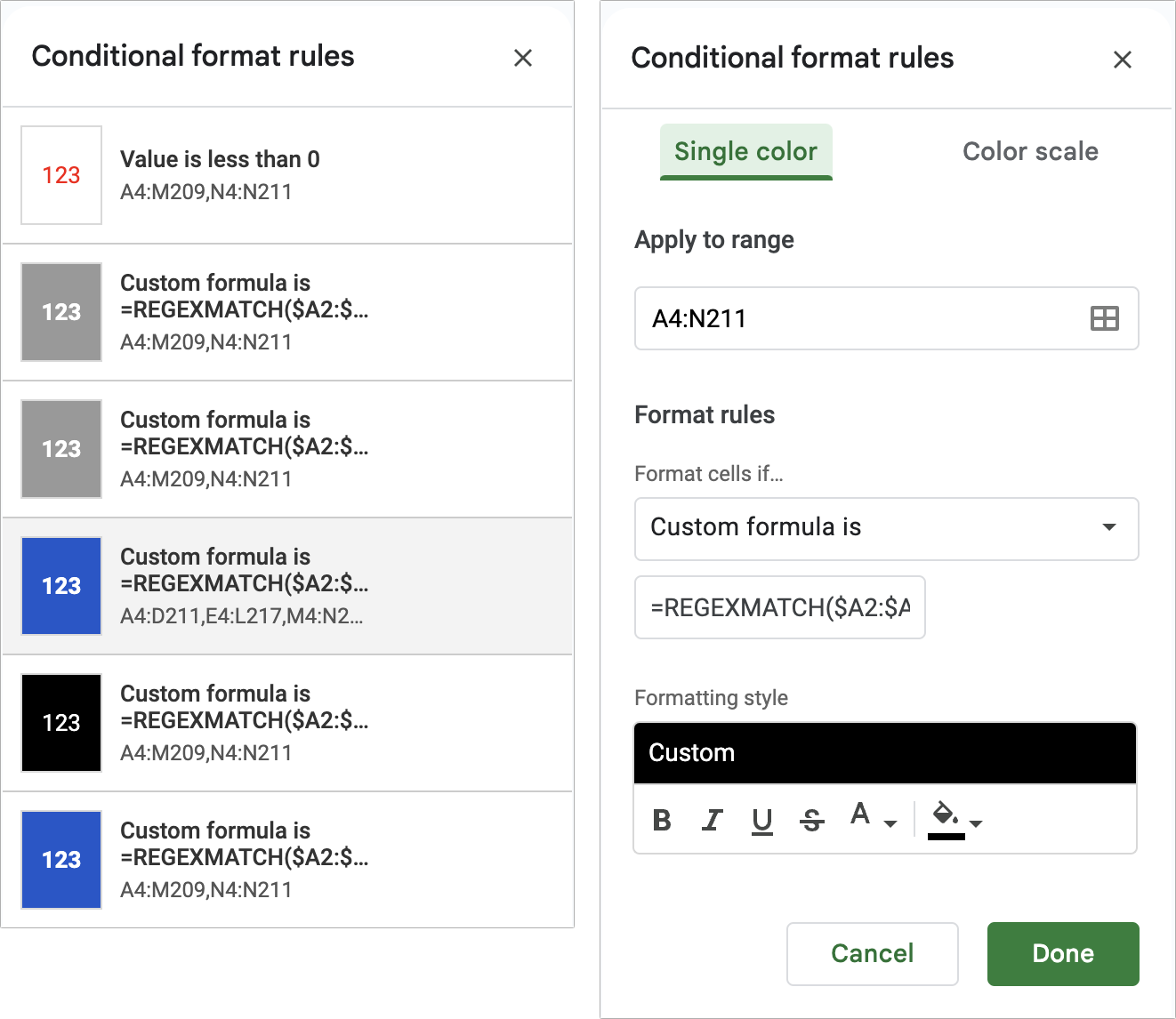
The trick in getting this to work was in the formula: =REGEXMATCH($A2:$A210,"Net Revenue"). REGEXMATCH is a regular expression (grep) function that looks for text within a range. As with so many other parts of this project, it took some experimentation to get it working. I’m not sure why some of the rules ended up with odd ranges—I changed the one shown to the simpler A4:N211 with no problem.
Once I had done this, I created several additional columns that Charlie and I could use for budget calculations—the ones in orange in the screenshot. They employ simple calculations to sum the revenues and expenditures and then calculate the net revenue. The notes column helps us remember why we estimated a particular number. Occasionally, I’ve also made a scratchpad column to preview what different estimates might do to a race’s bottom line—it’s just another orange column with the same calculations as the budgets.
I’ve been trying to abstract things like hidden rows and formatting because we have 22 sheets between all the races, General, and Total. If I decide to make a change, I must make it 22 times, which is tedious. In my last major revision, when I abstracted the hidden rows and formatting, I also had to recreate each sheet. That was easy enough; I duplicated one, changed the display name and race name in A2, and refreshed the filter. But having done that, I’m back to needing to make any further changes 22 times. For instance, I’ll need to add a 2024 column for each sheet next year. In an ideal world, abstraction capabilities would be easily applied to multiple sheets within a spreadsheet. Perhaps that’s possible, and I just haven’t discovered it yet!
Regular Usage
I want to leave you with a few notes about how we use our Budget Tool regularly.
First, after our bookkeeper has entered everything for a month into QuickBooks Online, we run a statement of activity report that includes all rows and export it to Excel format. Although it’s possible to import that into Google Sheets, overwriting the contents of a particular sheet, I find it easier to open the export in Excel, copy the data, switch to Google Sheets, and paste it over the associated year’s sheet.
(Is there an online integration that would move the data between QuickBooks Online and Google Sheets automatically? The closest I’ve found is Skyvia, but Intuit doesn’t provide the necessary API access to reports.)
As soon as Google Sheets has the new data, everything—and I mean everything—instantly updates, so we can spin through the sheets and see how each race is doing. If some numbers differ wildly from our budget estimates, we try to figure out why. (It’s usually just a categorization error.)
The only hitch we’ve encountered is a race getting data in a previously unused account; I have to refresh the filter by selecting all and then deselecting zero again. That’s happened only once so far.
When it comes to sharing the data with our race directors, there’s one final Google Sheets trick I wanted to share. If you click the blue Share button in the upper-right corner of Google Sheets, the link provided goes to the first sheet, Total in our case. That’s not bad, but linking directly to a race sheet would be better. To do that, I Control-click cell A1 for a particular sheet and choose View More Cell Actions > Get Link To This Cell at the bottom. That copies an appropriate custom link to the clipboard for sharing elsewhere.
You might wonder if I’m worried someone will inadvertently or maliciously delete or edit my carefully constructed sheets and formulas. My experience is that most people are sufficiently intimidated by collaborative documents that they won’t touch anything, but there are three ways of protecting shared spreadsheets like this:
- Share access: I chose to use the blunt force approach and limit the access for everyone but me and Charlie to Commenter. If people want to make changes, they can, but I get to approve or reject them. That hasn’t come up yet.
- Protect sheets and ranges: For significantly more granular control, the Data > Protect Sheets and Ranges options let you specify exactly who can do what with specific portions of the spreadsheet. I haven’t needed such fine-grained control yet.
- Previous versions: Google Sheets maintains a complete version history of all changes, making it easy to revert the entire spreadsheet to a previous version if necessary. Even if someone did make undesirable changes, it’s simple to recover. The only problem is if you don’t notice immediately and many legitimate changes are made afterward.
I realize everything in this story is highly specific to my project, but I hope you take away the idea that modern spreadsheets can do much more than just perform calculations—and perhaps some ideas for how to use similar techniques in your own work. Spreadsheets aren’t far off from full-fledged programming environments, and in fact, they often support macros or scripts that can go beyond what’s possible within the confines of rows and columns. But that’s another journey for another day.