1646: Security-focused OS updates, Photos Workbench review, Mastodon client wishlist, Apple-related conferences
Another week, another set of OS updates to plug a serious WebKit vulnerability that is being actively exploited in the wild—update soon! We also announce a new community-built list of Apple-related conferences. Intrigued by the possibilities associated with Mastodon’s open, non-commercial nature, Adam Engst suggests some ways that Mastodon clients could go beyond the Twitter paradigm. Finally, Julio Ojeda-Zapata rejoins us after a long absence with a look at Houdah Software’s new Photos Workbench, an app that provides more flexible and efficient organizational tools for your Photos library. Notable Mac app releases this week include Fantastical 3.7.7, DEVONthink 3.9, Quicken 6.12, DiskWarrior 5.3, and Safari 16.3.1.
iOS 16.3.1, iPadOS 16.3.1, macOS 13.2.1 Ventura, watchOS 9.3.1, tvOS 16.3.2, and HomePod Software 16.3.2 Fix Bugs and Security Vulnerabilities
Apple has once again pushed out updates to its entire family of operating systems, fixing bugs and addressing security vulnerabilities. Because one of these vulnerabilities—a bug in WebKit that could allow maliciously crafted Web content to execute code—is being actively exploited in the wild, we recommend installing all these updates immediately.
Details, such as they are, include:
- iOS 16.3.1: Apple says this update fixes a problem with iCloud settings displaying incorrectly or being unresponsive if apps are using iCloud, addresses an issue that prevented Siri requests for Find My from working, and improves Crash Detection on the iPhone 14 and iPhone 14 Pro models. With luck, Crash Detection will now stop triggering false alarms for skiers. iOS 16.3.1 also plugs two security vulnerabilities: the actively exploited WebKit vulnerability and another in the kernel.
- iPadOS 16.3.1: Unsurprisingly, iPadOS 16.3.1 gets the same bug and security fixes as iOS 16.3.1, minus the Crash Detection optimizations.
- macOS 13.2.1 Ventura: Apple doesn’t share any details about bugs fixed in Ventura but calls out three security fixes, the two previously mentioned and another in Shortcuts.
- watchOS 9.3.1: Apple hasn’t published release or security notes for watchOS 9.3.1 yet, but it’s a safe bet they won’t include anything surprising.
- tvOS 16.3.2: Nothing to see here—Apple merely says this update includes “general performance and stability improvements” and hasn’t yet published security notes. tvOS 16.3.1, which Apple quietly released a week ago, had the same release notes.
- HomePod Software 16.3.2: Apple didn’t describe last week’s HomePod Software 16.3.1, but 16.3.2 includes a fix for a bug where asking Siri to control smart home accessories could fail, along with general performance and stability improvements. There are no security notes for this update.
Help Build a List of Apple-Related Conferences in 2023
For several years before the pandemic, we created and maintained a TidBITS article listing as many Apple-related (or at least Apple-adjacent) conferences as we could find (see “The Top Conferences for Mac and iOS Professionals in 2019,” 19 May 2019). But as much as I liked the idea, I wasn’t happy with our execution. The research was a lot of work, I was never sure how popular the article was, and the TidBITS publishing model isn’t designed for living documents.
So, as in-person conferences return in response to the easing of pandemic concerns and precautions, I’m bringing back the conference list with a new community-driven approach that spreads the workload among everyone who’s interested.
I’ve created a wiki page to collect these conferences on the Discourse instance that hosts TidBITS Talk. Anyone with a TidBITS account can add to the new Apple-Related Conferences in 2023 community page by clicking the Edit link at the bottom. Conference organizers are welcome to submit their own conferences!
Rather than the narrative approach that we employed in the past, the format for this new community page is intentionally simple, with four pieces of information:
- Conference name as a heading, linked to the conference website
- Date(s) of the conference
- Location, at the level of city and state or country
- Target audience for the conference
The goal of this list is not to give readers every last detail but to provide a jumping-off point for more research: “I wonder if there are any conferences for Mac sysadmins in the US over the summer… hey, let’s see if MacAdmins in July fits my schedule and budget.”

So have at it! Please submit information on all in-person and virtual conferences that might interest Apple users and professionals. I retain full editorial privileges, so I may tweak details for accuracy and tone, and if I feel that a conference doesn’t belong, I’ll remove it. And, of course, I will deploy space lasers against spammers.
Mastodon Clients Could Do So Much More
Much of the appeal of Twitter in its early days was what the community made of it. @mentions, #hashtags, and even a bird as the avatar of Twitter—all came from community members and outside developers. Third-party clients reached much deeper than Twitter’s own Web app and basic platform apps. Software makers offered alternative interfaces, cleverly constructed bots tweeted information from automated systems, researchers extracted insights from trawling the data, and more.
But as Twitter focused on increasing engagement in the service of making money—and as the company flails wildly in the insanity era of Elon Musk—many of the unusual uses of Twitter have fallen away. (The most recent Twitter implosion entry: users posting just one or two tweets being told erroneously, “You are over the daily limit for sending Tweets,” an error previously reserved for posting what seems like a thoroughly excessive 2400 tweets per day.)
The rise of Mastodon, with its open-source, federated nature, has gotten me thinking (see “Mastodon: A New Hope for Social Networking,” 27 January 2023). If developers can break free from thinking of Twitter as the apex of microblogging, we could see tools that would radically change and improve our ways of interacting. Here are a few ideas that have occurred to me; share yours in the comments below and on Mastodon, where we can hope they’ll catch the eye of developers.
Interact with Mastodon More Like Slack or Discord
I can’t take credit for this one. I saw the basic idea roll through from a developer when I was first playing with Mastodon, but now I can’t seem to construct a search that finds that post. (Search is effectively local and unfederated.) My version of the idea is that, instead of a firehose timeline where every post appears in chronological order, a Mastodon client would present posts in a hierarchical, columnar fashion, much like messages appear in Slack or Discord channels. (Columnar Mastodon clients already exist, but they merely devote a different column to different timelines: your feed, notifications, messages, and profile, say.)
The first column would contain a list of people you follow, sorted alphabetically, with an option to pin favorites at the top and another option to show only those people who had new posts. The second column would naturally show posts from the selected person, and the third column would contain replies to the selected post. Below those three columns, an optional content pane would show the first linked Web page from the selected post; if it had multiple URLs, clicking another one would replace the previous page. (Bonus points for anyone who wants to create a mockup of this app interface.)
The big win of this technique would be that you could more easily pick and choose who you wanted to read at any given time, just as you can focus on particular people or channels in Slack, Discord, and other chat environments. Providing a Web view of linked content could also speed up reading by eliminating the need for a trip out to your browser for every link.
Limit Reading Time
Social media is an endless scroll. That’s one of my main complaints about it. There’s no way to “finish” reading unless you follow only a handful of people who post sparingly. Even TidBITS Talk is finite, despite its roughly 1400 posts per month. I read every post there, and if I skip a day or two, I can catch up easily. I can devote significant time to TidBITS Talk because it’s a key part of the overall TidBITS publishing model and thus is part of my work day. But I don’t have time or attention to spare for random content from social media, even if some of it comes from friends or other fascinating people. (Family doesn’t intersect with social media for me because we’ve successfully centralized all family communications in Slack, which is also finite; see “Fed Up with Facebook? Move Your Family to Slack,” 12 February 2019.)
I’d like to see a Mastodon client designed with “finishability” in mind. You could set a certain amount of time per day that you wanted to read Mastodon, and the app would manage that. It might prioritize what you see by preferring posts from certain people or that are connected to messages you replied to, favorited, or boosted. Then you would move on with your day without feeling like you were missing out because the next post might be life-changing (hint: it never is). Screen Time might seem like a solution, but I find it frustrating because it’s an arbitrary cut-off after X minutes, and I know more posts are waiting.
Instead, my hypothetical Mastodon client could estimate how long it would take to read a post, make some assumptions about whether you’d also read replies, build in some time for clicking out to external pages, and then display a selection of posts. The technology for this shouldn’t be difficult. Many blogs and publications now display a reading time estimate so you can get a sense of whether you would be committing to 4 minutes or 25 minutes before you start. It could also observe your reading speed and adjust accordingly. The trick is that when you say that you want to read 10 minutes of Mastodon, the client would have to make it seem like you had actually finished at the end. A nice “You’re done!” animation would be welcome.
In the meantime, you can simulate a finite Mastodon by tuning lists or using hashtags. In both cases, filtering by a set of people or a topic dramatically reduces what appears. These stop-gap measures for “finishing” work for now because fewer people post on Mastodon and tend to post less frequently.
Could Local Content-Selection Algorithms Serve Users?
Unlike Facebook and Twitter, which employ algorithms that choose which posts you see based on what they think will cause you to keep reading and replying, Mastodon apps generally present posts solely in chronological order, with the newest first. It’s sad that a simple chronological list is a refreshing change from the manipulation of social media algorithms, but algorithms don’t have to be evil. The desire to bring the best and most interesting posts to the fore isn’t problematic on its own; the concern is that these black box algorithms are designed to serve the needs of their corporate masters, not users.
Without a profit-driven company at the heart of Mastodon, I’d suggest that the time is right for Mastodon clients to revisit content-selection algorithms, but with two key differences.
- The algorithm should be designed to serve the user, and only the user, in ways specified explicitly or implicitly by the user. (The lack of a corporate overlord also means there’s finally room to revisit the discussions surrounding Asimov’s Three Laws of Robotics in the context of software agents.)
- The algorithm’s rules should be at least visible to the user, and preferably actively editable. It shouldn’t be difficult to specify people or topics that interest you more than others.
Tasking a client-based algorithm with what posts to show would also increase the utility of a feature that limited reading time because the algorithm could select only those posts most likely to be of interest. Mastodon servers are unlikely ever to adopt an API-accessible algorithmic feed, so we’re reliant on app developers experimenting in this area.
Add Categorization to the Mix
Adding categories to posts would let you see discussions that are topically related, something that’s not possible with social media now. Let’s face it: Twitter and Mastodon both suffer from an extremely short attention span when you look solely at the timeline. Posts jump from topic to topic haphazardly.
Chronological ordering works well on a service like Strava, where every post is a friend’s workout, but it’s just schizophrenic with quickly updating microblogs. Your feed might include someone linking to a long read about an important but depressing topic, others heatedly discussing last night’s sportsball game, a comedian trying out new material, and extreme weather warnings from a bot. They’re all interspersed with one another, forcing you to make mental context jumps every 20 seconds. That can’t be good for our brains.
The popularity of hashtags and trending topics on Twitter shows the extent to which people like to stay on one subject for a while before moving to another. I’ll admit that whenever I do end up loading the Twitter page, I can’t avoid looking at the What’s Happening box. I’m very seldom interested in anything there, but on the rare occasions I click through, I appreciate that all the tweets are inherently related.
We’re treading into the world of AI here, but if an algorithm could automatically categorize Mastodon posts, it would enable users to focus on specific topics in the Mastodon content stream. With a Slack-like Mastodon client, categories could appear alongside people, much like Slack channels mix with direct messages. You could pin favorite categories, but others would come and go as associated content ebbs and flows. Because machine learning benefits from training, an app that started with loose categories and let you provide feedback could rapidly produce worthwhile results.
Looking Forward
It’s still early days, and most Mastodon clients I’ve seen are nearly identical. I get that developers are still polishing their interfaces and figuring out how to handle Mastodon’s hypergrowth spurt. But I hope that, once developers have nailed the basics of this bigger ecosystem, they can turn their attention to taking advantage of the openness of Mastodon to innovate rather than merely copying Twitter clients.
What radically new approaches would you like to see in a Mastodon app?
Photos Workbench Helps You Organize, Rate, and Compare Photos
Apple’s Photos app on the Mac has powerful features—but when it comes to organizing and managing a large library, its capabilities aren’t as flexible or efficient as some desire.
For a bundled app aimed at average users, Photos is a highly functional photo management tool with impressive image-editing capabilities—and it can even edit video. As someone who uses Macs and Windows PCs equally, I am agog at how primitive Microsoft’s Photos app is, by comparison. Photos may not seem like one of Apple’s marquee apps, but it’s one reason to switch to a Mac. But that’s not to say that Photos has all the features—particularly when it comes to organizational workflows—that you want.
Photos Workbench, a new Mac app from longtime developer Houdah Software, is designed to complement Photos, adding features that help you organize, rate, and compare your photos in ways that are quicker and more efficient than performing those tasks in Photos itself. It works with the contents of your existing Photos library, with all changes immediately visible in Photos.
Although it doesn’t edit photos, Photos Workbench offers tools for batch-retitling pictures, editing titles, and assigning keywords and favorites—all of which Apple’s Photos does, but Photos Workbench does better. In addition, Photos Workbench has a star ratings tool, something Apple removed years ago. Unsurprisingly, given that Houdah Software makes the geotagging app HoudahGeo, you can also tinker with location data. Photos Workbench even provides a comparison mode for zeroing in on the best picture in a batch of similar images—finally, a fast way to see which of those five shots doesn’t have anyone blinking.
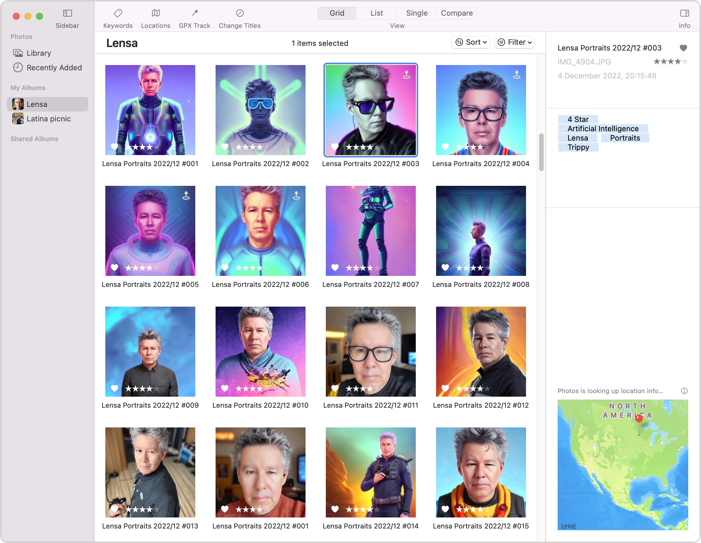
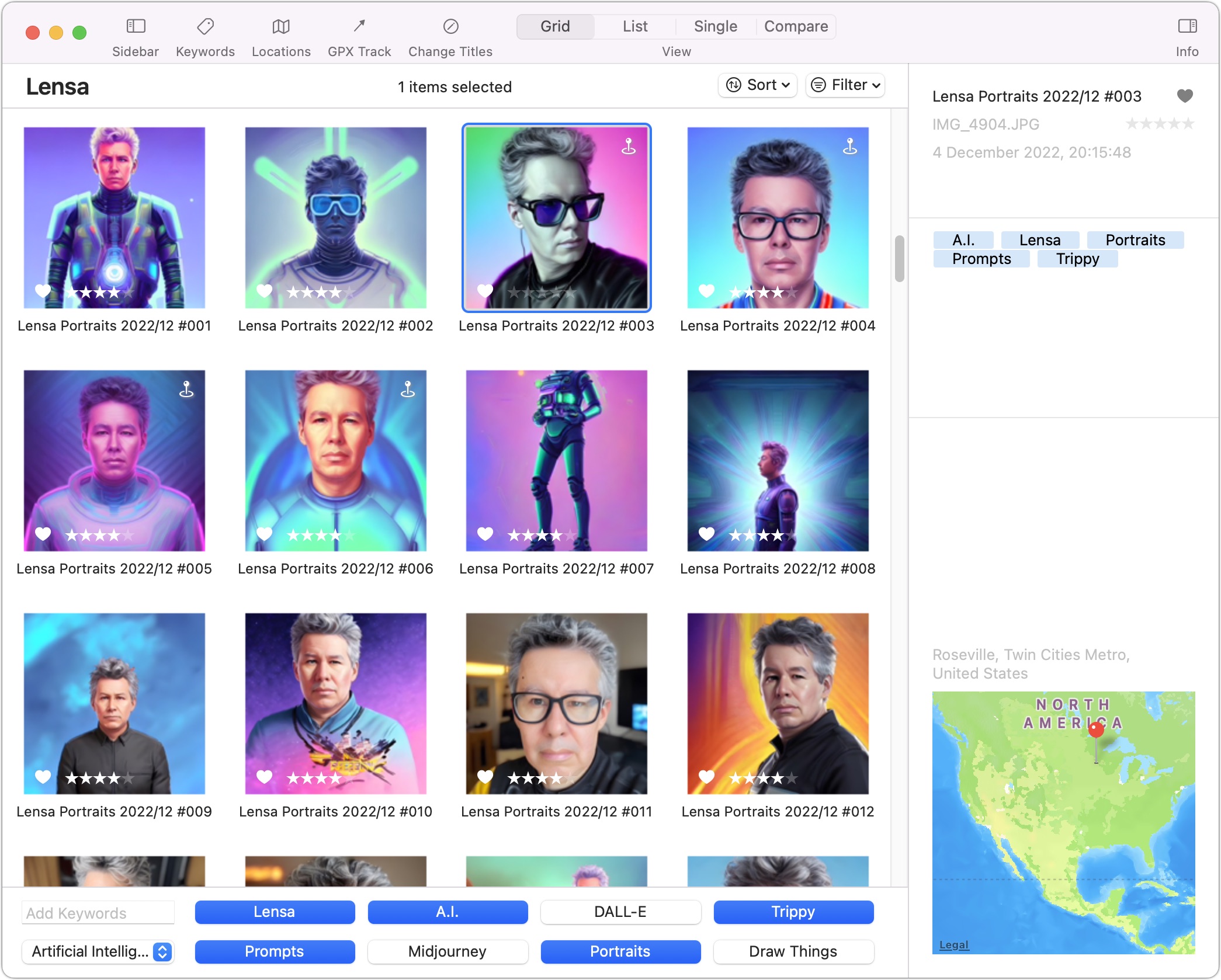
At first glance, you might mistake Photos Workbench for Photos. A familiar photo grid sits front and center in the middle, and a left sidebar provides access to your library, recently added pictures, albums, smart albums, and shared albums. The selected picture’s info appears in a panel on the right, not unlike the little floating window that appears when you choose Window > Info in Photos. Sort and Filter pop-up menus let you control how images appear in the photo grid.
As in Photos, you can organize your photo library by creating albums and dropping pictures into one or more of the albums. That’s good because it lets you do all your organization in Photos Workbench without switching back to Photos. And, of course, all your changes show up in Photos.
The toolbar in Photos Workbench points to the app’s main capabilities, with buttons for Keywords, Locations, GPX Track, and Change Titles. You can view your photos in four modes, accessible by additional toolbar buttons: Grid, List, Single, and Compare. Alas, you cannot change the thumbnail or image size.
Let’s dive in, following the button sequence in the toolbar.
Keywords
Keywords (which other programs might call tags) are metadata that you can assign to an image to describe its contents, the context surrounding it, or anything else related to the image. Keywords let you find all photos taken, for instance, at a “party,” all” indoor” shots; or all” indoor” “people” photos taken at a” party” in the “winter.”
Photos incorporates a keyword manager for this purpose (choose Windows > Keyword Manager), but Photos Workbench’s keyword tools are faster and more flexible. You can enter keywords by typing, clicking buttons, or hitting keyboard shortcuts.
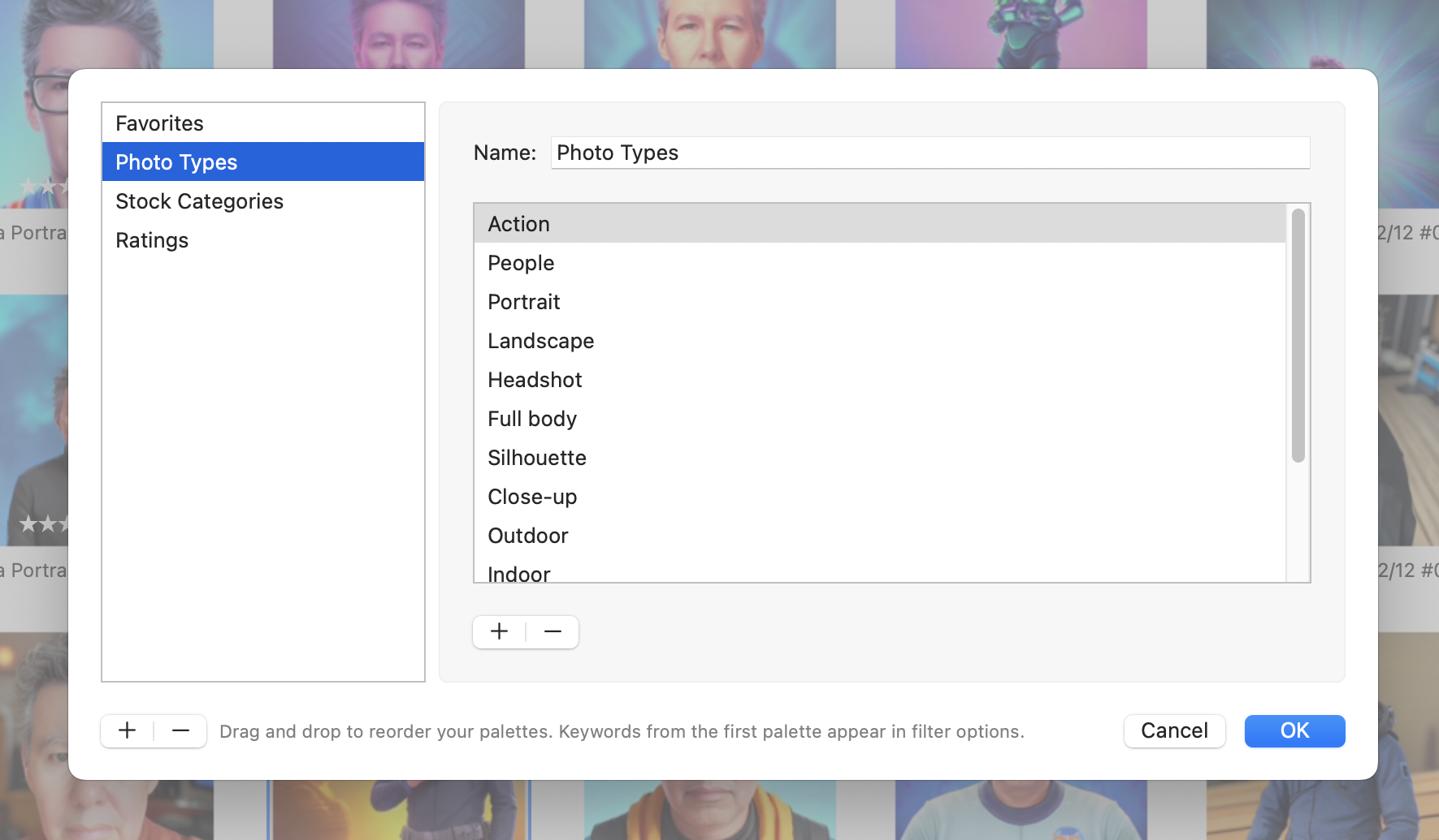
When you click Keywords in the toolbar, a palette appears at the bottom of the window. In it, a text field lets you assign or create keywords for the selected pictures (just keep typing, with commas separating keywords, to access existing keywords or create new ones on the fly). The keywords appear as blue bubbles in the info column on the right side.
Keyword categories—collections of related keywords—also appear in the palette, and you can switch among them using a pop-up menu just below the text field. To customize keyword categories, choose Edit Buttons in the pop-up menu to summon a floating window. In it, you can create, rename, reorder, or delete categories and create, reorder, or delete keywords within a category. Make as many categories as you want.
To reiterate, keywords created in Photos Workbench appear in the Keyword Manager in Photos so you can use them when searching for images in Photos.
I instinctively wanted to move keywords between categories within the Edit Buttons window with drag-and-drop, but this isn’t possible. This makes sense since keywords aren’t objects you can drag around—they’re just text strings. To “move” a keyword from one category to another, just delete it in one and add it in another.
There’s some oddness with uncategorized keywords, which you create in Photos Workbench by typing, and which thereafter autocomplete when you start typing them. But where are they? They seem to be effectively invisible. Similarly, Photos Workbench knows about your existing Photos keywords but doesn’t display them anywhere. It would be helpful if Photos Workbench included categories for All Keywords and Uncategorized Keywords.
Star Ratings and Favorites
Earlier photo management tools from Apple offered star ratings for classifying images by relative quality or relevance. Later versions of Photos turned star ratings into standard keywords, replacing them with a heart button that marked the image as a favorite, but many long-time users preferred the added granularity of star ratings. Ratings range from one star (worst) to five stars (best). The ratings for particular shots appear in the info column on the right.
You can set star ratings directly in Photos Workbench by using the commands in the Image > Rating menu (or, more likely, their keyboard shortcuts). You can also Control-click selected photos. For an individual photo, clicking the stars at the bottom of the thumbnail may be easier.
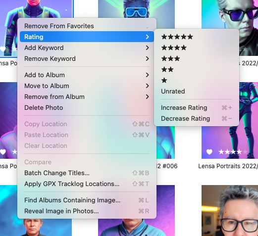
If you are using the current approach to favorites in Photos, you can set selected photos as favorites by choosing Image > Add To Favorites. If it’s set already, choose Image > Remove From Favorites. You can also click the little heart button in an image thumbnail.
Locations
Modern photos usually—but not always—have embedded location data. In cases where such EXIF data is missing or erroneous, Photos Workbench lets you fix that with the help of a big map that appears at the top of the main app window—click Locations in the toolbar to summon it.
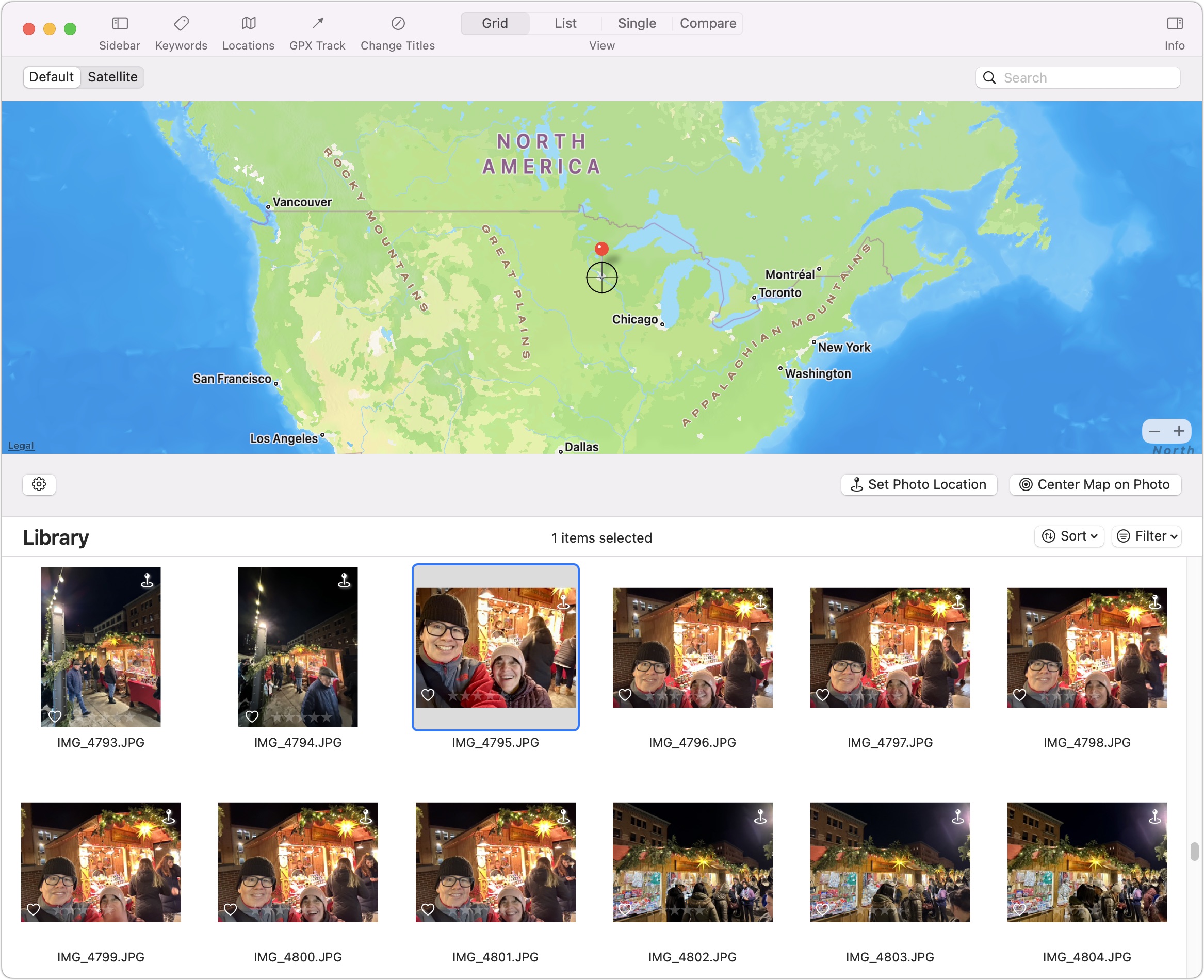
Some of these options are straightforward. Drag a photo or photos onto the map to assign a location, displayed as a red pin. If a photo’s pin isn’t precisely where it’s supposed to be, you can move it to the correct spot.
An “incremental” option lets you retrace a walking, cycling, or driving route you have taken, with your pictures assigned to their proper locations along the route. Crosshairs at the center of the map are helpful in this process. Once you’ve selected some photos, nudge the map so the fixed-in-place crosshairs point at the correct location for the first photo, and click Set Photo Location. Repeat this process along the route for the rest of your photos. It’s painstaking but worthwhile if your photos lack the necessary geotagged information.
As you’re doing all this, you have a Center Map on Photo button for putting the current photo underneath the crosshairs—a feature you may or may not like.
A third location-related option lets you copy location data from one picture and paste it into other photos taken in the same place. Select a picture and choose Image > Copy Location. Then select other photos taken at the same location and choose Image > Paste Location.
GPX Track
The GPX Track capabilities of Photos Workbench will be extremely welcome if your photos lack location metadata. These work off GPX files, which are track logs generated by GPS-enabled fitness devices, or by fitness-tracking apps on smartphones.
I track all my walking, hiking, and cross-country-skiing sessions in the Strava fitness app on my Apple Watch, which transfers the data to Strava on my iPhone for uploading to the Strava website. From there, I can download the GPX files for those excursions to my Mac.
Photos Workbench uses such data to assign locations to photos taken along the GPS-recorded route. For instance, I recently put on my cross-country skis to circumnavigate Pike Island, part of a Minnesota state park near where I live in St. Paul and where the Minnesota and Mississippi Rivers meet. I took pictures of the tame deer and gorgeous views along the way while Strava invisibly recorded my path.
Back at my Mac, I downloaded the GPX file for the ski outing while adding 15 pictures from the excursion to Photos. I then selected the photos in Photos Workbench and clicked GPX Track in the toolbar to locate and import the GPX file.
A dialog showed me one of my photos and asked me to confirm the time it was taken. Another option within that box asked me to confirm Strava’s timestamp for the outing. I selected the latter, clicked the button that read Geocode 15 Photos, clicked through a couple of confirmation prompts, and got a map with pins at the locations where I took the pictures. Check if the pins are correctly placed; you can adjust them if not.
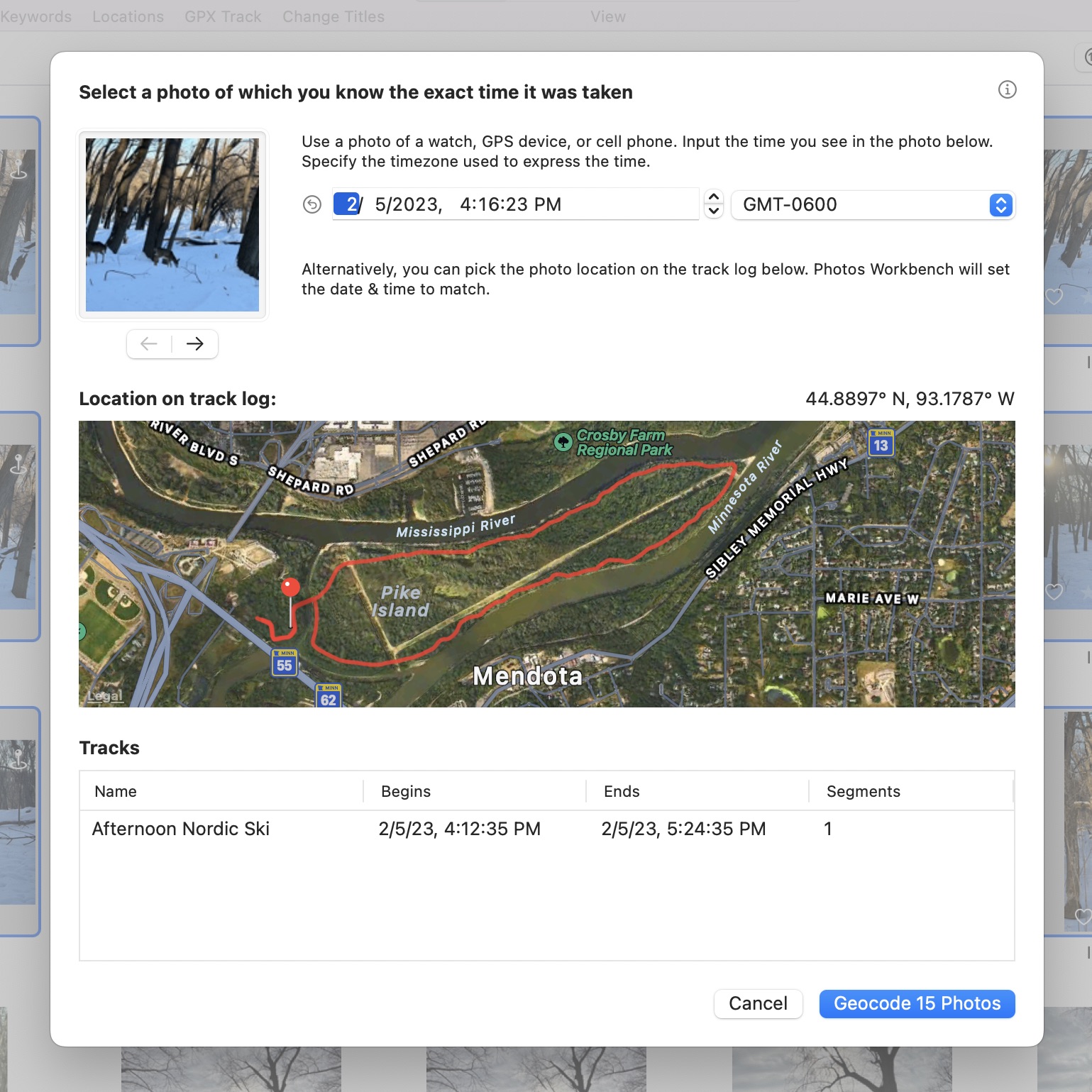
In my case, this was a pointless exercise because my pictures already contained location data, so I could see a map with pins just by selecting the photos. But GPX Track would be extremely welcome when location or time data is missing (because the phone was not set to record location information, say, or you used a camera without GPS capabilities) or incorrect (if the camera clock is set to another timezone, or just because the camera clock is a bit off). If your outing’s geocoding does not seem right, GPX Track will overwrite it with the new data. You can’t undo this, so be careful.
Change Titles
It’s always helpful when photos have descriptive titles instead of the generically assigned ones that come from the name of the underlying file. Custom titles make searching for particular photos in your immense library much easier. But it would be far too slow to change photo titles one by one; you want to work in batches.
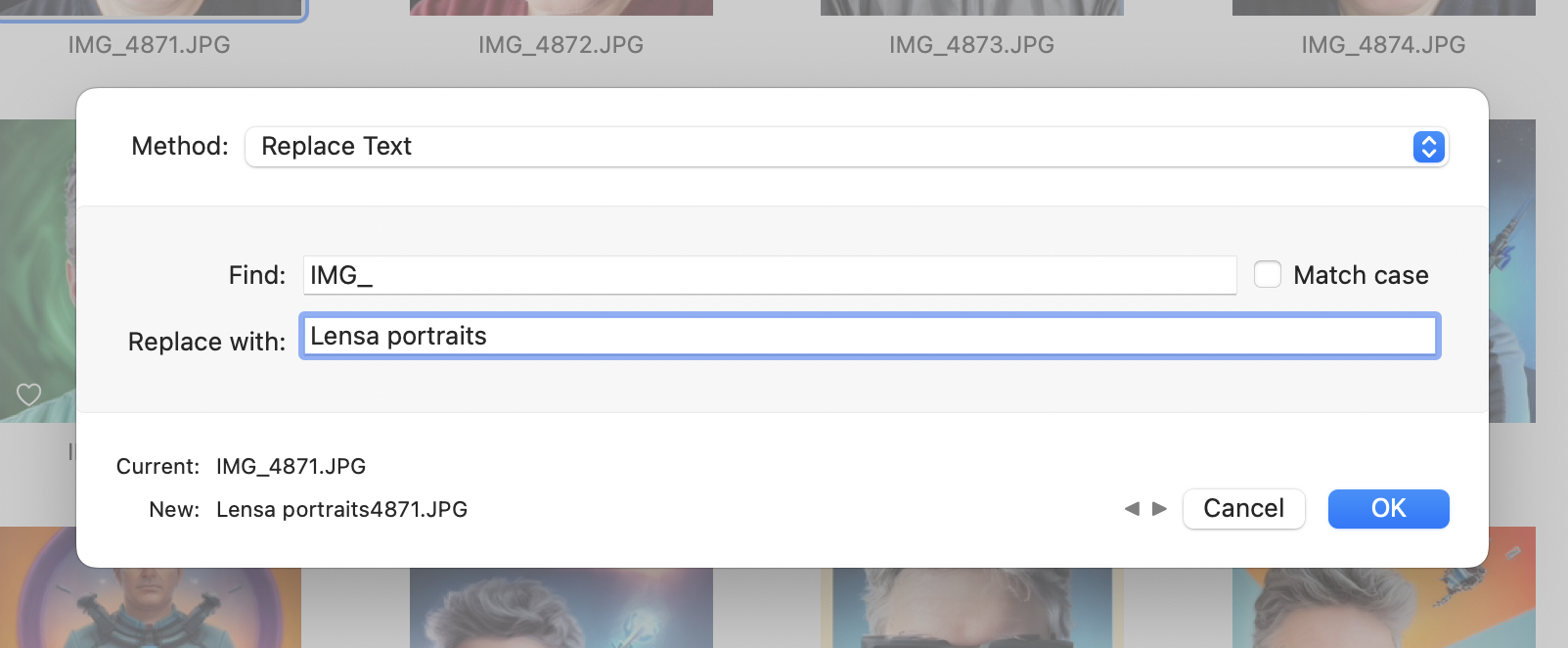
Note that a title isn’t the same as a file name. They start the same, but once you change the title, they’re no longer related. You can test this by retitling a photo and then dragging it from Photos to the Finder—you’ll see that the file is still called something like IMG_5831.JPG.
Photos Workbench provides batch-retitling of photos in two ways, both initiated by clicking Change Titles in the toolbar. The Change Titles window incorporates a text-replacement tool that, for instance, lets you swap out the common IMG_ prefix for a more memorable word or words, as I’ve done below.
The other, more interesting option, Name Format, enables you to replace photo titles in more complex ways. You start by creating a naming convention that builds in tidbits of information—such as date, time, camera make or model, or an image’s width, height, or pixel count.
Photos Workbench provides a drop-down menu with 20 name options (what the developer refers to as “tokens”). Click the little circle with the three dots in the Format field to display this menu. The choices you make appear as blue bubbles in the Format field, with Current and New lines below showing what the name is now and how it will change.
For example, “{Year Created}{Month Created}{Counter}” might translate to “20230263”. That’s a bit hard to decipher, so add words, spaces, and punctuation marks to the bubble sequence. For instance, “Lensa Portraits {Year Created}/{Month Created} #Counter” might translate to “Lensa Portraits 2023/02 #001”.
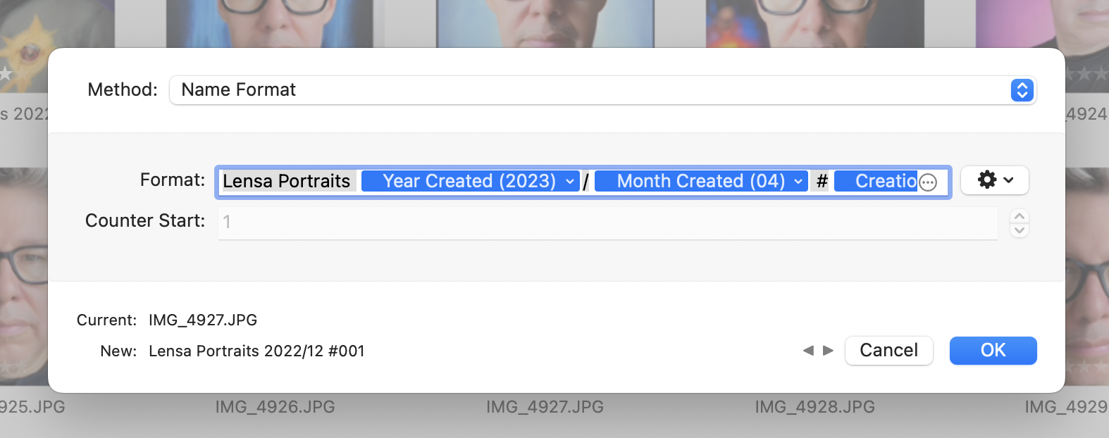
You can tweak some title tokens (their bubbles have tiny drop-down menus that are easy to miss). For instance, you can switch between years having two or four digits and months using numbers or names, as in “Lensa Portraits 23/February #001”.
An adjacent gear menu displays naming presets that came with the app. As with keywords, you can create, name, and save your own presets for future use or choose Manage Presets to summon yet another window to create, rename, design, reorder, and delete them more easily.
Once you have built a library of presets for common scenarios, you can power through batch-retitling jobs as never before.
Compare Mode
I always take more than one photo, particularly with posed pictures, since you never know if someone will blink or have an odd expression at the exact moment you press the shutter. That’s good since I can choose the best image from the set, but it does require additional work that isn’t particularly easy in Photos. The Compare view in Photos Workbench helps you pinpoint the best image among a set of similar photos.
To enter Compare Mode, select the pictures you want to compare and click Compare in the toolbar. The main viewer shows two photos side-by-side. The photo on the left is designated as the Pick, the best one seen so far. On the right is the Candidate, the picture you want to evaluate against the Pick.

If you think the Candidate is better than the current Pick, promote it to be the new Pick on the left by clicking the checkmark at the bottom or pressing Return, causing a new Candidate to appear on the right. Choose between them, and move on to the next comparison. In this way, you can quickly advance through a set of pictures to land on the best one.
While comparing photos, you can edit the Pick’s title, assign a star rating, add it to favorites, or edit its keywords.
When you’re done, accept the Pick by clicking the inward-pointing arrows button or pressing Command-Return. All that does is return you to Grid view with the Pick selected. Then you could manually swap the selection for the rest of the photos in the comparison group and delete them by pressing Delete.
If you were comparing many photos and wanted to delete all but one, you could assign the Trash keyword to all the photos you’re evaluating. Once you’ve settled on the best one, assign it the Keep keyword and remove the Trash keyword. Then use the Filter pop-up menu to select all the images with the Trash keyword and delete them.
There’s room here for a future version of Photos Workbench to provide more workflow, making it easier to select the images you don’t want to keep, for instance. There is an Edit > Invert Selection command, but that’s useful only if you’ve filtered the view or are looking at images in an album. I could imagine an option to delete or tag all the rejected Candidates at the end of the process. I’d also like to see some controls for zooming both the Pick and the Candidate so you can more easily see small details, such as if someone has their eyes closed.
The Upshot
Photos Workbench is for photographers who are way more organized than I am. I lean heavily on Photos’ image-editing features in both my personal life and at work (in somewhat of a rogue capacity because we officially use ThinkPads). But I rarely take the time to apply keywords, titles, star ratings, and the like, instead placing my faith in artificial intelligence to find the photos I want (my wife’s lovely face, say), and such AI-driven capabilities are continually improving.
But Photos Workbench would be welcome for meticulous Photos users who want more flexibility and a faster workflow than Photos provides out of the box. You can try it for free in demo mode, which will load only the first 100 photos in each album. If you like it, Photos Workbench regularly costs $29 from Houdah Software but currently has 25%-off introductory pricing of $21.75; family licenses are available for $44 regularly or $33 with the introductory discount.