#1481: Apple Watch screen replacements, Apple Music Web app, TidBITS 2019 reader survey results, Apple’s excess of ellipses
If your aluminum Apple Watch Series 2 or 3 is suffering from a particular type of crack in the screen, read on to learn how Apple will replace it for free. Want to listen to Apple Music on your Windows machine at work? Apple has quietly launched the beta of an Apple Music Web app to open the service to non-Apple platforms. And if you’ve been wondering how similar you are to other TidBITS readers, Adam Engst analyzes the results of our 2019 reader survey, which will help shape the direction of our coverage for years to come. Finally, do you know what ⋯ is? It’s an ellipsis, which has become one of the most common characters in the Mac and iOS user interfaces. But what does it mean? Josh Centers extracts numerous examples in a quest to answer that question. In ExtraBITS this week, the file transfer app Fetch turns 30 and Apple admits its apps had an advantage in App Store search rankings. Notable Mac app releases this week include Airfoil 5.8.7, Postbox 7.0, and SoundSource 4.1.4.
Apple Is Replacing Some Apple Watch Series 2 and 3 Cracked Screens
If your aluminum Apple Watch Series 2 or Series 3 has a particular type of crack around its screen, we have good news: Apple will replace the screen free of charge. Apple said:
Apple has determined that, under very rare circumstances, a crack may form along the rounded edge of the screen in aluminum models of an Apple Watch Series 2 or Series 3. The crack may begin on one side and then may continue around the screen as shown in the images below.

The screen replacement program covers all aluminum models of the Apple Watch Series 2 and Series 3, including GPS, GPS+Cellular, and Nike+ models. If you’re unsure which model you have, follow Apple’s instructions for identifying your Apple Watch.
If you have one of the included models with this sort of screen crack, you can make an appointment with an Apple Retail Store, contact an Apple Authorized Service Provider, or contact Apple Support to arrange mail-in service to an Apple Repair Center.
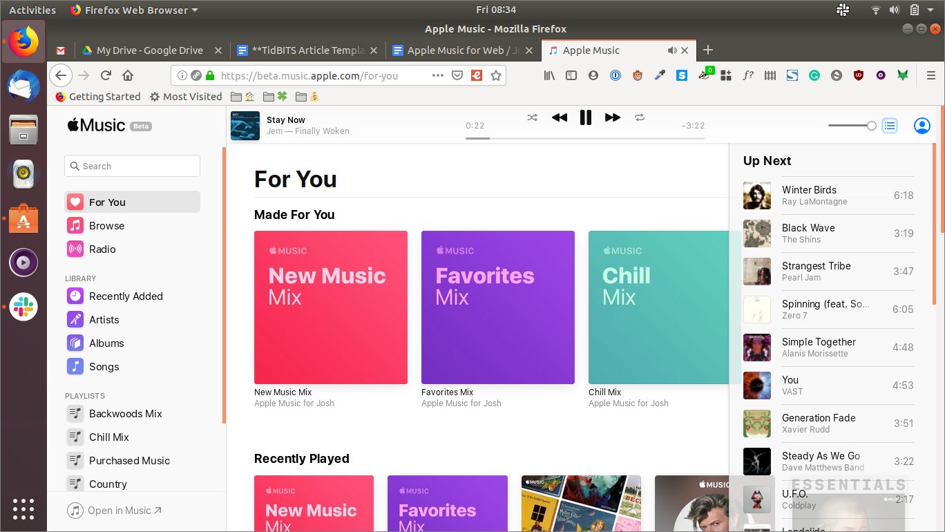
Apple Launches Beta of Apple Music for the Web
Apple has quietly launched the beta of a Web app for Apple Music, allowing Apple Music subscribers to access all their Apple Music content using a modern Web browser. Just about every feature you’d expect is there, except for the capability to upload music, smart playlists, some music videos, recently played custom radio stations, and curiously, Beats One radio.
Apple has provided native Apple Music clients for a variety of platforms:
- Mac: iTunes and the forthcoming Music app in macOS 10.15 Catalina
- iOS, watchOS, tvOS: Music app
- Windows: iTunes
- Android: Music app
However, Linux and ChromeOS users have been locked out, so this is good news for those folks. Current Mac users who dislike iTunes may also appreciate the Apple Music Web client. More generally, the release may point to Apple’s plans for Windows in a post-iTunes world.
To test out just how cross-platform the Web version of Apple Music is, I loaded it in Firefox on a Lenovo ThinkPad running Ubuntu Linux. Other than an error about being unable to find media keys, it worked as I expected, letting me browse my library, search the Apple Music catalog, and play songs.

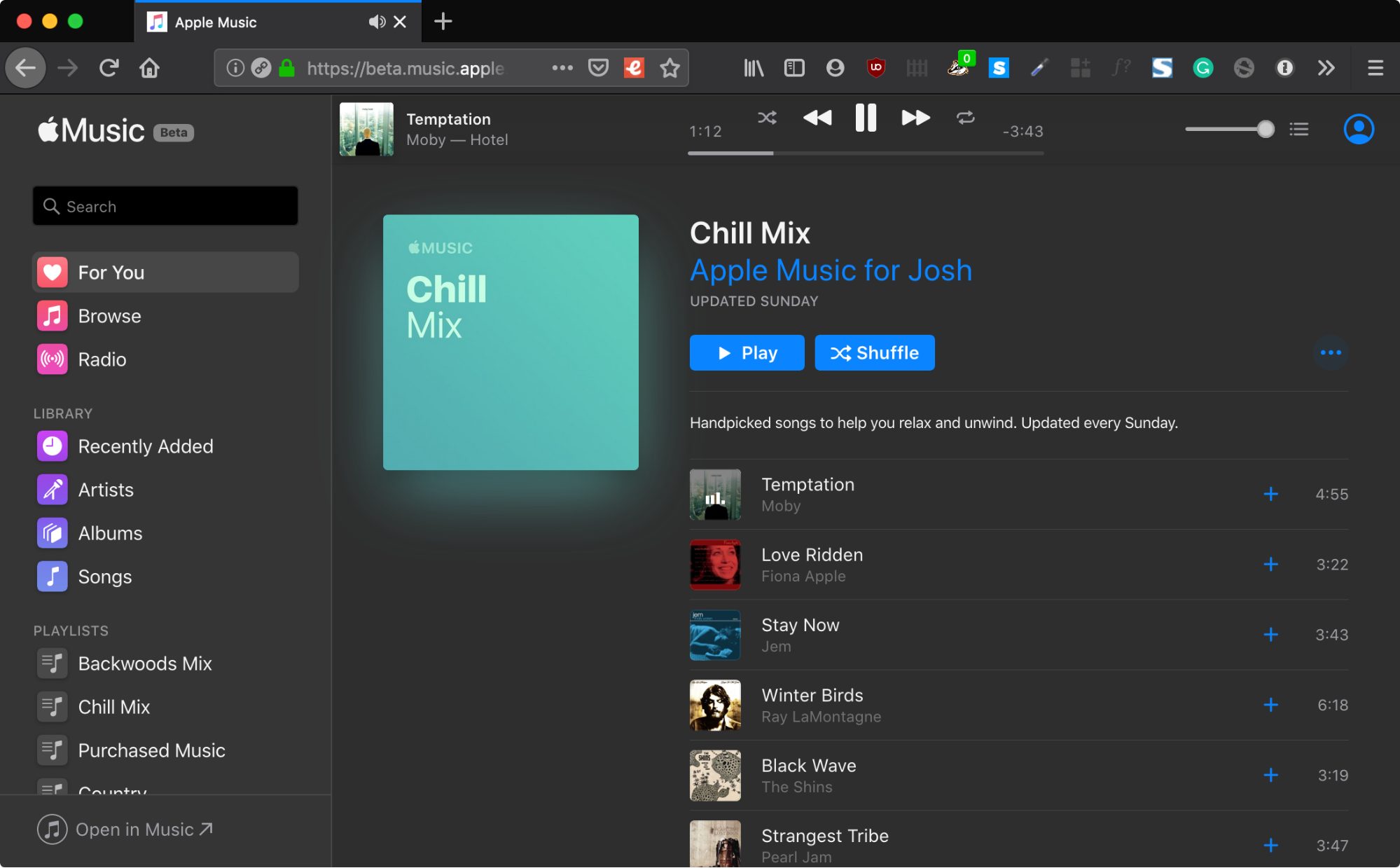
The Apple Music Web app mimics the interface of the Music app in Catalina. It provides access to your Apple Music library and playlists, along with Apple content, including editor-curated playlists and algorithmically generated playlists like New Music Mix and My Chill Mix. Even Up Next is there.
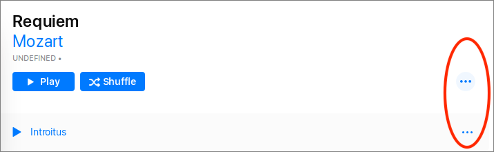
Of course, it wouldn’t be a modern Apple media app without a plethora of “click me for something or other” ellipsis buttons (see “Less… Is More? Apple’s Inconsistent Ellipsis Icons Inspire User Confusion,” 30 August 2019).
If you use the Apple Music Web app on a Mac, you get a few extra niceties, like Dark Mode support (which even works in Firefox), and media key support (at least in Safari).
The Apple Music Web app also reportedly works in Android, though I don’t have an Android device to test with. Trying to load it on an iOS device opens the Music app instead.
Given how Apple continues to pivot its business toward services, we may also see Web versions of the News and TV apps that would expand the audiences for Apple News+ and the upcoming Apple TV+.
Will you be using Apple Music on the Web? Would you like to see more Web apps from Apple? Let us know in the comments.
TidBITS 2019 Reader Survey Results
I always approach analyzing our surveys with some level of trepidation, since there’s nothing like asking tens of thousands of people what they think of your work to trigger latent insecurities. Happily, the results of the TidBITS 2019 Reader Survey proved largely positive and helpful (for a link to the full question set, see “Please Vote in the TidBITS 2019 Reader Survey!,” 16 August 2019). I was sad that this year’s survey attracted only 1094 responses, less than half of the 2267 people who responded to our last survey four years ago (see “TidBITS 2015 Reader Survey Results,” 7 December 2015).
We’re well aware that this sort of survey is far from scientific because respondents were self-selected. However, since 56% of respondents were TidBITS members who provide the bulk of our financial support, I’m happy to take guidance from this subset of our readership. (I may use “TidBITS readers” as a shorthand for “survey respondents” below; I’m aware the two groups aren’t identical, but that’s how we’re going to think about it, regardless. People who vote get more say in the future.)
About You
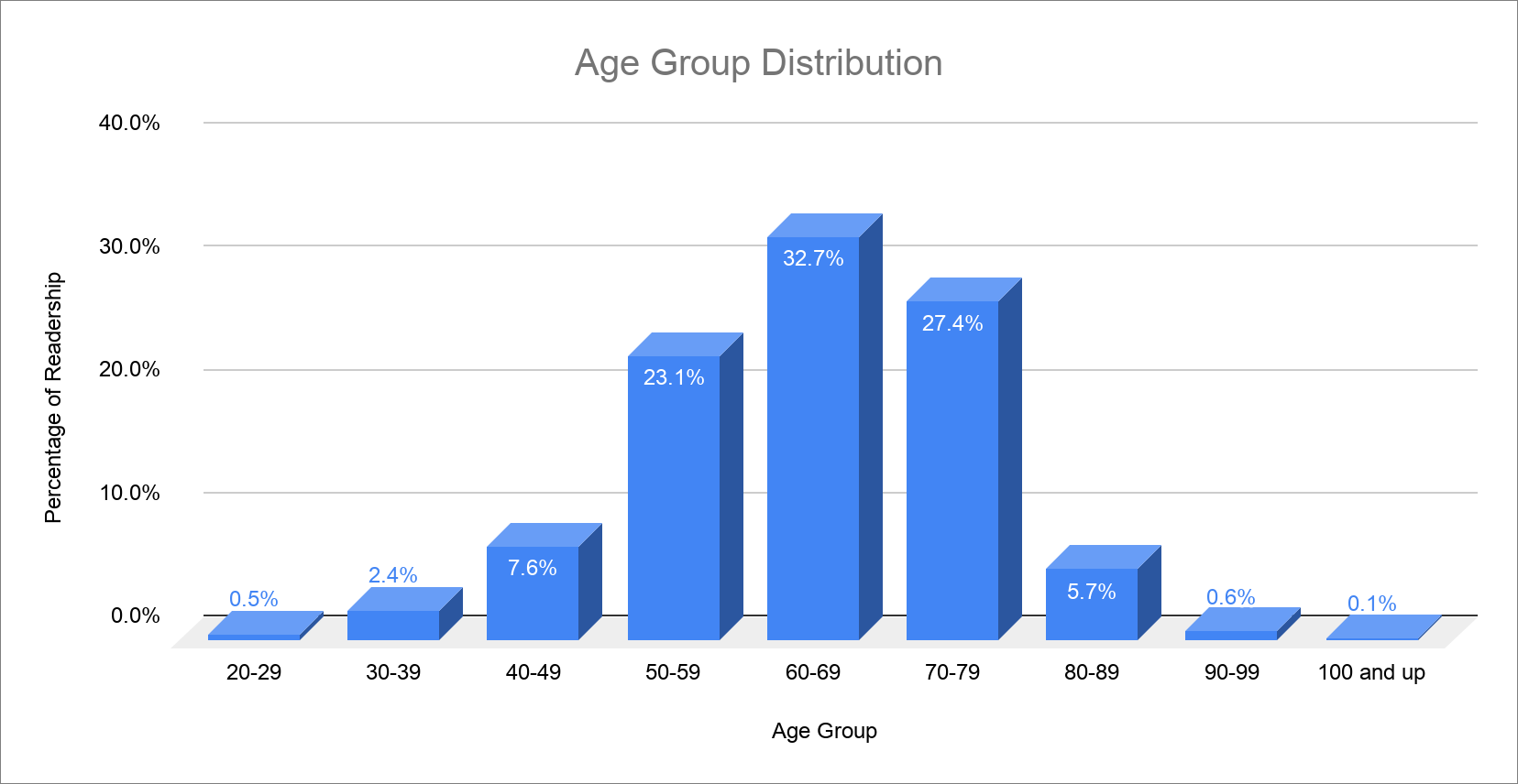
Our first few questions were designed to learn more about our readership so we could be sure we have the right targets in mind when developing articles. Unsurprisingly, given that we’ve been publishing TidBITS for 29 years and have many loyal readers who have stuck with us for decades, we’re all getting older (and wiser, of course). 90% of respondents are over 50, and since Tonya and I turn 52 shortly, we’re right in that demographic.
Some might say we should be trying to attract younger readers, but from watching our son Tristan and his friends, it seems unlikely that we’d be able to succeed at that. We don’t think the way younger generations do, and they neither consider reading to be a primary way to learn nor have much media brand loyalty. They tend to solve problems as they crop up, watching videos or cherry-picking articles from Google search results, rather than subscribing to a periodical. So be it—TidBITS doesn’t have to live forever, and we’re primarily interested in meeting the needs of the TidBITS members who keep us in business.
I was intrigued to see the results of our question about technical proficiency, which had a scale of 1 to 5, where 1 was “I’m a novice or often have trouble using my Apple devices” and 5 was “I solve problems with Apple devices for everyone around me.” Most of you—85%—are above average, with answers of 4 or 5. Only 13% of respondents picked 3 on the scale, and just a few people admitted to being less technical. These results are good, since they tell me that we can continue to assume that TidBITS readers are quite technical when deciding how detailed an article should be.

Internet Infrastructure
It’s clear that our most engaged readers, the ones who responded to this survey, see TidBITS as an email newsletter, with 79% saying that it was one of the ways they read our articles. (These numbers total more than 100% because people could read TidBITS in multiple channels.) Only 31% of respondents use our Web site, and after that, the numbers drop off even further, although the fact that 14% see TidBITS in Apple News was heartening. These numbers were virtually unchanged from 2015.

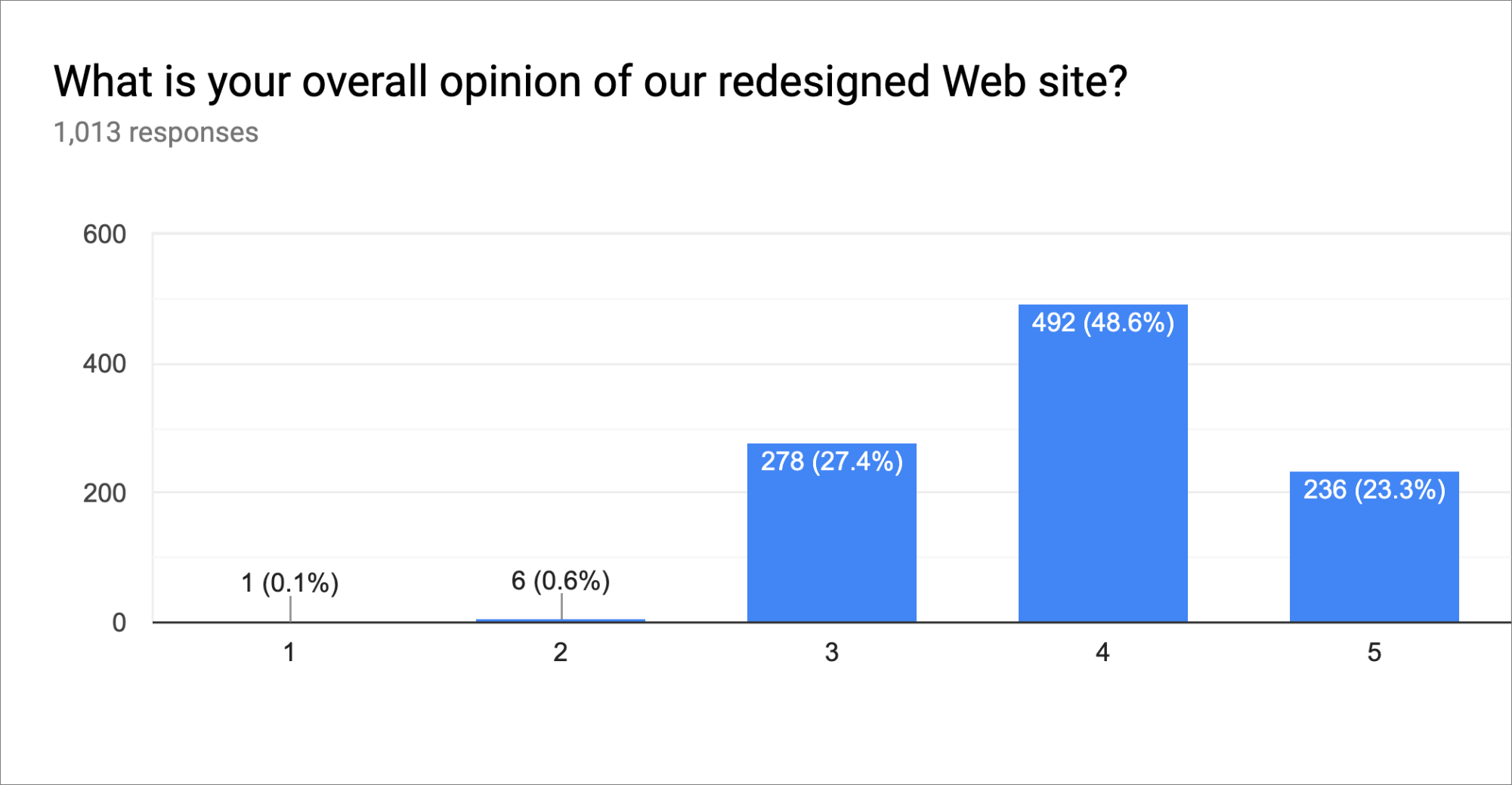
Speaking of our Web site, which we radically redesigned in April 2018, the overall ratings were pretty good, with 72% of respondents rating it as 4 or 5 on a 1–5 scale, where 1 was “Don’t like it” and 5 was “Love it.”
In the freeform responses, the most common adjective that people used to describe it was “easy” followed by “clean” (and yes, I checked to make sure there weren’t negatives in front of those words). Although a few people said they preferred our old site, there were equal numbers of people saying how much they disliked the old site and were happy we redesigned it. Can’t please all of the people all of the time.
I was a little taken aback to see so many comments that essentially said “I never/rarely use it” and even “I didn’t realize you had a Web site.” Although we publish almost everything in email, if you go to our Web site, you can read the comments that often provide additional information and commentary that expands on the article, and we even sometimes post comments on older articles with updates on the product or service discussed.
The site also provides a 29-year archive of past articles, many of which remain useful today. (In response to a comment in TidBITS Talk, for instance, I just posted a link to “Put Save As Back on the File Menu,” 30 November 2015.) To find those, you can use the site’s internal search capabilities, as about 37% of readers do, or follow the lead of another 6% of readers and target a Google search to our site by adding +site:tidbits.com to your search phrase. However, since 53% of people copped to rarely searching for old articles, I can only assume most of you aren’t interested in going back in time. You can also browse through back issues, if you missed one in email.
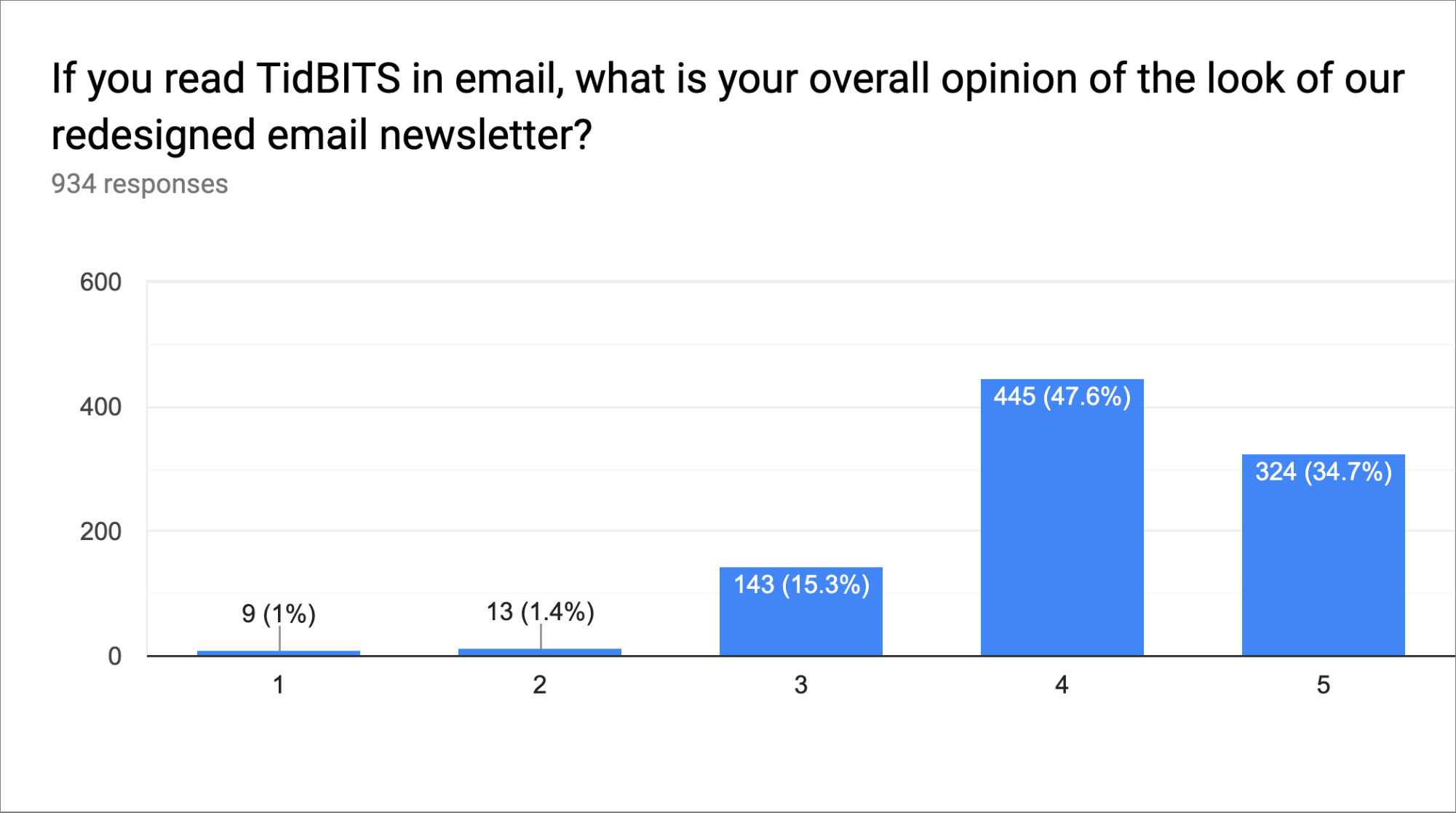
The design of our email issue was even better received than the Web design, with 82% of people rating it at 4 or 5 on the 1 “Don’t like it” to 5 “Love it” scale.
Many of the free-form comments again came down equally on opposite sides of the same topic, such as “Like the summary up front” and “I don’t think the summary at the top is necessary.” Can’t please all the people… A number of comments strayed into tech support territory, and I hope to collect and address those in a separate article.
Two categories of comment deserve an immediate response, however. First, quite a few people expressed annoyance that the links in the table of contents at the top of each email issue often don’t work. It’s true, but it’s not our fault! Blame Apple and other email developers, because our design has properly formed named anchors. Apple has ignored this problem in iOS for years—I first reported it in “Mail in El Capitan and iOS 9 Ignores Named Anchors” (5 January 2016). Although Apple closed my bug as a duplicate long ago with no commentary, the company did fix the problem in Mail for the Mac at some point. I’ve confirmed that iOS 13 still suffers from the bug, and I’ve reported it again. If you’re using the iOS 13 beta, please pile on and report it with the Feedback Assistant app.
Second, many people also commented on an annoyance with Gmail’s native Web interface. If a message contains more than 102 KB of text, Gmail puts a message at the bottom that says “[Message clipped] View entire message.” Clicking the “View entire message” link works fine, but is a frustrating extra step, since you have to then scroll down to where you left off reading. The problem is that the 102 KB limit includes the necessary HTML markup, and HTML email requires inefficient table-based coding and inline CSS. It’s only loosely related to the amount of readable text in the issue and is difficult to avoid. (Cornell University’s monthly newsletter for alumni and parents regularly exceeds 102 KB with just a few screens of text and graphics.)
Despite these irritations, only 30% of you said that you’d prefer a short, summary-only version of the issue with links to each article on our Web site. Such a version would require a fair amount of development effort and would both complicate our subscription interface and increase our support load. I’ll put it on our development wishlist but can’t promise if or when it will happen.
Current Content
When it comes to your opinions about what we’re writing, we were pleased to discover that our instincts were largely accurate, with two notable exceptions. Since we allowed everyone to rate each category on a scale from 1 to 5, we calculated weighted averages to compare the categories.
When it came to which products you want to read about, the Mac reigns supreme, as always. Moreover, as anyone would predict, the iPhone and iPad were close behind. The Apple TV garnered much less interest, with the Apple Watch at a similar level. We didn’t expect the AirPods and HomePod to be all that popular, and they weren’t, but they don’t need much coverage.
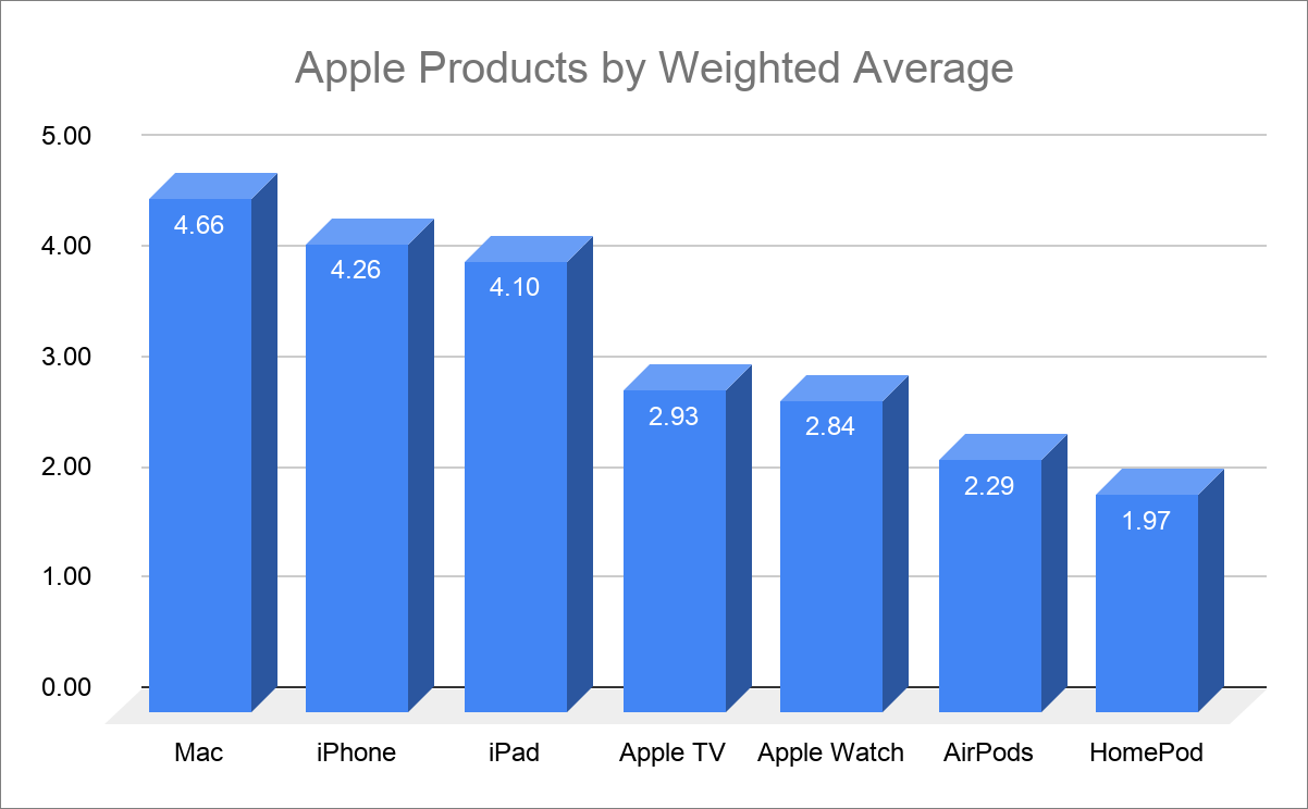
Interestingly, we asked the same question in 2015, and the Mac dropped 0.06 points, the iPhone rose 0.24, the iPad went up by 0.13, the Apple TV dropped by 0.24, and the Apple Watch rocketed up by 0.49. That makes sense—as iOS devices become ever more flexible and powerful, I can see them becoming more compelling at the slight expense of the Mac. The fourth-generation Apple TV and original Apple Watch shipped in the months before the last survey, and I think it’s fair to say that the Apple TV has not lived up to its promise, whereas the Apple Watch has exceeded its.
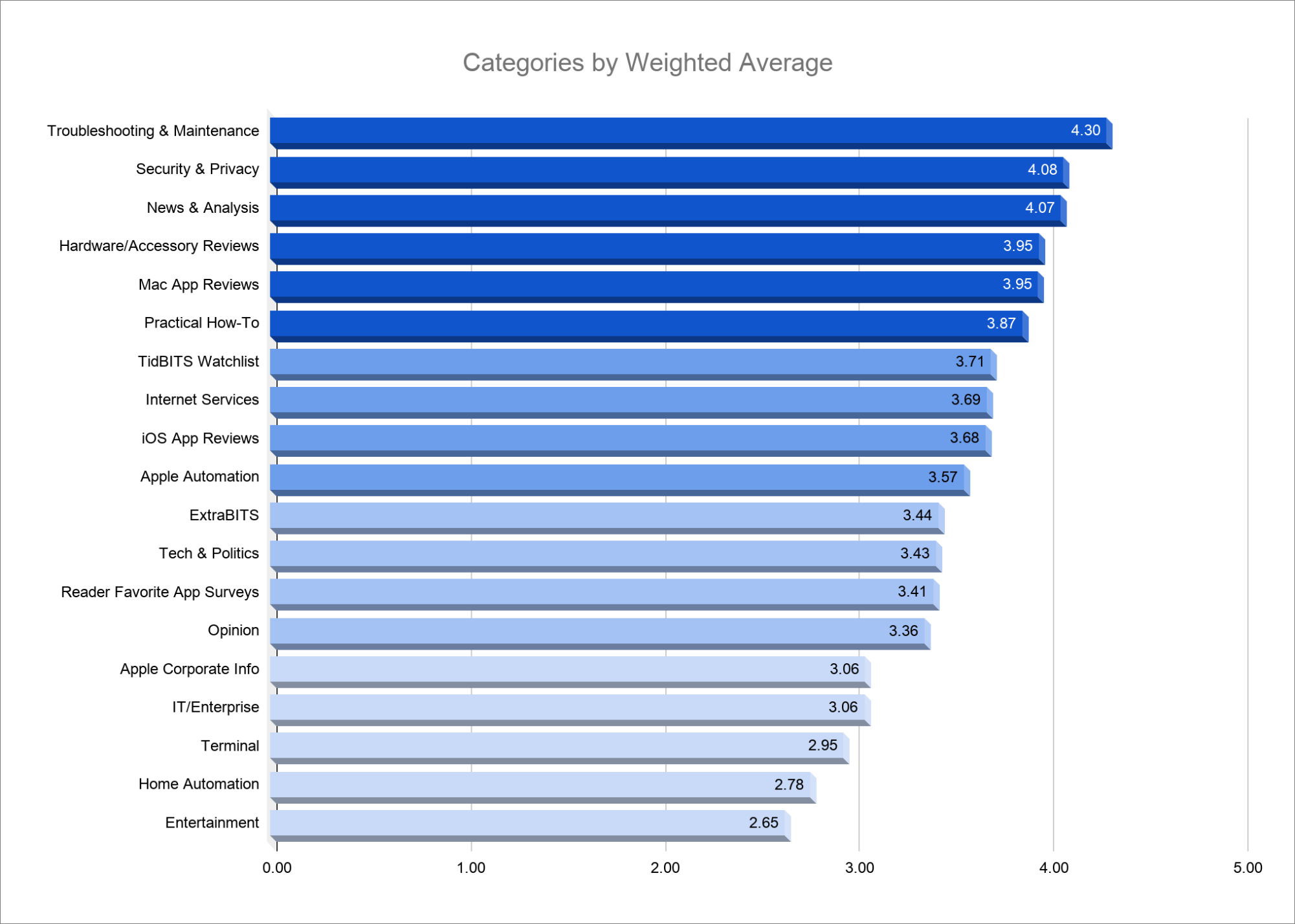
To make sense of all the different topics and types of articles we asked you to vote on, I’ve grouped them into four tiers. These are a little arbitrary, but they give us a way to evaluate any given article idea by the tier into which it would fall.
- Tier 1: These six categories were the most popular, with Troubleshooting & Maintenance far and away the winner with a 4.30 weighted average. I was a little distressed that Security & Privacy was second, purely because I wish we didn’t live in a world where it warrants such importance. The third-place ranking of News & Analysis was good, since we feel that we can’t ignore major news items. The final three—Hardware/Accessory Reviews, Mac App Reviews, and Practical How-To—are all utterly worthwhile, and we’ll continue to prioritize them.
- Tier 2: It didn’t surprise us one bit that the first category in this tier, TidBITS Watchlist, ranked so highly. People really like Agen Schmitz’s short descriptions of Mac app updates. The remaining three—Internet Services, iOS App Reviews, and Apple Automation—seemed to fit well as Tier 2 content. They’re appealing but not quite as core to the TidBITS reading experience.
- Tier 3: I’m less sure how to interpret the votes that filled this tier with ExtraBITS, Tech & Politics, Reader Favorite App Surveys, and Opinion. We spend a large amount of time researching and posting ExtraBITS summaries of external articles because it feels like they give TidBITS breadth each week. We may not be able to cover every interesting industry development in depth, but we consider it a service to point you to coverage elsewhere. Perhaps that time would be better spent on short Tier 1 articles. I can see Tech & Politics and Opinion ranking lower because, well, the Internet is way too full of both. We’ll try to restrict ourselves to those that feel the most important. Finally, the low ranking of Reader Favorite App Surveys surprised me. Those articles, where we rank apps in a particular category with crowd-sourced opinions, are quite a lot of work, but we previously thought they were more popular.
- Tier 4: The relatively low ranking of the IT/Enterprise category came as no surprise; most people simply don’t do that kind of work. Nor were we surprised by you being relatively uninterested in articles about Terminal. But the last two? Ouch! Home Automation and Entertainment were by far the lowest-ranked categories. We’ve focused quite a bit of coverage on both due to Apple’s HomeKit platform and forthcoming Apple TV+ and Apple Arcade platforms. Clearly, we’ll have to pull back on such coverage.
Finally, when we asked about doing more of the super-short surveys we’ve put at the end of some articles, the reaction was generally positive, with 66% of people saying that they’d like to see more. As we publish articles, we’ll ponder if a survey makes sense.
Article Details
When it comes to individual articles, we were pleased to hear that roughly 90% of respondents think that TidBITS articles are “just right” when it comes to length, depth, and technical level. Those who disagreed were split about evenly between the alternatives. At most, we’ll try to make articles a little shorter in the future.
With regard to the featured images we associate with every article, you gave us a resounding “Meh.” On a scale of 1 to 5, 52% ranked those images as a 3, 33% as a 4, and 10% as a 5.

Those who read only the email issue see those images only as small thumbnails to the right of the article title, since they’d take up too much space at full size. For the Web site and the individual articles that TidBITS members get, the images appear at the top of the article as a way of providing an attractive visual element to draw the reader in. They’re a common feature in Web publications and are reputed to be essential for attracting traffic on social media platforms and Apple News.
However, I have to admit that they’re an inordinate amount of work to find or create. So I’m going to try dropping them for a week or two. We’ll see if there is any apparent impact, particularly in Apple News, which really wants images. There may be some compromises that will feed a stock set of images to Apple News without requiring extra effort for every article.
Comments
With our infrastructure transition, we moved from a lightweight commenting system that Glenn Fleishman and I designed to an open-source system called Discourse. It was like switching from a canoe to an aircraft carrier in terms of flexibility and capabilities. Overall, I genuinely like Discourse as both a user and an administrator, and it integrates nicely with WordPress to embed comments under articles and simultaneously power the TidBITS Talk discussion forum.
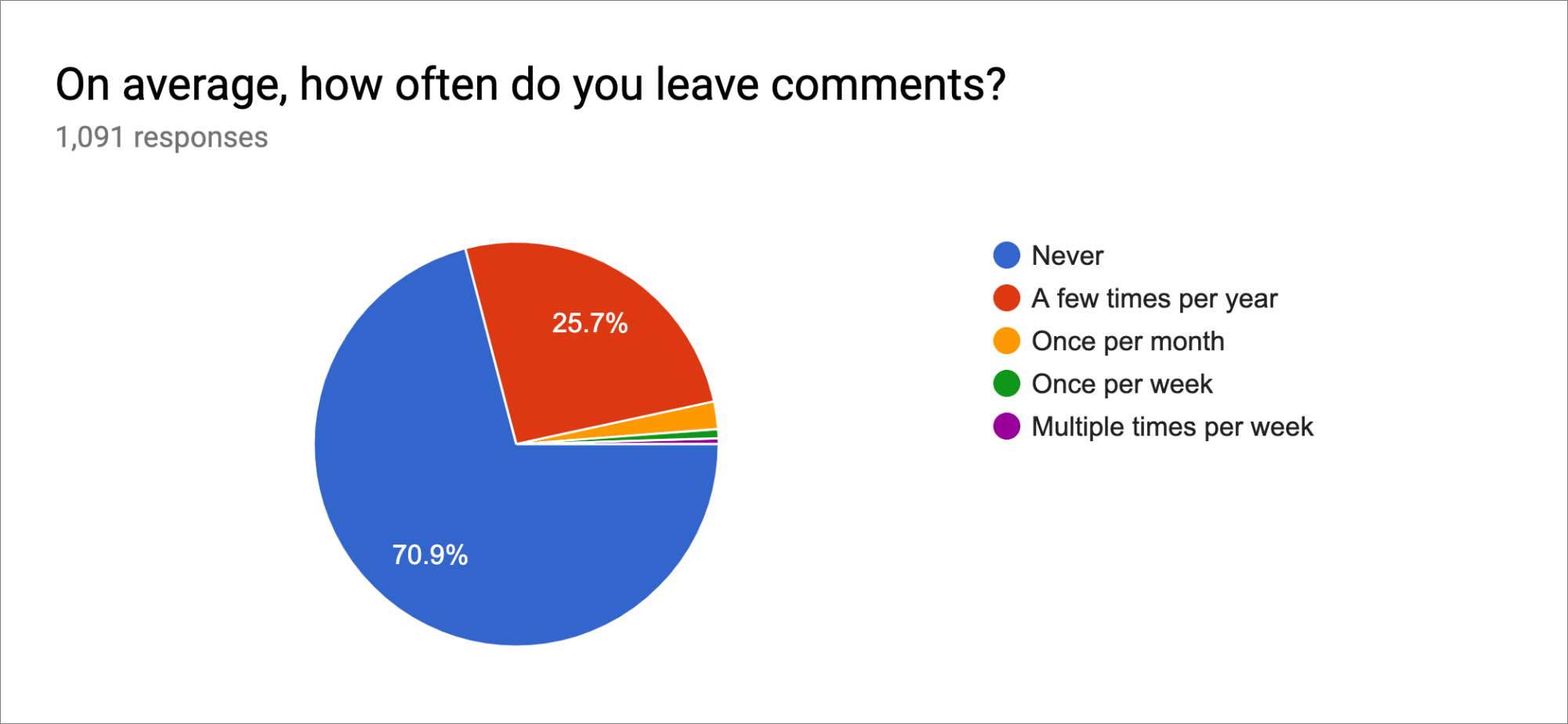
As far as those comments go, 52% of readers at least scan the comments at the bottom of each article, although only about 21% of people read them more regularly or follow the ongoing conversation as it evolves. About 27% never read the comments, which isn’t too surprising given that email subscribers have to click through from the issue to our Web site to see them.

Of the 30% of respondents who said they did comment, nearly all contribute something only a few times per year, with only about 4% writing in more frequently. Such percentages are probably to be expected, but remember that we welcome all constructive input on our articles. Some articles have garnered comment discussions that significantly expand on the topic in useful ways.
New Content
At times, we feel as though we’re being left behind by the sexier worlds of podcasting and short-form video. However, when we asked if you’d be likely to subscribe to either an Apple-related podcast or a regular YouTube series, the answers were identical and unequivocal:
- Just under 20% of respondents thought they’d subscribe.
- Just under 40% of respondents were on the fence, which I take to mean they’d try an episode or two but probably wouldn’t end up subscribing.
- Over 40% of respondents were sure they wouldn’t subscribe, due either to information overload or lack of desire for audio or video content.
I’m not going to make any promises either way, but this wasn’t a ringing endorsement from the people we most want to help.
Final Comments
We had five different free-form comment areas in the survey, culminating with the open-ended “Anything else about TidBITS you’d like to comment on, suggest, or otherwise tell us?” Those questions attracted 1375 responses overall, and I’ve collected them into long documents and am reading through them. Many are highly flattering, and I thank you for the kind words—they mean a lot to us. The criticisms were welcome as well, since only by knowing what people don’t like as much can we improve, and I’ll be taking those into account moving forward.
I regret not asking for an email address as one of the questions because quite a few people complained about problems that are easily solved or just made comments to which I’d like to respond. Since I can’t write back to people directly, I’m going to answer those questions and comments in an article. I strongly suspect that if one person is confused about something, others are as well, so my answers might end up helping quite a few people. And hey, more articles are good!
Thanks to all who responded to the survey, and I hope everyone has enjoyed this peek behind the curtains.
Less… Is More? Apple’s Inconsistent Ellipsis Icons Inspire User Confusion
As I’ve been exploring iOS 13 to write the just-released Take Control of iOS 13 and iPadOS 13, I’ve become concerned about what seems to be an increasingly frequent pattern in iOS software design. What finally pushed me over the edge into writing this article was documenting Apple Card’s user interface in Wallet (see “How to Get the Most from Your Apple Card Benefits,” 14 August 2019), because I found myself typing the same character over and over and over…
That’s right, I’m talking about the increasingly ever-present ellipsis ••• buttons in iOS (technically, we generally render a user-interface ellipsis in running text as three bullets to make them more easily seen).
Now, I don’t have a grudge against the ellipsis itself; it’s a perfectly valid character that writers can use in interesting and flexible ways. The most formal usage is probably as an indication of the intentional omission of a word, sentence, or section from a larger body of text. For instance, Apple inserts an ellipsis in a file name when it’s too long to display in the allocated space. But the ellipsis has also come to be used to indicate, as Wikipedia suggests, “an unfinished thought, a leading statement, a slight pause, an echoing voice, or a nervous or awkward silence. … When placed at the beginning or end of a sentence, the ellipsis can also inspire a feeling of melancholy or longing.” If only our technology could be so subtle.
That’s in writing. In the Macintosh interface, the ellipsis has long had a specific meaning. An ellipsis following a menu item means that choosing that item will result in a dialog, rather than an action being performed immediately. Choosing File > Save saves the current document; choosing File > Save As… displays a Save dialog where you can enter a new name and location for the file. In technical writing, we drop the ellipsis when referring to menu items to avoid confusion with the more traditional uses of the ellipsis.
But in iOS—and even in some Mac apps—Apple has started using the ellipsis in random ways that muddy its meaning. Let’s take a look.
Apple’s Use and Abuse of the Ellipsis
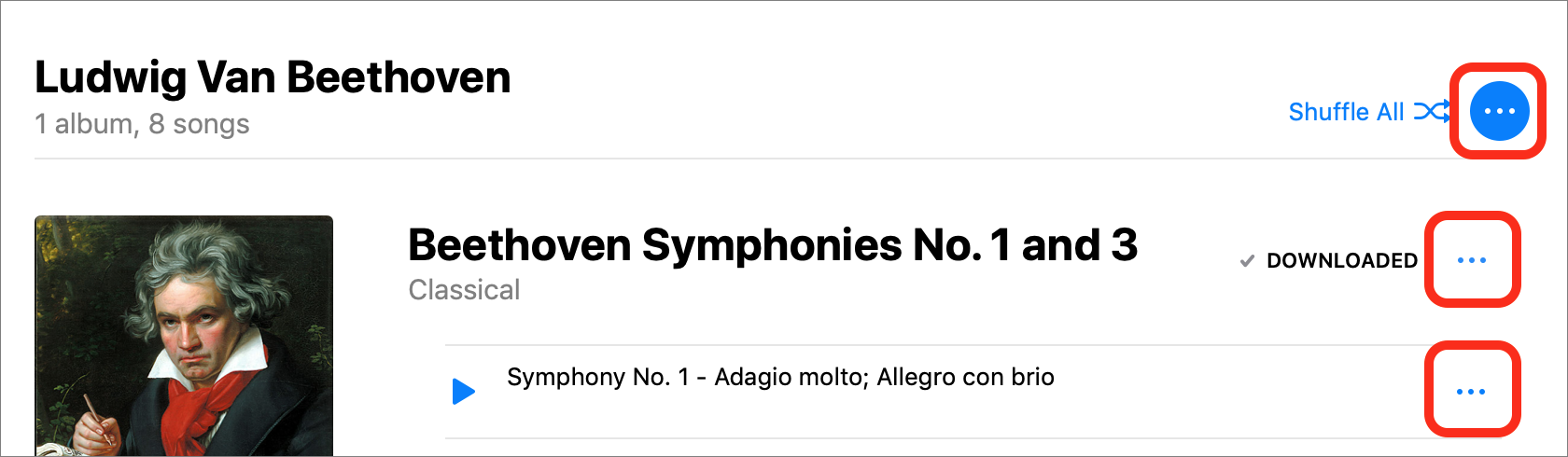
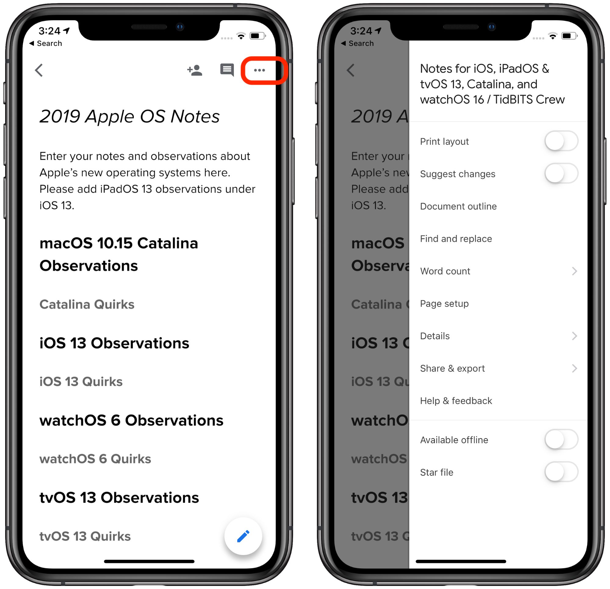
First, let’s return to the Wallet app, where you tap the ellipsis button to access information about a credit card and its settings.
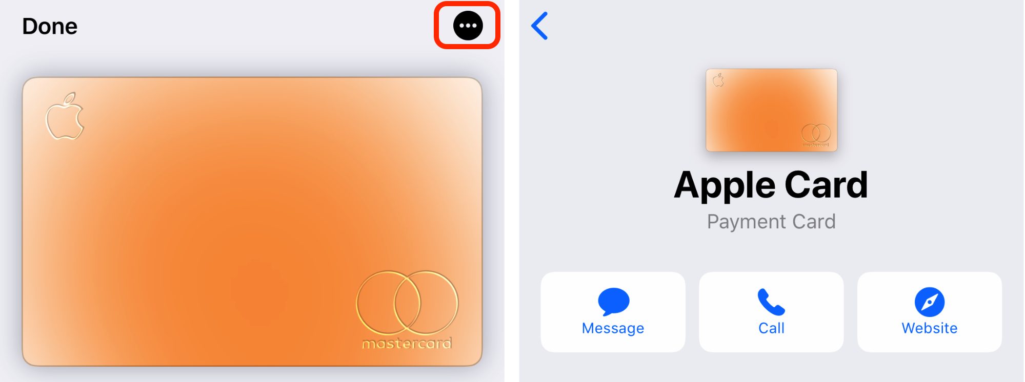
In this example, the ellipsis button is akin to choosing File > Get Info on the Mac to open the Get Info window, which displays metadata about the selected file. Interestingly, Wallet only recently switched to using the ellipsis button; before that, it relied on a button that looked like the lowercase letter i. Perhaps the i was awkward when localizing the interface into other languages and script systems, but it is an ISO standard symbol.
Let’s say you then switch to the Music app to play some tunes. While playing a song, you see yet another ellipsis button. You might assume that tapping it would display more information about the song, perhaps like what you can see in iTunes when you choose Edit > Song Info. But no, the ellipsis button in the iOS Music app brings up a list of track-specific actions, like adding it to your library, adding it to a playlist, creating an Apple Music station based on it, and so on. At least the Add to Playlist and Share Song menu commands honor the standard use of the ellipsis to indicate that a dialog will appear next.
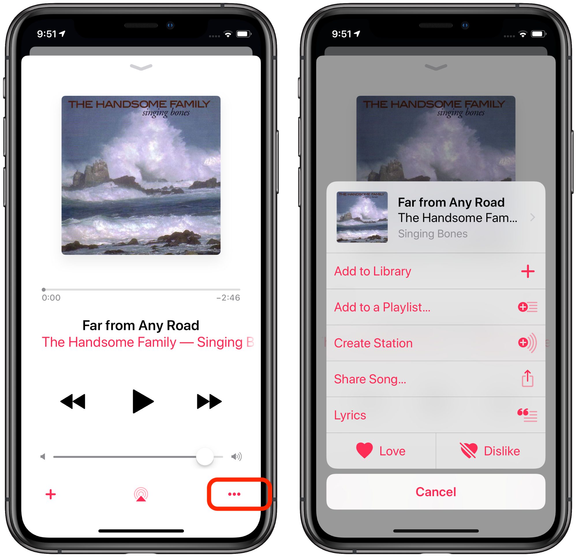
We’ve now switched from the ellipsis button indicating that tapping it will provide information and settings to it acting as a contextual menu of actions you can perform on the selected song. That’s a jump.
Speaking of the soon-to-be-defunct iTunes, it goes way over the top on ellipsis usage, especially when browsing for music by Artists.
While having so many ellipsis buttons—of two different types—seems excessive, at least Apple uses them consistently here: clicking any of the ellipsis buttons displays a contextual menu for the given item. But visually, this interface is a mess. Unfortunately, it’s similar in the Music app in the current beta of macOS 10.15 Catalina.
Speaking of betas, the iOS 13 beta presumably reflects Apple’s most recent design thinking. Since Apple is now beta testing iOS 13.1, iOS 13.0’s visual interface is likely locked down. (If you’d like to get a head start on your iOS 13 experience, check out Take Control of iOS 13 and iPadOS 13.)
iOS 13 tweaked the ellipsis button in Music, but not in a particularly helpful way.
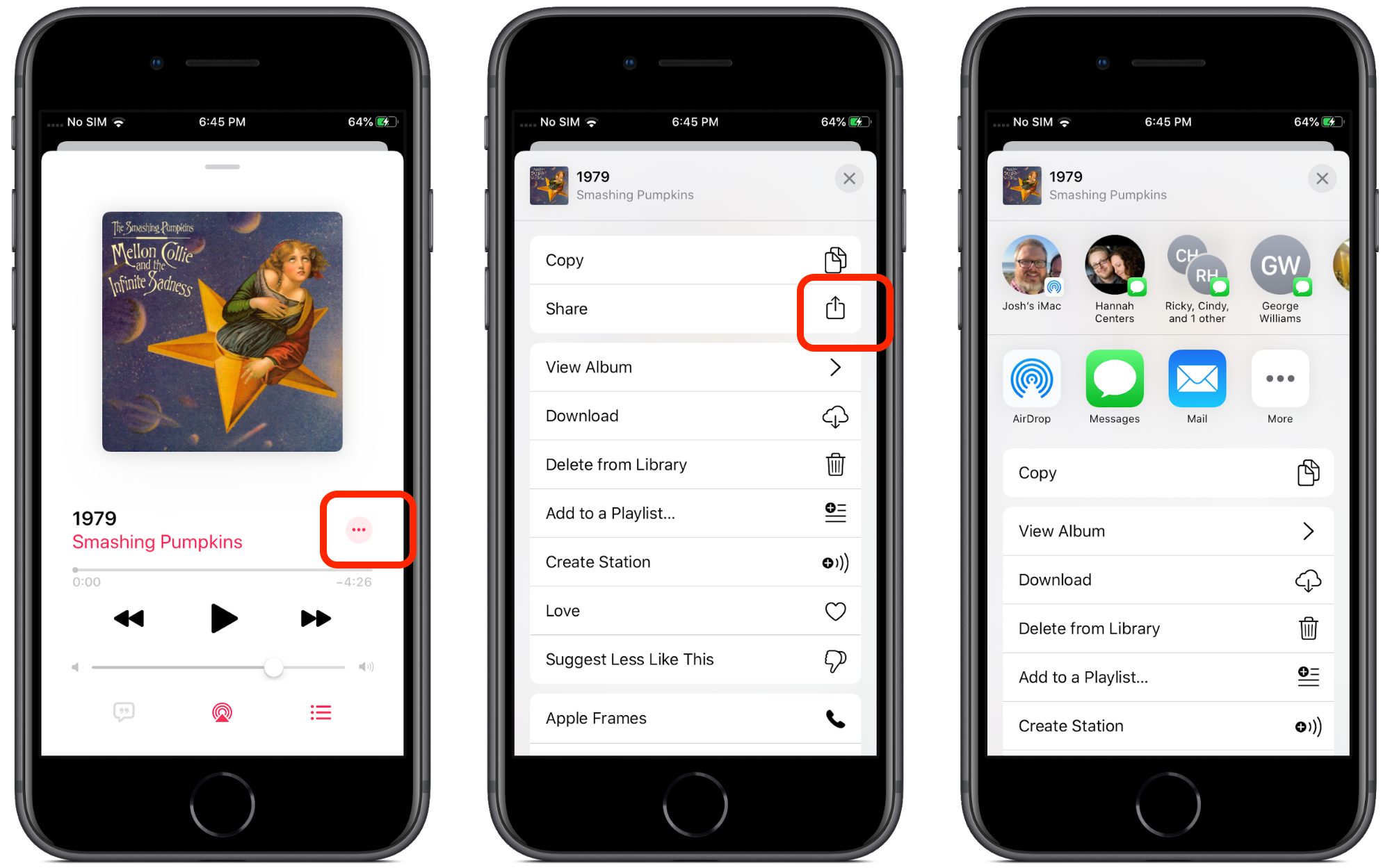
First, Apple changed its position, but more importantly, tapping it now opens an activity view instead of the action sheet that iOS 12 used. In interface language, should an ellipsis open an activity view or an action sheet? It may seem like a small difference, but any time an interface does something unexpected, users lose trust in their abilities.
These interface confusions extend to the Files app in iOS 13 as well. Much like with Wallet, Apple replaced a perfectly understandable Edit link with an ellipsis button. What does it do this time? Settings, perhaps? Sharing options?
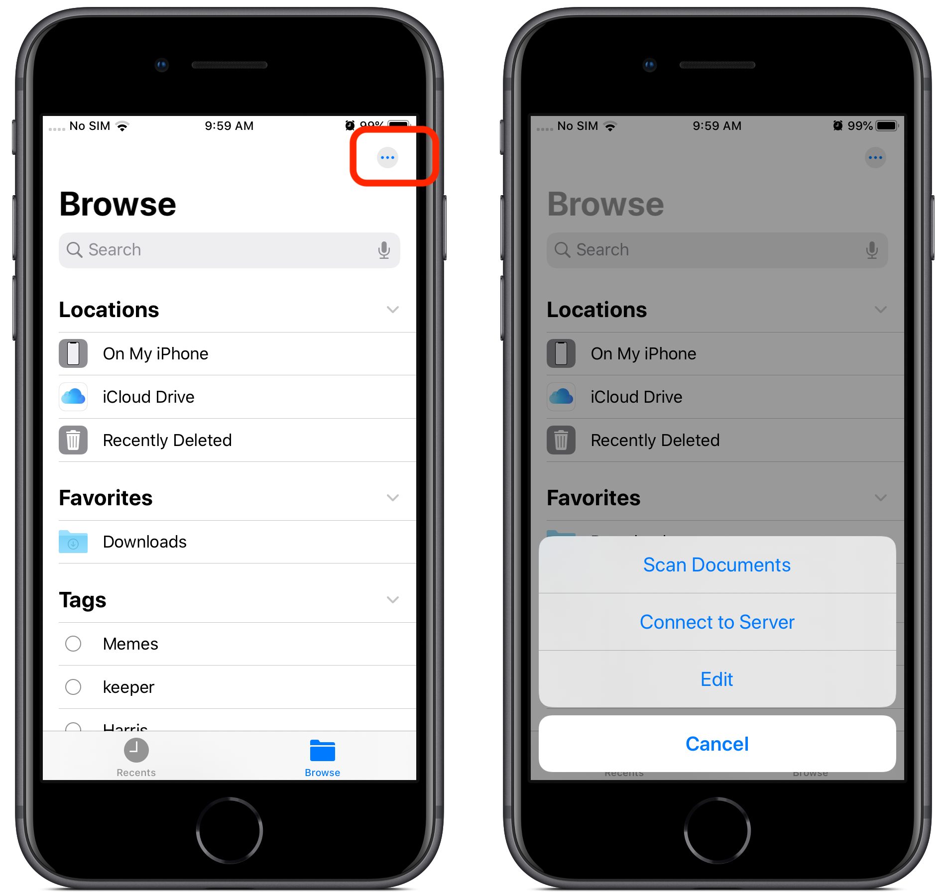
No, this time it offers commands for scanning documents, connecting to servers, and the options to edit locations, favorites, and tags. These are very different actions. The Edit command makes sense for manipulating the lists of items underneath, and the new feature for connecting to a server fits well too, but scanning documents? Nothing else in Files relates to creating documents.
Perhaps my favorite abuse of the ellipsis button is in iOS 13’s Shortcuts app, where tapping it on a shortcut takes you to the shortcut actions, but tapping it while viewing shortcut actions takes you to the shortcut’s settings, although the sheet is labeled “Details.”
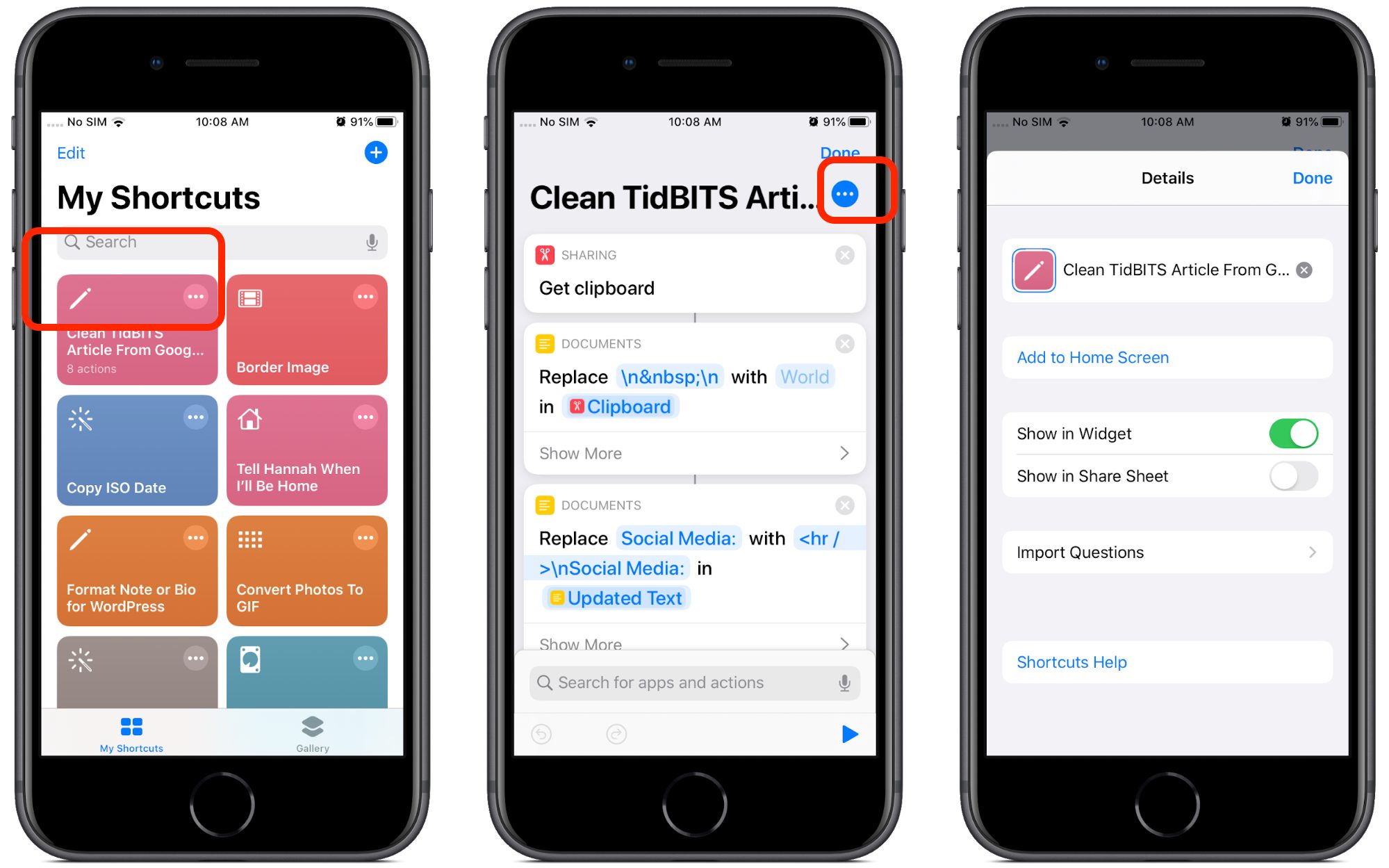
In the first instance, the ellipsis button means “Edit,” whereas in the second, it means “Settings.” This is once again a step back from iOS 12’s Shortcuts app, which uses a distinct settings icon with toggle switches for a shortcut’s settings. Why did Apple replace a visually clear icon with a generic one?
![]()
That’s exactly what the ellipsis buttons in iOS have become: generic icons that indicate that there’s something more to see, but you never know what. You could replace the ellipsis with Clarus the Dogcow, and it would be every bit as visually clear (and more interesting).
To make matters worse, in each of the above examples, the ellipsis button triggers a different sort of interface. Sometimes you get a separate screen, sometimes an action sheet, and sometimes an activity view. It’s disorienting because there’s no consistent behavior.
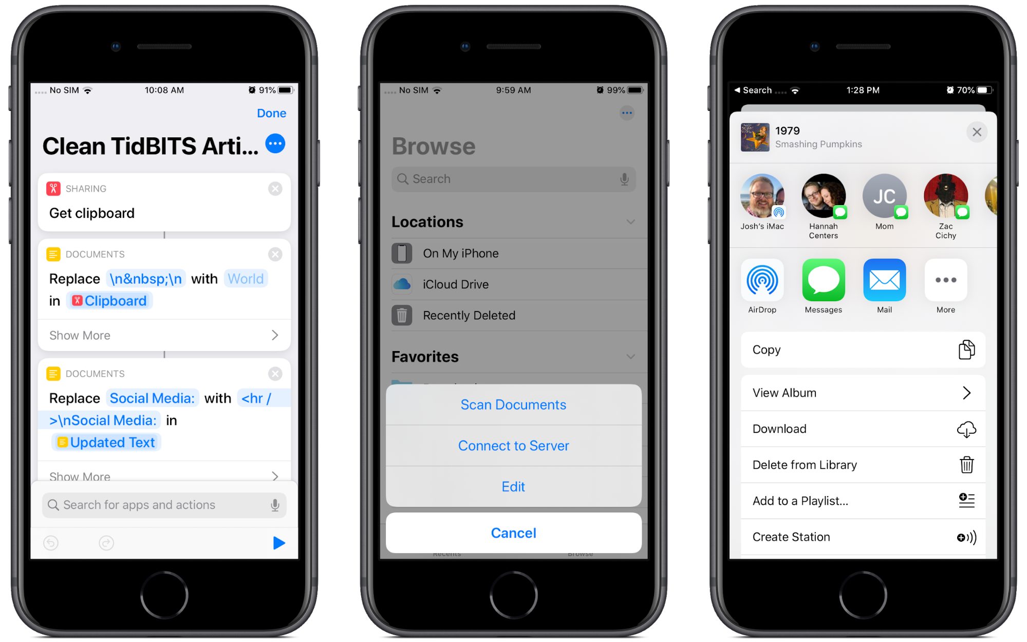
And of course, there’s yet another completely different context for the ellipsis, the incoming message indicator in Messages.
Don’t try tapping it—nothing will happen.
Unfortunately, Apple’s bad practices have infected third-party developers as well. Check out this example from Slack’s iOS app.

An ellipsis button just for a single View Files option! Why not just put a View Files button next to the other buttons?
What Is “More”?
You might be thinking that it’s obvious that the ellipsis buttons and icons simply mean “More,” but there’s no way to know this for sure.
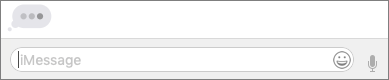
The good news is that Apple has introduced a standard library of icons in its upcoming operating systems, called SF Symbols. Until now, developers had to create their own icons or borrow them from a third party.
Unfortunately, the descriptions generally document only what the icons look like, not what they’re meant to mean. So the names don’t give developers any idea about why to use these icons, just what they look like, which is already obvious.
(SF Symbols isn’t a standard Unicode font, so there’s no way for tech writers to use them when documenting Mac and iOS apps. Worse, Apple’s license seemingly prevents their use in documentation anyway, saying “Your use of Symbols obtained from Apple’s SF Font is limited to creating mock-ups of user interfaces for software products running on Apple’s iOS, macOS and tvOS operating systems.”)
Names like ellipses.bubble and ellipsis.circle aren’t helpful. Interestingly, it’s not as if Apple can’t describe how specific icons should be used. The company does so for icons that developers are allowed to use only to indicate specific Apple features.
![]()
Developers and users can be sure that the icloud icon can only refer to Apple’s iCloud service, but good luck deciphering what ellipsis.circle means. Maybe it means “More,” maybe it doesn’t. Apple is being intentionally vague here.
The broader issue here in terms of usability isn’t the philosophical issue of “what is more,” but the practical issue of what “More” means to the user. As you saw in the above examples, tapping an ellipsis button can activate a widely varied range of user interface elements. Unlike, say, the Share icon, which consistently presents an activity view that contains sharing-related options, the behavior of ellipsis buttons isn’t predictable or consistent, which leads to user confusion. It confuses me, and I’ve spent years documenting iOS!
Let’s examine a competing approach to representing “More.”
Google to the Rescue?
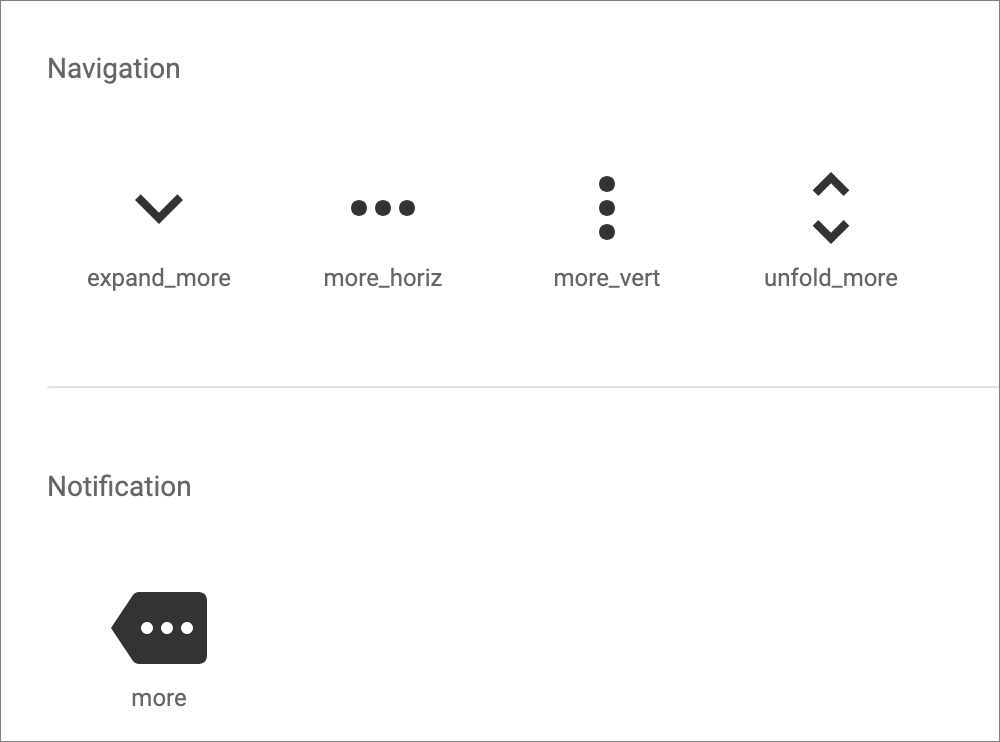
Believe it or not, Google might have outdone Apple on design here. Google gives developers a clear design standard, called Material Design, that comes with color palettes, templates, and icons. Each of Google’s open-source icons clearly states its purpose.
![]()
For the most part, Material Design doesn’t name its icons based on what they look like, but instead for what function they should represent. Unlike Apple, Google doesn’t call the gear icon “gear.” Instead, it’s named “settings” to indicate that tapping it should provide access to settings. Material Design also provides an array of other settings icons for different things, like Bluetooth and brightness.
To be fair, Material Design also includes the ellipsis button, though it puts “more” in the name to indicate that tapping them should provide more of something.
Let’s look at how Google uses ellipsis buttons in its iOS apps. Gmail shares iTunes’s annoying tendency to nest ellipsis buttons, and like iTunes, it uses them in an internally consistent way.
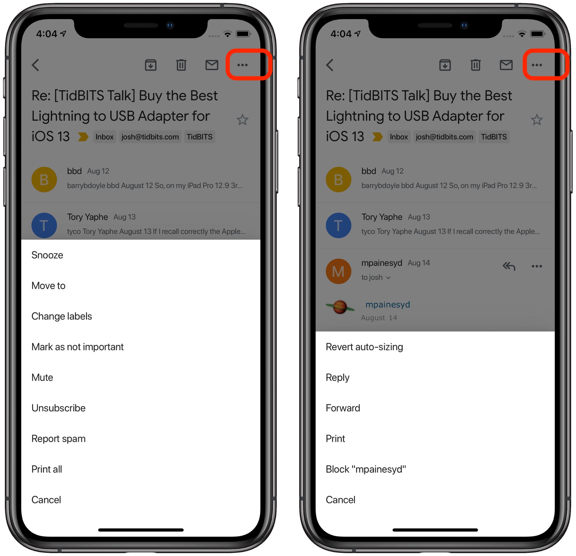
Tap the ellipsis button associated with an email thread to bring up a menu for that thread. Tap the ellipsis button associated with the message to bring up a menu for that specific message. As with iTunes, it’s not pretty, but it’s consistent and it works.
The ellipsis button (vertical this time, presumably to take up less horizontal space from the video title) works the same way in YouTube: tap it to see a menu of extra actions much like Gmail provides. The only difference is that each action has an icon to the left of it, which would be nice to have in Gmail.
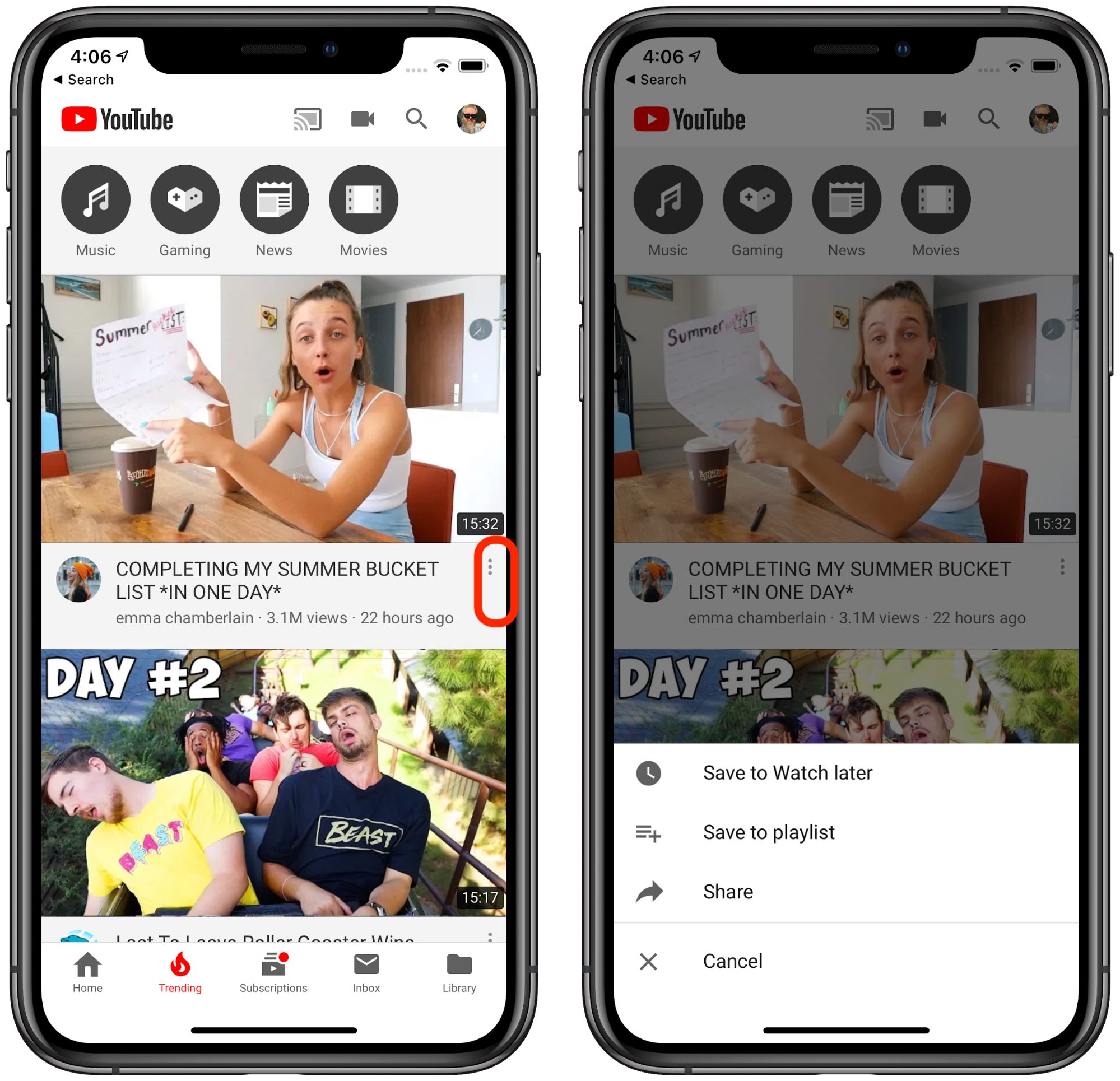
Just as with Gmail, the menu pops up from the bottom of the screen. Thankfully there’s no nesting here.
In Google Docs, ellipsis works much the same way: tap it to reveal a menu of hidden actions. In the file view, the menu pops up from the bottom like in Gmail and YouTube.
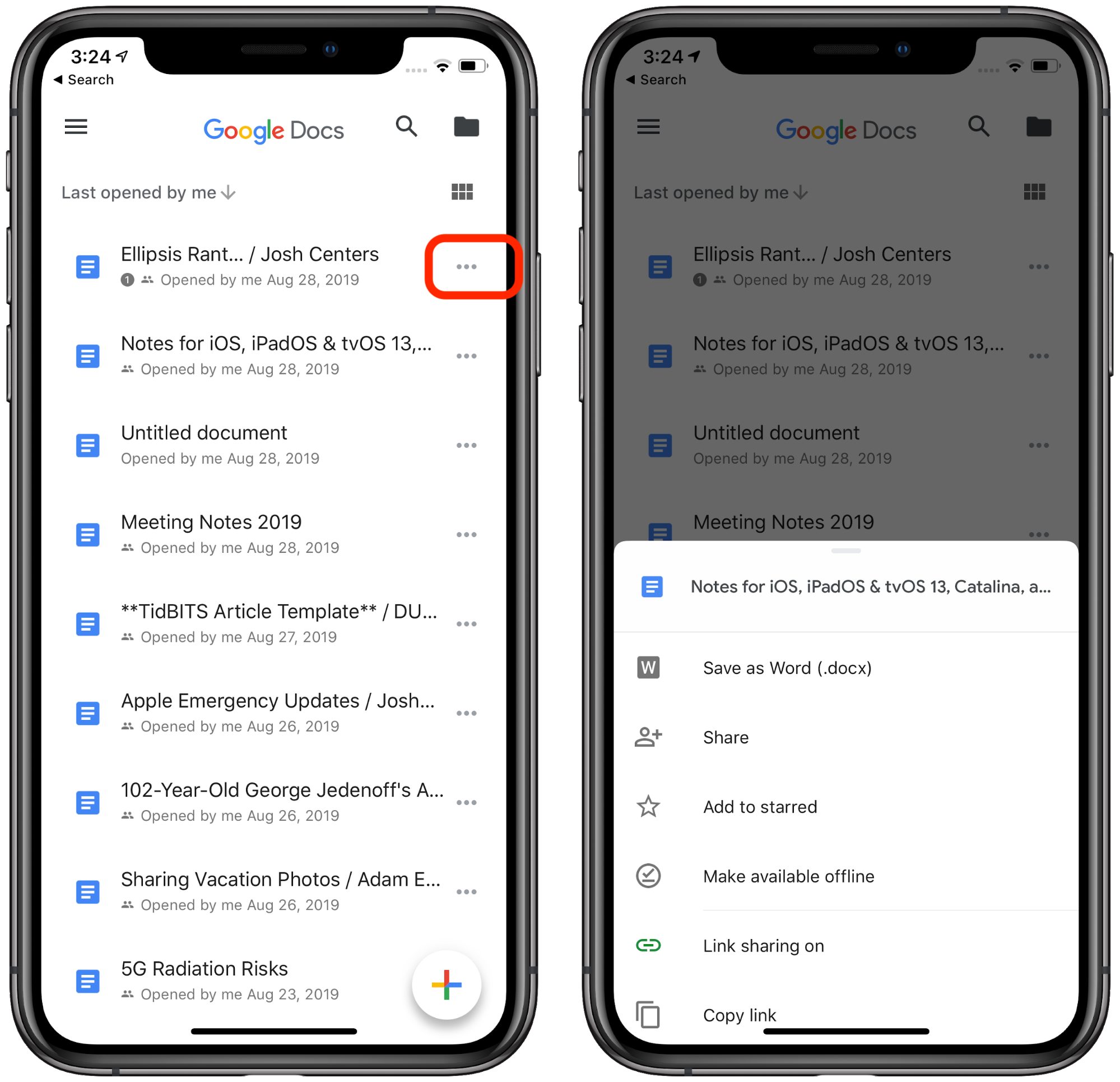
But tapping the ellipsis button while viewing a document causes the menu to pop out of the side of the screen. Given the length of the menu, that small inconsistency makes some sense, but I can’t help but think that a “hamburger” button (which Material Design calls a “menu” button and which Google apps use as well for app-level menu options) would be more appropriate.
Google Maps breaks this convention somewhat. Tapping More in the Explore Nearby pane opens a full-page menu of place categories.
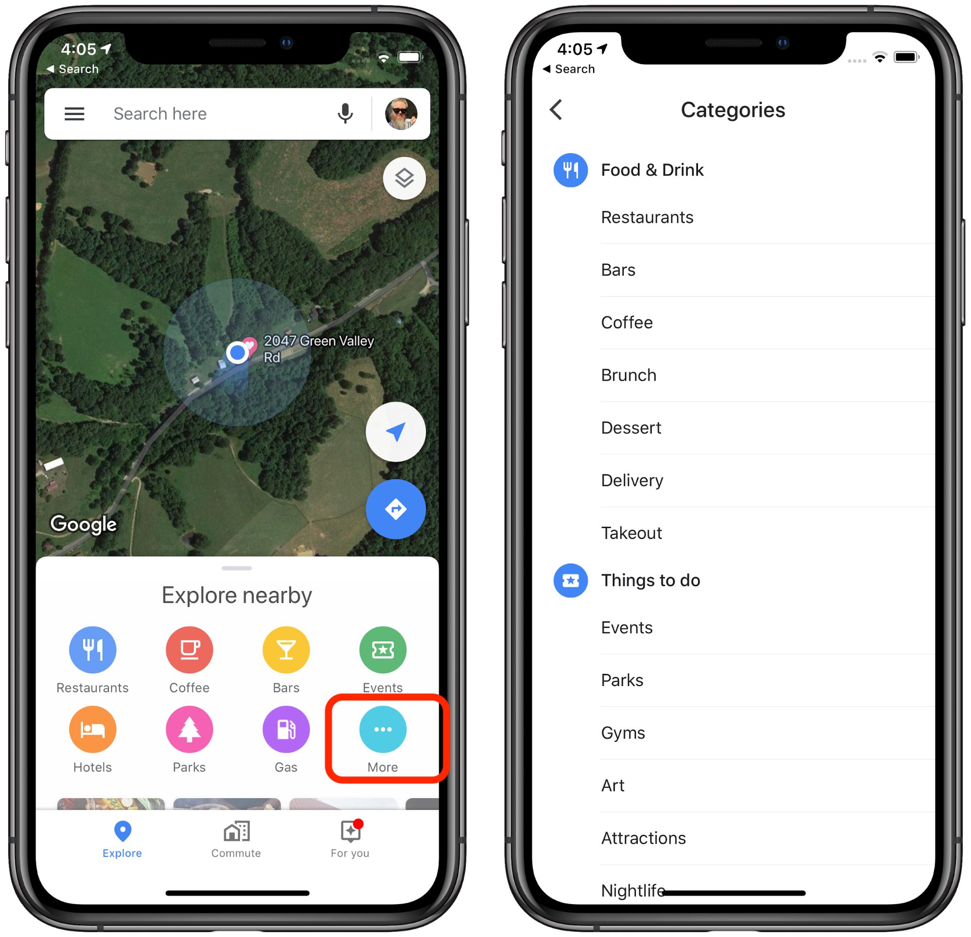
But this isn’t an entirely fair comparison, as this ellipsis button doesn’t look like most other ellipsis buttons—it matches the nearby colored icons and provides a text label. I like this particular usage because you can intuit what will happen when you tap that clearly labeled More button.
Of course, what you prefer is a subjective choice, and it’s not as if Android developers (including Google) follow the Material Design guidelines exactly. However, I think Google’s usage of ellipsis buttons is clearer and more consistent than Apple’s.
It’s disappointing that Apple, supposedly a leader in interface design, has resorted to such uninspiring, and I’ll dare say, lazy design in its icons. I don’t claim to be a usability expert, but it seems to me that icons should represent a clear intention, followed by a consistent action. To quote Apple’s Human Interface Guidelines:
A consistent app implements familiar standards and paradigms by using system-provided interface elements, well-known icons, standard text styles, and uniform terminology. The app incorporates features and behaviors in ways people expect.
The ellipsis button may be system-provided, but even Apple isn’t using it to initiate app functions in ways that people expect.